Product Showcase Techniques for Ecommerce (2026 Guide)
Last updated: February 2026
What You Will Learn
What “product showcase” really means in ecommerce
8 product showcase techniques (and where they win)
Using AI generated backgrounds for product photography (without looking fake)
Product showcase video: templates vs generators vs studio shoots
When to use 3D rendering and 3D ecommerce experiences
A practical production workflow for small teams
Product showcase quality control: a quick checklist before you publish
Marketplace and platform constraints that should shape your product showcase
File formats, sizing, and consistency: the unsexy part that affects conversion
A good product showcase is not “more content.” It is the fastest way to answer a shopper’s silent questions: What is it, what does it look like in real life, how big is it, and why should I trust it? In 2026, you can build those answers using a mix of classic still life photography, AI-generated scenes, short-form video, and (for the right catalogs) 3D views. The trick is choosing techniques that match your margin, your production bandwidth, and your return policy risk.
This guide breaks down the most effective display techniques and when to use each, with practical workflows you can apply whether you shoot in-house or work with a studio. If you are also tightening your PDP image set, start with this supporting guide on product photos so your showcase is built on a solid base.
What a product showcase is (and what it is not)
.webp)
A product showcase is your complete “visual proof set” across PDPs, collections, ads, email, and marketplace listings. It includes the hero image, supporting angles, contextual lifestyle shots, detail crops, scale references, and often a short video. The goal is to reduce uncertainty, increase add-to-cart rate, and lower returns by setting accurate expectations.
What it is not: a random collage of assets, a single aesthetic background, or a one-time photo shoot that never updates. Your best showcase evolves as your assortment changes, as seasons change, and as customer questions come in through reviews and support tickets.
For many catalogs, the fastest way to improve your showcase is to stop treating every SKU like a full studio campaign. Build a repeatable system: a baseline pack for every SKU, plus a small set of “conversion assets” for best sellers.
8 product showcase techniques that reliably lift conversion
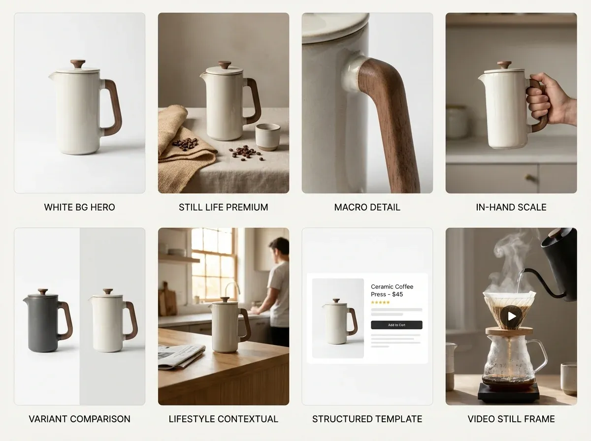
1) The conversion-first image stack (your default set)
If you are getting started in product photography or rebuilding your catalog, standardize an image stack before you chase fancy concepts. A solid baseline usually includes: front hero, back/side, top-down (if relevant), a close-up detail, a scale reference, and packaging or “what’s in the box.” This helps shoppers compare variants and reduces size and color confusion.
2) Still life product photography for premium perception
Still life product photography is the fastest path to “high end” without models. You control light, reflections, and composition so the product looks intentional and tactile. This works especially well for skin care product photography, fragrance, jewelry, and food where material cues matter.
Use props that reinforce benefits (not distract).
Keep a consistent prop library so your catalog looks cohesive.
Use shadow and highlight direction to signal quality.
3) Benefit-led detail crops (the “proof” layer)
Detail crops can outperform lifestyle shots when your product has a specific claim: texture, stitching, nozzle design, clasp mechanism, grain, or finish. Make sure your crop explains something. “Here is the logo” is rarely as helpful as “here is the double-stitched seam” or “here is the brush texture.”
4) Scale and use-case context (reduce returns)
Most avoidable returns come from expectation gaps. Add scale references that are honest: in-hand, on-desk, next to a phone, or on-body (with size shown). If you cannot shoot every SKU with a model, prioritize your top sellers and your most return-prone categories.
5) Comparison frames (your shortcut to clarity)
Use a consistent comparison layout for variants: side-by-side color swatches, size lineup, or “new vs old” improvements. This can be faster than writing paragraphs of copy and it translates well for marketplaces.
6) Contextual scenes for ads and collection pages
Collection pages and paid social often need a stronger “world” than PDPs. Build 3 to 5 repeatable scene archetypes (kitchen counter, bathroom vanity, gym bag, desk setup) and reuse them across products so your brand looks consistent.
7) Product showcase templates for speed
A product showcase template is any repeatable layout system for PDP image ordering, aspect ratios, and overlays (when overlays are allowed). Templates win when you have many SKUs and limited creative resources. The risk is “template fatigue” if every asset looks identical. Rotate backgrounds, crops, and context shots while keeping the structure consistent.
8) Product showcase video for “feel” and credibility
Video earns its place when motion communicates value: texture, pour, shimmer, fit, assembly, before-and-after, or unboxing. It also reduces the need for too many still images. If you only do one video, do a clean 10 to 20 second product demo that addresses the top pre-purchase questions.
AI generated backgrounds for product photography: where it helps (and where it hurts)
AI backgrounds can be a practical middle ground between a full studio set and plain white. You keep your real product photo and swap the environment to match a use case or a seasonal campaign. For small business product photography, this can unlock “lifestyle variety” without booking locations or buying props.
The main failure mode is realism: mismatched perspective, odd shadows, or reflections that do not match your original lighting. To avoid that, treat AI as a background and set dressing tool, not a replacement for a clean product capture.
A simple workflow that stays believable
Start with a sharp base image (good exposure, minimal motion blur).
Keep your camera angle consistent across a set so backgrounds feel cohesive.
Choose environments that match your product’s lighting direction and intensity.
Do a quick “zoom test” on mobile and desktop to catch edge artifacts.
Where ProductAI fits (as a practical option)
If your bottleneck is producing more lifestyle-ready images from the photos you already have, ProductAI is built specifically for product photography workflows. The AI Background Generator is useful for rapidly exploring scene concepts, while the Free White Background Generator helps you standardize marketplace-friendly images. If you are repurposing assets for ads, the Increase Image Resolution tool can help when you need higher resolution outputs from older files.
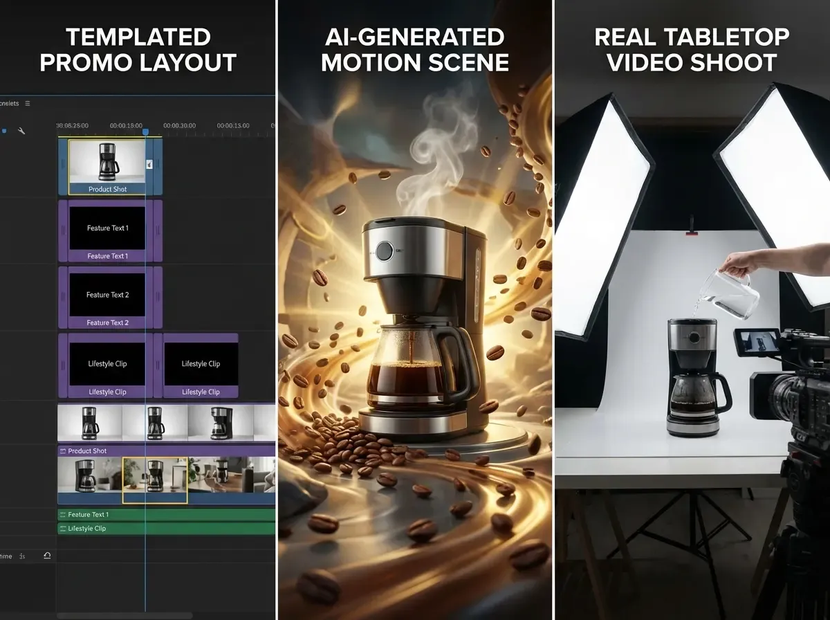
Product showcase video: templates vs AI generators vs a real shoot
There are three common approaches to product showcase video, and each has a “best use” depending on your budget and how nuanced your product is.
Option A: Template-based video
Templates are great for fast promos: product title, benefits, a few clips, and a CTA. They work well for commodity products, bundles, and seasonal sales. The downside is sameness. If your competitors use the same template style, you can look interchangeable.
Option B: AI video generator product showcase
An AI video generator for product showcase can be useful when you need many variations (different hooks, different scenes) for paid testing. The tradeoff is control. Motion can look synthetic, and brand-specific details may drift. If you sell regulated products or anything where precise claims matter, keep a tight review process.
Option C: A real shoot (even a simple one)
For high end product photography categories, a basic real video shoot with controlled lighting often wins on trust. You do not need a huge production. A clean tabletop demo and a few macro clips can outperform overly stylized AI motion because it feels real.
One practical way to decide: if shoppers ask “is this real?” in comments, lean toward real footage. If shoppers ask “what does this look like in my life?” and you need lots of variants, AI scenes and templated edits can help.
When your product showcase should use 3D, rendering, or 360
Some products are just easier to showcase in 3D: furniture, complex products with lots of variants, and items where dimensions and configuration matter. If your catalog needs many angles, material options, or interactive views, it is worth understanding when 3D becomes cheaper than endless reshoots.
If you are debating 3D vs photography, read product photography vs 3d rendering first.
If you want to explore 3D asset creation for catalogs, see product rendering.
If you are building interactive experiences, start with 3d ecommerce.
The cleanest approach for many brands is hybrid: use photography for trust and texture, then add 3D where it reduces variant costs or improves clarity (configuration, scale, or “look around” benefits).
A repeatable product showcase workflow (that does not burn your team out)
.webp)
Most ecommerce teams fail at product showcases because they build assets like one-off creative projects. A sustainable system has three layers.
Layer 1: Baseline assets for every SKU
White or neutral background hero
2 to 4 angles that match your category
One detail crop
Variant clarity (color, size, finish)
Layer 2: Conversion assets for top sellers
A lifestyle scene (real or AI-assisted) that matches your main use case
A scale reference image
A comparison image (bundle, sizes, “what’s included”)
A short product showcase video
Layer 3: Campaign assets for ads and seasonal pushes
3 to 5 reusable scene archetypes
Multiple aspect ratios (1:1, 4:5, 9:16)
Iterative creative testing cadence (weekly or biweekly)
If you want a reality check on what photography typically costs before you commit to a studio-heavy plan, this breakdown is helpful: Product Photography Pricing: How Much Should It Cost. For background selection rules that keep your catalog cohesive, see Location Backgrounds for Product Photography.
Product showcase quality control: a quick checklist before you publish
Here is the thing: most “showcase problems” are not creative problems. They are consistency problems. Before you publish a new PDP set or roll out a new template across a collection, do a fast QC pass that mirrors how customers actually shop.
The 60-second skim test (collection page reality)
Do your heroes look like one brand, with consistent crop, angle, and lighting?
Can a shopper instantly tell variants apart, or do they look identical at thumbnail size?
Do any images look like a different product category because the background or prop choice is misleading?
The trust test (PDP zoom and edge cases)
Zoom in: are edges clean, labels readable, and textures natural?
Do shadows and reflections match the scene, especially if you used AI backgrounds?
Are you accidentally implying scale, quantity, or accessories that are not included?
The return-risk test (what your support team will pay for later)
Do you clearly show size, thickness, and what is included?
If color accuracy matters, do you show the product in a neutral reference shot, not just stylized lifestyle scenes?
If assembly matters, do you show the “boring” steps that prevent confusion?
From a practical standpoint, this checklist is where your baseline pack earns its keep. When your white or neutral images are consistent, it is much easier to spot when a lifestyle or AI-assisted image drifts too far away from reality.
Marketplace and platform constraints that should shape your product showcase
If you sell across Shopify, marketplaces, and paid social, your product showcase has to survive multiple rule sets. What looks great on your PDP can get rejected, cropped weirdly, or down-ranked elsewhere. The fix is not to build totally separate asset libraries, it is to design a “source of truth” set that adapts cleanly.
Start with one compliant baseline set
Your white or neutral hero is the workhorse. It is the asset most likely to be accepted everywhere and the one you can safely reuse in feeds, catalogs, and comparison layouts. Once that baseline is consistent, you can layer on lifestyle images and video where the channel allows more creativity.
Design for cropping, not just composition
Most platforms will crop your images differently depending on placement. Consider this: an image that looks perfect at 4:5 in an ad can get center-cropped into a square in a product grid. If your product sits too close to the edge, you lose key details. Give your heroes breathing room and keep critical details near the center.
Know where overlays and claims create risk
Many brands like comparison frames and benefit callouts. They can work, but they also create compliance and review risk on some marketplaces, and they can create readability issues on mobile. If you rely on overlays, keep the underlying product image strong enough that it still sells when the text is removed.
The reality is that a great product showcase is not just “pretty assets.” It is operational. It reduces the odds that you will need to rebuild your library when you add a new channel, a new theme, or a new ad format.
File formats, sizing, and consistency: the unsexy part that affects conversion
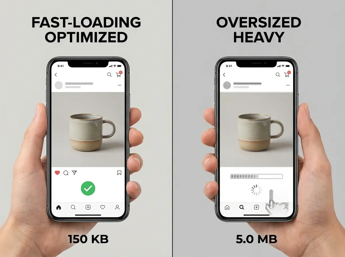
Competitors rarely beat you because their lighting is 10 percent better. They beat you because their catalog is easier to scan, loads faster, and looks consistent across every SKU. That is often a format and sizing problem.
Pick one “master” dimension and stick to it
Standardize your master exports for stills, then derive channel variants from that. When every SKU uses the same dimensions and crop strategy, your collection pages look calmer, and shoppers can compare faster.
Optimize for speed without destroying details
Heavy images can slow down PDPs, especially on mobile connections. Over-compress and you get banding, muddy textures, and unreadable labels. Under-compress and the page drags. Test your most detailed SKU shots and find the compression level where text and texture still look clean.
Keep color and white balance consistent across the whole set
Shoppers do not judge your product in isolation. They judge it next to your other SKUs, and next to competitors in search results. If your white background looks slightly blue on one SKU and slightly yellow on another, your store looks less controlled. Tight color consistency is a quiet trust signal.
Think of it this way: you can spend hours generating new scenes, but if the basics are inconsistent, you are multiplying inconsistency at scale.
Pros and Cons
Strengths
Improves conversion by reducing uncertainty (size, texture, use-case, included items).
Reduces returns when you add honest scale, close-ups, and clearer variant comparisons.
Supports omnichannel reuse (PDP, ads, email, marketplaces) when you standardize a template and shot list.
Scales better when you adopt a baseline-plus-bestseller system instead of treating every SKU like a campaign.
Pairs well with AI and 3D workflows so you can increase creative volume without linear cost growth.
Considerations
It is easy to create “pretty but unclear” assets that look premium yet fail to answer buying questions.
AI backgrounds can introduce realism issues (shadows, reflections, edges) if your base photo is not clean.
Video boosts trust, but it adds production steps (storyboard, capture, edit, approvals) that many small teams underestimate.
3D and rendering can lower long-term costs for variants, but the upfront pipeline and asset management can be heavy.
Frequently Asked Questions
What is a product showcase in ecommerce?
A product showcase is the full set of visuals that help a shopper understand and trust a product, not just a hero image. It typically includes multiple angles, detail shots, scale references, and sometimes video or interactive views. The best showcases reduce uncertainty, which tends to lift conversion rate and reduce avoidable returns.
How many images should a product showcase include?
Most ecommerce products perform well with 6 to 10 images when each one has a job: hero, alternate angles, detail, scale, and packaging or “what’s included.” If you add images that repeat the same information, you increase production work without improving conversion. Start with a baseline set, then add extras only where questions exist.
Do I need a white background image for every SKU?
For most stores, yes. A white or neutral background image is useful for marketplaces, catalog consistency, and quick scanning on collection pages. It also gives you a clean “source of truth” image you can reuse for future creative. If you sell highly experiential products, you can still keep white as your baseline and add lifestyle shots after.
Are AI generated backgrounds for product photography safe to use on PDPs?
They can be, as long as the product remains accurate and the background does not imply features you do not offer. The biggest risk is visual mismatch: lighting, shadows, or reflections that make the image feel artificial. A good approach is to start from a clean product cutout, then keep backgrounds subtle and consistent with your brand world.
What is the difference between product photos and product rendering?
Product photos capture a real item with a camera, which usually wins on trust and real-world texture. Product rendering uses a 3D model to generate images, which can be more scalable for variants and angles once the model exists. Many brands use a hybrid approach: photography for realism, rendering for configurations and large variant sets.
When should I choose 3D ecommerce experiences?
3D ecommerce is most compelling when shoppers benefit from exploring an item: furniture, home goods, complex products, or anything with modular parts. It can also help when you have many finishes or sizes and want consistent presentation. If your products are simple and low consideration, 3D may be extra work without a clear ROI.
Is a product showcase video worth it for small businesses?
Often, yes, but keep it simple. A short 10 to 20 second demo that shows scale, how it’s used, and one key benefit can outperform longer edits. If you cannot film everything, focus on your top sellers and your highest return-risk SKUs. You can then reuse those clips across ads, PDPs, and email flows.
What should I look for in a product showcase template?
Favor templates that standardize aspect ratios, safe text areas, and a consistent story order (hero, proof, detail, scale). Your template should speed up production without forcing every product into the same visual idea. A good template is flexible enough to support different categories while still looking like one brand.
How do I keep a “high end product photography” look without a big budget?
Control lighting, surfaces, and consistency. A simple tabletop setup, careful reflections, and intentional props can look premium without a large crew. Avoid cluttered scenes. If you use AI backgrounds, keep them believable and aligned to your product’s lighting. Premium is usually about restraint and clarity, not complexity.
How do I decide what to outsource vs do in-house?
Outsource when you need specialized skills (complex lighting, macro, high-volume retouching, or 3D asset creation) and when quality directly impacts pricing power. Keep in-house work for repeatable catalog capture, simple edits, and ongoing creative testing. A hybrid model often works best: a studio sets your “gold standard,” and your team maintains it.
What makes an AI-generated scene look fake?
The fastest giveaways are perspective and physics problems: shadows that fall in the wrong direction, reflections that do not match the environment, and contact points that look like the product is floating. Edges around handles, bristles, and transparent packaging are also common failure points. If you see those issues, choose a simpler scene, reduce visual complexity, or start from a cleaner base image.
Should my product showcase images be the same across my site and marketplaces?
Your baseline set should be consistent everywhere, especially your white or neutral hero. After that, adapt to the channel. On your own PDP you can use more context to sell the use-case, while marketplaces often favor clean, standardized images for easy comparison. A good system is one master set plus channel variants, not totally separate libraries.
How do I show scale without using a model?
Use familiar reference objects and consistent framing. In-hand shots work even without a full model, and on-desk references can be enough for many categories. Another practical option is to include packaging dimensions or “what’s in the box” layouts that make size obvious. The goal is not to be creative, it is to remove doubt.
What is the biggest mistake small teams make with product showcase video?
They try to do too much in one video. A simple demo that shows the product in use, confirms scale, and highlights one key benefit is usually the best ROI. If you need more depth, make a second clip for a specific question, like setup, cleaning, or what is included, rather than stretching one edit to cover everything.
Key Takeaways
A product showcase is a system: baseline SKU assets plus conversion assets for best sellers.
Still life and detail crops build premium perception when they explain material and benefits.
AI backgrounds can scale lifestyle variety, but only if your base photos are clean and lighting stays believable.
Video is worth it when motion communicates value (texture, use, fit, assembly).
3D and rendering are best when variants and configurations would otherwise force endless reshoots.
Conclusion
If you want a product showcase that actually drives revenue, build it like an operating system, not a one-time photoshoot. Start with a consistent baseline image stack for every SKU, then invest extra effort where it pays back: best sellers, high-return products, and ad creatives you will test every week. Add lifestyle context using real sets or AI-assisted backgrounds, and use video when motion makes the value obvious.
If you are exploring AI assistance, test a few concepts with the AI Background Generator and standardize your catalog with the Free White Background Generator. You will quickly see which approach fits your brand and workflow.
Last updated: February 2026
About the Author
Giles Thomas, Ecommerce & AI Product Photography Expert – Founder, AcquireConvert.
Giles helps ecommerce teams build conversion-first product content systems that scale, from standardized PDP image stacks to AI-assisted background workflows and video testing. His work focuses on practical visual merchandising processes that improve clarity, speed production, and reduce return-driving expectation gaps.

Hi, I'm Giles Thomas.
Founder of AcquireConvert, the place where ecommerce entrepreneurs & marketers go to learn growth. I'm also the founder of Shopify agency Whole Design Studios.