Creative Product Photography (2026 Guide)
Creative product photography matters because shoppers do not experience your product in person first. They judge it through your thumbnails, collection pages, PDP galleries, and ads. If your visuals feel generic, your store can look interchangeable even when your product is not. The good news is that better creative does not always mean a larger studio budget. For many Shopify merchants, the strongest approach is a mix of clean packshots, simple styled scenes, and a few conversion-focused lifestyle images. If you are still building your setup, start with this product photography studio guide, then use the ideas below to create a visual system that supports clicks, trust, and purchase intent.
Contents
Why creative product photography matters for sales
Creative product photography is not about making every image dramatic or artistic. For ecommerce, it means using visual choices intentionally so shoppers understand the product faster and feel more confident buying it. That could mean a minimalist white background shot, a flat lay with props, a textured beauty setup, or a lifestyle image showing scale and use.
Most stores need more than one image type. A skincare brand may need sterile-looking packshots for trust, ingredient-focused scenes for branding, and in-use images for credibility. A fashion store may need ghost mannequin or flat-lay images for catalog consistency, plus on-model visuals for fit and styling context. A watch brand may need macro closeups to show finish, dial detail, and strap texture.
The key point is this: creativity works best when it removes buying friction. If the styling hides the product, creates confusion, or breaks gallery consistency, it may hurt conversion. If it helps customers picture ownership, compare options, and understand quality, it could support stronger performance across product pages, social ads, and marketplace listings.
For merchants exploring faster production options, AI can help with concepting and scene generation. We have covered that in our guides to ai photoshoot workflows and ai product photography for ecommerce teams.
The 3 Types of Product Photography (And How to Use Each on Shopify)
Here is the thing: most Shopify stores get stuck because they treat every image like it has the same job. In practice, you will usually rely on three types of product photography, and each one supports a different moment in the buying decision.
When you separate these types, it becomes much easier to plan your shoot, structure your PDP gallery, and avoid creative images hurting clarity where it matters most.
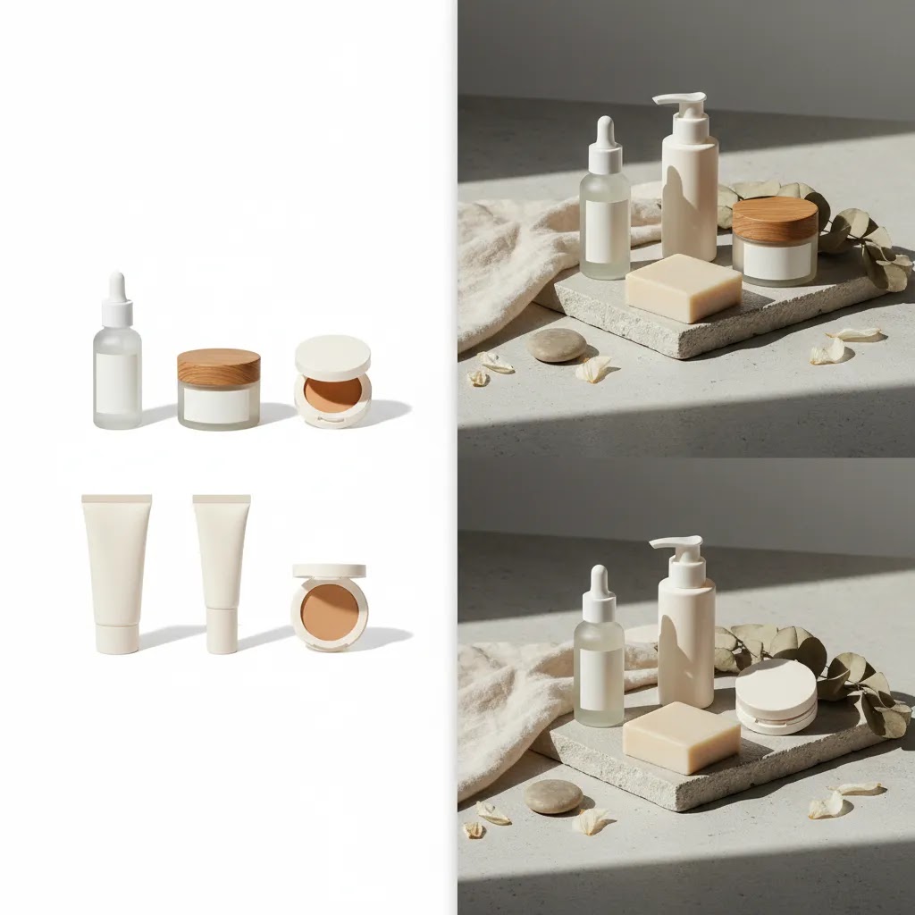
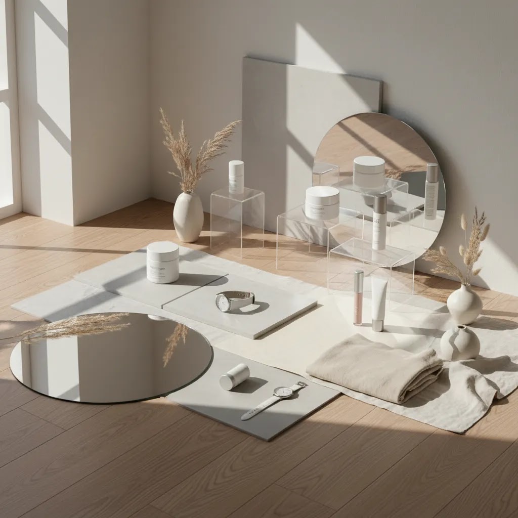
1. Packshot (catalog) photography
This is your clean, controlled product-only imagery. Often white background, sometimes a neutral color or consistent surface. The goal is fast recognition, accurate color, and repeatable presentation across a whole collection.
From a practical Shopify standpoint, packshots tend to do the heavy lifting in places where images are small or cropped tightly: collection page thumbnails, featured collection sections, search results, and any channel that pulls a primary image automatically.
2. Lifestyle (in-use) product photography
This is the product being used or worn, or at least shown in a believable environment. The goal is context: scale, how it fits into a routine, and what it looks like in real life.
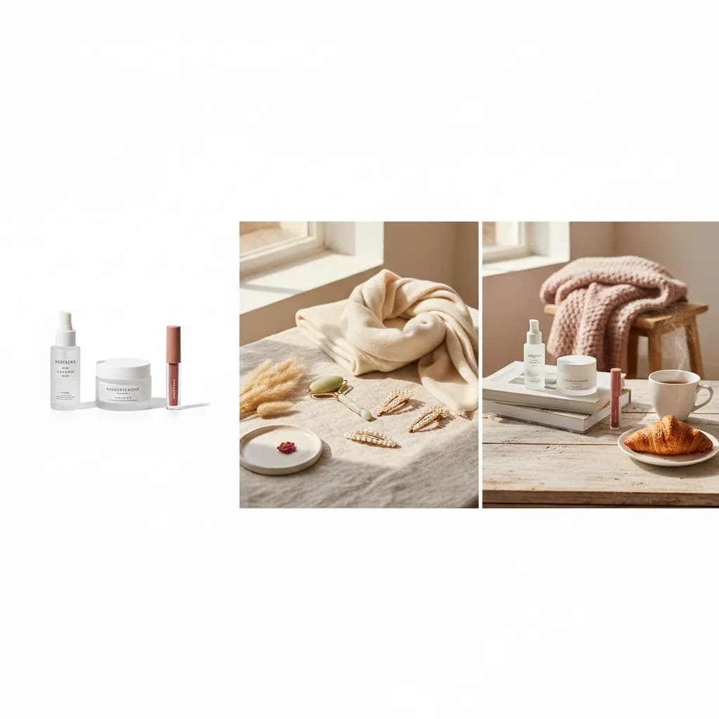
Lifestyle images often support conversion when shoppers need proof. Think apparel fit, skincare application, a bag on a shoulder, a candle in a room, or a kitchen tool in someone’s hand.
3. Creative (styled) product photography
This is where you use styling, props, set design, color, texture, shadows, and sometimes AI-assisted variations to create brand mood and campaign energy. The goal is differentiation and storytelling without losing product truthfulness.
Creative images tend to work best as supporting images on a PDP, and as attention-grabbing assets for paid social, email banners, and launch content.
How to structure a Shopify PDP gallery using these types
Most Shopify themes emphasize the first image, and that first impression carries into collection thumbnails, quick views, and sometimes into shopping placements. So the ordering matters.
Warning signs your creative photos are hurting clarity
What many store owners overlook is how creative images behave when they get cropped or shrunk. A beautiful styled photo can turn into a confusing thumbnail.
Think of it this way: packshots help shoppers orient, lifestyle helps them believe, and creative helps them feel. You want all three, but you want them in the right order.
10 creative product photography ideas you can use
These ideas are practical for ecommerce teams, not just editorial campaigns. You can use them for Shopify PDPs, category pages, paid social, email banners, and organic social content.
1. Start with a clean white background hero shot
Creative work starts with control. Your first image should usually be a clean, well-lit hero image that shows the product clearly. This is especially important for marketplaces, collection pages, and mobile browsing. Even if your brand leans artistic, shoppers still need one anchor image that feels dependable.
2. Use minimalist props, not prop overload
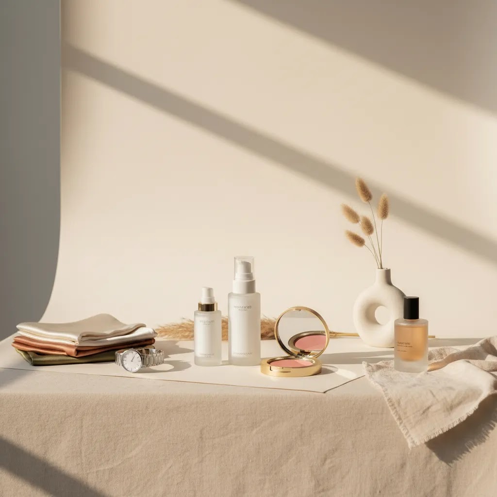
Minimalist creative product photography works because it adds context without clutter. A stone block, fabric fold, shadow line, or subtle surface texture can make an image feel premium while keeping attention on the product. This approach works well for beauty, homeware, jewelry, and wellness brands.
3. Build a flat lay system for repeatable content
Flat lay minimalist creative product photography is ideal when you need visual consistency across many SKUs. Try one background, one lighting style, and one spacing rule. Then rotate colors, accessories, or seasonal elements. This is efficient for cosmetics, stationery, supplements, and fashion accessories.
4. Show the product in use
Creative lifestyle product photography helps customers picture the product in their own routine. For skincare, show application. For kitchen tools, show handling. For apparel, show fit in motion. For watches, show wrist shots in believable settings. These images often answer questions your copy cannot answer quickly enough.
5. Use shadows intentionally
Natural or shaped shadows can make still-life photos feel less flat. This works well for creative beauty product photography and creative skincare product photography because it adds warmth and depth without complex staging. Keep the shadows soft enough that labels and textures remain easy to see.
6. Match the set design to the product promise
A clean clinical set may suit serums, actives, and dermatologist-led brands. A soft organic set may fit botanical skincare. Metallic surfaces may suit watches or tech accessories. Fabric and wood may fit handmade or sustainable goods. The scene should reinforce positioning, not fight it.
7. Include detail crops and macro shots
Closeups are often overlooked in creative cosmetic product photography and creative fashion product photography. They help show finish, ingredients, weave, stitching, hardware, and material quality. On Shopify product pages, these supporting images can reduce uncertainty for high-consideration products.
8. Create one signature branded composition
If you want your store and ads to feel more recognizable, create one repeated visual format. That might be a top-down composition, a diagonal product placement, a specific color backdrop, or a standard hand-held framing. This is one of the simplest ways to build visual memory without reshooting everything.
9. Use hands to add human context
Hands help communicate scale, usability, and emotional tone. This is especially effective for beauty, skincare, candles, beverages, and small accessories. It can also make static products feel more alive without needing a full lifestyle production.
10. Test AI-assisted variations for campaign creative
AI tools can help create concept images, alternate backgrounds, and campaign variations faster than traditional shoots in some cases. That can be useful for ad testing or seasonal creative exploration. Still, your core PDP image set should remain clear, accurate, and brand-consistent. If you are weighing software options for this, our photoroom breakdown is a useful next step for store owners comparing workflow tools.
20 Creative Product Photography Styles (So You Never Run Out of Concepts)
If you are trying to build an ongoing content engine, you need a menu of styles you can repeat, not one-off hero shots you cannot reproduce. Consider this a style bank you can pull from whenever you need new Shopify PDP support images, fresh paid social creative, or seasonal content.
The reality is that most of these can be done with a phone, window light, a roll of paper or a tabletop, and a couple foam boards. The constraint is usually not gear, it is clarity. Whatever you choose, make sure the product stays the main character.
For most Shopify store owners, the way this works in practice is simple: pick two to four styles that match your product category and repeat them consistently. That gives you brand recognition, faster shoots, and a catalog that does not feel random.
What strong ecommerce product photos need
Before you spend on styling, props, or AI tools, make sure your image set covers the basics that actually help shoppers buy.
If you are producing content in-house, a few specialized tools may help with post-production and variation building. Current options from the available tool data include AI Background Generator, Free White Background Generator, Increase Image Resolution, and Background Swap Editor. Based on their names and URLs, these are most useful for background cleanup, white background preparation, resolution improvement, and alternate scene testing.
For color cosmetics brands, campaign concept work often overlaps with beauty visualization. If that is part of your workflow, our related guide on the ai makeup generator topic may help you think through where creative imagery supports merchandising and where accurate product depiction matters more.
You can also browse AcquireConvert's broader Catalog Photography coverage and our Lifestyle Product Photography resources for more setup examples.
Pros and Cons
Strengths
Considerations
Who these ideas work best for
These approaches work best for ecommerce brands that already have basic product photography handled and want to improve click-through, perceived quality, or brand differentiation. That includes Shopify stores in beauty, skincare, fashion, accessories, home goods, and giftable categories.
If you are pre-launch or still struggling with basic lighting and consistency, start with dependable packshots first. If you already have clean catalog images but your brand feels flat in ads or on PDPs, adding a few strategic creative formats is usually the better move. You do not need every idea here. Most merchants will get the best result from choosing two or three visual formats and repeating them well.
How AcquireConvert recommends approaching it
At AcquireConvert, the practical recommendation is to treat creative product photography as part of conversion design, not just brand expression. Giles Thomas's perspective as a Shopify Partner and Google Expert is especially useful here because product imagery affects more than aesthetics. It shapes how customers evaluate your offer on collection pages, product pages, paid traffic landing pages, and shopping channels.
For most store owners, the best workflow is to create a three-layer image system: a clean hero image, a small set of detail or angle shots, and one or two lifestyle or styled compositions. That gives you coverage for clarity, proof, and brand storytelling. If you are experimenting with AI or background tools, use them to speed production and concept testing, but keep your merchandising standards tight. The image still needs to match what a customer receives.
If you want to go deeper, explore AcquireConvert's related guides and compare your current gallery against the ideas in this article. That kind of review often surfaces simple changes you can apply on your next shoot without rebuilding your whole content process.
How to choose the right creative direction
Choosing the right visual direction is less about trendiness and more about product type, traffic source, and buying behavior. Here are the criteria that matter most.
1. Start with how the customer buys
If the purchase is detail-sensitive, prioritize accuracy. Shoppers buying skincare may care about texture, ingredient cues, and packaging trust signals. Fashion shoppers may need fit, drape, and scale. Jewelry buyers may want finish and clasp detail. Your creative direction should answer the questions that block purchase.
2. Separate gallery needs from campaign needs
Your PDP gallery and your social ads do not need identical images. Collection pages and product pages need clarity first. Campaign creative can be more expressive. This distinction helps many brands avoid one common mistake: using ad-style images as primary storefront images where clarity matters more.
3. Match production level to SKU count
If you sell 12 hero products, a more stylized shoot may make sense. If you sell 400 SKUs, repeatability matters more. In that case, use one standardized packshot system and reserve creative sets for bestsellers, launches, bundles, or ad campaigns.
4. Consider whether AI fits your workflow
AI-assisted tools can be helpful for white background cleanup, alternate backdrops, mock scenes, or quick concepting. They are less suitable when exact material behavior, shade accuracy, or regulated presentation standards are critical. Treat them as production support, not a blanket replacement for product truthfulness.
5. Keep your Shopify merchandising in mind
Your image strategy should support how products appear in collections, search results, filters, and mobile carousels. A visually dramatic image that crops poorly in collection thumbnails may underperform a simpler one. Review your photos in the actual storefront environment, not only in a design mockup.
If you are evaluating your current setup, audit one collection page and three product pages. Check whether the first image is clear, whether at least one image shows use or scale, and whether the gallery style is consistent across products. That simple review often identifies more improvement potential than buying new equipment straight away.
Budget, Pricing, and the 20-60-20 Rule (Planning a Shoot That Produces Usable Assets)
Once you pick a direction, the next bottleneck is usually planning. Most shoots do not fail because of lighting. They fail because you end up with beautiful images that do not fit Shopify, do not match your catalog, or do not cover the questions customers actually need answered.
How product photographers typically price a shoot
Pricing varies widely, but photographers usually charge in a few standard ways. Knowing the model helps you compare quotes properly and avoid surprises.
What drives cost tends to be the complexity, not just the number of images: model casting, location, styling, prop sourcing, liquids or motion setups, heavy retouching, and tight turnaround all typically increase budget. If you are planning a mix of packshots and creative scenes, ask your photographer to separate the quote by setup type so you can see where the money goes.
How to think about ROI without guessing
From a practical standpoint, you are buying two things: clarity assets for conversion, and attention assets for acquisition. The ROI is hard to predict in advance because it depends on traffic quality, price point, and how well the images fit your pages and ads.
A useful way to make the decision is to ask, “Will this shoot produce images we can reuse across our PDPs, collection pages, ads, and email for the next few months?” If the answer is yes, even a modest shoot can be worth it because you are reducing the cost of content creation over time. If the answer is no because everything is a one-off concept, you may end up reshooting constantly.
The 20-60-20 rule for ecommerce product photography
The 20-60-20 rule is a simple planning framework that keeps your shoot productive.
What many store owners overlook is that the middle 60% is where consistency and scale come from. It is the difference between “we had a shoot” and “we built a content system.”
A simple pre-shoot checklist focused on ecommerce outputs
If you want the shoot to translate into usable Shopify assets, plan it like a merchandising project, not a mood board.
If you do this prep work, you are far more likely to walk away with a library that improves your storefront and gives you creative you can test in campaigns.
Frequently Asked Questions
What is creative product photography in ecommerce?
It is product photography that uses styling, composition, props, lighting, or context intentionally to make the product clearer, more appealing, or more brand-aligned for online shoppers. In ecommerce, the goal is not artistic flair alone. The image should still help customers understand what they are buying and feel confident enough to move closer to purchase.
Does creative product photography work better than white background images?
Usually, they work best together. White background images are strong for clarity, consistency, and marketplace compliance. Creative images add context, differentiation, and brand feel. Most ecommerce stores benefit from using white background shots as core catalog assets and creative images as supporting visuals across product galleries, ads, and social content.
Can I do creative product photography ideas at home?
Yes, many stores start that way. A window light source, foam boards, a clean surface, and a small selection of props can go a long way. The main thing is consistency. Choose one lighting approach, one or two background styles, and a repeatable framing system so your catalog does not look stitched together from unrelated experiments.
What works best for creative beauty product photography?
Beauty products often respond well to texture, reflection control, ingredient cues, and soft directional light. Minimal props usually outperform crowded setups. Show packaging clearly, include at least one closeup, and use lifestyle or hand-held shots where appropriate. For makeup and skincare in particular, shoppers often want both brand mood and accurate product presentation.
How many creative images should a Shopify product page have?
There is no single correct number, but many Shopify stores do well with a balanced set: one clear hero image, a few alternate angles, one detail image, and one or two contextual or lifestyle shots. The mix depends on product complexity. The aim is to answer buying questions without turning the gallery into a visually inconsistent set.
Should I use AI for product photography?
AI can be useful for concept development, background replacement, white background cleanup, and campaign variation testing. It is most helpful when it saves production time without reducing accuracy. If customers rely on color, texture, or material realism to make a decision, check outputs carefully before using them on a product page or in ads.
What is the difference between packshot and lifestyle product photography?
Packshot photography focuses on the product itself, usually on a simple background with controlled lighting. Lifestyle photography shows the product in a real-world or styled context. Packshots are typically stronger for catalog clarity, while lifestyle images often help with emotional appeal, scale, and use-case understanding. Most stores need both formats.
What is the best creative direction for fashion product photography?
That depends on what customers need to judge. Apparel often needs a combination of consistency and movement. Clean on-model images, flat lays, or mannequin shots work for catalog structure. Creative additions should show styling, fabric behavior, or brand attitude without hiding fit details. If the product is technical or premium, detail crops can be especially useful.
How do I know if my product photos are helping conversion?
Look at click-through from collection pages, engagement with product galleries, add-to-cart behavior, and overall conversion trends after image updates. Try to test changes in a controlled way rather than replacing everything at once. In many stores, stronger imagery supports performance indirectly by improving trust, product understanding, and perceived product quality.
What is the 20-60-20 rule in photography?
It is a planning framework that splits your shoot into 20% safe essentials, 60% repeatable core content, and 20% experimental concepts. For ecommerce, it helps you ensure you leave with the catalog images you need for Shopify, plus a reliable set of creative formats, plus a few higher-risk shots for ads and social testing.
How much should I pay a photographer for a product shoot?
It depends on your location, the photographer’s experience, the number of setups, and how much retouching and usage licensing is included. Photographers may charge a day rate, per image, per SKU, and sometimes separate licensing for broader commercial use. The most helpful next step is to get a quote that breaks costs out by setup type and deliverables, so you can compare options based on what your Shopify store actually needs.
What are the three types of product photography?
The three common types are packshot (catalog) photography for clarity and consistency, lifestyle (in-use) photography for context and proof, and creative (styled) photography for branding and campaign energy. Most Shopify stores perform best with a mix, with the clearest packshot typically leading the PDP gallery.
What is creative product photography?
Creative product photography is a styled approach that uses composition, props, lighting, and set design to communicate brand and make the product more compelling. In ecommerce, it should still be product-first. If the creative concept hides the item or creates confusion at thumbnail size, it can work against conversion.
Key Takeaways
Conclusion
Creative product photography can strengthen how shoppers perceive your products, but only when the visuals support clear merchandising. For most ecommerce brands, the winning formula is simple: dependable hero shots, useful detail images, and a selective layer of lifestyle or styled content that reflects the brand without obscuring the product. That approach is realistic for independent Shopify merchants and scalable for growing catalogs. If you want more practical guidance, explore AcquireConvert's photography resources and related AI workflow articles. Giles Thomas brings a valuable ecommerce operator perspective as a Shopify Partner and Google Expert, which makes these guides especially useful when you need visuals that support conversion, not just aesthetics.
This article is editorial content created for educational purposes. It is not a paid endorsement unless explicitly stated otherwise. Pricing, product features, and tool availability are subject to change, so verify current details directly with the provider. Any performance outcomes discussed are not guaranteed and will vary by store, product type, traffic quality, and implementation.

Hi, I'm Giles Thomas.
Founder of AcquireConvert, the place where ecommerce entrepreneurs & marketers go to learn growth. I'm also the founder of Shopify agency Whole Design Studios.