Product Photography Angles Every Listing Needs (2026)
Getting product photography angles right has a direct effect on how trustworthy, detailed, and purchase-ready your listings feel. For most ecommerce brands, the goal is not artistic variety for its own sake. It is showing shape, scale, texture, and use clearly enough that shoppers can buy with confidence. If you sell on Shopify, Amazon, Etsy, or your own DTC site, a repeatable angle checklist will usually improve consistency across your catalog and reduce gaps on product pages. This guide covers the angles for product photography that most listings need, when to use 360 or turntable shots, and where AI tools can help speed up edits. If you are building a repeatable workflow, start with this product photography studio guide as your foundation.
Contents
Overview
Product photography angles are the planned viewpoints used to present an item online. For ecommerce, they help answer the questions shoppers would normally resolve in a physical store: What does it look like from the front? How thick is it? What does the back include? What details am I paying for? How does it look in use?
The right angle mix depends on category. Apparel needs front, back, close-up fabric detail, and fit context. Beauty products often need straight-on, side profile, packaging detail, and texture shots. Home goods may need top-down, scale reference, and in-room context. A single hero image is almost never enough.
For lean teams, the smartest approach is to create a standard shot list per product type and reuse it across the catalog. That makes editing faster, keeps collection pages cleaner, and helps shoppers compare products more easily. At AcquireConvert, we assess visual workflows through the lens of conversion impact for real online stores. Giles Thomas brings Shopify Partner and Google Expert experience to that evaluation, which matters when imagery supports both onsite conversion and paid acquisition.
If you are testing AI-assisted workflows, our guides to ai photoshoot processes and ai product photography can help you decide where automation fits and where manual control still matters.
Product photography angle names, and what each one communicates
Most store owners know they need “front, side, back,” but what many teams miss is that angle names are really shorthand for shopper questions. If you pick angles intentionally, your product page does less guessing for the buyer.
Here are the most common product photography angle names you will see in ecommerce, and what they tend to communicate:
Eye-level (straight-on): This is the most “objective” view, which is why it works well as a hero on Shopify collection pages and in ads. It answers, “What is it, exactly?” and “What will I receive?” Packaged goods, labels, and anything with front-facing information typically needs this.
High angle: Shot from slightly above, this helps show top surfaces, openings, and overall layout. It often answers, “What does the top look like?” and “How does it sit on a table?” This can be useful for food, tabletop products, kits, and open packaging.
Low angle: Shot from below eye level, this can make an object feel larger and highlight height, underside design, or stance. It answers, “How tall does this feel?” and “What is the footprint like?” Use with care, because it can also distort proportions if you go too low.
Top-down (flat lay): A true overhead view. This answers, “What is included?” and “How are the parts arranged?” It is great for bundles, sets, and anything where components need to be counted visually.
Three-quarter: Not fully front, not fully side. It answers, “What is the shape?” and “What is the depth like?” This is why it is so persuasive for shape-driven products. In many categories, a three-quarter is the best second image after the hero.
Macro (detail): A tight crop that shows texture, materials, finish, stitching, print quality, ingredients panels, or hardware. It answers, “Is this quality?” and “What am I paying for?” It is also the angle that tends to reduce returns for products where feel and construction matter.
From a practical standpoint, you do not need every angle for every SKU. You need the angles that match the product’s uncertainty.
Here is a simple rule of thumb for choosing angles by product type:
CPG and packaging-led products: Prioritize straight-on label clarity, side profile for depth, back for ingredients or instructions, and one detail for print and finish. If the packaging design sells the product, consistency across the collection is usually more important than creative variation.
Apparel: Prioritize front, back, and fabric detail, then add angles that explain fit and structure. Side angles and close-ups are doing the work here. A top-down flat lay can help for folded apparel, but it is usually not a substitute for fit context.
Small objects and “shape-first” products (shoes, bottles, accessories, collectibles): Prioritize three-quarter and side profile early, then use back and details to remove doubt. These are the categories where a three-quarter can sometimes be a stronger hero than a flat straight-on shot, especially if the straight-on view hides depth.
Consistency matters too. For most Shopify stores, you want your hero angle consistent within a collection so the grid looks clean and shoppers can compare quickly. The main time to break that rule is when a consistent straight-on hero hides what makes the product valuable. In that case, a consistent three-quarter hero across that specific product line can be a better standard than forcing everything into a flat front view.
The angles every listing needs
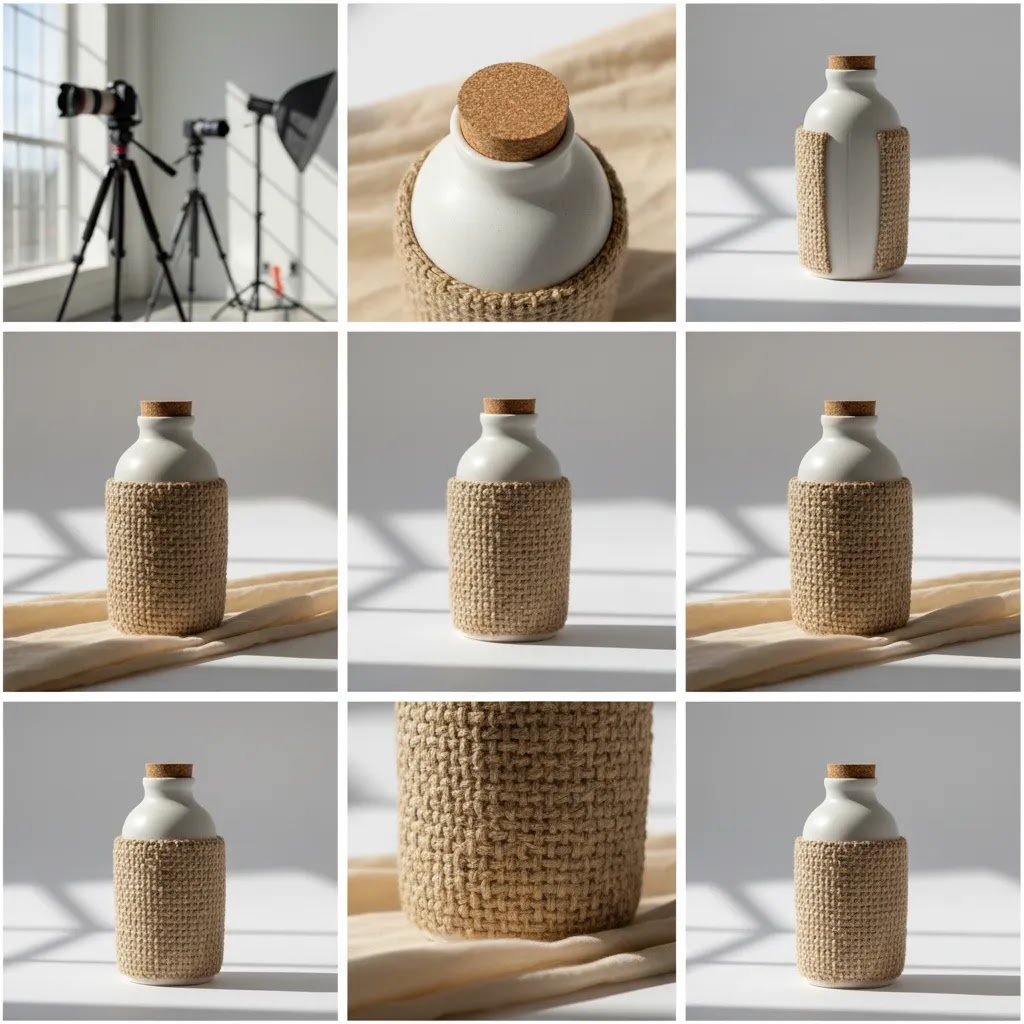
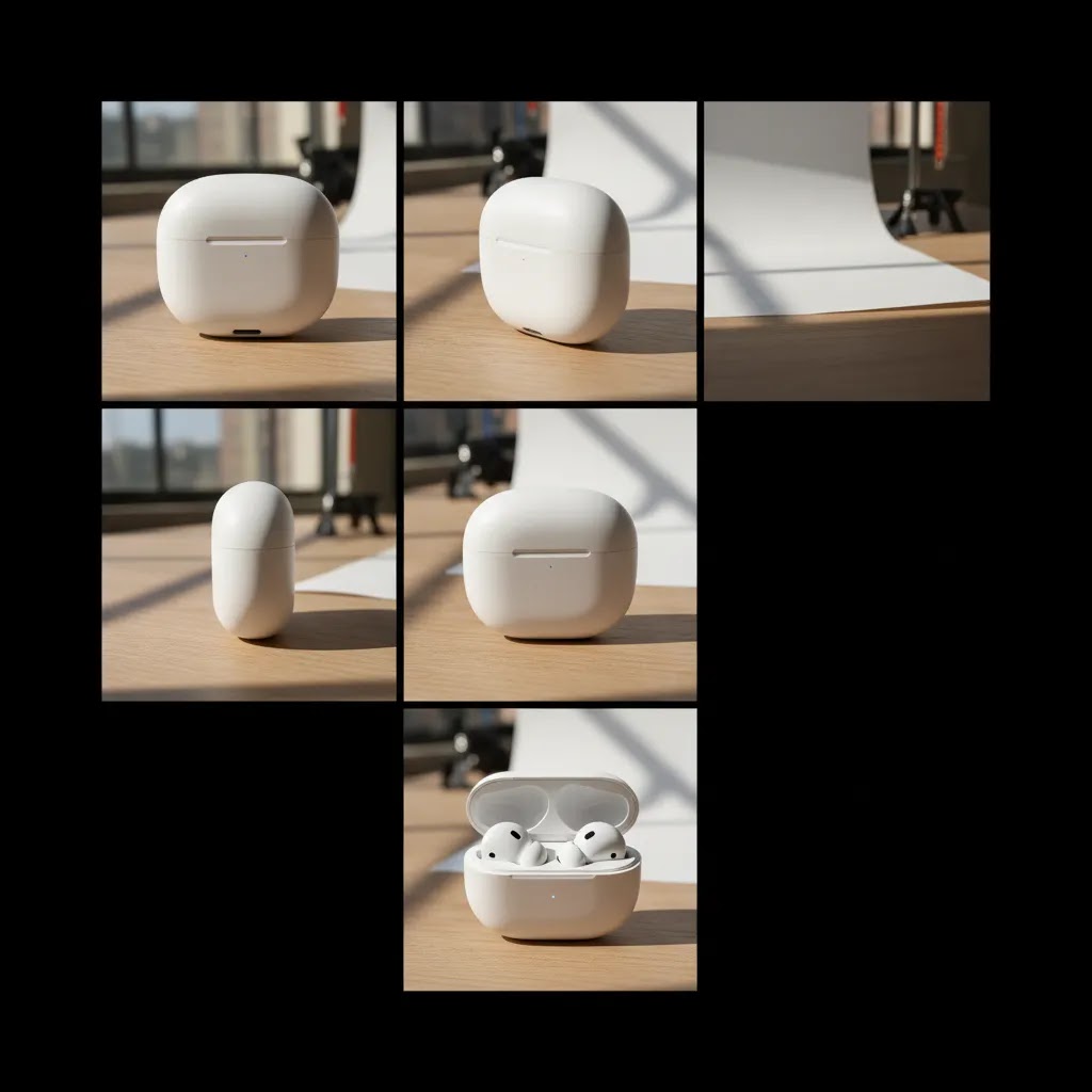
1. Front hero angle
This is your primary listing image. It should show the product clearly, with strong lighting, clean framing, and enough negative space for cropping across channels. For most products, the front hero is the image that earns the click from collection pages, ads, and marketplaces.
2. Back angle
Back views matter more than many brands expect. Shoppers want to confirm seams, closures, labels, ports, ingredients panels, or back design details. For apparel and accessories, this is often non-negotiable.
3. Side profile
A side angle communicates depth and construction. It is especially useful for shoes, bags, bottles, electronics, furniture, and packaged goods. If the product thickness is part of the buying decision, include it.
4. Three-quarter angle
This is often the most persuasive secondary image because it combines front visibility with depth. It helps flatter shape-driven products and can feel more realistic than a flat straight-on shot alone.
5. Top-down angle
Use this for trays, open boxes, flat products, food, cosmetics layouts, and kits with multiple components. It works well for bundle clarity and for showing how pieces are arranged.
6. Close-up detail shot
Texture, stitching, hardware, finish, ingredients, and material quality all benefit from detail images. These shots often do quiet conversion work because they reduce uncertainty. Shoppers may not always click every image, but when they do, details help justify price.
For some catalogs, you should add in-use lifestyle angles too. If you are shooting cosmetics or beauty products, techniques used in an ai makeup generator workflow can also influence how you present texture, shade, and application context.
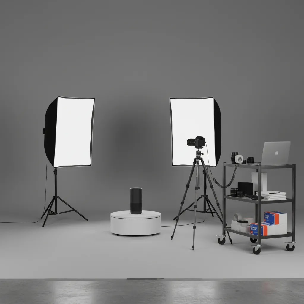
Turntable product photography is useful when static angles still leave uncertainty about form. It can work well for shoes, collectibles, tech accessories, and premium packaging. A basic turntable setup gives you evenly spaced angles around the product, which can then be shown as a spin sequence or converted into interactive 360 views. If you are considering polished post-production for white background assets, a tool such as photoroom may help speed up cleanup and consistency.
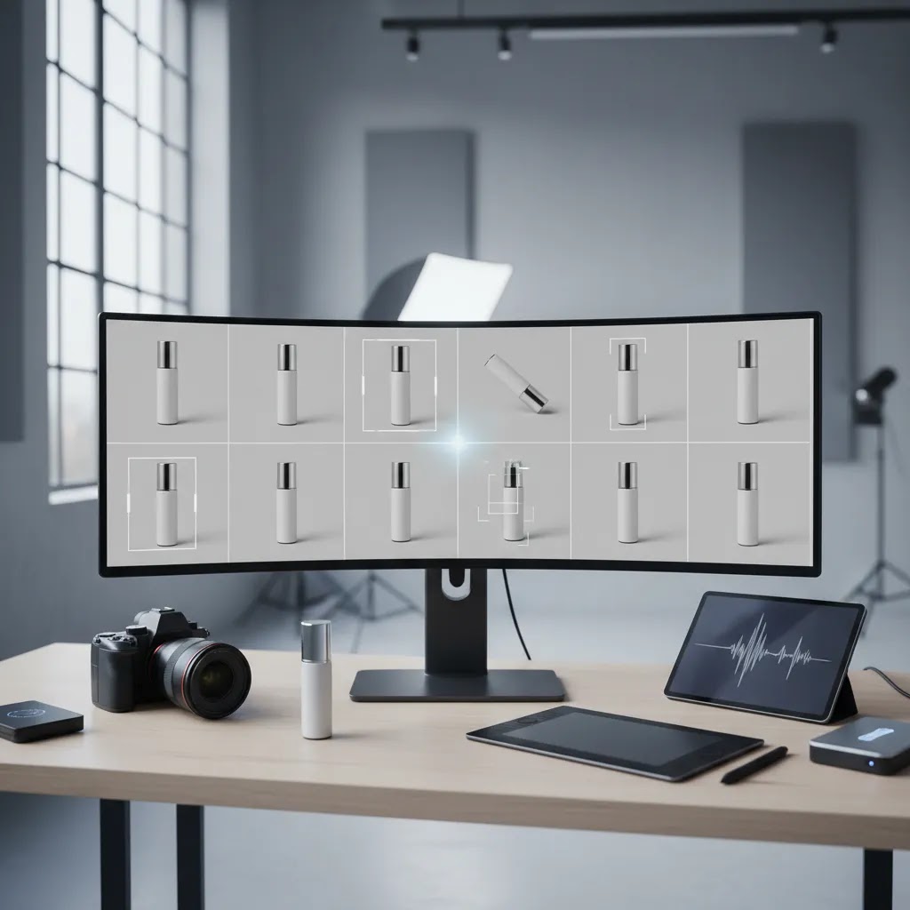
Where AI tools fit today is mainly in editing, background cleanup, and generating additional context images from a strong base photo. From the current product data provided, ProductAI offers tools including AI Background Generator, Free White Background Generator, Increase Image Resolution, Remove Text From Images, Background Swap Editor, Place in Hands, Magic Photo Editor, and Creator Studio. These are not full replacements for a disciplined angle plan, but they can support catalog expansion, testing, and retouching once your core shots are captured.
If you want a broader visual workflow benchmark, browse the Catalog Photography and E Commerce Product Photography sections for related setup and optimization ideas.
Build a shot list like a pro (angle planning and sequencing for ecommerce)
If you want consistent listings at scale, treat angles as a shot list problem, not a “we will figure it out on set” problem. A simple shot list also keeps your editing predictable, which matters when you are uploading and maintaining hundreds of Shopify product pages.
Think of your angle plan in three tiers:
Required angles: These are the non-negotiables for the product type. For many catalogs, that is hero, back, side, three-quarter, and at least one detail. If you skip these, you usually create support tickets, pre-purchase emails, and returns that could have been avoided.
Optional angles: These are helpful but not always needed. Examples include top-down flat lay, a second detail image, packaging in-hand for scale, or a “what is included” layout for bundles.
Only-if-needed angles: These exist for specific objections. For example, an underside shot for furniture, a ports and buttons shot for electronics, a closure mechanism shot for bags, or a thickness shot for mats and boards. If the product has a common hesitation, build an angle specifically for that hesitation.
Now, when it comes to actually shooting, sequencing is where teams save time. A clean sequence reduces reshoots and helps you avoid inconsistent framing across SKUs:
Start with the hero angle first, because it sets your height, crop, and lighting standard for the whole set. Then shoot your supporting angles (three-quarter, side, back). After that, capture details while the product is still perfectly clean and in position. Finish with lifestyle or in-use images last, because those often require prop changes, styling, or a different setup.
Consider this when you are trying to keep your catalog looking “same but better” across a whole collection:
Keep camera height fixed per product type. If you are shooting a lineup of bottles, do not change tripod height between SKUs unless the product size forces you to. Consistency here is what makes a Shopify collection grid feel premium.
If you use a turntable, mark increments so your angles are repeatable. Even simple marks (for example, quarter turns) help you keep spacing even across products and make it easier to pick the best frame for a three-quarter.
Standardize crop and framing rules. Decide what “fill” means for your hero (for example, product occupies roughly the same percentage of the frame across the line) and keep it consistent. This makes angle-to-angle comparison feel clean on product detail pages, and it also reduces the pain of resizing for ads.
Pricing and Costs
This topic is about shooting strategy rather than one single paid platform, so the main cost question is operational: what does it take to capture enough angles consistently?
Your first cost layer is equipment and setup. That may include lighting, backdrops, reflectors, a tripod, a shooting table, and potentially a motorized turntable if you want rotational content. If you are researching 3D product photography equipment or turntable product photography, remember that capture costs and post-production costs are usually separate.
Your second cost layer is labor. More angles mean more shooting time, more file organization, and more retouching. For many stores, a standardized shot list keeps this manageable because the team is not reinventing the process for every SKU.
Your third cost layer is software. Based on the live product data available here, ProductAI tools are listed by name and URL, but no pricing details were returned. That means we cannot verify current plan costs for those tools in this article. If you are evaluating AI product photography software, confirm pricing, usage limits, export rules, and commercial rights directly on the provider's site before committing.
For service-based searches such as product photography Cincinnati, product photography Seattle, or product photography Phoenix AZ, costs will vary widely depending on product size, shot count, styling, model use, and retouching requirements. The same applies to 3D product photography pricing. Ask for quotes built around deliverables, not just day rates, so you can compare vendors more accurately.
Composition rules that actually matter for ecommerce listings
Some of the most common photography questions are really composition questions, not angle questions. The reality is that ecommerce has different constraints than editorial photography. Your images have to survive cropping in Shopify themes, product page galleries, paid social placements, and sometimes marketplace requirements.
The “rule of thirds” (sometimes called the 2/3 rule) is useful for lifestyle images and in-use context, because it gives you a simple way to place the product without making the frame feel stiff. If you are shooting a model using a product or a scene in a room, placing the product slightly off-center can feel more natural. For hero images on white, many stores get better consistency by centering the product and keeping spacing uniform. If you also sell on marketplaces, centered product presentation is often the safer default because some channels prefer or effectively enforce it through their review standards. Always check current channel guidelines before changing a hero style across the catalog.
Another practical planning concept is the 20/60/20 idea. Think of it as an output mix for a product line, not a rule you need to follow perfectly. In many cases, around 20% of your images are “hero standard” assets (clean, centered, consistent across the collection), around 60% are supporting angles (side, back, three-quarter, top-down, details), and around 20% are lifestyle or context images. This can help teams avoid overshooting every SKU with too many variations while still producing enough images to answer shopper questions.
Aspect ratio is where composition gets real in production. For Shopify stores, square images are the easiest to manage across themes and collection grids. A 4:5 ratio is common for paid social placements and can work well for lifestyle and in-use images because it takes up more vertical space on mobile. A 16:9 ratio is typically better for banners, some video thumbnails, and wider scene-based images, but it can be awkward for product galleries because it forces heavy cropping or makes the product look small in-frame.
From a practical standpoint, pick a “master” ratio for your catalog shots and stick to it. Then create secondary crops for ad placements if needed. If you try to shoot every product natively for every ratio, you usually create inconsistency and extra editing work. This is also where leaving negative space in your hero image pays off, because it gives you room to crop for different placements without cutting off the product.
Pros and Cons
Strengths
Considerations
Frequently Asked Questions
How many product photography angles does one listing usually need?
Most ecommerce listings benefit from at least five to seven images, including a front hero, back, side, three-quarter, and one or two detail shots. Apparel, beauty, and higher-ticket products often need more. The right number depends on how much visual proof a shopper needs before buying and how complex the product is.
What is the most important angle for ecommerce product photography angles?
The front hero image is usually the most important because it drives clicks from collection pages, search results, ads, and marketplaces. That said, the hero rarely closes the sale alone. Secondary angles such as side profile, three-quarter, and details usually do the work of answering product questions and reducing uncertainty.
Is turntable product photography worth it for smaller stores?
It can be, but only for categories where shape and dimensionality strongly affect purchase decisions. Shoes, bottles, collectibles, and premium packaging are common examples. Smaller stores should test turntable content on bestsellers first rather than apply it to the full catalog. In many cases, better static angles deliver most of the value with less effort.
Can AI replace traditional product photography angles?
No, not fully. AI can help with editing, background generation, resolution enhancement, and creating context variations, but strong source photography still matters. If base shots are inaccurate or inconsistent, AI output may amplify those problems. For most ecommerce brands, AI works best as a production aid rather than a substitute for core catalog capture.
Do Shopify stores need 360 product photography AI tools?
Some do, many do not. If your products rely on form, finish, or mechanical detail, 360 visuals may improve shopper understanding. If you sell simpler products with straightforward buying decisions, standard multi-angle photography may be enough. On Shopify, the priority should be fast-loading, clear images that support conversion without overcomplicating your workflow.
What angles matter most for apparel and T-shirt listings?
For apparel, start with front, back, side, fabric detail, and fit or drape context. For T-shirts in particular, shoppers usually want to see print placement, collar shape, sleeve length, and material texture. AI can help create extra merchandising visuals, but buyers still need accurate core product views to purchase confidently.
Which is better, 3:2 or 16:9?
Neither is universally better, they solve different problems. A 3:2 ratio is common for camera sensors and works well for product and lifestyle photography because it gives you a balanced frame that is easier to crop into square or 4:5 for Shopify and ads. A 16:9 ratio is usually better for wide banners, some video placements, and scene-based images, but it can be less practical for product galleries because it often makes the product appear smaller or forces aggressive cropping. If you are standardizing a catalog workflow, choose one primary ratio that your Shopify theme displays well, then export secondary crops for ads as needed.
What is the 20 60 20 rule in photography?
In an ecommerce context, it is a planning shortcut for the mix of images you produce. Roughly 20% are “hero standard” catalog images (clean, consistent, designed to work on collection grids), around 60% are supporting angles (side, back, three-quarter, top-down, details), and around 20% are lifestyle or in-use images. You do not need to follow those numbers exactly, but it can help you avoid spending too much time shooting extra variations that do not change the buying decision.
What is the 2/3 rule for pictures?
People usually mean the rule of thirds. You mentally split the frame into a 3 by 3 grid and place the subject or key points near those intersections. For ecommerce, it is most useful in lifestyle and in-use images where you want a natural composition. For hero images, many stores choose a centered approach for consistency and to reduce cropping issues across Shopify themes and marketplaces.
What are the 7 posing points?
This is a model-posing framework used in fashion and portrait photography, and you will see different versions of it depending on the source. For ecommerce product pages, the practical takeaway is simpler: if you use models, make sure the pose shows the product clearly and consistently. For apparel, that usually means you can see the garment shape from the front and back, the fit at key areas (waist, sleeves, collar, hem), and at least one close-up detail for texture or construction. Prioritize clarity over dramatic posing, because your job is to reduce uncertainty for the buyer.
Key Takeaways
Conclusion
The best product photography angles are the ones that remove doubt and help shoppers understand what they are buying quickly. For most ecommerce brands, that means building a standard mix of hero, profile, back, and detail shots, then adding turntable, 360, or lifestyle content only where it clearly adds buying confidence. If your listings feel inconsistent or underperforming, start by auditing whether each product page answers basic visual questions before spending more on advanced production. Once that foundation is in place, AI-assisted editing tools may help you scale faster. Your next step is simple: choose one product category, define its required angles, and apply that shot list consistently across the next batch of listings.
Disclosure: AcquireConvert may receive affiliate compensation from some third-party links referenced across the site, where applicable. This article is for educational purposes and reflects practical ecommerce evaluation, not guaranteed performance advice. Tool pricing and availability can change, and any results from new photography workflows, AI tools, or creative updates will vary based on your catalog, traffic, niche, implementation quality, and sales channels.

Hi, I'm Giles Thomas.
Founder of AcquireConvert, the place where ecommerce entrepreneurs & marketers go to learn growth. I'm also the founder of Shopify agency Whole Design Studios.