How to Choose a Product Photography Background (2026)

Your product photography background affects more than how a photo looks. It influences perceived quality, product clarity, ad performance, and how consistent your storefront feels across collection pages, PDPs, social posts, and marketplaces. If you run an ecommerce brand, the right background helps the product stand out without creating distractions that lower trust or confuse the shopper. The best option depends on what you sell, where the image will appear, and whether you shoot in-house, use AI tools, or mix both. If you are still building your overall setup, start with this guide to a product photography studio. In this article, I’ll break down when to use white, lifestyle, textured, paper, and AI-generated backgrounds so you can choose the most practical option for your store.
Contents
Why background choice matters for ecommerce
A product photography background is not just a styling decision. It is part of your conversion system. Shoppers use imagery to judge quality, scale, material, and brand positioning in seconds. If the background competes with the product, your image may get attention but still fail to support the click or purchase.
For most stores, there are three jobs a background needs to do well. First, it should make the item readable on mobile. Second, it should fit the sales channel. Third, it should stay consistent enough that your catalog feels organized.
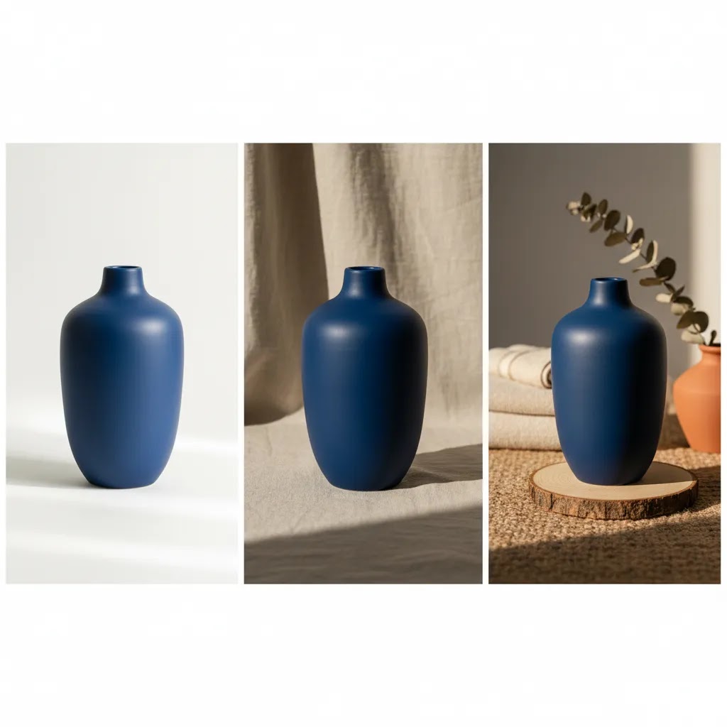
A white product photography background is often the safest default for marketplaces, feed-based ads, and clean product detail pages. A styled or lifestyle backdrop can work better for hero images, social creative, and premium brand storytelling. AI-generated product photography backgrounds can also be useful if you want variation without repeatedly staging physical sets, especially when testing seasonal campaigns or creative angles at scale.
If you are actively exploring synthetic scene creation, these AcquireConvert resources on ai photoshoot workflows and ai product photography can help you compare approaches before changing your image production process.
The main background types to consider
Most ecommerce brands end up using a mix of backgrounds rather than a single one. The key is matching each background style to a job in your funnel.
1. White backgrounds
A white product photography background works best for catalog consistency, marketplaces, Google Shopping-style feeds, and products where detail matters more than mood. Beauty, electronics, supplements, and many household goods perform well with this approach because shoppers can quickly understand the product shape and packaging.
If your product pages feel visually busy, a cleaner white setup often improves scanability. For more examples, see AcquireConvert’s White Background Photography category.
2. Paper and seamless backdrops
Product photography background paper is a practical studio option because it is predictable, affordable to replace, and easy to light. Paper rolls and sheets are useful when you want soft color without introducing texture. This is a strong choice for skincare, accessories, candles, stationery, and any product where color harmony supports the brand.
3. Textured and lifestyle backgrounds
Wood, stone, fabric, tile, and tabletop surfaces can add context. Used well, they help shoppers imagine the product in real life. Used badly, they steal attention. A textured background works best when the product itself is simple or when the buying decision depends on an aspirational setting, such as home decor, food, or cosmetics.
For beauty sellers creating scenario-based imagery, a related workflow to review is this guide to an ai makeup generator, especially if your content mix includes visual experimentation across campaigns.
4. DIY setups
A DIY product photography background can absolutely be enough in the early stages. Foam board, matte poster board, paper sweeps, and simple vinyl sheets can produce usable ecommerce photos if your lighting is controlled. This route is most effective when you keep variables tight: same light source, same angle, same editing process, same crop rules.
5. AI-generated backgrounds
AI product photography background tools are useful when you need creative variety, faster concepting, or cleaner edits from existing product shots. From the tool data available, relevant options include AI Background Generator, Free White Background Generator, Background Swap Editor, Magic Photo Editor, and Creator Studio.
These tools may help if you want to test ai-generated product photography backgrounds without building full sets. Still, AI backgrounds need review for realism, shadow consistency, edge quality, and channel compliance. If you are evaluating alternatives in this area, AcquireConvert’s photoroom article is a useful next step.
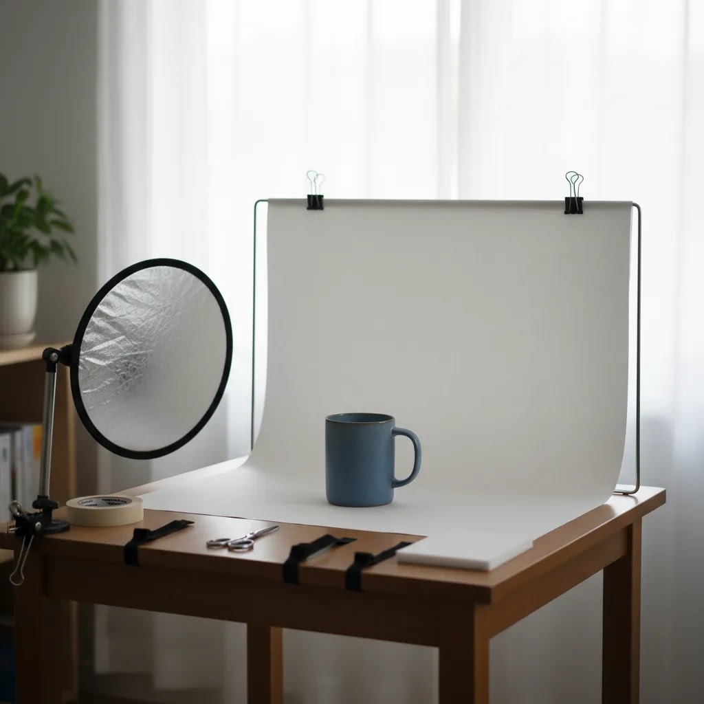
How to set up a product photography background (small-space, tabletop setup)
Here’s the thing: most Shopify stores do not need a dedicated studio room to get clean, consistent catalog images. You need a repeatable tabletop setup that produces the same framing and lighting every time, even if you are shooting in a spare bedroom or office corner.
A simple tabletop “sweep” setup for a seamless look
The easiest way to get that professional “infinite” background look is to create a sweep. That just means your backdrop curves from vertical (behind the product) to horizontal (under the product) with no hard corner line.
In practice, you can do this with a paper roll, a large sheet of background paper, or a vinyl sheet. Put the backdrop on a vertical support (a wall, a chair back, a shelf, or a simple stand), then let it curve naturally down onto the table. Avoid creasing it into a sharp 90-degree angle, because that crease becomes a horizon line you will have to edit out.
For consistency shot to shot, secure the top of the backdrop so it does not slowly slide or sag. Clamps work well, painter’s tape can work on some surfaces, and small weights can help keep the bottom edge from curling. The goal is boring consistency: the same curve, the same distance, the same clean surface every time you shoot.
Lighting placement to avoid harsh shadows and background gradients
Background problems are usually lighting problems. If your white background looks gray, or your colored backdrop looks patchy, it is typically because your light is too close, too directional, or placed at the wrong angle.
A practical starting point is two lights placed at roughly 45 degrees to the product, one on each side, with the camera shooting straight into the sweep. If you only have one light, place it at 45 degrees and use a white foam board on the opposite side as a reflector to lift shadows.
Now, when it comes to controlling harsh reflections on packaging, diffusion is your best friend. A softbox is the cleanest option, but you can also diffuse with a scrim, or even a white shower curtain material clipped between the light and the product. Diffusion makes the light source larger relative to the product, which softens shadows and reduces specular highlights on glossy bottles, metallic tins, and plastic wrap.
If you keep getting a gradient on a white backdrop, move the product farther away from the background so the light falloff is less visible behind it. Another option is to aim one light more at the background and one more at the product, but keep it subtle. If you blast the background too hard, you can get “halo” edges and lose product detail.
A quick consistency checklist for Shopify-ready catalog images
What many store owners overlook is that your collection pages are basically a grid-based design system. If every product is shot with a different height, distance, or focal length, the storefront looks messy even if each image is good on its own.
If you document these settings once, your photography becomes a process instead of a recurring problem. That is usually what separates “DIY but professional” from “DIY and inconsistent.”
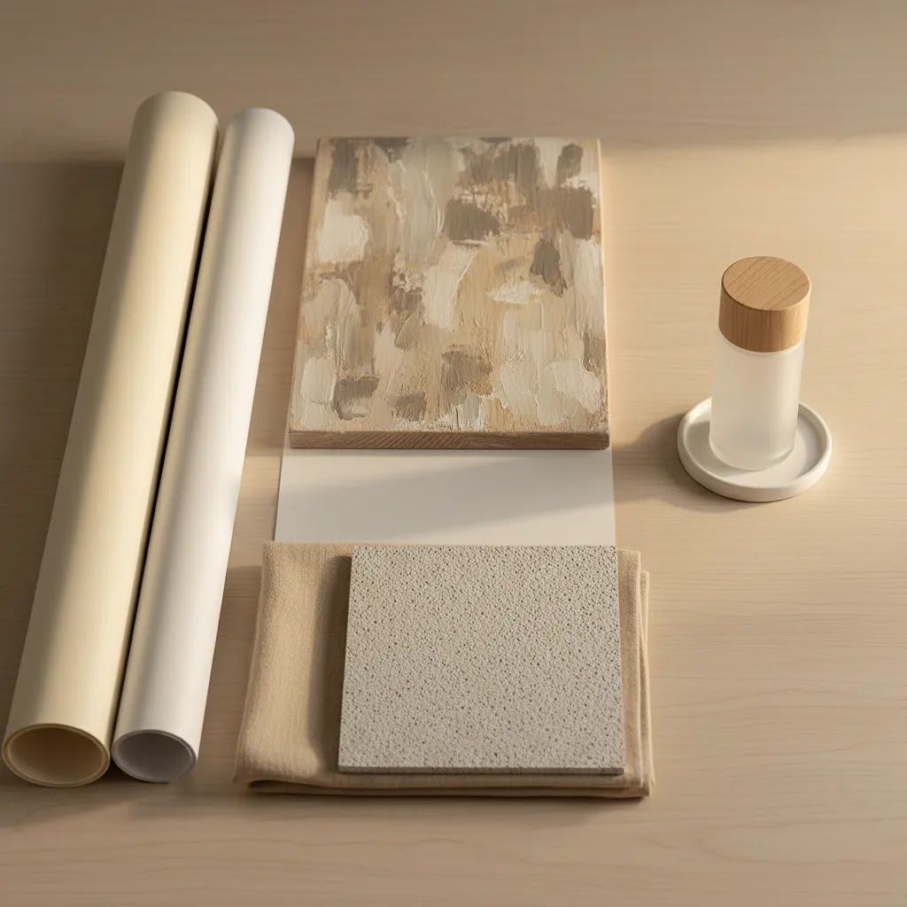
Background materials guide: paper vs vinyl vs boards vs fabric
Choosing a product photography background is not only about color and style. The physical material you shoot on affects glare, cleanup time, and how often you have to replace it. From a practical standpoint, there are four common options most ecommerce teams rotate between: paper, vinyl, boards, and fabric.
Vinyl backdrops (durable, wipeable, but watch glare)
Vinyl backdrops are popular because they are durable, portable, and easy to clean. If you shoot products that shed, leak, or leave residue (food items, bath products, oils, waxes), vinyl can be less stressful than paper because you can wipe it down and keep going.
The tradeoff is reflections. Some vinyl surfaces can produce glare hotspots, especially with direct lights or glossy products. If you use vinyl, look for a matte finish and use diffusion so your light does not create hard specular streaks. A small change in light angle can make a big difference here.
Backdrop boards and duo boards (fast for tabletop workflows)
Boards are a common solution for small-space shooting because they give you both a background and a surface in one. Some come as two-piece sets you can angle into an L-shape, which is basically a rigid sweep without the sag or curl you can get from paper.
They are quick to set up and store, and they tend to stay consistent across sessions. That makes them a good fit for small products like skincare, jewelry, supplements, and accessories where you want repeatability more than large scenes.
The pitfall is texture. Some boards have heavy patterning that looks great in a single lifestyle photo, but can steal focus across an entire Shopify catalog. If you choose a textured board, keep it subtle so the product remains the hero.
Paper backdrops (predictable, affordable, but easy to damage)
Paper is still one of the best choices for clean catalog photos because it is matte, predictable to light, and available in many colors. If a section gets dirty or scuffed, you can trim it off and keep moving.
The downside is that paper shows wear quickly. Scuffs, edge tears, and footprints (yes, even on a tabletop) can become a constant cleanup job if you are shooting frequently. A simple habit that helps is to keep a “shoot zone” where the product sits, and avoid sliding items across the paper.
Fabric backdrops (soft texture, but wrinkles are the enemy)
Fabric can work well when you want a softer, more lifestyle feel, especially for apparel, handmade goods, or cozy home categories. It also folds away easily, which is useful if you do not have a permanent setup.
The reality is that wrinkles can make fabric look cheap fast. If you go this route, you typically need to steam it, pull it tight, and light it carefully so creases do not become the main visual element. Fabric also tends to pick up lint and dust, which can create extra retouching work.
How to choose the right backdrop size for your products
Size is a hidden source of frustration. If your backdrop is too small, you will spend your time cropping around edges or fixing corners in editing. If it is too big, it becomes hard to store and light evenly in a small space.
A simple rule of thumb is this: choose a backdrop that gives you enough room to frame the product with comfortable margin on all sides, plus extra space for a little repositioning. Small products like jewelry, cosmetics, and supplements can often be shot on smaller tabletop backdrops or boards, as long as you can keep the edges out of frame. Larger products like home goods, food sets, or multi-item bundles usually need wider paper or vinyl so you can keep the sweep seamless and avoid visible edges.
Pros and Cons
Strengths
Considerations
Who this approach is for
This framework is most useful for Shopify store owners, ecommerce teams, and solo operators deciding how to standardize product imagery across their catalog. It is especially relevant if you are shooting products in-house, refreshing an outdated visual style, or comparing physical backdrops with newer AI-assisted workflows.
If you sell across multiple channels, this matters even more. The background that works on your homepage hero may not be right for collection grids, Amazon-style listings, or feed-based ad placements. Brands with growing SKU counts usually benefit most from setting one default background standard and one secondary creative standard rather than improvising photo by photo.
A practical AcquireConvert recommendation
For most ecommerce stores, the best move is to start with a professional product photography background standard that is simple, repeatable, and channel-friendly. In practice, that usually means a white or lightly neutral backdrop for core catalog images, then selective use of styled or AI-generated scenes for hero banners, social posts, and campaign creative.
This is where AcquireConvert is useful as a specialist resource. Giles Thomas brings a practitioner-led perspective as a Shopify Partner and Google Expert, which matters when your image decisions affect both onsite conversion and channel performance. If you want to go deeper, browse the broader Catalog Photography hub and compare visual production approaches before investing time in a full reshoot.
The practical takeaway is simple: build your baseline first, then test enhancements. Most stores do better with image consistency than with constant creative variation. Once your core catalog is solid, AI tools and styled backgrounds become much more useful because they are supporting a system rather than replacing one.
How to choose the right background for your store
If you are unsure where to start, use these five criteria.
1. Match the background to the sales channel
Your Shopify PDP, Meta ad, email header, and marketplace listing do not all need the same image treatment. Use plain backgrounds where compliance, clarity, or scale matter most. Use more editorial scenes where storytelling matters.
2. Prioritize product readability first
The product should always be the most obvious thing in the frame. If the color, texture, or props pull attention first, the background is doing too much. This is especially important for smaller products viewed on mobile, where detail disappears quickly.
3. Think in systems, not one-off photos
A background choice has to work across dozens or hundreds of SKUs. Ask yourself whether you can repeat it with the same lighting, crop, edit style, and file output. A background that looks good once but is difficult to maintain will slow your workflow and create a messy storefront.
4. Consider operational cost and speed
Product photography background sheets, paper sweeps, and vinyl surfaces are often practical for in-house teams because setup time is low. AI-based options may reduce the need for repeated staging, but they can add review time if outputs are inconsistent. The right choice is the one that your team can actually maintain.
5. Separate catalog images from campaign images
This is one of the most useful decisions a growing store can make. Keep your standard product images clean and consistent. Then create a second layer of image assets for promotions, landing pages, ads, and seasonal launches. That gives you flexibility without weakening your store’s core presentation.
If you are testing AI in this area, start small. Try replacing backgrounds for a limited product set, compare click-through and engagement patterns, and review edge quality carefully before publishing at scale. AI can save production time in many cases, but it works best when your source product image is already sharp, well-lit, and isolated cleanly.
Background color strategy for selling (white vs neutral vs brand colors)
Color is where background choice can help or hurt conversion. Not because shoppers consciously think about the backdrop, but because background color affects readability, perceived quality, and whether your product looks accurate.
When white is the conversion-safe choice
White is usually the safest default when you want catalog clarity and channel flexibility. It is a strong fit for Shopify collection grids, product comparison behavior, and any placement where the shopper is scanning quickly. It is also commonly expected in marketplace-style listings and feed-based ads where the goal is fast product recognition.
If you are investing in acquisition, white backdrops can also reduce creative risk. Your images tend to crop cleanly, your products remain readable in small placements, and you avoid “busy” scenes that can fall apart in a feed.
When neutrals beat pure white (especially for white or reflective products)
Pure white is not always the easiest background to shoot. White products, clear bottles, reflective packaging, and glossy surfaces can blend into a white backdrop or pick up strange edge reflections.
In those cases, a very light gray, warm off-white, or light beige background is often more forgiving. You still get the clean catalog look, but you may find it easier to keep edges visible and avoid overexposing detail. The key is to keep it subtle so it still reads as “clean” in a Shopify grid.
Using brand colors without hurting readability and trust
Brand colors can work well for campaigns, bundles, and social creative, but they need a bit of discipline for ecommerce. Think of it this way: the background should support recognition, not fight your product’s color.
Start with contrast. If your product is dark, a dark background can look premium but it can also hide edges and reduce scroll-stopping clarity. If your product is brightly colored, a saturated background can cause color collisions that make the product look less accurate. Accuracy matters because shoppers use photos to predict what they will receive, and mismatched color is a common source of disappointment.
From a practical standpoint, if you are using a colored background for a product line, test it on mobile and check that your product still reads at thumbnail size. If it only looks good full-screen, it may not work as a default catalog standard.
A channel-based note so you do not create feed problems
Background expectations can change depending on where the image appears. Your onsite Shopify creative can be more flexible because you control the page layout and context. In feeds and marketplaces, you are competing against many other products in a uniform grid, and some placements reward simple, high-clarity images.
If you plan to use the same asset across channels, it is usually safest to keep your primary image clean and channel-friendly, then use secondary images for brand-color backgrounds and lifestyle scenes. That approach tends to reduce the chance of creative that looks great onsite but underperforms in a feed environment.
Frequently Asked Questions
What is the best product photography background for ecommerce?
For most ecommerce stores, a white or neutral background is the strongest default because it keeps attention on the product and works across many channels. It is especially useful for catalog pages, marketplaces, and comparison shopping environments. Styled backgrounds can still be useful, but they generally work best as secondary creative rather than your main catalog standard.
Should I use a white product photography background for every product?
Not always. White backgrounds are excellent for consistency and clarity, but some products benefit from contextual imagery too. Home goods, cosmetics, gifts, and premium lifestyle products often sell better with a mix of plain catalog shots and styled brand imagery. The key is to keep your primary image clean even if supporting images are more creative.
Is product photography background paper good enough for a small store?
Yes, in many cases it is. Seamless paper is a practical option for small brands because it is easy to set up, easy to replace, and predictable under controlled lighting. If you choose paper, use matte finishes when possible and keep your lighting position consistent to avoid unwanted gradients or wrinkles showing up in every shot.
Are DIY product photography backgrounds worth using?
They can be, especially for new stores and low-SKU brands. Foam boards, poster boards, and simple sweeps can create clean product images when paired with decent lighting and careful editing. The limitation is consistency. As your catalog grows, DIY methods need a documented setup process or image quality may start varying from product to product.
Can AI-generated product photography backgrounds replace a real studio setup?
They can help, but they usually work best as part of a broader workflow rather than a complete replacement. AI backgrounds are useful for concept testing, campaign creative, and extending existing product images. They still need review for realism, shadow quality, and accurate product edges. For core catalog imagery, a controlled base photo is still very important.
What should I check before using an AI product photography background?
Review shadows, reflections, edge cleanup, color accuracy, and whether the scene makes sense for your product. A generated background may look attractive at first glance but still create trust issues if the object appears to float or the lighting looks unnatural. Always review the final image on mobile as well as desktop before publishing.
How many background styles should one store use?
Most stores should keep it simple. One standard background style for catalog images and one secondary style for campaigns is usually enough. More variation than that can make collection pages feel inconsistent and weaken brand cohesion. If you want to test creative directions, do it in promotional placements first before changing the full catalog.
What makes a product photography background look professional?
A professional result comes from control and consistency more than expensive materials. The background should support the product, have clean edges, balanced lighting, accurate color, and no visible distractions. Even a low-cost setup can look polished if the image is well lit, properly cropped, and edited to match the rest of your store’s visual standards.
What is the best background for product photography?
The best background is the one you can repeat consistently while keeping the product clear. For most Shopify catalogs, a white or lightly neutral background is the most reliable option because it works across collection pages, marketplaces, and many ad placements. If you are shooting reflective packaging or white-on-white products, a very light gray or warm neutral can sometimes be more forgiving while still looking clean.
How to set up a background for product photos?
For a small-space setup, use a sweep: curve paper, vinyl, or a board from vertical to horizontal so there is no visible corner line behind the product. Secure it with clamps or tape so it does not shift between shots. Then place your light source at about 45 degrees to the product, add diffusion if reflections are harsh, and keep camera height, distance, and crop rules consistent so your Shopify collection pages do not look mismatched.
What color background is best for selling?
White is usually the safest choice for selling because it keeps attention on the product and tends to look clean across many channels. Neutrals like light gray or beige can also work well, especially if you sell white products or reflective packaging where pure white can make edges disappear. Bold brand colors can be effective for campaign and social imagery, but they require careful contrast so product details stay readable on mobile.
What is the cheapest way to make a backdrop?
The cheapest reliable option is usually a sheet of matte poster board or a roll of background paper used as a sweep, paired with a simple reflector like a white foam board. If you control your lighting and keep your setup consistent, this can be enough for clean ecommerce photos. The cost tends to show up later if the material scuffs or wrinkles easily, so it helps to pick something you can replace quickly and shoot with the same setup each time.
Key Takeaways
Conclusion
Choosing the right product photography background comes down to one practical question: what helps your shopper understand and trust the product fastest? For most stores, that means starting clean and consistent, then adding lifestyle or AI-enhanced backgrounds where they support the buying journey. If you are a Shopify merchant refining your visual setup, AcquireConvert is a strong place to continue your research. Giles Thomas brings hands-on ecommerce perspective as a Shopify Partner and Google Expert, with practical guidance built for store owners rather than theory. Explore more from the Catalog Photography hub, compare AI image workflows, and use these standards to build a product image system your brand can scale.
This article is editorial content created for educational purposes and is not a paid endorsement unless explicitly stated otherwise. Tool availability and features are based on the data provided at the time of writing. Pricing was not available from the product data supplied and should be verified directly with each provider. Results from photography, background changes, or AI tools are not guaranteed and may vary based on product type, source image quality, workflow, and sales channel requirements.

Hi, I'm Giles Thomas.
Founder of AcquireConvert, the place where ecommerce entrepreneurs & marketers go to learn growth. I'm also the founder of Shopify agency Whole Design Studios.