Product Photography Props (2026 Guide)
Good product photography props do one job: they help shoppers understand the product faster and imagine it in their own lives. Bad props do the opposite. They distract from the item, confuse scale, and make a product page feel more like an art project than a sales asset. If you run an ecommerce store, that distinction matters. Props should support conversion, not just aesthetics. Whether you are planning flat lays, lifestyle images, skincare shots, or simple homepage banners, the best approach is usually a restrained one. A clean setup, clear lighting, and thoughtful styling usually outperform clutter. If you are still building your core setup, start with this guide to a product photography studio so your props work inside a repeatable system rather than a one-off shoot.
Contents
What product photography props actually do
Props are context tools. In ecommerce, they can communicate use case, ingredients, mood, seasonality, texture, scale, or customer identity. A linen cloth beside a ceramic mug suggests warmth and home. Citrus slices near a skincare serum hint at freshness. A notebook, pen, and desk surface around a tech accessory can signal everyday practicality.
That said, props are not mandatory. Many stores do better with clean white-background product images for collection pages and paid ads, then use prop-based lifestyle images lower down the product page or in email campaigns. This is especially true if you sell products that need clarity first, such as beauty, supplements, jewelry, or small home goods.
For many Shopify merchants, the strongest image stack includes both types: straightforward catalog photography and a smaller set of styled supporting visuals. If you are testing new creative workflows, it is also worth reviewing how ai photoshoot workflows can help you mock up concepts before committing to a full manual shoot.
The key principle is simple: every prop should earn its place. If it does not clarify the product, fit the brand, or improve shopper understanding, remove it.
The props that usually improve ecommerce images
Not every prop category performs equally well. The most useful ones tend to be simple, repeatable, and visually supportive rather than attention-seeking.
1. Surfaces and backdrops
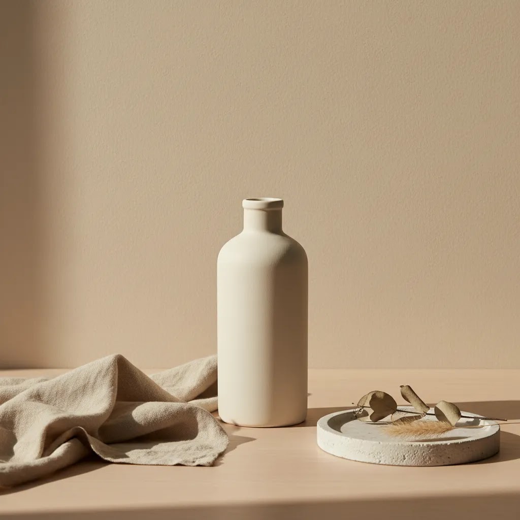
Flat lay product photography surfaces and props often start with the base layer. Acrylic, matte paper, stone-look boards, painted wood, and neutral fabric can change the feel of an image without stealing focus. For most stores, beige, white, charcoal, pale gray, and muted earth tones are safer than bright colors.
2. Texture props
Textural elements like linen, kraft paper, ceramic trays, marble offcuts, or brushed metal add depth to moody product photography and interesting product photography. They work best when the product itself has a tactile story to tell, such as candles, skincare, apparel accessories, or handmade goods.
3. Ingredient or use-case props
This is where cosmetic product photography props and beauty product photography styling props become effective. Droppers, glass beakers, leaves, stones, towels, brushes, mirrors, or ingredients that genuinely relate to the formula can help create trust. The caution is obvious: if the props imply ingredients or benefits your product does not actually have, skip them.
4. Scale and human-context props
Books, hands, trays, cups, desks, or bathroom counters can help shoppers understand size and setting. This is often more useful than purely decorative styling, especially for products where dimensions are hard to judge online.
5. Light-shaping tools
These are not props in the styling sense, but reflectors, diffusers, acrylic blocks, and shadow cards often improve the final image more than decorative add-ons do. If your product is glossy or reflective, practical control tools matter more than visual extras.
Store owners experimenting with faster creative production can also compare manual styling against ai product photography approaches for concept generation, seasonal variations, and campaign mockups.
Product photography props by product category (quick ideas that still look on-brand)
Here is the thing, most prop advice falls apart when you try to scale it across a collection. You get one great hero image, then the rest of the product line looks inconsistent because every scene uses different colors, materials, and “cute” objects.
From a practical standpoint, the simplest way to keep your photos on-brand is to use a repeatable formula, then swap just one or two elements to create variety.
A simple formula that scales: hero prop + texture + containment
Think of it this way, you want one “hero prop” that anchors the scene, one texture element that adds depth, and one containment element that keeps the layout tidy.
Once you choose these three roles, you can shoot 20 SKUs without reinventing the styling each time. That matters if you are building Shopify collection pages where thumbnails need to feel like they belong together.
Candles and home fragrance
Candles usually photograph best when you lean into ritual and materials, but keep it clean.
What many store owners overlook is scale. If your candle comes in multiple sizes, include a consistent reference in a secondary image, such as a hand shot, a coaster size that stays consistent, or a standardized riser. Otherwise, the smallest jar can look like the largest jar depending on lens and crop.
Common mistake: adding botanicals or food props that imply a scent note your product does not actually contain. If the label says “vanilla,” a vanilla pod can be fine. If the scent is more abstract, “cozy cabin,” “midnight,” “rain,” skip literal props that can feel misleading.
Soap and handmade bath products
For soap, the biggest win is showing texture and usage without turning the frame into a spa explosion.
Keep an eye on “ingredient signaling.” Dried flowers, oats, citrus, and herbs can look great, but they also create expectations. If your soap is fragrance-free or your claims are sensitive, stay closer to neutral bath props and let your label do the talking.
Common mistake: confusing scale by using oversized towels or thick robes that dominate the frame. On mobile, the product can disappear fast.
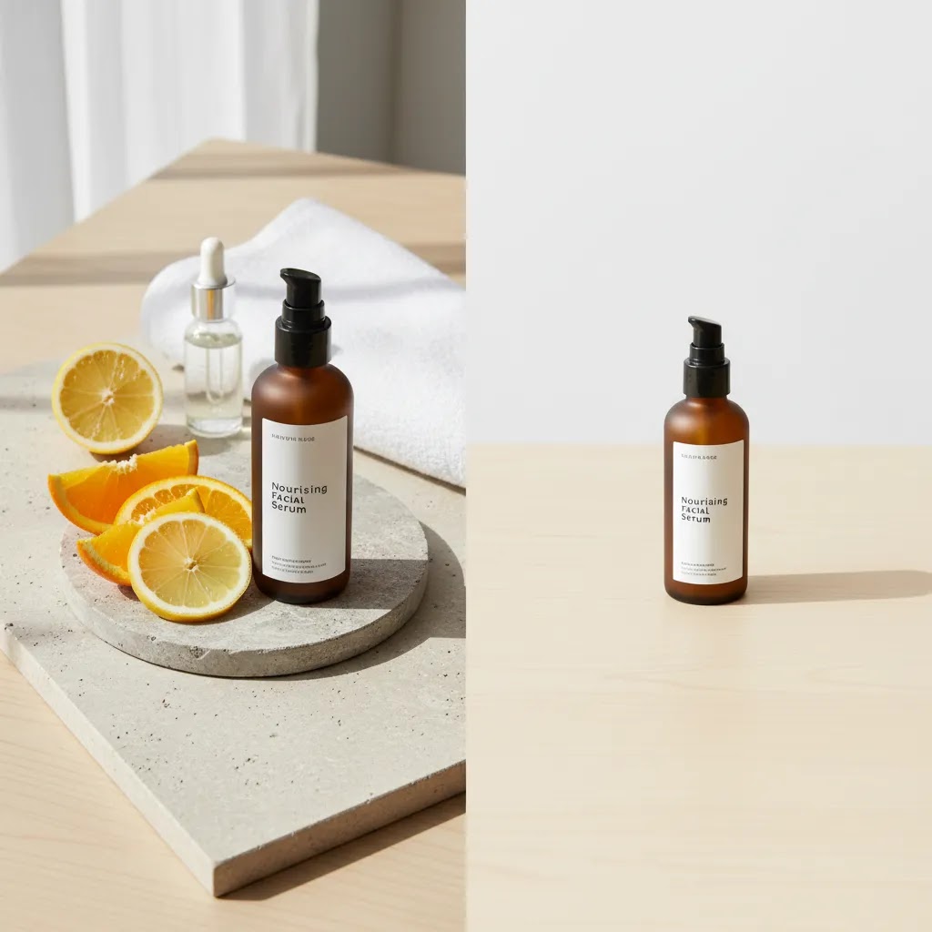
Skincare and beauty (including cosmetic product photography props)
Beauty is where props can either build trust or create doubt. The reality is that shoppers are scanning for packaging clarity, shade cues, and routine fit, and props should not block any of that.
Consider this, if you sell premium skincare, thin plastic organizers and shiny chrome bathroom props can pull the image downmarket. Matte ceramics and simple neutral trays usually read more premium on camera.
Home goods and decor
Home goods can handle more environment, but the job is still clarity. Show how it lives in a space, then give the product a clean moment too.
Common mistake: seasonal cues that date your photos too fast. Pumpkin spice props, holiday ornaments, or very “on-trend” colorways can work for a campaign, but they usually should not become your evergreen product page images on Shopify.
Handmade goods and gifting
Handmade brands often sell story and process. You can hint at that without cluttering the frame.
What many store owners overlook is consistency across the whole gift experience. If your packaging is a key differentiator, use props that echo your packaging colors and materials, so your images match what customers receive.
When props hurt more than help
There are plenty of situations where skincare product photography without props is the better choice. The same goes for supplements, electronics, replacement parts, and items sold primarily through search-led buying behavior where shoppers want clarity above all else.
Props can weaken performance when:
This is especially relevant if you sell across Shopify, marketplaces, and paid social. Marketplace listings often need plain, compliant product imagery. Your lifestyle or prop-heavy images may be more useful on landing pages, PDP galleries, Instagram content, and retention emails than as your lead image.
If you want a quick way to clean up backgrounds or build simpler variants, tools such as photoroom are often evaluated by merchants for this kind of workflow. The broader lesson is that simpler imagery often scales better operationally.
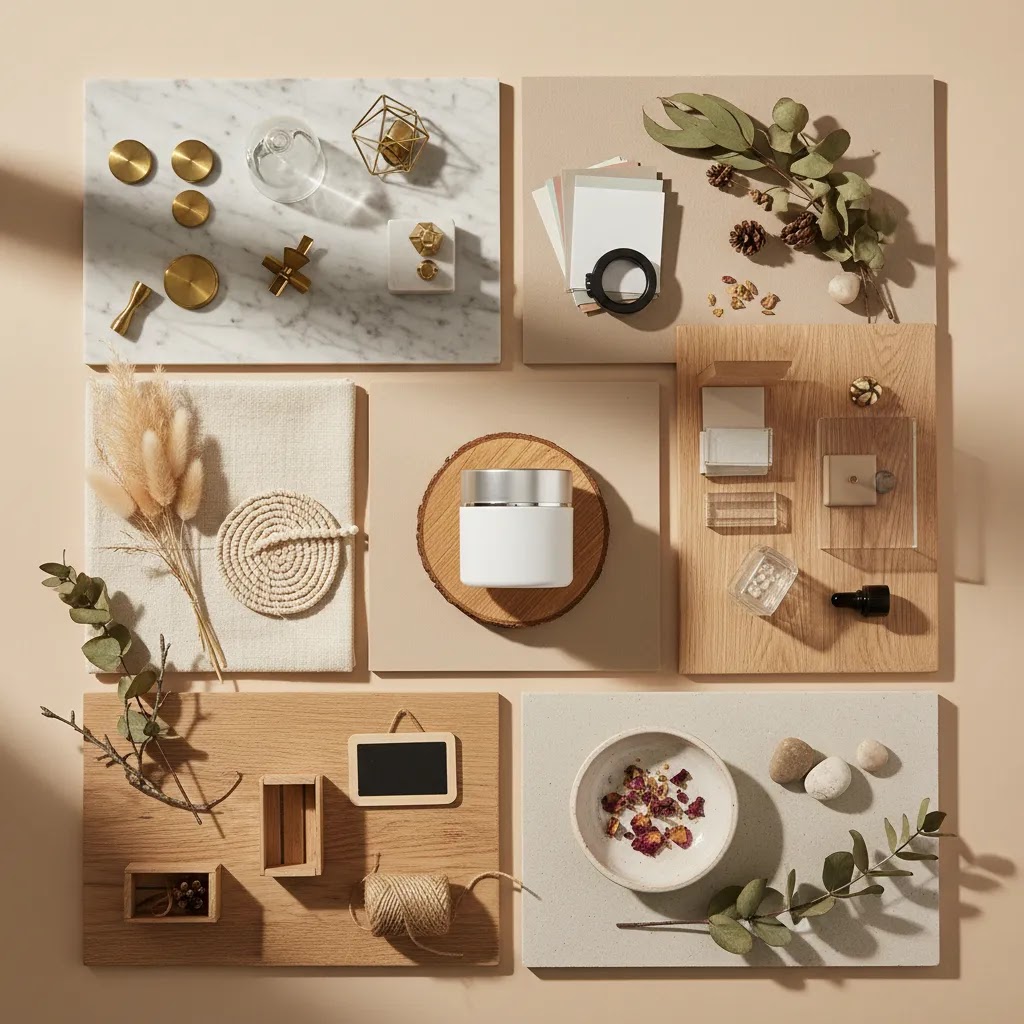
Budget-friendly, everyday props (and DIY substitutes) that still look premium on camera
You do not need a huge prop closet to create solid ecommerce images. For most Shopify store owners, the smarter move is using a small set of everyday items that look good on camera, then standardizing how you use them.
The way this works in practice is you pick “neutral, matte, simple” as your filter. If an item is glossy, logo-heavy, or overly trendy, it will usually create more editing work and less consistency.
Everyday props that often work well
These are the kinds of items you can usually source from home, a local store, or a thrift find, and still keep your images looking premium if you stay consistent.
How to make inexpensive props look better on camera
Cheap-looking props typically fail because of shine, branding, and color mismatch. You can often fix that without buying new items.
If you use sprays or coatings to reduce shine, test first on a spare item and keep them away from products, especially anything that will be ingested or applied to skin. You do not want a photography hack creating a product safety issue.
When budget props backfire
Budget props can be a smart move, but some are consistently risky for ecommerce.
Consider this, if you are selling a premium product, the props are part of the perceived quality system. The prop does not need to be expensive, but it needs to look intentional.
Who should use props and who should keep it minimal
Props tend to work best for brands selling emotion, ritual, gifting, or aesthetic identity. That includes beauty, candles, food, stationery, fashion accessories, wellness, and home decor. In those categories, the surrounding scene helps shoppers picture ownership and can increase perceived polish.
If your products are highly functional or specification-driven, keep props minimal. Use one or two contextual images, then prioritize clean catalog photos, close-ups, and scale shots. For many growth-stage Shopify stores, that is the sweet spot: use props to support the story, not to carry it.
Beauty brands have a special case here. If you create visual content around looks, shades, or tutorials, adjacent workflows like an ai makeup generator can be relevant for concepting and campaign ideation, but core PDP imagery still needs to show the product itself clearly.
AcquireConvert recommendation
At AcquireConvert, we generally recommend a layered image strategy for ecommerce brands. Start with conversion-critical essentials: clean product shots, consistent lighting, clear scale, and mobile-friendly framing. Then add prop-based lifestyle images where they strengthen shopper understanding or brand perception. That approach is usually more reliable than building your whole visual strategy around highly styled scenes.
Because Giles Thomas is a Shopify Partner and Google Expert, the advice here is grounded in how store owners actually sell across product pages, search traffic, Shopping feeds, and paid campaigns. Props can help, but only if they fit the channel and the buying stage. For more practical photography guidance, browse the Catalog Photography section or explore visual storytelling examples in Lifestyle Product Photography. If you are comparing production methods, AcquireConvert’s related guides help you see how other Shopify store owners approach studio shoots, AI-assisted workflows, and image cleanup.
How to choose the right props for your store
If you are deciding what props to buy, borrow, or build, use these five filters before spending anything.
1. Match the buying intent
Ask where the image will appear. Collection pages, Google Shopping, and marketplaces usually need clarity first. Product detail pages, landing pages, and social ads can support more styling. The same product may need both a plain image set and a styled one.
2. Match the product truthfully
Your props should reflect the real use case, customer environment, and positioning of the product. If you sell minimalist skincare, use restrained beauty product photography props. If you sell rustic homeware, natural materials may fit better. Avoid props that imply ingredients, performance, or luxury cues your product does not actually deliver.
3. Optimize for repeatability
Diy product photography props can work very well if they are consistent and reusable. Foam board, sample tiles, painted panels, parchment paper, neutral fabric, acrylic risers, and ceramic dishes are common because they are flexible. The best prop kit is not the most elaborate one. It is the one your team can reuse across launches without visual drift.
4. Think mobile first
Interesting product photography often looks weaker on a phone than on a desktop monitor. Before finalizing any scene, zoom out and view it at thumbnail size. If the product disappears into the styling, the composition is probably too busy. This matters a lot for Shopify collection grids and email thumbnails.
5. Build around your brand system
Create a small styling library rather than buying random product photography props amazon bundles and hoping they work together. Define your approved colors, materials, surfaces, and mood. Then document 3 to 5 repeatable setups. That makes it much easier to brief freelancers, maintain consistency, and test what actually resonates with your audience.
A good starting kit for most stores includes:
If you are handling your own shoots, this is usually enough to create unique product photography without turning every session into a styling challenge.
Where to source props and how to build a small prop library that scales
Buying props is not the hard part. Keeping them consistent across shoots is. If you run a Shopify store, you are not styling one photo. You are building a repeatable system that shows up across product pages, collection grids, paid ads, and email creative.
Where to source product photography props
There are a few reliable sourcing routes, and each one has tradeoffs. Pricing varies, so treat this as a quality checklist more than a shopping list.
What to look for when you are selecting items:
Build a small “core kit,” then add category modules
For most Shopify store owners, a scalable prop library looks like this: a core kit you use constantly, plus a small add-on module for each category or collection.
A core kit is usually your backdrops, your two or three containment pieces, and a few texture options. Your category module might be a candle kit (matches, coaster, wick trimmer) or a beauty kit (towel, mirror edge, tray). This keeps your images consistent even when you are launching new products fast.
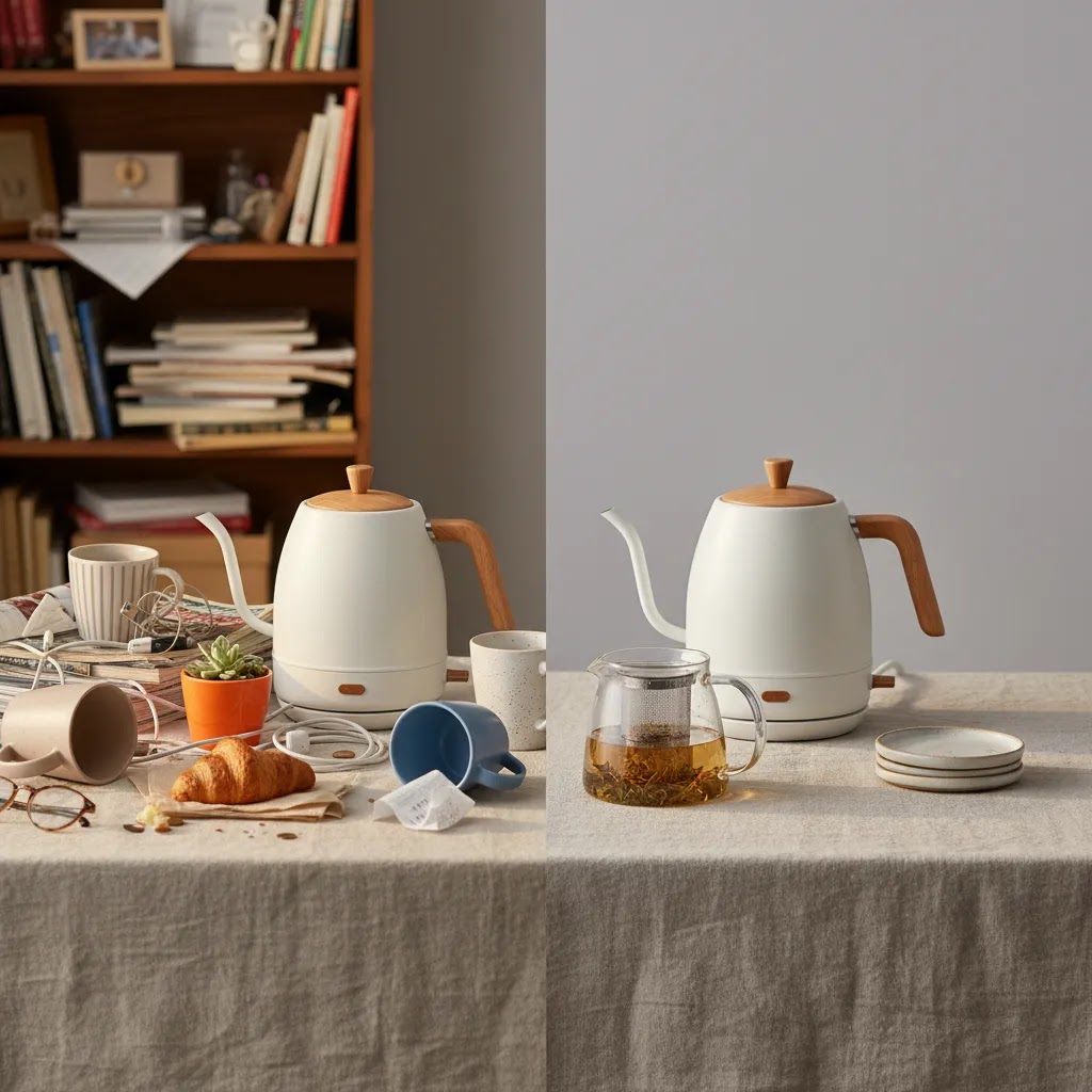
How to organize props so shoots stay repeatable
Operationally, this is what keeps your photography from turning into chaos.
Now, when it comes to scaling content production, the goal is not having more props. It is having fewer props that you can use on purpose.
A practical buying checklist (so you do not waste money)
If you are about to order or thrift new props, run through this checklist first.
Pros and Cons
Strengths
Considerations
Frequently Asked Questions
What are the best product photography props for ecommerce?
The best props are usually neutral surfaces, subtle texture materials, scale references, and use-case items that support the product story. For most ecommerce stores, simple props outperform dramatic ones because they keep attention on the item being sold. Start with versatile basics you can reuse across multiple shoots.
Do product photography props increase sales?
They can improve shopper understanding and perceived brand quality, which may support conversions in some cases. But props do not increase sales on their own. Their value depends on product category, image placement, and execution. Clear, accurate product presentation still matters more than decorative styling.
Should my main Shopify product image include props?
Usually, no. Your primary product image often works best when it is clean, consistent, and focused entirely on the item. Props are often more effective in secondary gallery images, landing pages, social ads, and email campaigns where there is more room for context and storytelling.
What are good diy product photography props?
Foam board, sample tiles, painted MDF boards, parchment paper, linen napkins, ceramic plates, and acrylic blocks are practical DIY options. They are affordable to test, easy to store, and flexible across categories. The main goal is not cost alone. It is repeatability and visual consistency.
How many props should I use in one photo?
In most ecommerce images, fewer is better. One to three supporting elements are often enough. If you notice the viewer could describe the props more easily than the product, the setup is too busy. Keep the product as the visual priority at every stage.
Are props necessary for beauty and skincare photography?
No, but they can be useful. Beauty product photography props often work well when they reflect routine, texture, or ingredients truthfully. Still, many skincare brands benefit from mixing prop-based lifestyle shots with clean pack shots and close-ups so customers can see the packaging and formula cues clearly.
What surfaces work best for flat lay product photography props?
Matte white, pale gray, stone-look, muted wood, and soft fabric surfaces are common because they add character without overpowering the frame. Choose surfaces that fit your brand palette and can be reused across collections. Consistency usually matters more than novelty.
Where can I buy product photography props?
You can source props from dedicated photo prop shops, general home goods retailers and marketplaces, local thrift and vintage stores, and craft or hardware stores for surfaces like tile and wood. Prioritize matte finishes, simple shapes, and a consistent color palette so your props stay reusable across many Shopify product photos.
What are the best props for candle (or soap) product photography?
For candles, a clean coaster or tray for containment, linen or stone texture, and one subtle ritual cue like a matchbook or wick trimmer often works well. For soap, a soap dish, neutral washcloth, and a simple tile or plaster surface usually reads clearly and premium. In both cases, avoid props that imply scent notes or ingredients your product does not actually have.
How do I choose a backdrop color for product photos?
Choose a backdrop color that protects clarity first, then supports your brand palette. Neutral backdrops like warm white, beige, pale gray, and charcoal are common because they keep attention on the product and stay consistent across a collection. Before committing, check a test image at thumbnail size to make sure the product edges, label text, and color are still easy to read on mobile.
What props should I avoid in product photography?
Avoid props that create confusion about scale, hide the product, or overpower the frame on mobile. Shiny plastics, logo-heavy items, overly seasonal objects, and trend-driven decor can also date your photos quickly. Skip any ingredient or benefit props that could imply claims your product does not actually make.
Can AI replace physical props in product photography?
AI can help concept scenes, test visual directions, and create some supporting creative assets. It may reduce the need for large physical prop collections in certain workflows. Still, merchants should review outputs carefully for realism, brand fit, and product accuracy before using them in customer-facing ecommerce imagery.
Key Takeaways
Conclusion
Product photography props can absolutely improve ecommerce images, but only when they make the product clearer, more relatable, or more desirable in a credible way. The strongest setups are usually the simplest: a thoughtful surface, one or two contextual elements, and lighting that keeps the item itself front and center. If you run a Shopify store, think in systems rather than single photos. Build a consistent image style that works across collection pages, PDPs, social campaigns, and retention channels. AcquireConvert is a useful place to keep refining that process. Explore more photography and AI-image guidance across the site to compare approaches, pressure-test your creative decisions, and apply practical recommendations grounded in Giles Thomas’s Shopify and ecommerce expertise.
This article is editorial content created for educational purposes and is not a paid endorsement unless explicitly stated otherwise. Pricing, tool availability, and platform features are subject to change, so verify current details directly with the provider. Any performance outcomes discussed are illustrative only and not guaranteed.

Hi, I'm Giles Thomas.
Founder of AcquireConvert, the place where ecommerce entrepreneurs & marketers go to learn growth. I'm also the founder of Shopify agency Whole Design Studios.