Product Photography Settings (2026 Guide)
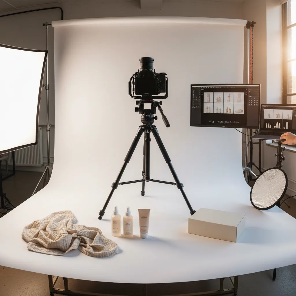
If your product images look too dark, too grainy, or inconsistent across the same collection, the issue is usually not your camera. It is your setup and settings. For ecommerce brands, getting product photography settings right matters because image quality shapes trust, perceived value, and how accurately shoppers understand what they are buying. Whether you shoot on a DSLR, mirrorless camera, or a capable smartphone with manual controls, the same three variables do most of the work: aperture, ISO, and white balance. This guide breaks them down in plain English so you can create cleaner, more reliable product photos for your store. If you are still building your overall setup, our guide to a product photography studio is a helpful next step.
Contents
Why settings matter for ecommerce product photography
Good product photography is not just about making products look attractive. It is about reducing doubt. Shoppers want to see color accurately, understand texture, and compare variants without guessing. That is especially important on Shopify product pages where images often carry more selling weight than the copy.
In practical terms, strong product photography settings help you create a repeatable process. Instead of fixing exposure and color one image at a time, you can shoot a full batch with consistency. That makes catalog updates faster and keeps collection pages looking more professional.
For most ecommerce brands, the goal is not artistic complexity. It is clean, trustworthy imagery that works for product grids, PDP galleries, ads, email, and marketplaces. If you are exploring synthetic or hybrid workflows too, see how merchants are using ai photoshoot tools to extend existing image sets without reshooting every variation.
Aperture, ISO, and white balance explained
Aperture controls depth of field. In product photography, that means how much of the product stays in focus from front to back. A lower f-stop such as f/2.8 creates a blurrier background, while a higher f-stop such as f/8 or f/11 keeps more of the product sharp. For most studio product shots, higher aperture settings are safer because shoppers need to see details clearly.
ISO controls your camera sensor's sensitivity to light. Higher ISO brightens the image, but it also introduces noise and reduces image quality. For ecommerce, lower ISO is usually best. If your image is too dark, add more light or slow the shutter speed instead of pushing ISO too high.
White balance controls how warm or cool your image looks. If your white background looks blue, yellow, or gray, white balance is probably off. This matters a lot for brand product photography because inaccurate color can lead to returns, complaints, or disappointed customers.
These settings work together. If you raise aperture to keep the whole product sharp, you may need more light. If you do not have enough light and raise ISO too far, image quality drops. That is why product photography is less about one perfect number and more about balancing settings based on your lighting, lens, and subject.
Shutter speed: the setting that protects sharpness
Here is the thing. Even with perfect aperture, ISO, and white balance, your photos can still look soft. The most common reason is shutter speed.
Shutter speed controls how long your camera sensor is exposed to light. If it is too fast, your image may be underexposed unless you add more light. If it is too slow, you risk motion blur, either from your hands moving the camera or from the product moving slightly. In product photography, that often shows up as edges that are not crisp, label text that looks smeared, or fine texture that never quite snaps into focus.
In a studio setup, shutter speed is often the “fourth setting” that matters because it is the setting that lets you keep ISO low without making the image too dark. If your camera is on a tripod and your product is stationary, you can usually slow the shutter down instead of raising ISO, which typically produces cleaner files for ecommerce.
Practical shutter speed starting points
From a practical standpoint, start with ranges like these and adjust based on your lighting and stability.
If you are shooting on a smartphone with a manual app, the same logic applies. If the shutter gets too slow, any small movement can soften the image. A phone tripod and a 2-second timer can make a bigger difference than most people expect.
When to slow shutter speed instead of raising ISO
Consider this. If your images are a little dark and you are already at a sensible aperture (like f/8 to f/11 for most catalog work), you usually have three options: add light, slow the shutter, or raise ISO. Raising ISO is often the last choice for ecommerce because noise can make product surfaces look gritty, and it can reduce fine detail that shoppers rely on.
If you are on a tripod, slowing the shutter is usually the cleanest fix. If you are handheld, add light first if you can, then consider slowing shutter speed slightly, and only then raise ISO if you still need exposure.
Quick troubleshooting for “soft” product photos
What many store owners overlook is that “not sharp” can mean different problems. Here is a simple way to narrow it down:
The reality is that shutter speed, light, and stability work as a system. If you fix one and ignore the others, you may still end up with images that look “almost” right, but not clean enough for a Shopify product page.
Best settings for common product photography scenarios
There is no single best setting for product photography, but there are strong starting points that work for most ecommerce use cases.
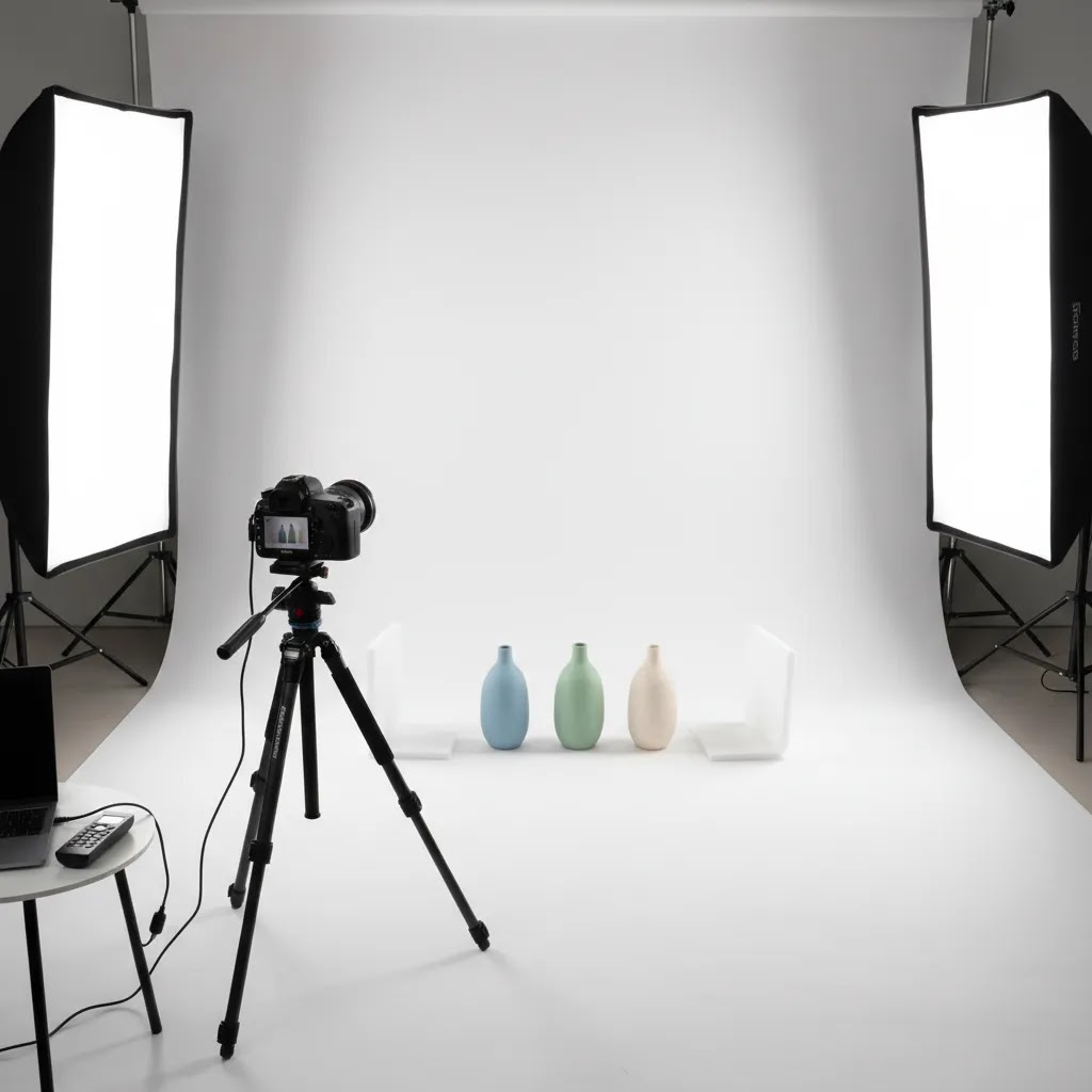
1. White background product photography
This setup helps keep the full product sharp while minimizing grain. If your store relies on a clean catalog look, review more examples in AcquireConvert's White Background Photography section.
2. Small products like cosmetics, jewelry, or packaging
Smaller items often need more depth of field. That matters for product packaging photography, where text, finish, and edges need to stay readable and crisp.
3. Lifestyle or angled hero shots
Here, you may want selective blur for a more premium feel, but the key selling features should still be in focus. If you are supplementing real shoots with generated imagery, our guide to ai product photography covers where that approach can help and where it needs careful review.
4. Smartphone product photography with manual controls
A phone can work well for early-stage ecommerce, but only if lighting is stable and you avoid auto mode changing from shot to shot.
Advanced settings and camera features that improve consistency
Once you have your baseline settings dialed in, the next level is consistency across a batch. This is where a lot of ecommerce shoots fall apart, not because one photo is bad, but because a collection looks like it was shot on three different days with three different cameras.
Focus and sharpness controls
For most Shopify catalog work, you want predictable focus, not the camera guessing. If your camera supports it, use single-point autofocus and place the focus point on a high-contrast detail near the front third of the product. Think logo edge, label text, or a seam. That typically gives you a better chance of front-to-back clarity once you stop down to f/8 to f/11.
Manual focus can be even more consistent on a tripod, especially for reflective or transparent products where autofocus tends to hunt. If your camera has focus magnification or focus peaking, those tools can help you confirm sharpness before you start batch shooting.
If you are shooting something like glossy packaging and the camera keeps jumping focus, try changing the focus target. Move the focus point to a more contrasty edge, or temporarily place a small piece of removable tape near the focus plane to lock focus, then remove it before the final shot if it is visible. This is a practical workaround, but you still need to make sure you are not damaging packaging or leaving residue.
Exposure consistency: metering and exposure compensation
Now, when it comes to exposure, auto settings can drift. A white background is a classic problem because many cameras try to make white look gray. If you are using any semi-auto mode, exposure compensation is the control that pushes the camera brighter or darker without changing your whole setup.
For white background work, you often need to push exposure brighter than the camera wants, but only to the point where you keep product edges and highlights intact. The way this works in practice is simple: take a test frame, check the brightest parts of the product, then adjust exposure compensation slightly if your background is dull or your whites look muddy.
Metering mode also matters if you are not shooting full manual. Evaluative or matrix metering is a reasonable default, but spot metering can be useful if you are metering off the product itself rather than the background. The key is not which mode is “best,” it is choosing one and keeping it consistent across the session so your edit time does not explode later.
File format and color management basics (RAW vs JPEG)
File format decisions affect your workflow. RAW files typically give you more flexibility for correcting exposure and white balance without damaging image quality, which can be helpful if you sell color-sensitive products. The tradeoff is larger files and a slower workflow, since RAW needs processing before it is ready for your product pages.
JPEG can be faster for high-volume catalog updates, especially if your lighting is controlled and your white balance is locked. If you choose JPEG, pay extra attention to in-camera settings like picture style, contrast, and saturation. These are not just “looks,” they can change how accurate your product appears and how consistent a collection feels.
Think of it this way. The more consistent your in-camera choices are, the less you have to fix later. That is usually the difference between a clean, repeatable ecommerce workflow and a shoot that turns into hours of trying to match color from image to image.
A practical shooting workflow for store owners
If you want consistency, treat settings as part of a repeatable workflow rather than a one-time adjustment.
This process is especially useful for stores with frequent launches or large SKU counts. If you need a quicker cleanup workflow after shooting, a commercial tool like photoroom may help with background edits and marketplace-ready image prep.
For broader inspiration, the Catalog Photography hub pulls together related guidance on building a catalog image workflow that supports ecommerce merchandising.
Pros and Cons
Strengths
Considerations
Who this guidance is for
This article is for ecommerce store owners, Shopify merchants, and small in-house teams who want cleaner product images without relying entirely on a photographer for every update. It is especially relevant if you shoot products on white backgrounds, manage a growing SKU catalog, or need visual consistency across your storefront, ad creatives, and email campaigns.
It is also useful for brands testing a hybrid workflow, where some images are photographed traditionally and others are enhanced or extended with AI tools. For beauty brands, there is some crossover with visual experimentation tools like an ai makeup generator, though product listing images still need a higher standard of accuracy and consistency.
AcquireConvert recommendation
For most store owners, the best next step is not buying more gear. It is standardizing your shooting process. Start with one product type, one lighting setup, and one reliable range for aperture, ISO, and white balance. Then document it so future shoots match. That simple change often improves catalog consistency more than upgrading a camera body.
AcquireConvert takes a practical approach to ecommerce visuals, with guidance shaped by real store-owner use cases. Giles Thomas brings a Shopify Partner and Google Expert perspective to the broader ecommerce workflow, which matters when your images are not just for aesthetics but for conversion, search visibility, and ad performance. If you are comparing production methods, explore related AcquireConvert resources on studio setup, AI-assisted imagery, and image editing workflows to decide what fits your store stage and team capacity.
How to choose the right settings for your store
Choosing the right product photography settings comes down to five practical factors.
1. Product size and shape
Flat items, boxed goods, and front-facing products are usually easier to shoot at mid-range apertures like f/8. Deep products, bundles, and angled compositions often need f/11 or higher to hold focus across the full subject.
2. Surface type
Reflective products such as glass, metal, or glossy packaging are less forgiving. You may need to prioritize lighting control over speed. White balance accuracy also becomes more noticeable on reflective surfaces because color casts show up quickly.
3. Sales channel requirements
Amazon-style white background images usually benefit from a more technical, consistency-first approach. Social content and lifestyle landing page imagery can allow shallower depth of field and more atmosphere. If the image is intended for a product detail page, clarity should usually win over dramatic blur.
4. Team skill and workflow
If different people shoot your products, create a simple settings checklist. For example: ISO 100, aperture f/8 to f/11, manual white balance, tripod always. The more your process depends on memory or taste, the more inconsistent your results tend to become.
5. Post-production capacity
If you have limited editing time, do more in-camera. That means lower ISO, more controlled white balance, and stable lighting. If you have a stronger post-production workflow, you can afford a little more flexibility, but it is still better to capture clean source images first.
The practical rule: use the lowest ISO you can, stop down enough to keep the product sharp, and lock white balance before you begin the full batch. Those three habits solve a large share of common ecommerce image issues.
Handling tricky products: reflective, transparent, and highly textured items
Some products break “normal” catalog settings. You can be at f/11, ISO 100, with good white balance, and the photo can still look wrong. Reflective metal can show ugly highlights. Clear bottles can lose their edges. Heavy texture can look muddy or over-sharpened depending on light direction.
The key is knowing when a settings change will help, and when you need to control the light instead. In many cases, the fastest improvements come from stabilizing the scene and shaping reflections, not from chasing exposure with ISO.
Reflective products (metal, glossy packaging, polished finishes)
Reflective surfaces show everything, your light source, your room, even your shirt. If highlights blow out, the product looks cheap or the finish looks wrong, even if the exposure is technically “correct.”
Settings can help a little. Keeping ISO low protects detail in highlights and avoids noisy gradients. A mid-to-high aperture (often f/8 to f/11) usually helps overall clarity, but stopping down too far can introduce diffraction on some lenses and reduce crispness. The bigger lever is lighting control: larger, softer light sources and careful placement tend to create cleaner reflections than small harsh lights.
If you have access to a circular polarizer and your lens supports it, it can sometimes reduce glare on certain materials. It will not fix every reflection, and it can also reduce the amount of light reaching the sensor, so you may need a slower shutter speed or stronger lights.
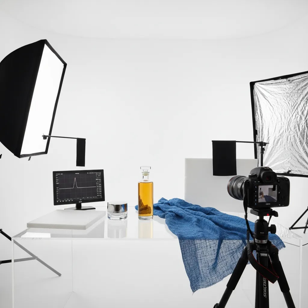
Transparent products (glassware, clear bottles, acrylic)
Transparent items are difficult because the camera needs something to define the edges. On white backgrounds, the product can look like it is disappearing, even though it is perfectly in focus.
Aperture choices still matter. Many store owners push to f/16 to get everything sharp, but if your lighting is limited you will end up with very slow shutter speeds and a higher chance of blur, or you will raise ISO and lose the clean look. In practice, a controlled f/8 to f/11 setup with stable lighting often gives you a better balance, then you shape the edge definition with lighting and positioning.
For white background requirements, do a test-shot check specifically for edge definition. Zoom in and look for clean transitions along the product outline. If the edges fade into the background, adjust your light placement so the product has a subtle gradient or rim separation. This is more reliable than trying to “fix it in editing,” because missing edges can be hard to recreate convincingly.
Highly textured products (fabrics, knits, paper, food, skincare textures)
Texture needs direction. Flat front lighting can make texture look dull. Side lighting can reveal it, but it can also exaggerate imperfections and create shadows that feel too harsh for a clean catalog look.
From a settings standpoint, keep ISO as low as you can, because noise can look like fake texture. Then use shutter speed and tripod stability to maintain exposure. If you are shooting close-up, consider that depth of field gets thinner as you move in, so you may need to stop down slightly more than you would for a wider shot, then compensate with light or slower shutter speed.
The practical goal for ecommerce is accuracy. You want shoppers to understand texture without making the product look rougher or shinier than it is in real life. That usually takes a couple of test shots, small lighting adjustments, and a consistent settings baseline you can repeat across the whole SKU group.
Frequently Asked Questions
What are the best product photography settings for beginners?
A solid starting point is aperture at f/8 to f/11, ISO 100, and manual white balance matched to your light source. Put the camera on a tripod so you can use slower shutter speeds without blur. This setup usually gives beginners cleaner, sharper results than relying on auto mode.
What ISO should I use for product photography?
In most studio photography product setups, ISO 100 is the safest choice because it keeps noise low and image detail cleaner. If you need a brighter image, try adding more light or slowing your shutter speed before raising ISO. Higher ISO can work, but it often reduces the polished look ecommerce brands want.
What aperture is best for product photography?
For many ecommerce products, f/8 to f/11 is a strong range because it keeps most of the item in focus. Smaller or deeper products may need f/11 to f/16. Hero shots with a softer background can use lower apertures, but be careful not to blur important details shoppers need to see.
How do I set white balance for product photography?
The most reliable method is to set white balance manually using a gray card or by matching the Kelvin setting to your lighting. Avoid auto white balance if you want consistency across a batch. Auto mode can shift from image to image, which creates extra editing work and may distort product color.
What are the best camera settings for product photography on a white background?
Start with aperture at f/8 to f/11, ISO 100 to 200, and manual white balance. Expose carefully so your whites stay clean without blowing out product edges. A tripod is helpful because you can use a slower shutter speed instead of increasing ISO and introducing grain.
Can I shoot ecommerce product photography with a smartphone?
Yes, if your phone or camera app allows some manual control. Keep ISO low, lock white balance, and use stable lighting. A tripod and simple light setup make a big difference. Smartphones can work well for smaller catalogs, but consistency gets harder if you rely heavily on automatic settings.
Why do my product photos look yellow or blue?
That usually points to incorrect white balance or mixed lighting. For example, daylight from a window and warm indoor bulbs in the same scene can create color problems. Use one type of light source where possible and set white balance manually so the camera does not guess incorrectly.
Should I use auto mode for product photography?
Auto mode can be fine for quick reference shots, but it is not ideal for ecommerce catalog images. It may change exposure, ISO, and white balance between frames, which makes your product pages look inconsistent. Manual settings are slower at first, but they usually produce more dependable results.
Do I need a professional camera for product photography?
Not always. A professional camera helps with lens options and manual control, but lighting, stability, and consistency matter just as much. Many early-stage stores can get strong results with a smartphone plus a tripod and controlled lighting, provided they use a repeatable process.
What are the best settings for product photos?
For most ecommerce catalog shots, a reliable starting point is aperture f/8 to f/11, ISO 100 to 200, manual white balance matched to your lights, and a shutter speed that gives correct exposure without blur. If you are on a tripod, slowing shutter speed is often better than raising ISO. The exact numbers still depend on your lighting strength, subject size, and whether you need a pure white background.
Is f/2.8 or f/4 better for product photography?
It depends on the type of photo. f/2.8 creates a shallower depth of field, so parts of the product can fall out of focus quickly, which is risky for product detail pages. f/4 is slightly safer and can still give a premium look on hero shots. For most catalog and white background images where shoppers need clarity, f/8 to f/11 is typically a better range than either f/2.8 or f/4.
What is the 20 60 20 rule in photography?
The 20 60 20 rule is often used as a simple composition guideline: keep roughly 60% of the frame focused on the main subject, with the remaining 40% supporting the subject through negative space, background, or context. In ecommerce product photography, the practical takeaway is that your product should dominate the frame clearly, with enough breathing room for cropping and consistency across your product grid.
What is the 3/4 rule in photography?
The “three-quarter” (3/4) view is a common product angle where you photograph the item slightly turned, so you see the front and one side at the same time. Store owners use it because it shows shape and depth better than a straight-on shot. If you use a 3/4 angle, depth of field becomes more important, so you often need a higher aperture (like f/8 to f/11) to keep the front and side detail sharp.
Key Takeaways
Conclusion
Product photography settings do not need to feel complicated, but they do need to be intentional. If you control aperture, ISO, and white balance instead of leaving them to auto mode, your images usually become more consistent, easier to edit, and more trustworthy for shoppers. That matters whether you are shooting a single hero product or a full catalog refresh. Start simple, test one setup, and document what works for your store. If you want more practical guidance, explore AcquireConvert's photography resources and related content on studio setup, AI-assisted image workflows, and editing options shaped for ecommerce operators. It is a useful way to turn better product images into a more reliable storefront experience.
This content is editorial and provided for educational purposes only. It is not a paid endorsement unless explicitly stated otherwise. Any tools or services mentioned should be evaluated based on your store's needs. Pricing, features, and availability are subject to change. Product photography outcomes vary based on equipment, lighting, editing workflow, and operator skill, so specific results are not guaranteed.

Hi, I'm Giles Thomas.
Founder of AcquireConvert, the place where ecommerce entrepreneurs & marketers go to learn growth. I'm also the founder of Shopify agency Whole Design Studios.