Ecommerce Product Images: Best Practices That Help You Sell More

If you’re an ecommerce store owner then it’s likely that ecommerce product images are VERY important to you. Presenting any product well is key to its success, but some products are especially visual, such as fashion or furnishing products, for instance. Customers will be wondering how an item of clothing or jewellery will look on them, or how a particular leather sofa will look in their living room. That said, people now expect 360-degree views of almost anything they buy.
This places extra emphasis on your ecommerce product images. Getting them right doesn’t just affect the appearance of your store; it will affect conversion rates and sales, and it also influences the amount of organic traffic you receive.
So how do you present your products in the best light to maximize sales? Below are some guidelines to creating images that look great and will appeal to the target audience on your ecommerce store.
These are ecommerce product image best practices that will show you how to:
- Plan your images and the importance of sizing
- Shoot your own images with professional lighting techniques
- Use post-production techniques to get the most out of your images
- Understand the different requirements for category and product pages
- Use tools to make life easier
- Optimize your images for SEO
So let’s get straight into all that…
Planning your images
Before we get into actually shooting your product images, you need to plan. But how can you do this until you know what’s needed with your images and where exactly they’re going to go?
Well, you can’t really. But you can start considering how your final images will create the most impact on your store. This will be explained in full in the rest of the article. It’s enough here to point out that you should have a clear idea on the following aspects of your images before you set out:
- What is the best size for ecommerce product images
- What’s the ideal file size to maintain good page load times?
- What file types are best to use?
- Which images are you going to provide for thumbnails?
- What type of images do you need to optimize category pages and individual product pages?

I’ll get into this in more detail later in the section on optimizing images, but for now get clear on the types of details you need to consider. You are probably aware that it’s not simply a case of picking up the camera and shooting, but you may be surprised how a lack of attention to the planning stage with images leaves you with a poor user experience later.
Creating your raw images
It will help greatly if you are able to shoot the ‘raw’ images in a way that presents each product in enough detail, in its best light, AND minimises the amount of post-production work necessary.
It takes time (and money) to fix up images later, so shooting them as close as possible to the desired end state makes sense.
If you are an amateur producing your own images, start with three important elements: choosing the right camera, getting the lighting right, and shooting in high enough resolution.
Camera and image quality
As this product photography guide points out, DSLR cameras will nearly always take better images than smartphone cameras – but there is no mistaking that the best smartphones are closing the gap.
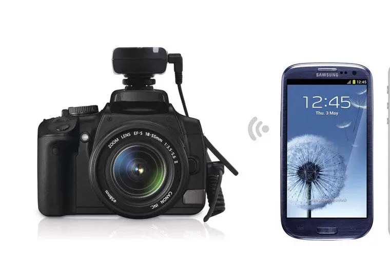
The important thing is to understand what your camera can and can’t do. You can compensate for most shortcomings in a good smartphone camera by setting your camera and photography session up correctly.
If you have a DSLR camera you’ve probably spent a bit of money on it, so make sure you get to know the basics about aperture, shutter speed, and ISO. Getting these elements right will give you the best chance of shooting near-perfect product images with the correct brightness, depth of field, and focus. Most product photography requires a slow shutter speed with a small aperture. Never use a flash!
With a smartphone, set your camera up free of filters, frames, zooms, and flash, as effects can be added later, if necessary. The beauty of these cameras is that practically anyone can take a decent shot, given the right setup, because you can just activate the auto focus feature by tapping the viewer before taking the shot. Most decent smartphone cameras can produce sharp, well-defined, high-quality product images.
Lighting and consistency
You may have guessed from the above that lighting is always critical. The most important elements of lighting to focus on are:
- Is there enough natural light?
- Is it consistent across your product images?
The first element can be solved by setting up your product-shooting session to the side of a window (the light should not face the camera or be behind it). It’s best to avoid using artificial lighting unless you are an experienced photographer and know what you’re doing; and generally keep away from outside shots, as powerful sunlight may make consistency more difficult.
This brings us to the second element. Keep your lighting consistent across your products. Your customers will be expecting a consistent appearance for your products so that they can compare like for like, side by side. It’s easier to arrange this while shooting the raw image than fixing it up later in post-production. Be aware that the strength of natural light can change in a room very quickly – so don’t delay too long in taking your pictures.
Show detail and the full product range
The Shopify blog has some great tips on shooting high-quality images and especially on this topic.
Making sure that your images carry enough detail means shooting in high enough resolution to be able to show close ups of your product. Especially with items like clothing and jewellery, people expect to be able to see it up close, so you will need to provide the option of zooming in on the details.
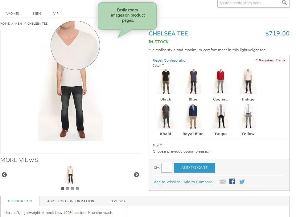
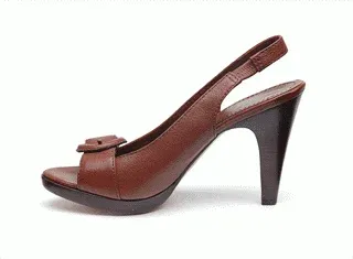
People expect to see images of everything that’s mentioned in a tag line or key product feature. If there are three diamonds on that ring, make sure that your customers can see all three diamonds from as many different angles as possible. Show the back of the shoe as well as the front…
Additionally, don’t leave too much up to people’s imagination. Shoot a range of colors and sizes with your products – people may have trouble visualizing their particular size or color: your images are a good way of showing them exactly what they can expect.

I’ll finish this section with a few other quick technical tips below that will help you achieve the right quality and consistency in your store’s product images:
- Use the same plain white background for all products – no distractions!
- Steady your camera with a tripod or smartphone mount to ensure sharpness of image
- Use a reflector to avoid shadows on your product
The above will help ensure that you shoot raw images that are sharp and attractive enough to sell the product benefits – which is, after all, what you are looking to achieve. But that’s only the first part of the work. Next, they need to be edited…
Post-production image tips
Nobody is going to shoot website-ready images all the time – even the professionals. But, with the array of post-production tools now available to image editors, there is less of a need to.
Much can be done after the event and you can use these tools to adjust your work and create the best user experience in your store.
There are several notable areas to pay attention to here.
Consistency, consistency, consistency
Again, the most important thing is to maintain quality and consistency. Maintaining high quality is a given, but you are also looking for consistency of size, look, feel, format, page loading – pretty much everything. It looks more professional and will add an edge to your store that can set it apart from others.
Consistency and impact can be achieved through many of the editing tools I mention below.
Photoshop ‘actions’
Much of your image editing will be done using Adobe Photoshop, as this is still the industry standard program for post-production. There are many inbuilt tools you can use to apply automated ‘actions’ that rapidly bring consistency to your images. You can apply a specific set of filters to images, such as curves, colour-grading etc. Simply drop all images onto a particular action and lessen the amount of post-production work needed to achieve consistency.
Adding shadows
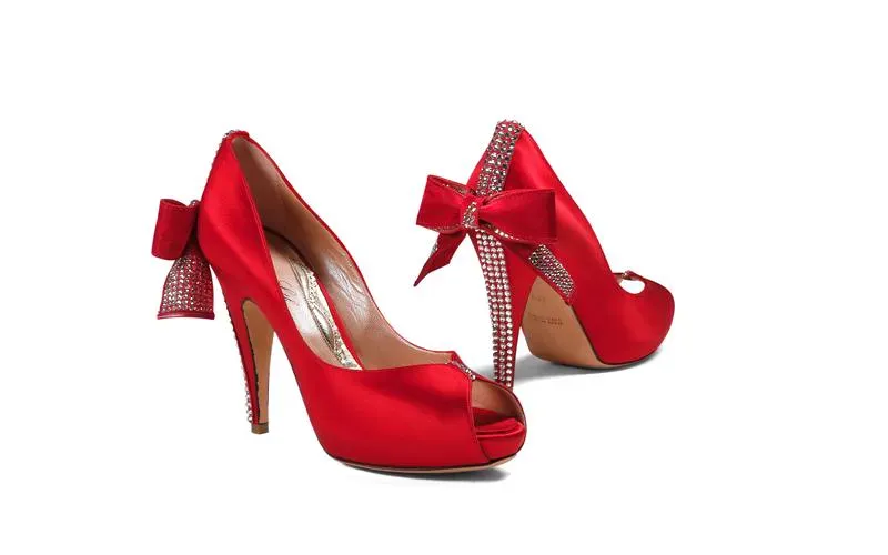
Simple touches to existing photos can add a professional edge to the product images on your site. Adding shadow is a great example of an effect that is easy to add in Photoshop and which subtly elevates the appearance of your products.
Note that I am talking about shadows created by a product on its white background – which adds depth to the product – NOT about shadows on the products themselves, which are often a nuisance and obscure detail. You can find more about this subject here but, meanwhile, see what adding shadows does for this pair of red shoes…
Photoshop Lightroom
One of Adobe’s best tools is Lightroom, which can be used to touch up image lighting. It uses templates to help you maintain that all-important consistency, and the tool can also help you to touch up colors and add vibrancy to dull-looking images.
Remove unwanted backgrounds with Pixc
A great tool for removing unwanted backgrounds is Pixc. You can edit the image yourself or send it to them to do. This can help you achieve the perfect white background that will make your images stand out. Remember that unwanted distractions may reduce the impact of your images and other colors may clash with your product colors. The tool also allows you to crop and resize all your images so the products area sized correctly and sit in a uniform line. Play safe with white and your professional, clean-looking images will help you sell.

Outsource repetitive tasks
Many of the post-production tasks for getting your images into shape are repetitive and time-consuming. There are talented contractors out there who can probably do it quicker and more effectively than you, so why not outsource these tasks to them, using Upwork or a similar freelancer site.
Make sure that you have your Standard Operating Procedures (SOPs) clearly outlined and you prepare detailed briefs so that your contractors have clear guidelines of what’s expected.
Optimizing your images
As you are editing, consider the basic optimization requirements of your images. There are some differences between optimizing images for category pages and for single product pages. These are detailed in the next section with specific examples, but for now, consider some general factors below:
How big should your images be?
If you are using Photoshop, develop a product image template by creating a blank file and resizing it to the required dimensions. This will help you maintain consistent image sizes. There is more about the need for this below but a good starting point for a template size to use across your store is between 1200px and 1600px on its longest side. Remember you want enough detail for customers to be able to zoom.

How can you reduce page load times?
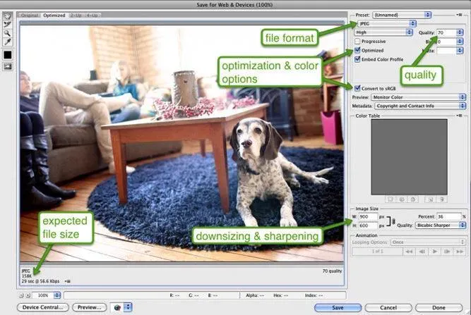
A key consideration here is reducing the file size of images to keep page-load times to a minimum. Nothing ruins a user experience quite like a slow-loading page. In fact, 47% of users expect a webpage to load in under 2 seconds, and 40% will abandon a page that takes more than 3 seconds to load.
So it’s vital that you avoid large file size images, which naturally take longer to load. A general rule would be to AIM for image file sizes below 70 Kb. Fortunately, these days it’s possible to reduce your filesize without a significant loss in image quality by using Photoshop’s ‘Save For Web’ tool, as depicted here:
More information on page load times can be found on my vlog.
What file types should you use?
You will be working with either JPEGs, GIFs, or PNGs. The Shopify blog has an excellent rundown on the major qualities of these three image filetypes.
- JPEGs – standard internet image files, due to the ease of compressing
- GIFs – lower quality images often used for icons and simpler images
- PNGs – often good alternatives to GIFs, supporting more colors, with no degeneration after repeated saving (unlike JPEGs) but tend to be large file sizes.
Generally speaking, JPEGs will be your focus, as they support higher quality at smaller file sizes.
Thumbnail requirements
Most ecommerce stores should employ thumbnails as a quick visual product reference for their customers but beware of their impact on page load times. Make sure they do not hold up pages from loading. If you are using Shopify, then your thumbnails will be automatically optimized, but still try to keep file sizes down.
Use the right names and alt tags
Name your images more descriptively than the messy name that your camera will give to them. It’s much better to name an image 2016-red-polo-short.jpgthan DCMIMAGE10656.jpg, for instance.
Alt tags are what customers see when they hover their mouse over a product image, so make it descriptive and accurate. Using your keywords in the alt tag for that product will also help your SEO efforts, as images show up in Google image search. Make sure that you choose different alt tags for your thumbnails and your main images so that your main images are the ones indexed and that appear in the search results. More about SEO below.

Optimizing category pages vs. single product pages
Here we need to understand that image requirements on category pages are different to those on individual product pages.
Category pages
The most important element here is, once again, consistency of size. Blue Acorn A/B tested their product category pages and found that the page with consistently sized images converted with 17 percent higher revenue than the page with different-sized images.
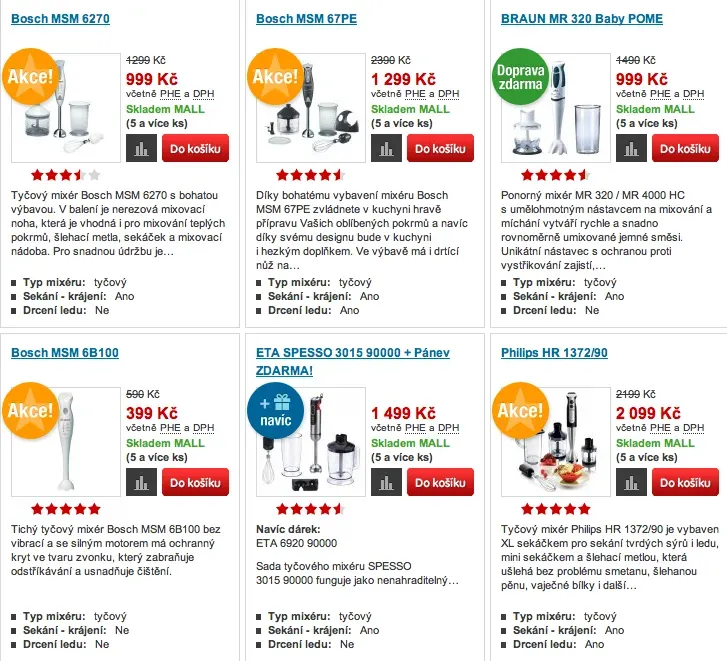
Secondly, it’s important to get the number of images per grid right. Here, like with many areas of your ecommerce store, you need to have two approaches – one for desktop and one for mobile.
For desktop, it’s best to have three large images per row, while for mobile there should only be one per row, making sure that its height does not exceed smartphone screen height. Also, for ease of use on a smartphone, include a swipeable carousel of images on the category page, as this will help users scan through the images a lot quicker, without first having to go through to the product page.
Product pages
When your customer clicks through to the individual product page, there should be an image of the product taking up around two-thirds of the width of the page on desktops; on mobile, it should take up practically the whole screen.
Here you need larger images, with a zoom feature that allows customers to really see the details of your products down to the bone. You should also provide them with a 360-degree view of the product, so the user will feel like it’s almost there in front of them.
There should be multiple images of the product from multiple angles and make sure that there is an image for every color or product variation you have. As mentioned earlier, don’t expect people to be able to visualize too much.
Another important element of your product pages is contextual images. These are images of your product being used in real life and they are VERY important, especially for items like clothing, jewellery, accessories, or furniture. Show the ring being worn, the scarf being used on a cold winter’s day, or the couch looking beautiful in the apartment. But first, consider who your target market persona is. If, for example, your target market is 30-something white Caucasian females, then create images with these people using the product. The customer will then relate more to the product.

Other benefits of a smart product image strategy
There are many advantages of getting your product image strategy right – but there are two benefits I have not really discussed yet.
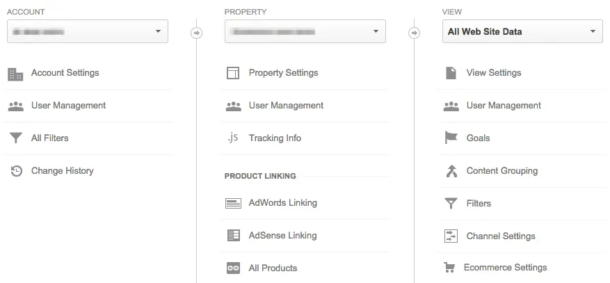
Firstly, using images in your site search can help sell your products. When customers search for products and you are able to return images as well as text, they are FAR more likely to click through to the product page. You can easily see why here:
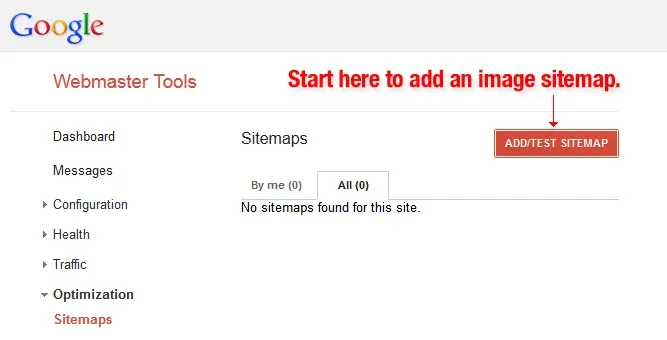
The right product images also aid your SEO. I have already covered naming and alt tagging your image in the optimization section, but you can further improve SEO by creating an image sitemap to help the search engines recognise your images. This is especially useful when you have a lot of images on your site. Web crawlers are not able to find images that are not in the source code for the page, so detailing where and what they are is very helpful.
Google’s image publication guidelines can be found here. Image sitemaps are an added optimization technique that most sites miss and which can give you the edge over the competition.
Final thoughts about ecommerce product images
Images have the potential to elevate the look and feel of your store and to act as an important sales tool. All the tools you need to make this happen are readily available and I have tried to include the most important tips and techniques above.
The best part is that you can do all (or most of it) yourself. As mentioned, some of it can be time-consuming, but it’s not difficult or expensive to hire talented freelancers if you don’t have the time yourself.
Now you have reached the end of the article it’s time to go back to the start again: planning is the key. You should have all the information you need to plan a product image strategy that sets your store apart from your competitors.

Hi, I'm Giles Thomas.
Founder of AcquireConvert, the place where ecommerce entrepreneurs & marketers go to learn growth. I'm also the founder of Shopify agency Whole Design Studios.