Landing Page Optimization Checklist
If you are a marketer or business owner and need to improve your landing pages performance then this is the checklist for you.
You won’t find any opinions here or fake one size fits all hacks, just case studies, best practice and a badass Landing Page Optimization Checklist you can start using today.
Why you need Landing Pages
Landing pages allow you to become laser focused on one action that you want the user to perform, an action directly related to your business goals and profits.
With landing pages you can direct users and help them get on their way much more quickly and with a higher success rate than when simply using the dreaded homepage landing page dun dun derrr.
Landing pages allow you to create a custom destination for segments of your audience. Optimizing experiences to their exact needs and wants. Like traffic from pay-per-click ads, with unique pages for different keyword groups or social networks. Different keywords and social networks drive users with different intent at different stages of the buying process that require segmented marketing approaches.
You can also offer different options of your product or services to different customer bases. Not all customers will find every single offer appealing.
Business Goals & Understanding Your Customer
Just like any type of marketing, landing page creation starts with the customer. The more you understand about the customer and their feelings, the more likely you’ll be able to sell to them.
The best place to start learning about your customer is FROM YOUR CUSTOMERS!
So speak with your existing customers and ask them.
- What were their three biggest pain points?
- How were they solving them before taking up your services?
- What was the process that transformed them from interested prospects into paying customers?
- What do your customers value or care about?
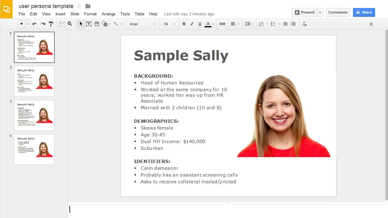
Create personas or profiles of your best customers so you have a human to reference when creating all marketing strategies. Consider psychographics not just demographics. People buy because of deeper and more meaningful reasons than they are 40, white and live in Chicago.
Think about:
- Aspirations — What they want to accomplish
- Attitudes — What are their feelings and values
- Lifestyles — How they choose to live, including work, family and personal life
Get this Persona Creation Template as part of the free checklist download pack.
"When creating landing pages focus on the customers problems and desired actions not your products specifications"
What is their desired action? What is their source of traffic, what does this tell us about their intent? Users need to be told what to do, where to go and how.
Here is some further reading for getting your customer development right
Understanding where your lead is in the buying process.
Having landing pages for each of the steps is vital to capturing the largest share of targeted customers no matter where they are in the buying process. By understanding their position in the process you can better understand their mind state and intent and how to speak to them directly.
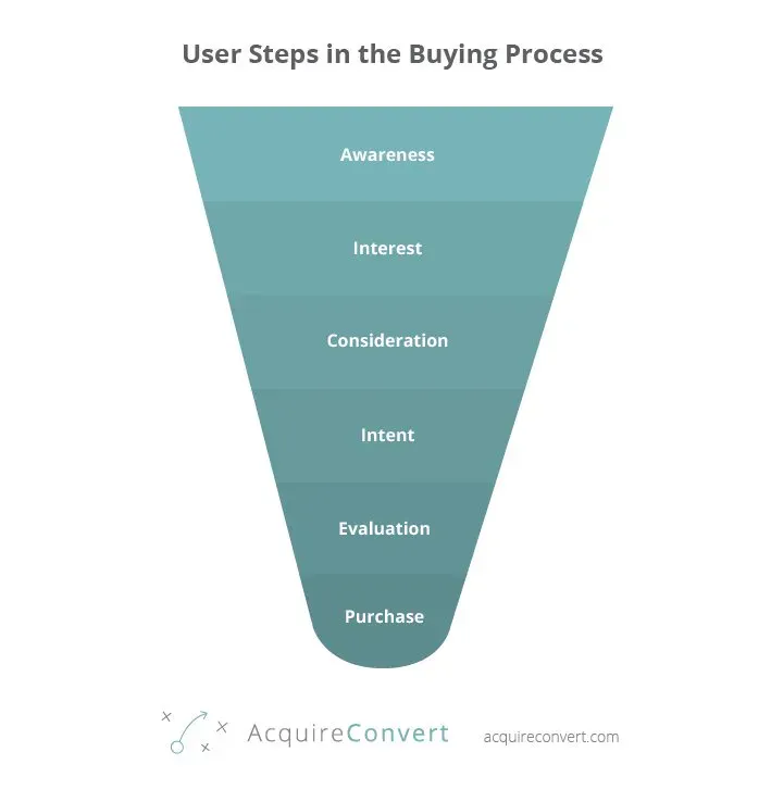
Awareness
The customer is just finding out about your brand. At this point you purely want to add value and answer the users questions. Leverage any trust from the referring website by co branding.
Interest
So they know who you are but are not necessarily ready to buy. List benefits in the form of bullet points. Benefit driven copy will rock their socks clean off!
Consideration
They are now seriously considering you as an option. It is time to show the security seals and transaction safety seals and give them comfort. Try to alleviate any concerns or reservations the user may have.
Intent
So they have chosen your service or product.
Don’t wait until they’ve finished checking out to let them know what will happen with their purchase. Delivery times, costs, returns, make sure to answer any FAQ’s before the point of purchase.
Evaluation
This is where you get compared directly with your competitors. Focus on your UVP or unique value proposition here. Don’t try to bash your competitors but be loud and proud of what makes you stand out.
Purchase
Post purchase the customer still needs some love. Keep them up to date on happenings around their order. Customer service does not end ever if you want return business.
User Intent
What did the user want when landing on the page?
You need to extend the gap between the users intent and your page. For example if someone is booking a car, “cheap car rental”, they may be at the beginning of the buying process. However if they search for “car rental washington dc june” then they more than likely have dates and location sets in their mind. A good opportunity to up sell them hotels and activities.
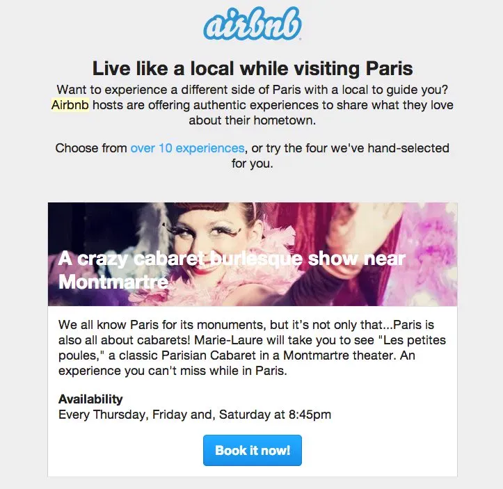
Airbnb do this with their transactional emails, up selling relevant upgrades. Context is GOD!
What causes a conversion
Everyone focuses on their product and company when doing marketing creative. But you need to focus on the customer and see things from their point of view.
The benefits
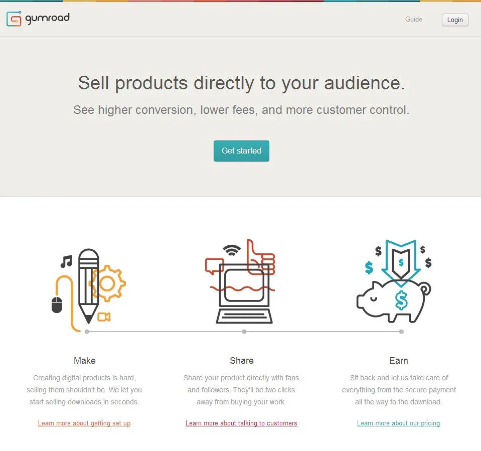
Rather than listing the features, list the benefits. Understand what the root motivations are being the purchase that cause people to buy and include them in your landing page. The benefits of Gumroad are higher conversions, lower fees and more customer control!
Fear
Address reservations, what is the most scary and unknown thing about your product or service, make sure you address these worries and fears.
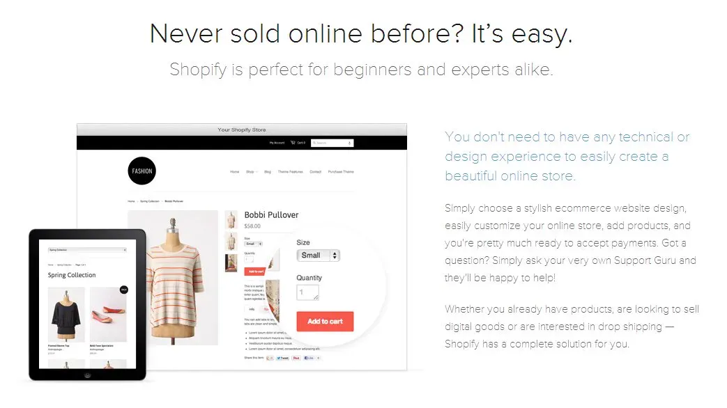
Shopify is a platform for creating online stores. They realised people were scared they would not have the tech chops to make a store so they addressed this in their copy from the get go. Creating a website can be daunting so they let users know that ‘Shopify is perfect for beginners’ and ‘You don’t need to have any technical or design experience.’
Urgency
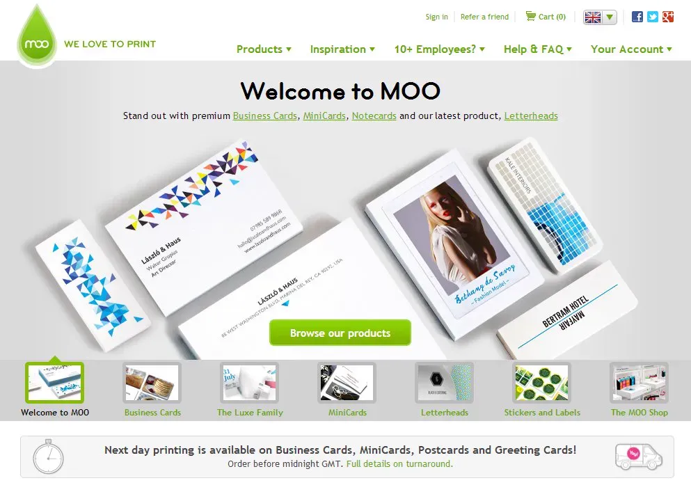
Use time as a motivator. Moo.com a website for printing business cards let’s visitor know if they order before midnight they will print the next day. This makes you more likely to buy as you feel rushed to hit the deadline.
Scarcity
To use the scarcity tactic, you need to convince people if they don’t act now they’ll miss the offer or supplies will run out. Expedia uses this tactic through listing “Only 3 Tickets Left At This Price”. By being transparent about the number of seats left Expedia leverages a psychological trigger to make you pay without delay.

Social Proof
People are way more likely to take your desired action if you backup your claims with proof. Relative and tangible proof. This can be customer testimonials, logos of well known companies you work with or impressive stats. Lead pages shows their internal stats and figures to imbue trust.

Another great and recently more popular way to display social proof is by embedding a great testimonial from twitter. This makes the quote very authentic and impossible more or less to fake if the account has stature.
A study showed that 70% of Americans read product reviews before purchasing. So it is clearly in your best interest to be transparent about what your customers say and get the product right so they say the right thing.
Before and after photos
Results are rarely as impressive as the journey towards that result. If you got a six pack I would say well done, if you were really really fat ten months ago and NOW you have a six pack. Holly shit! That is amazing. Before and after photos also let you control the journey. You use the skyscraper technique to make your offer look overwhelmingly better the the alternative or current state.
Learn more about before and after phycology here from Derek Halpern of Social Triggers
Landing Pages Are Like People
When we first meet somebody new, we unconsciously think about whether we like or dislike that person for no real reason.
Humans tend to trust people with confidence more, who have positive body language and who speak calmly and directly. We are less trusting of those who appear weak or nervous and sadly those you don’t look too hot.
People’s reaction to your landing pages are just the same. You need to imbue trust, speak calmly and look great to convince and convert.
Copywriting
Story Framework
Great copywriting relies heavily on story telling ability. Here is a framework for constructing your next story:
- Statement of uniqueness
- Backed up with a supporting statement to establish credibility
- Expand on the experience
- And explain how you solve a pain point
- Close with urgency to encourage a call-to-action click
Don’t sell your product
The point of your landing page is not to sell your product, but to sell your visitor on your product.
The first is about saying your product rocks, its features and which competitors don’t have them, and its purchase price available today for a bargain.
The later is talking about the changes it makes in someones life, how much time and frustration it will save and how its feature set makes it intuitive and easy to use.
Do I want to read more?
Ask yourself if it makes you want to read on, for instance if you we’re selling running shoes.
“Make the sweat sting their eyes. Get their heart thumping so loud it’s all they hear besides their feet hitting the ground and the quiet voice whispering “you’re almost there.”
Exclamation marks
Don’t use exclamation marks. People won’t take action because you shout at them. Cheap!!! this doesn’t make people think your product is any cheaper. It will just make them not trust you.
Imagine you can only use 2 exclamation marks a year, make them last.
Consistency
Every element of your landing page refers or supports your core value proposition. If the copy is not directly supporting your goals get rid of it and rewrite it.
Be audience appropriate
If you are copywriting for a spa don’t use aggressive language. If you offer funeral services don’t use exclamation marks at the end.
Don’t write an essay
To paraphrase Steve Krug (author of “Donʼt Make Me Think”), cut your copy in half and then throw away half of whatʼs left.
Headlines
Headlines are one of the key ingredients to your page, in the split second your visitor decides if they will bounce or stay the headline and hero image are two of the few things they care to glance at. So headlines must be crafted and tested extensively. Spend half the entire time you spend on copy on your headline and the first paragraph. Often people suggest just the headline, but peoples bullshit detectors are great so make sure the first few sentences tell them what they get if they keep reading too.
The headline should use value driven and actionable words, don’t talk about your product but speak to the users problem emotionally. It is also best practice to use a sub header to list a benefit of completing the desired task.
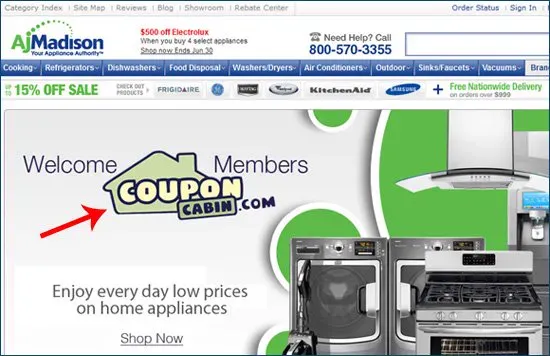
Don’t use words like I or we, use words like you or my. Speak to the user not about yourself.
Here are some option when creating a benefit and value driven headline:
1. Differentiation
Explain why your customers should buy from you instead of someone else.
2. Specifics
Give details of the benefits eg. “You’ll lose 2% body fat in 6 months or your money back”.
3. Relevancy
Tell how your service will fix the users problem in a way that they can relate to.
Information Gaps
Opening an information gap in your headline can also draw the reader in, humans naturally want to close these loops.

Headline Frameworks
Here are some frameworks for writing great headlines, the idea is to replace the bracketed text with your company related copy.
The Only Way to [Do Something Desirable] Without [Doing Something Undesirable]
eg. Task Rabbit – The only way to Get errands done without doing them yourself
[Do Something Hard] in [Period of Time] or [Promise]
eg. Tune Your Piano in 15 Minutes or “Piano Tuner App” Is Free
[Do Something Desirable] Like [an Expert] Without [Something Expected & Undesirable]
eg. Learn to Play Chess Like Bobby Fischer – Without Any of the Crazy!
Another great tip for writing headline copy that I learned from Brian Dean of Backlinko.com is to search for your topic in google and looks at the ad headlines in the sidebar on the right. These have probably been optimized a lot, especially for expensive keywords. So they are already a great place to start.
Headline Dont’s
Do not:
1. Create a Slogan
Make a slogan, this is just more ego massaging and talking about yourself. ps most slogans suck, get rid of them they don’t feel authentic.
2. Blow your own trumpet
This is not an opportunity to boast or tell the world how great you are, unless it is social proof.
3. Use Positioning
“Best ribs this side of the mississippi”, this doesn’t mean anything and is purely opinion based.
SEO
Just because it is a landing page and even if the text content is minimal does not mean you need to forget about on page SEO. Whatever your site wide strategy is employ it here also.
Here is a list of some things to consider.
1. Page Title Double Ranking
Make sure the keyword you are trying to rank for is in the page title, and preferably at the beginning of the title. Placement is very important here. You can also combine long tail keyword phrases with the main keyword you are trying to rank with for a double ranking effort.
For example if your title was ‘Ecommerce SEO Case Study’ you could try rank for ‘Ecommerce SEO’ and ‘SEO Case Study’.
Ensure the keyword is in the meta description (make sure it is less than 156 characters for it all to fit on google), page URL and spread around in the content; but watch out for the keyword density 5% would be too much.
2. HTML Tags
Make sure the keyword is in the H1 article headline and in the first paragraph of the page. I also try to ensure it is one H2 tag.
Your media should be optimized for SEO, alt tags for images with the keyword and the image file name with the keyword in also.
3. Speed & Relevant content
Having outbound links to relevant content is also a relevancy signal to google, so link to great content on your topic.
Finally fast loading pages are also a factor google considers.
Design Theory
Colour
Sometimes some colours convert better than others. But as with anything in CRO there are no universal rules. You can point to case studies that say certain colours convert better than other; like this one by hubspot. But the truth is you have to test. Visual heirachy and contrast are the best places to start. But nothing will finish the argument unless you follow a tried and tested conversion rate optimization process.
Directional Cues

Faces are great for eye tracking, and humans will follow the direction of a persons eyes within an image. This allows you to lead the user to look toward the cta or product. You’ll notice in this example the woman’s focal direction heavily influences the eye tracking data results.
Humans
A university study showed that websites were perceived as more appealing, having warmth or social presence and as more trustworthy when they included human faces. Include people in your landing pages.
Photography
A case study by the national library of medicine showed that photographs increase trust. Even when they are not relevant to the subject.
When making quick judgements (like when landing on a page and deciding whether to bounce or not (not in a street slang way) ) photos increase the chance of us accepting truth. Trust is a huge phycological factor in conversions. Therefore we want it!
The study showed when asked if a celebrity was dead the students were more likely to accept that it was a fact when the name was accompanied with a photo.
Some say this is why e book companies such as kindle photoshop fake versions of books on their pages, even though the book is fake. It makes it of a higher value and more legitimate in the buyers mind.
Fonts
Ensuring fonts are easy to read is huge for conversions. Click laboratory ran a test by increasing their body copy from 10px to 13px.
The result of the test was impressive. This simple test improved the bounce rate by 10%, the site exit rate by 19%, pages per visit by 24%, and an impressive 133% improvement in form conversion rate.
Layout – Observe, Remove, Repeat
Ensure the primary site navigation is stripped out, removes distractions and additional elements to click on and should help with conversions.
Remember the famous advert that had one button that said “don’t click me”. Apart from being impossible not to click there was also no other competing information on the page. As your design your layout step back and look at it from a distance and ask yourself if there too many elements fighting for attention.
Social
Add social share buttons to your pages, people aren’t sharing because they care. Sharing to their personal timelines extends their online persona by demonstrating content that represents their personality and beliefs. Think of the last thing you shared. It was probably to show off that you know about tech or futuristic stuff or maybe even CRO…
Landing pages are also killer for social, some businesses use multiple facebook fan pages or twitter accounts for different user segments. Segmentation allows more narrow and effective marketing.
Forms
Form length
Your form does not need to be short or long to be effective, it just needs to be relevant to the goals of the page. So if you want a lot of contact form completions have a very short form, but the quality of of your leads will be reduced. If you want higher quality leads make the form length appropriate to the page goals.
At the same time don’t ask for information you do not need, it is also good sometimes to add a privacy policy link over the email input next to the label.
A recipe for a sexy form
Headline: Introduce the reason to complete the form
Description: Bullet points to highlight the benefits and contents of what you’re giving away upon completion
Form fields: Original label names and questions can capture attention
Call To Action: Linked back to the PPC add, email, and landing page and form title
Trust Statements: Security badges and seals
Closing Statement: Close with an urgent message and context enhancement statement
Technology
Enable your forms for progressive profiling for return visitors.
Call To Action
Copywriting your call to action copy is super important. A good process is to write down exactly what will happen when the button is clicked, then write those words on the button. Here are some more tips:
Actionable words
Add actionable words like ‘get’ at the start of the button copy to heighten the idea of receiving something.
Use MY not YOUR
Personalise the connection by adding my instead of your. And use time dependant words like NOW to get people to click TODAY.
Personalize / Localize the CTA
So if the person is being asked to call a number, give them a toll free one or use geo location for local codes.
Consistency
Keep your CTA the same or consistent from the point of acquisition, whether through ppc or email to the final cta on the landing page.
Tie button labels back to their action
You can do this anytime you use buttons. Rather than just having a save button at the end of a form, the button could read “Submit Form” or whatever element you are going to save. When saving a deal in Highrise the button label says “Save this deal.” Very good copywriting.
Video
Often people presume video improves conversion rate, because of the few high profile wins in CRO from video. In some cases especially if the audience is older, for instance if you are selling wheelchairs to seniors, then video can be overwhelming and cause high bounce rates. Again there is no one rule.
Wistia Turnstile
Wistia the video marketing company added a great feature for email capture which is called the turnstile, learn more here:
The thing to keep in mind is will video enhance the ux, short videos which are very much like a sales pitch or advert can really hurt it. Again, don’t sell too hard upfront, landing pages are just like any other marketing.
Ecommerce
Landing pages for ecommerce websites often try to push the sale too early. Offering categorization and options within the scope of the users search intent is a great way to drive sales without closing the buyers options too early.
Analytics
You need to track the core business goal or success metric of the landing page. You need to make your goals are DUMB as Avinash Kaushik says. Doable, understandable, manageable, beneficial.
It is important not only to track data but to make it available to everyone at all times. Compile regular reports and let the whole team access them through the shared drive. Failure to do so can cause loss of useful ideas from people who spot problems you might have missed.
Some key metrics to watch out for are:
Bounce rate
It tells you the percentage of people that exit page without one click 🙁
Time to convert
This lets you understand how slowly or fast a visitor converts. Cheaper products convert faster in general as they are not considered purchases. Adjust your landing page and visitor paths accordingly. For something very expensive it is better to use the landing page to employ a drip email course rather than trying in any way to sell at this point in the buying process.
Beware of averages in analytics, if you look at a stat and ask yourself, what will I do differently next time and draw a blank, it is probably not actionable and therefore is useless.
Conversions per segment
Look at conversions per source, you will then start to understand how you’re different channels and paths to sales should be treated differently.
Google Analytics
Some key metrics to track.
1. URL Destination
This allows you to set a success destination that counts as one conversion if someone reaches the page, like a thank you page for an opt in.
2. Visit Duration
Let’s you see the time the user spent on the page, longer times indicate more successful content
3. Page/Visit
Similar to visit duration but it counts the number of pages per visit. Great for multi step forms like when signing up for insurance.
4. Referrer
Which traffic source brings the most conversions, not traffic, but converted traffic
Eye Tracking
If you can afford it eye tracking reports can give great insight into how people use the page and where they scroll to. If your CTA is not above the fold then I bet your scroll map shows that some people don’t quite get to see it.
Prioritise Your Optimization Tasks
When choosing which tests to perform we must first understand the time and cost implications of running each test and their resultant value. We can then choose first the tests with the least cost and highest return.
Here is a test score sheet you can use. Get the spreadsheet in the pack download.
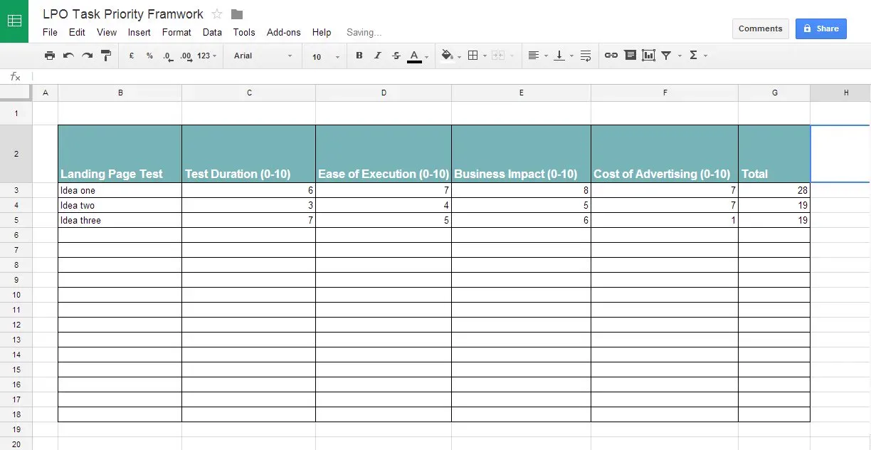
I’ll explain each column:
Test Duration
How long it takes for the test to reach statistical significance, shorter tests score higher.
Ease of Execution
The easier a test is to implement the higher it should score.
Business Impact
How much will this test change the business. The business! Not the conversion rate, not the revenue but the profit, the business. Big changes score high.
Cost of Advertising
How much will it cost to drive traffic to this page. If it is all organic traffic then a higher score is more appropriate, if it is expensive high competition keywords score it lower.
Overall the task or idea that scores highest in first in line to be implemented.
Now you have a framework to rank and prioritise your tasks.
Traffic Segmentation
This is simply meaning split your traffic that comes from different places online. For example, people from Google+ might want something more in depth whereas tumblr uses love a gif. Knowing your traffic segments, where they’re originating from and what they expect can provide you with awesome information on making landing pages that feel as if they were custom built just for that particular user.
If you have more than one user type, for instance if you are a platform like Airbnb. Use different destinations for each of the personas. Here you can see they have an alternate page for the people that rent out their apartments to the renters.

If you’re different users are segmented geographically you can use geo-targeting to dynamically change page content to fit that segment. This can be tricky with google analytics however.
Co branded pages can improve conversions, if traffic is driven from a partner website show their logo to build trust with your customer segment.

Employ social media segmentation – understand the narrative and lingo of a network, the reasons why people use it and you’ll market to them much more effectively. For example Pinterest is an aspirational network, beautiful imagery and deep desires. Perhaps rethink your landing page image for pinterest traffic, ensure it is of the best quality and inspires.
Top Tips For Landing Page Optimization
Don’t repeat old mistakes, write down the errors you made in your last iteration or even for a different landing page. These will serve you well as you start to build a library of do’s and dont’s.
I know it is basic, but please check for typos.
Don’t bait and switch, if you promise people something in an ad; don’t give them something else on the landing page. Unless you like bounce rates that make you feel ill.
Never, ever, even if your Prince use music, ever. No.
Don’t use landing pages for broad marketing, the more specific and niche you can be the better optimized and effective the page can be. An inch wide and a mile deep.
What not to do
Sell Sell Sell
This is not the time to sell your product details or specs, give the user what they were looking for immediately and make sure your offer is very relative to their problem.
Ask for Emails without good cause
Don’t just give away something free and ask for an email, marketing has evolved beyond this so catch up.
Push for a sale
This is probably their first encounter with the brand so don’t shove them down the funnel, add value and think about the customers first impressions with your brand.
Build once and forget
Marketing has to evolve with changes to the marketplace and customer needs. Always, always be testing and LISTENING to your customers so that their problems and pain points become your marketing copy.
The “CRO Pinboard Post”
Landing pages should be able to pass the fixation test, a few seconds glance should reveal to the user the pages intent and where to click. This is also swapped with the blurred eyed test, where the tester blurs their eyes and points out where they are supposed to click.
In the ‘CRO Pinboard Post’ test print off your latest landing page design and stick it on the wall in your office, then stick a piece of paper with a pencil attached with string to the other end of the wall. Ask people to glance at it as they walk by and write on the paper with the string and pencil what they saw and where they would click.
The point here is that your CTA should more or less hit people in the face and the Headline copy and image should explain enough of the page that a quick glance allows users to get it straight away. A split second is all you have before you’re seeing those nasty high bounce rates!
Help someone out
I hope you found some new approaches to Landing Page Optimization in this checklist. Do you have a friend, client or teacher who could benefit from or use this article? If yes, share it with them now. Don’t forget to download the checklist so next time you design and implement a kick ass landing page you can be sure not to miss any of the tips above.


Hi, I'm Giles Thomas.
Founder of AcquireConvert, the place where ecommerce entrepreneurs & marketers go to learn growth. I'm also the founder of Shopify agency Whole Design Studios.