Giles Thomas, Author at Acquire Convert - Page 35 of 41
Categories
Ecommerce UX Trending

[38] Shopify Store Examples To Get More Visitors To Buy

Because very few store owners invented the strategy they use; they simply copied what others were doing well. Then tailored it to their brand through continuous testing and you can do the same!

That’s what this post is all about – ecommerce website examples to study and learn from – and I’ll get straight into it. I’ve picked out 38 examples of ecommerce websites that stand out for one or more feature and helps to make them a success.

Treat this as a checklist and inspiration gallery of the great features you need on your store.

Several of them will probably command your attention more than others; focus on tweaking and testing these to achieve better conversion rates – and more profits.

Let’s look at 38 ecommerce website examples you can copy and test.


‘Global’ features of well designed ecommerce stores

1. One clear call to action on every page in the ecommerce sales funnel

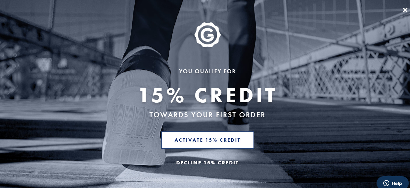
Look at how the Greats home page is dominated by a clear call to action to activate 15% credit. There can be no confusion with this one, test how trip wires or incentives affect your new visitor conversion rates:

OJ6McObIzqfqokFDH0UrZ4neJ2OETodHb3ope5wf92csDyXb92r9aL hgM8jI1RsoMFKEAs2048

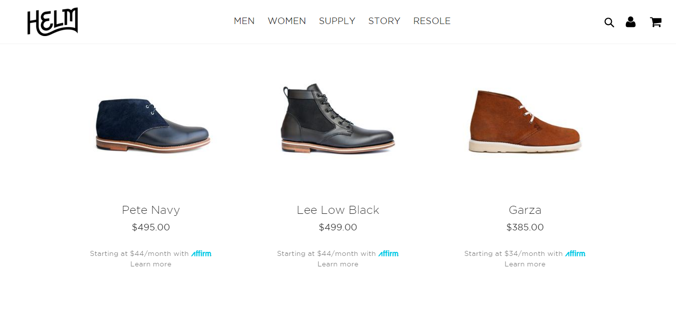
When you get past the home page and start to browse products, you will first come to the category pages. See how Helm displays the men’s footwear with a call to action of ‘Learn More’ – it is an invitation to go deeper rather than to buy. Sometimes it makes sense to give deeper information before asking for the sale for a more expensive product. This learn more button could be more higher in the visual hierarchy though.

FFUrOnBYTOP8wIWhXTxsBWDq3iItaPfB4tIsQjLWEl1zCX8D4Dph2MzmRz2uEBY4MBl YQs2048

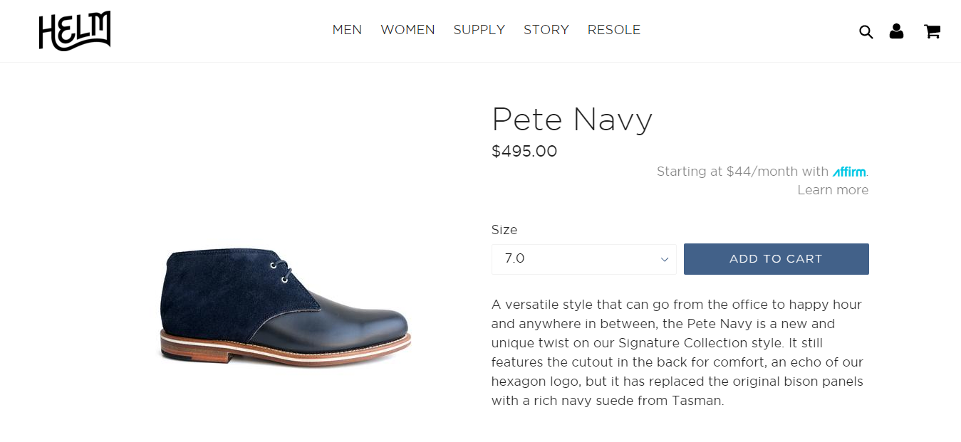
Delving deeper into the site, you come to the individual product pages, where a call to action to buy is necessary. After clicking on the ‘Learn More’ with the Pete Navy boot, Helm uses ‘Add to Cart’ as the call to action to buy. Notice how it stands out from all the other content apart from the shoe.

73HRM3i31V3 c8TqOkO2lf OZUpWsX kMFKzXHwe3jpPywVB dUTaKjE0MdlSa9hAlImfQs2048

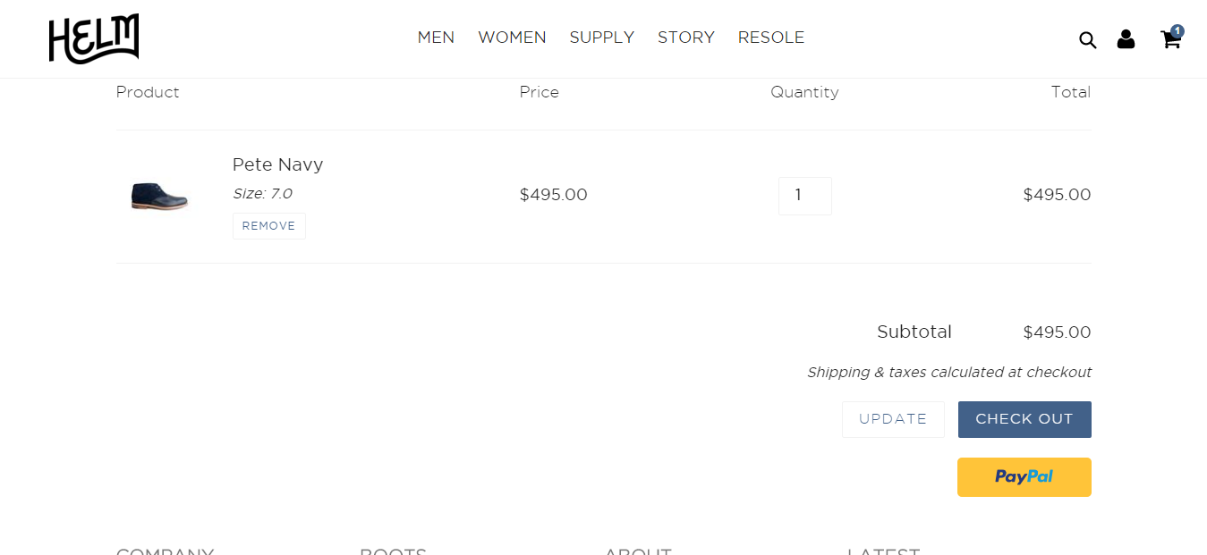
The last important call to action is on the shopping cart page. After you click ‘Add to Cart’, Helm asks you to ‘Check Out’, as you can see in the following screenshot. They could marginally improve this by adding a second ‘Check Out’ button at the top of the cart page incase someone has selected a number of products pushing the ‘Check Out’ button below the fold.

WPYbMV8i8s6n7UtSVH5Q5 WYt8 QfoQDRqwf6SdxNmL3VAU0IzL514DFoKEnBsJuCRrAYws2048


2. Page load times

How long have you got before a visitor decides that the wait is not worth it? Depending on where you get your info from, it’s between 2 and 5 seconds for a page to load. According to Kissmetrics, 47% of consumers say they expect a page to load in 2 seconds or less.

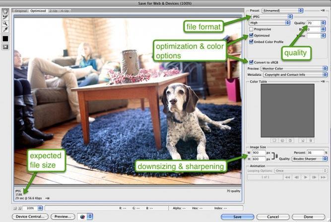
All of the best ecommerce stores have this element of their site covered – with optimized images and page loading times. Look at the page load time for

Look at how the Google Page Speed Tool rates the Alivia Simone site on mobile and desktop:

GHgU7OpBANZk282C8SpFh8A4F4adXjcMoVeld wPgh6m VOMHlsL0 D5vvP1poat5KQpsAs2048

Lj73Zh2CfxrZpAXUSSttfDUaV1nuFwn4g UB0hnkrqHsoLhi0kxzbyibTyK9f8hySUY0Ngs2048

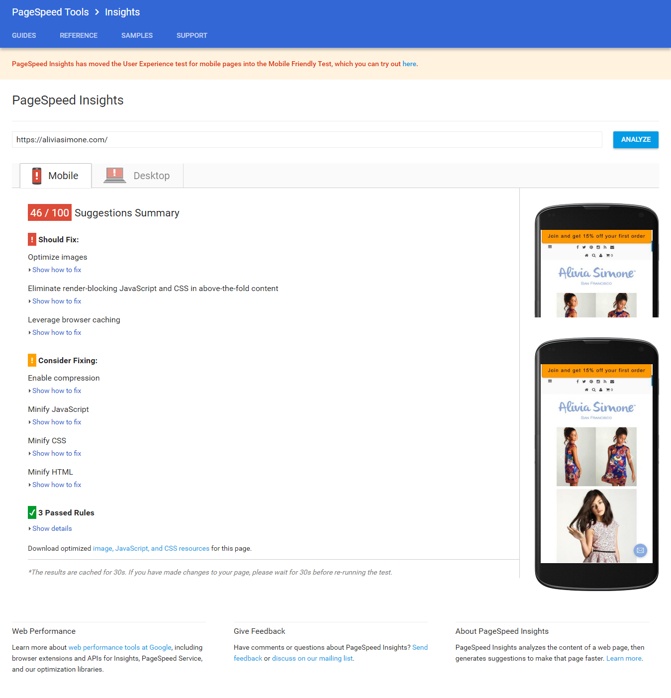
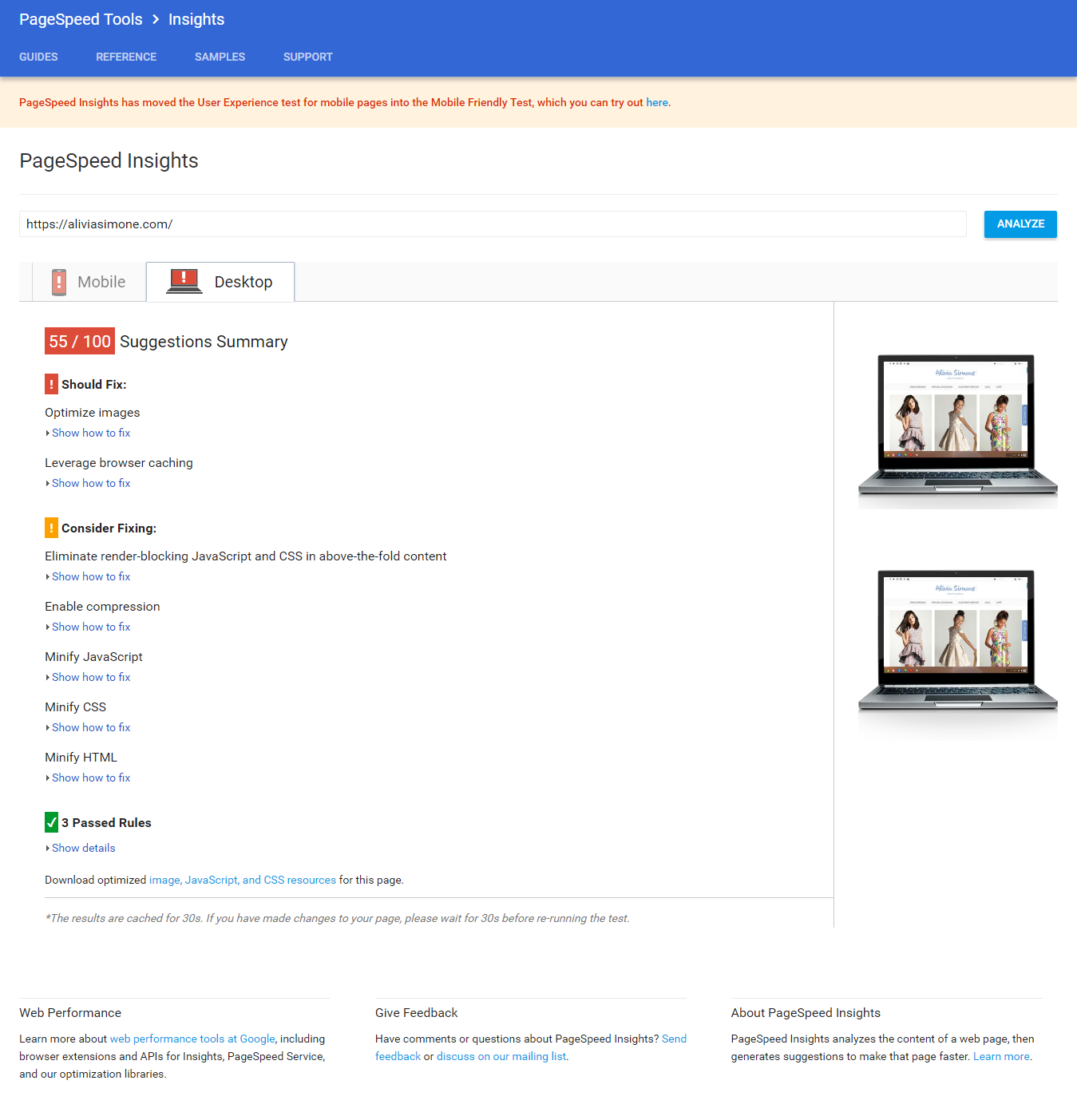
You can see that there is room for improvement both on mobile and desktop versions of the site, with optimizing images and leveraging browser caching two key suggestions for fixing the speed. Check your site speed using the Google PageSpeed insights tool.


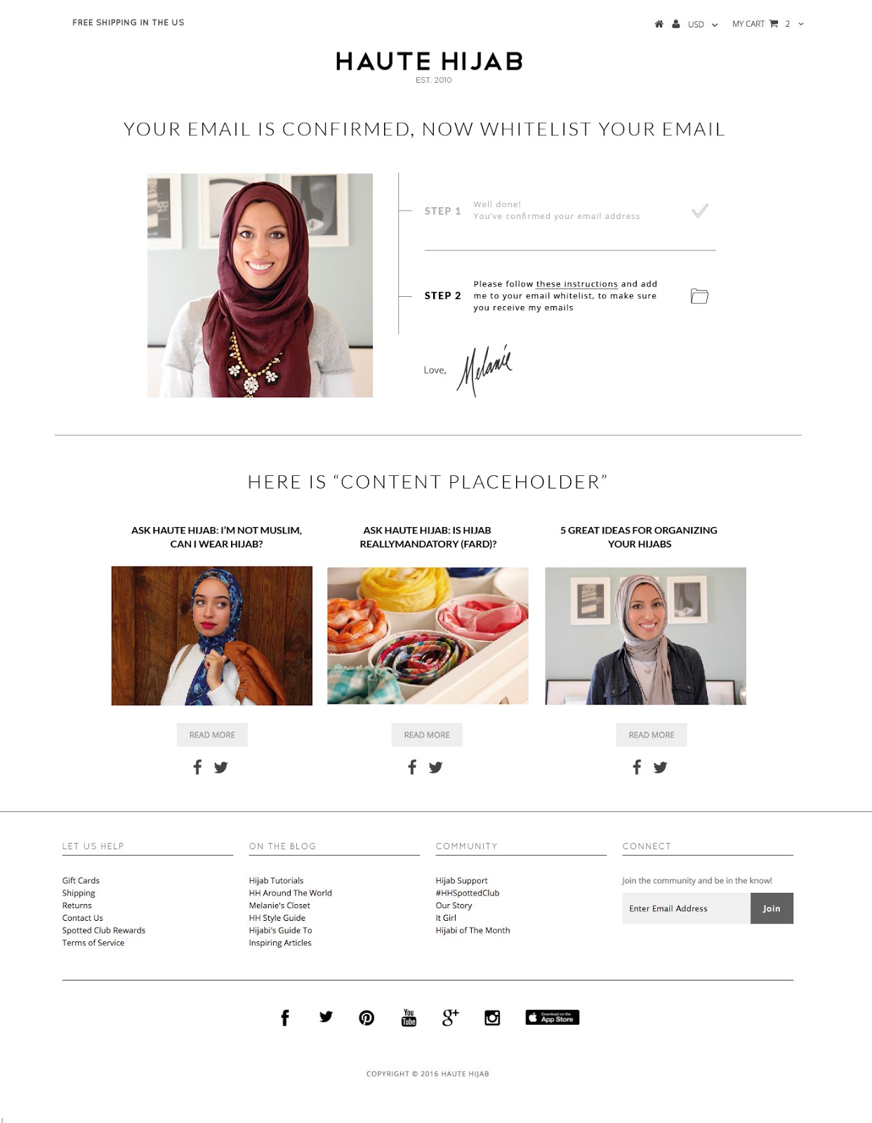
3. Improve email double opt-in sequence

How many of us have actually thought to optimize our double opt-in email sequence?

Make sure you don’t use the default opt-in pages you get from your email service provider.

Create custom ones with clear instructions on how to confirm your email address, adding some personality and a human touch too.

Step.01

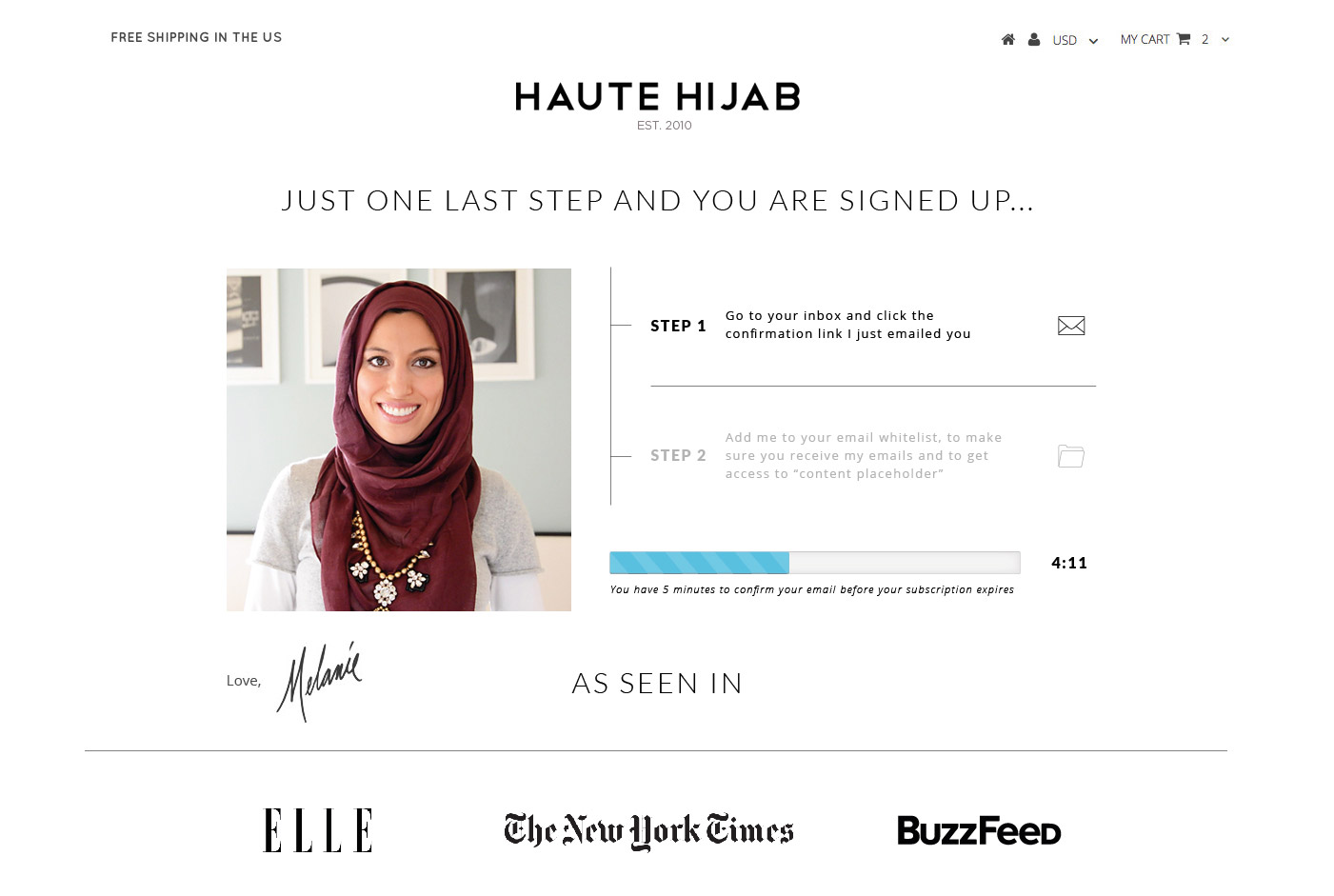
Ensure the email has one clear call to action.

Step.02

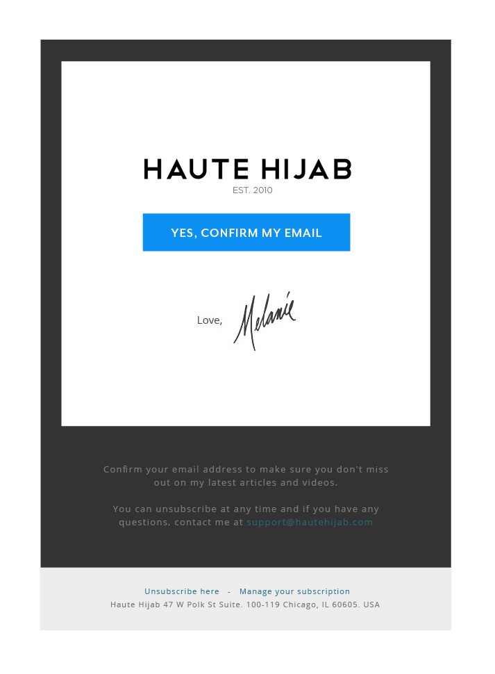
And suggest white labeling email address once confirmed so you don’t end up in the Gmail promotions tab!

Step.03


4. Implement Facebook retargeting to bring visitors who don’t buy back to the website

It hard enough getting visitors to the store, so when they leave without buying it can be disheartening.

Use tools to automate Facebook retargeting ads, ads that are shown to people who’ve already visited your site.

SmartlyFrontPage.pngt1490986855334width911nameSmartlyFrontPage

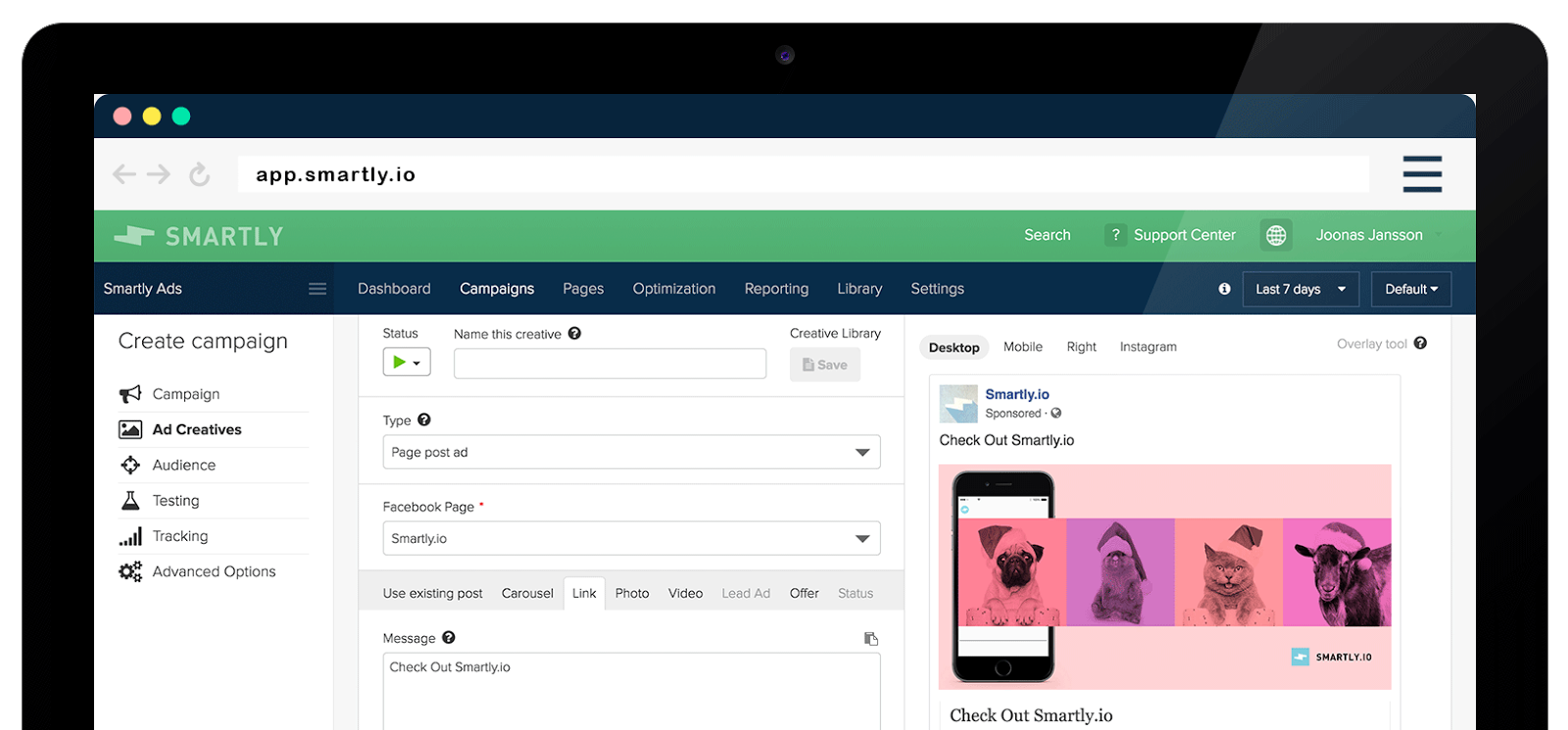
Or better still use an advanced tool like Smartly to automate dynamic product ads using your product feed. You can use Shopify apps for this like Flexify.


Home page ecommerce website examples

5. Have a value proposition for new visitors

As well as a call to action on your homepage, as mentioned above, you need to let any new visitors know why they are there. How do they benefit from what’s in your store? What’s the value proposition to anyone who doesn’t already know you and your brand? How do you talk to their pain points or tell them why they can’t afford to miss what you’re offering?

Shopify does it this way:

shopify

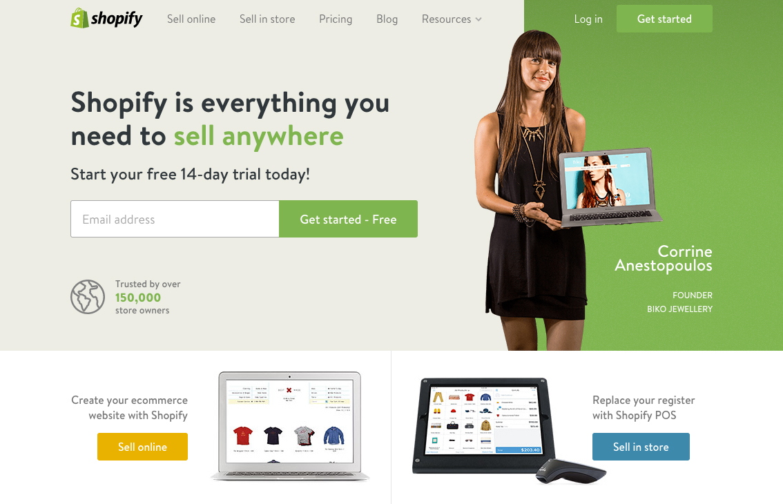
Note how the value proposition tells you exactly how you can benefit within seconds of landing on their home page. Are you giving returning and new visitors the same experience, why? Don’t they need different and personalized messaging?


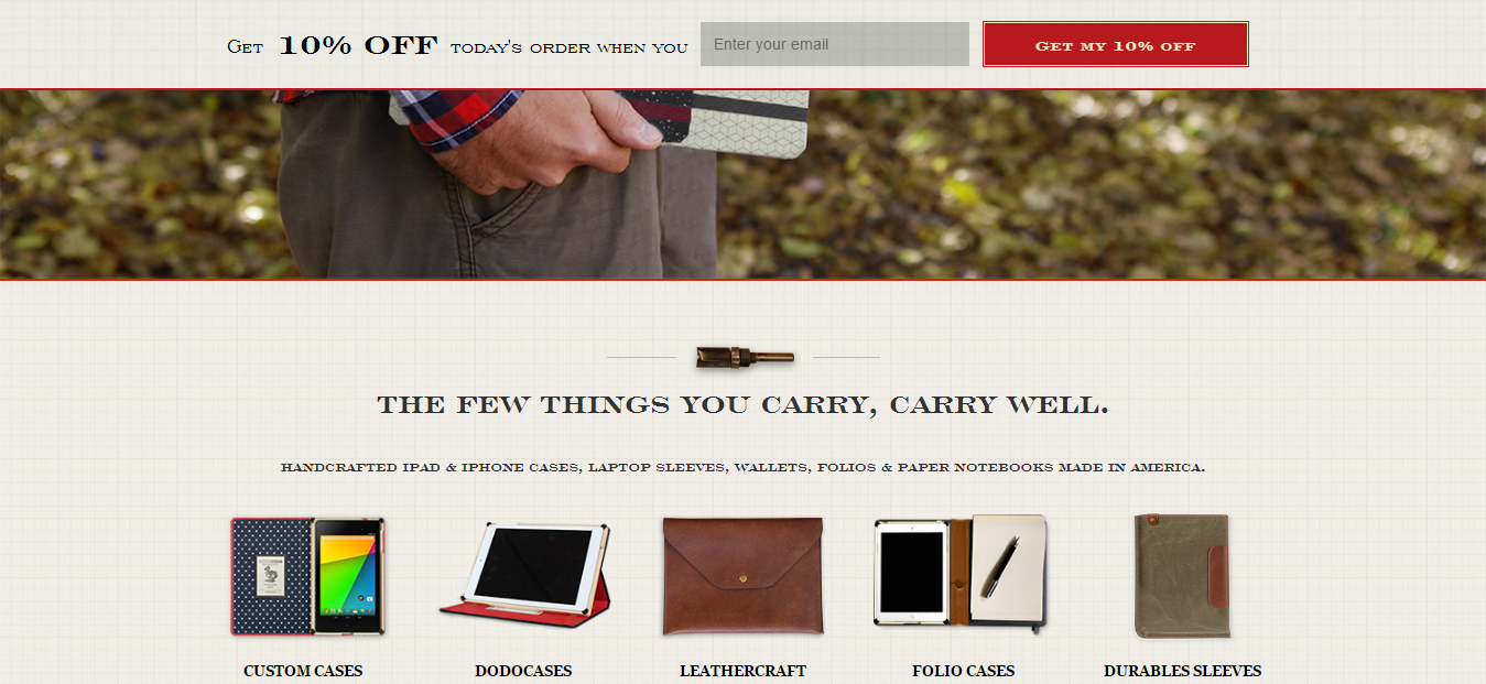
6. Show relevant category links and imagery below the value proposition

Let’s look at Dodcase as an example of how to display category links. Including these just below the value proposition is smart design…Dodocase includes links to its custom cases, dodocases, leathercraft, folio cases, and durables sleeves.

yGau7C6BI8xuGryIvozTa1OjffN4EE1wPQUqXytW AcH0LT39cngt8FvbylYfGKVDEmLnws2048


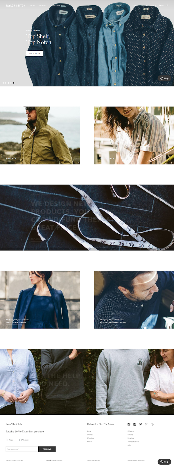
7. Remove links to blog posts or social accounts

The home page should largely be about what shoppers can buy in your store and how it benefits them. You need to avoid ‘clutter’ and distractions as much as possible on your homepage so ensure that there are no links to blog posts or social accounts that can take people away from accessing the main product pages of your store. Social should bring traffic to the store and into the ecommerce sales funnel, not away from it.

You see with Taylor Stitch, the home page is solely focused on selling; it tucks the social account buttons into the footer out of the way and doesn’t surface content.

WBHA nR Lo7BQHR1QaJV3TcP5TECL fAhqb5oySkuhE17iAZEjYlKFO ixif UkBU1YlAs2048


Category page ecommerce website examples

8. Test removing your image banner to display products above the fold

The whole purpose of your ecommerce site should be to sell more products and grow profits.

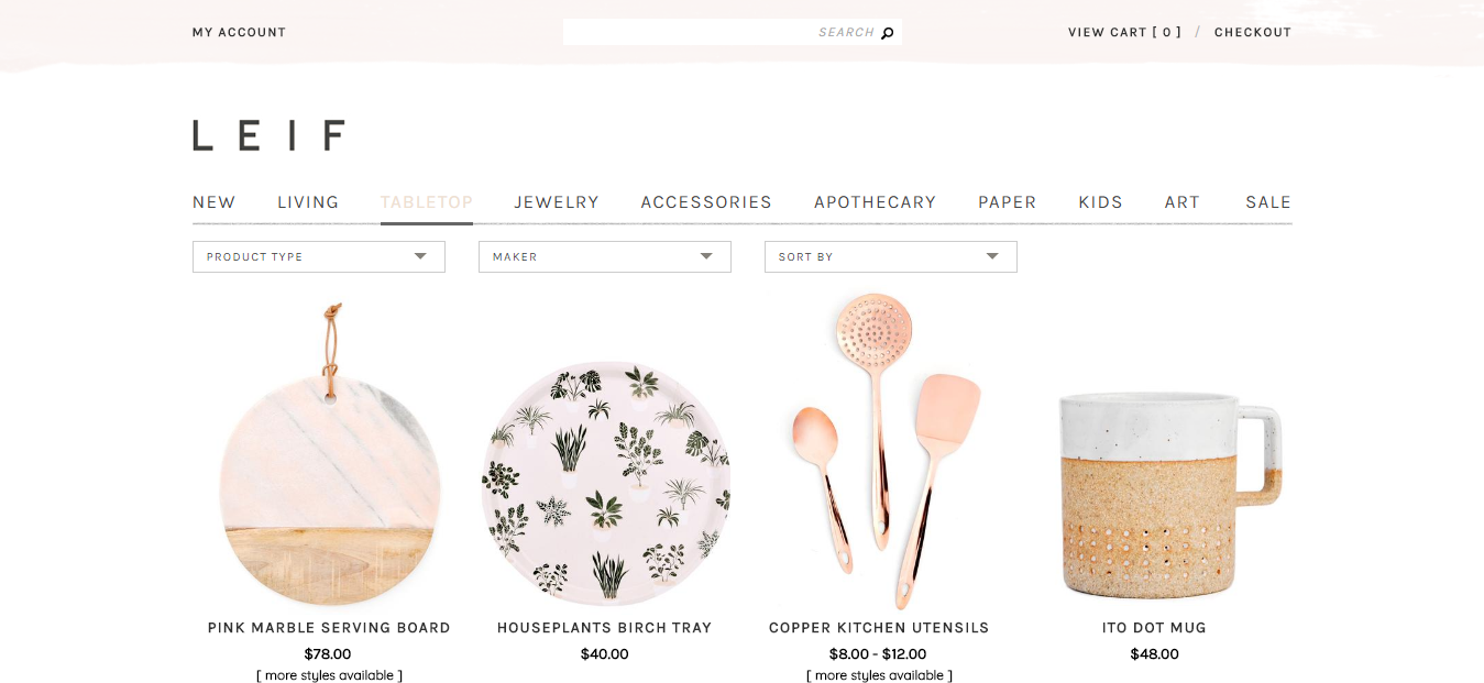
Conversions have been improved by stores that remove the image banner from their category pages, so that products sit higher on the page (above the fold).

It may seem counter-intuitive to remove the banner but test it and, hey, if it helps you sell more, it’s working – as Leif has clearly found out on its category pages, where it’s products start well above the fold:

waLUwQOZgv4uMjNyRKJuvS0yDlnJ5baeM HF9o9dDCuLu5hTxlSsWd0tSVv AHH2gn3uqAs2048


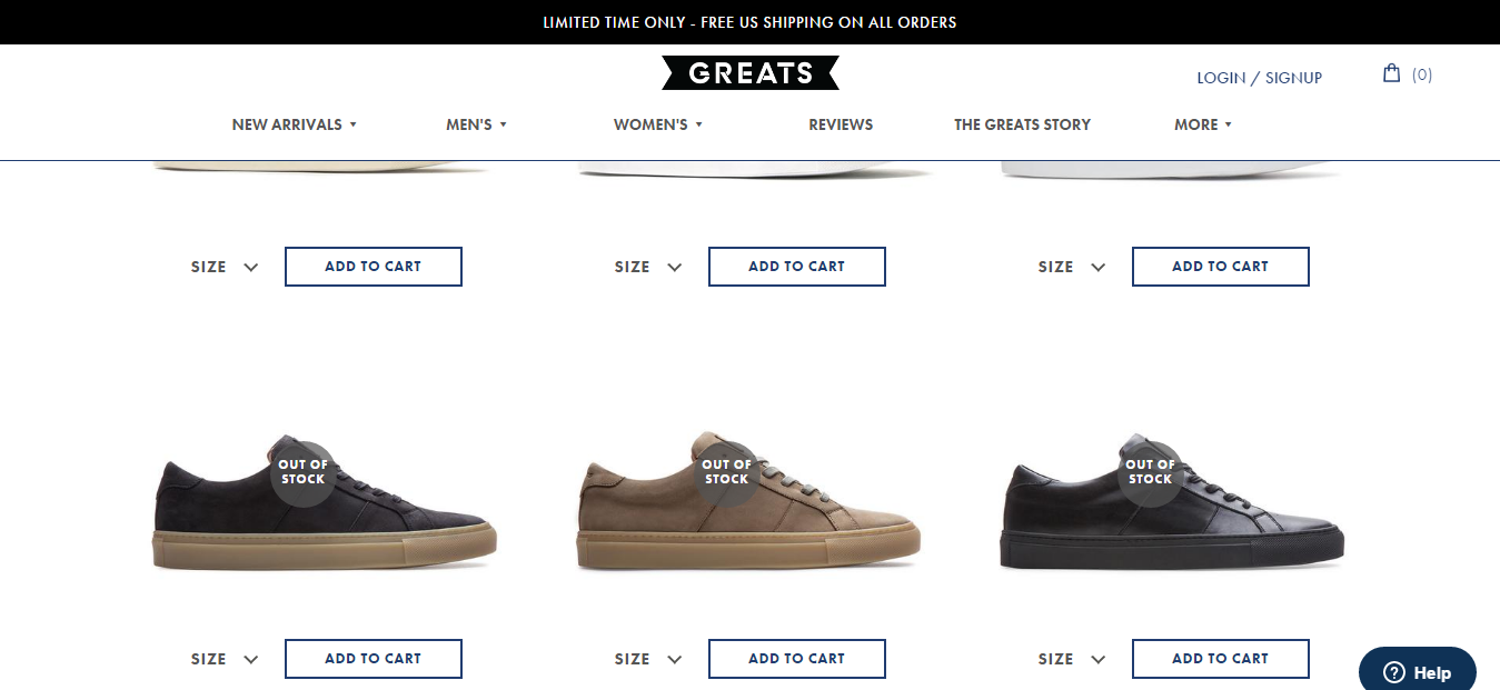
9. Use product badging for sales, out of stock, and new

Rather than creating disappointment for shoppers at the checkout page, tell them what’s going on with your products right from the category pages – what’s on offer, what’s out of stock, and what’s new are particularly important badges to use.

See how clearly Greats displays its out of stock badges on the product thumbnails on the category pages:

uG0vqW7Joucexytdbu4sW2FCOsPnTAGVI64HbCJwHKMz9Zu0C3EafkqGp0e9cZf4SxSYnws2048

It’s better not to hide out of stock products and instead build an email list around people who are interested in learning when they are back in stock. This also allows you to continue to rank for organic traffic with that page.


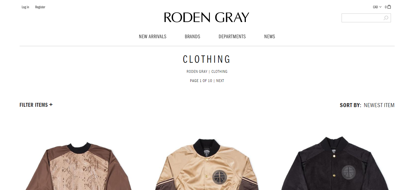
10. Improve filtering and sorting

Making the user experience as easy as possible is key on your store. Part of this is allowing shoppers to sort items and filter out what they are not looking for. This not only saves time and frustration for the shopper; it narrows down their choices and brings them closer to making a purchasing decision.

Roden Gray’s clothing category page demonstrates this well, offering both a filtering feature where you can filter out colours, sizes etc and a ‘Sort By’ option, where you can sort by newest items, price, or name:

PK9n0v7ND0wW8sEug91 8JpDRRbpmKVShy5nYdQ8XfaibpluzzCyOmSgvkQIJGbBGGPOOQs2048


11. Improve your category names

The category names are vital for helping shoppers find exactly what they want quickly and with the minimum of fuss. You want to avoid sending potential customers on a wild goose chase for products or they will vanish.

See how Little Sparrow Tea breaks down their range of products into clear categories so it’s easy to find what you want:

FRlCZ0eXMTeGNgPlRGJIMIrtJQVddDtL9MPxPqkxMLTtBWhvTyg8AttrAoXWvBxLR4AFuws2048

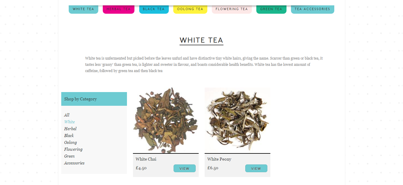
Don’t use branded or cryptic category names, keep it logical and explicit.


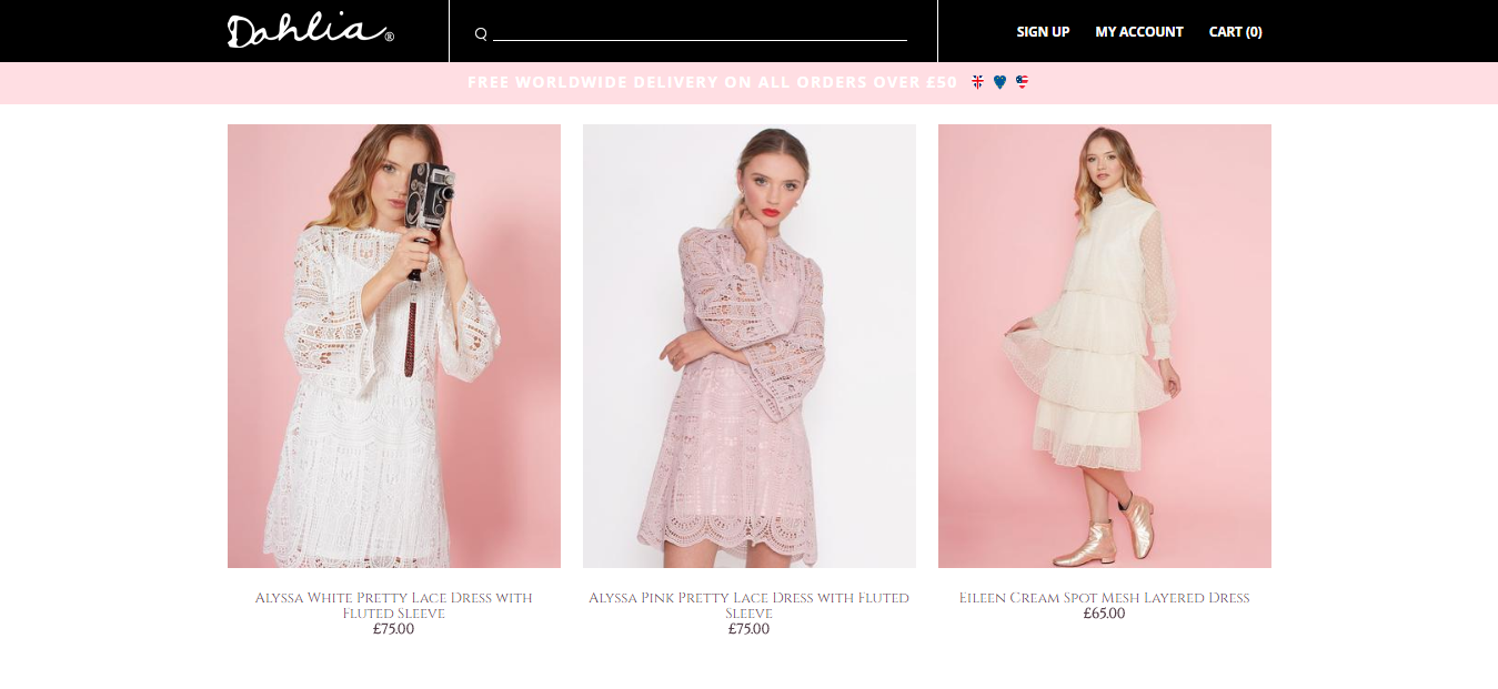
12. Show the product price on the category page

Don’t make shoppers click through to the actual product page to find out the price – this will create a trail of unnecessary clicks that will slow down the journey to checkout (which you are trying to make as short as possible).

Notice how Dahlia clearly displays the prices on their dresses category page:

Uv q4ObT9Dc4nWpHSDAZgcFlZn wuNoITWSoHKgD9gloFDbdTMpSWPyf6t4p6Evc6TpXzAs2048


Search page ecommerce website designs

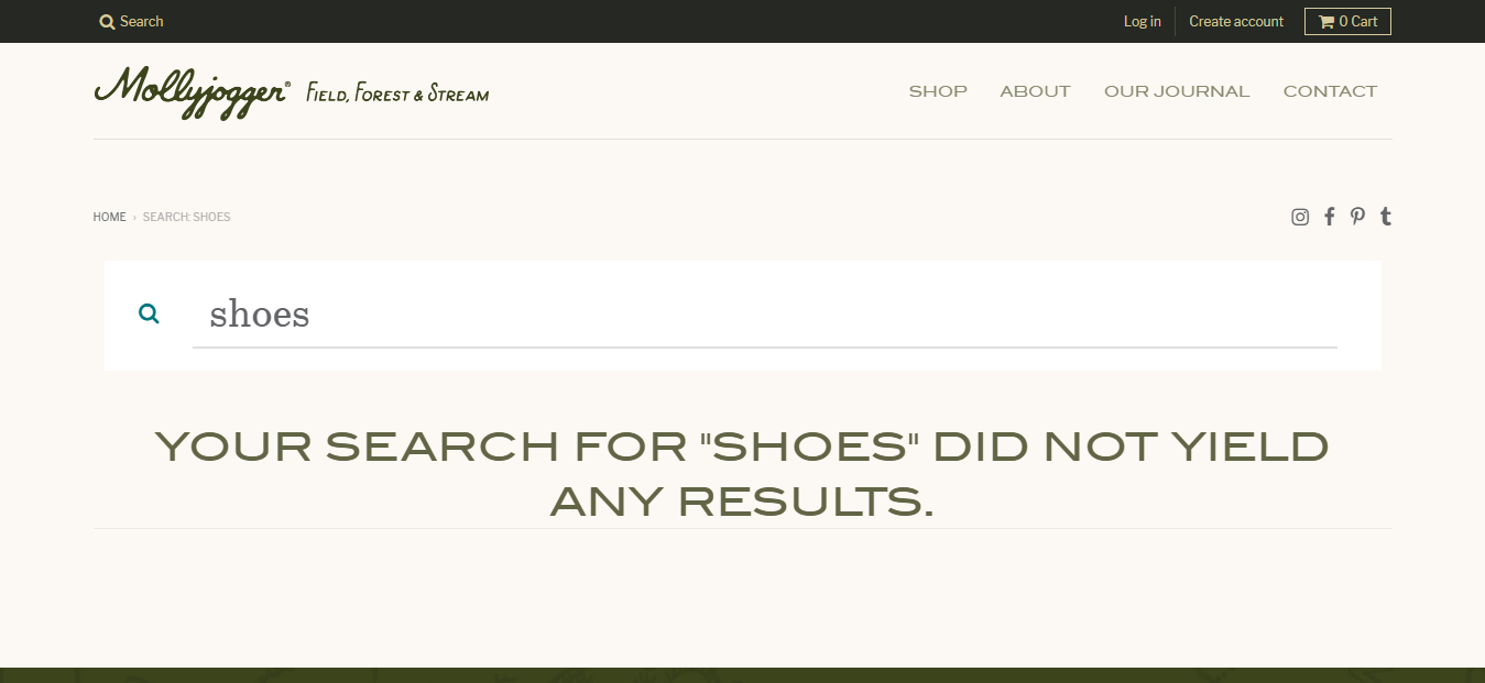
13. Gracefully handle ‘empty’ or null search queries

Not everyone will get the right search terms first time. They may misspell an item, look for something you don’t stock, or be in completely the wrong place. It’s important to handle such ‘empty’ search queries in the right way.

A search for ‘shoes’ on the Mollyjogger store produces this response:

DW7aUNsqhVoC42eIAmVPGPYoebsasRT Uya1WDdfVWaIFED7syTzrZkHpyxaU3Me9JxS1ws2048

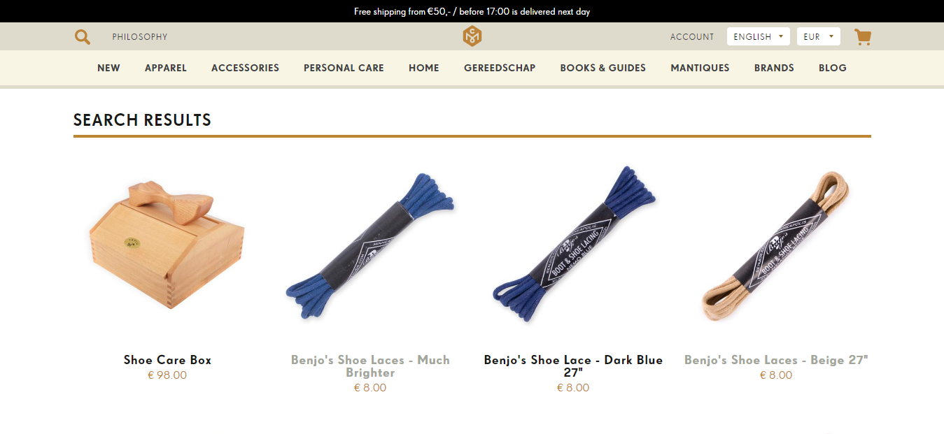
That’s fine. But you could also get more creative. The same search for ‘shoes’ on the Concrete Matter store (which does not stock shoes either) produces details of shoe accessories that could be of interest…

YUcddRJumf6I7uFG4v5kAXXSDrofl2FM7I4Yn817FMbR6 NnSgRFMxwiXLPvqLkzY7 KAs2048


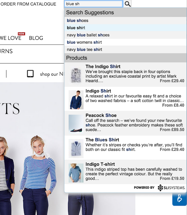
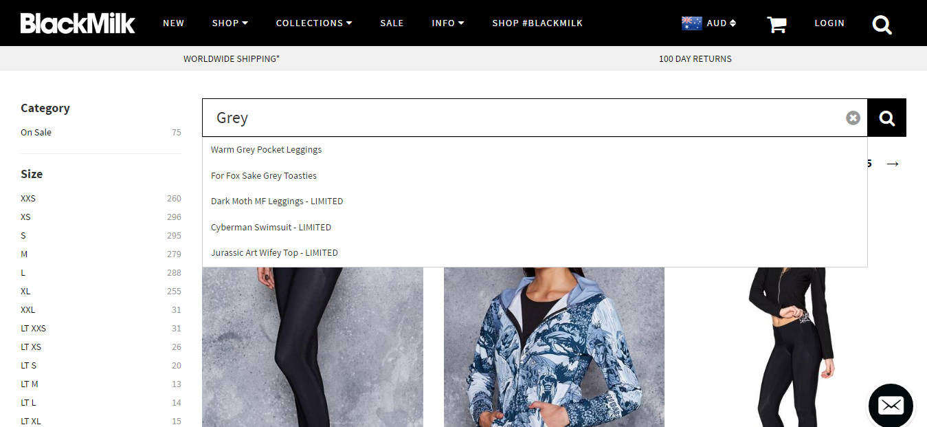
14. Add autocomplete or autospelling

Another excellent idea for optimizing the search pages of your store is to offer autocomplete, autospelling (to automatically fix typos), or a dropdown menu of suggestions for product types that you are searching for.

Look what happens when you type ‘grey’ into the search box on the BlackMilk clothing ecommerce store:

Wrjm2BruxuIOAppYO5nY47o 8 XcpxoJF 7Wi5gjELjlqCygepiL3eCAh7ZU49WcQnP8Xws2048


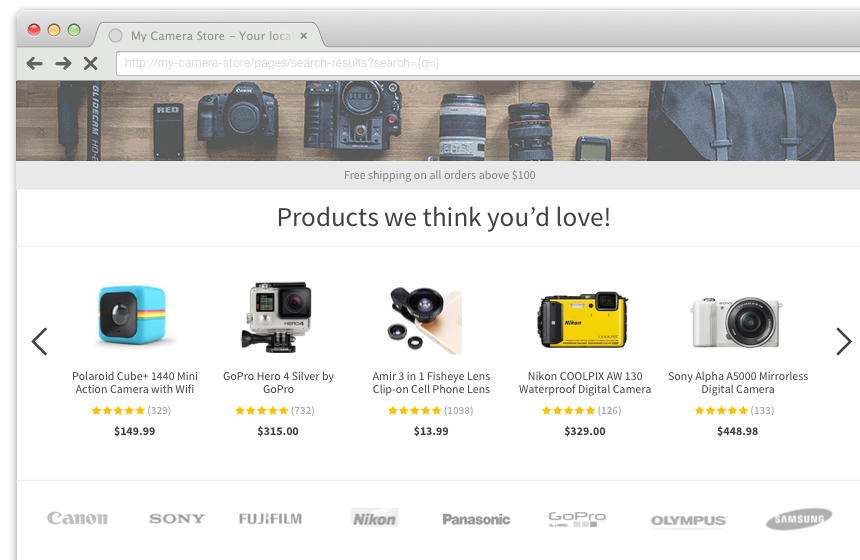
15. Use Findify to improve search results and conversions

Findify is a useful tool for improving search results for your customers. It plugs straight into a Shopify store with all solutions available from a single integration: self-learning search, product recommendations and smart collections. These are all designed to make the search more ‘intelligent’ and tailored to each shopper.

A/B testing with Findify has increased revenues by up to 30%.

Y4UJ8dh2fhGrARFk1wtA0hPVBzY6n AAyHrJBMKcMB2a8FrexuZvRGR1m gUeejijvXc As2048


Product pages website examples for ecommerce

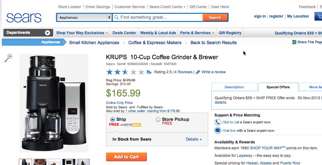
16. Add breadcrumbs to the product pages – improves product findability

Breadcrumbs are tools for secondary navigation for users, helping them find their way around your store and locate products more easily. They reveal the user’s location and offer shoppers a way to trace the path back to their original landing point.

These are useful conversion tools because they reduce bounce rates and add a level of convenience by reducing the number of clicks to navigate, without taking up much screen space on a webpage.

See how Sears shows your navigation path using breadcrumbs:

e2UNbfQ43KgyKzBkz xYklSCE PdHpR kbSQui91DimucYa0cP10IGm6RPTMZ22Y GdjoAs2048


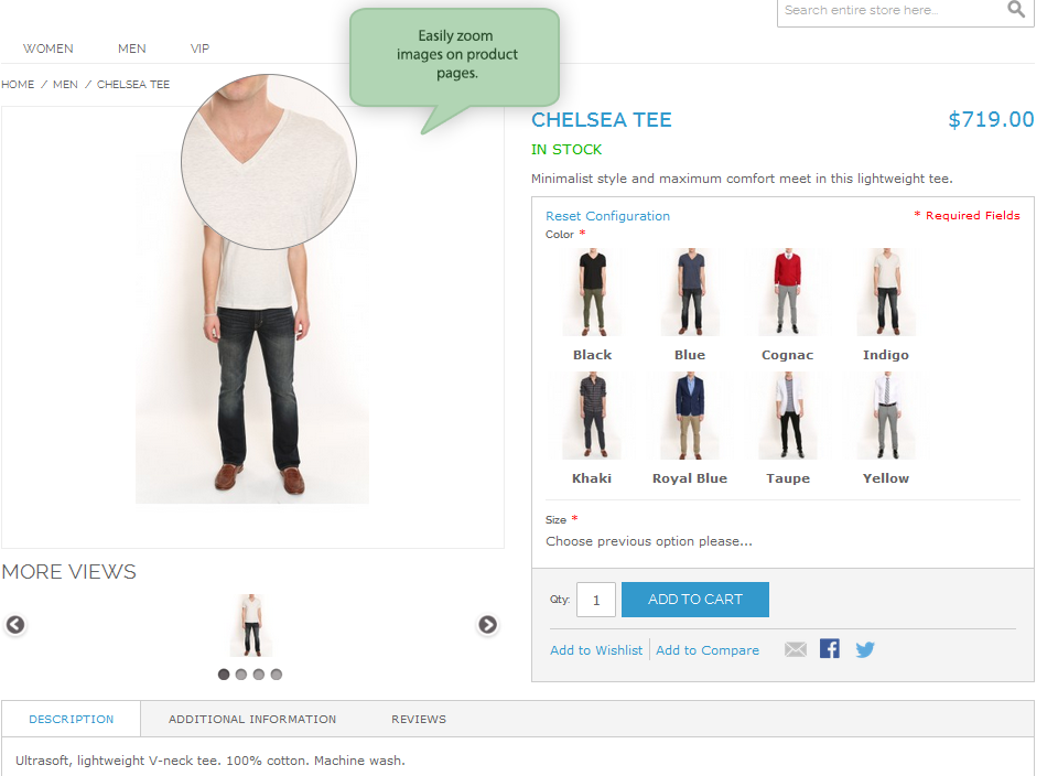
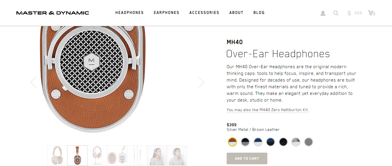
17. Increase your product image size and add zoom feature

Images need to load quickly but they also need to be large and zoomable to sell your products most effectively. You have the best of both worlds if you get the compression right.

Look how the Master & Dynamic site allows you to zoom in on this set of headphones so that you can inspect the product in minute detail – in several different colours:

PgI4j1 9EWLMG UQgo5CtVoqhDmuSYZJIEJZCxkUzdXJfZw9pmRnFUsgQCsv4s47lvuHews2048


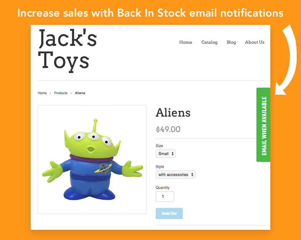
18. Add the ‘back in stock’ plugin

An important part of managing your inventory on your ecommerce store is informing shoppers that an item that has sold out is now back in stock. Don’t force them to go through the sales process and arrive at checkout to find this information out; be proactive and allow shoppers to opt in and receive an email when an out of stock item is now back in stock. A simple Shopify Back In Stock plugin makes this simple.

This is how Jack’s Toys do it:

gUZf0iChmnQqvpfjX56TxSBjdNYhoYkA7fpXwveWe1kH0D5MpBZylpmDmmSFF46Xir3Gpws2048


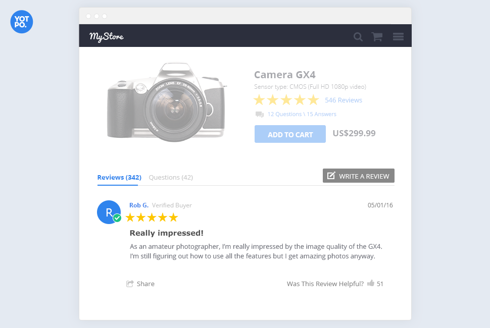
19. Add the Yotpo ‘product review’ plugin

Reviews are valuable currency for your products; you need to proactively gather as many product reviews as you can to add social proof to your offerings.

A great way of making this relatively simple is to install Yotpo, the Shopify product review plugin. Here’s a good example of what it can look like:

gJb3661XYPuk EOPY5szTw7opQ1R S7Sci1sETXISOysNR8f1nkoI0VkFeEPVFywCysiuQs2048


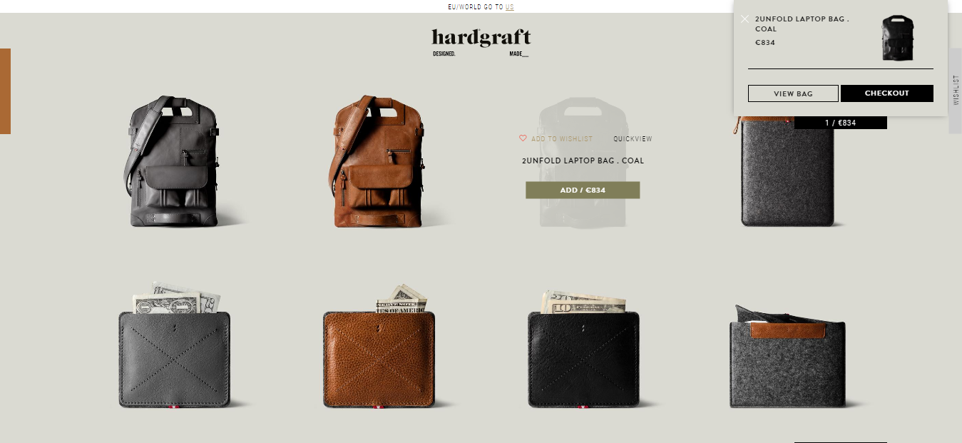
20. Add alert for when products are added to cart

Adding an alert when a product is added to the shopping cart is a good way of letting customers know that their choice has been registered.

Most commonly, there is a popup showing the product (with image, details, and price) has been added to the cart, like in the example from Hardgraft below – note the popup in the top right of the screen, with the option to continue to the checkout:

SONb6XcNWt7B Ac3aAsP8KH2m7FbCdIax4cwWIkuCxZM3zIA RoWVEs2iZYcFJbKJxsOGgs2048


Ecommerce header design examples

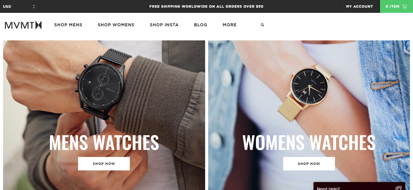
21. Show your top level categories in the main navigation

An important way to improve product findability is to include the main, top=level product categories in the main navigation menu at the top of each page – don’t hide it away and force an unnecessary click to find them.

Note how MVMT Watches includes Men’s and Women’s watches in the main navigation and VERY prominently on the homepage as soon as you land there:

Z5moe2YXnht7 OsXuclwsnQwEw4ZxgrxuOnajGw2QUj5GWVCzqphjG4NEuxzc2nPaqP6JAs2048


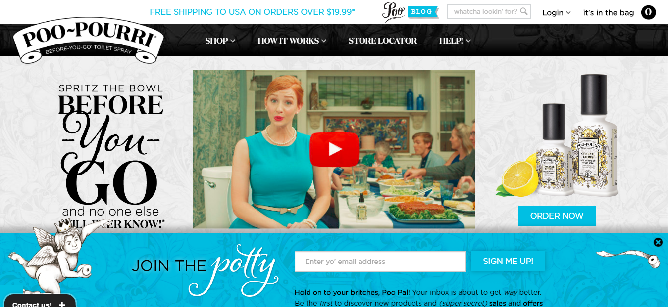
22. Search feature visible on every page in the header

Don’t hide your search facility away. Include it prominently, high on every page in the header, and make sure that shoppers can see it. Again, this will improve the findability of products and reduce unnecessary clicks for shoppers.

Look how prominent the search feature is at the top of the Poo-Pourri site, for instance:

hLmvdsdlqduy9h8fGS000KMIR0EKBj39FDBPu u8B4Xjgn yQU uuddwgyE oEByvaaFSws2048


Ecommerce footer design website examples

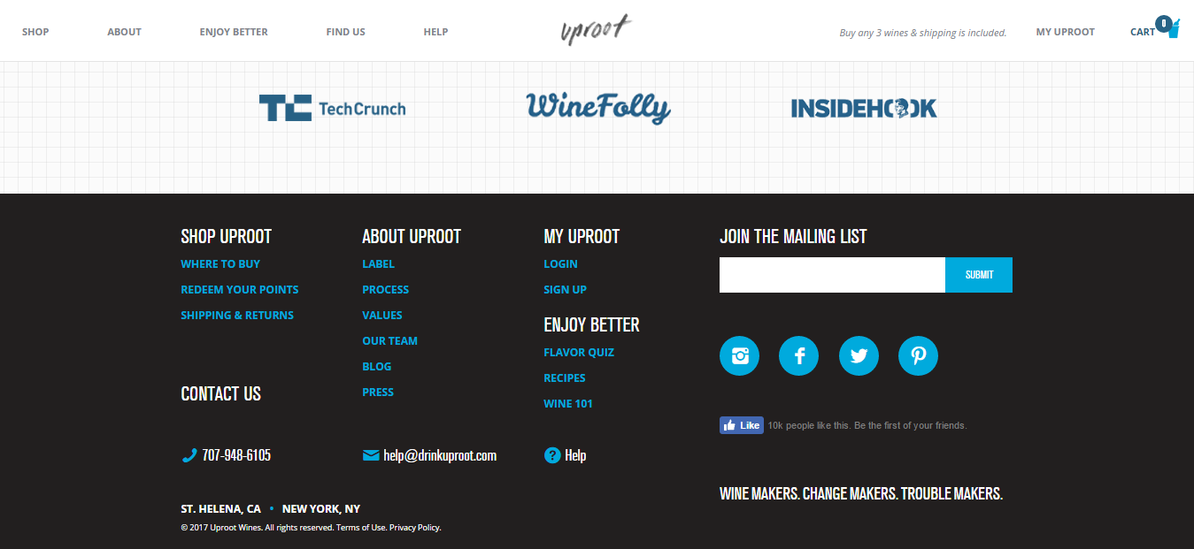
23. Add the company telephone number

No matter how established you are in your niche, always include the company telephone number in the page footer as it improves company credibility to know that there is a number with a real person at the end of it.

This is from Uproot Wines, for instance:
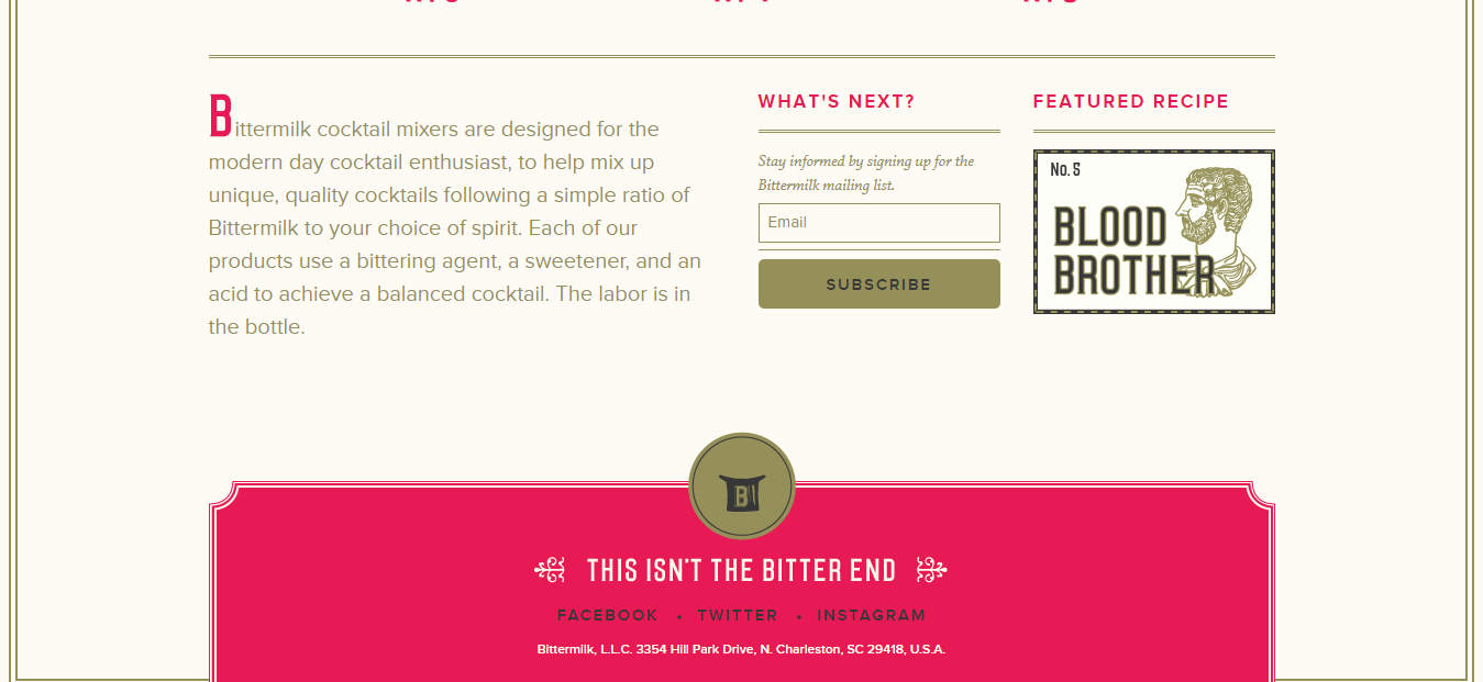
V2BAMaTgsHy9OqZrPiPVvbPfD8mI6qEer44nEUYhJ Q1F79wMBSYRef1ZnMyO1eBy6ic8gs2048


24. Add an address

For the same reason that you include a phone number, also include an office or store address. A physical premises is always comforting for any online shopper.

This is an example from the BitterMilk store, with the full company address featured along the very bottom of the footer:

HzksadKzL13W coOZHDbB7sl8X5 fPrkkZmoP27U3R5bTNtlklvbt8esLhr06WdGBkQ2lws2048


25. Link to your return policy

Another excellent way to use the space in the footer of your store is to help remove the anxiety associated with buying products online – which is real and still exists, despite the rise of ecommerce.

You can provide a link to your return and/or refund policy, which will help set people’s minds at rest that they have a fall-back if something goes wrong:

aVAeoxkIdZkqqzv85LoWI2Hl1G4AN9v1Cymmndef4 cxBBHyG1f1csupQPm387YwS KJZQs2048


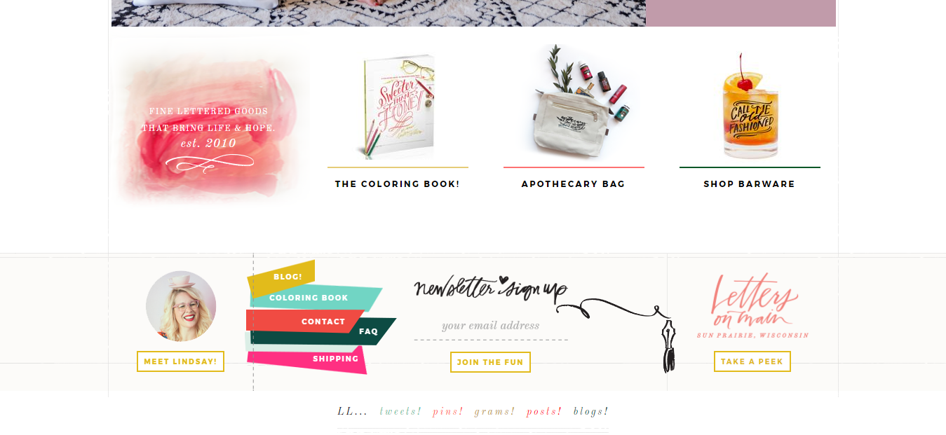
26. Include key information pages

Also, use your footer space to list your key information pages. While the sales and product pages must be prominent on your pages, it’s important to provide newcomers with the information they need to reach a buying decision.This should include links to FAQs and other resources where they can discover more information.

Here’s how the Lindsay Letters store displays the FAQs in the footer:

VCGWGvoVfzOIsmbxOjA vkRuU7j21eKD 4uKy5d1njWqhga6m DW4cW98bzg2z0IZmw4Qws2048


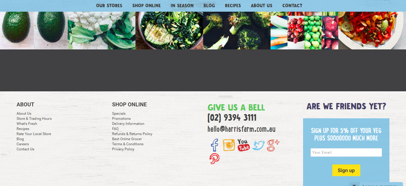
27. Incentivize visitors to join your email list

Another excellent use of the footer is to ask your visitors to sign up to your email list. They will need an incentive – either a newsletter, some other free content, or a special offer.

By improving the visitor to lead conversion rate you will develop a large email list of prospects at the top of your sales funnel to whom you can market to.

This is how the Beardbrand store does  it – notice how prominent they make the call to action:

3BGFCvqCOxrH7M0cC0xeSHFcqstWZg H93AYkIHHoeUDofAtIraqvHpTkuSFYoOsydOdNQs2048

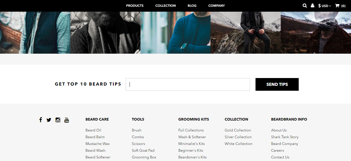
And look at how this one from Harris Farms in Australia ties four of the key things mentioned above together in their footer:

RuSh jNsxs1jYdi065dsd7ce RO32tOSMdABy OuTkkY 4ARFGpoi0dguDtxG 0vMo6oHws2048


Shopping cart page ecommerce website examples

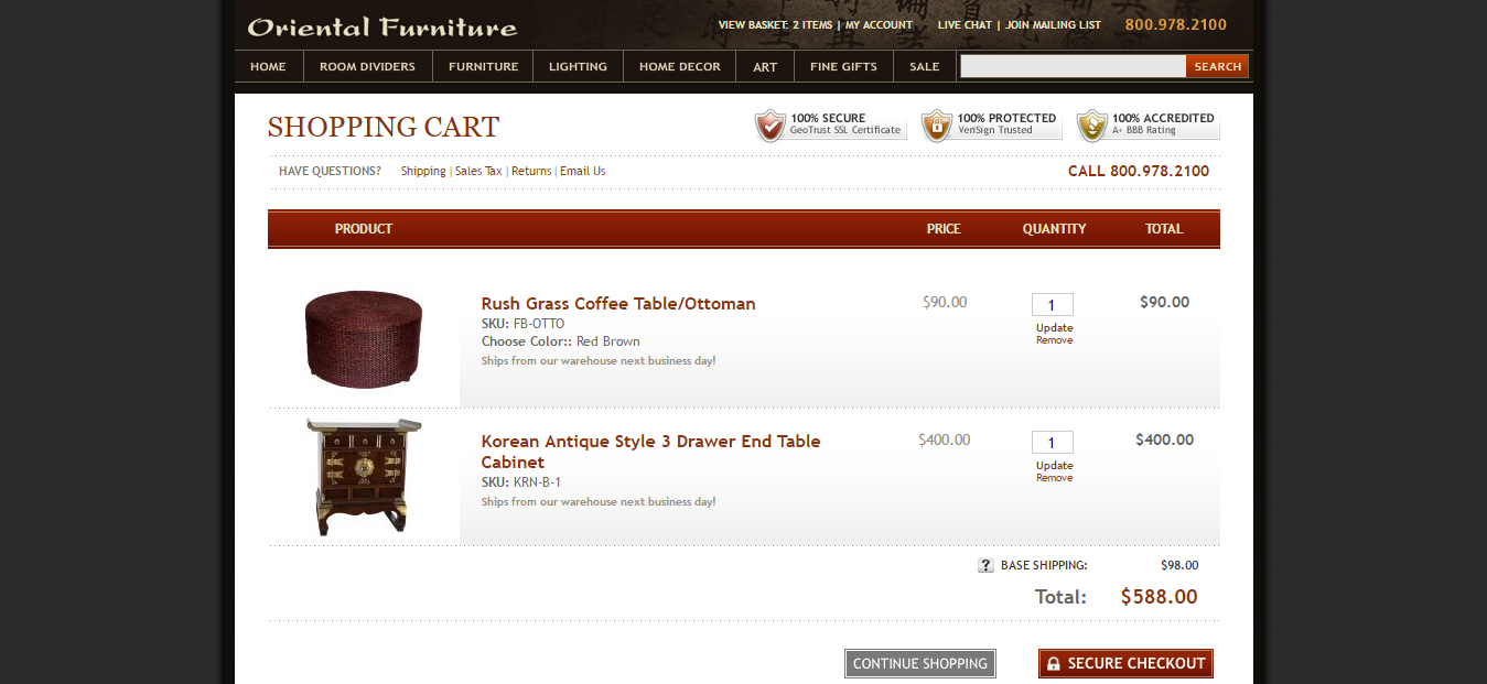
28. Include trust seals

The shopping cart is where you’re finally asking shoppers to part with their money. They need to feel absolutely comfortable with doing so, or they will abandon their cart.

By including trust seals like Norton Secured by Verisign or McAfee Secure you’re saying ‘it’s safe to spend your money with us; we are secure and verified’. This imparts a warm, fuzzy feeling to shoppers, who are more likely to take the final step.

Check out the 3 trust seals in the top right of the Oriental Furniture shopping cart page

bKp1R Ysr01F4Y v3 oBdTnspi1E94r8YvDGYlLot z8ikHpDioeDe38zOTz4WRM2Bg7Qs2048


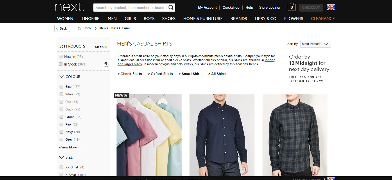
29. Show estimated delivery date  

We live in a world where people don’t like to be kept waiting, so inform buyers about when they can expect to receive their purchase. This will not only reduce frustration but also buyer ‘anxiety’ and cart abandonment because the number one concern of shoppers online is that they’ll be scammed and won’t receive their goods.

The Next store even takes this a step further and says ‘order by midnight for next day delivery’, using the speed of delivery as an excellent selling point. This is from the product pages onwards.

T52Ai YoMi1lJAoNEoZd1hpwG1I95jmbJ44KEndDNA5Hfqwxl3yXQMh96WsgIOQ9xCew5ws2048


30. Free shipping or upfront shipping costs

Make sure there are no surprises for your customers. One of the key reasons that shoppers abandon shopping carts is because of unexpected or hidden costs – and chief among these is shipping. Why not make shipping free and build it into the price? Half of online stores now do this. If that’s not possible, at least ensure your customers are aware upfront of the costs.

Don’t believe it? When Amazon implemented free shipping, sales increased everywhere except France, where they charged 20 cents for shipping.

Zappos actually includes the FREE shipping information prominently from the product pages, as you can see here:

x9 7cj1czeO3MSHiHjg tOQfKOdfu4UJNIY9gzfqKKm0Rofa5KmCyJ v3WVvswYRU1FPws2048


31. Use personalization to improve checkout conversions

Personalization is the name of the game with ecommerce. The more personal the user experience, the better the conversion rate, in general. You can start this personalization at the shopping cart to improve checkout conversions.

A study by MyBuy found that 40% of consumers buy more from stores using personalization. This is the type of personalized message you get on the Very.co.uk store:

z9iyQZTP8PSwMUL3ES tKm4lJHKQh U9vzjRufvo7Usmp1u kspeJ73A38jUkozfjvEZkws2048


32. Add coupon checkbox to cart page

You should be using promotional coupons as part of your marketing strategy. Include a coupon checkbox on the shopping cart page so that the customer knows they will be receiving their discount from the moment they land there. Don’t wait until checkout to let let them know this information. If they feel that the discount is not applicable to them, they may abandon the cart.


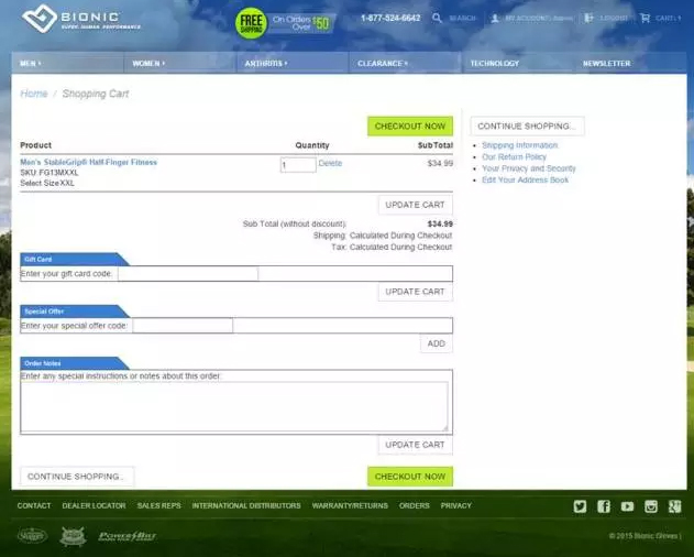
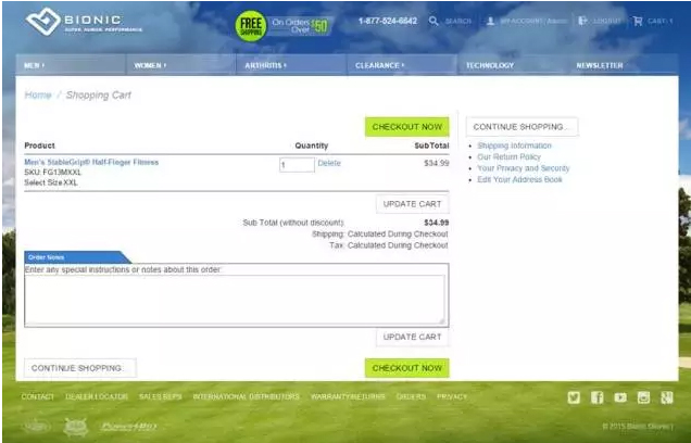
33. Hide coupon field – change to checkbox

An important tweak for many stores is to hide the coupon code field on shopping cart pages so that the customer is not automatically searching for coupons as soon as they land on the page. This would mean that they leave checkout – which will obviously have a harmful effect on conversions. You need to keep the shoppers on the checkout pages in order to complete the sale.

This is the wrong way to do it:

WJ9My L8BZ0b9LanFINnQqAu3Lo65L pPiPNPdx3CTRXxHtGvXrjfi Npl0n8umHeit6fws2048

And this is a much better way:

TpHA3wFyrON4Isna xH3VBNerj5ulQQQnSHUsX WhnSzRFAsv95fCfDPLsCriFv3Q3TmUAs2048


34. Place ‘add to cart’ button above the cart details as well as below

Another important design feature of the shopping cart pages is to allow customers to add to their cart without having to go back to the product pages again. People change their minds and think of something else they need, so placing an ‘Add to Cart’ button above AND below the cart details will make sure it’s nice and visible.


35. Allow guest checkout

Guest checkout is all about managing the user experience as hassle-free as possible. People may want to buy without having to sign up for another account, generate another username, and remember another password. Allow them to buy as a guest, without creating an account to increase conversions.

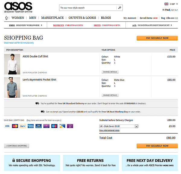
A great example of this is when ASOS removed the mention of creating an account from their cart page, it reduced their checkout abandonment rate by 50%!

B1cJ6RWuFJp SVPy o6xq4WGLOmkHwtvEFzS0A5ADzq1g6I7pgkpujCcYjdoHadrDnawcgs2048


36. Add product recommendations using Findify

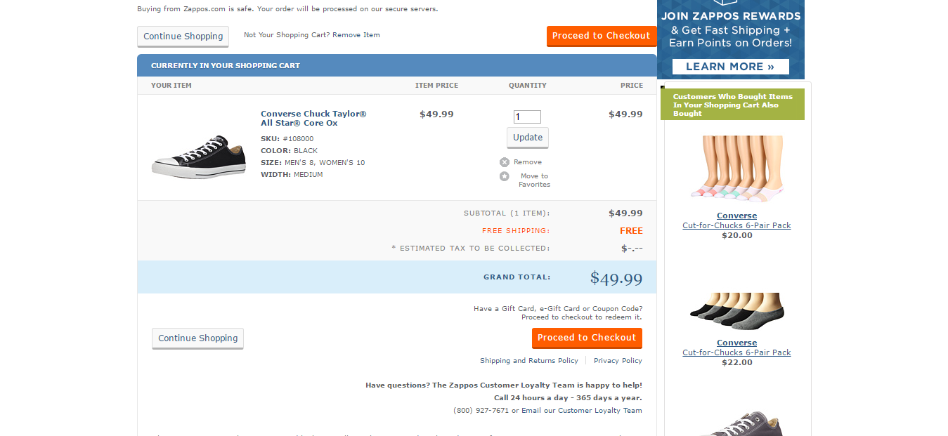
Everyone knows that Amazon started doing it ages ago; you can use your shopping cart pages to upsell to customers, making product recommendations and showcasing complementary products that add to their chosen items. Findify can help you do this.

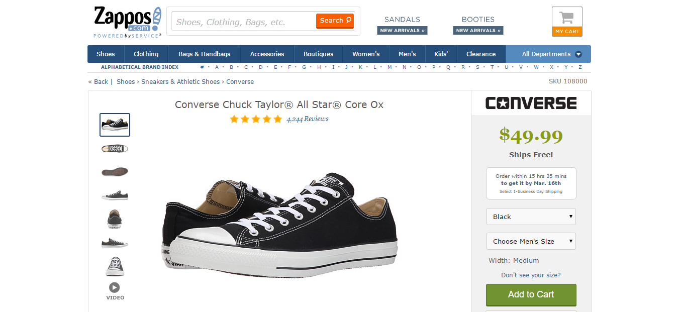
Look at the product recommendations down the right hand side of the Zappos cart page:

pqSx 0yJU68Zvhc58MmDwenIG9GRZTj1CDySEDe1QqT0IQpEWkWUMzKx0hj4 w mscNeVgs2048


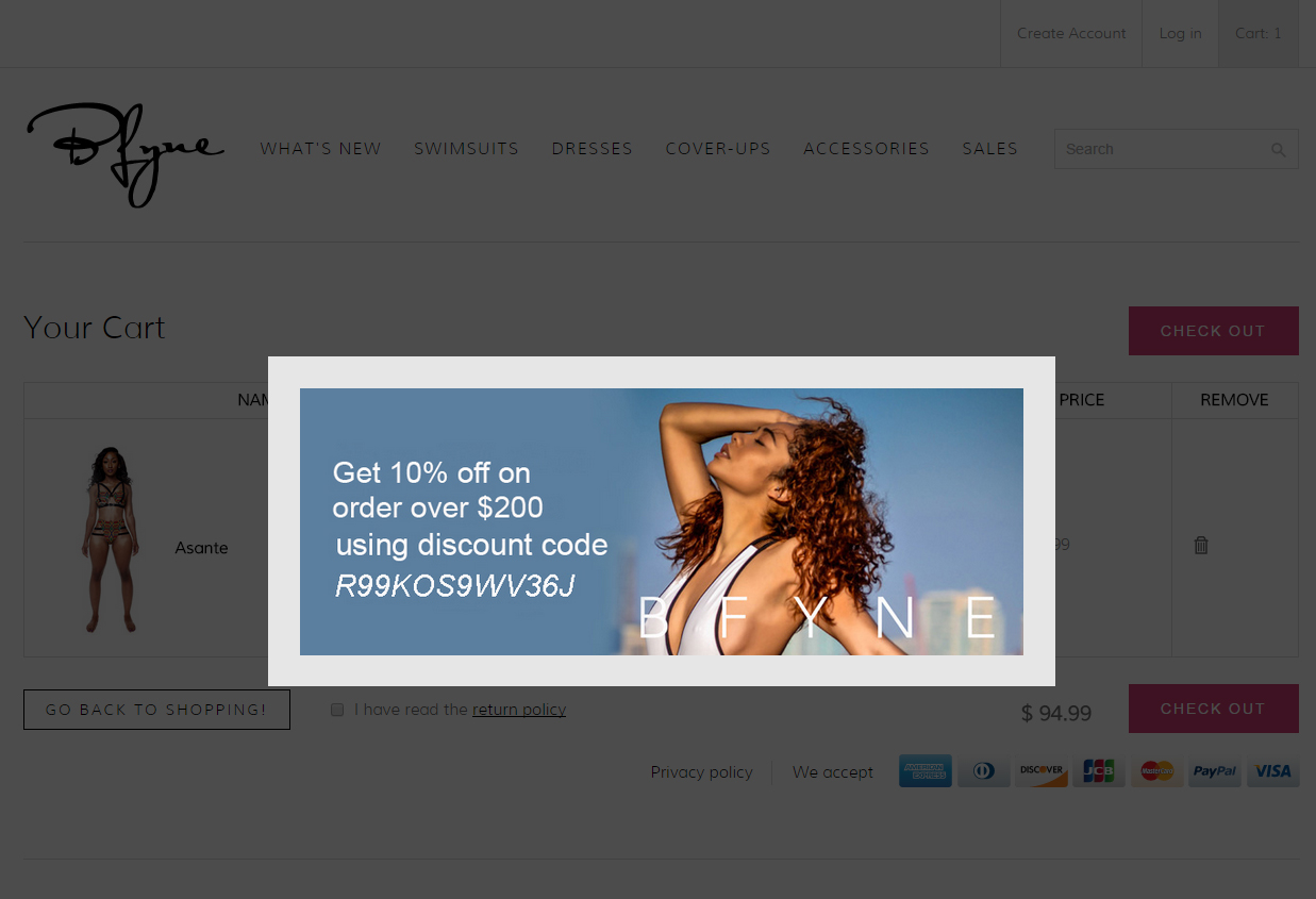
37. Use exit intent popups & discounts to reduce abandonments

In many ways, reducing cart abandonments is the most effective starting point for increasing conversions, Even converting 1 in 10 or 1 in 15 abandonments will significantly increase profits. So when a customer intends to abandon their cart, why not have a popup message to confirm this intent and perhaps offer a discount to first-time buyers if they complete the purchase there and then.

The BFyne store does it this way:

hQF2hhhvAHTSMGSR1 9V nJQ DA7VgoXM5BgQjmnbAu2yhcmVQogZIxsUZkbfBQgoCDGuws2048


Ecommerce Website Examples

There you have it. A whole swathe of ecommerce website examples and best practice ideas from other, successful ecommerce businesses that have largely copied what works from others.

Why not do the same? Take the ideas in, compare them against what you are doing now, but most importantly, apply them and test them to see what works best. The most successful ecommerce stores are always tweaking for higher conversions.

Don’t expect everything to work for you – but start testing what does work if you want to improve conversion rates.

Categories
Ecommerce UX

Ecommerce Product Images: Best Practices That Help You Sell More

This places extra emphasis on your ecommerce product images. Getting them right doesn’t just affect the appearance of your store; it will affect conversion rates and sales, and it also influences the amount of organic traffic you receive.

So how do you present your products in the best light to maximize sales? Below are some guidelines to creating images that look great and will appeal to the target audience on your ecommerce store.

These are ecommerce product image best practices that will show you how to:

  • Plan your images and the importance of sizing
  • Shoot your own images with professional lighting techniques
  • Use post-production techniques to get the most out of your images
  • Understand the different requirements for category and product pages
  • Use tools to make life easier
  • Optimize your images for SEO

So let’s get straight into all that…

Planning your images

Before we get into actually shooting your product images, you need to plan. But how can you do this until you know what’s needed with your images and where exactly they’re going to go?

Well, you can’t really. But you can start considering how your final images will create the most impact on your store. This will be explained in full in the rest of the article. It’s enough here to point out that you should have a clear idea on the following aspects of your images before you set out:

  • What is the best size for ecommerce product images
  • What’s the ideal file size to maintain good page load times?
  • What file types are best to use?
  • Which images are you going to provide for thumbnails?
  • What type of images do you need to optimize category pages and individual product pages?

image06 1

I’ll get into this in more detail later in the section on optimizing images, but for now get clear on the types of details you need to consider. You are probably aware that it’s not simply a case of picking up the camera and shooting, but you may be surprised how a lack of attention to the planning stage with images leaves you with a poor user experience later.

Creating your raw images

It will help greatly if you are able to shoot the ‘raw’ images in a way that presents each product in enough detail, in its best light, AND minimises the amount of post-production work necessary.

It takes time (and money) to fix up images later, so shooting them as close as possible to the desired end state makes sense.

If you are an amateur producing your own images, start with three important elements: choosing the right camera, getting the lighting right, and shooting in high enough resolution.

Camera and image quality

As this product photography guide points out, DSLR cameras will nearly always take better images than smartphone cameras – but there is no mistaking that the best smartphones are closing the gap.

image00 1

The important thing is to understand what your camera can and can’t do. You can compensate for most shortcomings in a good smartphone camera by setting your camera and photography session up correctly.

If you have a DSLR camera you’ve probably spent a bit of money on it, so make sure you get to know the basics about aperture, shutter speed, and ISO. Getting these elements right will give you the best chance of shooting near-perfect product images with the correct brightness, depth of field, and focus. Most product photography requires a slow shutter speed with a small aperture. Never use a flash!

With a smartphone, set your camera up free of filters, frames, zooms, and flash, as effects can be added later, if necessary. The beauty of these cameras is that practically anyone can take a decent shot, given the right setup, because you can just activate the auto focus feature by tapping the viewer before taking the shot. Most decent smartphone cameras can produce sharp, well-defined, high-quality product images.

Lighting and consistency

You may have guessed from the above that lighting is always critical. The most important elements of lighting to focus on are:

  • Is there enough natural light?
  • Is it consistent across your product images?

The first element can be solved by setting up your product-shooting session to the side of a window (the light should not face the camera or be behind it). It’s best to avoid using artificial lighting unless you are an experienced photographer and know what you’re doing; and generally keep away from outside shots, as powerful sunlight may make consistency more difficult.

This brings us to the second element. Keep your lighting consistent across your products. Your customers will be expecting a consistent appearance for your products so that they can compare like for like, side by side. It’s easier to arrange this while shooting the raw image than fixing it up later in post-production. Be aware that the strength of natural light can change in a room very quickly – so don’t delay too long in taking your pictures.

Show detail and the full product range

The Shopify blog has some great tips on shooting high-quality images and especially on this topic.

Making sure that your images carry enough detail means shooting in high enough resolution to be able to show close ups of your product. Especially with items like clothing and jewellery, people expect to be able to see it up close, so you will need to provide the option of zooming in on the details.

image11

People expect to see images of everything that’s mentioned in a tag line or key product feature. If there are three diamonds on that ring, make sure that your customers can see all three diamonds from as many different angles as possible. Show the back of the shoe as well as the front…

image03

Additionally, don’t leave too much up to  people’s imagination. Shoot a range of colors and sizes with your products – people may have trouble visualizing their particular size or color: your images are a good way of showing them exactly what they can expect.

image04

I’ll finish this section with a few other quick technical tips below that will help you achieve the right quality and consistency in your store’s product images:

  • Use the same plain white background for all products – no distractions!
  • Steady your camera with a tripod or smartphone mount to ensure sharpness of image
  • Use a reflector to avoid shadows on your product

The above will help ensure that you shoot raw images that are sharp and attractive enough to sell the product benefits – which is, after all, what you are looking to achieve. But that’s only the first part of the work. Next, they need to be edited…

Post-production image tips

Nobody is going to shoot website-ready images all the time –  even the professionals. But, with the array of post-production tools now available to image editors, there is less of a need to.

Much can be done after the event and you can use these tools to adjust your work and create the best user experience in your store.

There are several notable areas to pay attention to here.

Consistency, consistency, consistency

Again, the most important thing is to maintain quality and consistency. Maintaining high quality is a given, but you are also looking for consistency of size, look, feel, format, page loading – pretty much everything. It looks more professional and will add an edge to your store that can set it apart from others.

Consistency and impact can be achieved through many of the editing tools I mention below.

Photoshop ‘actions’

Much of your image editing will be done using Adobe Photoshop, as this is still the industry standard program for post-production. There are many inbuilt tools you can use to apply automated ‘actions’ that rapidly bring consistency to your images. You can apply a specific set of filters to images, such as curves, colour-grading etc. Simply drop all images onto a particular action and lessen the amount of post-production work needed to achieve consistency.

Adding shadows

Simple touches to existing photos can add a professional edge to the product images on your site. Adding shadow is a great example of an effect that is easy to add in Photoshop and which subtly elevates the appearance of your products.

Note that I am talking about shadows created by a product on its white background – which adds depth to the product – NOT about shadows on the products themselves, which are often a nuisance and obscure detail. You can find more about this subject here but, meanwhile, see what adding shadows does for this pair of red shoes…

image01 1

Photoshop Lightroom

One of Adobe’s best tools is Lightroom, which can be used to touch up image lighting. It uses templates to help you maintain that all-important consistency, and the tool can also help you to touch up colors and add vibrancy to dull-looking images.

Remove unwanted backgrounds with Pixc

A great tool for removing unwanted backgrounds is Pixc. You can edit the image yourself or send it to them to do. This can help you achieve the perfect white background that will make your images stand out. Remember that unwanted distractions may reduce the impact of your images and other colors may clash with your product colors. The tool also allows you to crop and resize all your images so the products area sized correctly and sit in a uniform line. Play safe with white and your professional, clean-looking images will help you sell.

image08 1

Outsource repetitive tasks

Many of the post-production tasks for getting your images into shape are repetitive and time-consuming. There are talented contractors out there who can probably do it quicker and more effectively than you, so why not outsource these tasks to them, using Upwork or a similar freelancer site.

Make sure that you have your Standard Operating Procedures (SOPs) clearly outlined and you prepare detailed briefs so that your contractors have clear guidelines of what’s expected.

Optimizing your images

As you are editing, consider the basic optimization requirements of your images. There are some differences between optimizing images for category pages and for single product pages. These are detailed in the next section with specific examples, but for now, consider some general factors below:

How big should your images be?

If you are using Photoshop, develop a product image template by creating a blank file and resizing it to the required dimensions. This will help you maintain consistent image sizes. There is more about the need for this below but a good starting point for a template size to use across your store is between 1200px and 1600px on its longest side. Remember you want enough detail for customers to be able to zoom.

image07

How can you reduce page load times?

A key consideration here is reducing the file size of images to keep page-load times to a minimum. Nothing ruins a user experience quite like a slow-loading page. In fact, 47% of users expect a webpage to load in under 2 seconds, and 40% will abandon a page that takes more than 3 seconds to load.

So it’s vital that you avoid large file size images, which naturally take longer to load. A general rule would be to AIM for image file sizes below 70 Kb. Fortunately, these days it’s possible to reduce your filesize without a significant loss in image quality by using Photoshop’s ‘Save For Web’ tool, as depicted here:

image02

More information on page load times can be found on my vlog.

What file types should you use?

You will be working with either JPEGs, GIFs, or PNGs. The Shopify blog has an excellent rundown on the major qualities of these three image filetypes.

  • JPEGs – standard internet image files, due to the ease of compressing
  • GIFs – lower quality images often used for icons and simpler images
  • PNGs – often good alternatives to GIFs, supporting more colors, with no degeneration after repeated saving (unlike JPEGs) but tend to be large file sizes.

Generally speaking, JPEGs will be your focus, as they support higher quality at smaller file sizes.

Thumbnail requirements

Most ecommerce stores should employ thumbnails as a quick visual product reference for their customers but beware of their impact on page load times. Make sure they do not hold up pages from loading. If you are using Shopify, then your thumbnails will be automatically optimized, but still try to keep file sizes down.

Use the right names and alt tags

Name your images more descriptively than the messy name that your camera will give to them. It’s much better to name an image 2016-red-polo-short.jpg than DCMIMAGE10656.jpg, for instance.

Alt tags are what customers see when they hover their mouse over a product image, so make it descriptive and accurate. Using your keywords in the alt tag for that product will also help your SEO efforts, as images show up in Google image search. Make sure that you choose different alt tags for your thumbnails and your main images so that your main images are the ones indexed and that appear in the search results. More about SEO below.

image05 1

Optimizing category pages vs. single product pages

Here we need to understand that image requirements on category pages are different to those on individual product pages.

Category pages

The most important element here is, once again, consistency of size. Blue Acorn A/B tested their product category pages and found that the page with consistently sized images converted with 17 percent higher revenue than the page with different-sized images.

Secondly, it’s important to get the number of images per grid right. Here, like with many areas of your ecommerce store, you need to have two approaches – one for desktop and one for mobile.

For desktop, it’s best to have three large images per row, while for mobile there should only be one per row, making sure that its height does not exceed smartphone screen height. Also, for ease of use on a smartphone, include a swipeable carousel of images on the category page, as this will help users scan through the images a lot quicker, without first having to go through to the product page.

image12 1

Product pages

When your customer clicks through to the individual product page, there should be an image of the product taking up around two-thirds of the width of the page on desktops; on mobile, it should take up practically the whole screen.

Here you need larger images, with a zoom feature that allows customers to really see the details of your products down to the bone. You should also provide them with a 360-degree view of the product, so the user will feel like it’s almost there in front of them.

There should be multiple images of the product from multiple angles and make sure that there is an image for every color or product variation you have. As mentioned earlier, don’t expect people to be able to visualize too much.

Another important element of your product pages is contextual images. These are images of your product being used in real life and they are VERY important, especially for items like clothing, jewellery, accessories, or furniture. Show the ring being worn, the scarf being used on a cold winter’s day, or the couch looking beautiful in the apartment. But first, consider who your target market persona is. If, for example, your target market is 30-something white Caucasian females, then create images with these people using the product. The customer will then relate more to the product.

image09 1

Other benefits of a smart product image strategy

There are many advantages of getting your product image strategy right – but there are two benefits I have not really discussed yet.

Firstly, using images in your site search can help sell your products. When customers search for products and you are able to return images as well as text, they are FAR more likely to click through to the product page. You can easily see why here:

image13

The right product images also aid your SEO. I have already covered naming and alt tagging your image in the optimization section, but you can further improve SEO by creating an image sitemap to help the search engines recognise your images. This is especially useful when you have a lot of images on your site. Web crawlers are not able to find images that are not in the source code for the page, so detailing where and what they are is very helpful.

image10 1

Google’s image publication guidelines can be found here. Image sitemaps are an added optimization technique that most sites miss and which can give you the edge over the competition.

Final thoughts about ecommerce product images

Images have the potential to elevate the look and feel of your store and to act as an important sales tool. All the tools you need to make this happen are readily available and I have tried to include the most important tips and techniques above.

The best part is that you can do all (or most of it) yourself. As mentioned, some of it can be time-consuming, but it’s not difficult or expensive to hire talented freelancers if you don’t have the time yourself.

Now you have reached the end of the article it’s time to go back to the start again: planning is the key. You should have all the information you need to plan a product image strategy that sets your store apart from your competitors.