Perfume Photography: Capturing Glass and Light (2026)
Perfume photography looks simple until you put a glass bottle under lights and see every fingerprint, reflection, and label glare at once. For ecommerce store owners, that matters because fragrance buyers cannot smell the product on your site. They rely on imagery to judge quality, finish, scale, and brand positioning. A weak photo can make even a premium scent feel ordinary.
This is where a more controlled approach helps. Whether you shoot in-house, work with a freelancer, or test AI-assisted workflows, the goal is the same: clean, persuasive product images that fit your store, ads, and marketplaces. If you are also exploring beauty visuals more broadly, AcquireConvert's guide to ai makeup generator workflows is a useful next step for visual planning across cosmetics content.
Contents
Why perfume photography is harder than it looks
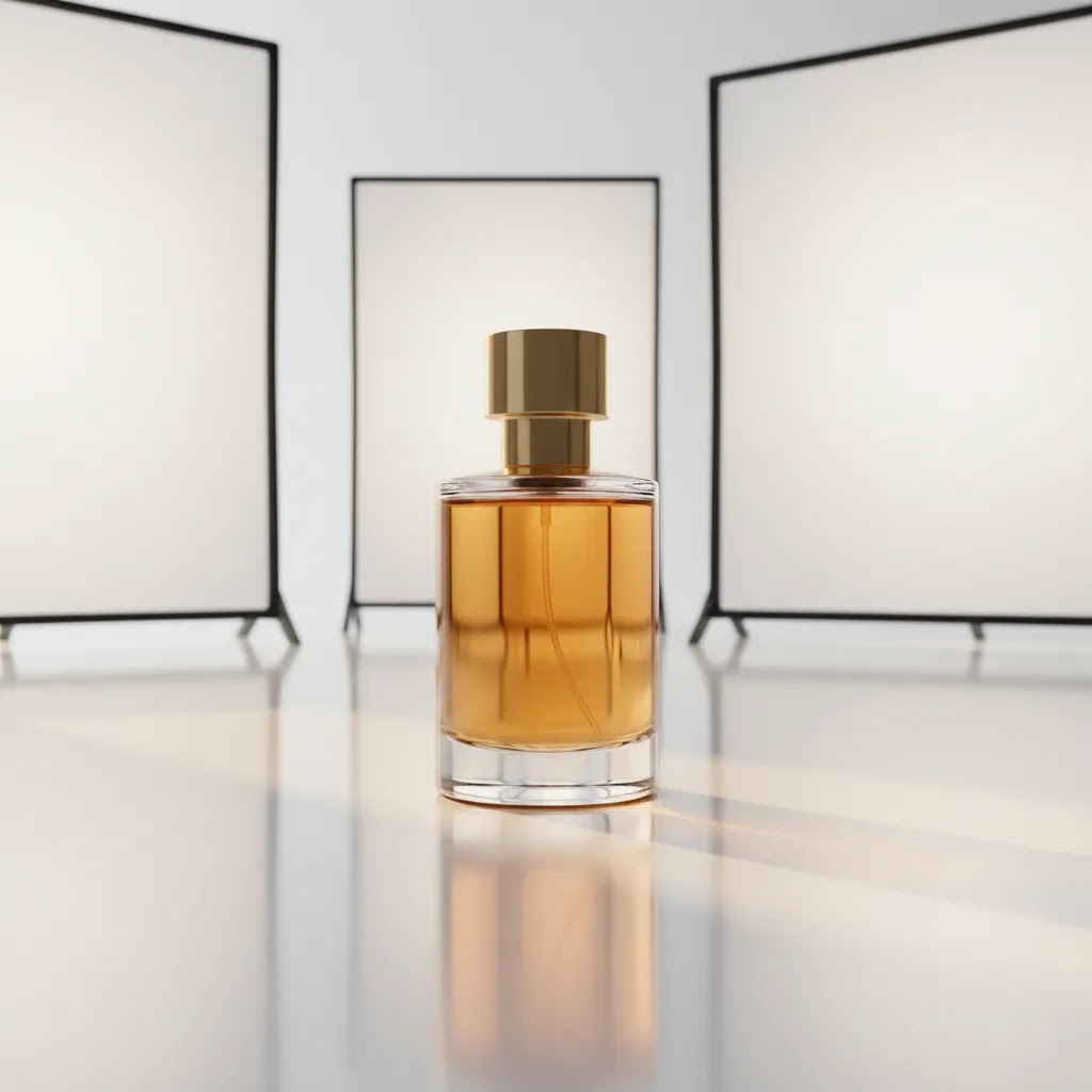
Perfume bottles combine several difficult product photography elements in one object. You have reflective glass, metallic caps, transparent liquid, glossy labels, and often very small branding details. That means lighting mistakes show up fast. Harsh direct light can create blown highlights. Poor diffusion can flatten the bottle. Weak styling can make a luxury fragrance feel generic.
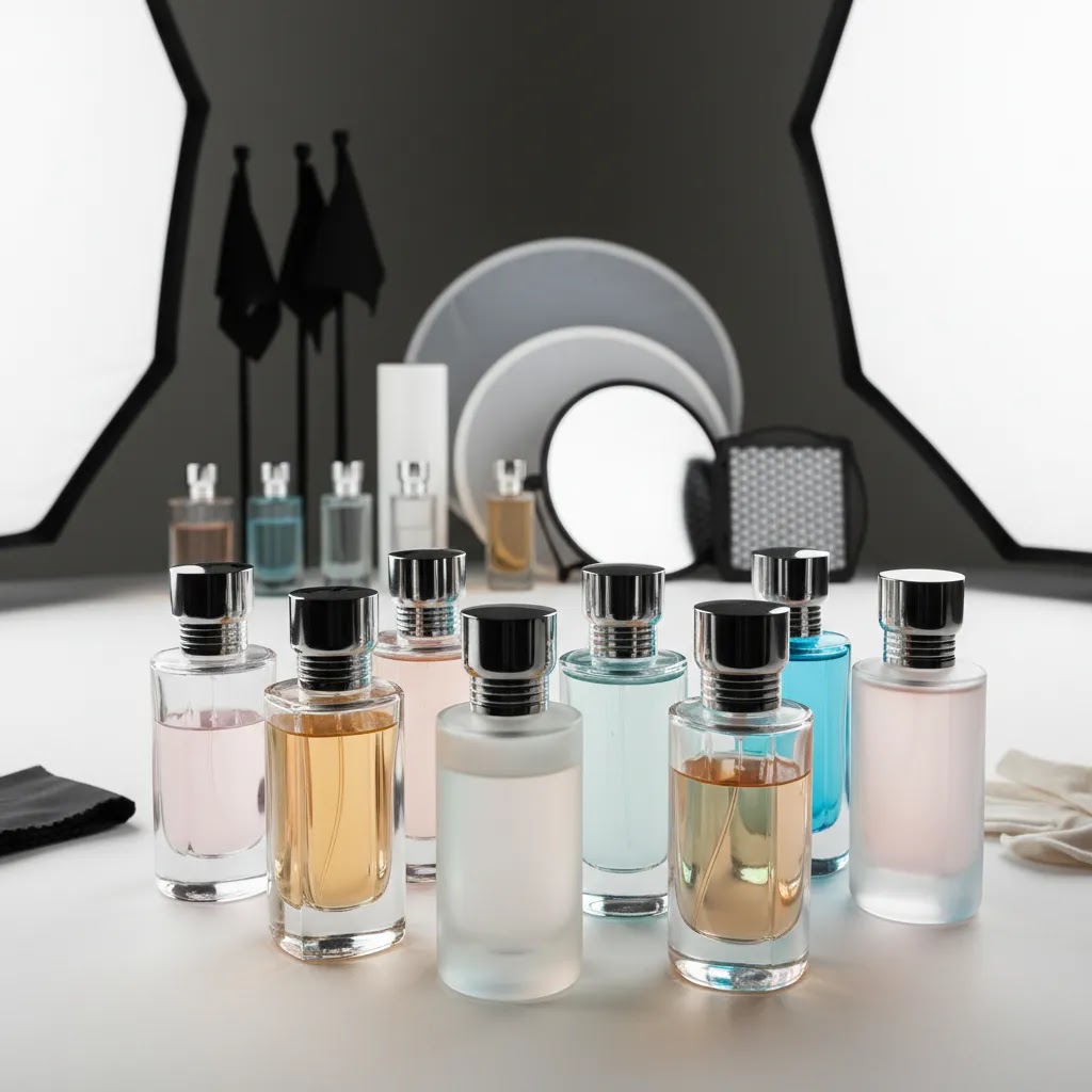
For ecommerce, perfume photography usually needs to serve more than one job. You may need a white background hero image for Shopify collections, marketplace compliance, Google Shopping feeds, or Amazon-style product listings. You may also need editorial images for social ads, homepage banners, and email campaigns. In practice, the best-performing brands often create both.
A good starting point is separating your image needs into two groups: conversion-focused catalog shots and brand-building lifestyle visuals. If your range includes other beauty products, the standards overlap with skincare product photography, especially around reflections, ingredient cues, and premium texture.
For many stores, the challenge is not just taking one nice image. It is creating repeatable images across a collection so the store feels consistent and trustworthy.
What strong perfume photography needs
Controlled lighting is the first requirement. Glass and metallic surfaces need large, diffused light sources so reflections feel intentional rather than messy. Softboxes, scrims, and white bounce cards usually do more for fragrance photography than stronger bulbs alone.
Precise bottle prep matters more than many new store owners expect. Dust, fingerprints, liquid streaks, and crooked labels become obvious in close-up photography pictures. Before every frame, clean the bottle, align the front face, and check the cap position. This saves hours in retouching.
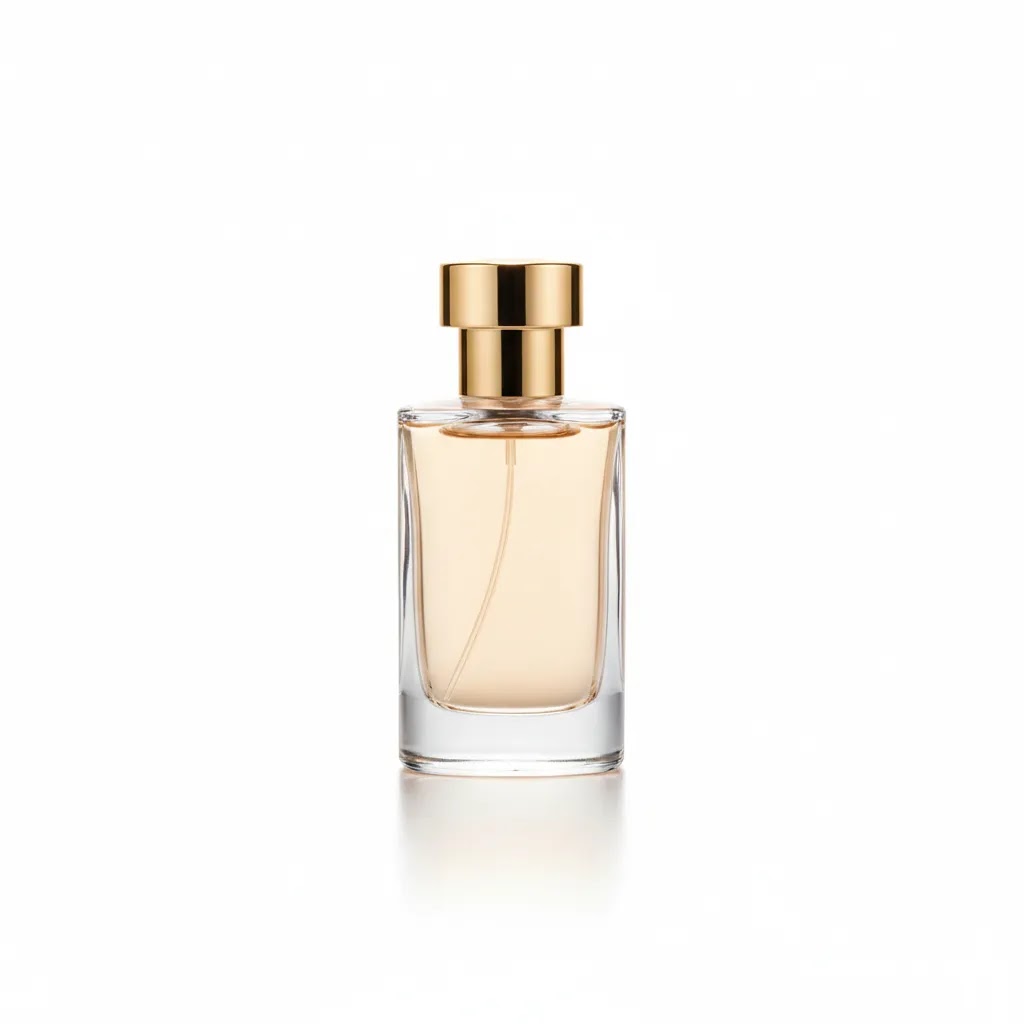
Background choice depends on the selling context. Perfume photography white background images are often needed for marketplaces and collection pages because they keep the bottle shape clear and consistent. Lifestyle backgrounds can work better for brand storytelling, seasonal campaigns, and higher-end landing pages. If you need inspiration for clean catalog output, AcquireConvert's White Background Photography category is a practical place to compare styles.
Reflection management is what separates average from polished fragrance imagery. You want definition on the bottle edges without seeing the room, camera, or hard hotspots. This often means moving the lights farther away, diffusing them more heavily, and shaping light with black cards as well as white cards. Contrast photography can help here, but too much contrast can obscure transparent liquid and label details.
Multiple formats are also important for ecommerce. A single perfume launch may need vertical images for paid social, square crops for product grids, and horizontal banner assets. If you are testing creative quickly, AI editing tools can help extend a shoot rather than replace it. From the live product data available, ProductAI offers several relevant tools such as AI Background Generator, Free White Background Generator, and Background Swap Editor. These can be useful for testing alternate scenes or cleaning up secondary assets, though they still work best when the original source photo is strong.
Composition and styling should support the product story. Flat lay photography cosmetics setups can work for gift sets or campaign visuals, but upright bottle shots are usually stronger for PDP clarity. Props should add context without confusing the shopper about what is actually included.
Perfume photography ideas (at home, lifestyle, and campaign concepts)
Here is the thing, many fragrance founders get stuck because they think their only options are a white background packshot or a fully produced campaign. In practice, you can plan a small set of repeatable “idea buckets” that cover ecommerce needs and still give you scroll-stopping creative for ads and social.
A simple way to plan your shoot is to create 3 to 5 concepts that you can repeat for every SKU, then vary the details (notes, props, palette) per scent. That keeps your Shopify product pages clear, while your brand marketing stays fresh.
Idea bucket 1: Minimal studio, not sterile
This is the bridge between pure catalog and lifestyle. You keep the bottle as the hero, but add one controlled element: a shadow shape, a subtle gradient, a single prop, or a textured surface. This style usually works well for secondary PDP images, collection banners, and ads where you still need immediate product recognition.
From a practical standpoint, this is also the easiest to scale across a whole line because the lighting and camera position can stay the same. You are changing styling, not rebuilding the setup every time.
Idea bucket 2: Mood-led lifestyle that still sells the product
Lifestyle does not have to mean clutter. One strong approach is to show “where the scent lives” with a simple environment cue: a bathroom vanity, a bedside table, a marble tray, a travel bag, a gift moment. The key is that the bottle and label still need to read clearly at a glance, especially on mobile.
For most Shopify stores, lifestyle images tend to work best as supporting images, homepage features, and paid social creative. If you use lifestyle as the hero image on your PDP, make sure you still include a clean, front-facing bottle shot early in the image gallery so shoppers can confirm what they are buying.
Idea bucket 3: Seasonal and gifting campaign concepts
Fragrance is heavily seasonal for many brands, even when the product is evergreen. Think of it this way, you can build a small set of repeatable campaign “frames” and reuse them every year: holiday gifting, Valentine’s, summer travel, wedding season, fall cozy. If you keep the lighting and composition consistent, you can shoot new seasonal assets quickly by swapping a few props and color accents.
What many store owners overlook is that seasonal creative still needs ecommerce clarity. If you add gift wrap, cards, or multiple items in the frame, be explicit in your captions and product page context so customers do not assume those extras come in the box.
Idea bucket 4: Ingredient or note-driven sets
This is one of the most reliable ways to translate scent into something visual. You are giving the viewer “proof” of what the fragrance is about. For citrus, you might use peel texture and bright directional light. For woody notes, warmer tones and matte surfaces can feel more grounded. For floral, softer diffusion and gentle color can fit the mood.
The way this works in practice is keeping props logical and minimal. One hero note is often enough. If you add too many ingredients, the scene can feel like a recipe, not a perfume.
How to translate “scent” into visuals without confusing the product
Scent is invisible, so you are using cues: texture, color palette, light quality, and prop logic. Texture is underrated here. Glossy acrylic can feel modern and sharp. Linen can feel airy and clean. Stone can feel premium and grounded. Light quality matters too. Hard light can feel energetic and editorial. Soft light can feel intimate and calm.
Now, when it comes to ecommerce, keep a hard line between “storytelling cues” and “product truth.” Do not hide the fill level, warp the label, or obscure the atomizer if those details affect buying confidence. Your best creative is the one that makes someone stop scrolling and still helps them understand what is actually for sale.
Pros and Cons
Strengths
Considerations
Who this approach is for
This approach works best for ecommerce brands selling fragrance directly through Shopify, marketplaces, or retail partner catalogs. It is especially relevant if your perfume bottle design is part of the product value, which is true for most premium or giftable fragrance lines.
It also suits beauty brands that need consistency across categories. If you already sell serums, creams, or color cosmetics, your fragrance visuals should not feel disconnected from the rest of the store. Founders managing shoots themselves, small teams without a full studio, and brands comparing DIY versus outsourced production can all use this framework.
Using a model in perfume photography (when it helps, and how to keep it ecommerce-friendly)
Using a model can be worth it for perfume, but only if it supports selling the product, not just creating a nice image. For many Shopify brands, a small set of model assets can add scale, aspiration, and gifting context, especially if your bottle size is hard to judge from packshots alone.
When a model tends to help
A model can be a strong fit when you need to show scale in a premium way, position the fragrance as part of a lifestyle, or make gifting feel more emotional. It is also helpful when you want to show usage without relying on unclear props. Even one well-shot “in-hand” image can reduce uncertainty for first-time buyers.
When it can backfire
The risk is that the model becomes the product. If the bottle is small in frame, out of focus, or turned so the label cannot be read, the image may look like an ad but not work as ecommerce. Another risk is inconsistency. If every launch uses a different model style, lighting, and crop, your product pages can start to feel disconnected across the catalog.
Consider this, if you are submitting images to marketplaces or running shopping ads, you will still need clean product-forward images. Model shots are usually best as secondary images and paid social creative, not your only core assets.
A practical model shot list that still supports conversion
If you want model content that pulls its weight on a Shopify PDP, keep it structured. The goal is a small set you can repeat and rotate across launches without turning every drop into a full-scale campaign.
Consistency and reuse across launches
For most Shopify store owners, the best approach is creating two to three repeatable poses and a consistent crop strategy. Keep wardrobe neutral, keep light direction consistent, and lock in your background palette. That way you can shoot multiple SKUs in one session and still have a cohesive look across product pages, ads, and email assets.
AcquireConvert recommendation
For most store owners, the best move is not choosing between traditional photography and AI. It is building a reliable base image set first, then using AI selectively where it actually saves time. That might mean capturing a clean perfume product photography white background hero image in-camera, then testing alternate backgrounds or campaign scenes later.
AcquireConvert approaches this from a practical ecommerce angle. Giles Thomas brings Shopify Partner and Google Expert experience to the question, which matters if your images need to work not just aesthetically but across product pages, shopping feeds, and ad creative. If your visual workflow spans the full beauty category, see the main Cosmetics Photography hub for related techniques. If you are planning a more formal shoot environment, this guide to choosing a product photography studio will help you decide when outsourcing makes sense.
How to choose the right setup
1. Start with your sales channel requirements.
If your store depends on Shopify collections, Google Shopping, and retail line sheets, prioritize clean front-on packshots first. A perfume photography white background setup is usually the safest foundation because it is versatile and compliant with more placements. Add mood-led campaign imagery after the core catalog images are complete.
2. Match production quality to your price point.
A $25 body mist and a $180 niche fragrance do not need identical art direction. Higher-priced products usually benefit from more refined reflection control, macro detail shots, and richer styling. Your imagery should support the product's perceived value without overspending on unnecessary complexity.
3. Decide what should happen in-camera versus in post.
In-camera accuracy still matters. Clean glass edges, readable labels, and realistic liquid color are easier to trust when captured properly. Post-production is best used for refinement, not rescue. If you plan to test AI support, use it for background extension, alternate crops, or scene exploration. ProductAI's Magic Photo Editor and Creator Studio may help with asset variations, but you will still want reliable original captures.
4. Build a repeatable shot list.
Most fragrance brands need at least: front hero, angled side view, detail shot of cap or atomizer, scale shot, white background image, and one styled image. If you sell coordinated beauty ranges, review your existing pictures of skincare products and align composition choices so your store feels cohesive.
5. Use props carefully.
Flowers, fruit, stone, water, mirrors, and fabric are common in perfume photography. They can reinforce notes and mood, but they can also distract. If a prop makes the shopper wonder what the product actually is, simplify the scene. The bottle should stay dominant.
6. Know when to outsource.
If you keep fighting glare, crooked reflections, or inconsistent crops, a professional setup may be more efficient than repeated DIY attempts. This is especially true for launch collections, retailer submissions, or rebrands where consistency matters across many SKUs.
Backgrounds and surfaces for perfume photography (beyond pure white)
White backgrounds are the ecommerce workhorse, but they are not the only way to make perfume look premium. The reality is, background and surface choices do a lot of heavy lifting in fragrance because they can signal mood and price point before someone reads a word of your copy.
A practical way to approach this is assigning background styles to specific jobs: PDP hero clarity, secondary image variety, and marketing creative for ads and social.
White background (clean and compliant)
This is the safest choice for Shopify collection grids, marketplaces, and shopping feeds because it keeps the bottle silhouette readable. It is also easier to keep consistent across a product line. The main downside is that it can feel generic if you do not control reflections and shadow styling.
Black or dark moody backgrounds (premium, but harder)
Dark backgrounds can make metallic caps and highlights feel more luxurious, but glass edges can disappear quickly, especially with dark liquid or smoked glass. You usually need strong edge definition from controlled reflections, plus careful separation between the bottle and the background. If the label is dark too, test readability early, not after you have shot the whole set.
Gradients (modern and flexible)
Gradients are a strong middle ground for ecommerce because they add depth without adding clutter. They can work well for secondary PDP images and ads, and they are often easier to repeat across SKUs than full lifestyle scenes. Keep your gradient direction consistent so your collection looks intentional, not random.
Mirrored acrylic and reflective surfaces (high-impact, high-risk)
Mirrors and glossy acrylic can look expensive fast, but they also amplify problems: dust, fingerprints, uneven shadows, and unwanted reflections. You may also see your camera and lights if your angles are not controlled. If you use reflective surfaces, prioritize bottle prep, use diffusion, and plan your camera position and crop so you do not create a retouching nightmare.
Stone, concrete, and matte premium textures
Matte surfaces like stone or concrete tend to work well for “quiet luxury” art direction. They can make clear glass feel sharper and reduce reflection noise compared to mirror surfaces. This is a common choice for secondary product images and lifestyle scenes that still need a clean, product-forward look.
Fabric and soft textures (cozy, gifting, and intimacy)
Fabric can communicate softness and comfort, which fits certain scent profiles and seasonal stories. The risk is wrinkles, lint, and uneven color casts that can make a premium bottle look messy. If you use fabric, keep it simple and controlled, and watch the edges of your label for color contamination.
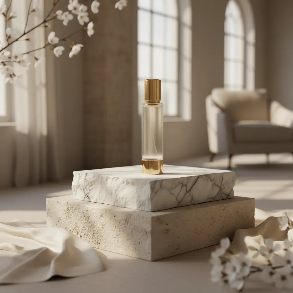
In-environment lifestyle (most emotional, least controlled)
Lifestyle scenes can work well for ads, email headers, and brand storytelling on your homepage. For ecommerce, the risk is losing product clarity. If you shoot in environment, build the scene around the bottle, not around the room. Keep the bottle label readable and avoid backgrounds that create reflections you cannot control.
How to keep background choices consistent across a product line
If you want your Shopify store to feel cohesive, consistency beats variety. Pick a small background system you can repeat, for example: one white background look for the hero, one gradient look for secondary images, and one lifestyle “set” you can reuse across launches. Photographing one SKU in bright airy light and the next in dark moody light can look cool on social, but it often makes a collection page feel disjointed.
Think of it this way, you are building a visual template. Once you have it, you can swap surface color, props, and notes per fragrance while keeping the overall structure recognizable.
Frequently Asked Questions
What is the best background for perfume photography?
For ecommerce, white is usually the most practical starting point because it keeps the bottle shape clear and works across product pages, feeds, and marketplaces. Styled backgrounds can add brand character, but they are usually best used as secondary assets rather than your only product images.
Why is perfume photography so difficult?
Perfume bottles combine transparent glass, reflective surfaces, shiny caps, and small labels. Each one reacts differently to light. That makes glare, distortion, dust, and unwanted reflections more visible than they are with many other product categories, including some makeup cosmetics photography setups.
Can I shoot perfume photography at home?
Yes, many founders can create usable results at home if they control light carefully. A small table, white and black foam boards, diffused lighting, and a tripod can go a long way. The challenge is maintaining consistency across multiple SKUs, especially for premium-looking imagery.
What lighting works best for glass perfume bottles?
Large diffused light sources usually work best because they create softer reflections and more even bottle definition. Instead of pointing a bare light directly at the bottle, try bouncing or diffusing the light first. Small lighting changes often produce noticeable improvements with glass products.
Should perfume product photography use flat lay images?
Flat lay photography cosmetics scenes can work for campaigns, gift sets, or editorial storytelling. For primary product images, upright front-facing shots are often more effective because they show the bottle structure and label clearly. Use flat lays as supporting creative, not your only format.
Is AI useful for perfume photography?
It can be useful in a limited, practical way. AI is often most helpful for background generation, scene variation, and cleanup tasks after you have a solid source image. It is less reliable if you are trying to fix major lighting problems, warped reflections, or unclear product details from a weak original photo.
How many perfume images should a product page have?
In many cases, five to seven images is a sensible range. Include at least one clean hero image, one alternate angle, one close-up detail, one scale or in-hand reference if relevant, and one styled lifestyle shot. The exact mix depends on bottle design and price point.
Do I need a professional studio for perfume photography?
Not always. If your assortment is small and your standards are moderate, DIY can work. If you sell premium fragrances, need retailer-grade consistency, or are launching many products at once, a studio may be the more efficient and reliable choice over time.
What should I avoid in perfume photography?
Avoid cluttered props, harsh direct flash, dusty bottles, and reflections that hide the label or bottle silhouette. Also avoid styling that looks attractive but unclear from a shopping perspective. The image should still help the customer understand exactly what they are buying.
How do you photograph perfume bottles with mirrors or reflective surfaces without showing the camera?
The most reliable approach is controlling angles and what the bottle can “see.” Move your camera slightly off-axis, then use diffusion (like a scrim) so the reflections the bottle picks up are soft and clean rather than showing the room. You can also use black foam boards as flags to shape edges and hide unwanted room reflections.
In practice, the camera often shows up when the reflective surface is perfectly flat and aimed back at you. Changing the surface angle slightly, raising the bottle a bit, or adjusting your shooting height can reduce that. Plan extra time for reflective setups because tiny changes in position usually matter.
What camera settings are best for perfume product photography (aperture, shutter speed, ISO)?
It depends on your lens and how much of the bottle needs to be tack sharp, but a common starting point is a mid-range aperture (often around f/8 to f/11) for product clarity, a low ISO (like 100 to 200) to keep the label clean, and a shutter speed that matches your lighting.
If you are on a tripod, you can use a slower shutter speed to keep ISO low, as long as nothing moves. If you are handholding, raise shutter speed to avoid blur, then compensate with more light. The goal is a sharp label, clean glass edges, and realistic color, not a specific “magic” setting.
How do you edit perfume photos to remove glare, dust, and fingerprints without making the label look fake?
Start by fixing the source image as much as possible, then retouch lightly. Remove dust and fingerprints with spot healing and careful cloning, but avoid over-smoothing label texture and fine print. If you reduce highlights too aggressively, the bottle can look flat and the label can start to look pasted on.
A good check is to zoom out to the size most shoppers will see on mobile. If the label still looks natural and readable, and the glass still has believable highlights, you are usually in a good place. If AI tools are part of your workflow, review outputs closely before publishing because label edges and small text are where artifacts tend to show up.
What are some perfume photography ideas for Instagram or Pinterest-style content that still works for ecommerce?
Use concepts that look editorial but keep the product clear: note-driven props (one hero ingredient), seasonal setups (gifting, travel, cozy), or minimal studio scenes with a gradient and controlled shadow. These styles can be cropped for social while still supporting a Shopify PDP as secondary images.
The practical rule is simple: even if the image is made for social, keep at least one version where the bottle and label are readable. That way your best-performing creative can be reused across ads, landing pages, and email without re-shooting.
Key Takeaways
Conclusion
Perfume photography is really about control. The better you control light, reflections, background, and bottle prep, the more premium and trustworthy your product pages can feel. For ecommerce brands, that usually means getting the core catalog shots right first, then expanding into lifestyle and AI-assisted creative once the basics are solid.
AcquireConvert focuses on this practical middle ground. You do not need theory that looks good on Pinterest but fails on a product page. You need images that support merchandising, acquisition, and conversion. For more beauty-focused guidance, explore AcquireConvert's cosmetics photography resources and related Shopify-friendly visual content strategies shaped by Giles Thomas's practitioner experience.
This article is editorial content for educational purposes and is not a paid endorsement unless explicitly stated otherwise. Tool availability and product features may change over time, so verify current details directly with the provider. Any pricing, where available, is subject to change. Results from photography, AI editing, or ecommerce optimization will vary by store, product category, and implementation quality.

Hi, I'm Giles Thomas.
Founder of AcquireConvert, the place where ecommerce entrepreneurs & marketers go to learn growth. I'm also the founder of Shopify agency Whole Design Studios.