Pictures of Skincare Products: 2026 Guide
If you sell serums, moisturizers, oils, or cleansers online, your images do a lot of the selling before a shopper reads a single word. Strong pictures of skincare products can help communicate texture, quality, ingredients, and brand positioning fast. Poor lighting, messy reflections, or inconsistent styling usually do the opposite. This guide is built for ecommerce store owners who want better product images without turning every shoot into a full agency production. You will learn how to plan skincare products photography, choose the right light for taking pictures of products, style scenes that feel premium, and edit images so they stay accurate to the item you ship. If you want more category-specific inspiration, AcquireConvert’s ai makeup generator resource is also useful for evaluating beauty visual workflows.
Contents
Why skincare product photos matter
Skincare is one of the most visual categories in ecommerce. Shoppers look for clues about trust, texture, cleanliness, formulation, and brand fit. A clinical white-background image may work well for Amazon-style catalog needs, while a softer lifestyle image can support premium direct-to-consumer positioning.
Most stores need both. Your core product page should usually include clean packshots, close-ups of labels, texture shots, and at least one contextual image showing the product in use or in a styled setting. That mix helps answer the questions customers ask before buying: What size is it? What does the cream look like? Is the packaging matte, glossy, frosted, or transparent? Does the brand feel luxurious, clinical, natural, or playful?
For Shopify merchants, this matters beyond aesthetics. Better products pictures may improve on-page clarity, reduce uncertainty, and support conversion if they match the product description and offer. They can also improve the consistency of your collection pages, ads, email campaigns, and landing pages.
If you are building a broader image system, AcquireConvert’s skincare product photography guide is a helpful next read.
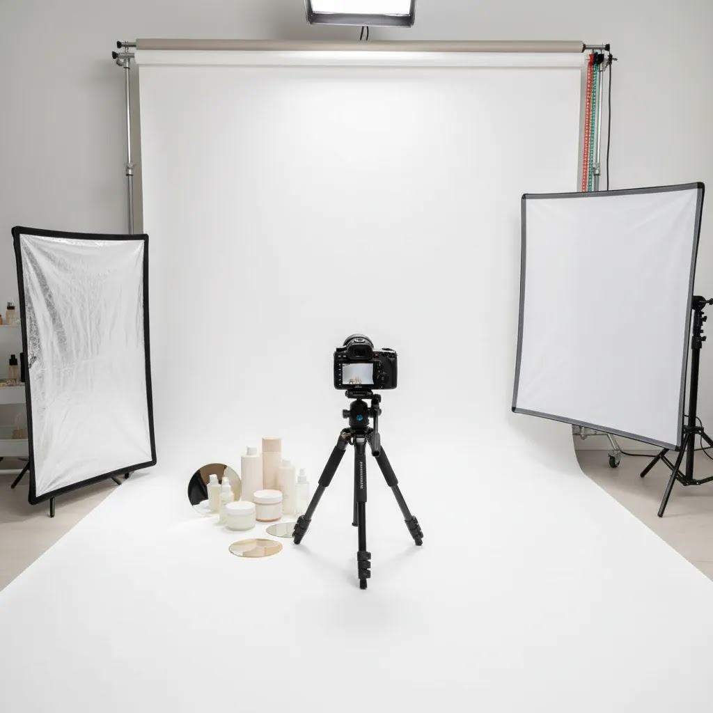
How to set up a skincare product shoot
You do not need a large studio to start taking pictures of products well. You do need repeatability. That means choosing a space, a surface, a lighting setup, and a shot list you can use again when new SKUs arrive.
A practical skincare workflow usually includes:
Before shooting, wipe every bottle and jar carefully. Skincare packaging shows fingerprints, dust, dried product, and tiny scratches very clearly. Transparent packaging is especially unforgiving. If you are shooting glossy containers, adjust the product angle before changing the light. Small rotations often fix reflections faster than moving everything else.
For stores balancing in-house content with occasional outsourced work, it helps to think in systems. A repeatable setup can cover routine launches, while a specialized product photography studio may still make sense for major campaigns or hero images.
Lighting that flatters bottles, jars, and tubes
Light for taking pictures of products matters more than the camera in most skincare shoots. If your lighting is soft and controlled, even a recent smartphone can produce strong ecommerce images. If your lighting is harsh or inconsistent, an expensive camera will not save the shot.
For skincare, soft side lighting often works best because it reveals shape while keeping labels readable. Front lighting can flatten the product. Strong overhead lighting may create distracting shine on caps and jars. Start with one main light source, then use white cards to bounce light back into darker areas.
Window light works well when:
Artificial light works well when:
One common mistake in taking pictures of products to sell online is mixing light temperatures. If window light is cool and your room bulbs are warm, whites can shift and packaging colors may look wrong. That creates extra editing work and can make a product page feel inconsistent. For a deeper look at setup options, see AcquireConvert’s Product Photo Lighting category page.
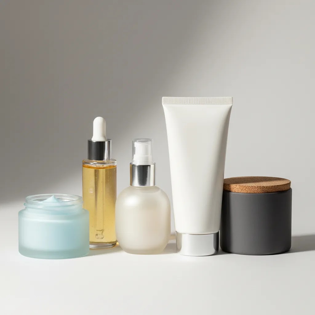
Skincare shooting problems: reflections, transparency, and accuracy
Here is the thing: skincare packaging is designed to look good on a shelf, not under lights at close range. Glossy jars, metallic caps, and clear droppers can look premium in person, then turn into a reflection mess on camera.
How to control reflections on glossy jars and metallic caps
If you can see a bright rectangle or a hard white stripe on the product, that is usually your light source reflecting back. The fastest fix is often diffusion and angle, not more editing.
From a practical standpoint, you are trying to decide where you want the highlight to live. A controlled highlight that outlines the bottle can look premium. A highlight that runs through your brand name usually looks like a mistake.
Shooting clear bottles and droppers without losing the label
Clear packaging is unforgiving because it shows everything: the background, your light, and sometimes the liquid level inside the bottle. If your label looks muddy or low-contrast, it is often because the product is blending into the background.
Keeping “clinical” images accurate (white balance, color, and finish)
Many store owners overlook this: skincare shoppers often care about clinical cues and accuracy. If your packaging is “cool white” and your photo turns it creamy yellow, the whole product page can feel off. The same goes for pastel packaging that shifts hue under mixed lighting.
Set a consistent white balance and stick to it across the shoot. If you shoot on a phone, avoid using multiple auto modes across different products. If you shoot on a camera, pick a white balance setting that matches your lights and keep it fixed for the catalog session.
If you use AI tools for cleanup, be careful about anything that changes the reality of the product finish. Over-smoothing can make matte look glossy. Aggressive background generation can shift edges and label shapes. AI can be a time-saver, but you still need human review before publishing to a live store.
Quick troubleshooting checklist
If your image looks “almost right” but still not store-ready, these are common culprits:
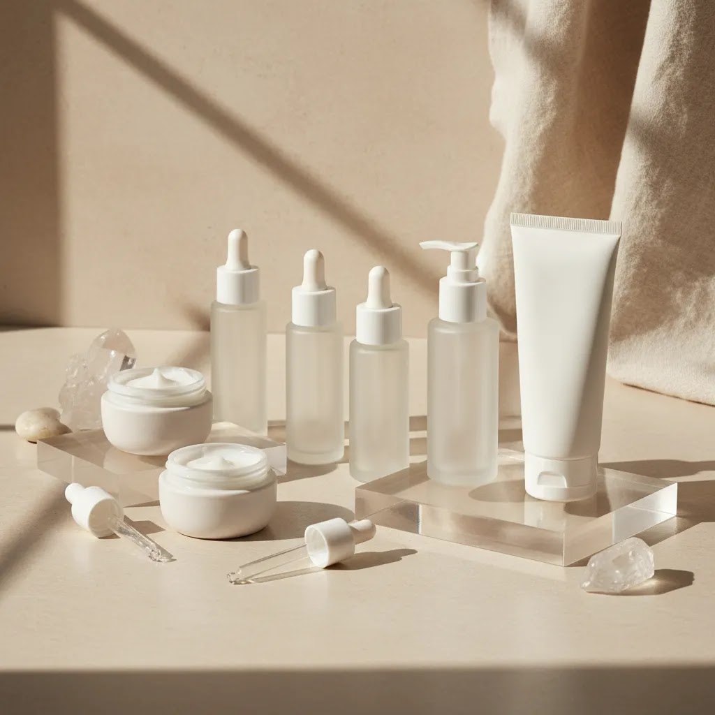
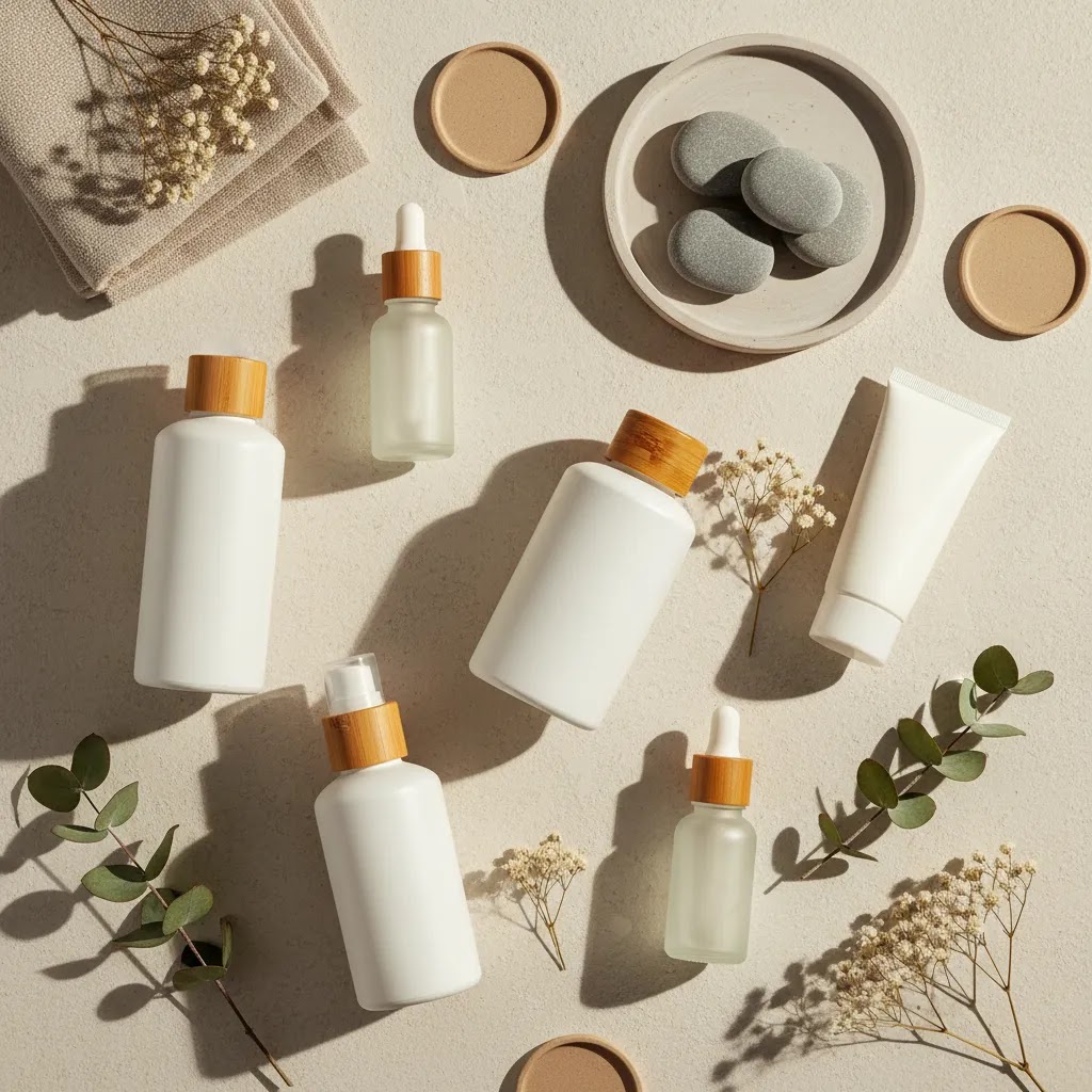
Styling ideas for better skincare products pictures
Skincare products photography ideas should support the product, not overpower it. A serum bottle should still be the focal point even if you include water droplets, leaves, towels, stones, or ingredients. Overstyling is one of the fastest ways to make products pictures feel less premium.
Here are practical styling directions that usually work:
Keep brand consistency in mind. If one moisturizer is photographed in warm beige light and the matching cleanser appears in cool blue light, the range can feel disconnected on collection pages.
If your beauty catalog includes adjacent categories, studying perfume photography can also help, especially for glass, reflections, and premium composition ideas. You can also browse AcquireConvert’s Cosmetics Photography section for more beauty-specific direction.
Skincare photo inspiration and reference sources (what to use legally)
A lot of people searching for pictures of skincare products are really trying to browse, identify, and compare. That often looks like “pictures of skincare products with names” style content. As a store owner, you can use that intent to improve your own imagery, without copying competitors or stepping into licensing issues.
Where to get inspiration without copying
Consider this: the best reference library is usually the one tied to your brand and your actual catalog.
The reality is that inspiration is normal. Replicating someone else’s exact composition, prop set, and lighting style can create brand confusion and can create rights issues if you are using their image as more than a reference.
A practical “reference vs replicate” workflow
If you want a repeatable process, create a simple mood board for each product line or campaign. The goal is to capture the rules, not the exact photo.
Then translate that into your brand system. Choose two to three background options, one lighting setup, and a fixed crop style. Document it once so anyone on your team can shoot new SKUs without guessing.
Usage rights basics (why it matters)
If you are using stock, supplier imagery, or UGC, you need to understand usage rights. Licensing and attribution requirements can vary. Some images can be used commercially with restrictions. Some can be used only in certain channels. Some require credit. Some require a specific contract.
Even if an image is “just for reference,” do not download and reuse it on your product page unless you have permission to do that. For most Shopify store owners, the safe approach is simple: publish only images you created, images your team has licensed for commercial use, or UGC you have explicit permission to use.
Editing and optimization for ecommerce
Editing is where good raw photos become store-ready assets. The goal is not to make the product look unreal. The goal is to make it look accurate, clean, and consistent across your storefront and marketing channels.
Your basic editing checklist should include:
If you use AI-assisted image tools, treat them as workflow helpers, not a substitute for product accuracy. For example, tools such as AI Background Generator, Free White Background Generator, and Increase Image Resolution may help with background cleanup or catalog preparation. They can save time for routine edits, but you still need to check shadows, edges, reflections, and label fidelity before publishing.
For Shopify store owners, the practical test is simple: does the final image help a customer feel more confident buying? If the answer is yes, the edit is doing its job. If the product starts looking overly artificial, pull it back.
How to photograph skincare for Shopify and marketplaces (requirements and consistency)
Your photography system needs to work in a Shopify theme grid, in product page galleries, and often in ads and marketplaces too. What looks perfect as a standalone hero image can break down when it gets cropped into a square collection tile or compressed in an ad placement.
Shopify-specific image considerations that affect how your catalog looks
For most Shopify store owners, consistency is the hidden conversion win. A collection page that looks tidy and uniform typically feels more trustworthy than a grid of random crops and background colors.
Think of it this way: your product page is not just one image. It is a sequence. The sequence should feel like it was shot in one session, using one set of rules.
Marketplace and ad placement constraints (verify current platform policies)
Now, when it comes to marketplaces and ad placements, “good” often means “compliant and clear.” Many placements expect a clean main image, often on white, with the product filling the frame and no confusing props. Some channels also have rules around text overlays, claims, and before-and-after style imagery.
Policies change, so verify current requirements before you shoot a full catalog. The practical takeaway is to capture at least one clean, versatile packshot per SKU that can work as your “default” image across channels, then layer in lifestyle and texture images for your Shopify product page experience.
File naming and organization so you can scale without chaos
What many store owners overlook is operational sanity. If you cannot find your own assets, you will reshoot things you already shot, or you will ship inconsistent images into ads and email because the team grabbed the wrong file.
A simple approach is to name files using your SKU and shot type, then keep versions clear. For example, you might separate hero images from marketplace packshots and keep a consistent naming pattern for front, angle, back label, and texture. That makes it easier to reuse the same images across Shopify product pages, email campaigns, and ad creative without hunting through random folders.
Pros and Cons
Strengths
Considerations
Who this approach is for
This approach is best for ecommerce teams that need better skincare products pictures without building a full commercial studio from day one. It suits Shopify merchants launching new skincare SKUs, founders managing content in-house, small beauty teams creating assets for product pages and paid social, and growth-stage brands that want more visual consistency before outsourcing larger shoots.
It is especially useful if you sell online and need practical answers to how to take pictures of products, how to take good pictures of products, and how to keep those images aligned with your product page messaging. If you already have stable demand and need campaign-quality hero visuals every month, a hybrid model with outside support may be the better fit.
AcquireConvert recommendation
For ecommerce operators, the best photography workflow is the one you can repeat consistently across your catalog. That is where AcquireConvert is useful. The site focuses on practical visual commerce advice for store owners, with guidance shaped by Giles Thomas’s experience as a Shopify Partner and Google Expert. That matters because product images are not only a branding decision. They affect merchandising, landing page clarity, ad creative quality, and search visibility.
If you are refining beauty imagery, start with the related skincare and cosmetics resources on AcquireConvert, then compare where AI-assisted editing might fit into your workflow. The goal is not to chase effects. It is to publish more convincing product visuals that support selling. For beauty brands experimenting with creative concepting, the ai makeup generator article is a useful next step.
How to choose your photography workflow
If you are deciding between DIY photography, AI-assisted editing, or hiring outside help, use these criteria.
1. Catalog volume
If you launch products often, consistency matters more than perfection on every frame. A simple in-house setup with controlled lighting and light retouching may be more valuable than occasional premium shoots you cannot repeat. High-SKU stores usually benefit from a documented process.
2. Packaging complexity
Opaque tubes and matte bottles are usually easier to shoot than clear glass droppers, reflective jars, or metallic finishes. If your products are difficult to light, test whether AI cleanup can help with routine edits, but be realistic about its limits. Complex hero imagery may still require a specialist.
3. Brand position
A clinical skincare line often needs bright, accurate, minimal imagery. A luxury or botanical brand may need moodier styling or more texture-led composition. Your photography should match your pricing, product promise, and audience expectations. Mismatch here can weaken perceived value.
4. Channel requirements
Your website, marketplaces, paid ads, and social channels do not always need the same image style. White-background images may be necessary for some placements, while your product page may benefit from richer editorial shots. Plan for a mixed image set rather than one universal image type.
5. Team capacity
If your team is small, the right system is the one you can manage week after week. That might mean creating clean base photos in-house, then using selected tools for background fixes, resizing, or resolution enhancement. If turnaround time is more valuable than internal control, outsourcing part of the workflow may make more sense.
The practical answer for most stores is a hybrid setup: create accurate base images with a repeatable shooting process, use editing tools cautiously for efficiency, and bring in professional support when launch campaigns or premium positioning demand it.
Frequently Asked Questions
What is the best background for pictures of skincare products?
White, off-white, stone, and soft neutral backgrounds work well for most skincare brands because they keep attention on the product and make packaging easier to read. The best choice depends on your brand position. Clinical brands often benefit from clean white scenes, while natural or premium brands may suit warmer textured surfaces.
Can I use a phone for skincare products photography?
Yes, in many cases you can. A recent smartphone paired with soft lighting, a tripod, and careful editing can produce strong ecommerce images. The bigger issue is usually lighting control, not camera price. If you are taking pictures of products to sell online, focus first on consistency, reflections, and clean composition.
What light is best for taking pictures of products?
Soft diffused light is usually the safest starting point. Indirect window light works well for smaller shoots, while continuous artificial light is better if you need consistency across many SKUs or shoot days. Avoid mixed lighting temperatures because they can shift product color and make packaging look inaccurate.
How many photos should a skincare product page include?
Most skincare product pages benefit from at least five to seven useful images. That often includes a front packshot, angled view, back or ingredient panel, scale reference, texture shot, and one or two lifestyle or routine images. The right mix depends on product complexity and how much education the customer needs before purchase.
Should I show texture in skincare products pictures?
Usually, yes. Texture shots can help customers understand whether a formula looks rich, lightweight, gel-like, foamy, or oily. That may reduce hesitation, especially for first-time buyers. Keep these shots clean and accurate. They should support the product description, not exaggerate what the formula looks like in real use.
Can AI tools help with skincare product photos?
They can help with selective tasks such as background cleanup, white background creation, and resolution enhancement. They are most useful as workflow support tools. You still need to review the output carefully so packaging edges, shadows, textures, and labels remain realistic. Accuracy matters more than novelty on product pages.
Can I use pictures of branded products from suppliers?
You should verify usage rights before doing that. Some suppliers allow approved retail image use, while others restrict where and how those images appear. Even when permitted, relying only on supplier photos can make your store look identical to competitors. Original photography often gives you more brand control and differentiation.
When should I hire a professional instead of shooting in-house?
If your packaging is highly reflective, your brand is positioned as premium, or you need campaign-level hero assets, a professional shoot may be worth it. Many ecommerce brands still handle routine catalog images in-house and outsource only major launches. That hybrid approach often balances speed, cost control, and quality.
What are the top 10 most popular skincare brands?
Popularity changes by country, retailer, and time period, so there is no single definitive top 10 list. From an ecommerce photography standpoint, the more useful takeaway is why popular brands look popular: consistent packshot framing, readable labels at thumbnail size, and a repeatable visual system across the full range. If you want your Shopify collection pages to feel “big brand,” aim for that same consistency rather than chasing a specific brand aesthetic.
What skincare is good for hyperpigmentation?
Hyperpigmentation routines often include ingredients like vitamin C, niacinamide, retinoids, and exfoliating acids, but what is “good” depends on skin type and sensitivity. If you sell products in this category, your images should support clarity and trust: clean front label shots, close-ups of the ingredient panel, and texture images that accurately show opacity and finish. Avoid edits that change product color or imply results. Customers tend to scrutinize claims here, and ad platform policies can be strict, so keep your photography clean and accurate.
What is the best Botox in a bottle?
“Botox in a bottle” is usually marketing language for products that aim to smooth the look of fine lines, often using peptides, retinoids, or hydrating formulas. There is no true topical equivalent to Botox injections. If you sell smoothing or anti-aging skincare, your images should avoid exaggerated before-and-after expectations. Focus on what you can show honestly: packaging, texture, application context, and regimen placement.
Is Bubble ok for 11 year olds?
Age-appropriateness depends on the specific product, ingredients, and a child’s skin, so it is best handled with guidance from a qualified medical professional. From a store owner perspective, if you sell products that parents may buy for tweens, your imagery should support safe expectations: clear product names, straightforward packshots, and gentle lifestyle styling. Be cautious with heavy “clinical” implication in visuals unless your product positioning and compliance support it, and always verify current ad platform and marketplace policies for skincare claims.
Key Takeaways
Conclusion
Beautiful pictures of skincare products come from control, consistency, and clear brand intent. You do not need an oversized production setup to get there. You need the right light, a repeatable process, and image standards that fit how you sell online. For most ecommerce stores, the smartest move is to build a reliable in-house workflow first, then add editing tools or outside creative support where they genuinely help. AcquireConvert is a strong resource for that next step, especially if you want practical guidance shaped by Giles Thomas’s experience as a Shopify Partner and Google Expert. Explore the site’s beauty and visual commerce resources to sharpen your imagery, improve product page clarity, and build a more convincing storefront.
This content is editorial and for educational purposes only. It is not a paid endorsement unless explicitly stated otherwise. Any third-party tool availability or features may change over time, so verify current details directly with the provider. Photography improvements may support stronger ecommerce performance, but specific results are never guaranteed.

Hi, I'm Giles Thomas.
Founder of AcquireConvert, the place where ecommerce entrepreneurs & marketers go to learn growth. I'm also the founder of Shopify agency Whole Design Studios.