Skincare Product Photography (2026 Guide)
Skincare product photography has a direct effect on how premium, trustworthy, and giftable your products feel before a shopper reads a single line of copy. If you sell serums, creams, cleansers, or masks online, your images need to do two jobs at once: show the product clearly and support the brand story behind it. That is especially important on Shopify product pages, collection pages, ads, and email campaigns where visual consistency often shapes click-through and conversion behavior. In this guide, I’ll walk through what actually makes skincare imagery work for ecommerce, from lighting and backgrounds to styling and post-production. If you are also exploring adjacent beauty visuals, AcquireConvert’s guide to ai makeup generator tools is a useful next read for creative testing and campaign production.
Contents
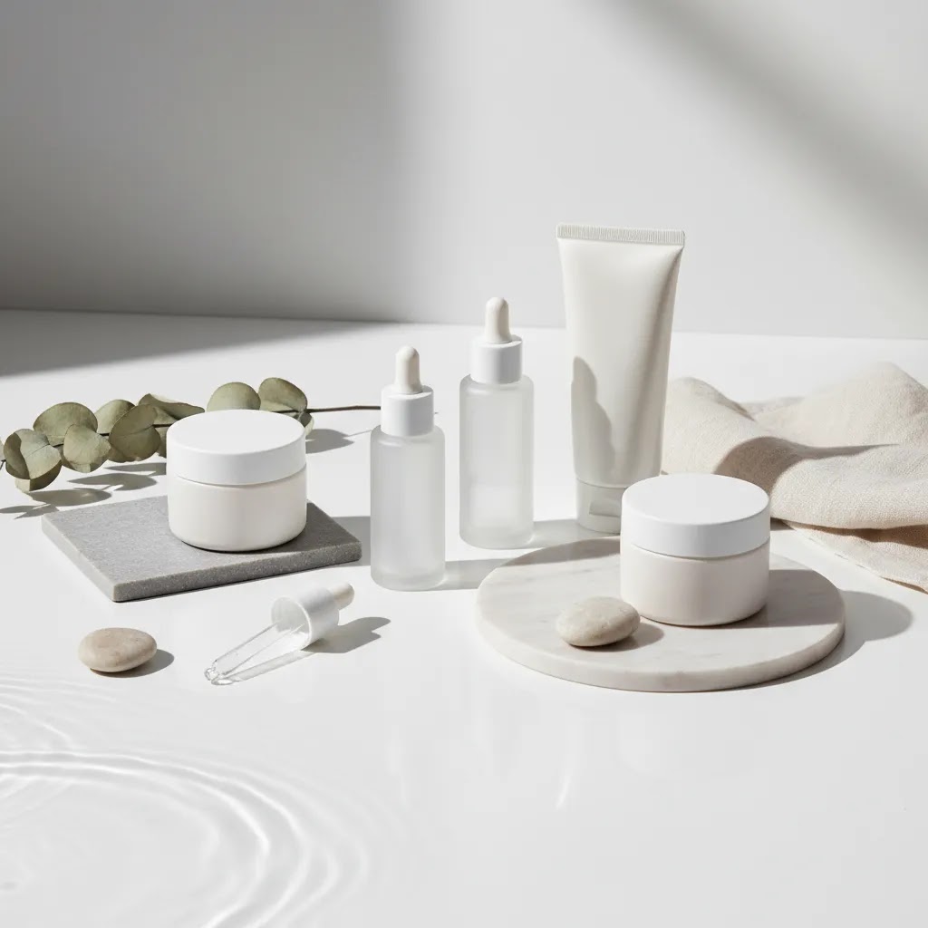
What good skincare product photography looks like
Good skincare product photography is clean, intentional, and consistent. Shoppers should be able to identify packaging details, texture cues, and product positioning within seconds. For skincare brands, that usually means balancing clinical clarity with aesthetic appeal. A white-background hero image may help on collection pages and marketplaces, while a styled image with stone, water, leaves, or soft fabric can support your brand tone on landing pages and social ads.
Most ecommerce brands need a mix of image types rather than one single style. You may need packshots, ingredient-led lifestyle shots, texture close-ups, in-use imagery, and comparison visuals. A luxury skincare product photography setup often leans on controlled reflections, premium surfaces, and restrained color palettes. A natural skincare product photography setup usually uses softer materials, daylight, and ingredient cues without making the frame feel cluttered.
If you are planning a broader beauty shoot, it helps to study adjacent categories too. For example, many of the composition lessons in perfume photography also apply to serum bottles and premium glass packaging. The core principle is the same: your images should reduce uncertainty and reinforce perceived value.
Working with models and in-use skincare imagery
Here’s the thing: in-use skincare imagery can do a lot of heavy lifting for ecommerce, but it only pays off if it is shot with the same clarity as your packshots. For many Shopify stores, one strong hand-in-frame photo can answer three conversion questions at once: “How big is it?”, “How do I use it?”, and “What does it look like on skin?”
In-use imagery is usually worth prioritizing when your product needs usage clarity, when the texture is a key selling point, or when scale is hard to communicate with packaging alone. Serums, SPF, masks, scrubs, and products with a visible finish tend to benefit. Product-only images are often enough when your packaging already communicates scale well, when the formula is not visually distinctive, or when you are mostly selling through collection pages where speed and consistency matter more than storytelling.
How to keep it conversion-focused (and not stocky)
Most “stocky” skincare photos fail because they look generic, not because they include a person. From a practical standpoint, you want the hands, skin, and background to feel like your brand, and you want the product to stay the hero.
Usage rights and deliverables to plan before you hire
If you hire a photographer, model, or both, get clear on deliverables before shoot day. You want assets that can be reused across Shopify, ads, and email without constantly running into licensing gaps.
Policies and licensing terms can vary, so it is worth getting specifics in writing. That small bit of planning can save you from having to reshoot just to get one missing crop size for a campaign.
Key elements that shape better product images
Lighting comes first. Skincare packaging often includes glossy labels, reflective caps, frosted glass, metallic finishes, and translucent textures. Soft directional light usually works better than harsh front-facing light because it defines shape without flattening the object. If you are shooting skincare product photography at home, a window with diffused daylight, white foam board, and careful shadow control can get you surprisingly far.
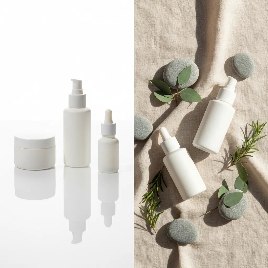
Background choice changes product perception. White backgrounds are still essential for many ecommerce uses because they look clean and keep the product page focused. AcquireConvert’s white background photography resources are useful if you need a more systematic approach to marketplace-ready images. For aesthetic skincare product photography, use props carefully. Surfaces like travertine, acrylic, frosted glass, linen, or wet tile can create mood without distracting from the product.
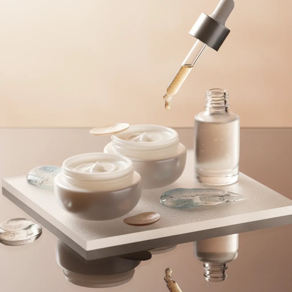
Texture photography matters more in skincare than in many other categories. Cream swipes, gel droplets, foam, or oil sheen can communicate product type faster than copy alone. This is where creative skincare product photography ideas can help, but the goal is still clarity. If a texture shot looks beautiful but leaves the shopper unsure what the product is, it is not doing enough for ecommerce.
Retouching and cleanup also matter. Stray dust, fingerprint smudges, inconsistent shadows, and label wrinkles can quietly lower trust. Tools such as AI Background Generator, Free White Background Generator, and Increase Image Resolution can support editing workflows when you need cleaner catalog images, alternate backgrounds, or sharper exports. For brand teams producing frequent assets, Creator Studio and Magic Photo Editor may help with iteration speed. These tools can save time, but they still work best when your original lighting and composition are solid.
Finally, think in sets, not single shots. Your store will often need visual continuity across bundles, routines, and variant ranges. Reviewing lots of pictures of skincare products can help, but what matters most is building a repeatable style system for your own catalog.
Skincare product photography shot list (by channel and SKU type)
What many store owners overlook is that “good photos” is not the goal. The goal is a shot set that answers shopper questions in the order they show up on a Shopify product page. That is why a practical shot list is so useful. It keeps your shoot focused, and it helps your product pages feel consistent even as you add new SKUs.
A minimum viable shot list for Shopify product pages
If you want a dependable baseline, aim for these images first. This is the set that typically does the most work for conversion on a PDP and in collections.
Optional but often helpful for email and ads: a square crop-friendly lifestyle image, a benefit-led composition with one prop that signals the main ingredient, and one negative-space image that can carry overlay text without covering the product.
Variations by packaging type (so you do not miss the “proof” shots)
Different packaging formats create different trust problems. Your shot list should reflect that.
Variations by formula (clear, opaque, glittery, or pearlescent)
Now, when it comes to formulas, the camera sees differently than the eye, especially with skincare textures that reflect light.
How to name and sequence Shopify images so they display in the right order
The way this works in practice is simple: your first image usually becomes the featured image across collections, search, and sometimes social previews. After that, shoppers swipe in order. So plan the order intentionally.
If you are managing a larger catalog, adopt a consistent naming pattern on your side, even if customers never see it. For example: brand-sku-front, brand-sku-angle, brand-sku-back, brand-sku-texture, brand-sku-scale. The main win is internal: you and your team will be able to spot what is missing in seconds, and your Shopify media order stays predictable across launches.
Pros and Cons
Strengths
Considerations
Who this approach is for
This approach is best for skincare founders, Shopify merchants, and ecommerce marketers who need images that sell without making the brand look generic. It fits brands launching new SKUs, refreshing product pages, improving ad creatives, or building a cleaner visual system for email and social. It is especially relevant if your current images feel inconsistent, too dark, overedited, or disconnected from your price point.
If you are shooting in-house, these recommendations will help you create a practical workflow. If you are working with a freelancer or agency, they will help you brief the shoot more effectively. If your catalog is growing quickly, a documented image style guide often matters just as much as camera gear.
AcquireConvert recommendation
For most ecommerce brands, the right move is not chasing the most artistic skincare image possible. It is building a dependable image system that supports conversion, brand trust, and reuse across channels. That means starting with your must-have ecommerce shots, then layering in creative assets for campaigns and social content.
AcquireConvert is a strong specialist resource if you want practical guidance grounded in real ecommerce use cases. Giles Thomas brings the perspective of a Shopify Partner and Google Expert, which is useful when your photography decisions affect shopping feeds, landing page performance, and product page clarity. If you want to branch into beauty AI workflows, revisit the ai makeup generator guide. If your bottleneck is setup and space, the guide to a product photography studio can help you plan a more repeatable in-house process. You can also browse the broader Cosmetics Photography category for related beauty-specific guidance.
How to choose the right photography setup
If you are deciding how to approach skincare product photography, start with business needs rather than gear. Here are the main criteria that usually matter most.
1. Sales channel requirements
Your image needs are different if you sell mainly through your Shopify store versus marketplaces, retail decks, or paid social. Marketplace listings often need plain, compliant packshots. Brand-led DTC stores usually benefit from a broader image set, including texture and lifestyle photography. Decide which assets are non-negotiable for your main channels first.
2. Packaging complexity
Tubes are easier than mirrored jars. Matte cartons are easier than clear serum bottles. If your range includes reflective lids, transparent glass, or metallic foils, you may need better diffusion, flags, and post-production support. Luxury skincare product photography techniques usually involve tighter lighting control because shoppers notice flaws more quickly on premium packaging.
3. Brand position
Minimalist skincare product photography works well when your brand cues are clinical, modern, or ingredient-led. Natural skincare product photography often suits botanical or wellness positioning. If you are trying to sit at a higher price point, every visual choice should support that, including shadows, spacing, prop materials, and retouching restraint. Premium does not always mean elaborate. Often it means cleaner and more deliberate.
4. Production model
If you have frequent launches, an in-house setup may be more efficient. If you only refresh imagery a few times a year, hiring outside help may make more sense. For some brands, the best option is a hybrid model: shoot core packshots in-house and outsource campaign visuals. If you are comparing creative standards and surfaces, the category pages on E Commerce Product Photography are worth reviewing alongside beauty-specific examples.
5. Post-production workflow
Editing speed matters once your catalog grows. A practical workflow could include white-background exports for product pages, alternate ratio crops for ads, and a few edited lifestyle variants for email or homepage use. If you rely on AI tools, use them to support repetitive cleanup and variation, not to cover weak source images. That usually leads to more believable results and fewer brand inconsistencies.
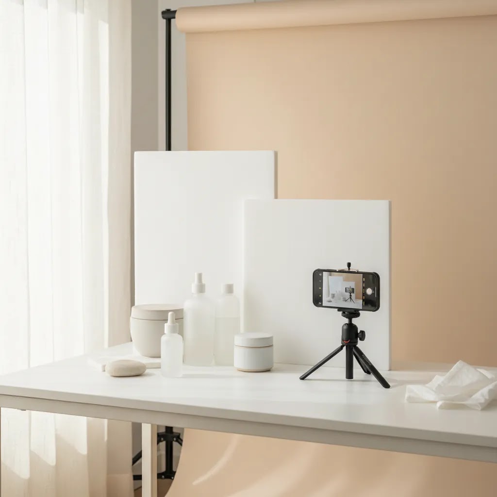
A skincare product photography kit you can standardize at home
Consider this: the biggest difference between “random DIY photos” and a credible in-house system is not the camera. It is whether your lighting and set can be recreated on demand. For most Shopify store owners, a small standardized kit makes it far easier to keep new launches consistent with the rest of your catalog.
A practical kit checklist (small space friendly)
You do not need everything at once, but these are the pieces that tend to solve real skincare packaging problems like glare, label readability, and repeatability.
How to set up a repeatable mini studio
For most skincare products, a tabletop setup is enough. The reality is you get better consistency by fixing variables than by chasing “perfect” light each time.
Once you have this in place, adding a new SKU becomes a process, not a creative reinvention. That tends to reduce the “new product looks like a different brand” problem on Shopify collections.
Common DIY failure points (and how to correct them)
If you are using AI cleanup tools, this standardized setup also makes those tools more reliable. The cleaner and more consistent your source files are, the less likely you are to get odd edges, fake-looking shadows, or mismatched product color in your final exports.
Frequently Asked Questions
What is the best background for skincare product photography?
A white background is usually the safest starting point for ecommerce because it keeps the product clear and consistent across collection pages, search results, and marketplaces. For campaign content, textured stone, acrylic, tile, glass, or soft fabric can work well if they match your branding. The key is making sure the background supports the product rather than competing with it.
Can I do skincare product photography at home?
Yes, many small brands start that way. A window with diffused light, a tripod, white bounce cards, and a clean surface can produce strong results for tubes, jars, and bottles. The challenge usually comes with reflections and consistency. If you shoot at home, document your setup so future products match the same lighting angle, crop style, and background tone.
How many photos should a skincare product page have?
In many cases, five to eight images is a solid target. That usually includes a hero shot, alternate angle, packaging detail, texture image, scale reference, ingredient or benefit shot, and one or two lifestyle images. The exact number depends on product complexity. A serum in premium glass often needs more visual explanation than a basic cleanser tube.
What makes luxury skincare product photography feel premium?
Premium skincare images usually feel intentional rather than busy. Controlled reflections, accurate color, refined shadows, consistent spacing, and restrained props all help. Materials also matter. Stone, frosted acrylic, brushed metal, and clean architectural surfaces tend to photograph better than random decorative props. The goal is to raise perceived value without making the product harder to understand.
Should skincare brands use lifestyle photos or just packshots?
Most brands should use both. Packshots help with clarity and trust, while lifestyle photos add context, mood, and brand personality. If you only use packshots, the store may feel flat. If you only use lifestyle photography, shoppers may miss key packaging and formula details. A balanced set usually works best for ecommerce performance.
How do I photograph clear serum bottles without messy reflections?
Use larger diffused light sources, add white or black cards to shape the edges, and keep the set uncluttered so unwanted objects do not reflect in the bottle. Small lighting shifts can make a big difference. It often helps to think about what the glass is reflecting rather than just where the lamp is pointed.
Are AI editing tools useful for skincare product photography?
They can be useful for cleanup, background replacement, and resizing, especially if you need multiple asset versions quickly. They are less reliable when the original image has poor lighting, heavy glare, or inaccurate color. For ecommerce, AI works best as a production aid rather than a substitute for thoughtful photography and quality control.
What props work well for natural skincare product photography?
Props that echo ingredients or brand mood tend to work well, such as leaves, stones, ceramic dishes, linen, water ripples, or wood with a restrained finish. Use them sparingly. If shoppers remember the prop more than the product, the composition probably needs simplifying. Good props support positioning, but they should not distract from the SKU.
Do I need a professional studio for skincare photography?
Not always. Many ecommerce brands get strong results with a small controlled in-house setup. A studio becomes more useful when you need complex lighting, high output, on-model content, or campaign-level art direction. For growing brands, the decision usually comes down to SKU volume, packaging complexity, and how often assets need to be refreshed.
What is the 20 60 20 rule in photography?
People use “20 60 20” in a few different ways, so you will want to check how your team defines it. In product photography planning, a practical interpretation is content mix: around 20% clean packshots (catalog clarity), 60% core ecommerce story assets (angles, details, texture, scale, routine context), and 20% creative experiments (seasonal styling, bold props, campaign concepts). The exact split can vary, but the point is to prioritize the images that support conversion before you spend time on purely artistic variations.
What is the 50 50 rule in photography?
“50 50” is also used in different contexts. For ecommerce photography, think of it as a reminder to balance capture and editing. Aim to get about half of the final look in-camera through lighting, styling, and cleanliness, then use editing for refinement, not rescue. This usually leads to more believable product color, fewer weird reflections, and less time fighting background inconsistencies later.
How much do product photographers get paid?
It varies based on experience level, geography, the complexity of the shoot, and what is included. Some photographers charge per image, some charge day rates, and some price by project with a clear deliverables list. Usage rights for paid ads can also affect cost. If you are comparing options, ask for a quote that specifies the shot list, number of final retouched images, turnaround time, and usage terms, so you can compare like-for-like.
What is included in a skincare product photography kit?
A practical skincare product photography kit usually includes diffusion to soften light, white and black cards to shape reflections, clamps to hold modifiers, a tripod for repeatability, cleaning supplies to keep packaging pristine, and a small set of consistent surfaces and backdrops. Many brands also add acrylic risers for bundles and a simple “marked” tabletop setup so new launches match existing product pages.
Key Takeaways
Conclusion
Skincare product photography done right is less about chasing trends and more about creating images that make buying feel lower risk and more appealing. When your photos show packaging clearly, communicate texture honestly, and match your brand position, they tend to support stronger product pages and more consistent creative across channels. Start with a practical shot list, tighten your lighting, and make your editing workflow repeatable. If you want more beauty-specific guidance, explore AcquireConvert’s cosmetics resources, compare visual approaches across related articles, and use Giles Thomas’s practitioner-led insights to shape a photography system that fits how your store actually sells.
This article is editorial content for educational purposes and is not a paid endorsement unless explicitly stated otherwise. Tool availability, features, and pricing are subject to change, so verify current details directly with the provider. Any performance outcomes discussed are illustrative only and are not guaranteed.

Hi, I'm Giles Thomas.
Founder of AcquireConvert, the place where ecommerce entrepreneurs & marketers go to learn growth. I'm also the founder of Shopify agency Whole Design Studios.