Studio Background for Product Photography (2026)
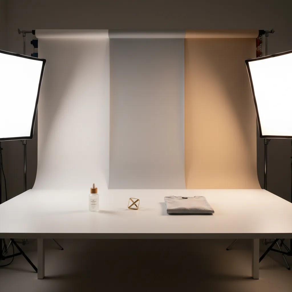
Choosing the right studio background shapes how professional your product photos look, how consistent your catalog feels, and how much editing work your team takes on later. For ecommerce store owners, that matters. A clean white studio background may help with marketplace compliance, while a textured or colored photo studio background can support brand positioning on your Shopify product pages and paid social creatives. The right choice depends on your products, shooting setup, and post-production workflow. If you are still mapping the bigger service picture, start with this guide to commercial photography. In this article, I’ll break down the main studio background options, where each works best, the trade-offs to watch, and how to choose a setup that fits your store rather than copying what works for someone else.
Contents
What a studio background really does for ecommerce
A studio background is not just a visual preference. It affects consistency, editing speed, product clarity, and conversion signals across your store. If you sell on Shopify, Amazon, Etsy, Google Shopping, or Meta, the background you choose can influence how well your products stand out in feeds, search results, and on-page galleries.
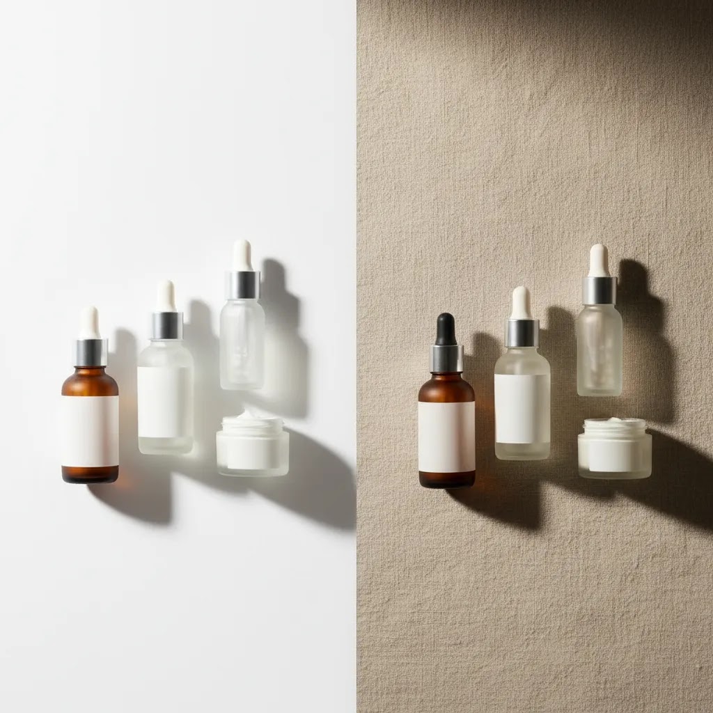
The most common option is a white studio background. It is popular because it keeps attention on the product, works across most store themes, and often aligns with marketplace image requirements. A white background studio setup is especially useful for apparel basics, beauty products, supplements, electronics, and home goods where clarity matters more than atmosphere.
That said, white is not always the strongest choice for every image in your catalog. A lifestyle-oriented brand may need some photos on a controlled studio backdrop with subtle color or texture to create separation and brand feel. This is common for premium skincare, jewelry, handmade goods, or giftable products where visual identity carries more weight.
For many stores, the best approach is mixed usage. Use white background studio photography for primary product images and reserve styled backgrounds for secondary gallery images, landing pages, and ads. That gives you catalog consistency without making the brand feel flat.
Key studio background options to evaluate
If you are reviewing product photography needs for your store, these are the main background formats worth evaluating.
1. White seamless paper
This is the standard studio white background for many ecommerce shoots. It creates a clean, continuous surface with no hard line between wall and floor. It works especially well for apparel on mannequins, tabletop products, and flat lays. It is practical, familiar to photographers, and easier to edit than textured setups.
2. Vinyl white background
Vinyl is more durable than paper and easier to wipe clean, which makes it useful for cosmetics, food packaging, pet products, or anything that may spill, leak, or shed. The trade-off is that cheaper vinyl can create reflections or wrinkles if not lit carefully.
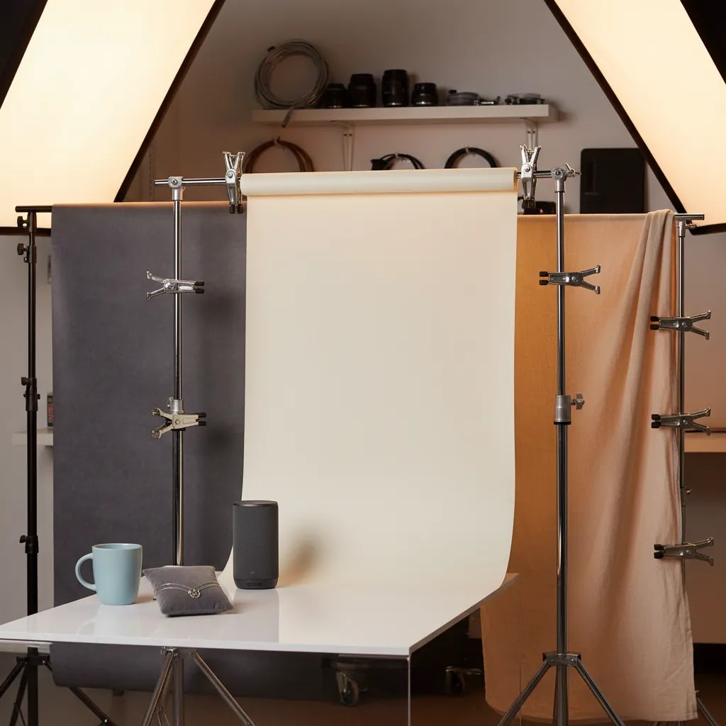
3. Fabric backdrops
Fabric can work for softer brand aesthetics, especially in a photo studio background where you want less clinical results. It is flexible and reusable, but creases are a real concern. For a photography studio white background, fabric often needs more steaming, clipping, and retouching than store owners expect.
4. Textured or colored studio backgrounds
These are useful for secondary shots, campaign imagery, and social content. They can make your catalog feel more branded, but they are harder to standardize across a growing SKU range. If your store has a large assortment, too many background variations can make collection pages feel inconsistent.
5. Digital background workflows
Some merchants now combine a controlled white background studio photography setup with AI-assisted editing tools. That gives you one efficient base image and multiple output styles. AcquireConvert’s product data includes tools such as Free White Background Generator, AI Background Generator, and Background Swap Editor for merchants who want to test digital photo studio backgrounds after the shoot. These can help create alternate creative assets, but they still work best when your original lighting and product cutout are strong.
6. Full-service studio production
If your in-house process is becoming inconsistent, outsourced product photography services may be the more reliable option. This is usually the better fit once you need repeatable shots across many SKUs, stricter brand standards, or production support across primary white background images and campaign content.
Studio background sizes, materials, and finish: what to buy for your space
What many store owners overlook is that “white background” is not one purchase. The size of your roll, the material, and the surface finish all affect how fast you can shoot and how often you have to fix problems in post.
From a practical standpoint, start by thinking about your largest product, not your average product. Your background needs to cover the full frame with some margin for cropping, straightening, and different aspect ratios for Shopify, ads, and marketplaces.
Common backdrop widths (and how to choose)
Most studio backgrounds come in a few common widths. Smaller rolls work well for tabletop products, while wider rolls are designed for full-body apparel and larger items.
Here’s the thing: the “right” width depends on your camera distance and how much you need to crop. If you are shooting close with a longer focal length, you might get away with a narrower background. If you are forced to shoot wider because your space is tight, a narrow roll can create edge problems quickly, especially when you need alternate crops for ads.
In many cases, going one size wider than you think you need reduces time spent fixing visible edges, corner shadows, and uneven falloff. It also makes it easier to keep your subject centered and still have room for a consistent crop across a SKU range.
Paper vs vinyl vs fabric (what changes in day-to-day use)
Paper is popular because it looks clean and matte, which helps avoid distracting reflections. It is also predictable for editing because you typically get a consistent tone behind the product. The downside is durability. Paper gets scuffed and marked, so you will usually end up cutting and rolling forward as you shoot.
Vinyl is more durable and can be wiped down, which is helpful if you shoot products that shed, spill, or leave residue. The trade-off is that vinyl quality varies. Thin vinyl can show ripples and glare, and that can turn into extra work when you are trying to create a clean white background studio look.
Fabric can be a good fit when you want a softer, less clinical aesthetic, but it is the most sensitive to creasing and texture inconsistency. If you want fabric for ecommerce production, plan for steaming, clipping, and tensioning. Otherwise you may end up chasing wrinkles between every product.
Matte vs glossy: why finish matters more than you think
If you sell reflective products, glossy backgrounds can multiply your problems. A shiny surface may look premium in a creative shoot, but it also increases unwanted reflections, hotspot clipping, and “muddy” shadow transitions.
For most Shopify store owners, a matte finish is the safer baseline for primary catalog images. It helps keep attention on the product and makes your lighting more forgiving. You can always add controlled shine with lighting and styling, but it is harder to remove glare that was baked into the capture.
Avoid these common time-wasters
Cheaper vinyl that produces strong glare is a common trap. It may look fine to the eye, but it can create hotspots that are hard to fix consistently across a catalog.
Fabric backdrops that are not tensioned can turn into a constant retouching job. If you do not have time to steam and clip, it is usually better to choose paper or a higher-quality matte vinyl.
Too-narrow rolls often create edge issues that look minor on a single product photo, but become obvious when images sit together in a Shopify collection grid. A wider roll can be a simple way to reduce that friction.
Pros and Cons
Strengths
Considerations
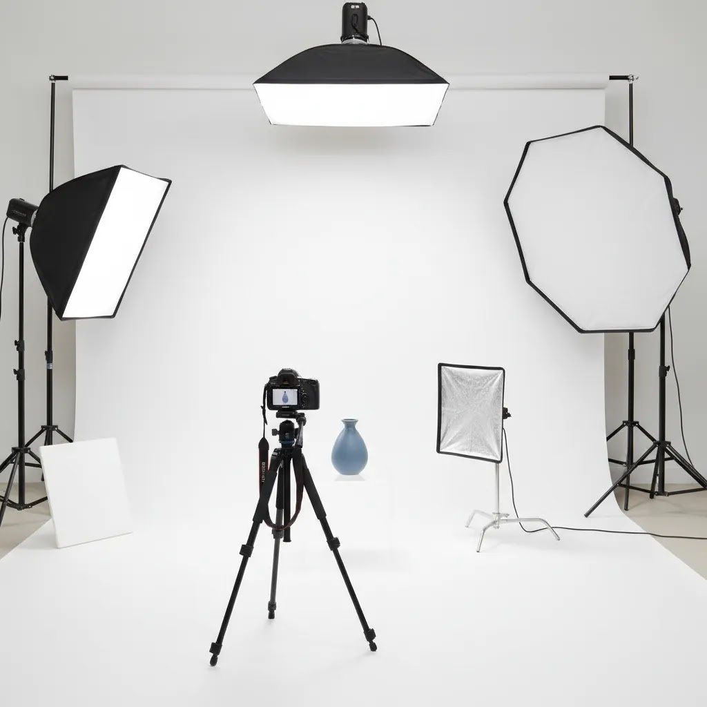
Studio background lighting and setup basics (so your white looks white)
Consider this: most “bad white background” photos are not caused by the background. They are caused by a setup that puts the product too close to the background, uneven light across the sweep, or exposure that is trying to force the white to pure white without protecting product detail.
The way this works in practice is simple. You want the background to read clean and bright, but you also need enough separation and control that you do not lose edges, blow out labels, or flatten texture.
Distance and shadow control (the simplest fix)
If you can, pull the product forward from the background. That reduces hard shadows falling onto the sweep and makes it easier to keep the background even. It also helps with edge separation on light products because you can shape the light on the product without lighting the background in exactly the same way.
Even in small spaces, a little separation can make editing easier. If you are constantly painting out background shadows in post, this is usually the first thing to adjust.
Even background lighting without blowing out the product
For a clean white studio background, you typically want the background lit evenly and the product lit for shape. That often means treating them like two related problems rather than trying to solve everything with one light position.
If the background goes too bright, it can spill back onto the product, soften edges, and wash out highlights. If the background is too dark, it can turn “white” into light gray and create extra masking work. The balance comes from controlled angles and consistent exposure, not from pushing sliders after the fact.
Hard products on white: reflective, transparent, and white-on-white
Some products are difficult even with good gear. Reflective items can mirror the room and the sweep. Transparent items can lose their outline. White products on a white background can disappear at the edges.
In those cases, you do not always need a different backdrop. You often need better control of reflections and contrast. Flags, diffusers, and careful angle choices can help you shape what the product reflects. You can also create subtle edge definition by controlling where the product falls into shadow, instead of trying to make every part of the frame equally bright.
Think of it this way: the goal is not “white everywhere.” The goal is clear product separation and readable detail, with a background that meets your channel requirements.
Consistency checks for ecommerce catalogs
If you are building a Shopify catalog that feels cohesive, consistency matters as much as quality. Two photos can both be “good” and still look wrong together if the white balance shifts or exposure varies from product to product.
A few simple habits help here: keep white balance steady across a shoot, keep exposure consistent, and review images as a set, not as individual favorites. This matters because your collection grids and carousels put images side by side. Small differences that are easy to ignore on one PDP become obvious when customers scroll a category page or when your products show together in ads.
Who this matters most for
This topic matters most if you run a growing ecommerce store and want product photos that can work across multiple channels without rebuilding your image workflow every quarter. Shopify merchants with medium to large catalogs often benefit most from a consistent photography white studio background because it supports collection page uniformity and faster merchandising updates.
It is also highly relevant if you are comparing DIY production with a professional product photography studio. Once you move beyond occasional shoots and start launching collections, bundles, or seasonal variants regularly, the background decision becomes an operations issue as much as a design one.
AcquireConvert recommendation
For most ecommerce brands, I would treat a white background studio setup as the default starting point, not the full creative strategy. Primary product images should usually be clean, consistent, and easy to reuse across your Shopify store, marketplaces, and paid channels. Then layer in selective branded or lifestyle backgrounds where they help tell the product story.
This balanced approach is consistent with how experienced operators build scalable catalogs. Giles Thomas’s background as a Shopify Partner and Google Expert is relevant here because product imagery does not sit in isolation. It affects feed performance, landing page clarity, merchandising, and conversion paths. If you are refining your visual workflow, AcquireConvert is a useful specialist resource to explore broader guidance on Product Photography Services and practical image standards for White Background Photography.
How to choose the right setup
If you are deciding between a white studio background, colored set, or digital editing workflow, use these five criteria.
1. Your sales channels
If you sell across marketplaces and shopping feeds, a photo studio white background is usually the safest base format. It is the most portable option. You can always create styled variants later, but converting heavily styled assets back into compliant catalog images is much harder.
2. Your product type
Small, reflective, or transparent products often need more careful testing. A studio photography white background may expose glare, blown highlights, or edge loss. In these cases, the right answer is not always a different backdrop. It may be better lighting, more spacing from the background, or a professional retoucher.
3. Your brand presentation
If your brand sells premium, artisanal, or gift-focused products, all-white may be too plain for every image. Keep your primary image simple, then use supporting gallery shots with subtle color, props, or texture. This keeps the catalog clean while giving your PDPs more persuasion power.
4. Your production volume
For a handful of SKUs, almost any setup can work. For 100 products or 1,000 variants, consistency becomes far more important than creativity. White seamless setups are often easier to repeat across teams, photographers, and shoot days. That matters when you need your catalog to look unified month after month.
5. Your editing resources
If you do not have an in-house editor or reliable post-production process, do not choose a background style that creates extra cleanup work. A simple white photography studio background usually reduces friction. If you want creative flexibility after the shoot, tools like Magic Photo Editor or Creator Studio may help you generate alternate versions, but they are best treated as workflow support, not a replacement for strong source photography.
Studio background “HD/4K” downloads and digital packs: what they are, and when to avoid them
A lot of people searching for studio background ideas are not looking for paper rolls or vinyl at all. They are looking for “studio background hd 4k,” “1080p,” “free download,” or “for Photoshop.” Those assets exist, but they are not the same thing as a controlled product photography studio background.
Most of these downloads fall into a few buckets: JPEG backdrop images (often gradients or textures), PSD templates with a background layer and a shadow layer, and overlay packs designed to sit behind a cutout product. They can be useful, but you need to be honest about what job they can and cannot do for ecommerce.
When digital background packs can help
For many Shopify teams, these assets are most useful for secondary creative. Think ad variations, social posts, or a quick concept mockup when you need more variety than your core catalog images provide.
They can also help you test a look before you invest in physical sets. If a textured “studio” look performs well in ads, you can decide whether it is worth building a repeatable physical setup for future campaigns.
A quality checklist (so it does not look fake)
The reality is that a lot of downloadable studio background images look templated when you use them with real product photos. The giveaway is usually mismatch: the perspective, lighting direction, and shadow behavior do not match the original capture.
Before using a digital background pack for ecommerce, check a few things. Does the background perspective make sense for your camera angle? Is the light direction consistent with the highlights on the product? Do shadows sit under the product in a believable way, or do they float? Is the resolution actually high enough for your product image size, or will it look soft and compressed once cropped?
Also consider creative fatigue. If a background pack is widely used, your ads can start to look like everyone else’s, even if your product is different.
When to avoid them (especially for primary PDP images)
For most ecommerce stores, your primary product images should still come from a controlled physical setup when consistency and compliance matter. Marketplaces and shopping feeds often expect clean, accurate representation. Even on Shopify, the main PDP image is the trust moment. If the background looks artificial or inconsistent across SKUs, it can reduce perceived quality.
A safe workflow for many teams is: keep your primary images captured on a repeatable physical background, then use digital backgrounds and AI tools for secondary creatives only. If you do use them on important pages, review every output carefully for edge quality, realism, and whether the result matches your brand standards.
Frequently Asked Questions
Is a white studio background best for ecommerce product photography?
For many stores, yes. A white studio background is often the most practical choice for primary product images because it keeps focus on the item, supports consistency across collections, and generally fits marketplace requirements. It is not always the most branded option, so many merchants pair it with more styled secondary images.
What is the difference between a white background studio and a styled studio setup?
A white background studio aims for clean, neutral, repeatable product images. A styled setup uses color, texture, props, or atmosphere to create more brand personality. For ecommerce, the best approach is often to use white for the main listing image and styled photography for gallery images, ads, and campaign pages.
Can I use digital photo studio backgrounds instead of building physical sets?
You can in some cases, especially for alternate marketing assets. Digital photo studio backgrounds are most effective when the original product shot is well lit and easy to isolate. They can save time for creative variations, but results still need review so shadows, scale, and edges feel realistic to shoppers.
Do white backgrounds help Shopify product pages convert better?
They may help clarity and consistency, which can support decision-making for shoppers, especially on collection pages and product grids. Still, there is no single background that guarantees better conversion. Product type, image quality, page layout, trust signals, and merchandising all play a role in how customers respond.
What products are hardest to shoot on a studio white background?
Reflective, transparent, glossy, and very light-colored items can be challenging. Glass bottles, chrome accessories, and white packaging are common examples. These products often need more precise lighting and separation from the background to avoid losing edges or creating distracting reflections in the final image.
Should I hire a professional studio or shoot products in-house?
If you have a small catalog and straightforward products, in-house production can work. If you need repeatable quality across many SKUs, variants, or campaign launches, professional support is often more reliable. The tipping point usually comes when image inconsistency starts slowing approvals, merchandising, or ad production.
Are fabric backdrops good for product photography?
They can work for softer or more editorial looks, but they are not always ideal for high-volume catalog photography. Fabric wrinkles easily and often needs extra prep and retouching. If your goal is speed and consistency, seamless paper or vinyl usually creates fewer production issues for ecommerce teams.
How many background styles should an ecommerce brand use?
Usually fewer than you think. Most brands benefit from one core background standard for primary images and one or two supporting styles for secondary creative. Too many background treatments can make category pages look disjointed and weaken the visual consistency that helps products feel part of the same brand.
What size studio background should I use for product photography?
Choose a background based on your largest product and your shooting distance, not your smallest SKU. You want enough width to cover the frame with margin for cropping and straightening, and enough length to create a smooth sweep if you are shooting products sitting on the background. If you keep seeing edges, corner shadows, or inconsistent crops in your Shopify collection grids, sizing up is often the simplest fix.
How do you light a white background so it stays pure white without blowing out the product?
Separate the product from the background and light them with control. Pull the product forward to reduce shadows on the sweep, aim for even background illumination, and expose for the product so you keep label detail and texture. If the background gets too bright, it can spill onto the product and soften edges, so balance matters more than pushing everything to maximum brightness.
Where can I download studio backgrounds for Photoshop, and are they worth using for ecommerce?
Most downloadable studio backgrounds for Photoshop are JPEG backdrops, PSD templates, or overlay packs intended to sit behind a cutout product. They can be worth testing for secondary creatives like ads or social posts, but they often look templated if the lighting direction, perspective, and shadows do not match your original photo. For primary Shopify product images, a controlled physical background is typically the safer option when consistency and trust matter.
What color background is best for product photography besides white?
It depends on what you are trying to communicate. Light neutrals can add warmth without overpowering the product, while darker tones can make bright packaging and reflective items stand out. For ecommerce catalogs, it usually works best to pick one or two brand-friendly colors for secondary images and campaigns, while keeping primary product images consistent so collection pages do not feel visually fragmented.
Key Takeaways
Conclusion
The best studio background for product photography is usually the one that helps you produce clear, repeatable, channel-ready images without adding unnecessary complexity. For most ecommerce stores, that starts with a white background studio workflow for core product images and expands into more branded setups only where they add real value. That balance supports both efficiency and presentation. If you are comparing production options, refining your image standards, or deciding whether to outsource, AcquireConvert offers practical guidance built for store owners rather than generic creatives. Explore more of our photography and ecommerce resources to see how other Shopify merchants approach image quality, catalog consistency, and growth-focused visual content decisions.
This content is editorial and intended for educational purposes only. It is not a paid endorsement unless explicitly stated otherwise. Pricing, product availability, and tool features are subject to change, so verify current details directly with the provider. Any performance or conversion impact discussed here is directional only and not guaranteed.

Hi, I'm Giles Thomas.
Founder of AcquireConvert, the place where ecommerce entrepreneurs & marketers go to learn growth. I'm also the founder of Shopify agency Whole Design Studios.