Why Every Listing Needs Packshots (2026 Guide)
If you sell physical products online, your listing image is doing the work that shelf presence, packaging, and in-store handling would normally do. That is why packshots matter. A clean, accurate product image helps shoppers confirm what they are buying, compare options quickly, and decide whether your brand looks trustworthy enough to deserve a click. For Shopify merchants and other ecommerce operators, packshots are not just a design detail. They are part of your conversion path. Strong product photos can reduce uncertainty at the exact moment a shopper is deciding whether to engage or move on. This article breaks down what packshots are, why every listing needs them, where they fit alongside 3D and 360 assets, and how to choose the right approach for your catalog.
Contents
What packshots actually do for ecommerce listings
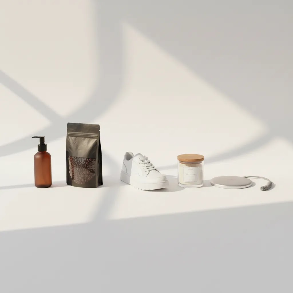
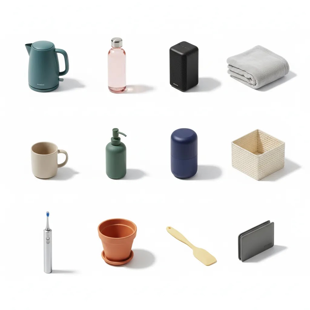
Packshots are clean, controlled product images that show the item clearly, usually against a simple background. In ecommerce, they often serve as the hero image on collection pages, search results, marketplaces, product detail pages, and ads.
The job of a packshot is simple but important. It tells the shopper, fast, “this is the product.” That clarity matters because listing environments are crowded. Whether someone is browsing Shopify category pages, Google Shopping results, Amazon search pages, or a social commerce feed, your image needs to communicate shape, color, finish, and format in a split second.
For many stores, packshots are the baseline visual asset. Lifestyle imagery can sell aspiration. Video can show use. A 360 product photography setup can help with product inspection. But none of those replace the need for a standardized, accurate packshot that keeps the catalog consistent.
That consistency can affect more than aesthetics. It may improve click-through rates from search or collection pages, reduce confusion about variants, and support a more professional brand impression. It also helps with merchandising. If your catalog spans dozens or hundreds of SKUs, packshots make it easier to compare products side by side and maintain visual order across the store.
What does “packshot” mean, and how is it different from a product shot or hero image?
“Packshot” originally comes from commercial photography, where the goal was to capture the product and its packaging clearly for advertising, catalogs, and retail. In that classic sense, a packshot often includes the packaging, label, and any key on-pack messaging, because those details matter in the buying decision.
Here is the thing: in modern ecommerce, store owners often use “packshot” as shorthand for any clean catalog-style image where the product is isolated, lit evenly, and easy to compare across a grid. That might include the packaging, but it does not have to. A skincare brand might show the bottle only. A supplement brand might show the tub and the box. Both can function as packshots if they are consistent and clear.
To remove the ambiguity, it helps to separate the terms by what job the image is doing inside your Shopify store:
Packshot usually means your most standardized listing image. It is designed for clarity at thumbnail size, consistency across SKUs, and fast identification in collection pages, search results, and ads.
Product shot is broader. It can include packshots, but it also includes angles, close-ups, and detail images that are not necessarily standardized for a grid. A macro of fabric texture is a product shot. A close-up of ports on an electronic device is a product shot. These support evaluation, not just identification.
Hero image is a role, not a style. The hero image is the primary image shoppers see first in a given context, such as your collection page tile, your product page main image, or a paid ad creative. In many Shopify stores, the hero image is a packshot because it is the most reliable option for clarity. In other cases, especially for fashion or home, the hero image might be lifestyle. The key is to choose a hero image that stays legible and honest when it is cropped down to a small square in a grid.
Then there is the “packaging shot,” which is often confused with packshots. A packaging shot is specifically about the packaging, the unboxing, and what arrives, not just the product itself. These are useful lower in the gallery to set expectations and reduce surprises, especially for gifts, bundles, and products with multiple components.
If you want quick mental examples, think of it like this:
For packaged CPG, a packshot is often the front-facing pouch, box, or bottle with the label readable, because the label is part of what shoppers compare.
For cosmetics, a packshot is commonly the primary unit, like a tube, compact, or dropper bottle, sometimes paired with the box if shade names or claims live on the packaging.
For electronics, a packshot is often the device itself on a simple background, with a separate packaging shot showing what is included, like cables, case, or manual.
From a practical standpoint, you do not need perfect terminology. You need a consistent system: one standardized image that sells clarity in a grid, plus supporting images that answer the questions your customers always ask.
What makes an effective packshot
Not every product photo qualifies as a strong packshot. The best ones are built for clarity first.
Accurate representation is the first requirement. Your image should match the actual product as closely as possible in color, proportions, texture, and included components. If the buyer receives something that looks different from the listing image, trust drops fast and returns may rise.
Clean composition is next. The product should be centered, well lit, and easy to read at thumbnail size. For most catalogs, a white or neutral background works best because it keeps attention on the item and creates a consistent store layout. This is especially relevant if you sell on channels with image guidelines or if you want a cleaner visual grid across category pages. You can explore more on this in AcquireConvert’s catalog photography content.
Strong packshots also support comparison. If you sell products with minor differences, such as shades, sizes, bundles, or technical variations, standardized angles and framing make browsing easier. A shopper should not have to work to understand which product is different and why.
There is also a technical side. Packshots need enough resolution to stay sharp on retina displays and zoom views without creating heavy page loads. File naming, alt text, and image compression all matter, particularly for SEO and storefront performance.
For some products, a static packshot is enough. For others, adding an interactive 360 view helps close the gap between browsing online and inspecting in person. The key is not choosing one instead of the other by default. It is understanding that the packshot is usually the entry point, while richer assets support consideration later in the journey.
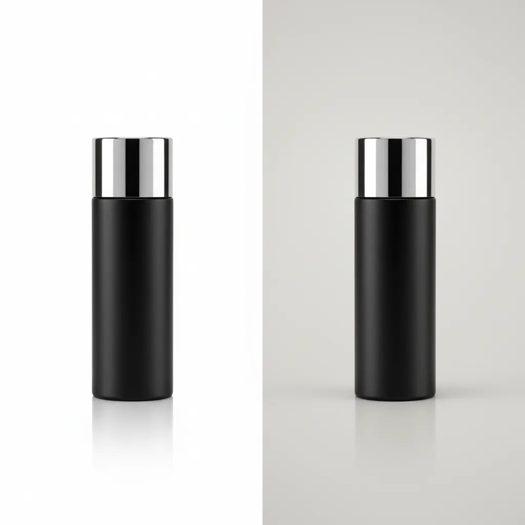
Does a packshot have to be on a white background?
No, a packshot does not have to be on a pure white background. White is common because it is predictable, it works across most themes, and it aligns with a lot of marketplace and ad catalog requirements. But for many Shopify stores, the more important rule is consistency and clarity, not “white at all costs.”
Now, when it comes to channel requirements, white sometimes is required. Many marketplaces have strict image guidelines, and some product categories get flagged more than others. If you sell across multiple channels, it is often smart to keep a clean white-background master packshot in your library and then create versions for your storefront from that.
On your own Shopify site, neutral and brand-tinted backgrounds can work well if they preserve legibility at thumbnail size. The risk with non-white backgrounds is not that they are “wrong,” it is that they can break the grid. Collection pages are a scanning environment. If half your SKUs look brighter, darker, warmer, or more contrasty than the rest, shoppers may struggle to compare products, and the store can feel less organized.
If you decide to move away from white, treat it like a system, not a one-off design choice. For most Shopify store owners, that means setting standards you can repeat:
Keep the background consistent across the category, ideally across the whole store. One neutral light gray that stays stable is usually better than a different color per SKU.
Keep shadows consistent. A soft grounded shadow can help products feel real, but mixed shadow directions or heavy drop shadows can make the catalog look messy fast.
Keep crop and framing consistent. If one product is zoomed in tight and another is small in the frame, your grid loses its usefulness, even if each image is “high quality” on its own.
Match aspect ratio and padding. Shopify themes can crop images differently on collection pages, so consistency in the source files helps prevent awkward trims and unexpected zooming.
Consider this when choosing your background: the best packshot background is the one that makes variant comparison and thumbnail scanning effortless. A background that looks cool in a single PDP may still be the wrong choice if it hurts readability across a collection page or paid catalog ad.
Pros and Cons
Strengths
Considerations
Who should prioritize packshots first
Almost every ecommerce store needs packshots, but some merchants should treat them as an urgent priority.
If you run a Shopify store with inconsistent listing images, packshots should come before most visual upgrades. The same goes for stores moving from handmade photography to a more polished catalog, brands expanding into marketplaces, or merchants preparing paid traffic campaigns where product image quality directly affects first impressions.
They are especially valuable for electronics, beauty, supplements, accessories, home goods, and any product category where buyers compare multiple items quickly. They also matter for merchants planning to scale merchandising workflows inside a product photography studio process, whether in-house or outsourced.
If your products are visually complex or tactile, packshots should still be your foundation, but you may need supporting assets as well.
How AcquireConvert looks at packshots
At AcquireConvert, we look at product imagery through a practical ecommerce lens. The question is not whether a visual asset looks impressive in isolation. The question is whether it helps a store owner sell more clearly, merchandize more consistently, and create less friction for the customer.
That perspective reflects Giles Thomas’s background as a Shopify Partner and Google Expert. On Shopify, catalog presentation affects collection page usability, product page trust, and theme consistency. On Google surfaces, image clarity can shape how competitive a listing appears when shoppers compare similar offers.
For most merchants, the right order is simple. Start with accurate packshots. Then layer in richer assets where they add buying confidence. That might include interactive spins, video, or product detail close-ups. If you are weighing whether advanced imagery is worth it, AcquireConvert’s guide to 360 photo software is a practical next step, and our broader 3D Product Photography resources can help you evaluate where static images stop being enough.
How to choose the right packshot approach
If you are building or refreshing listing visuals, use these criteria to decide what kind of packshot workflow makes sense for your store.
1. Start with your sales channel requirements
Your own storefront gives you flexibility, but marketplaces and ad platforms may not. Some require white backgrounds, certain crops, or restrictions on text and props. If you sell across Shopify, Google, and marketplaces, the safest approach is often to create a clean master packshot first and derive channel-specific versions from that source file.
2. Match image style to product complexity
Simple products often need only one strong hero packshot plus a few support angles. Complex products need more. If shoppers are likely to ask about ports, closures, ingredients, texture, or materials, static packshots should be supplemented with detail shots and possibly rotational or 3D content. A single image rarely answers every buying question.
3. Think about catalog scale, not just one SKU
Store owners often judge photography decisions on a favorite hero product. That is a mistake. You need a system that works across the entire catalog. Consider background style, lighting, cropping, aspect ratio, and naming conventions. Standardization matters more as your SKU count grows. It keeps collection pages organized and reduces rework later.
4. Balance clarity with brand presentation
A packshot should be clean, but it does not have to feel sterile. Premium brands can still create recognizable visual standards through lighting, color treatment, and framing. The goal is to make the product obvious without making the listing forgettable. In many cases, brands use the packshot as the hero image and then follow with richer storytelling lower down the gallery.
5. Decide when to add 360 or 3D support
Not every product needs interactive imagery. But if return risk is high, product detail matters, or customers often want to inspect shape from multiple angles, richer formats may help. That is often the case with footwear, furniture, technical equipment, and premium accessories. In those categories, packshots remain essential, but they work best as part of a broader visual system that may include spins, renders, or close-up sequences.
For many growth-stage stores, a practical workflow looks like this:
If you sell products where finish, shape, or dimension strongly influence the purchase decision, packshots are your baseline, not your endpoint.
Packshot production workflow: shooting setup, post-production, and scaling consistency
What many store owners overlook is that “better packshots” is rarely about one perfect shoot. It is about a repeatable workflow you can run again next month when new SKUs arrive. That is how you avoid the common problem where half your catalog looks like it belongs to a different brand.
A practical end-to-end workflow has three parts: capture, post-production, and scale.
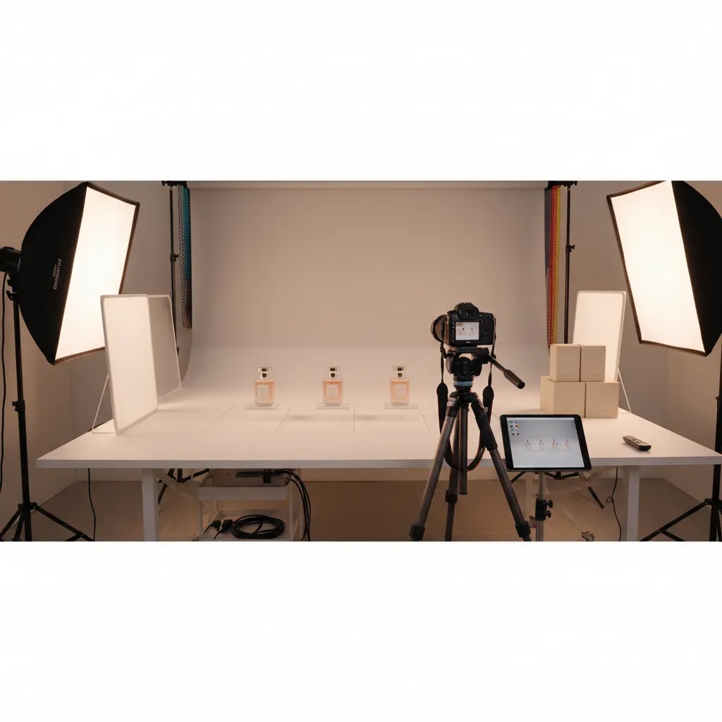
Capture: get consistency in-camera first
Start with lighting. You do not need an expensive studio to improve packshots, but you do need consistent light direction and diffusion. A basic softbox setup or light tent can work well for small to medium products, as long as you control reflections and keep the background evenly lit.
Use stabilization. A tripod is one of the simplest upgrades you can make because it locks your framing and makes it easier to repeat angles across SKUs. For small products, a consistent shooting distance and focal length also helps your catalog look uniform.
Pay attention to color. If you are selling products where shade accuracy matters, like cosmetics, apparel, or home decor finishes, inconsistent white balance can create real customer confusion. Even if you plan to edit later, starting with correct exposure and neutral color in-camera reduces the amount of “guesswork” in post.
For reflective or glossy products, plan for extra time. Metal, glass, and high-gloss packaging can look great, but they are less forgiving. You may need to adjust light placement, use flags to control reflections, or take more than one exposure to get a clean result.
Post-production: make the packshot store-ready
Post-production is where most packshots become usable for ecommerce. The goal is not to “beautify” the product into something it is not. The goal is to make the photo accurate, clean, and consistent.
Typically, that means background cleanup, consistent cropping, and color correction. If you are using white or near-white, you want the background to be clean without blowing out product edges. If you are using a neutral tone, you want it to be consistent across the catalog so your collection pages do not look patchy.
Shadow consistency matters more than most people think. A grounded soft shadow can help keep products from looking like they are floating, but random shadow intensity across SKUs can make a grid feel unprofessional. If you add shadows in editing, keep the direction and softness consistent.
AI tools can help with background removal, masking, and batch edits, but they still need human review before you upload images to Shopify. Edges, labels, and fine details are where automation can introduce small errors that become obvious in a zoom view, or worse, make the product look different than what ships.
Scaling: standards that prevent “every SKU looks slightly different”
If you want packshots to stay consistent as you add products, write down your standards. That might sound formal, but it can be a simple internal checklist.
Create a shot list per product type, like front, 3/4, side, back, and one detail. Define which angle is your hero packshot and keep that consistent across similar items so your collection page grid is easy to scan.
Set framing rules, like how much padding you want around the product and what aspect ratio you are delivering. Many Shopify themes use square crops in collections, so test how your images look at thumbnail size before committing to a standard.
Use a naming convention in your working files. Even if Shopify customers never see it, your team will. Naming images by SKU, angle, and version makes it far easier to replace a hero image later, run batch exports, and avoid uploading the wrong variant photo.
Build in QA. A quick review step, even five minutes per batch, catches the problems that create returns and customer service tickets: wrong color temperature, missing components, misleading scale, or packaging that does not match what ships.
The way this works in practice is simple: if you can shoot, edit, and publish one SKU cleanly, you can scale it. The difference is whether you document what “cleanly” means, then keep doing it.
Frequently Asked Questions
What is a packshot in ecommerce?
A packshot is a clear, controlled product image used to show the item accurately, usually on a simple background. In ecommerce, it is commonly the main listing image on collection pages, product pages, marketplaces, and ads. Its job is to communicate exactly what the shopper is considering without distractions.
What does packshot mean?
Packshot is a term from commercial photography that traditionally refers to a clear image of a product, often including the packaging and labeling. In ecommerce, many Shopify store owners use “packshot” more broadly to mean a clean, catalog-style product image that is consistent across a product grid and easy to recognize at thumbnail size.
What is the difference between a packshot and a product shot?
A packshot is usually the standardized listing image designed for clarity and consistency, often used as the main image in a grid. A product shot is a broader category that can include packshots, plus detail shots, close-ups, and alternative angles that help shoppers evaluate the product. In many stores, packshots are the foundation, and product shots provide the supporting evidence.
Is a packshot the same as a hero image?
Not necessarily. “Hero image” describes placement and priority, it is the first image shown in a specific context like a collection tile, product page gallery, or ad. A packshot is a style of image built for clarity and consistency. Many stores use packshots as hero images because they read well in a grid, but some categories use lifestyle images as heroes and keep packshots as supporting images instead.
Are packshots only for physical packaged goods?
No. The term often comes from commercial photography for packaged products, but ecommerce merchants use it more broadly for clean standalone product images. Apparel accessories, cosmetics, electronics, home products, and many other categories benefit from packshot-style imagery, even when the product is not sold in visible packaging.
Do packshots improve conversions?
They can help by reducing visual confusion and improving trust, but results vary by store, category, traffic source, and the rest of the product page experience. Packshots are best viewed as a foundational asset that supports clearer merchandising and better first impressions rather than a guaranteed conversion fix on their own.
What is the difference between a packshot and a lifestyle photo?
A packshot isolates the product and focuses on clarity. A lifestyle photo shows the product in context, often being used or styled in a setting. Most ecommerce stores need both. The packshot helps shoppers identify the item quickly, while lifestyle imagery helps them imagine ownership or use.
Should every product page have only one packshot?
No. One strong hero packshot is the minimum, but many products need additional angles or close-ups. If customers care about finish, scale, texture, closures, or components, you should include supporting images. The hero image gets attention, but the rest of the gallery helps answer buying questions.
When should I add 360 or 3D visuals?
Add them when static images leave too much uncertainty. Products with important side views, structural detail, or premium inspection value often benefit most. If shoppers frequently zoom, compare angles, or hesitate because they cannot fully visualize the item, interactive visuals may be worth testing alongside standard packshots.
Do Shopify stores need different packshots than marketplace sellers?
Often, yes. Shopify gives you more freedom in presentation, while marketplaces and ad channels may have stricter image rules. A smart workflow is to produce one clean master packshot and adapt it for each channel. That keeps the catalog consistent while reducing the need to photograph products multiple times.
Can AI tools replace traditional packshot photography?
AI tools can assist with background cleanup, resizing, and visual edits, but they are not automatically a full replacement for careful product photography. Accuracy still matters. If an image no longer reflects the real item, it can create trust issues. Use AI support carefully and keep the product representation honest.
What background works best for packshots?
White is the safest option for many ecommerce uses because it keeps focus on the item and aligns with common marketplace requirements. Neutral backgrounds can also work well if they support the brand without distracting from the product. The most important factor is consistency across the catalog.
What is the typical cost of a packshot?
The cost varies widely based on product type, volume, and the level of retouching required. For example, photographing a simple matte product in bulk is typically less expensive per SKU than shooting reflective items, complex bundles, or products that need extensive label cleanup and color matching. Costs also depend on whether you shoot in-house, use a studio, or hire a photographer, and whether you need additional angles beyond the hero packshot.
Key Takeaways
Conclusion
Every listing needs a packshot because every shopper needs clarity before they feel confident enough to click, compare, or buy. Whether you sell ten products or ten thousand, a clean and accurate hero image helps your catalog work harder. It supports trust, improves merchandising, and gives your brand a more professional foundation across Shopify, search, and marketplace channels. If you are refining your product imagery strategy, AcquireConvert is a strong next stop. Explore our practical guides on 3D product visuals, catalog photography, and store-ready image workflows shaped by Giles Thomas’s experience as a Shopify Partner and Google Expert. Use this article as your cue to audit your current listings and fix your weakest images first.
This article is editorial content created for educational purposes and is not a paid endorsement unless explicitly stated otherwise. Pricing, platform features, and channel requirements are subject to change, so verify current details directly with each provider or platform. Any performance outcomes discussed are illustrative only and are not guaranteed.

Hi, I'm Giles Thomas.
Founder of AcquireConvert, the place where ecommerce entrepreneurs & marketers go to learn growth. I'm also the founder of Shopify agency Whole Design Studios.