To get explosive ecommerce growth you need to have an in-depth understanding of data analysis.
Not only do you need to know how to analyse your different data sources, you also need to understand how to turn data insights into a/b test hypotheses.
Hypotheses are assumptions, ideas for website changes that come from your data that you need to test.
You test them to confirm their truth. The question…will they increase your conversion rates and profits?
Once you’ve created your hypotheses you need to prioritize them using the conversion hierarchy.
In this article you’ll see the ecommerce data we analysed from By Charlotte, our Jewellery store case study.
You learn how to turn the data into insights and test hypothesis and later how to prioritize them for implementation and a/b testing.
This is part 3/5 in a series on ecommerce conversion rate optimization.
Ecommerce Data Analysis & Hypotheses
At the beginning of our case study we outlined which data sources we would collect from By Charlotte to inform our a/b tests.
They were as follows:
- Mouse tracking
- User testing
- Live chat
- Customer Surveys
- Website & Exit Intent Polls
- Usability Evaluation
- On page SEO audit
- Accessibility evaluation
- Sales funnel audit
- Browser & device conversion rate audit
- Internal search audit
- Compass KPI benchmark
- Shopping cart abandonment audit
You’ll learn as we go through each data source, discover the insights, turn them into hypothesis and later prioritize them ready for execution and testing.
How To Write An A/B Test Hypothesis
Before we start diving into the data and creating test hypotheses, first let’s quickly learn the three elements of a great a/b test hypothesis.
I use what I call the ASL model, no this is not 90’s MSN chat so this doesn’t mean age/sex/location, it means:
- Analysis: What lesson you learned from data collection and analysis
- Solution: What the potential solution is
- Lift: Which conversion rate you are trying to improve
As we analyse the data and find new insights and hypotheses we will add them to this hypothesis spreadsheet.
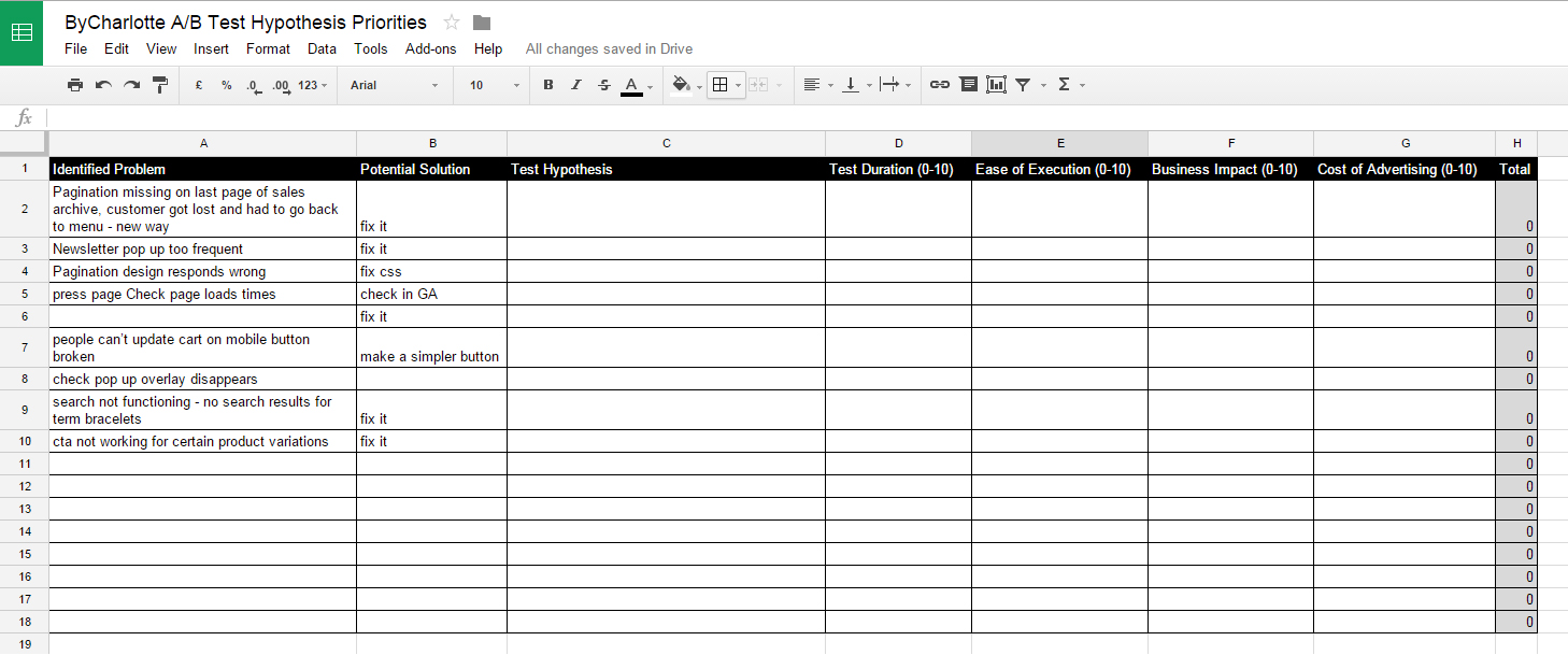
At the end of the analysis we will complete the spreadsheet and rank the a/b tests.
Ecommerce Mouse Tracking Data Analysis
When you are analyzing your mouse tracking data there are three main points to focus on:
- Do visitors click on and complete the one core task for the page
- Are visitors clicking where they shouldn’t be
- Are there any surprising areas with high click density (what can you learn from that?)
Home Page Mouse Tracking Data
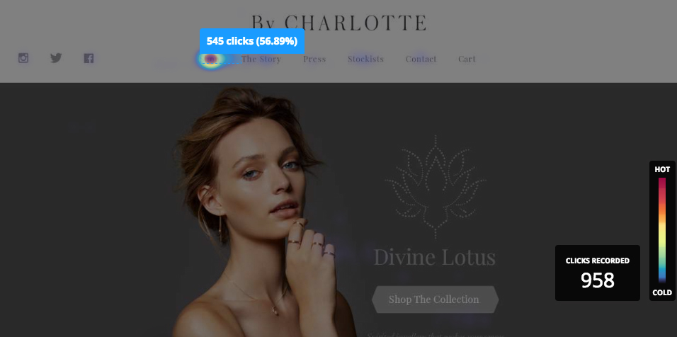
Click map
From the homepage click map you can see most visitors go directly to the shop page via the navigation menu. They do not click on the call to action, our one core task for the page.
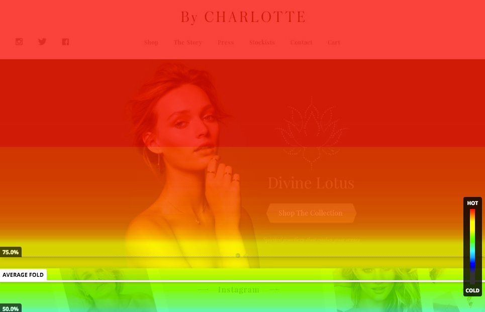
Scroll map
It is also clear they do not scroll down the page.
The same patterns were repeated on tablet and mobile devices for both click and scroll maps.
Hypothesis
- Analysis: Visitors do not click on the call to action meaning we cannot drive them to specific product or collection pages.
- Solution: Change the visual hierarchy of the page to highlight the call to action using a contrasting off brand color.
- Lift: Homepage to collection / product page conversion rate, the first step in the ecommerce sales funnel.
Shop Archive Page Mouse Tracking Data
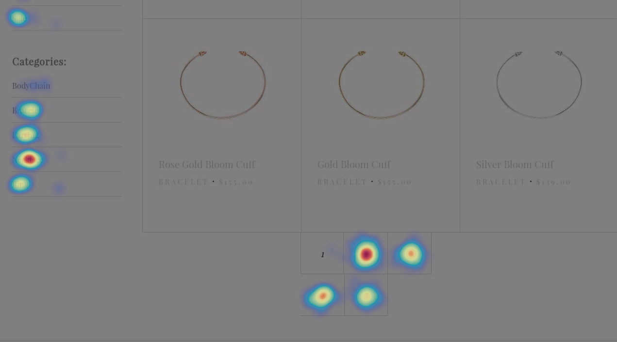
Click map
From the archive page click map you can learn that the majority of visitors click either the archive pagination or the necklace category
Hypothesis
- Analysis: Visitors have to scroll down to the bottom of the archive to find the categories.
- Solution: Add the main categories to the global persistent website navigation.
- Lift: Percentage of visitors who add a product to the shopping cart. Improve website usability making it easier for visitors to find specific products and checkout.
Single Product Page Mouse Tracking Data
Click Map
You can see people are clicking ‘shop’ in the navigation menu to return to the product archive. We also know many visitors shop by category from the archive click map.
Hypothesis
- Analysis: Visitors do not have a way to return to their previous category page.
- Solution: Add in breadcrumbs to the single product pages.
- Lift: Percentage of visitors who add a product to the shopping cart. Improve website usability making it easier for visitors to find specific products within a desired category.
Story Page Mouse Tracking Data

Scroll Map
We learned visitors do not scroll to the section about Charlotte on the Story page. This section is important as it explains why Charlotte is an authority in the fashion industry and creates credibility around her brand.
At the moment the visitors just see the header image.
Hypothesis
- Analysis: Visitors do not scroll to and read about Charlotte’s accolades on the Story page.
- Solution: Change the content hierarchy of the page, placing Charlotte and associated publications and accolades above the fold.
- Lift: Percentage of visitors who add a product to the shopping cart. Improve social proof and credibility of Charlotte and her brand through better content hierarchy.
Press Page Mouse Tracking Data

Click Map
Some insights from the usability evaluation and website walk through were cross referenced in this hypothesis.
The press page is hard to use and very long and slow to load. The navigation menu at the top is makeshift and doesn’t have a selected state or even look like navigation.
People also try to click on the images but they do not lead to the single product pages for the items displayed.
Hypothesis
- Analysis: The press page usability is poor and the images don’t link to the products displayed.
- Solution: Add a sidebar navigation with selected state and split the page into three smaller, faster to load pages. Make all the images links to product pages.
- Lift: Press page bounce rate, press page visitors who add to cart. By improving the page load times and sending visitors to products from the celebrity images, more press page visitors will add products to cart.
That concludes the big insights from the mouse tracking data, we also learned:
- The FAQ page and Product Info page needed in page navigation and were also difficult to use with too much scrolling.
Automated User Testing Sessions
There are a number of ways you can perform user testing.
In this case study we recorded videos of people using the shop using Hotjar Recordings.
Here is an example video recording
As you can see you are able learn how the visitor interacts with the shop and learn their behaviors.
You can also learn about obstacles in your sales funnel such as bugs or usability problems.
Here are a few takeaways with supporting screenshots from the video session data.
No user feedback on slider position
Hypothesis
- Analysis: The single product page slider does not show users which slide they are on and they subsequently get lost.
- Solution: Add slider pagination to feedback to the user their current slide.
- Lift: Percentage of visitors to add to cart. Improve the usability and search-ability of product assets to inform the user on the their purchasing decision.
Sold out products have no notification feature
Hypothesis
- Analysis: Sold out products do not communicate a back in stock date
- Solution: Add a ‘Get notified when back in stock’ feature, with a simple email list sign up, segmented by product for quick email marketing blasts.
- Lift: Value per lead. Get more targeted with email marketing and improve per email or lead value and monetization.
Ecommerce Live Chat Data Analysis
Our next source of data is qualitative and aims to understand reservations visitors have around their purchase.
We used Olark live chat to help customers at the point of purchase and then analysed the live chat transcripts for insights.
Here are some of our insights and hypothesis:
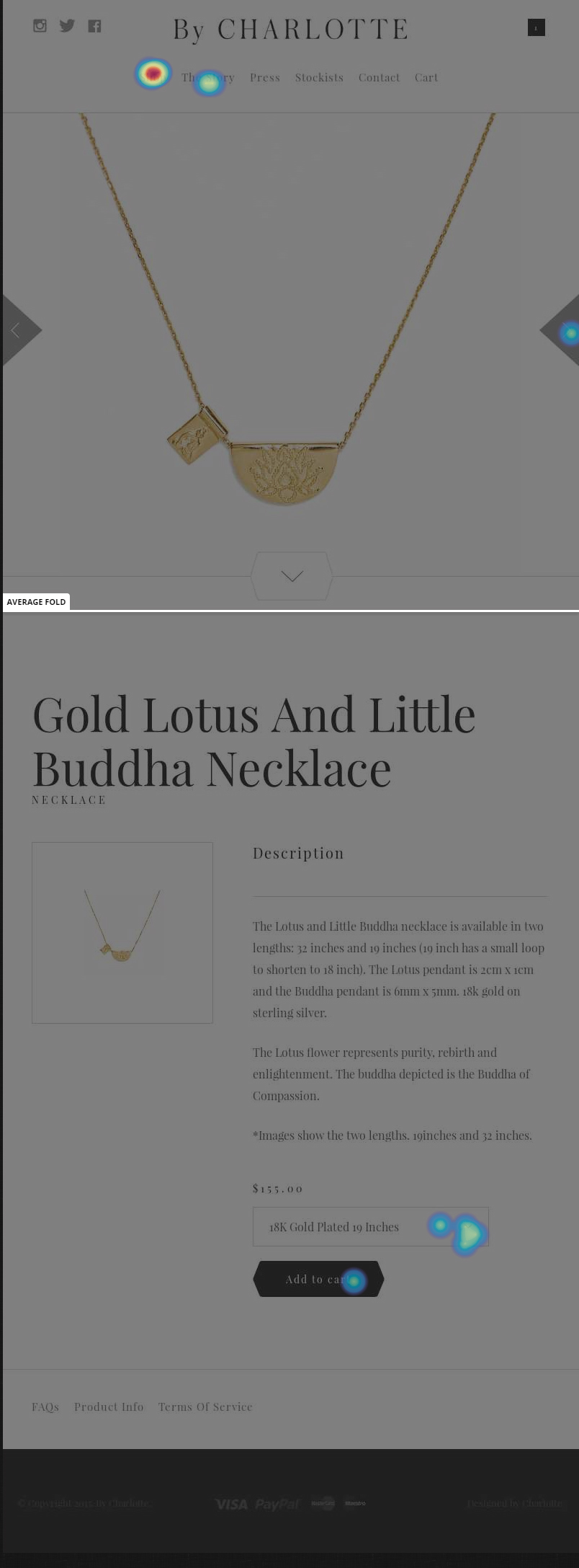
Product Information Gap
Customer: Hey guys, Could you please tell me if your sterling silver jewellery will tarnish if worn in salt water? Thanks 🙂
Customer: I was looking at the Gold ‘You are blessed’ tan bracelet and was wondering if it’s durable enough to wear everyday?
Hypothesis
- Analysis: There are some product information gaps
- Solution: Add more detail around product use to the single product pages, perhaps behind a tabbed system for people looking for in-depth information
- Lift: Single product page to cart conversion rate. More detailed product info means less reservations around the purchase and more checkouts.
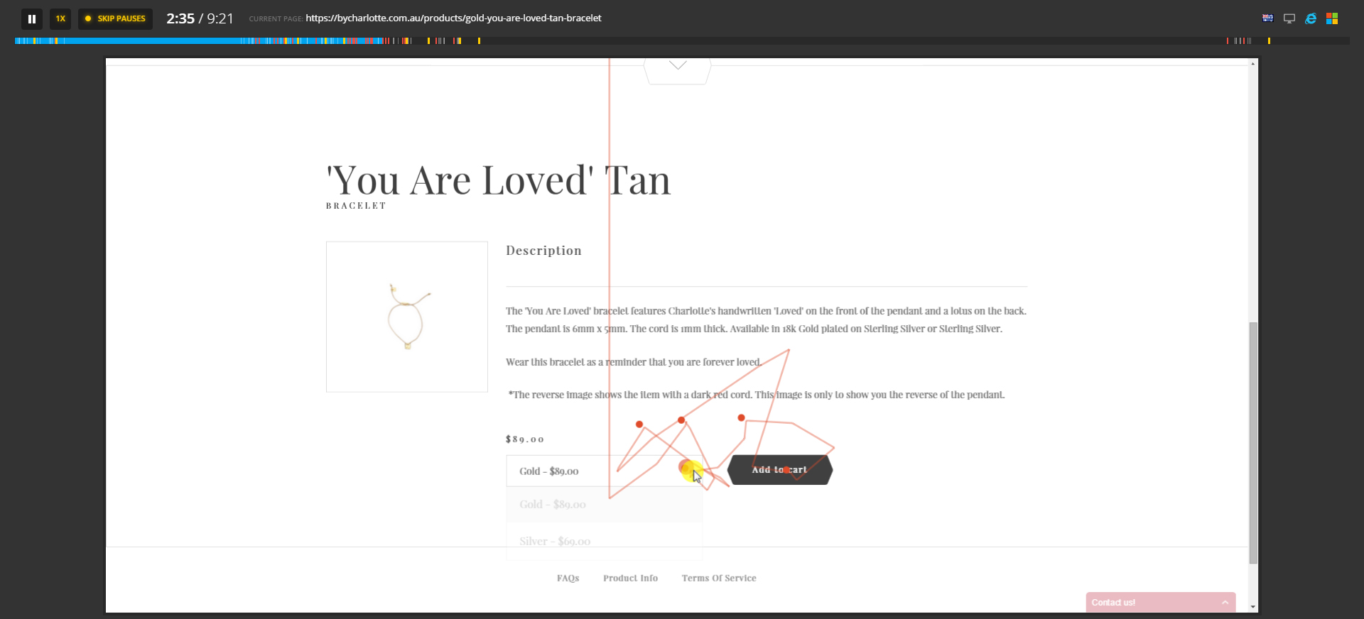
Validation For Our ‘Get Notified’ Hypothesis
Two different people’s chat transcripts here:
Customer: Hi, Looking to buy the Lotus Star Necklace as a gift, but its sold out online, any chance there’s any available in store?
Customer: Hello, I would like a notification for when the “Silver Lotus Moonlight Short Necklace” is back in stock, if this is possible. Kind regards, Susanna Scholz
Hypothesis
- Analysis: Sold out products do not communicate a back in stock date
- Solution: Add a ‘Get notified when back in stock’ feature, with a simple email list sign up, segmented by product for quick email marketing blasts.
- Lift: Value per lead. Get more targeted with email marketing and improve per email or lead value and monetization.
An additional hypothesis here could also revolve around showing store availability and stock levels on the website.
Expected Delivery Dates
Customer: HI! I’m Aria and I live in New York. I was wondering how long it would take to ship here? Thanks btw love the website!!
Hypothesis
- Analysis: No way to communicate expected delivery date to visitor
- Solution: Add an expected delivery date to the single page, cart and a delivery date calculator for different shipping options on the cart page.
- Lift: Cart page to checkout conversion rate. More people will move to the next step in the funnel after the cart page as delivery dates will be more clearly communicated.
Communicate policies clearly
Customer: Hi, I purchased the Gold Sacred Pearl Necklace from you last week and it arrive in good time, thank you. Unfortunately the chain where the pearl connects to the necklace has broken. I had only worn the necklace for a day. Can you please let me know about your faulty items policy? Thank you for your help! x
Customer: Hi there, i have recently purchased a star necklace and it is been sent to the wrong address how do i change it? kind regards
Hypothesis
- Analysis: Not easy to find returns or shipping policies.
- Solution: Improve product information page and in page navigation.
- Lift: More people will solve their own customer service issues, reducing the cost of customer service representatives monthly and increase the profits.
Ecommerce Survey Data Analysis
Our next data source is a survey sent to By Charlotte customers.
The customers were first time customers and had bought in the last month.
This is important as long time customers can skew the data and be overly loyal or pissed off about something.
Also recent buyers still have the transaction clear in their mind, they can remember what happened basically.
Where as these insights do not always create hypothesis, they can help with suggesting ideas and language for input to your copywriter.
Here are some answers to the more interesting questions.
Question: What made you choose to buy By Charlotte jewellery?
Answer: I appreciate fine jewellery, its obvious that Charlotte does as well. Her pieces are simply beautiful.
Answer: Simplicity and delicate
Answer: Because I love the design, the meaning and that it is very fine/dainty
Answer: I love the lotus collection and was looking for rose gold jewellery
Here we learn which attributes of Charlotte’s jewellery are important to her customers: fine, simple, delicate, dainty
We can also learn that rose gold jewellery could be an SEO term worth ranking for, further research needed, there are always cross over in data sources in CRO.
Remember to look for patterns across your different data sources.
Question: What questions or doubts did you have before you purchased the jewellery that you couldn’t find an answer to?
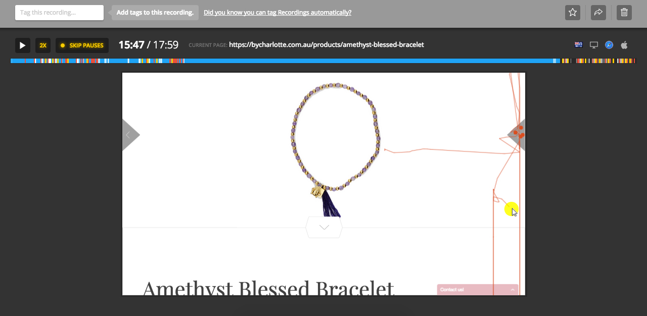
Answer: The sizing of particular pieces- wasn’t a major issue though
Answer: Wasn’t 100% sure how large the pieces will be
Again we learn that product information could be more in-depth on the single product page.
Hypothesis
- Analysis: Product sizing unclear
- Solution: Add size charts to the single product page and ensure every product has image on model as well as on white background
- Lift: Percentage of visitors who add to cart. More product information means better informed buying decisions.
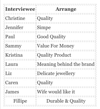
Question: What is important to you in a piece of jewellery?
Answer: Quality at an affordable price
Answer: that it’s a little unique, fine, well made and has some significance
Answer: quality & significance of piece – i like jewellery that has meaning to it or something behind it if that makes sense!
Answer: Quality
Answer: Meaning
Customers repeat the word quality again and again here, we’ll see this later in other data sources too. People also talk about the meaning behind the jewellery or the design concept.
This is great input to value proposition copywriting and product description copywriting.
Analyzing Website Poll Data
Our next source of data is from two polls we had running on the website.
Let’s dig into the data and create some hypothesis.
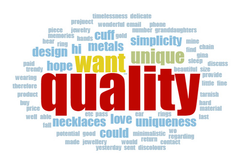
Poll 1: What is stopping you from checking out today?
I created a word cloud are part of my three step system for qualitative data analysis, to showcase the data.
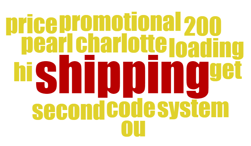
It’s clear from this data that shipping is not communicated clearly throughout the site, how much is international shipping, expected delivery dates and so on.
Hypothesis
- Analysis: People don’t have clear shipping expectations
- Solution: Show shipping costs and times upfront on every page, discuss with Charlotte where we can ship for free and communicate this to visitors, use location sniffing javascript to communicate international shipping costs
- Lift: Percentage of visitors who add to cart. More shipping information means better informed buying decisions.
Poll 2: What’s important in a piece of jewellery for you?
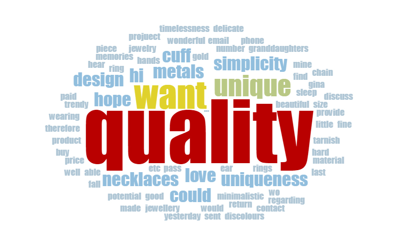
Again we learn that Charlotte’s audience really cares about quality. We also saw the re-occurrence of the word simple and unique. The customer language or visitors vocab as I call it is becoming more clear and we are building up some great ammunition for copy changes.
Usability Evaluation
A usability evaluation is a great way to improve the conversion rates of your ecommerce store.
Rather than write all the hypothesis from our study here (which would require it’s own blog post).
I will write the takeaways from each step in the usability evaluation as a bullet point list.
The evaluation is split into nine steps and areas of focus.
Homepage Takeways
- No global search
- No product categories on the homepage
- Poor on page SEO optimization
- No link under new arrivals, header also not a link
Task Orientation Takeways
- Shop categories should be above the fold
- No link to privacy policy
- No checkout button at top of cart
- Continue to cart is a link not a button (call to action consistency)
- Yes, could add more filters to shop
Navigatoin & Informatin Architechture
- No categories in the persistent global navigation
- No add site map
- Pre order should not be a category – turn into page or collection
- Links need underlining and consistent styling
- Make add to cart more obvious and ajax update cart status in header navigation
- Add more advanced filters to shop
Trust & Credibility
- Add in testimonials from featured celebrities
- Add a contact form to contact page
Writing & Content Quality
- Story page could be inverted to show Charlotte’s and celebs testimonials at the top
Page layout and visual design
- Consistent improved hyperlinks all round
- Links don’t show history of being clicked or focus
Search
- Should have search term at top of results page
- No spell check or auto correct
- Empty searches are not gracefully handled
- No advanced search functionality
- Search input not on every page
- No search scoping
- add related items search option
Help, Feedback, Error Tolerance
- FAQ should be more step by step and less text heavy
- 404 page needs designing with links to products
Most of these usability problems will fall into the first and third bucket in our hypothesis spreadsheet, ‘funcational’ and ‘usable’.
Ecommerce On Page SEO Analysis
Rather than list the changes we made here i thought I’d give you a simple list of on page SEO items to consider.
- Keyword is in your title tag (at the front of the title if possible)
- The URL is the keyword only and nothing else
- Add in multimedia to the page (video, images) and make sure the alt tags and file names include your keyword
- Link to authority webpages on the topic of your keyword
- Include the keyword in the first paragraph or two
- Include the keyword in your H1 tag
- Use LSI keywords
- Description as shown in your SERP’s
A big part of SEO optimization that is often overlooked is click through rate from SERP’s pages.
Make sure to record your CTR’s from your Google Analytics accounts monthly and measure for changes when amending your page titles and descriptions.
Don’t forget these are mini pitches to people, like a small value proposition to get them to your page.
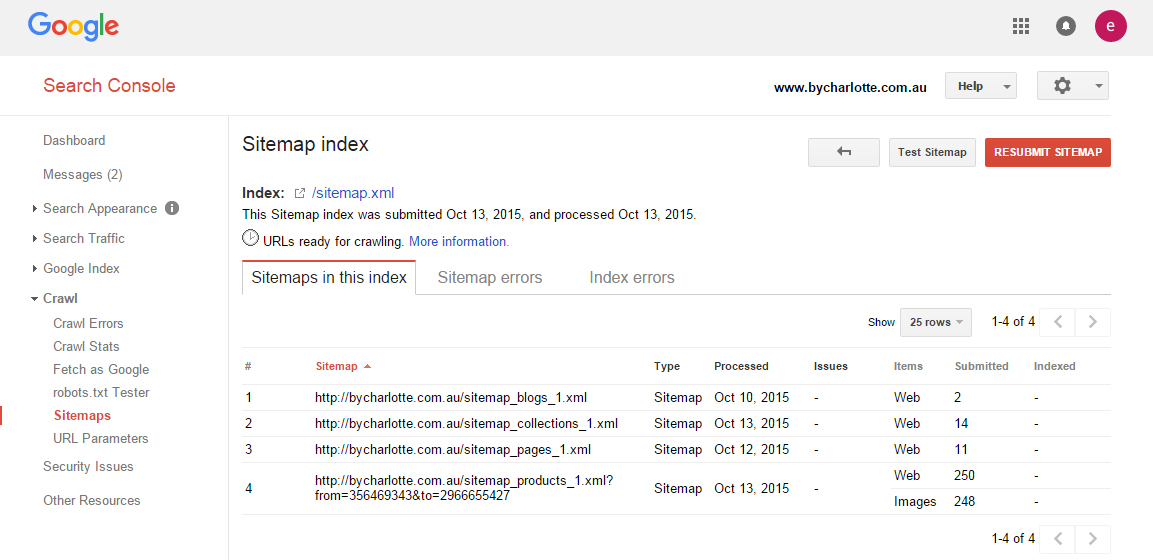
We also submitted a sitemap to Google Webmasters.
Accessibility Evaluation
There are four categories of accessibility: visual, auditory, motor and cognitive.
Accessibility is often thought to entail making your site function well for screen readers.
Actually, web accessibility is a part of user experience design focused on making your websites usable by the widest range of people possible, including those who have disabilities.
Any changes or hypothesis from this data source would go into the second bucket in our hypothesis spreadsheet, ‘Accessible’.
Ecommerce Sales Funnel Audit
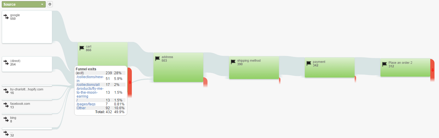
Next up we are going look at the By Charlotte sales funnel to learn where people are dropping off and leaving the website.
You want to get a large data sample when possible for this and try to measure in complete months and from Monday to Sunday.
For example:

You can generate this report by navigating in your Google Analytics account under Reporting to:
Conversions > Goals > Funnel Vizualisation
In our case the funnel goal was set up incorrectly and therefore we could only measure from September the 14th on wards, the point at which it was rectified.

From the funnel vizualisation we learned the biggest drop off was between the cart and the first step in the checkout process, in our case the address details page.
Only 50.19% of people continued to the address details page.
However, of the people who did not take the next step only around 18% total exited, some people continued to shop or navigated to other pages.
This is still however the biggest percentage drop off of exits in the funnel.
It is important to dig deeper in CRO, learn where the people are leaving to and then try to learn why.
Cross referencing this with other data sources shows this may be due to the lack of shipping and delivery date information available on or before the cart page.
We learned this from multiple sources including the poll we had running on the cart page.
As a CRO you must look for patterns across your data, patterns will partially validate hypotheses and improve their position in the priority ranking.
Hypothesis
- Analysis: The highest percentage drop off in the sales funnel is between the cart page and the address details pages.
- Solution: Add in shipping pricing information and expected delivery date.
- Lift: Percentage of visitors who move to the address step in the checkout funnel. More shipping information means better informed buying decisions.
Ecommerce Goal Flow Data Analysis
You can generate this report by navigating to:
Conversions > Goals > Goal Flow
The goal flow report echoes the same message.
28% of people exit from sales funnel on the cart page step.
Browser & Device Data Analysis
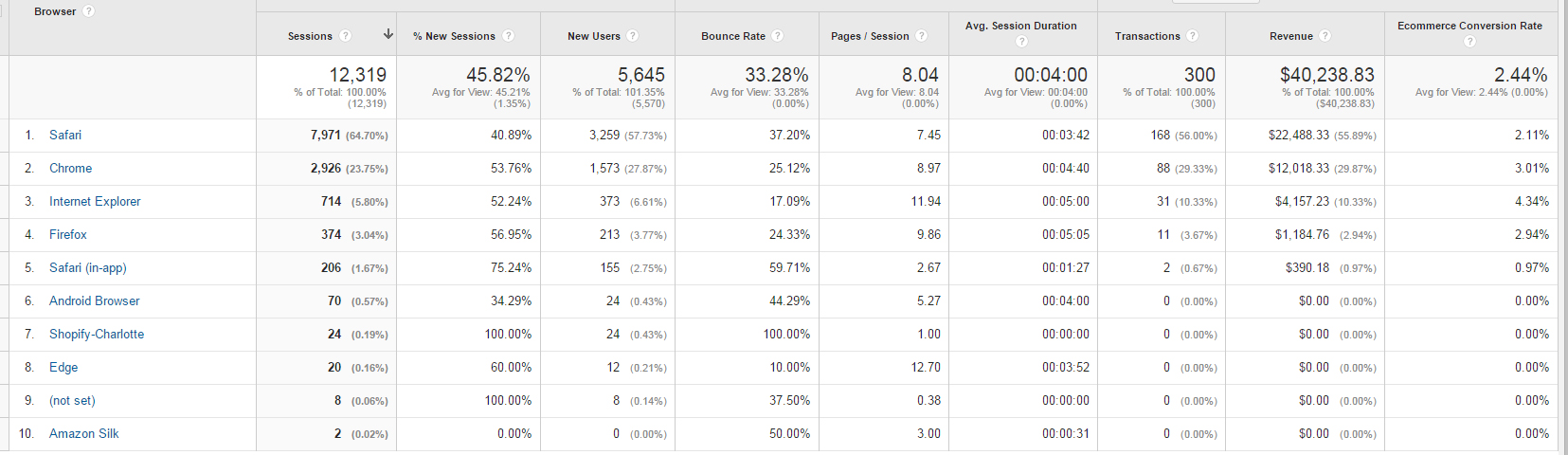
The next analysis we will dig into in Google Analytics is:
Reporting > Audience > Technology
This initial report above gives the impression both Firefox and Safari (in-app) have worryingly low conversion rates.
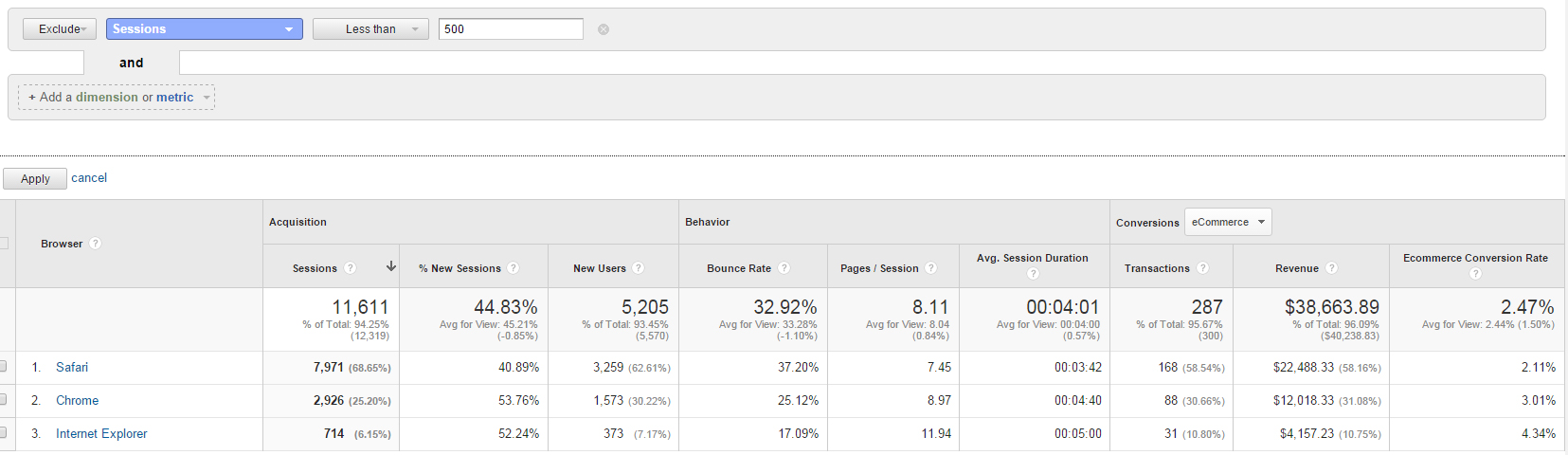
However when we filter the data to remove any browsers with monthly sessions less than 500 we can see that Firefox and Safari (in-app) disappear.
This is because with so few sessions the data is not significant and doesn’t warrant investigation.
Remember, base reports in Google Analytics lie, you have to filter and segment the data to understand the truth.
Cross referencing this with the Safari page load times, we found no page speed problems.
Hypothesis
- Analysis: Safari browser has a low conversion rate
- Solution: Undertake a walk through analysis of the browser to find any functional errors, perform further browser testing.
- Lift: Conversion rate for Safari browsers.
Mobile Data Analysis
The next analysis we will dig into in Google Analytics is:
Reporting > Audience > Mobile > Overview
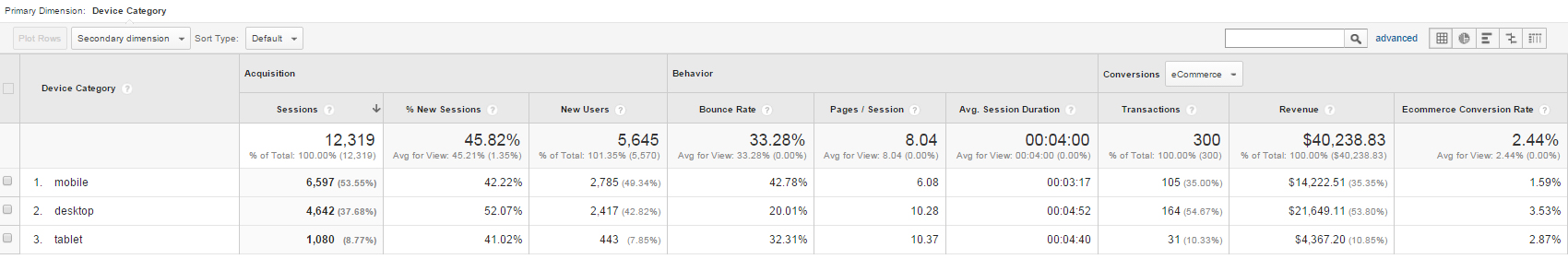
From the report we can see mobile devices and tablets, somewhat expectedly, have a lower conversion rate than desktop.
However in today’s ecommerce world, where even on this store more than 60% of visitors are on mobile, you cannot afford to take mobile optimization lightly.
Digging deeper we found some functional mobile errors like here (10 minute mark in the video), where css needs updating and could affect visitors at the point of purchase.
Digging into the device specific report, we found this was mostly traffic on the Apple iPhone.
Hypothesis
- Analysis: Mobile conversion rates are lower than expected.
- Solution: Improve mobile browser testing on Apple iPhone.
- Lift: Conversion rates for mobile visitors.
Ecommerce Internal Site Search Data Analysis
Finally we looked at the internal search data.
Reporting > Behaviour > Site Search > Search Terms
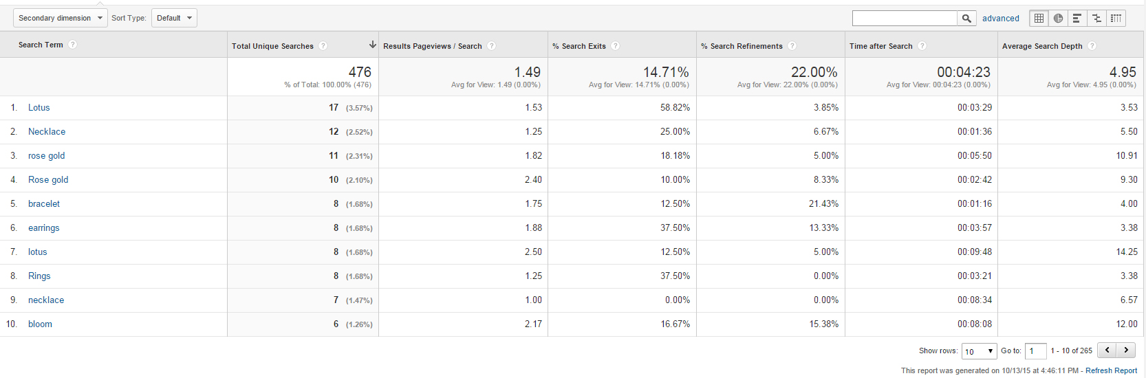
There are many mentions of metal types with the search terms report. This is therefore a good filter to add into the shop archive to help visitors find the right products for them.
It will also create category or collection pages we can try to rank in Google and increase search traffic.
Hypothesis
- Analysis: Many people search for metal types.
- Solution: Add metal type filtering to Google Analytics.
- Lift: Conversion rate.
Shopping Cart Abandonment
Unfortunately I don’t have the data to share on this quite yet, I will update it in the next week.
When it comes to optimizing your shopping cart abandonment rates here are a couple of things to consider:
Timing
Make sure you send the first transaction email right away, the longer you wait to reengage the prospect the harder they will be to bring back to the website and close them.
According to a study by MIT 90% of ecommerce leads go cold in the first hour.
Send Multiple Emails
Apart from sending your first email early, you need make sure you send multiple emails warming the lead back up to the sale.
Show Product Details
Show the product details of their cart such as pricing, sizing, images, people need the same information in the email as in the cart to push them through the sales funnel.
Additional Reports
Of course there were many other reports we exported from Google Analytics but found no great insights.
For example:
- Demographics
- New vs Returning
- Source/Medium (all the traffic is direct or organic)
- Landing Pages
- Exit Pages
- Ecommerce (no campaigns or coupons set up)
- Segmentation by day of the week
Another great source of data to analyse is using the app Compass.
This shopify app helps you to analyze, track and evaluate your acquisition channels. Maximize the ROI of your marketing activities Google Adwords, Facebook Ads, Display Ads, Email, Social Media, Organic Search. With it you can learn benchmark data on the effectiveness of your marketing. You can even get practical tips on how to improve those benchmarks.
How To Prioritize Your A/B Test Hypotheses
Now is the time to score and prioritize all our a/b test hypothesis.
The final hypothesis spreadsheet can be seen here.
The spreadsheet is separated into 5 buckets:
- Functional
- Accessible
- Usable
- Intuitive
- Persuasive
These five tabs represent the 5 levels of the conversion hierarchy.
As we analysed our data sources we put each hypothesis into the corresponding bucket.
Now as a rule, any changes that fall into the first three buckets, we would generally just execute them as updates to the overall website or Shopify theme.
The first three buckets are about having a functional and usable website, this is a no-brainer, these changes all need making.
That’s not to say the changes shouldn’t be tested, they will be when we run a site wide a/b test using Convert.
We’ll test the current Shopify theme against the new design which will be informed by our study.
The tests that fall into the last two buckets are the ones that truly require ranking.
The last two bucket have a scoring system. There are four ways to score each test.
Overall the test that scores highest will be executed first.
Here’s how it works:
Time
How long it takes for the test to reach statistical significance.
Ease
How easy it is to execute the test.
Business Impact
How much the test will change the profit of the business. Big changes score high.
Cost of Advertising
Less important for this project as all the traffic is organic. But it basically asks how much the traffic will cost. Expensive traffic scores lower.
Ecommerce Data Analysis
When looking to improve the conversion rates and profits of your ecommerce store you need to collect and analyse lots of different types of customer data.
For the data to be actionable you have to analyse it and turn your insights into a/b test hypothesis.
Finally, to ensure you choose the most profitable a/b tests to run first you must rank and prioritize your a/b tests.
Check out the PDF download below, it includes the prioritization framework as a checklist to save for your next conversion focused redesign.
Coming Up In Part Four & Five Of The Case Study
Next up in part four of the case study we’ll look at A/B testing best practices.
In part five we’ll see the executed designs and code changes informed by the data and the A/B test results from our site wide A/B test.
Let me know in the comments below what other data sources you have collected and analysed to improve your store in the past…