When it comes to conversion rate optimization, and website design in general, there is an ever evolving discussion about what role best practices and conventions should play in your designs.
And the same can be said when considering which tips you should follow.
The truth is best practices and conventions can guide you, but there are no hard and fast rules.
In conversion optimization everything is an assumption, what worked for someone else won’t necessarily work for you.
You can start with ecommerce best practices and follow the lead of the best ecommerce sites…
…but remember…
…you must use a/b testing to validate your hypotheses and website changes.
Blindly pushing changes live to your online store could make your conversion rate decrease and end up costing you some serious dough.
In this post we’ll learn best practices and conventions for your online shop, homepage, product archive, product page and checkout page.
But to be crystal clear, I am not telling you to add every best practice or feature listed in this post to your shop and wait for more sales to roll in.
You ideas and hypotheses for website changes should come from analysis of data collected from your website and customers, you should follow a complete conversion optimization process.
With these best practices I’m simply showing you what experts and experienced ecommerce entrepreneurs have seen work again and again, so you can test what works for you.
Increasing your ecommerce sales is no easy feat and requires constant iteration and testing of your user experience.
Let’s learn how some of the world’s best ecommerce websites convert millions of customers.
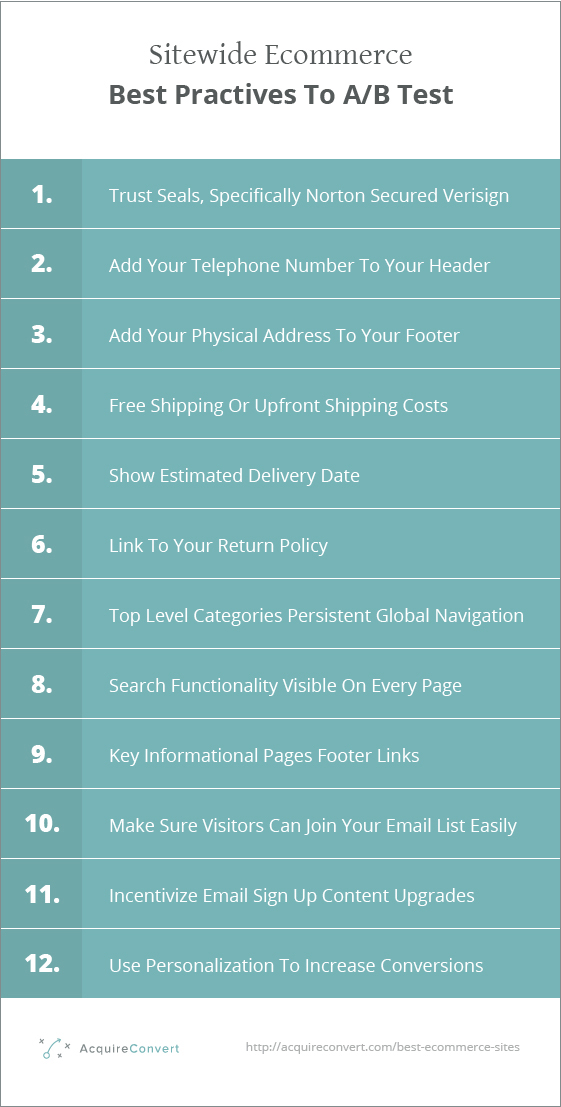
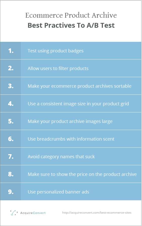
Global Ecommerce Best Practices To Test On Every Page In Your Online Store
When a new visitor lands on your website you have a finite amount of time to convince them to stick around.
There are a number of factors to consider when trying to reduce your bounce rate, let’s explore some ecommerce best practices that you should test on every page in your shop (this means these elements probably belong in the header or footer).
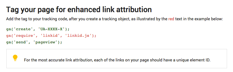
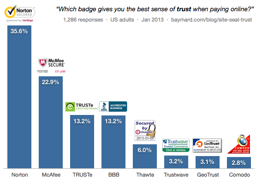
A/B Test Adding Security Seals Throughout Your Store
ConversionIQ found in their studies applying McAfee Secure trustmark to ecommerce websites that new visitors responded positively to the added trust factor.
For an Internet Retailer Top 200 supplement supplier they measured a 3% lift in conversion rate for all traffic and a 12% lift in conversion rate for new visitors.
Another McAfee Secure test with a major off road parts supplier measured a 6% increase in average order value for all traffic and a 23% increase in average order value for new visitors.

Actual Insights conducted a further study where they asked participants to evaluate the 20 above seals. You can see the heatmap results below.
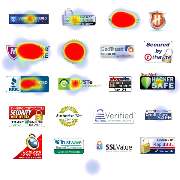
When asked which seals gave them the most reassurance of a safe transaction, Verisign was the clear winner, specifically with the Norton Secured Verisign combination.
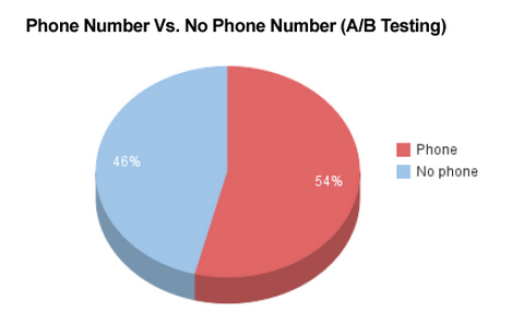
Test adding your telephone number to your header
One element you can use to build trust is your telephone number.
Databox showed in an a/b test that adding a phone number to their homepage increase their conversion rate by +.5%, even though the test was not statistically significant it did show a positive trend.
Test adding your company address to your header
Another trust factor often used alongside telephone numbers is your company address.
People like to know the company is real and has a physical address. This helps to remove fear around scams or credit card fraud.
Show standard shipping costs on every page (they should be free)
Half of online orders include free shipping. If you are charging even small amounts for standard shipping, you could be killing your conversion rate.
An E-tailing Group study showed that free shiping was the number one reason for making a purchase, with more than 70% of people identifying it as ‘critical’ to the purchase.
In this study more than 90% of people felt that free shipping would encourage them to purchase more products.
What about a small shipping fee?
When Amazon implemented free shipping sales went up in every country apart from one. France. Why?
Because in France the shipping was set to 20 cents.
Once they recognized the pattern they changed France to free shipping also, and the sales went up.
Seems like people care about free vs cheap.
What about if you ‘have to’ charge for shipping?
If you do need to charge for shipping make sure to use a flat rate fee and let people know about the costs upfront.
E.g. On every page in your shop in the header and or footer.
Nothing will hurt your bottom line more than surprise costs at the last minute.
In this study 47% of people showed they would abandon a purchase if they got to buy page and learned shipping was extra.
Show shipping costs upfront!
Make the estimated delivery date visible and make it quick!
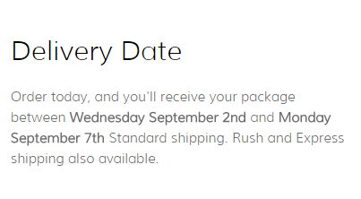
In today’s consumer economy, people don’t expect to be kept waiting for things they are spending hard cash on.
In this infographic the data showed that shoppers are more likely to drop out of the sales funnel if they have to wait a long time for delivery of their goods.
When asked what would encourage them to complete their purchase, 60% of respondents said a guaranteed delivery date.
Test Including a link to your return policy
When people are shopping on your ecommerce store they have questions in their mind, reservations to the purchase.
Like we just learned these can be:
“How much is shipping?”
or
“What is the expected delivery date of this item or cart?”
Your job as a conversion optimizer is to remove these reservations.
Another common obstacle to the sale I have seen again and again, especially in ecommerce is a company’s return policy.
Not necessarily the details of it, although more favorable return policies will alleviate buyer concerns more. But, whether or not items can be returned.
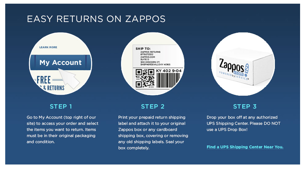
A great way to get over this hurdle is to simply make it clear how long your returns policy lasts for.
Zappos made this feature famous with their customer centric approach to selling shoes online.
Its free-call number, free shipping and returns, 365-day return policy and 24/7 availability also helped to set it apart.
Make sure you don’t follow minimal design trends and kill global navigation
Historically an ecommerce stores global navigation appears on every page of the website.
This serves two core purposes:
- It communicates to the user where they are and allows them to switch between top level categories quickly.
- It gives people who don’t land on the homepage (when categories are named well) a descriptive overview of what else is available in the store.
Ok so you can argue that Amazon got rid of their product categories as persistent global navigation. But just because it worked for them doesn’t mean it will work for you.
Unless your visitors are consistently logged in or frequent users or if they rely predominantly on search to navigate, please do not kill your global navigation in exchange for a mobile menu burger or hidden menu!
Avoid making your users journey through your sales funnel harder where possible. Show your main categories clearly in a persistent global navigation with sub categories in a megamenu drop down (for desktop) like this.
And if you do change your global navigation to something like this burger below, even on desktop.
Make sure to collect user testing and usability data and understand how the change affects your users and conversion rates.
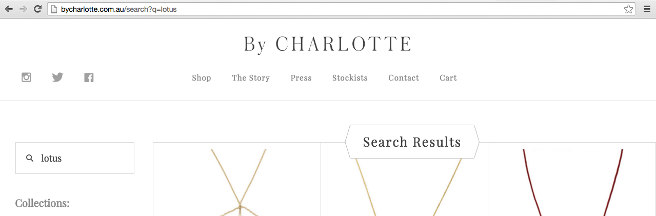
Get more sales with better search usability
30% of visitors will use internal search and in this case study by econsultancy after investigating 21 ecommerce websites they found that the average revenue generated was highest from visitors who performed searches.
Search can have a huge impact on conversion rates and revenue.
Your internal search should be really easy to locate when a user lands on your shop.
Following design patterns is important when designing your shop layout, users expect to find the site search in the top right or top middle of the screen. Reebok gets this right.
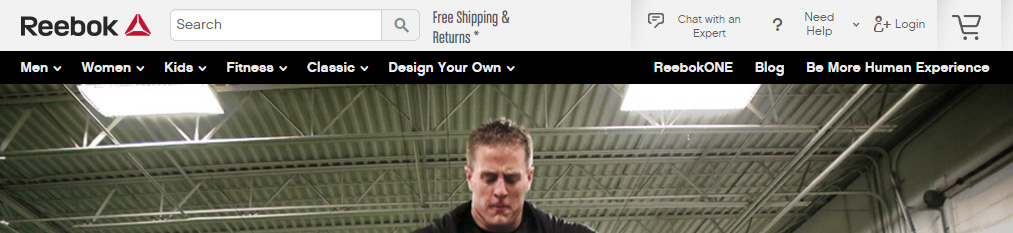
Don’t hide the search in a search page or behind an icon. This may be challenging for less able users to find.
Here are a list of other search features and functionality to take into account:
-
- Make the search input available in the search results page
-
- Offer scoped search so users can search within a category
-
- Autocomplete search queries as users type
-
- Autocorrect search query misspellings for more useful results
-
- Offer related or relevant products when search queries return no products
-
- Make your your search performance is fast and can handle multiple concurrent searches
- Allow B2B sites to save searches for later and recurring use
Make key information accessible in your footer links
Visitors want to remove any and all reservations they have around the purchase. Shipping costs, delivery times, return policy, size charts.
So make all this information easily accessible from every page using your footer links.
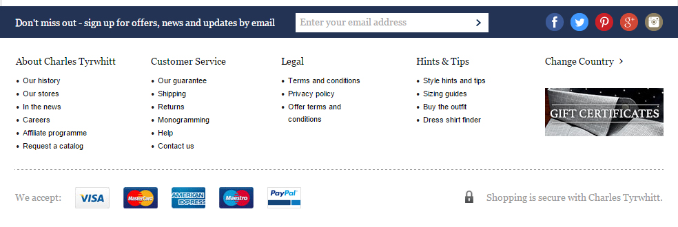
Ctshirts.com does a great job of this, with a clear and simple ‘Customer Service’ & ‘Hints & Tips’ footer links.
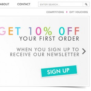
Incentive visitors to join your email newsletter
Email marketing accounts for 7% of all ecommerce transactions, so you need to be collecting your visitors emails without fail.
Don’t simply offer generic opt ins for email capture, use content upgrades or offer discounts.
Use personalization to tailor your offers to your shoppers
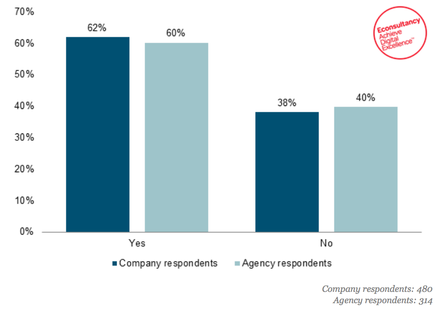
A study by Econsultancy showed that 62% of online retailers are reporting doing some form of personalization.
And the Aberdeen Group found 75% of shoppers liked it when stores used personalization for messages and offers.
But most importantly MyBuy found that 40% of consumers buy more from stores that personalize their customer experience.
Here are some personalization options to consider testing in your online store:
- You the incoming keyword to personalize a landing page
- Use geolocation to personalize messaging or colloquial copy
- Test using self segmentation to route visitors through different sales funnels
- Further reading on ecommerce personalization
Rounding Up: Global Ecommerce Best Practices To A/B Test
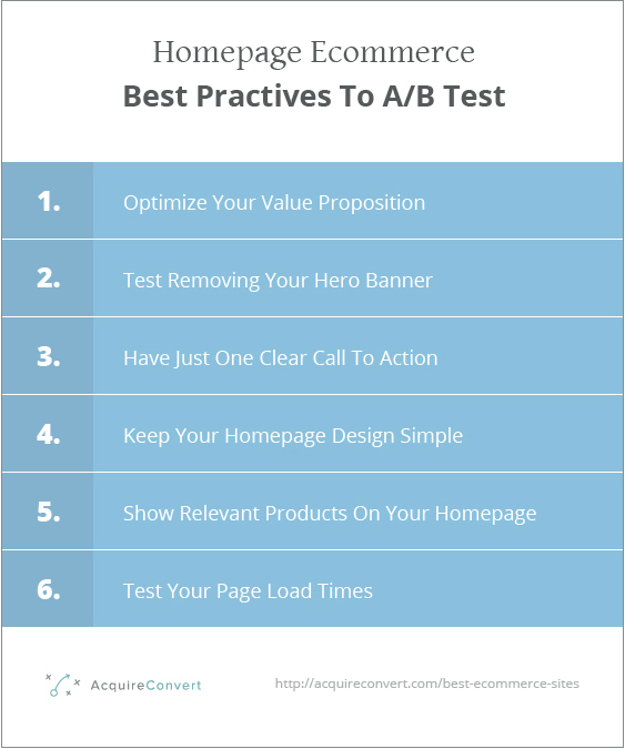
Ecommerce best practices to test on your homepage
Let’s look now at store homepage conventions you can test on your online shop.
Your value proposition is the most important part of your homepage
Optimizing your value proposition helps focus your business and marketing efforts in one direction or on one core pain point within your market.
It stops you from wasting time trying to acquire the wrong customers with the wrong marketing message. Demonstrating to your prospects you understand their needs and what they value in a product or service.
It also helps you align your product with your prospects goals, clearly and concisely communicating to them the outcome of spending money with you.

DonorPro increased their revenues by 37% by revamping their value proposition.
Check out my practical guide to value proposition optimization for further reading.
The world’s leading CRO experts hate sliders or rotating banners
It doesn’t take much research to realise this is one best practice that may be universally true (if there is such a thing).
Chris Goward of Wider Funnel hates them, Peep Laja of ConversionXL detests them, even Tim Ash of Site Tuners says: “Just say no!”
And the evidence is clear, the gospel truth spoken by Jakob Neilsen of the Nielson Norman Group is that carousels are just wrong.
In a usability test run by the NNGroup in the U.K. where one user was attempting the following task: “Does Siemens have any special deals on washing machines?” They were shown this website.
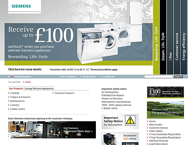
Any guesses?
Could the visitor complete the task?
The offer is front and centre.
The visitor failed to answer the question as the auto rotating banner hid the information from her before she found it.
Please, test removing your sliding banner.
Have one clear call to action
When you’re designing your homepage. It’s important not to forget the paradox of choice.
You should focus your homepage design around the one most important action you want your visitor to take.
For an ecommerce store which has a flagship product or a best selling category, then you want to push visitors towards this.
For people who sell premium products, I suggest trying to capture their email address rather than push for the sale.
More expensive, more considered decisions require a longer lead nurturing funnel.
Once you have their email address you can sell to them using a launch sequence or drip email campaign.
For some it will be a try before you buy scenario, like a free trial.
You also need to consider the design of the button, in this case study by Michael Aagaard he changed the button colour of this Danish portals call to action.
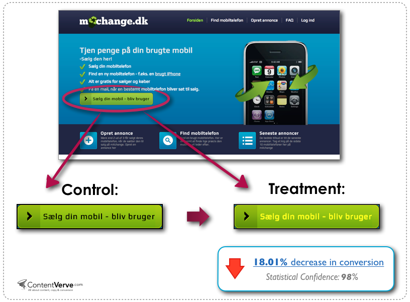
The test failed, which highlights how careful you have to be when it comes to small details like button design.
A great example is Shopify, it is very easy to spot where they want you to click.
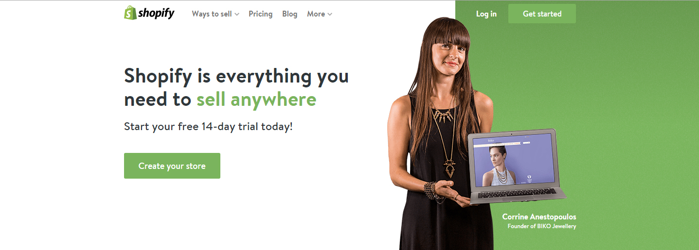
I would however test changing the call to action button colour to something that contrasts with the brands core green colour palette. To make the button even more prominent in the visual hierarchy.
Shopify’s beautiful design execution segways us nicely into our next point:
Keep your homepage design simple
When it comes to ecommerce homepage designs, it oftens pays to keep things simple. Don’t forget, this is the first step in your funnel, and we want visitors moving down it consistently.
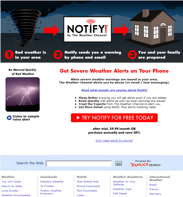
In this case study, the Weather Channel wanted to turn more of their visitors into premium subscribers.
They simplified their homepage and focused (like we just said) on one main call to action.
These changes increased conversions 225%.
Show your products on the homepage
In Keith Hagen’s top ecommerce website comparative analysis, he found 13/13 of his best in class ecommerce websites (for CRO purposes) showed merchandise on the homepage.
He said:
“From this we can see the sites we consider (and track) best-in-class pretty much all offer direct access to specific products from their home pages. Often eCommerce sites leave out direct access to products citing that they sell too many to call out just a few. However in the case of these best-in-class sites, we see homepage ares like “Most Popular” or seasonal highlighted products.”
Your homepage needs to load lightning fast!
Page load times are not joke.
47% of consumers say the expect a webpage to load in 2 seconds or less.
According to akamai.com and gomez.com, a one-second delay in page response can result in a seven percent reduction in conversions. So for an eCommerce site that makes $1,000 a day, the same delay could end up costing them $25,000 in lost sales every year.
So you need to optimize your website for faster load times.
These are the elements you need to consider:
-
- CSS compression
-
- Javascript compression
-
- HTML compression
-
- Image compression
-
- Server response time
-
- Browser caching
- Content delivery network
Rounding Up: Ecommerce best practices to test on your homepage
As a bonus read, here are the most violated homepage guidelines. Make sure your homepage is up to scratch.
Ecommerce best practices to test on your product archive
Let’s look now at product archive conventions you can test to increase sales on your ecommerce store.
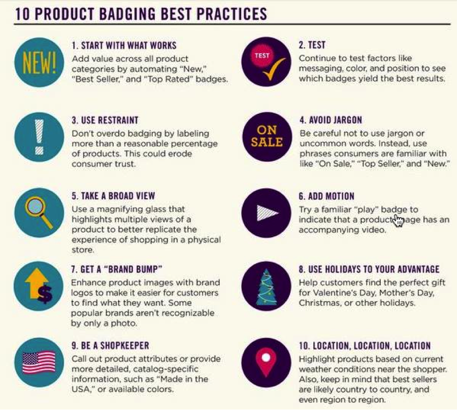
Use product badging to increase ecommerce conversion rate
Product badges are like digital stickers that you can add to your products in the product archive.
The draw special attention to specific items in your product lists or grids.
Product badging has added as much as $2.7 million to some companies bottom line.
Check out these top ten best practices for product badging by BrandWatch.
Add filters to your product archive to improve usability
Filters are really important from both a usability and conversion stand point.
You must evaluate what product criteria are important for your shoppers when searching through your product archive.
You can use methods such as Card Sorting to help choose and name these criteria so users recognise and are aligned with your descriptions.
The convention is to place filters and categories on the left hand side of the page on desktop.
You can place your filters above the product archive, but this is only conventional for shops with fewer criteria.
It is however a good way to increase product image sizes.
Make your products sortable
Ensure your products are organised in a logical manner and allow the user to sort the products in a useful manner.
Avoid things such as, ‘Sort by date added’ or ‘Sort by ID’.
These types of filters and sorting do not improve the user experience.
Conventional and useful sorting options are:
-
- Best selling
-
- Low to high price
-
- High to low price
- Highest rated
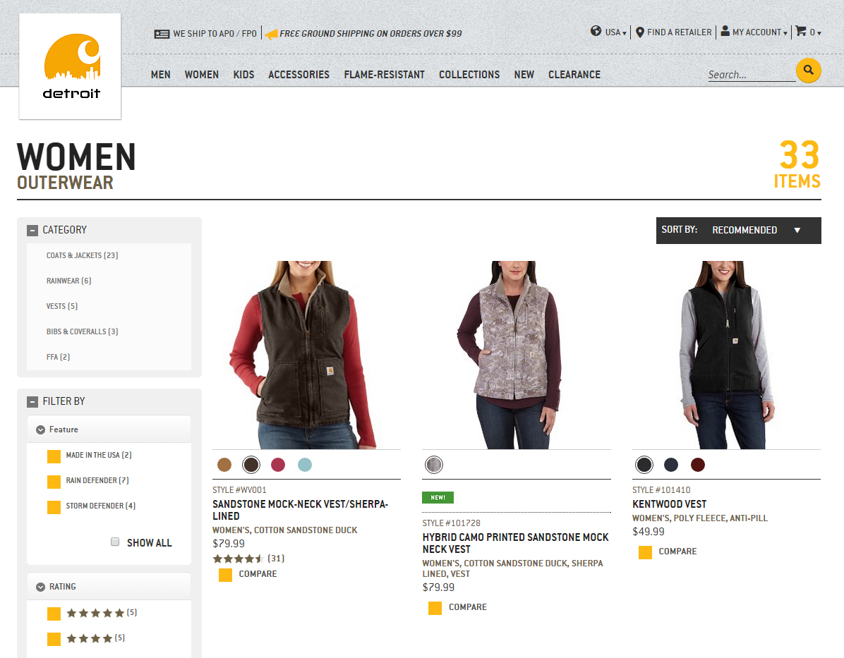
Use a consistent image size in your product archive
Something as simple as the consistency of your image sizes within your grid could affect your conversion rate.
In this case study, Blue Acorn tested the below two variations of their product archive.

After testing 25,000 visitors and with a statistical confidence of 95%, the variation (with consistent image size) beat the original by increasing revenue per user by 17.1% against the baseline.
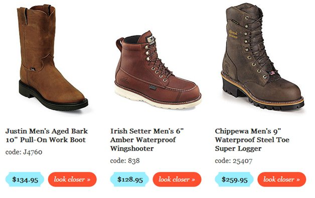
Make your product archive images large
Not only should your product archive images be consistently sized, but also it seems bigger is better.
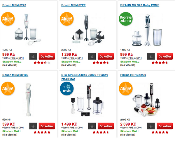
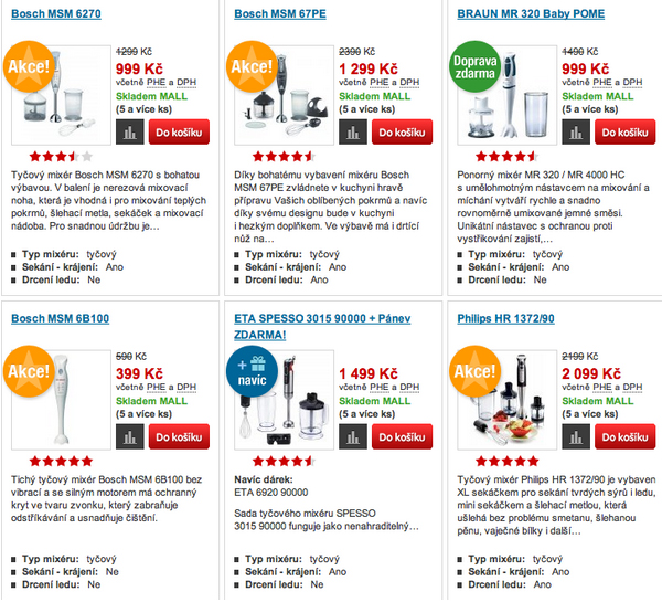
This case study by ConversionXL.agency saw a 25% increase in sales, when this boot store went from a four row grid:
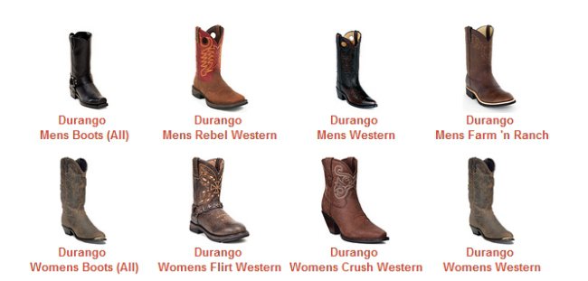
To a three row grid:
When using breadcrumbs don’t ignore the information scent
In his book Designing Search: UX Strategies for eCommerce Success.
Greg Nudelman suggests the biggest problem with breadcrumbs is their “lack of scent” and that the “wording of the individual trail element becomes very important”.
His research showed that providing a clear attribute name label for each of the applied attributes added a great deal of information scent.
Further reading on breadcrumbs
Avoid category names that suck
When designing your site, it is easy to get overly creative and make up fun category names. But clever category names invariably suck.
Descriptive words that users relate to easily are a much better choice, even if they are more dull.
This includes ignoring the pull of making up words or phrases.
Don’t rely on your gut feelings when naming categories, use card sorting and user testing methodologies to learn your users preferences and behaviours.
Make sure to show the price on the product archive
When people are comparison shopping, a common step in a visitors buying process, they are trying to decide if a product is right for them.
The defining factors that ultimately affect this outcome are:
-
- Price
-
- Product Presentation (Images, video)
- Copywriting
You must show the price, do not hide it on the archive. And make sure you consider your product naming and description carefully. Great descriptions can improve product archive to single product page click through rates.
Use personalized banner ads to increase conversions
59% of online shoppers believe that it is easier to find more interesting products on personalized online retail stores. And 56% of online shoppers are more likely to return to sites that use personalization.
So serving your users individual messaging is worth testing!
Bedbathstore.com used personalization to improve their conversion rate by 10%.
They served visitors personalized banner ads on their category pages, depending on what the user searched for.
“Now, if a person is searching for bedding, we can do a targeted banner for the bedding category,” marketer Reichman says. “The offer can appear in the bedding category on our site and can say anything from ‘Shop our Luxury Bedding and Save 10 Percent,’ to ‘Free Shipping on All Bedding Orders Over $75.'”
Rounding Up: Ecommerce best practices to test on your product archive
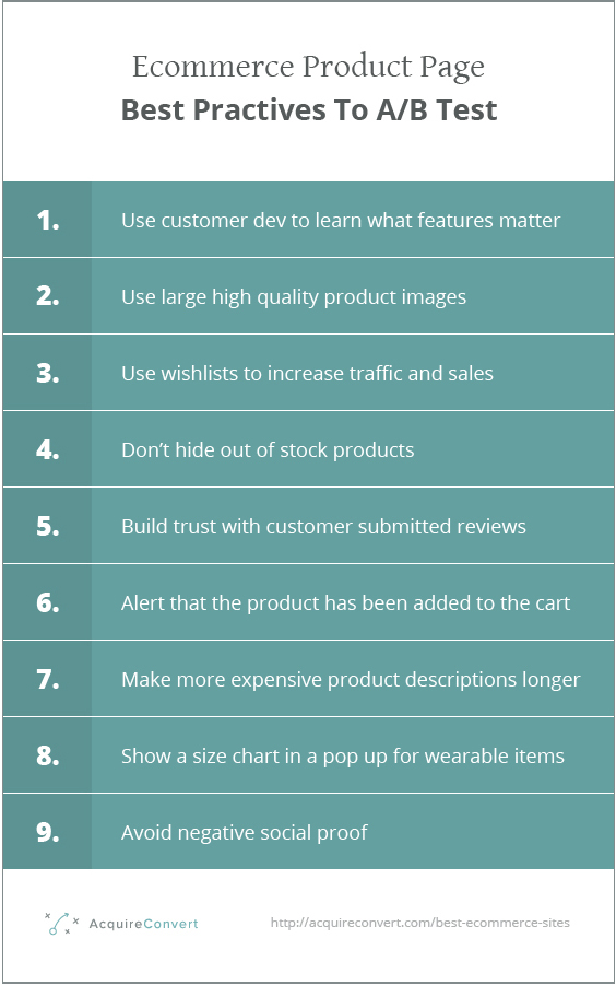
Ecommerce best practices to test on your product pages
Now we’ve optimized your shop, homepage and product archive, let’s look at some case studies on how the best eccomerce sites improve their single product pages.
Don’t guess what product features are important to your customers
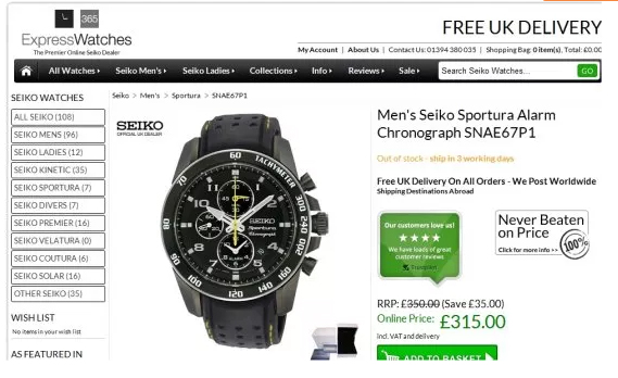
ExpressWatches wanted to test if their customers cared more about a price guarantee or a trust symbol.
So they tested it 😉
Original:
Variation:
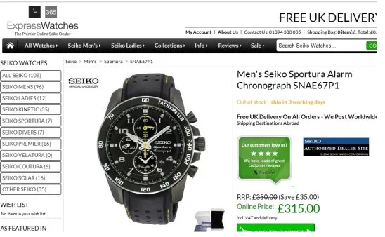
The replacement of the price guarantee with a trust symbol increased sales by 107%. The lesson here is, don’t presume to know what your customers care about.
Use customer development to learn about their motivations and test your hypotheses using a/b tests.
Use large high quality product images
In this case study, they use larger product images and saw a 9.46% increase in sale.
Original:
Variation:
Test bigger product images as Mall did.
Use wishlists or Facebook ‘Want Buttons’ to increase traffic and sales
People are often frustrated when they can’t save products to a wishlist or save for later feature.
Make it so visitors can remember what they want to buy later using wishlist or want buttons.
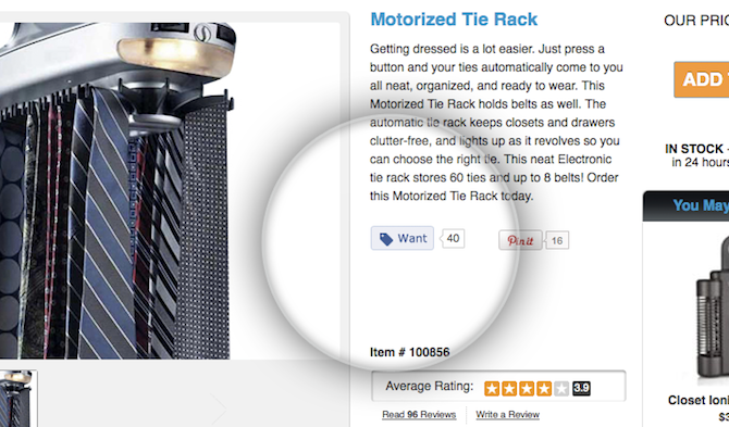
Here is an app Shopify users can use to add the want button.
These buttons post to people’s Facebook timelines and drive more traffic to your store.
Make sure to test this, it may prove to be a distraction from conversions!
Don’t hide out of stock products
If one or more of your products are out of stock, it is simple to think simply removing them from the store is the best option. Inventory management can be used as a conversion tactic.
In this cast study, the company added a ‘Get notified when back in stock’ email sign up, in place of the ‘Add to cart’ button.
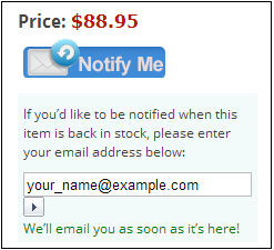
They then sent transactional emails to the visitor to update the visitor the item was available again.
The emails saw a 22.45% increase in conversion rate!
Here is an app you can use for Shopify stores to implement this functionality cheaply.
Build trust with customer submitted reviews
People often look for reviews of things before they buy them.
Adding customer submitted reviews to your single product pages can help improve trust and user experience.
As the visitor doesn’t even need to leave the website to find impartial reviews.
In this case study by VWO Express Watches added inline customer reviews to their single product pages, this helped them achieve a 58.29% increase in conversion rate to sale!
Alert the user that the product has been added to their cart
Even though your average web user is becoming more savvy. When users try to use new sites, well-known usability problems still cause task failures.
And one of the most common mistakes in usability is feedback.
You need to constantly:
-
- Show the users the system’s current state
-
- Tell users how their commands have been interpreted
- Tell user’s what’s happening
For example on this VW car designer app, users were confused which wheel was selected and currently being shown on the car, because the selected wheel was ‘greyed out’; which is normally a convention meaning ‘unavailable’.

With this in mind make sure visitors on your ecommerce store know their commands have been interpreted.
The most important commands in terms of conversions are form completions. Such as ‘Add to cart’, ‘Checkout’, ‘Sign Up’.
You wouldn’t leave out a ‘Signed Up!’ page or ‘Purchase Complete!’ confirmation, so don’t leave out ‘Added to your cart’.
You can also show the cart has items and show how many.
GerrettLeight.com does a great job of this with a very obvious mini cart pop out, showing the product and offering a checkout option.
Make more expensive product descriptions longer
When someone is paying a lot for something, especially if the brand is not very established, you need to give them all the details. The specs, the reviews, the full description. More information and more reservations and FAQ’s answered.
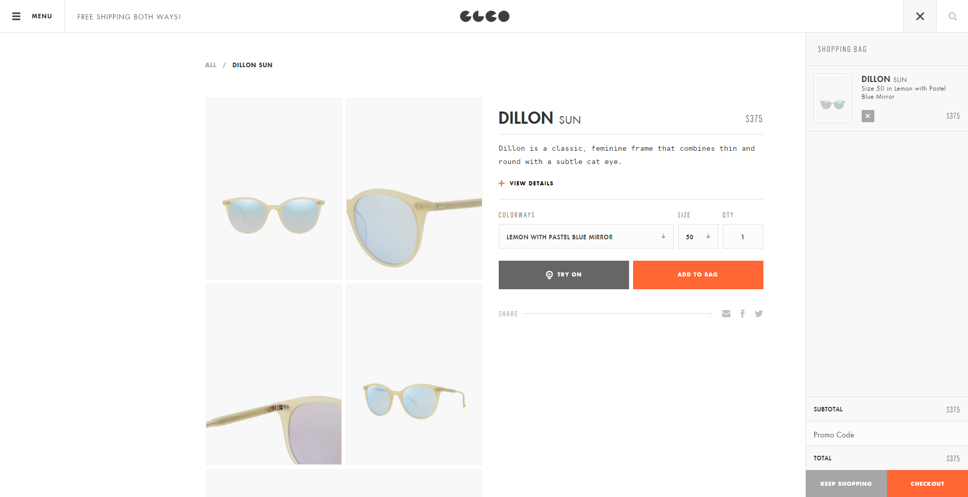
If you are selling wearable items, show a size chart in a pop up
It’s a great idea to have a size chart for your products, whether rings or sweaters. All wearable things have at least some size ranges.
Make it easy for visitors to learn which size is best for them.
Don’t however, show the size chart inline. This will distract most visitors (who may already know their size for common goods) and could reduce conversions.
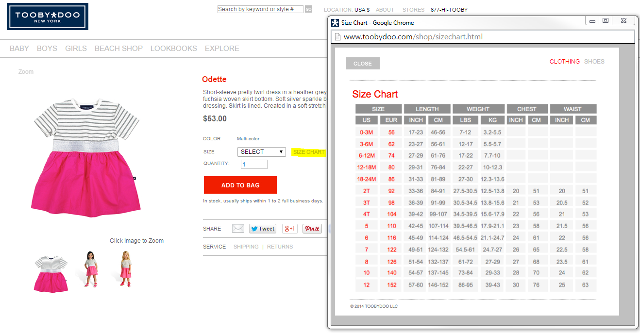
Instead hide the size chart in a modal window or slide down panel in mobile.
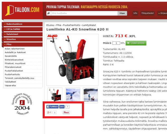
Avoid negative social proof
Taloon a/b tested removing their social sharing buttons from their product pages.
Original:
Variation:
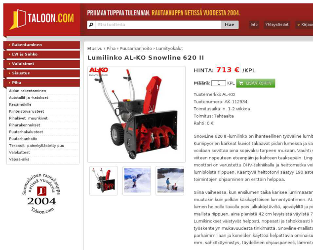
The variation saw an 11.9% increase in CTA clickthroughs as compared to the original.
This was hypothesized as due to negative social proof, most of the pages had zero shares and therefore people thought the products were unpopular.
The share buttons are also a distraction for the one main goal or task for the page which is to get the visitor to click ‘Add to cart’.
Rounding Up: Ecommerce best practices to test on your product pages
Ecommerce best practices to test on your checkout or cart page
Finally ley’s look at ecommerce checkout page best practices and case studies you can learn from and A/B test.
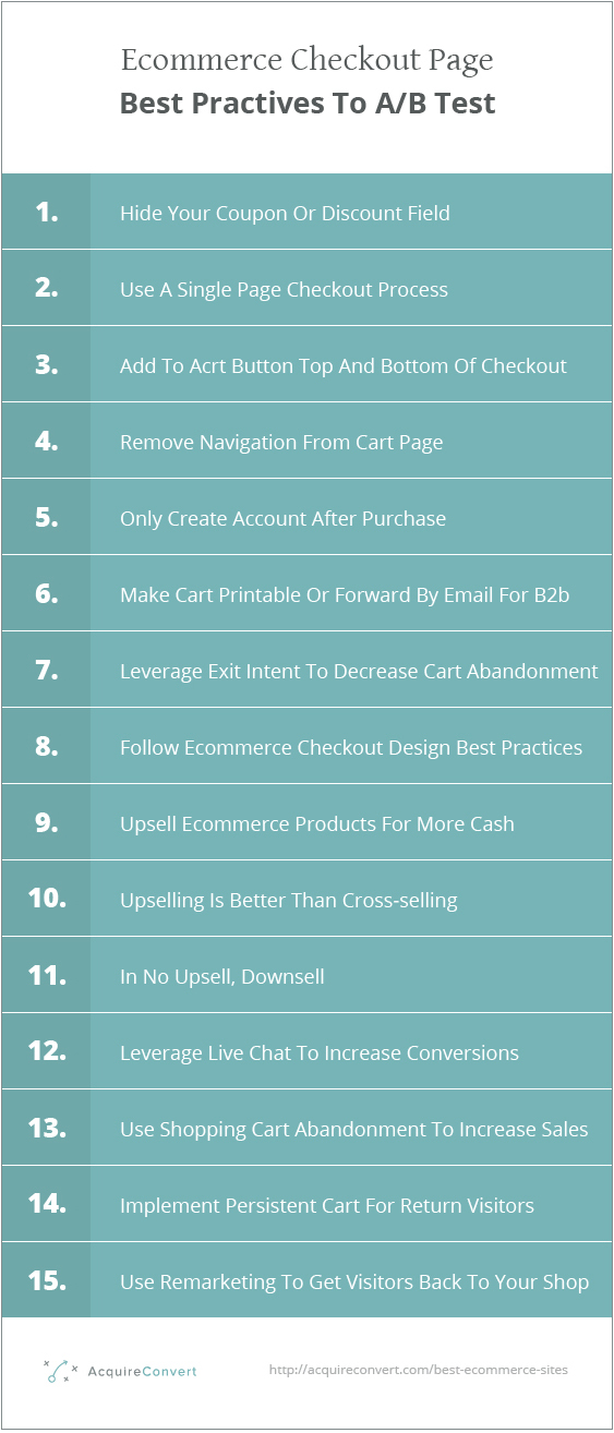
Remove or hide your coupon or discount form field
Marketer Michael Folling recommends removing or hiding your coupon or discount field.
In this case study Bionic Gloves, an online store that designs and sells a range of gloves, in a test to improve their cart abandonment removed their ‘special offer’ and ‘gift card’ fields from the cart page.
This is the original design:
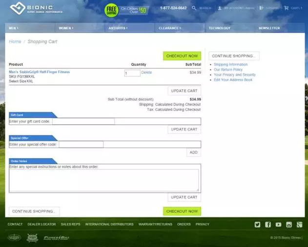
This is the variation:
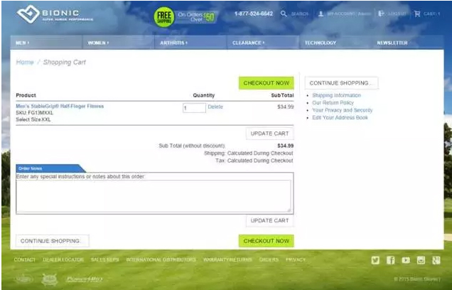
The primary goal that they were tracking was the revenue made. The variation won and increased the total revenue by 24.7%, and revenue per visitor by 17.1%.
David from Sq1 the agency behind the test said:
“By showing the Promo Code field on the cart, users were enticed to leave the site in search of a promo code. At that point, the conversion process is interrupted and you are more likely to lose potential customers. As such, hiding it was a very logical test.”
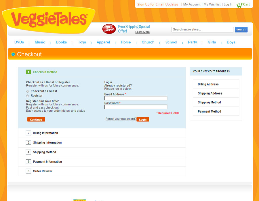
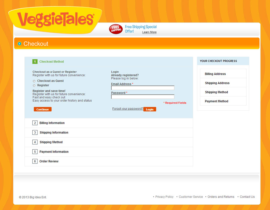
Use this pros and cons list to decide on a single page checkout
There are enough case studies to sink a battleship arguing over single and multi page checkouts.
The truth is, it’s different for different businesses, and it comes down to the execution.
The pros of using a single page, ajax checkout process
-
- More conversions as the process is quicker and easier for the user
-
- Faster page load times. Studies from Akamai, Shopzilla, Google, and Bing all suggest that consumers won’t tolerate slow loading pages.
- Higher customer satisfaction through improved experiences as above.
The pros on focusing on a single page checkout relate to customers and profits.
The cons of using a single page, ajax checkout process
-
- It won’t work without JavaScript Ajax depends on JavaScript, if a user has JavaScript disabled, the page will revert to server-side validation.
-
- Some browser functions won’t work as expected sometimes, like the back button.
- Ajax requires more investment upfront in development.
Test adding an add to cart button at the top and bottom of your checkout page
Whether or not you believe in ‘the fold’, you’ll probably agree it is easier to checkout on a cart page that has a checkout button above and below the cart.
Although many people talk about this in the UX and CRO community, I couldn’t find a case study with any data to back it up. Please post links in the comments!
Don’t add distractions to the cart funnel pages
The last thing you want to do once you get a visitor to the cart page is to distract them away from clicking checkout.
Less of this:
More of this:
This means, don’t include social share buttons, remove navigation and don’t add a ‘Continue shopping’ button next to your call to action.
If you must have a ‘Continue shopping’ button next to the ‘Checkout’ button, make sure the visual hierarchy highlights the ‘Checkout’ button.
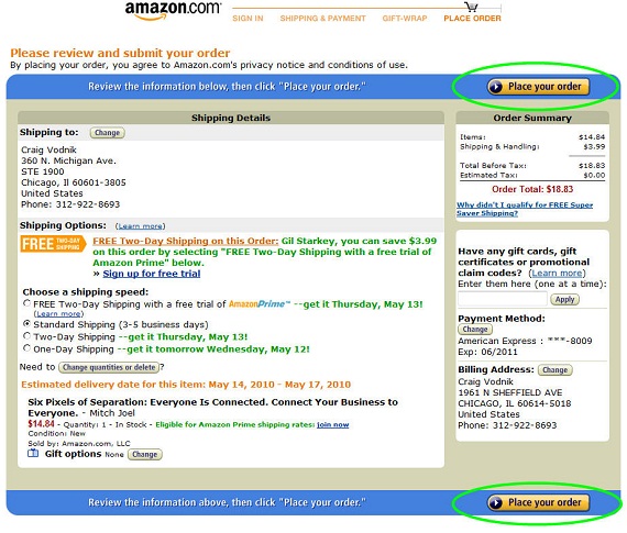
Offer the user to create account ONLY after the checkout is complete
This is a must when it comes to ecommerce CRO.
ASOS completely removed the mention of creating an account from their cart page and reduced their checkout abandonment rate by 50%!
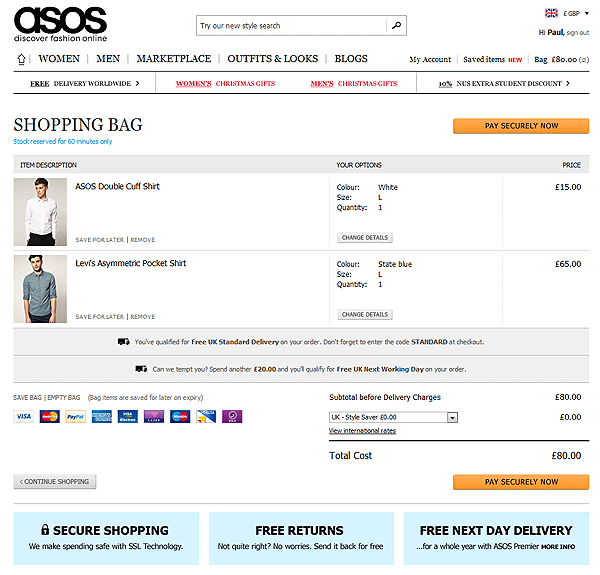
Enough said.
B2B ecommerce websites should have a print cart or forward by email function
As some B2B businesses need manager or executive approval before completing a checkout, it is important to make it easy for them to sign off the cart’s contents.
You can do this with a simple print functionality or better still, forward cart via email for sign off function.
Leverage exit intent to decrease lost revenue through cart abandonment
Exit intent’s are those friendly 😉 pop ups that shown up when you move your mouse cursor towards to the browser or tab cross to close the website.
They are very effective at increasing conversions and capturing leads.
They play on a number of emotional buying factors such as the paradox of choice, decision fatigue, analysis paralysis and use a neuro-linguistic programming technique called pattern interrupt.
This sounds complicated but simply means: Do or say something unexpected that disrupts a prospect from their normal pattern.
They also steal one more page view and chance for conversion from the user, without their permission; brilliant!
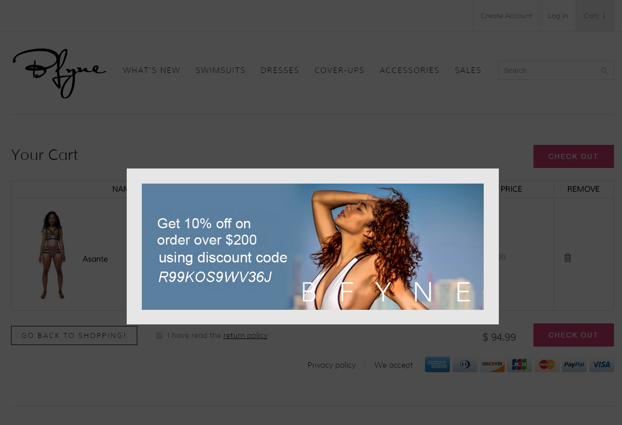
You can offer discounts, coupon or even dynamically offer money off their current cart value.
Ecommerce cart design tips
Even once a user has submitted something to the cart, there is still time for product inspection and deliberation.
So make sure you optimize your product details as below and include:
-
- Product name
-
- Product summary
-
- Large product image
-
- Updateable quantity and attributes
-
- Order number
-
- Final price and total price
-
- Option to remove an item
-
- Cards accepted
-
- Shipping details
-
- Delivery times
-
- Privacy policy link
-
- Confirm item is in stock with green visual tick
-
- Test including product ratings or testimonials inline or in the sidebar of the cart (warning, may be a distraction!)
-
- Make digital download instructions very clear (step 1 etc)
-
- Offer multiple payment options
- If you need detailed information, tell them why and how it helps them get what they want faster
Darren DeMatas of ecommerceCEO suggests:
“Aside from the basic stuff that every cart page should do, I think every ecommerce site cart page should display availability and when it will ship. Adding something like “In Stock, Ships Today” can help boost customer confidence in your brand and give them a sense of urgency. Its important to reassure them that you can fulfill the order quickly. If you’re drop shipping items might take longer, so let your customer know.”
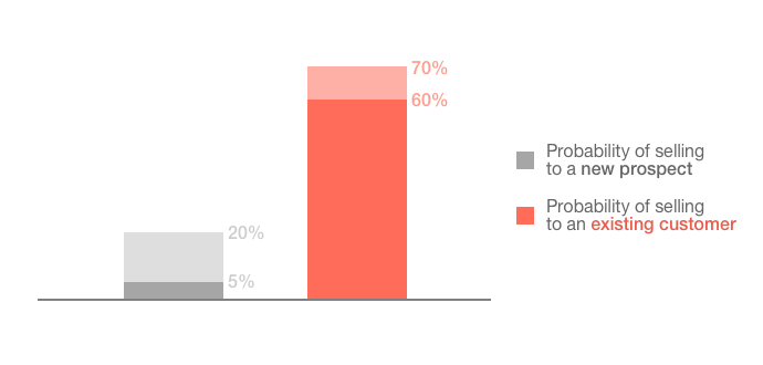
Upsell ecommerce products for increased revenues
In this case study Marketing Results used upselling to increase sales by 56.3%.
Some people think upselling is a dirty word, but in fact it can make your customers happier.
According to Marketing Metrics:
The probability of selling to a new prospect is 5-20%. The probability of selling to an existing customer is 60-70%.
Here is an app you can use to upsell in Shopify.
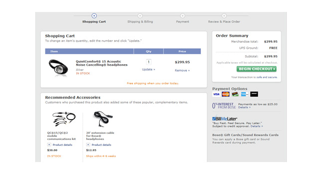
You can offer related products or add-on products at the point of checkout as an effective upsell strategy.
For example:
Bose.com recommends accesories in their checkout that match the products included in the cart’s contents.
Upselling is way better than cross-selling
According to a study by econsultancy upselling makes up around 4% of your overall sales. Where cross-selling only around .5%.
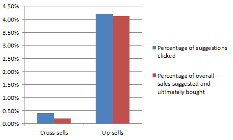
So if you’re choosing between the two, I’d go for upselling.
If No Upsell, then Downsell
Downselling is often done after the rejection of the core offer and upsell.
An example would be, Neil Patel’s Quicksprout university:
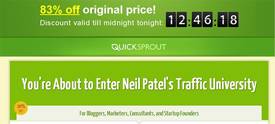
He down sold this for 83% off, using exit intent pop ups to drive page abandons to the cart page. (the content is now free)
Leverage live chat to get more sales
Intuit famously increase their conversion rate by 211% using proactive chat.
Speaking with the visitor at the point of sale can help answer any final questions and remove important reservations.
You can then compile the live chat transcripts and analyse them for customer learning.
Use shopping cart abandonment to increase sales
According to SaleCycle the average shopping cart, basket and booking abandonment rate reached 73.6% in Q1 2013, up from 70.7% in Q4 2012.
You can use transactional emails to bring abandoned cart visitors back to your store.
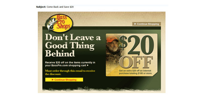
Bass Pro deliver a $20 coupon in an email, toward items already in the user’s cart.
A clear call-to-action invites the user to click through, apply the coupon and continue shopping.
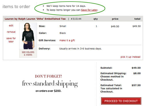
Implement persistent cart functionality to your online store
A study by SeeWhy showed 16% of males and 26% of females abandoned their cart because they wanted to complete the checkout at a later date.
Many customers expect that their carts will remain intact when they return.
Persistent shopping carts maintain cart contents using persistent cookies.
Use remarketing to get visitors back to your shop to checkout
Remarketing is a smart way to get visitors back to your website who may not have turned into customers during their first visit.
It allows you to position targeted ads in front of a defined audience that had previously visited your website – as they browse elsewhere around the internet.
After looking at data across a myriad of case studies I would say, if you can remarket you should.
In this shop case study remarketing accounted for 16% of all ecommerceconversion in the last six months.
Also CareerIndex according to think with Google, saw a 73% increase in conversion rate and 20% decrease in cost per acquisition after using remarketing.
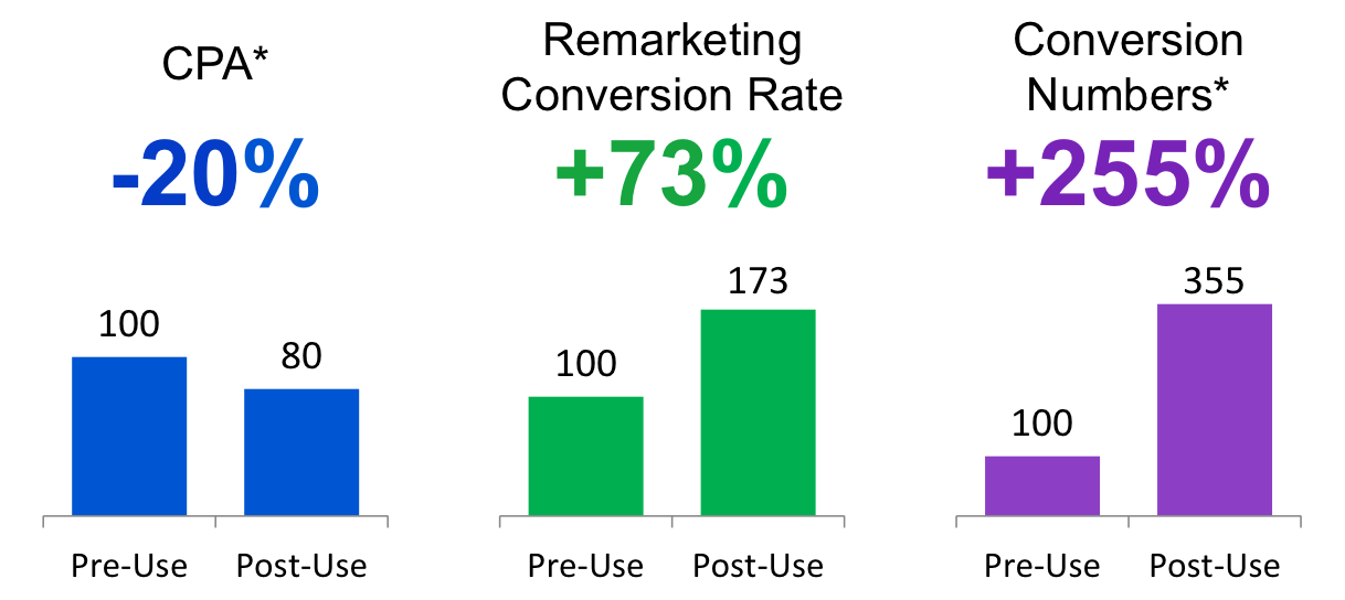
Perfect audience is a good choice for people looking to get started with remarketing and retargeting.
Rounding Up: Ecommerce best practices to test on your checkout or cart page
Will your online store become one of the best ecommerce sites?
To increase your ecommerce conversion rates and sales you need to be constantly iterating on your store design and user experience.
Best practices and conventions can guide us and provide inspiration for a/b tests to run…but.
The best way to come up with new ideas and websites changes to test is by talking to your customers.
Remember, quantitative data like analytics can tell us where we have problems in our sales funnel.
But we need qualitative data like customer development calls and user testing to understand why.
The more you understand about your customers the more aligned your offer will be with their needs and motivations.
Basically, customer understanding = more profits.