In this in-depth guide to ecommerce store web form optimization & conversion optimization we’ll learn about:
- Different types of forms we can optimize
- Designing for efficiency with UX best practices
- Customer development for forms
- Conversion copywriting for forms
- How to support your conversions
- How to design a high converting form
We’ll explore each chapter looking at hard data from case studies and tests. No opinion or fake one size fits all advice.
Throughout the guide I’ll give tips on form conversion best practices & form conversion rates. Actionable ideas you can start testing today, with a control of course 
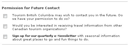
What types of forms are you optimizing?
When it comes to conversions there are four main types of forms we are interested in:
Lead Form Optimization
- Contact forms
- Subscribe forms
Ecommerce
- Checkout forms
User Provisioning
- Sign Up forms
Productivity
- Task oriented forms
Lead generation forms include getting in contact with a business or joining an email list.
Ecommerce forms are all about buying things.
User Provisioning forms are about creating new users.
Productivity forms are about getting things done within the websites or apps we create, like online banking.
But whatever forms you work with, you can analyse the user flows and funnel data and improve their conversion rate.
Designing for efficiency – User experience best practices for forms
When you think about designing forms, the words you use are probably not the first thing on your mind.
But words, even descriptive ones for input labels for example, really matter.
Simple and clear wording can be the difference between someone easily and confidently completing your form or bouncing.
Jason Fried of 37Signals famously said.
“Most copywriting on the web sucks because it’s written for the writer, not for the reader. Write for the reader. That is all.”
Copywriting IS interface design, every word matters as much as every icon and pixel detail.
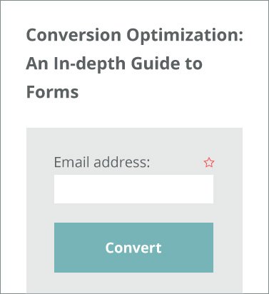
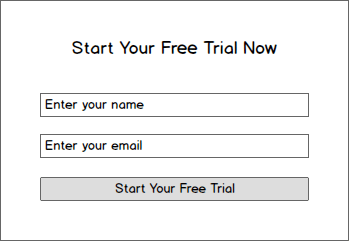
Your forms name should describe its purpose
The first part of your forms interface the user reads is the header, the forms name. Make sure this describes the purpose of the form to the user clearly and concisely.
Not only that, use action words to create a call-to-action.
Let them know what the results of completing the form is and encourage them to do it.
For example:
CRO TIP: Make sure your form title describes the purpose of the form and uses action words.
Don’t Use Yes / No Dialogs
As we know users scan they don’t read websites, and the speed a user completes a task in a web app affects how efficiently they can use the app and ultimately if they renew their membership or cancel it; it affects the apps churn rate.
So getting the details right in your forms ux is crucial even within the application itself.
One very common mistake I see in copywriting for productivity or task orientated forms is misuse of the yes / no dialog.
‘Yes / No’ or ‘Confirm / Cancel’ provides no context to the user.
A classic example is the Windows 7 delete dialog.
Simply looking at the buttons communicates nothing to the user.
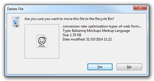
Assume the user will read nothing but the buttons, therefore tie button labels to the questions directly.
Here we tie the button with ‘Save Worksheet’ back to the question. Speeding up the task for the user and making the form more efficient.
CRO TIP: Make sure to tie your buttons back to the questions for maximum efficiency.
Placeholder text within the form field harms usability
Some forms replace their label by putting instructions or hints within the input field using the placeholder.
E.g.
Eyetracking studies however show that users focus more on empty fields. They waste time finding non-empty fields and can even overlook those fields completely. This could be a conversion disaster.
Also, as soon as the field is selected the user has to remember what its purpose was as the placeholder disappears. This might mean deleting what they wrote to check the placeholder again, slowing down the completion time; increasing friction and potentially decreasing conversions.
When the user submits a longer form they would be unable to check their data entry against the labels and any validation errors would again mean deleting the content to reread the placeholder.
If they use the tab key to move through the fields, the field placeholder would disappear before they even made a new eye fixation on that section of the form.
CRO TIP: Don’t use placeholders as labels, they are meant be used as hints or to display example input data
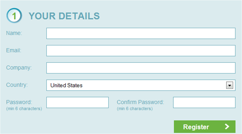
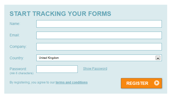
Label placement in forms matters
And it is not only the misuse of placeholders as labels that can slow down the completion time of your forms. The placement of labels in relation to the input field itself can cause unnecessary friction to the user too.
In this case study by uxmatters they found that the placement of labels in forms can affect the speed with which the form is completed.
They recorded the eye tracking data for three main tests.
- Left aligned labels in-line with field
- Right aligned labels in-line with field
- Left aligned labels above the field
![]()
Labels left aligned and in-line with the field were the hardest to read as they required the user to take two eye fixations per input/label due to the distance between the elements.
![]()
Labels right aligned and in-line with the fields performed better than the left aligned.
![]()
But they found that labels above the form field allowed users to capture both the input and label in one eye fixation. Making it the fastest and easiest form to read.
CRO TIP: Place your labels above the input fields, left aligned for the fastest reading experience.
For long forms test against an in-line right aligned label control, perceived friction can be high when forms look really tall and long! Placing the label in-line makes them appear smaller.
Form validation should be inline
When a user submits a form there are often errors.
Some forms group the error messages at the top of the form.
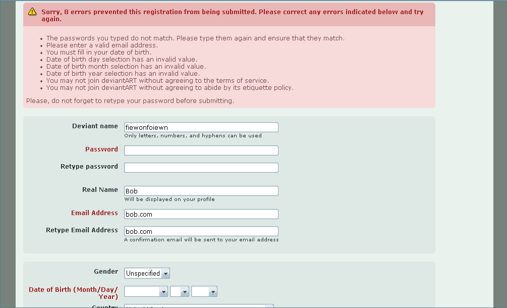
This makes it hard for the user to find the and fix the errors as each time they complete a task they have to scroll back to the top of the form to read and then find the next error.
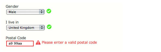
In this above example they highlight the fields by making the labels red. However it is better to show the fields validation errors in-line as seen below, with the reason for the error displayed next to the input.
According to this study by Luke Wroblewski you can achieve even greater results when the in-line validation is in real-time. E.g. it updates as the user fills out the form.
[youtube_sc url=”http://www.youtube.com/watch?v=hlU74LIPauo#t=26″]
In this video you can see as the user completes the forms it feedback in real time with validation confirmations or errors.
When compared to a control which only validated once the user submitted the form. The real time validation saw these results:
- a 22% increase in success rates
- a 22% decrease in errors made
- a 31% increase in satisfaction rating
- a 42% decrease in completion times
- a 47% decrease in the number of eye fixations
The tests also showed that the validation error is best shown after each section of the form is complete. E.g. when the user moves to the next field or ‘on blur’ of the previous field.
Finally they found that persistent messages, error or confirmation messages that remained visible; didn’t fade away based on time were the least confusing.
CRO TIP: Test your form validation, make sure the error messages are inline with the fields and if possible real time validate your fields after completion with persistent feedback messages.
Radio vs Dropdown
When your users are faced with options they are often slowed down. We want to ensure our forms are efficient to complete so when it comes to radio buttons and dropdowns it is important we choose the right tool for the right job.
In this case study from Marketing Experiments they tested radio buttons against dropdowns in a single factor a/b test.

The control used radio buttons.
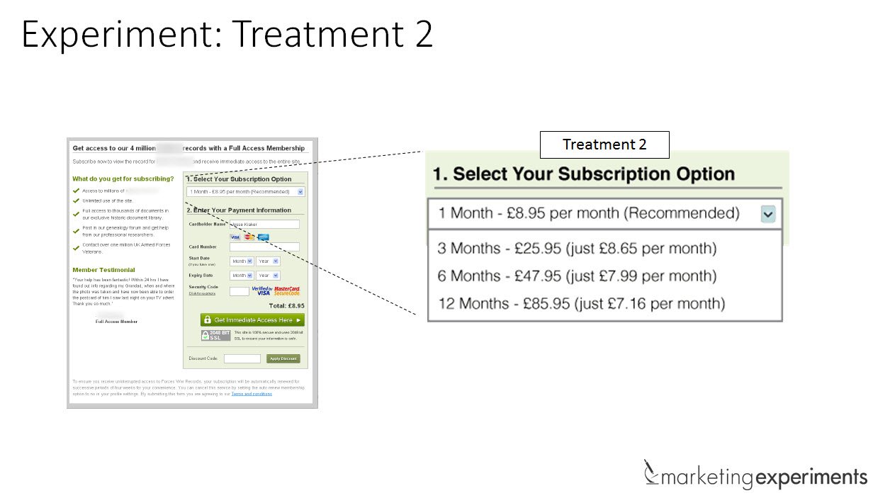
The variation used a dropdown menu with the same options.
The hypothesis stated that the dropdown would increase conversions of the sign up form as it made the form shorter and decreased the perceived friction of the form.
However, the radio buttons beat the dropdown option with a 15% relative lift in conversions.
This was believed to be due to the difficulty orientated friction that arose from the dropdown field which was greater than the length orientated friction the longer radio buttons had.
CRO TIP: Make sure to test your dropdown against radio buttons to ensure your forms friction is as low as possible.
The right and wrong way to create a ‘Mad Lib’ form
Jeremy Keith creator of Huffduffer created the Mad Lib form. The idea behind the concept is that you have the normal form input field for entry, however the form is laid out and presented as a narrative.
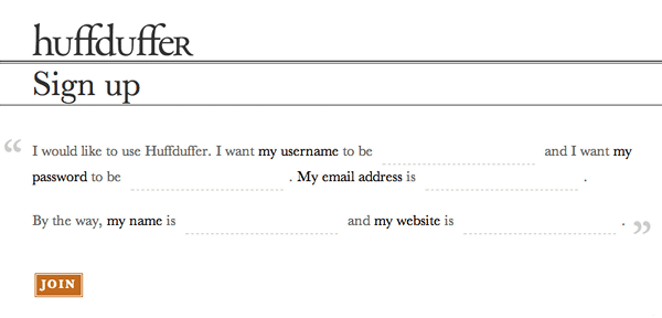
The right way to do Mad Lib
Vast.com tested this form concept with an A/B test that compared a traditional form against a mad lib style one.
The mad lib style form increased conversions 25-40%, see the two forms below.
The wrong way to do madlib
In this case study from Kalzumeus they saw a significant drop in conversions with their mad lib variation, let’s look at the two form designs.
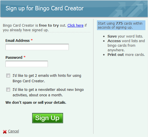
The control, the traditional form style
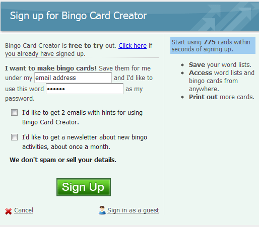
The variation, the mad lib form style.
The traditional form converted at 27.5% while the mab libs form converted at 21.73%. A 22% decrease for the mad libs style with a 95% confidence level.
The issue was when you replace the inputs with the data the narrative does not make sense.
CRO TIP: Mad libs can be tricky to get right, ensure when testing a mad libs form variation against a traditional form control that your narrative once populated makes grammatical sense and does not confuse the reader and decrease conversions as in this example.
Asking for the password twice is not efficient
The premise behind inputting a password twice is to ensure the user doesn’t make a typo and then need to reset their password.
However, simply by adding a ‘show password’ checkbox or button so the user can check for spelling mistakes we remove the need for a second input.
In this case study they tested a traditional two input password approach control against a ‘show password’ button variation.
The control
The variation.
The results they made meant a:
- 14.3% more visitors starting the form after visiting the page
- A 56.3% increase in overall conversions
- A 35.5% increase in the proportion of those who start the form completing it
- A 23.9% decrease in the number of corrections made in the form
CRO TIP: Test your password fields to find out if you can improve the efficiency and conversion rate with show password checkboxes or buttons.
Captchas are insulting and worrying
Harry Brignull said this about Captchas:
“Using a CAPTCHA is a way of announcing to the world that you’ve got a spam problem, that you don’t know how to deal with it, and that you’ve decided to offload the frustration of the problem onto your user-base. As statements go, that’s pretty lame.”
Ok so we don’t want to be lame and we certainly do not want to decrease our conversion rates.
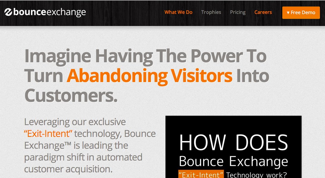
Animoto a cool app for helping you make great videos ran a test on their sign up form below.
They ran the test until 99% confidence level was achieved. The form with a captcha converted at 48% whilst without it converted at 64%. A 33% increase in conversions!
CRO TIP: Test your forms with and without Captcha’s
Increase your conversion by converting your form inputs to html
We’re all looking for incremental improvements to our websites. So updating our forms to use html5 form input types just makes sense.
Have you ever used a website on your phone and noticed when asking for your email the @ sign is on the main keyboard.
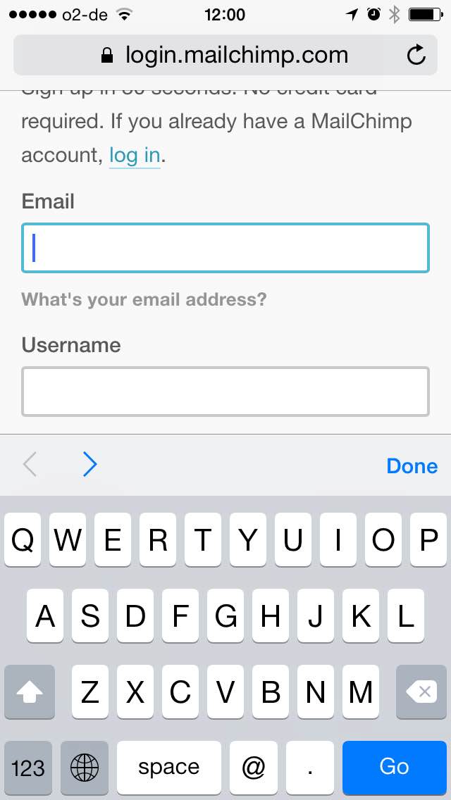
Here is the mailchimp create account screen on mobile, they got it right!
This is because the developer had the foresight to use the ‘email’ form type.
<input type=”email” name=”email” />
The are a number of other examples we can use to improve the efficiency of filling out forms on mobile with specific inputs.
The URL input type includes a slash and a period.
<input type=”url” name=”url” />
The TEL input type brings up the telephone keypad.
<input type=”tel” name=”telephone” />
The number input type brings up the numeric keyboard and you can even set min or max values and step sequences.
<input type=”number” name=”number” min=”10″ max=”100″ step=”10″ value=”10″ />
CRO TIP: Try testing HTML5 form inputs to increase your mobile conversion rates and form efficiency.
Fewer form fields can mean unqualified leads
Everyone has heard reducing form fields means higher conversions and there are plenty of tests to prove it.
However it is important to test the quality of your leads within the success metrics of your conversions.
A short form just to get more conversions can mean you spend marketing dollars targeting the wrong people: poor quality leads. Ouch!
In this case study Kindercare increased their form fields, the variation added a ‘comments or questions’ textarea.
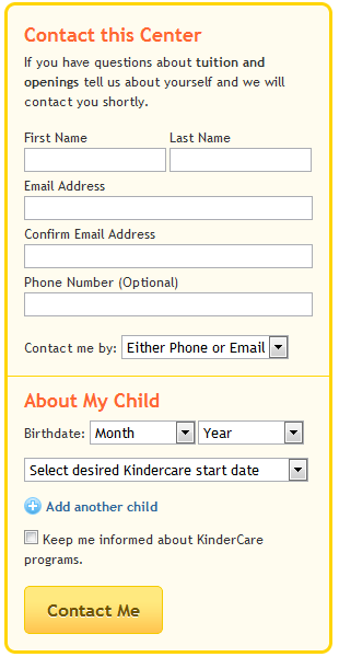
The control
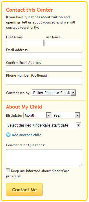
The variation
The conversions remained stable and the lead quality increased.
CRO TIP: Make sure to measure and test your lead quality when optimizing the amount and types of data you collect.
Multistep forms vs Long Forms
When you have a lot of information to collect from your user, like in a checkout process. It is important to test a longer form on a single page against a multiple step form and see which performs better.
Because abandonment rates (the measure of visitors that begin the form process but do not complete the process) can be highly influenced by your form flow and layout.
In this case study for Pass4Sure they tested the use of a basket page and how combining it with the checkout process page affected conversions.
The shop sells downloadable exam software for the IT industry. The test ran for 5 weeks with 3300 transactions.
![]()
The control
![]()
The variation
As you can see in the variation they removed the basket page and included this inline at the top of the checkout process page.
The hypothesis stated, by removing the the basket page the visitors would go directly to the checkout process, see how short the form was and due to a reduced perceived friction the conversion rate would increase.
Conversions increased by 13.39% at 100% confidence level! The per visitor revenue went from $44.87 to $51.52, 14.82% increase. The annual revenue increase to the company was $744,000.
CRO TIP: Remember to test your longer form flows, try reducing steps or perceived friction. Look at your google analytics funnels or use paditrack to retroactively build funnels to see where users are dropping off in your multistep forms. Manually reconstruct funnels to check the accuracy of your data.
Vertical vs Horizontal Form Layout
We’ve looked at many factors and minutia that affect out forms elements and their conversion rates. Next we’ll dive deeper into the layout of those elements and learn what to test through a case study by Arenaturist.
Arenaturist.com are one of the top hotel booking and resort chains in Croatia. They redesigned their website and in doing so tested how the layout of their booking engine form affected conversions.
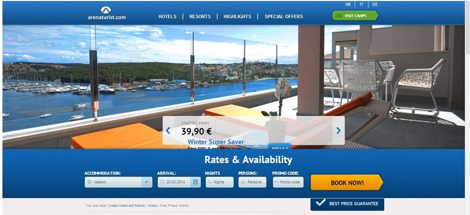
The control
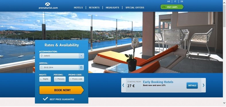
The variation
The A/B test made use of canonical tags, to stop Google indexing duplicate content and penalising the company in terms of SEO.
The variation conversion rate was 52% higher than the control.
CRO TIP: Test your forms layout and positioning and measure how it affects conversions, I also feel the control increased the form within the pages visual hierarchy so consider this during your redesign also.
Form Conversion Customer Development
A lot of companies do not have customer development cycles within their monthly conversion rate optimization processes. However, from my experience this is the most insightful and revealing part of conversion work!
Take aways from customer interviews and surveys are the best way to learn about your product/market fit and most importantly your customer and their frustrations.
Resources to find customers for your interviews
The first step to performing interviews with your customers or potential customers is actually finding them, not always that easy!
Here is a hit list of resources to plunder:
Adwords / Facebook Ads
Set up a simple landing page using launchrock and run some ads to drive fake trial sign ups.
Social Search
@mention people in your niche or people who post about your product or solution, start a relationship and then reach out to them via email.
Google Alerts / Buzzsumo Alerts
Set up google/buzzsumo alerts and use email outreach to build connections and set up interviews.
Ask for introductions from first degree contacts
People are generally open to connect you with their first degree contacts, but make it easier for them with this email template:
“Hey [Your connection]
I saw you know [Person you want to interview] on Linkedin. Would love to chat with him. Think he’d have some great insights about [Your niche].
Can you forward him/her the email below please?
Hey [Person you want to interview],
My good friend [Your name] found your LinkedIn account and wanted to chat about [Your niche].
[Your name] is awesome and definitely someone you should have in your inbox.
Anyways, I’ll let them follow up with more details.”
Offer existing customer an incentive
Message your email list and offer an incentive to existing customer to give you 20 mins of their time. Some people suggest offering incentives can devalue the results of the tests but more often than not the value of the feedback outweighs the few poor responses from people simply looking to cash out. You can also simply exclude these people from the data.
Cold call people you are targeting
Just google your niche in your local area and pick up the phone, worse case scenario is some abuse; best case is you get to sit down face to face for the interview. GOLD!
Ask for a referral
Getting people to spend time with you is hard, so leverage them the best you can. Ask them for friend or contacts you can interview too. This can even result in a new lead or customer!
Ask interview questions that enable listening
When creating your interview questions there are two main things to focus on. Behavioural study, what people do now, what their problems are and how they solve them. Feedback study, the user experience of your product.
Separate your questions into behavioural study and feedback
When writing your interview script start with questions that inquire about the personas current behaviours, problems and solutions.
Then ask about their experience with your service.
Understanding the distinction is key, if you have the resources these types of interviews are best served completely separately.
Then you have a more narrow focus of learning for the short interview time.
Create open questions
Don’t ask closed questions e.g.
Q: Would you recommend _____ to a friend or family?
A: Yes/No
What do you learn from the yes or no answer here? Nothing.
Q: Why would you recommend our services?
A: Learning!
Don’t ask rate us 1 out of 10 questions.
Q: How satisfied were you with the product/service (1-10)?
A: 6
What do you learn from the number 6? Nothing.
Q: What about the product/service did you like/dislike? (More specific questions are better around your assumed top three pain points/solutions.)
A: Learning!
CRO TIP: Conduct customer interviews to learn about your customers and their needs.
Customer & Exit Intent Surveys
A great way to learn about your visitors is to use Qualaroo. Qualaroo allows you to show customers surveys and questionnaires, helping you to dig deeper into their problems and reservations around your solution.
You can also be very specific in where the surveys are shown and under what circumstances.
They offer exit intent technology which causes the survey to be shown when the users mouse behaviour indicates they are about to bounce or exit the site.
This effectively gives you one more page view in an attempt to convert the user or find out why they chose to leave.
When surveying customers it is important to understand which customers you are targeting, this is directly related to their stage in the buying process.
They could be a first time visitor that bounced, a repeat customer or a whale in your system, hey big spender!
We are trying to understand why they buy, how, how they think and their reservations.
Segmenting your surveys and surveying different questions to different user profiles can enable much deeper and more personalized learning. This then enables more of a segmented and personalized marketing approach.
We know when you go niche and specific, conversions are easier to get.
Find the big leaks in your conversion bucket and plug them with Qualaroo
It is good to show surveys all over the website, don’t show them multiple times to people in a short time period however this can be annoying.
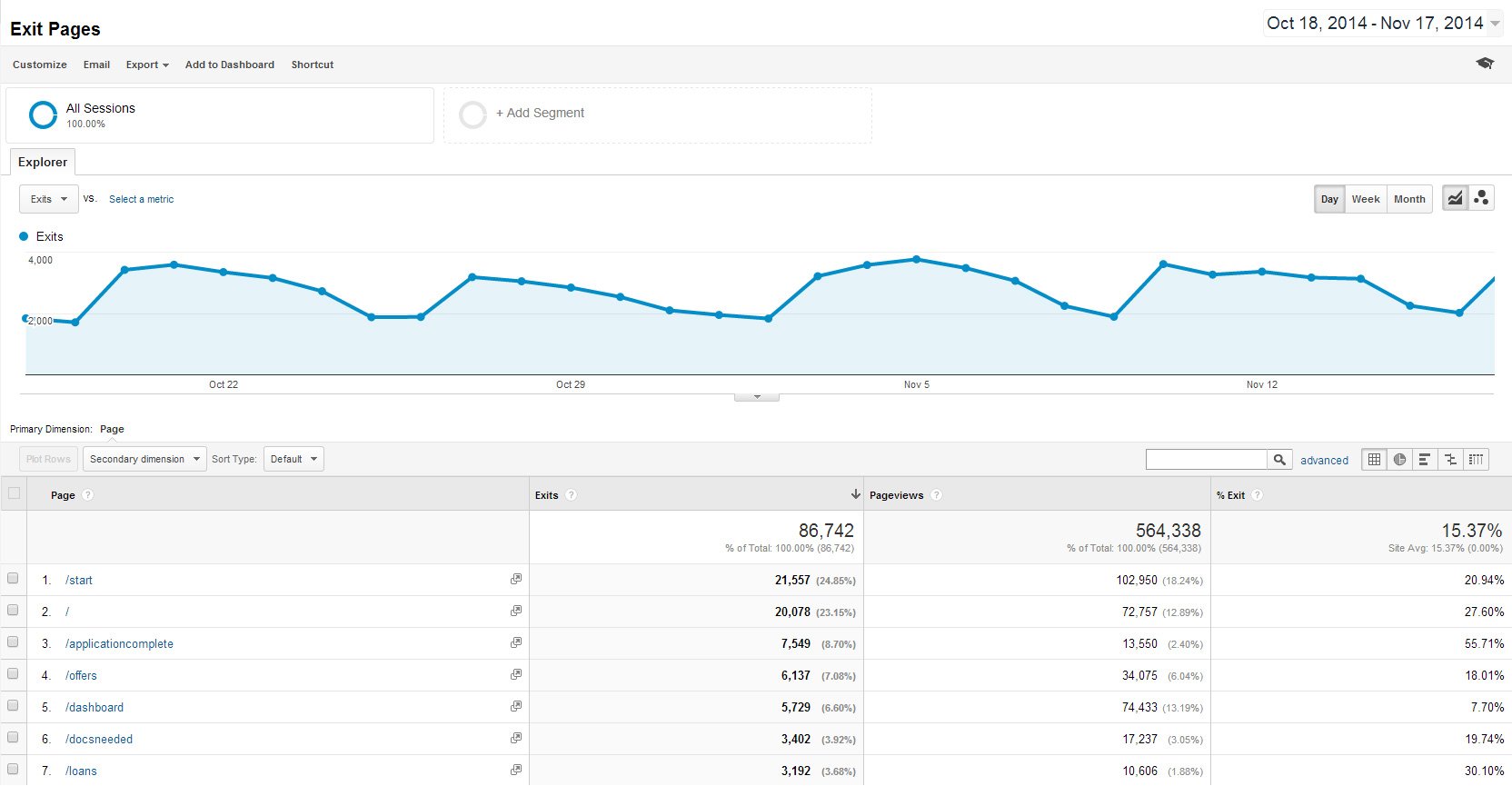
A really great location for surveys is on the pages with the highest traffic and bounce rates, your exit pages.
These pages represent the biggest holes in your funnel and can hopefully offer some deep learning.
You can find this data in google analytics under Behaviour > Site Content > Exit Pages
Now ask more specific survey questions, aligned with the one main task or goal you want the user to complete on the page.
For example:
If the page was a product page in a online sports shop about a specific tennis racket, you could ask them something specific to tennis or finding the best racket for them.
The idea is to learn about their buying process and thinking when choosing a shop, brand, model etc.
Invert what you learn from interviews and surveys and turn it into marketing copy
Once you’ve collated all your qualitative feedback from the interviews and surveys look for patterns or recurring frustrations or reservations around the form conversion.
It is important to not only listen and address recurring themes but also to use the exact language and phrasing your customers use to speak to them directly.
In this case study Officedrop used Kissinsights to survey customers on their saas pricing page.
They knew visitors spent a long time on their pricing page and it was a high exit page too.
The question asked: “Is our pricing clear?”
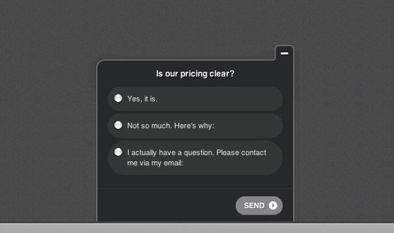
They showed a textarea after the multiple choice question above.
The recurring theme they found was the difference between their new products and plans were not clear on the pricing page.
They made copy edits to the pricing page, the A/B test showed a 15% increase in conversions compared to before the edits and they saw a 10.5% increase in customers saying the pricing was now clear to them.
Other qualitative data points to consider would be site walkthroughs (browser and device testing), usability evaluations and heuristic analysis.
CRO TIP: Use learnings from your qualitative surveys to generate ideas for continuous development and a/b/ testing, remember to prioritize your tests.
Copywriting your form
Write benefit driven form headlines
In this well known case study 37Signals redesigned their homepage, A/B testing a more benefit driven headline.
The original headline was:
“The better way to get projects done.”
The variation was:
“Manage projects better with Basecamp”
The word manage seems to be more explicit and benefit focussed than ‘done’ which is quite loose and open for interpretation.
The new design increased CTR to the signup page by 14%, there were many other factors in the redesign as well as the headline that could of affected conversions.
CRO TIP: Test your headline with more benefit driven wording.
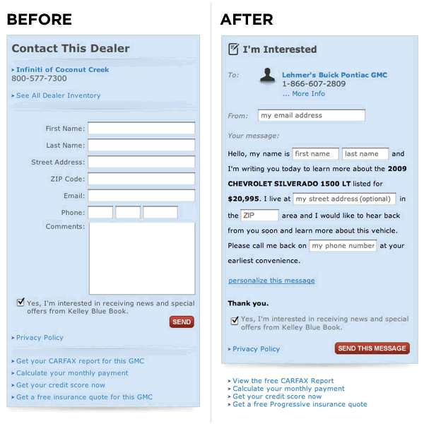
Test personalized call to action button copy
When copywriting for your form the title and the call to action button are very important. The call to action is the decisive point at which someone bounces or converts.
The title and button communicate the purpose of your form, what happens after the user completes it and hopefully provide a call to action too.
In this case study they tested a personalized button copy variation against a control.
The button copy was also more benefit focused, they removed the phone number also.

The control

The variation
The variation, written in the first person lifted conversions by 24% with a 98% confidence.
Like with any copywriting make sure the text is concise, simple (no technical jargon) and friendly!
This is a great resource from Android on copywriting for their platform, but the rules can applied to any copywriting.
CRO TIP: Test which person the copy of your buttons are written in, remember to tie button text back to the form title. Make the copy more user focussed or personalized.
Remove reservations or worries inline with the form
The insights we learned from the customer interviews and surveying can provide the best copywriting ammunition.
Take the customers biggest worries, the ones that stop them from converting and remove their reservations inline next to the form.
A lot of times you see websites have FAQ sections, this is bad because the user has to leave the funnel to answer their questions and may bounce or not come back to the point of conversion. This supporting copy should be inline next to the form so it can help push them down the funnel.
Supporting the conversion
Use supporting images and copy alongside form elements
We often overlook small conversion points such as checkbox copy and styling.
In this case study Wilder Funnel investigated the impact of bolding type and using supporting images next to checkboxes to increase checkbox opt-ins.
The control
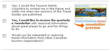
The variation
As you can see in the variation the copy has been addressed to be more benefit focused, the text bolded and a supporting image used next to the checkbox opt-in.
The variation increased checkbox opt-in conversions by 12%.
CRO TIP: Don’t underestimate smaller elements of your forms and their importance. A/B test your checkboxes copy and try supporting the conversion with images related to the checkbox subject. Remember to also collect behavioral data using tools like crazyegg heatmaps and scroll maps to see how users are interacting with your forms.
Testimonials can prove you credibility
Having a past customer or user say good things about your business seems like an old school thing to do.
When designing your forms consider testing the inclusion of a testimonial inline with the form or call to action.
In this case study Wikijob tested the addition of a case study within their landing page copy.

The control
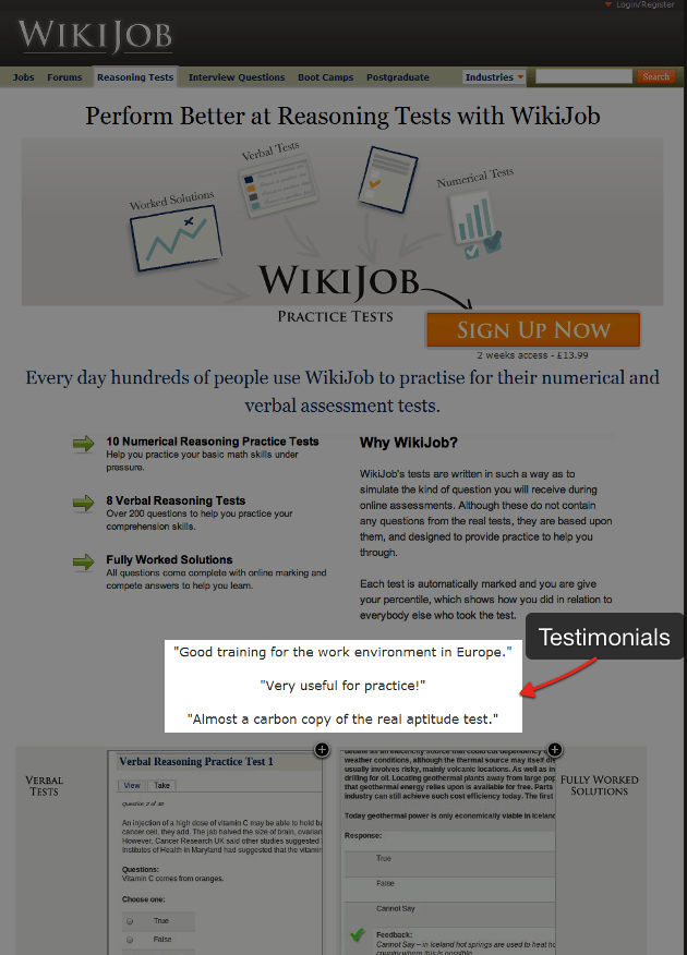
The variation
The addition of testimonials to this section increased sales by 34%. This shows how important social proof can be in proving credibility around a service or product.
CRO TIP: Test testimonials and other forms of social proof inline or within your forms and measure conversion changes.
Do not use what I call ‘halt’ words near your call to action
The inclusion of privacy messages to your opt-in forms is thought to build trust with the user around data privacy fears and concerns.
However sensible this sounds, as with anything in conversions we need to test to make sure ‘best practice’ holds true in our own individual cases. There are no rules set in stone!
In this case study by Content Verve, they tested adding a privacy message that read: “100% privacy – we will never spam you!” it caused conversions to fall by 18.70% with a statistical significance of 96%; Ouch!
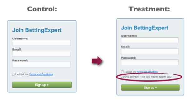
My theory is that the word “spam” could have caused negative connotations in the users minds and prevented them from converting.
The second half of the test illustrates how important it is to keep testing, continuous improvement.
The next test copy was “We guarantee 100% privacy. Your information will not be shared.” The control included no privacy message.
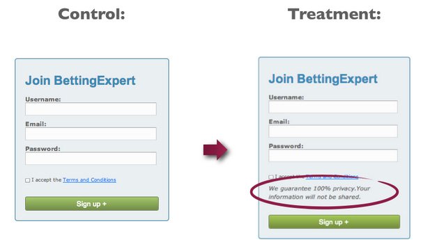
This second test increased their signups by 19.47%.
This suggests that the phrasing of your privacy statement can have a serious impact on conversions.
CRO TIP: Make sure to test your privacy policy wording and inclusion of it at all! Ensure that you do not use ‘halt’ words and make the feeling an overall positive one.
Designing a high converting form
We’ve learnt about efficiency, customer development and copywriting. Now we can design our form keeping in mind a couple more case studies. Are you ready?
Visual hierarchy can make or break your conversions
Visual hierarchy is the order in which we see and perceive elements in a design.
I know what you are thinking, make the call to action button huge!

Just because an elements is big, doesn’t make it the most prominent part of the design.
You can also use contrast, colour, density and white space to influence how people perceive a design.
In this case study we see how contrast makes this call to action stand out and increases it’s position in the visual hierarchy of the page to affect conversions.
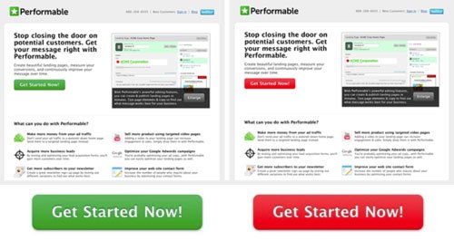
It doesn’t matter that the button colour is red or green, it is that the rest of the page elements and logo use green and therefore red is contrasting and stands out in comparison.
They use the context of the page, leveraging contrast and colour to increase the buttons visibility.
CRO TIP: Ensure the most important task you want your user to complete on each page is high up in the pages visual hierarchy.
Leverage visual cues to guide your reader to the call to action
In this case study the make use of the F-Shaped pattern of eye movement to direct the user through four steps finally landing on the call to action.
The F-Shaped pattern for reading web content is an eye tracking study that shows that users often read websites in the shape of a big letter F, see below.
![]()
Here are the details.
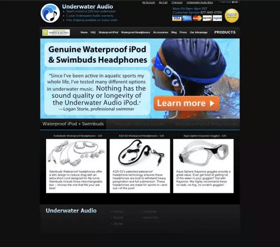
The control
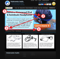
The variation
The concept behind the test was that by swapping the call to action and testimonial placement, the user would follow the steps title – quotation – action (due to the f-shaped reading pattern, see below) Read and understand more of the benefits before being presented with the call to action and therefore increase conversions.
The variation increased conversions 35.6%.
CRO TIP: Test visual order of your page elements and how they relate to your form or call to action.
Conclusion
Improving the conversion rate of your forms is no mean feat, but as long as you apply the ideas learned here you’ll be well on your way to some great test ideas and hopefully higher conversion rates.
Remember to use UX best practices and employ customer development to aid in copywriting for your forms. Support your form conversion with benefit driven headlines and supporting images and social proof.
And don’t forget, higher conversions does not always mean better quality leads.
Make sure to follow a conversion rate optimization process, follow best practice but test your variations against a control. There are no hard and fast rules in conversions!
Now it is time to increase your conversions
Your forms can have awesome conversion rates too…
…but you need to put into practice what you have read.
I’ve put together an exclusive bonus area with three free resources to help improve your forms conversion rates.
What you get: