Ecommerce Product Page Layout Guide (2026)

Your ecommerce product page does far more than display a price and an add-to-cart button. It has to answer buying questions, reduce hesitation, present product visuals clearly, and guide shoppers toward a decision without friction. If your traffic is decent but conversions feel uneven, the page layout is often the issue. For Shopify merchants especially, product page performance usually comes down to structure, image quality, trust signals, and how well the page matches buyer intent. This guide breaks down what a high-converting ecommerce product page should include, how to arrange each section, and where visuals such as photos, mockups, and video help most. If you are also comparing visual workflow options, start with these ecommerce tools to see the broader ecosystem.
Contents
What a converting ecommerce product page needs
A strong ecommerce product page does not try to do everything at once. It prioritizes the information shoppers need in the order they need it. In most stores, that means the visual gallery and key purchase details appear first, followed by proof, explanation, and reassurance.
At a minimum, the page should communicate five things quickly: what the product is, what it looks like, why it is worth buying, how it fits the shopper's needs, and what happens next if they order. If any of those are unclear, conversion rates may suffer even when traffic quality is solid.
For Shopify store owners, this usually means working within your theme's product template, app blocks, metafields, and media gallery settings. Giles Thomas's Shopify Partner experience is particularly relevant here because layout decisions are rarely just design choices. They affect trust, usability, mobile behavior, and how well your merchandising strategy supports AOV and conversion.
If your catalog spans marketplaces as well as your own site, studying amazon product photography standards can also help sharpen image sequencing and compliance thinking.
Recommended product page layout
There is no single perfect template for every store, but most high-performing product pages follow a similar order. The goal is to reduce cognitive load and answer objections before they become drop-off points.
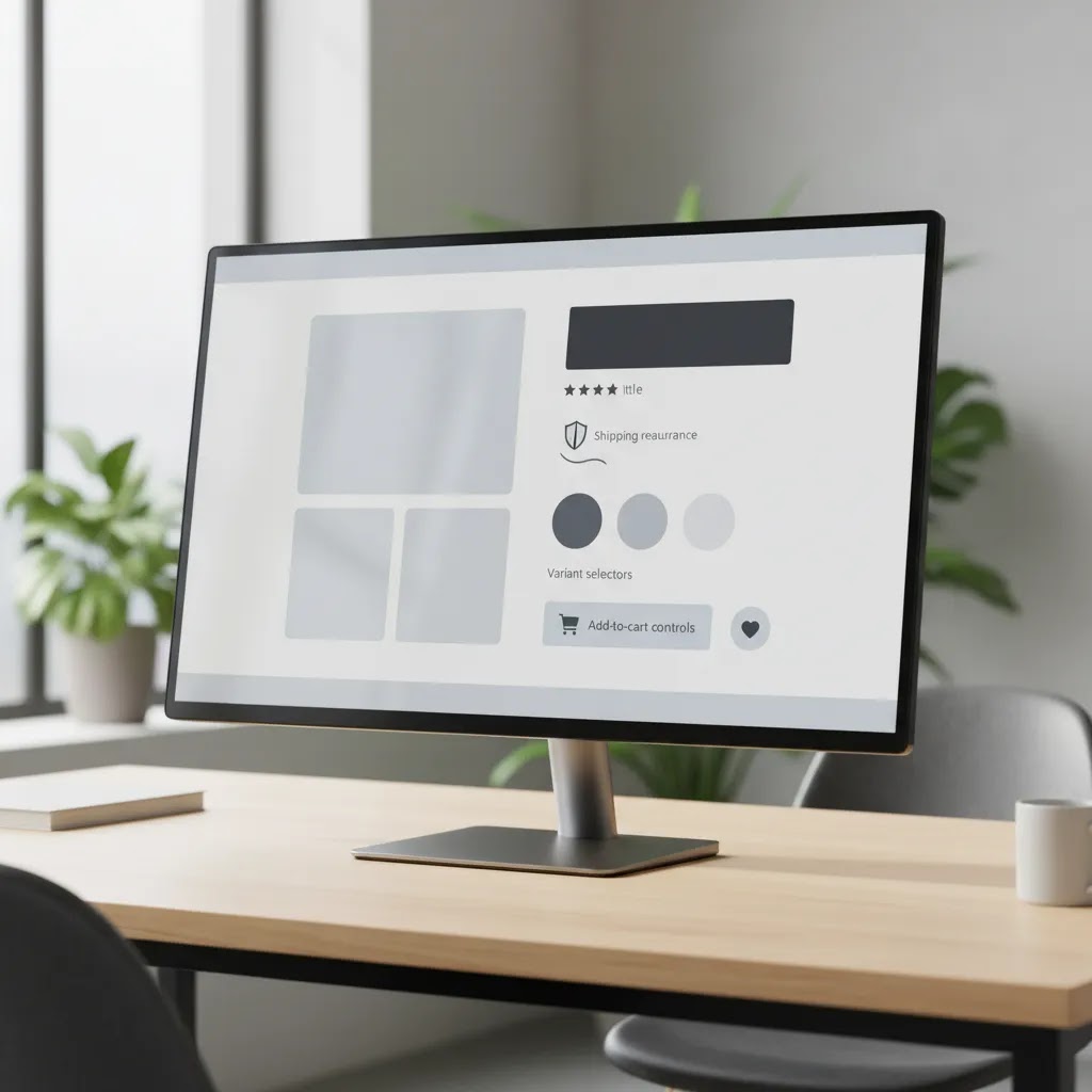
1. Above-the-fold purchase block
This section should include the product title, price, variant selectors, a concise value proposition, shipping or returns highlights, and the primary add-to-cart button. Keep this area clean. If you overload it with tabs, badges, popups, and long paragraphs, shoppers have to work too hard before they can act.
2. Product image gallery
Your gallery should show the product from multiple angles, in context where relevant, and with zoom or high-resolution support. The first image should confirm exactly what is being sold. Secondary images can show detail, dimensions, texture, use case, and packaging. If you sell apparel, beauty, home goods, or accessories, lifestyle imagery often matters almost as much as the studio hero shot.
3. Short-form conversion copy
Use bullets for benefits, not just specs. Save long-form brand storytelling for lower on the page. Early copy should help the shopper decide, not force them to scroll through your company history.
4. Social proof and reassurance
Ratings, reviews, user-generated visuals, shipping estimates, and returns information can reduce hesitation. Place these close enough to the purchase block that they support action rather than feeling buried.
5. Expanded details below the fold
Add sizing, ingredients, materials, care instructions, FAQs, and comparison modules lower on the page. This is where thoughtful ecommerce photography still matters because supporting images can explain use, scale, and quality better than text alone.
Product Page UX Pitfalls to Avoid (2026)
Here’s the thing, most product pages do not fail because they are missing a section. They fail because one or two small UX issues add friction right at the moment a shopper is trying to buy. You can usually spot these problems faster than you can fix them, which is useful, because it keeps you from making random theme changes that do not address the real bottleneck.
These are some of the most common failure points that show up across Shopify stores in 2026.
Unclear variant and option selection
If your product has sizes, colors, bundles, or any other options, the selection UI has to be unmissable and self-explanatory. A surprising number of stores still rely on subtle dropdowns, unclear option labels, or variant names that mean something internally but not to shoppers. If a shopper is not 100 percent sure what they are selecting, they are more likely to pause, open a new tab, or leave.
From a practical standpoint, the fix is often boring but effective: use clear option names, ensure the selected state is obvious, and make sure the price updates predictably if variants change price. If you sell apparel or anything with fit, put your size guidance where the size selector is, not in a separate accordion five scrolls down.
Hidden total cost until late in the process
Many store owners overlook how early shoppers try to estimate total cost. If shipping cost, delivery windows, subscription terms, or taxes feel hidden, some shoppers assume the worst. They may still add to cart, but they are more likely to abandon once they see the final total.
You do not need to quote an exact shipping cost on the product page for every scenario, but you should be clear about what is typical and what the shopper should expect next. Shipping highlights, delivery estimates, and returns cues work best when they sit close to the add-to-cart area, not buried under long descriptions.
Weak out-of-stock handling for variants
Stock issues are a normal part of ecommerce, but poor error handling makes them feel like a broken site. Common issues include allowing shoppers to select an out-of-stock variant without making it obvious, showing “sold out” only after add-to-cart, or failing to explain what to do next.
If a variant is unavailable, it should be clearly disabled or labeled, and the page should offer a next step, such as “notify me,” a nearby alternative, or a recommendation to choose another variant. Even simple clarity can reduce frustration.
“Mystery meat” information architecture
This is when the information shoppers care about is technically present, but it is buried inside generic tabs and accordions. Materials, compatibility notes, sizing, warranty, and what’s-in-the-box details are common offenders. Shoppers scanning the page should not have to guess where the answer might be.
Think of it this way, if an item is a top three reason someone buys or does not buy, it deserves a clear label and a predictable location. The reality is that shoppers do not read product pages like a blog post. They hunt for confirmation.
Mobile-specific pitfalls that quietly kill conversion
Mobile product pages fail in different ways than desktop. Even when the same content exists, the order and spacing can make the page feel heavy.
Common issues include overlong accordion stacks that take too much scrolling, review modules that push the add-to-cart area too far down, cramped size charts that are hard to read, and image galleries that are difficult to swipe or zoom reliably. On Shopify, it is also worth checking if a sticky add-to-cart bar blocks important UI, like variant selectors or chat widgets, especially on smaller screens.
Quick self-checks you can do in minutes
Before you touch your theme, use a few fast checks to identify what is actually wrong.
How photos, video, and editing affect conversion
Visuals are often the strongest part of a product page because they answer questions shoppers may not even know how to phrase. Good visuals reduce uncertainty. Weak visuals create it.
For many catalogs, the essential visual stack includes:
That does not mean every SKU needs an expensive custom shoot. Some merchants mix studio photography with edited variants, mockups, or AI-assisted workflows to speed production. Product tools such as AI Background Generator, Free White Background Generator, and Increase Image Resolution may help improve presentation for some catalogs, especially when you need consistency across many SKUs.
There are trade-offs. AI or edited imagery can save time, but it still needs human review. If the output misrepresents texture, color, or product scale, it can increase returns or damage trust. That is why many growth-stage merchants use editing support for efficiency while reserving premium launches or hero assets for a dedicated product photography studio workflow.
If you are selling customizable items, apparel, or print-on-demand products, a mockup generator can help you test concepts faster before committing to a full shoot. For broader visual standards, the E Commerce Product Photography category is a useful reference point.
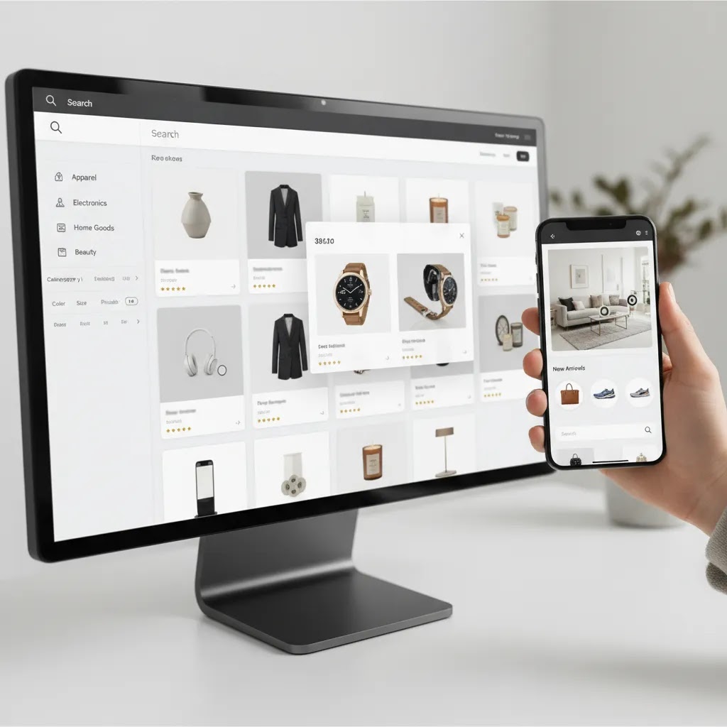
Product Page Search UX and Findability (On-page and On-site)
What many store owners overlook is that product page UX is not just about layout. It is also about findability. Shoppers “search” in two ways: they scan the page to find a specific answer, and they use your on-site search and collection filters to locate the right product in the first place. Your product page content supports both behaviors.
Support on-page scanning with clear, predictable structure
Most shoppers are not reading every word. They are looking for confirmation. That means you should make key information easy to spot with clear headings, scannable specs, and direct answers to common pre-purchase questions.
Consider this, if you sell items where compatibility matters, like accessories, electronics, or parts, a short compatibility note near the buy box often prevents wasted sessions. If you sell consumables, ingredients and allergen cues need to be easy to find. If you sell apparel, fit guidance should not be buried under a generic accordion label.
This does not require bloating the top of the page. The way this works in practice is choosing a few high-impact “confirm” elements near the purchase block, then putting deeper reference detail further down with clear headings so it is easy to find when someone scrolls.
Make on-site search and filters work by using consistent product data
On Shopify, a lot of “search UX” comes down to how consistently you name and structure product information. Your theme and search app can only surface what is actually in your product data.
If shoppers search for “navy,” but your variants are labeled “midnight,” you may lose them. If people filter by “organic cotton,” but that attribute only exists inside a paragraph description instead of a structured field, it is harder for your store to help them browse.
For most Shopify store owners, the practical focus areas are:
You do not have to over-structure everything. Start with the attributes that drive purchase decisions in your category, and make those consistent across products first.
Align sections with shopper intent without overloading above the fold
One of the best ways to think about product page structure is by intent. Some shoppers are in browse mode. They want a quick sense of what it is, how it looks, and whether it is in budget. Other shoppers are in confirm mode. They want shipping timing, sizing, compatibility, ingredients, warranty, and proof.
A page that satisfies both tends to have a clean “browse” experience up top, then a fast path to “confirm” answers without forcing endless scrolling. This is why a small set of well-labeled sections beats a massive wall of text. When you make answers easier to find, you reduce repetitive customer service questions too, which is a quiet conversion win for many stores.

Pros and Cons
Strengths
Considerations
Ecommerce Product Page Examples and Template Notes (What to Copy, What Not To)
If you are trying to improve your ecommerce product page, examples help, but only if you understand what you are copying. Many store owners copy surface design trends and miss the structure underneath. A strong product page pattern is really a set of modules that answer buying questions in the right order.
A template-style pattern that works across categories
In most categories, a reliable product page pattern looks like this:
The big decision is not whether you include all modules. It is choosing the minimum set that answers the top objections in your category.
What changes by product type: fast-moving vs high-consideration
For faster-moving consumer goods, shoppers typically want quick reassurance: what it is, what it does, ingredients or key specs, and whether they can trust it. These pages often perform well with tight benefit bullets, an ingredient or specs panel, and strong review proof close to the buy box.
For higher-consideration items, shoppers need more confirmation. That may include comparison tables, compatibility notes, setup guidance, warranty clarity, and richer media. The goal is not to make the page longer. It is to reduce uncertainty for the people who are actually ready to evaluate.
Common module variations, and when they are worth it
Now, when it comes to page modules, a few patterns show up repeatedly because they solve real buying problems.
Each of these modules is only helpful if it is accurate, specific, and easy to scan. Generic filler sections add scroll without reducing doubt.
A lightweight starter template you can model without a redesign
If your current page feels messy, start by making a few layout decisions and implementing them consistently across products. You are aiming for a stable template, not a one-off “perfect” page.
If you keep the structure consistent, you can improve the page over time without constantly reworking your theme.
Who this layout works best for
This approach works best for Shopify merchants and other ecommerce operators who already have products live and want to improve conversion quality without rebuilding the whole store. It is especially useful for growth-stage brands with decent traffic but inconsistent product page performance.
It also fits merchants expanding their visual workflow, whether that means improving ecommerce product photos, adding video, testing image editing, or standardizing templates across a larger catalog. If your store has many SKUs, the priority is usually consistency and clarity. If you sell a smaller premium range, the priority may be richer storytelling and stronger media.
AcquireConvert recommendation
AcquireConvert is a strong fit if you want practical, Shopify-aware guidance rather than generic CRO advice. Giles Thomas brings the perspective of a Shopify Partner and Google Expert, which matters because product page decisions affect both conversion and discoverability. The most useful next step is usually not a full redesign. It is auditing your current page against merchandising basics, image quality, mobile usability, and trust cues.
If you are refining your visual stack, review the Product Photography Fundamentals category alongside the related product page resources in this hub. That gives you a clearer framework for deciding whether you need better original photography, stronger editing, more marketplace-style image sequencing, or supporting mockups. For many store owners, that kind of focused review is where the best improvements begin.
How to evaluate your own page
If you are auditing an ecommerce product page, use criteria that connect directly to buyer behavior. These five checks are usually the most revealing.
1. Clarity in the first screen
Can a shopper understand the product, the price, the main benefit, and the next action without scrolling? If not, simplify the top section. Remove distractions and prioritize the essentials.
2. Visual completeness
Do your images answer likely buying questions? Shoppers often want to see scale, texture, fit, packaging, and real-world use. If your gallery only includes polished hero shots, you may be missing the images that actually support purchase confidence.
3. Mobile buying flow
Most stores now see substantial mobile traffic. Check whether sticky add-to-cart behavior, image swiping, accordion content, and review placement work well on smaller screens. A layout that feels logical on desktop may create friction on mobile.
4. Trust and objection handling
Look for missing reassurance points. Are shipping timing, returns, sizing, ingredients, compatibility, or warranty details easy to find? Many abandoned sessions happen because the answer exists somewhere on the site but not where the shopper needs it.
5. Visual production workflow
Ask whether your current photography process can scale. If every new launch requires a bottlenecked manual shoot, your catalog may become inconsistent over time. Some stores use studio imagery for hero assets, edited derivatives for supporting images, and selective AI assistance for background cleanup, resolution improvement, or concept testing. The right mix depends on your category, margins, and brand standards.
The key is alignment. Your layout, photography, copy, and search experience should all support the same buying decision. A visually strong page with weak product information still underperforms. A detailed page with poor images does too. When those pieces line up, the page usually feels more persuasive without becoming aggressive.
Frequently Asked Questions
What is the most important part of an ecommerce product page?
The most important part is usually the first visible section that combines the product title, price, primary image, key benefit, and add-to-cart action. That area sets buying confidence. If shoppers cannot quickly understand what the product is and why it matters, the rest of the page may not get enough attention to help.
How many images should an ecommerce product page have?
There is no fixed number, but most products benefit from more than one image. A practical baseline is a hero image, a few alternate angles, one close-up, and one image that shows scale or use. Higher-consideration products often need more. The right number depends on how much visual explanation the product requires.
Do ecommerce product videos really help conversion?
They can, especially when motion, fit, texture, or functionality is hard to communicate with still images alone. Short videos often work best when they answer a clear question, such as how a product moves, opens, fits, or looks in real use. They are most useful when they support the purchase decision rather than act as brand filler.
Should I use AI for ecommerce product photography?
AI can be useful for selected tasks such as background cleanup, white background generation, resolution enhancement, or concept mockups. It is usually best treated as a support tool rather than a full replacement for all photography. If AI output changes the product too much or creates unrealistic visuals, trust may suffer and returns could increase.
What should appear above the fold on a Shopify product page?
For most Shopify stores, include the product title, price, variant selector, add-to-cart button, a short value proposition, and strong visual media. Depending on category, you may also include review stars and shipping or returns highlights. Keep it focused. Above-the-fold space should help buyers act, not force them to process too much information.
How do I improve product page trust without cluttering the layout?
Use a few high-value trust elements instead of many low-value ones. Reviews, shipping information, returns policy highlights, and category-specific reassurance like size guidance often do more than a stack of generic badges. Place trust cues near likely hesitation points so they feel helpful rather than decorative.
What is the difference between ecommerce product photography and mockups?
Product photography captures the real item, while mockups simulate how it may look in context. Both can be useful. Photography usually builds more direct trust, especially for hero images. Mockups can help with concept testing, customization previews, or fast merchandising workflows. The best choice depends on how accurately each method represents the final product.
How often should I update an ecommerce product page?
You should review product pages regularly, especially after traffic increases, product changes, or merchandising updates. Common triggers include adding reviews, improving images, clarifying FAQs, or updating shipping and returns details. Product pages are rarely one-and-done assets. Strong stores refine them as they learn more about buyer objections and search intent.
What is a product page in ecommerce?
A product page in ecommerce is the page where a specific item is sold. It typically includes the product name, images, price, options like size or color, purchase actions like add to cart, and supporting information such as shipping, returns, specs, and reviews. In most Shopify stores, the product page is built from a product template and populated using your product data, variants, and any relevant metafields.
What are the 4 types of e-commerce?
The four common types are business-to-consumer (B2C), business-to-business (B2B), consumer-to-consumer (C2C), and consumer-to-business (C2B). Most Shopify stores are B2C, but B2B is also common for wholesale and reorder-focused catalogs.
Do I need an LLC for e-commerce?
Not always. Many store owners start as sole proprietors, then form an LLC as the business grows. The right setup depends on your location, risk, tax situation, and how you run the business. If you are unsure, it is worth speaking with a qualified accountant or attorney who understands ecommerce. Requirements and benefits vary by jurisdiction.
What are the 5 C’s of e-commerce?
The “5 C’s” framework is usually referenced as concepts that support online selling: customers, content, convenience, cost, and credibility. Different sources define them slightly differently, but the practical point is consistent. Your product page needs clear customer-focused information, strong content and visuals, a convenient buying flow, transparent costs, and credibility signals like reviews and policies.
Key Takeaways
Conclusion
A better ecommerce product page usually comes from better structure, not more noise. If your page makes the product clear, uses strong visuals, handles objections, and keeps the buying path simple, it is far more likely to support conversion. For Shopify merchants, many of these gains come from improving the existing template rather than replacing it. AcquireConvert is a useful next stop if you want practical guidance grounded in real ecommerce execution. Explore the related photography and product page resources across the site to compare approaches, sharpen your visual workflow, and see how experienced store owners think about merchandising, CRO, and image strategy.
This article is editorial content for informational purposes only and is not a paid endorsement unless explicitly stated otherwise. Pricing, features, and tool availability are subject to change, so verify current details directly with the provider. Any conversion or performance impact from product page changes will vary by store, traffic quality, product category, and implementation quality.

Hi, I'm Giles Thomas.
Founder of AcquireConvert, the place where ecommerce entrepreneurs & marketers go to learn growth. I'm also the founder of Shopify agency Whole Design Studios.