Website Hero Image Tips for Ecommerce (2026 Guide)

Your website hero image does more work than most store owners think. It sets first impressions, frames product value, and influences whether a shopper keeps scrolling or leaves. For ecommerce brands, that makes it a conversion asset, not just a design choice. A strong hero image should support the offer, match the traffic source, and make your next action obvious. A weak one often does the opposite by slowing load time, confusing visitors, or distracting from the buy path. If you are reviewing visual strategy across your storefront, it helps to look at your hero section as part of a wider ecommerce tools stack that includes imagery, optimization, and conversion-focused merchandising.
Contents
Why the hero image matters
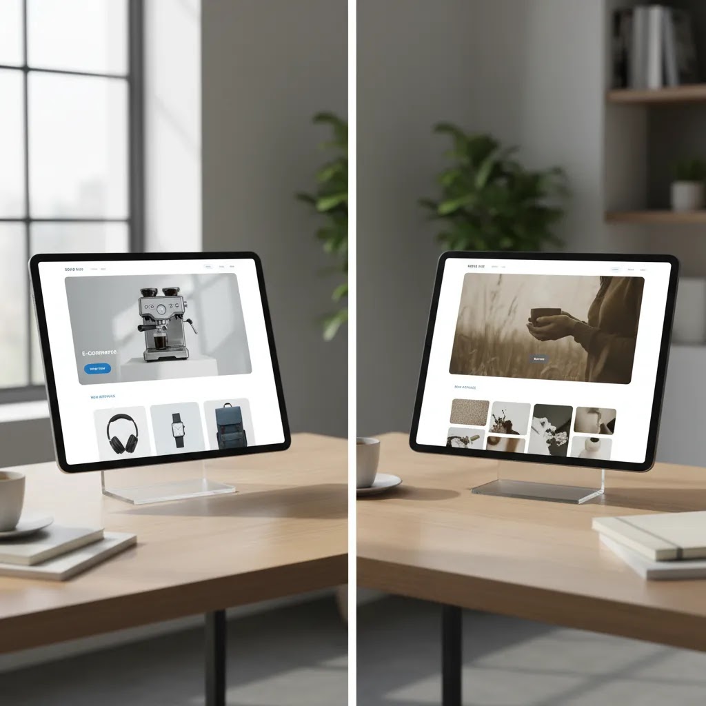
A website hero image is the main visual at the top of a page, usually paired with a headline, short supporting copy, and a call to action. On an ecommerce homepage, collection page, or landing page, it has one job: help the right shopper understand what you sell and why they should care.
Store owners often overvalue style and undervalue clarity here. A beautiful image can still underperform if it hides the product, competes with the headline, or feels disconnected from the traffic source. For example, if your paid social ad promotes a seasonal bundle but your hero image shows a vague lifestyle scene, you create friction right away.
In practice, the best hero sections usually combine product context, clean composition, and a clear next step. That can be a featured product, a collection, a launch, or a promotional offer. If you sell on multiple channels, consistency matters too. Brands working on amazon product photography often see this firsthand because marketplace shoppers respond well to visual clarity, not visual clutter.
What makes a high-converting hero image
A strong ecommerce hero image does not need to be complex. It needs to reduce uncertainty and support purchase intent.
Here are the core traits that matter most:
This is where many brands benefit from reviewing hero images as part of their wider ecommerce photography strategy. Hero visuals should not sit in isolation from product page images, collection banners, or ad creative. The strongest stores create a system where each image type plays a specific role in the conversion funnel.
Hero image templates and layout patterns that tend to convert
What many store owners overlook is that high-performing hero sections usually follow a small number of patterns. You can call them templates if you want, but the idea is simple: start with a layout that already supports clarity, then swap in your product, your offer, and your brand style.
Here are a few patterns that tend to work well for ecommerce, especially when you are trying to balance acquisition and conversion.
1) Product-only hero with a direct CTA
This is the cleanest option for clarity. The hero image shows the product (or a tight product grouping), the headline says what it is, and the CTA points to the next obvious step.
In practice, this works best when:
Headline type: name the product category or the primary outcome. Supporting copy length: one short line that answers the first question a shopper has, such as what makes it different or who it is for. CTA style: one primary button with a clear action like “Shop” or “View collection.”
2) Product-in-context hero (use case, scale, or environment)
This pattern keeps the product central, but adds context that reduces uncertainty. Think of it this way: you are answering “What is this like in real life?” before the shopper has to scroll.
This works well when size, texture, or usage is hard to understand from a pack shot alone. The image should still make the product the hero. Context is there to explain, not to distract.
Headline type: benefit-led, but specific. Supporting copy length: one to two lines max. CTA style: one primary CTA, and optionally a secondary text link style CTA if your theme supports it without clutter.
3) Value-prop hero with supporting proof (icons or short callouts)
Some categories need trust upfront. If your conversion barriers are about quality, materials, shipping, or guarantees, a value-prop-first hero can help. The image can be product-led or lightly lifestyle-led, but your supporting elements do more of the persuasion work.
Keep the proof tight. Two to four short callouts is usually enough. If you add too many, you create a mini brochure where a shopper just wanted a reason to click.
Headline type: one clear promise. Supporting copy length: one line. CTA style: one primary CTA that matches the promise.
4) Promo or launch hero (time-bound offer)
This is the pattern most stores use during seasonal pushes. It can convert well, but only if the offer hierarchy is clear. If the image, the headline, and the CTA all compete, shoppers hesitate.
The image should show what the promotion is actually about. If it is a bundle, show the bundle. If it is a new drop, show the new products. If it is “up to 30% off,” show a representative product set, not a generic background with discount text.
Headline type: promo-led, but anchored to product. Supporting copy length: one line that reduces terms confusion. CTA style: one button that leads to the promoted collection.
5) Collection-first hero (category navigation)
If your store has multiple product lines, a collection-first hero can be the right move. The goal is to route shoppers quickly, not to convince them in the hero itself.
This works well when you have clear categories and shoppers tend to self-select quickly. The image can be a category collage or a strong representative lifestyle shot, as long as it does not become vague.
Headline type: category-led. Supporting copy length: minimal. CTA style: one primary CTA to the top collection, or two to three category CTAs if your theme supports it without pushing the content below the fold.
Template traps that look good but convert poorly
The reality is that some hero styles are popular in design galleries, but regularly underperform for independent ecommerce brands.
Design tips that support conversions
Start with the offer, not the image. Ask what action this page should drive. If it is a new collection, show the collection. If it is a hero product, show the product in a way that communicates use, scale, or outcome.
Keep your headline short enough that the image still has room to work. One common issue is forcing too much copy into the hero section because the image is not doing enough of the communication. If the image already establishes category, audience, and product type, your copy can stay tighter.
Use contrast deliberately. The call to action should stand out against the image background. If your text disappears into the photo, the problem is not your button color alone. The image itself may be too busy for a text overlay.
Test product-led images against lifestyle-led images. Product-led heroes usually help with clarity. Lifestyle-led heroes can help with aspiration and context. Which works better depends on your category, average order value, and traffic intent. A first-time visitor arriving from search may need more clarity, while a returning customer may respond well to a branded campaign look.
Do not ignore file handling. Compress images before upload, use modern formats where your stack allows it, and check how the crop behaves across desktop and mobile. A hero image that looks polished on desktop but cuts off the product on mobile can quietly reduce engagement.
If you are creating campaign imagery without a full studio shoot, an mockup generator can help you test concepts faster before committing to final creative. That is especially useful for product launches, seasonal promotions, and pre-sell pages.
Hero image sizes, dimensions, and responsive cropping (Shopify-focused)
There is no single universal hero image size, but you still need a practical baseline. Most Shopify themes display hero images in responsive containers that change shape across screen sizes. If you upload a file that only works for one layout, the theme will crop it in ways you might not expect.
From a practical standpoint, think in terms of two things: the container shape (aspect ratio) and the minimum pixel dimensions needed to avoid looking soft on larger screens.
Common hero layouts and usable size ranges
For many Shopify stores, these ranges are a good starting point. Your theme may vary, so treat them as guidelines, then test in your theme editor.
Now, when it comes to Shopify specifically, the bigger risk is not just “wrong dimensions.” It is that your product or model gets cropped in a way that removes the key selling detail. That is where safe zones matter.
Avoiding the “critical subject gets cropped” problem
Most hero images fail on mobile because the focal point was designed for desktop. The theme then center-crops, and your product shifts off-screen or gets cut in half.
Consider this simple rule: keep the important subject and any must-read text away from the extreme edges. Leave breathing room on all sides, and especially at the top and bottom where Shopify headers and overlay gradients can cover content.
If your hero includes text overlays inside the image itself (which is not always recommended, but some stores do it), build a clear “safe zone” where text can live without running into the crop. In many cases, keeping the text area centered and away from edges reduces the chance it gets chopped on smaller screens.
How responsive hero behavior works in Shopify themes
Many Shopify themes render hero images as background images, or as responsive images inside containers with fixed aspect ratios. That means your uploaded file may be scaled and cropped to fit the container, not displayed exactly as designed.
What you can do in practice:
If your theme offers a “focal point” or “image position” setting for the hero, use it. It is one of the simplest ways to keep the product framed when the container crops for different screens.
File format and delivery basics that affect perceived speed
Hero images are usually some of the largest files on a homepage, so format matters. WebP typically provides smaller file sizes at similar visual quality, which can help performance in many cases. JPG is still common for photos when WebP is not used in your workflow. PNG is usually best kept for graphics that need transparency, because it can be heavier for photographic images.
The way this works in practice: start with enough pixel dimensions to avoid blur, then compress so the file weight stays reasonable. If you upload an oversized image and do not compress it, you can end up with a hero that looks great but loads slowly, especially on mobile connections.

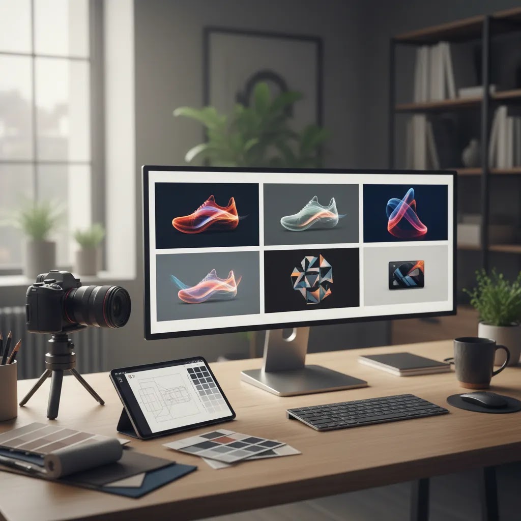
Tools that can help you create hero images
For store owners building hero visuals in-house, a few image tools can help with common ecommerce workflows. The available product data here is limited to tool names and URLs, so it is best to treat these as starting points to evaluate directly based on your store's needs.
These tools may help speed up concept testing, but they are not a substitute for good merchandising judgment. The most effective hero image still depends on offer clarity, audience fit, and solid page structure. If your brand is considering whether to build visuals internally or with outside help, reviewing what a product photography studio can deliver may help you decide where AI editing fits and where professional production still adds value.
Hero image generator workflows (AI and non-AI) and how to choose
If you search for a “website hero image generator,” you will see a mix of tools that do very different jobs. Some are template-based design tools, some generate images from prompts, and some are editing tools that help you adapt real product photography into campaign-ready creative.
Here is the thing: for ecommerce, the best workflow is usually not fully generated from scratch. It is typically built around real product imagery, with tools used to speed up variations and polish.
Three types of “hero image generator” options
Most options fall into one of these buckets:
Choosing between them comes down to your bottleneck. If your issue is layout and messaging structure, start with templates. If your issue is limited photo variety, start with editing tools. If your issue is early-stage branding concepts, experimenting with generation can be useful, but you will still want a realistic final asset.
A simple, repeatable workflow for Shopify hero creation
For most Shopify store owners, a reliable process looks like this:
This approach also makes testing easier. You can swap the image while keeping the layout and copy consistent, so you are not changing five variables at once.
Quality control checks that matter for ecommerce trust
AI tools can speed up production, but you still need a human review. For hero images, a few checks prevent avoidable trust problems:
Ad platform and theme rules also change over time, so if you are reusing hero assets in ads, verify the current platform policies and creative specs before you push spend behind them.
Pros and Cons
Strengths
Considerations
Who should prioritize hero image optimization
Hero image work matters most for stores where the homepage or landing page plays a major role in discovery and conversion. That includes newer brands building trust, design-led brands selling through storytelling, and growth-stage stores running paid campaigns to category or collection pages.
It is especially relevant for Shopify merchants who update campaigns frequently and need visuals that can be refreshed without a full redesign. If you have strong traffic but weak engagement on key entry pages, your hero section is one of the first areas worth reviewing. It is not the only variable, but it often shapes whether a shopper understands your store fast enough to keep exploring.
AcquireConvert recommendation
At AcquireConvert, the practical view is simple: your website hero image should earn its space. Giles Thomas approaches ecommerce visuals through the lens of conversion, merchandising, and platform reality, not just design preference. As a Shopify Partner and Google Expert, he focuses on what helps store owners present products clearly across storefronts, campaigns, and search-driven landing pages.
If you are improving visual performance across your store, start by reviewing the pages that get the most traffic and the weakest click-through to collections or products. Then compare your hero treatment with the rest of your image system, including category banners, product imagery, and campaign assets. For deeper guidance, explore AcquireConvert's category resources on E Commerce Product Photography and Background Removal & Editing to see how other visual decisions affect conversion quality.
How to choose the right hero image approach
There is no single best hero image style for every ecommerce brand. The right choice depends on your product, traffic mix, and how your customers make decisions.
1. Match the image to shopper intent
If most visitors land from branded search or email, they may already know what you sell. In that case, a more campaign-led or lifestyle-driven hero image can work. If much of your traffic is cold, such as paid social or non-branded search, clarity usually matters more than atmosphere. Show the product, category, or use case fast.
2. Decide whether the page is brand-led or action-led
Homepage heroes can carry more brand storytelling. Landing page heroes should usually be more action-led. If the goal is to push visitors to a collection or product detail page, avoid vague imagery that forces extra interpretation. The closer the page is to purchase intent, the more direct the image should be.
3. Consider your production model
If you already run regular shoots, you may have enough assets to build strong hero variations without relying heavily on AI tools. If not, AI-assisted background editing and composition tools can help you test concepts. That said, use them carefully. The final image should still reflect the real product and brand experience. For categories where detail and trust matter, realism beats novelty.
4. Optimize for mobile first
Many hero sections fail because they are approved on a large monitor and never checked on a phone. Review crop behavior, focal point placement, text legibility, and button visibility on smaller screens. If your product gets cropped out or your text becomes unreadable, the hero section is not doing its job.
5. Measure the right outcomes
Do not judge hero performance by aesthetics alone. Watch click-through to collections, bounce patterns, engagement depth, and assisted conversion behavior. A design that looks polished but lowers product exploration may not be the right choice. In many stores, small visual changes produce modest but meaningful improvements in how clearly users move through the funnel.
Frequently Asked Questions
What is a website hero image in ecommerce?
A website hero image is the main visual section at the top of a page, usually paired with a headline and call to action. In ecommerce, it often introduces your brand, a featured collection, or a promotional campaign. Its job is to help shoppers understand what they can buy and where to go next without creating friction.
Why do they call it a hero image?
It is called a hero image because it is the primary visual that leads the page. Think of it as the “main character” at the top of your homepage or landing page. It is the image that carries the first impression and supports the headline and call to action.
Are hero images still relevant?
Yes, in many cases, because ecommerce still depends on fast clarity. The format has evolved. Some stores use video, sliders, or more modular sections, but the core job remains the same: help the right shopper understand what you sell and what to do next. The key is making sure the hero section earns its space. If it adds scroll depth without adding clarity, it may not be the right choice for that page.
What size is a hero image for a website?
There is no single perfect size because hero containers are responsive and vary by theme. As a baseline for ecommerce, many stores start with a file that is 2000 to 3000 pixels wide for full-width heroes, then test the crop across desktop and mobile. The practical goal is crisp display on larger screens and a crop that keeps the product and headline readable on phones.
What is a hero section background image?
A hero section background image is an image that sits behind the hero content, usually behind the headline, supporting copy, and CTA. Shopify themes often crop background images to fit different screen sizes, so the safest approach is to keep important subjects away from the edges and test the focal point on mobile and desktop.
Should my homepage hero image show a product or a lifestyle scene?
It depends on shopper intent and category. Product-focused images usually improve clarity, especially for newer visitors. Lifestyle scenes can work well when context or aspiration is part of the sale. Many stores benefit from testing both. If you choose lifestyle imagery, make sure the product and category are still obvious at a glance.
Can AI tools help create ecommerce hero images?
Yes, they can help with concept generation, background editing, and visual variations. They are most useful when you need faster campaign production or want to test several looks before a shoot. They work best as support tools, not as a replacement for strong merchandising decisions or accurate product presentation.
How large should a hero image file be?
There is no single perfect size because it depends on your theme, layout, and device behavior. The practical goal is to keep visual quality high while minimizing file weight. Compress images, test load performance, and review how they render on mobile and desktop. Large files that slow the page can undermine the value of the hero section.
Do hero images affect conversions?
They can, especially when the hero section is a major part of the first-page experience. A better hero image may improve message clarity, engagement, and click-through to products or collections. That said, it works as part of a wider system that includes offer quality, page speed, copy, navigation, and product detail pages.
Should every ecommerce page have a hero image?
No. Hero images are useful when they clarify the page purpose or support a campaign. On some pages, especially product pages with strong purchase intent, a large hero section may add unnecessary scroll depth. The decision should depend on what helps the shopper move forward, not on a fixed design rule.
What is the biggest mistake store owners make with hero images?
The most common mistake is prioritizing visual style over clarity. If a shopper cannot tell what the store sells or what action to take next, the hero section is underperforming. Other frequent issues include weak mobile crops, unreadable text overlays, and oversized files that slow the first page load.
How often should I update my hero image?
Update it when your offer, season, or campaign focus changes. For active stores, that may mean monthly or quarterly reviews. You do not need to change it constantly, but you should revisit it whenever your top-selling products, promotional priorities, or traffic sources shift enough that the current hero no longer reflects what visitors need to see first.
Key Takeaways
Conclusion
A high-performing website hero image is usually simple, relevant, and tightly connected to the action you want shoppers to take. For ecommerce brands, that means showing the right product context, keeping copy readable, and making sure the visual works just as well on mobile as it does on desktop. If your store gets traffic but visitors are not moving deeper into collections or product pages, your hero section is worth a closer look. AcquireConvert publishes practical guidance for store owners who want to improve visuals without losing sight of conversion. If you want the next step, explore more of the site's photography and creative optimization resources and use Giles Thomas's practitioner-led advice to sharpen what shoppers see first.
This article is editorial content created for educational purposes and is not a paid endorsement unless explicitly stated otherwise. Tool availability, features, and pricing may change over time, so verify current details directly with the provider before making a decision. Any performance or conversion discussion is general guidance only and does not guarantee specific results.

Hi, I'm Giles Thomas.
Founder of AcquireConvert, the place where ecommerce entrepreneurs & marketers go to learn growth. I'm also the founder of Shopify agency Whole Design Studios.