Fashion Background for Clothing Shoots (2026)
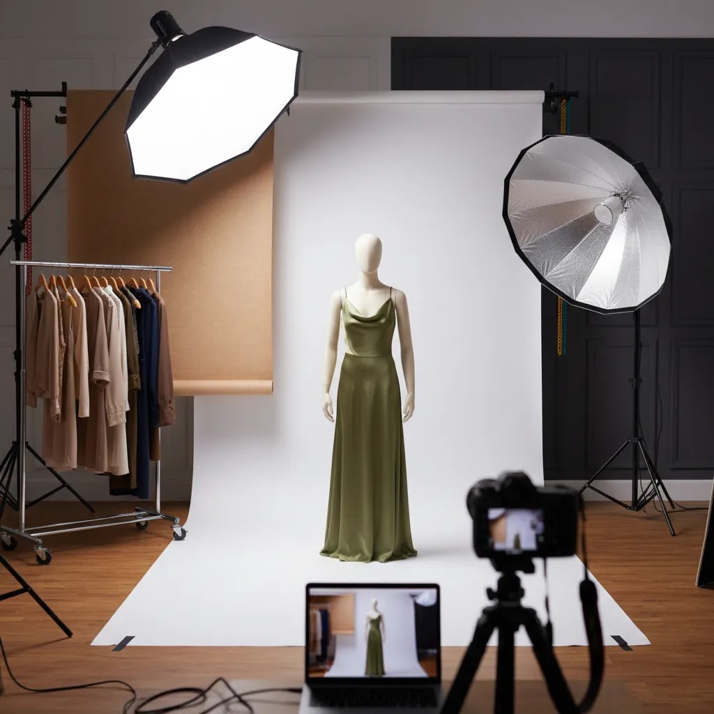
If you sell clothing online, your fashion background choice affects more than style. It changes how colors read, how clean your product page looks, and whether your images feel editorial, catalog-ready, or inconsistent. For Shopify merchants especially, the right backdrop can make collection pages easier to scan and product pages more trustworthy. In most cases, you do not need an elaborate set. You need a background strategy that matches the type of apparel you sell, the channels you publish on, and the amount of editing your team can realistically handle. If you are still refining poses and framing as well as your set, this guide pairs well with our article on photography fashion model best practices. Here, we will evaluate the main background options, the trade-offs behind each, and how to choose one that supports ecommerce performance.
Contents
What a fashion background needs to do
A good fashion background should help your clothing stand out without creating extra work in post-production. That sounds simple, but ecommerce teams usually need one background setup to do several jobs at once. It needs to work for product detail pages, collection thumbnails, paid social creatives, email banners, and sometimes marketplace requirements.
For many apparel brands, white background fashion photography remains the safest option for core catalog images. It is clean, familiar, and easy for shoppers to scan. It also makes cropping, retouching, and page layout more predictable. If your brand relies on mood and storytelling, though, an all-white setup may feel too flat for hero images or seasonal campaigns.
That is why most growth-stage merchants split their approach. They use a white or light neutral background for primary PDP shots, then add a lifestyle or tonal background for campaigns and social assets. If you are comparing broader clothing photography approaches, this is often the most practical balance between consistency and brand expression.
The key evaluation question is not which background looks best in isolation. It is which background helps you sell apparel clearly across channels while staying manageable for your team.
Best fashion background options for clothing shoots
There is no single best background for every clothing brand. The right choice depends on what you sell, how your customers shop, and how much visual consistency you need across hundreds of SKUs.
1. White background
This is the standard for catalog and ecommerce product pages. It keeps attention on fit, silhouette, color, and fabric details. It works especially well for stores with large assortments, frequent new arrivals, and simple theme layouts.
White works best when your lighting is controlled. If your shadows are muddy or your garment edges blend into the set, the image can look low quality very quickly.
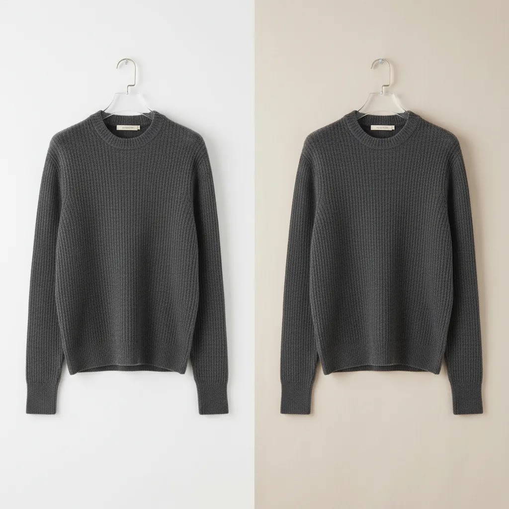
2. Light neutral background
Soft gray, off-white, beige, or muted stone tones can make apparel feel more premium without distracting from the product. These tones are often easier to maintain than a perfect pure white and can reduce harsh contrast on lighter garments.
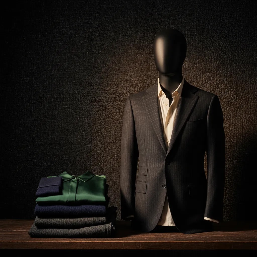
3. Black or dark background
A dark fashion background can create drama and works well for luxury, eveningwear, or editorial brand campaigns. The drawback is practical. Dark sets can swallow black garments, reduce detail visibility, and make collection page consistency harder to maintain.
4. Textured studio background
Paper rolls, painted canvas, and subtle textured walls can add personality while staying studio controlled. This is useful for lookbooks, homepage banners, and campaign shoots where mood matters as much as product clarity.
5. Digitally edited or AI-assisted background
For some merchants, especially those testing multiple creative directions, edited backgrounds can speed up asset production. If you are exploring that route, our guide to ai fashion content covers where AI can help and where manual review still matters. AI-assisted edits may save time, but they still need quality control to avoid unnatural edges, fabric distortion, or inconsistent shadows.
Fashion background ideas and design templates (that still work for ecommerce)
Here is the thing. Most “fashion background ideas” you see online are designed to look good in a single image, not to hold up across a Shopify collection grid with 60 products. You can still borrow the aesthetic, you just need to turn it into a repeatable system.
Common fashion background aesthetics and where they fit in your image stack
Instead of picking one background for everything, decide where each style belongs. In practice, most Shopify stores do best with a clear separation between conversion images and marketing images.
Minimal studio (white or light neutral): This is your “default template” for PDPs and collection pages. It is designed for browsing speed and clean comparison, especially when a shopper is scanning thumbnails fast.
Editorial (texture, gradient, or controlled set design): Use this for hero images, lookbooks, and seasonal campaigns. It can work on PDPs too, but typically as secondary images after you have shown the clean front, back, and detail shots.
Street and urban (concrete, brick, real-world locations): Strong for acquisition assets, especially paid social and email banners where mood can earn the click. It can be risky as a primary catalog standard because location-to-location variation is hard to control.
Luxury (dark, high contrast, polished surfaces): Useful for premium positioning and eveningwear. If you use it in the catalog, test it across your darkest SKUs first so you do not lose edge detail.
Seasonal (holiday color stories, spring pastels, summer sun tones): Works best as a campaign layer. If you bake seasonal backgrounds into every SKU image, your store can look outdated the moment the season changes.
Design rules that keep backgrounds on-brand without hurting product clarity
Most store owners get into trouble when background “style” starts competing with the garment. These rules keep you on the right side of ecommerce performance.
Limit your palette: Pick one primary catalog background (white or neutral), then one accent direction for campaigns. Too many tones across the same category page creates visual noise.
Control texture: Texture is fine, but it should be subtle enough that it does not create compression artifacts or make fabric texture harder to read. If shoppers cannot tell whether the texture is the garment or the wall, it is the wrong backdrop.
Keep a consistent horizon line: If you are shooting full-body models, keep the floor line and perspective consistent. If one product floats and the next sits on a visible floor seam, your grid will look messy even if each shot is “good.”
Standardize crop and scale: Decide what percentage of the frame the garment should take up, then stick to it. This matters more than most people expect, because a consistent crop makes your collection pages easier to scan.
A simple workflow to turn inspiration into a Shopify-ready standard
From a practical standpoint, the goal is to stop making background decisions product by product. You want a template your team can follow.
Step 1: Build a small “reference set” of 10 images that represent your brand. Include at least one black item, one white item, one patterned item, and one shiny fabric so your background choice is stress-tested.
Step 2: Define your catalog standard: background color, lighting direction, shadow style (soft or crisp), and crop rules. If you have models, define whether you show full body, 3/4, or waist-up as the default.
Step 3: Create a one-page background style guide your team can follow. It should include: background reference photo, camera height, distance, crop examples for desktop and mobile, and a short checklist for quality control before images go live on Shopify.
Step 4: Test in a grid. Upload the reference set into a staging theme and review a collection page on mobile. If the grid looks chaotic, your “template” is not strict enough yet.
This is also where AI-assisted background tools can be helpful. They are most valuable when you already know your standards and you are using them to keep output consistent, not to experiment blindly on live product images.
Key features to evaluate before you shoot
Think of background selection like an operational decision, not just a creative one. These are the features that matter most for ecommerce teams.
Product separation
Your background should create enough contrast for garment edges, texture, and shape to read clearly. This is crucial for white tops, cream knitwear, black denim, and reflective fabrics.
Editing efficiency
If you photograph 20 SKUs a month, you can tolerate more manual cleanup. If you process 200, you need a setup that keeps masking and color correction manageable. Tools such as Free White Background Generator and AI Background Generator may help with background cleanup or variation testing, especially when your original capture is already well lit.
Brand consistency
Fashion shoppers notice when one product image feels editorial and the next looks like a rushed warehouse photo. A consistent background policy supports trust. That does not mean every image must look identical, but your core product set should follow one repeatable standard.
Multi-channel use
A background that works on your PDP may not work in paid social, marketplaces, or lookbook placements. White backgrounds are often the most adaptable. Moodier backgrounds may perform well in ads but need alternate versions for standard ecommerce layouts.
Post-production flexibility
If your team wants more than one output from the same shoot, choose a setup that gives you editing room. A controlled studio capture can later be adapted using tools like Background Swap Editor or Magic Photo Editor. That can be useful for seasonal campaigns, social tests, or regional creative variations.
You should still plan your original shoot carefully. Editing tools are most useful when they extend a strong workflow, not when they are expected to rescue poor lighting, wrinkled garments, or inaccurate color capture.
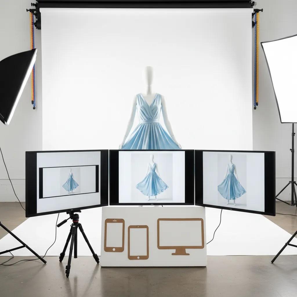
Image specs for Shopify and channels (so your backgrounds survive cropping)
Many store owners search for “background images for clothing website” because they are trying to solve a real problem: images that look good in one format can break the moment you crop them for a different placement. Background choice and framing are tied together.
Why background complexity causes problems across formats
Think of your image as getting reused in multiple aspect ratios. Collection thumbnails are often closer to square. Paid social commonly leans toward 4:5. Homepage banners and email headers may be wide. If your background includes a visible floor line, a doorway, a wall edge, or strong texture, cropping can cut it in awkward ways that make the image look accidental.
Simple backgrounds survive reuse because they do not have “visual landmarks” that need to stay intact. This is one of the reasons a fashion portrait photography white background or light neutral setup can be so forgiving for ecommerce workflows.
Plan outputs before you shoot: clean-safe vs moodier
For most Shopify store owners, the most reliable approach is to decide which shots must be “clean background safe” and which can be mood-driven.
Clean-safe shots: These are your primary PDP and collection images. Keep the background simple, keep the crop consistent, and leave enough space around the garment so you can crop for square thumbnails without cutting off hems, sleeves, or hair.
Moodier shots: These are for ads, editorial sections, and seasonal creative. You can use location, texture, props, or deeper color, but treat them as secondary assets that support acquisition rather than the baseline for your whole catalog.
What many store owners overlook is that you can mix these on the same PDP without hurting consistency. You just need to keep the first 1 to 3 images standardized so the browsing experience stays clean.
A simple export consistency checklist for Shopify-friendly backgrounds
Even if your theme auto-crops thumbnails, you can make the output far more predictable by standardizing a few basics.
Framing: Keep garment scale consistent. If one product fills 90% of the frame and another fills 60%, your grid will feel uneven.
Padding: Leave a consistent buffer around the garment so square crops do not clip important edges. This matters a lot for long dresses, wide sleeves, and hats.
Shadow tolerance: Decide what “acceptable” shadow looks like for your catalog. Heavy shadows may look dramatic on a PDP, but can turn into dark blocks in small thumbnails.
Background uniformity: If you use white, keep the white consistent. Mixed “almost white” backgrounds can look like inconsistent editing rather than a deliberate style choice.
This is not about chasing a perfect spec sheet. It is about making sure your background and cropping rules produce a clean browsing experience across the placements that actually drive sales.
Pros and Cons
Strengths
Considerations
HD and 4K fashion backgrounds, zoom, fabric detail, and site speed
Some people searching for “fashion background hd 4k” are looking for wallpaper-style visuals. For ecommerce, the better question is: when does higher resolution actually help you sell clothing, and when does it just slow the site down?
When higher resolution matters for apparel
Higher resolution can be genuinely useful when shoppers need to inspect material quality. Think textured knits, intricate prints, embroidery, lace, or any fabric where detail is part of the value. It can also matter if your Shopify theme supports zoom that customers actually use, which is common in categories like premium denim, outerwear, or occasionwear.
If you sell basics where fit and color are the main decision drivers, pushing every image to extreme resolution may not change buying behavior much. It can, however, increase load time, especially on mobile.
How background choice affects perceived sharpness and noise
The background can make an image look sharper or softer even when the garment is in focus.
Dark backgrounds: They can amplify noise in shadows and make compression artifacts more obvious, especially if you underexpose and then brighten in post. They also make dust, wrinkles in paper rolls, and uneven gradients show up fast.
Textured backdrops: Texture can look premium, but it can also confuse the eye, especially in thumbnails. It may reduce perceived garment sharpness because the “busy” background competes with fabric detail.
Gradients: Gradients are popular, but they can band after export if you push compression too hard. If you want gradients in your catalog, test exports across your theme and devices before committing.
Balancing detail with performance on Shopify
The reality is that image quality and site speed are connected. You want enough resolution for zoom and crisp detail, but not so much that pages feel heavy.
A practical approach is to keep your primary PDP images clean and simple so compression has an easier job. Simple backgrounds typically compress better than noisy dark scenes or textured walls. Then you can reserve heavier, more cinematic files for campaign placements where a single hero image carries the page.
If you decide to increase resolution, do it deliberately. Test on mobile, test on a collection page with many thumbnails, and watch whether the browsing experience still feels fast. In many cases, a well-lit image with clean separation will look more “high-res” than a technically large file shot in poor light.
Who this guidance is for
This evaluation is for ecommerce teams selling apparel online, especially Shopify merchants who need a repeatable visual system rather than a one-off creative concept. It is most useful if you are photographing clothing for product pages, collection grids, ads, or marketplace feeds and need to balance brand look with production efficiency.
It is particularly relevant for stores that are growing beyond founder-shot photos and trying to standardize imagery. If you are building your first repeatable setup, a simple studio approach inspired by a product photography studio workflow will usually serve you better than a highly stylized set that is difficult to repeat.
AcquireConvert recommendation
For most clothing stores, the strongest commercial choice is a two-layer system. Use a white or light neutral setup for primary ecommerce images, then create a second background style for campaign and social content. That gives you consistency where conversion clarity matters and flexibility where brand storytelling matters more.
At AcquireConvert, we generally look at these decisions through the lens of how real store owners operate. Giles Thomas’s experience as a Shopify Partner and Google Expert is especially relevant here because image decisions do not sit in isolation. They affect product page conversion, feed presentation, ad creative quality, and how easily customers can browse your catalog. If you want the broader context, explore our Fashion & Apparel Photography resources and our White Background Photography guidance for more practical setup advice. If you are evaluating automated creative options for apparel visuals, our piece on ai clothing generator workflows is a useful next step.
How to choose the right background for your store
Use these five criteria to decide.
1. Start with your main sales channel
If most sales come from your Shopify store and paid social ads, you may need two outputs from every shoot. A clean primary image for PDPs and a more branded variant for ads is often the most efficient setup. If marketplaces are important, check their image requirements first. White may be mandatory for certain placements.
2. Match the background to your product range
Large, fast-moving catalogs benefit from standardization. White or soft neutral backgrounds are easier to scale. Smaller brands with edited collections can support more stylized backdrops, but only if the styling remains consistent and repeatable.
3. Consider garment color and material
Do not choose a background because it looks good with one hero SKU. Test it across black, white, denim, satin, prints, and textured knits. A fashion photography white background setup may be ideal for one category and problematic for another if separation is poor.
4. Audit your editing capacity
If your team is small, pick a backdrop that reduces retouching time. A slightly warm neutral can be easier to work with than a technically perfect white. If you plan to adapt images later, AI tools can help, but build around reliable source photography first.
5. Protect consistency at the collection-page level
Many merchants review images one by one and miss how they look in a full grid. Before finalizing a background, upload sample shots to a staging theme or design mockup. Check how thumbnails look next to each other. If one background style makes the catalog feel messy, it is probably the wrong standard even if individual images look good.
The practical rule: choose the simplest background that presents your clothes clearly and supports your brand. Then build variety through styling, poses, crops, and campaign-specific edits rather than changing your core backdrop every week.
Frequently Asked Questions
Is white the best fashion background for ecommerce?
For many apparel stores, yes. White is usually the most practical option for product pages because it keeps the focus on garment details and supports a consistent grid layout. It is not always the best choice for campaign imagery, though. Many brands use white for core catalog shots and a second background style for ads and editorial content.
What is the difference between fashion photography on white background and lifestyle photography?
Fashion photography on white background is usually designed for clarity, consistency, and product comparison. Lifestyle photography is more about mood, context, and brand storytelling. For ecommerce, both matter, but they serve different jobs. White-background images often support conversion-focused PDPs, while lifestyle shots can help with acquisition, homepage design, and social engagement.
Can a black background work for clothing shoots?
Yes, especially for premium, evening, or editorial fashion brands. The challenge is maintaining detail in dark garments and keeping the image useful for ecommerce layouts. A black background can look striking, but it often needs more careful lighting and may not be the best primary standard for stores with large, mixed-color assortments.
Should every product image use the same background?
Not necessarily, but your core catalog images should usually follow one standard. Consistency helps customers browse faster and makes your store feel more professional. You can still vary backgrounds for campaign creative, homepage banners, and social assets. The key is making sure the product page experience remains coherent across the catalog.
Are AI background tools good enough for clothing brands?
They can be useful for testing concepts, generating variants, or cleaning up simple studio captures. They are less reliable when fabric edges, transparency, lace, jewelry details, or complex shadows are involved. Most stores should treat AI edits as production support, not a full replacement for good lighting, styling, and manual quality checks.
What background color works best for white clothing?
A slightly off-white, light gray, or soft beige background often works better than pure white for white garments because it creates cleaner edge separation. The goal is to preserve the product’s shape and detail without making the item blend into the set. Test this before locking in a catalog-wide standard.
How do I choose between white and neutral backgrounds?
Choose based on your brand style, editing workload, and garment mix. White tends to look cleaner and more standardized. Neutral tones can feel warmer or more premium and may be easier to maintain in real studio conditions. If you are unsure, test both in a sample collection grid, not just as individual images.
Do backgrounds affect conversion rates?
They can influence how clearly shoppers understand the product and how consistent your store feels, which may affect buying behavior. Still, outcomes depend on many factors, including pricing, fit information, page speed, reviews, and traffic quality. Treat background choice as one part of a broader ecommerce conversion system, not a standalone fix.
What if I cannot afford a full studio setup yet?
Start with a simple repeatable setup. A paper backdrop, controlled lighting, and clear framing standards can go a long way. Focus on consistency first. You can expand into more styled imagery later. For smaller brands, a modest setup executed well usually outperforms a more ambitious one that cannot be repeated reliably.
What is the 3-3-3 rule in fashion?
The “3-3-3 rule” is usually used as a simple styling framework. Pick three core garments (like tops or layers), three bottoms, and three pairs of shoes, then rotate them into multiple outfits. For ecommerce, it can be a useful planning tool for shoots because it forces you to think in combinations. That can help you create more usable lifestyle content while keeping the background and lighting consistent across a small set of repeatable looks.
What is the history behind fashion?
Fashion has always been tied to culture, technology, and social identity. Historically, clothing signaled status and occupation, then industrial production made styles easier to spread and change faster. For modern ecommerce brands, the practical takeaway is that “fashion” is not only about the garment. It is also about how the product is presented, who it is for, and what story it signals. Your background choices are part of that signal, whether you intend them to be or not.
What brand is Gen Z wearing?
It depends heavily on subculture, budget, and region. Gen Z buying behavior is often trend-driven and influenced by creators, resale, and micro-aesthetics rather than a single dominant label. If you are trying to market to Gen Z, focus less on copying a specific brand and more on matching the visual language they respond to. Clear fit photos, honest fabric detail, and consistent imagery tend to matter more than an overly complex background.
What are the 7 types of fashion styles?
Different lists exist, but seven commonly referenced style categories are: classic, casual, streetwear, minimalist, bohemian, preppy, and edgy. For Shopify stores, these labels can help you choose backgrounds that support the vibe without distracting from the product. Minimalist styles usually benefit from white or neutral backgrounds, while streetwear and edgy brands can often support darker tones or textured environments as long as the core catalog remains consistent.
Key Takeaways
Conclusion
The best fashion background is the one that helps your clothing read clearly, fits your brand, and stays workable as your catalog grows. For most ecommerce operators, that means starting simple with white or light neutrals, then adding more expressive backgrounds where they support campaigns rather than complicate the core shopping experience. If you are building a visual workflow for Shopify, it pays to think beyond aesthetics alone and consider editing time, thumbnail consistency, and how assets will be used across ads, email, and product pages. AcquireConvert is built for that kind of practical decision-making. Explore our related fashion photography resources and AI apparel guides to compare approaches, pressure-test your setup, and see how other store owners structure image systems that are easier to scale.
This article is editorial content for educational purposes and is not a paid endorsement unless explicitly stated otherwise. Pricing and product details for third-party tools are subject to change, so verify current information directly with the provider. Any performance or conversion impact discussed is not guaranteed and will vary by store, implementation quality, product category, and traffic source.

Hi, I'm Giles Thomas.
Founder of AcquireConvert, the place where ecommerce entrepreneurs & marketers go to learn growth. I'm also the founder of Shopify agency Whole Design Studios.