Photo Backdrop Ideas for Product Shots (2026)
If your product photos feel flat, cluttered, or inconsistent, the backdrop is often the first thing to fix. For ecommerce store owners, the right background can help products look cleaner, more premium, and easier to trust on collection pages, product pages, ads, and marketplaces. The good news is that you do not need a full studio to improve this. You need a practical system. That might mean seamless paper, foam board, textured surfaces, or using an ai background generator when a physical setup is too slow or costly. In this guide, I’ll walk through five proven photo backdrop ideas for product shots, where each one works best, what can go wrong, and how to choose the right option for your catalog. The goal is not prettier photos in isolation. It is better visual consistency that may support conversion.
Contents
Why backdrops matter for ecommerce
A backdrop does more than fill empty space. It controls contrast, mood, perceived quality, and how clearly a shopper can read the shape, color, and details of a product. On Shopify stores especially, where buyers often scroll quickly across grid layouts, clean visual hierarchy matters. If the backdrop fights with the item, your product can look less polished even when the item itself is strong.
Different product categories need different approaches. Beauty, jewelry, tech accessories, apparel add-ons, and home goods rarely perform best with the exact same setup. A white sweep can be ideal for consistency and marketplace compliance, while a stone or wood surface may work better for lifestyle-driven merchandising. If you need a cleaner catalog presentation after the shoot, tools and workflows in Background Removal & Editing can help you standardize images across a growing SKU count.
The main decision is not “what looks cool?” It is “what backdrop helps customers understand this product fastest?” That is the standard experienced merchants usually use when balancing branding, conversion, and production speed.
5 photo backdrop ideas for stunning product shots
1. White seamless paper or white sweep
A white photo backdrop is still the most dependable option for many ecommerce stores. It removes distractions, works across most categories, and keeps your product page gallery consistent. It is particularly useful if you sell on marketplaces or want a clean, minimal brand style.
This setup usually works best with a curved sweep instead of a sharp corner behind the product. That reduces visible lines and creates a cleaner “floating” effect. If your results still look dull, improving your lighting matters more than changing the background itself. AcquireConvert’s White Background Photography category is useful if this is your main style.
2. Foam board for a low-cost tabletop studio
Foam board is one of the most practical backdrop ideas for smaller products. You can use white, black, or colored boards for both background and light control. Many merchants use one board behind the product and another underneath, then add side boards as reflectors to soften shadows.
This option is especially useful if you are shooting from a home office or packing area and do not have room for a dedicated product photography studio. The trade-off is size. Foam board works best for compact products and can show dents or marks over time.
If you like the foam board approach but want more variety than a single white board, there are a few DIY materials that work well in small spaces. Butcher paper (or large rolls of kraft paper) can give you a clean sweep look without buying a full photo studio backdrop system. Poster board is a step up from standard printer paper when you want a quick solid color behind smaller items. Fabric can also work when you want softer texture, for example a bedsheet, linen, or blackout curtain fabric, but you need to control wrinkles or it will show immediately in product photos.
From a practical standpoint, small-space success comes down to whether you can set it up and put it away fast. If your “studio” is also your packing area, store paper rolls vertically in a corner so they do not crease. Use a wall as a mounting point when possible, since it saves floor space. A fold-away setup is often as simple as keeping one board as your base, one as your background, and a third as a reflector, then clipping everything together and sliding it behind a shelf when you are done.
Here’s the thing: these materials all have tradeoffs. Butcher paper and kraft paper can crease if you fold them, and they stain if you handle them with dusty hands. Poster board is inexpensive, but it dents easily and can look a little “craft store” if the surface has a sheen. Bedsheets are tempting, but thin fabric can show texture, seams, and shadows in a way that reads homemade unless you pull it tight and light it carefully. If you want a material that typically photographs cleaner, thicker matte paper or heavier fabric usually behaves better, even if it costs a bit more upfront.
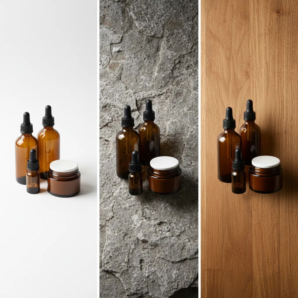
3. Textured surfaces like wood, stone, linen, or concrete
If your store leans on mood, gifting, or lifestyle positioning, textured backdrops can add context without a full scene build. A wood board can warm up candles or handmade goods. Faux stone can suit skincare or premium kitchen products. Linen or neutral fabric may work for wellness, baby, or home categories.
The key is restraint. Texture should support the product, not compete with it. Keep colors muted and avoid busy patterns unless your brand is intentionally bold. This style works well for hero images, social content, and ad creatives, but many stores still pair it with cleaner secondary images for clarity.
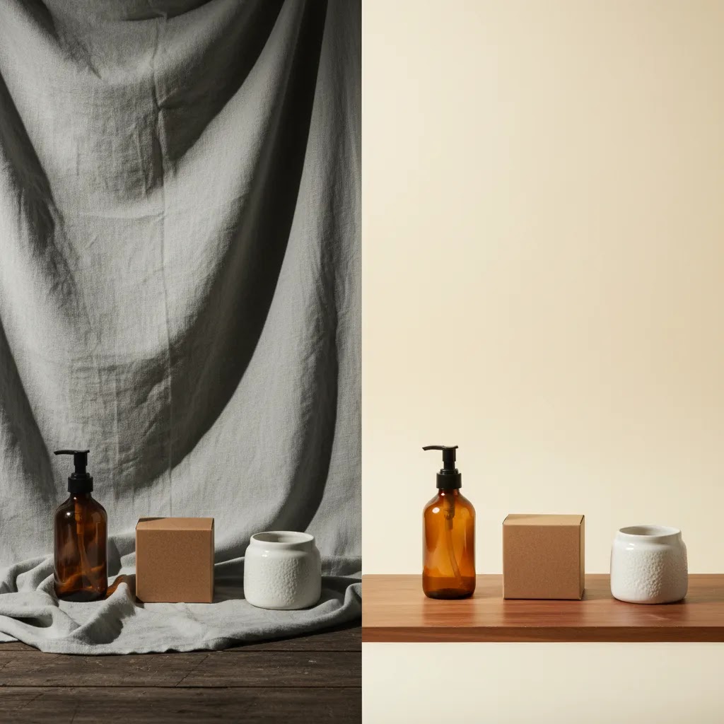
4. Colored paper backdrops for contrast and brand identity
Colored backdrops can make products pop, especially when your packaging has neutral tones or you want stronger brand recall. Soft beige, gray, blush, sage, or pastel blue are often easier to work with than intense saturated colors. Strong colors can shift your product tones if the lighting is not controlled.
This option is useful for seasonal launches, limited collections, and campaign-specific imagery. It can also create a “custom photo backdrop” feel without the production complexity of printed sets. If you use color, test how it looks on mobile screens and in paid social placements before rolling it out store-wide.
5. AI-generated or digitally edited backdrops
For many growth-stage stores, physical and digital backdrops now work best together. You might shoot clean source images on simple paper, then extend or replace the background later with tools like ProductAI Photo’s AI Background Generator. This is useful when you need more campaign variety without reshooting every SKU.
Other related workflows can also help. ProductAI Photo offers Increase Image Resolution if a cropped image needs sharpening for larger placements, and Remove Text From Images if packaging or source assets include unwanted text overlays. For broader edits, Magic Photo Editor and Creator Studio support more flexible creative workflows.
AI editing is useful, but it works best when the original photo is already well lit and well framed. It should support your workflow, not compensate for a poor source image. If your immediate need is to isolate products cleanly before changing the setting, see this guide to an ai background remover.
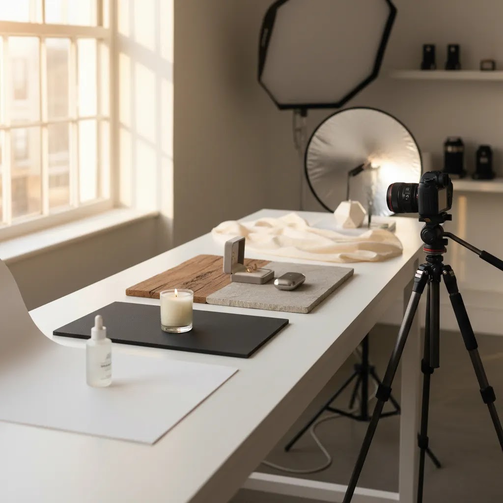
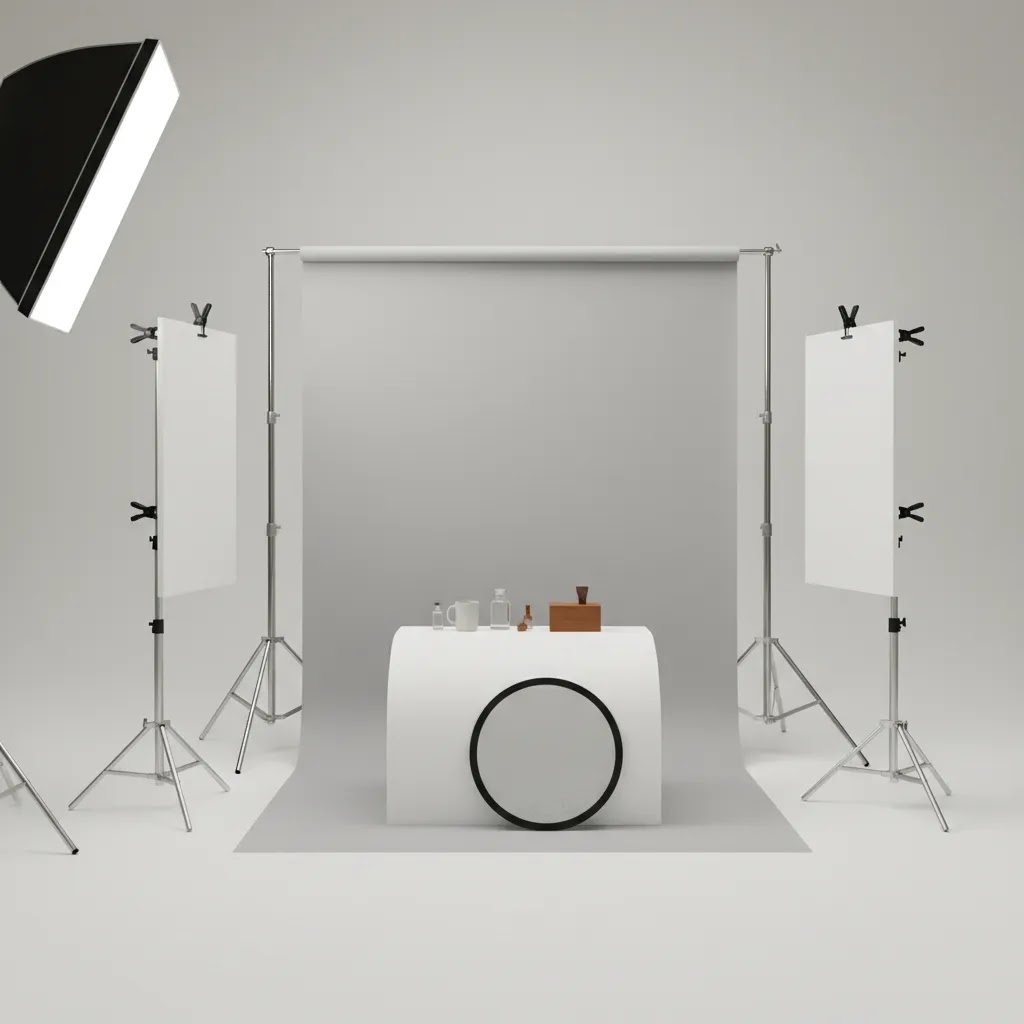
Backdrop stands and hanging options (when you need one and when you do not)
A photo studio backdrop stand sounds like the “pro” move, but many Shopify store owners do not actually need one on day one. If you sell small items and you are shooting on a tabletop, foam board or paper clipped to a chair, wall, or shelf is often enough. You can get consistent results with a simple sweep and a repeatable camera position, especially if you are shooting for product pages and thumbnails where the background is meant to disappear.
Now, when it comes to when a stand really matters, it usually comes down to three situations. First, you are shooting larger products where a tabletop setup cannot stay out of frame. Second, you need consistent vertical framing across many SKUs, for example apparel, bags, boxed kits, or anything shot standing upright. Third, you shoot often enough that setting up and tearing down your backdrop every time is slowing your team down.
If a traditional stand is not a good fit for your space, there are a few practical alternatives that work well for small studios and home setups. You can clamp paper or fabric to a shelf or tabletop using sturdy clamps. You can use a tension rod between two walls or inside a doorway and hang fabric like a curtain. You can mount hooks on a wall and rest a simple crossbar across them, then clip your backdrop to the bar. Some merchants even use a rolling garment rack as a frame, which can be useful if you want to move the setup out of the way between shoots.
If you do buy a stand, focus on what actually affects results. Width matters because it determines whether the backdrop stays edge-to-edge at your intended shooting distance. Stability matters because light stands that wobble can create wrinkles and shifting backgrounds between shots. Clamps matter because weak clips slip and create waves in paper or fabric. Portability matters if your setup needs to move, for example from a corner of your office to a window for better light.
Think of it this way: the stand is not there to make the photo look professional. It is there to make your process repeatable. In a tight space, a quick setup tip is to mark your “product spot” on the table and keep your camera height consistent, then adjust the backdrop position around that fixed point. If you try to “eyeball it” each time, your catalog can end up with small angle and horizon changes that are hard to unsee on a Shopify collection page.
Pros and Cons
Strengths
Considerations
Common backdrop mistakes that make product photos look cheap (and how to fix them)
Most “cheap-looking” product photos are not caused by a bad camera. They come from a few repeatable backdrop problems that show up once you start building a catalog. The good news is that the fixes are usually simple, as long as you treat your backdrop like part of a system and not a one-off creative choice.
Wrinkles and creases are the biggest one, especially with fabric and paper that has been folded or stored poorly. On a product page, those wrinkles read as mess, even if everything else is lit well. A curved sweep helps because it removes the hard corner and reduces the chance of a visible line behind the product. For fabric, you usually get better results by pulling it tight and clipping it in place, rather than letting it drape naturally.
Visible seams, horizon lines, and backdrop edges are another common issue. If your background changes from vertical to horizontal with a sharp corner, your camera angle will often catch that line. Increasing the distance between the product and the backdrop can help, because it makes the background fall out of focus slightly and reduces harsh shadow edges. It also gives you room to light the product without blasting a hotspot onto the background.
Distracting texture and patterns can also hurt clarity. This happens when the texture has more contrast than the product, or when the pattern scale is too similar to the product details. Texture should feel supportive, not loud. If you want texture, aim for lower contrast and keep the light soft so it does not exaggerate every thread, dent, or grain.
Color casts are another big trust-killer, and they are easy to miss until you compare SKUs side by side. If you shoot next to a colored wall or use a colored board close to the product, that color can bounce into reflective packaging and shift your product tone. The fix is often to use neutral surfaces near the product and set a consistent white balance in your camera or phone app. If you are shooting a lot of products, consistency usually matters more than a “perfect” setting on any single shot.
Inconsistent shadows across a catalog are what many store owners overlook. One product has a soft shadow, the next has a hard shadow, the next has no shadow at all. On a Shopify collection page, that inconsistency can make the entire brand feel less polished. Start by keeping your light position consistent, then control shadow softness by moving the light closer or farther, or by using diffusion. If you see glare or hotspots on a white backdrop, shift the light angle slightly or move the product forward so the background receives less direct light.
If you want repeatable results, use a basic pre-shoot checklist mindset. Keep your camera height consistent, keep product-to-background distance consistent, and check backdrop condition before every session. Wipe dust off surfaces, remove marks, and replace paper when it starts to look tired. Those boring steps are often what separates “we took some photos” from “we have a catalog we can scale.”
Who these backdrop ideas are for
These backdrop ideas are most useful for Shopify merchants, ecommerce marketers, and small brand teams that want stronger product images without overcomplicating production. If you run a growing catalog and need consistent PDP imagery, white sweeps and foam board setups are usually the safest place to start. If your brand relies on emotion, gifting, or visual merchandising, textured and colored backdrops may give you more flexibility for ads and social content.
They are also relevant if you are exploring AI-assisted editing but want a grounded workflow. In practice, many merchants combine simple physical shooting conditions with digital refinement after the fact. That approach tends to be more manageable than trying to create every visual style on set.
AcquireConvert recommendation
If you are weighing physical backdrops against AI editing, keep the decision practical. Start with the setup that gives you the cleanest, most repeatable source image for your store. Then layer in digital tools where they save time or expand creative options. That is the approach AcquireConvert tends to favor because it aligns with how real ecommerce teams work under time and margin pressure.
AcquireConvert is a useful specialist resource here because the content is shaped by Giles Thomas’s experience as a Shopify Partner and Google Expert, with a clear focus on what helps store owners present products better and market them more effectively. If you are refining your image workflow, it also makes sense to review guidance on an image upscaler and how to remove text from image files when inherited assets are not clean enough for storefront use.
How to choose the right backdrop for your store
1. Start with the job of the image. Your main product page image usually needs clarity first. That often points to a white or neutral backdrop. Hero banners, email campaigns, and paid social ads can handle more atmosphere. Separate your “conversion” image style from your “campaign” image style before buying materials or changing workflows.
2. Match the backdrop to product size and finish. Reflective packaging, glass, and metal need tighter control than matte cardboard or fabric goods. White acrylic, foam board, or neutral paper may be easier than textured scenes when glare is an issue. Larger products need wider sweeps or more space than tabletop items.
3. Think in systems, not one-off shoots. Store owners often get one great image, then struggle to repeat it across 50 more SKUs. A backdrop is only useful if your team can reproduce it. Document the paper color, surface type, light position, and camera angle. That matters more for conversion consistency than chasing isolated creative ideas.
4. Decide where AI fits in. AI background tools are most helpful when you already have clean cutouts or simple source photos. They can support faster content production, especially for seasonal themes or marketplace-specific creative. They are less reliable when the original photo has messy edges, poor lighting, or low resolution. If you shoot quickly on plain backgrounds first, then edit selectively, you usually keep more control.
5. Test against your actual sales channels. A backdrop that looks great on Instagram may not be the best fit for a Shopify collection page or Google Shopping image. Review how your photos appear as thumbnails, on mobile, and next to competitor listings. In many cases, the best-performing backdrop is not the most artistic one. It is the one that helps shoppers identify the product fastest and trust what they are seeing.
If you are still unsure, begin with a white setup for your entire catalog, then introduce one secondary backdrop style for campaigns. That gives you both consistency and brand flexibility without creating operational chaos.
Frequently Asked Questions
What is the best photo backdrop for ecommerce product photography?
For most stores, a white or very light neutral backdrop is the safest starting point because it keeps attention on the product and is easier to repeat across a catalog. It is especially useful for product page images. Lifestyle or textured backdrops can still work well for ads and social content, but they are usually better as a secondary style rather than the default.
Is a white photo backdrop always the right choice?
No. A white backdrop is great for consistency, but it can make some products feel clinical or low contrast. Premium home goods, handmade items, and giftable products may benefit from subtle texture or warmer tones. The better question is whether the backdrop helps shoppers understand the product quickly while still fitting your brand style.
Can I create a professional photo backdrop without a studio?
Yes. Many smaller merchants use foam board, seamless paper, a folding table, and window or softbox lighting to create strong results. A studio helps with scale and repeatability, but it is not required for every category. What matters most is controlling light, maintaining consistency, and avoiding visual clutter around the product.
Are AI backdrops good enough for Shopify product images?
They can be useful, especially for campaign images, landing pages, and social creatives. For core product images, use caution and review outputs closely. Unrealistic shadows, edges, and proportions can damage trust if left unchecked. In many cases, merchants get the best results by starting with a clean source shot and using AI for selective enhancement rather than full replacement.
How many backdrop styles should one store use?
Most stores do well with one primary catalog backdrop and one or two secondary campaign backdrops. More than that can create inconsistency unless you have a clear image system. If your catalog is large, standardization usually matters more than variety. If your assortment is small and brand-led, you may have more room to experiment.
What colors work best for colored backdrops?
Neutral and slightly muted colors are generally easier to manage than highly saturated ones. Beige, pale gray, soft blue, sage, and blush often support the product without overpowering it. The right color depends on your packaging, lighting, and brand palette. Always test on mobile because some tones can look very different on smaller screens.
Do textured backdrops hurt conversion?
Not necessarily. They can help products feel more premium or contextual, which may improve engagement in the right setting. Problems usually happen when the texture is too busy or the styling adds confusion. For ecommerce, the safest approach is to use texture where it supports the story, while keeping at least some images clean and highly legible.
What should I fix first if my backdrop still looks bad?
Fix lighting before replacing the backdrop. Many weak product photos come from harsh shadows, poor exposure, or color casts rather than the background itself. After that, check focus, wrinkles, dust, and framing. Once those basics are handled, the backdrop choice becomes much more effective and easier to evaluate honestly.
Can backdrop editing replace good source photography?
No. Editing can improve and extend a usable image, but it rarely rescues a badly shot one at a professional standard. If the product edges are soft, colors are inaccurate, or reflections are uncontrolled, editing becomes slower and less reliable. Clean source photography still gives you the best base for physical or AI-enhanced backgrounds.
How to make an inexpensive photo backdrop?
Start with what gives you the most consistency for the least effort: a roll of paper (white, neutral, or kraft) clipped to a wall or shelf so it curves onto a table as a sweep. Foam board is another strong option for small products because it is rigid and easy to position as both background and reflector. If you use fabric like a bedsheet or linen, pull it tight and clip it to reduce wrinkles, since creases tend to show immediately in ecommerce product photos.
What to use as a backdrop for pictures?
For product photos, you can use seamless paper, foam board, poster board, textured boards (wood or stone-style surfaces), or fabric like linen if it is controlled. For many Shopify catalogs, a white or light neutral backdrop is the most repeatable choice for product pages, while textured or colored backdrops are often better for ads, social, and hero images where mood matters more.
What are common backdrop mistakes?
The most common mistakes are wrinkles or creases, visible seams or horizon lines, distracting textures or patterns, color casts from nearby walls or boards, and inconsistent shadows across your catalog. Fixes usually involve using a curved sweep, moving the product farther from the background to reduce shadows, keeping your light position consistent, and checking the backdrop condition before each shoot so you are not retouching the same problems repeatedly.
What can I use instead of a backdrop stand?
You can clamp a backdrop to a shelf, use a tension rod between two walls or in a doorway, hang a crossbar on wall hooks, or use a rolling garment rack to support paper or fabric. For tabletop shoots, you may not need any frame at all. A sheet of foam board or paper positioned as a sweep can be enough if it stays smooth and consistent from product to product.
Key Takeaways
Conclusion
The best photo backdrop ideas are the ones that fit your products, your brand, and your workflow. For most ecommerce stores, that means starting simple: a clean white or neutral setup for consistency, then layering in texture, color, or AI editing where it supports merchandising and campaign goals. If you are trying to improve product presentation without wasting time on trial and error, AcquireConvert is a strong place to continue your research. You can explore practical guides across Background Removal & Editing, compare image workflow options, and learn from Giles Thomas’s practitioner-led perspective as a Shopify Partner and Google Expert. Use this article as your framework, test one backdrop system at a time, and build a repeatable process your store can actually sustain.
This article is editorial content intended for educational purposes. It is not a paid endorsement unless explicitly stated otherwise. Pricing, product features, and tool availability are subject to change, so verify current details directly with the provider before making a decision. Any performance or conversion impact discussed here is directional only and not guaranteed.

Hi, I'm Giles Thomas.
Founder of AcquireConvert, the place where ecommerce entrepreneurs & marketers go to learn growth. I'm also the founder of Shopify agency Whole Design Studios.