Product Background: How to Choose the Right One (2026)
Your product background affects more than how a photo looks. It shapes how clearly shoppers see your item, how professional your store feels, and how well your images fit channels like Shopify, Amazon, Meta ads, and Google Shopping. If you are choosing between a plain white product background, a styled lifestyle scene, or an AI-generated setup, the right answer depends on what you sell, where the image will appear, and how much control you need. If you are still comparing AI-assisted options, our guide to the ai background generator category is a useful next read. This article will help you evaluate backgrounds the way an ecommerce operator would: by balancing compliance, conversion potential, workflow speed, and brand consistency.
Contents
What a product background actually needs to do
A good product background should support the sale, not compete with it. For most ecommerce stores, that means making the product look accurate, clear, and appealing at a glance. Shoppers often decide in seconds whether an image feels trustworthy, especially on collection pages, search results, and mobile product pages.
In practice, the right background does four jobs. It isolates the product, supports your brand style, works across sales channels, and fits your team’s workflow. A skincare brand may need clean consistency across dozens of SKUs. A fashion label may want editorial energy. A home goods store may benefit from contextual, room-based scenes that help shoppers imagine ownership.
This is why there is no single best product background for every store. A white product background may be best for marketplace compliance and catalog clarity. A lifestyle setup may work better for paid social and homepage banners. AI-generated backgrounds can help you scale variations faster, but they still need review for realism, shadows, proportions, and brand fit.
If you are broadly researching this topic, AcquireConvert’s Background Removal & Editing hub is a strong place to compare related workflows and tools.
The main types of product backgrounds
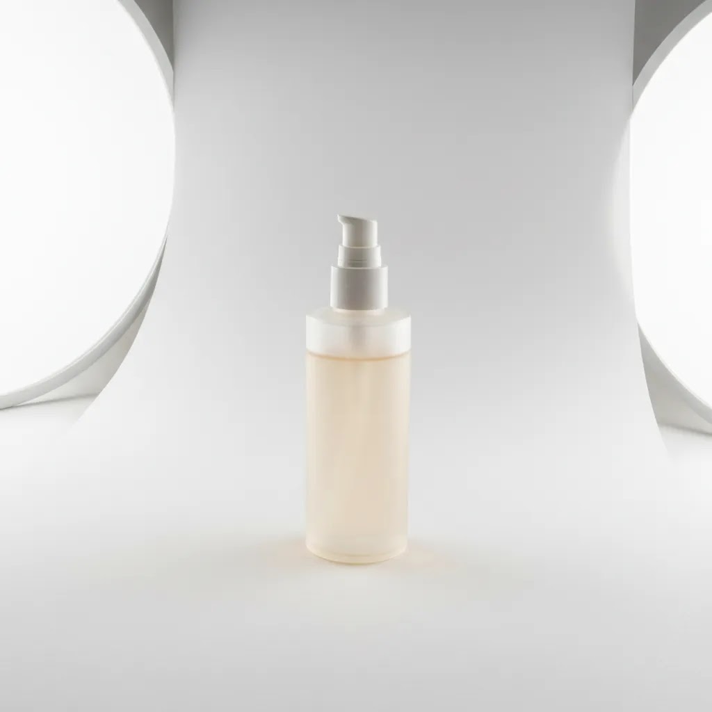
1. White backgrounds
A white background is the default choice for many ecommerce operations because it keeps attention on the product and usually meets the image requirements of major marketplaces. It also makes your catalog feel tidy and consistent. For stores with large inventories, this is often the most scalable option.
2. Transparent or cutout backgrounds
Transparent backgrounds are useful when you want design flexibility. Your team can place the product into landing pages, ads, or promotional graphics without re-shooting the image. This setup is especially helpful if your designer creates frequent campaigns or channel-specific assets.
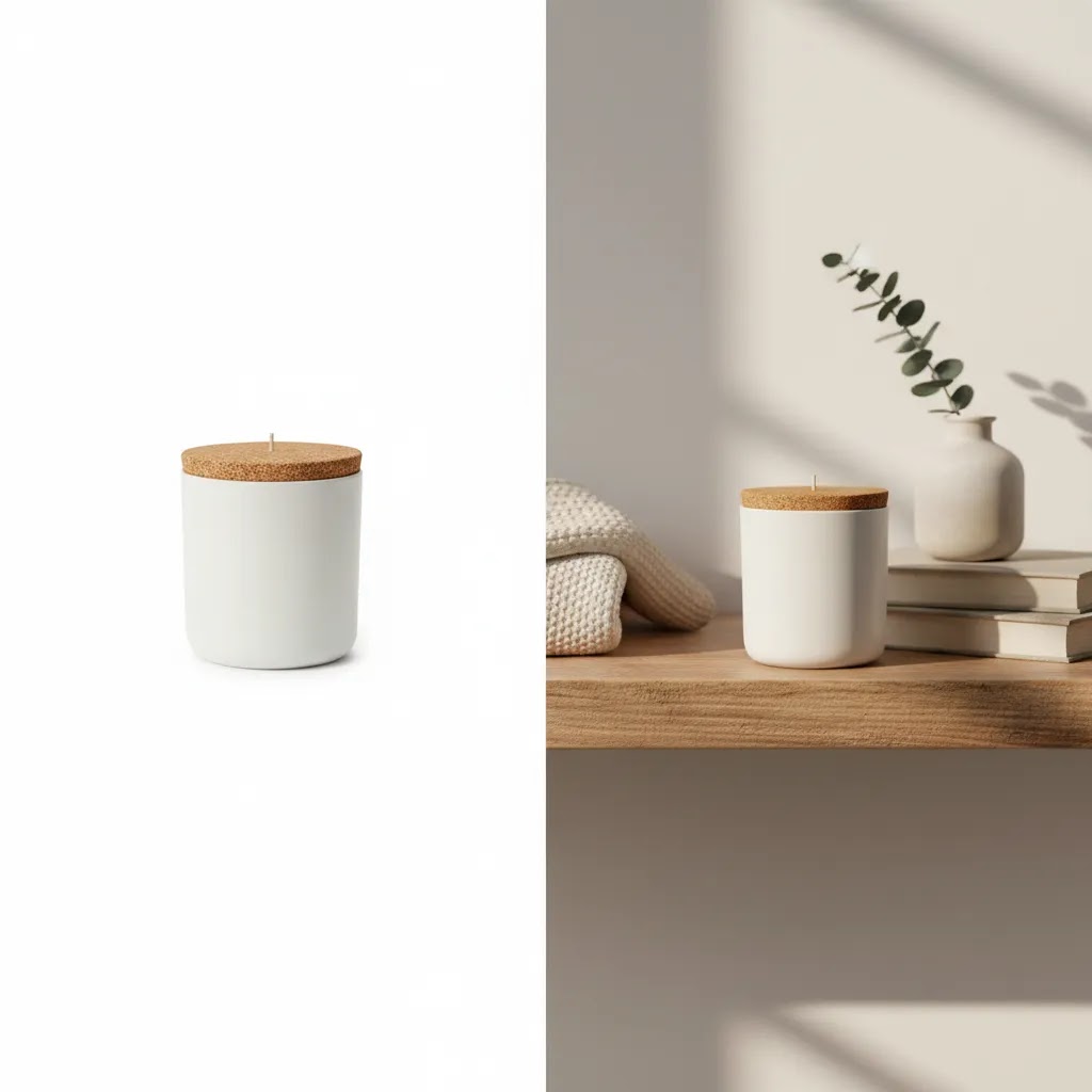
3. Lifestyle backgrounds
Lifestyle product backgrounds show the item in use or in a relevant setting. These images can improve context and help customers understand size, mood, and use case. They are often effective for social creative, hero sections, and email campaigns, but they can be less consistent if not tightly art directed.
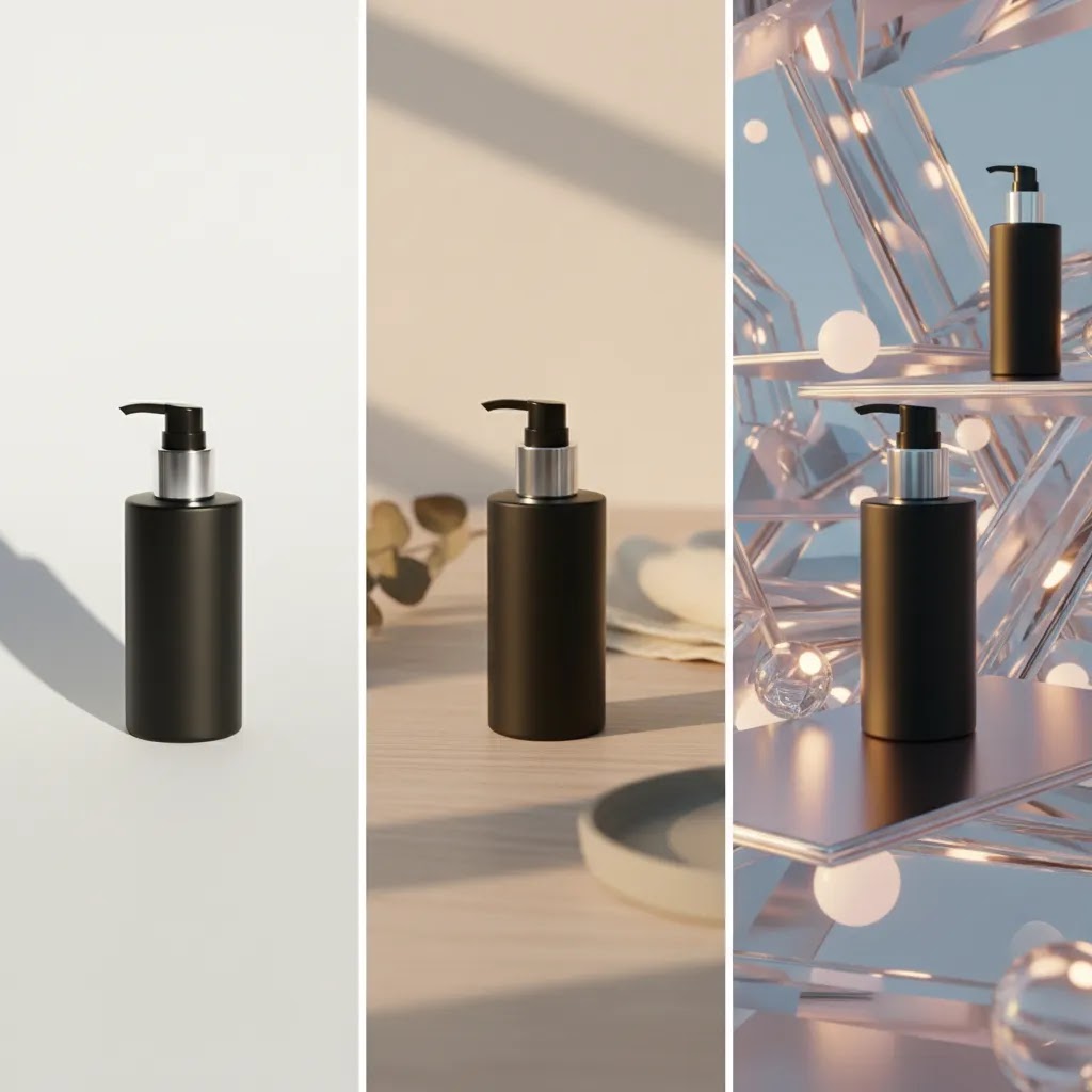
4. AI-generated backgrounds
AI product background tools can create or swap scenes without arranging a full shoot. Options from the current tool set include AI Background Generator, Free White Background Generator, and Background Swap Editor. These can be useful if you need speed, multiple creative directions, or lower production overhead for routine assets.
5. Composite or mockup-style backgrounds
These combine a product cutout with a designed scene or promotional layout. They work well for ads, seasonal graphics, and merchandising blocks. The risk is that they can look artificial if scale, lighting, or shadows are off.
Product background ideas by product type and brand aesthetic
Many store owners get stuck between “pure white” and “full lifestyle shoot.” The practical middle ground is choosing a small set of repeatable background directions that fit your product category, then using them intentionally by image role. Your Shopify PDP and collection grid usually need clarity first. Your ads and email creative have more room for mood and context.
Here are background directions that tend to work in real ecommerce catalogs, without turning your images into busy posters.
Beauty and skincare
Beauty shoppers care about packaging accuracy, color, and finish. White or soft neutral backgrounds are the safest for PDP hero images. For supporting images and ads, a clean “bathroom shelf” or “stone surface with soft light” look can add premium cues without distracting from the label. If you go creative, keep props minimal and on-brand, for example one ingredient element that matches the scent or formula, not a whole scene.
Jewelry and accessories
Reflective surfaces and fine edges make jewelry one of the hardest categories to fake convincingly. For PDP, a neutral background with controlled, consistent shadows usually sells best, especially on collection pages where items are tiny. For ads, a simple premium surface, like matte stone or velvet, can work if you keep lighting direction consistent. Consider this: if your product is a small, high-ticket item, the background should signal craftsmanship and trust, not novelty.
Food and beverage
Food needs appetite appeal, but Shopify product grids still need consistency. A common approach is white or neutral for the primary pack shot, then a consistent “kitchen counter” or “ingredient backdrop” style for secondary images and paid social. If you sell multiple flavors, your background should not change so much that it becomes hard to compare SKUs quickly.
Home goods and decor
Context helps here because shoppers want scale and fit. The reliable setup is a clean catalog image for the main grid, plus a room scene for supporting images. For ads, a cropped vignette in a realistic room often works better than an overly styled flat lay. Seasonal variants can make sense, but the reality is that changing every background for every season can make your collection page feel chaotic unless you keep the same surface, crop, and lighting rules.
Apparel
Apparel backgrounds are about consistency and color accuracy. For PDP, solid or neutral backgrounds are common for a reason. They make it easier to judge silhouette and fabric. For marketing assets, lifestyle backgrounds can work well, but they need art direction so that your product stays the focal point. If you mix studio cutouts, outdoor lifestyle, and heavy AI scenes across the same collection grid, the store can start to feel less cohesive even if each individual photo looks “good.”
How to choose an aesthetic that stays consistent across a catalog
Pick a small background system and stick to it. Most Shopify catalogs look best with one primary background standard for collection pages, plus one or two secondary styles for campaigns. The way this works in practice is deciding upfront: your palette (two to three neutrals plus one brand accent), your surface choice (matte, stone, paper, wood), and your prop limits (often none or one supporting element max). If you want seasonal variants, keep the same framing, crop ratio, and shadow direction, then change only one variable, like a subtle color shift or a single seasonal prop.
Where AI-generated backgrounds fit, and where they usually struggle
AI-generated backgrounds can be useful for ideation and fast variations, especially for ad testing. They can also help you create consistent “sets” when you do not have the time to build a real studio scene. But there are categories where real sets typically look more believable, especially when the product interacts with the environment. Reflections on glossy packaging, translucency in glass, liquids, and fabric drape are common failure points. If you use AI for these, plan on extra review and sometimes manual cleanup, because a small realism error can stand out immediately to shoppers.
What to evaluate before you choose
Channel requirements
Start with where the image will be used. Shopify product pages give you more creative freedom. Google Shopping and many marketplaces tend to favor clean, distraction-free images. If one image has to serve multiple channels, a white or neutral background is usually the safest base asset.
Brand presentation
Your product background should fit the rest of your visual identity. Premium beauty brands often use soft, minimal environments. Outdoor brands may benefit from realistic environmental context. If your backgrounds vary too much from one SKU to the next, your store can feel inconsistent.
Production speed
If you launch products frequently, workflow matters. AI-assisted options like Magic Photo Editor or Creator Studio may help your team generate more variations without booking a fresh studio session every time. That said, faster production still needs quality control.
Image quality after editing
Background changes can expose flaws in the original file. Edges may look rough, fine details can blur, and lighting mismatches may become obvious. If you are working from smaller source files, an image upscaler can help improve resolution before publishing, especially for zoomable PDP images.
Post-production needs
Background selection is rarely the only edit. You may need to clean labels, remove unwanted packaging text, or adapt old assets for new campaigns. In those cases, a guide on how to remove text from image files can save time and avoid avoidable rework.
Realism and trust
For AI product background use, realism matters more than novelty. Shadows should match, the surface should make sense, and the product should remain accurate to the original. If the edited image creates a misleading impression, it may hurt trust rather than help conversions.
Pros and Cons
Strengths
Considerations
Common product background mistakes (and how to fix them)
What many store owners overlook is that shoppers are not judging your background in isolation. They are using it as a shortcut for trust. If the background feels “off,” the product often feels less real, even when the product itself is legitimate.
The most common issues shoppers notice fast
Busy textures and distracting props are at the top of the list. A marble pattern with heavy veining, a wrinkled fabric, or a countertop with lots of color variation can pull attention away from the product and make your collection grid feel noisy. Harsh gradients can create the same effect, especially if the gradient is inconsistent from one SKU to the next.
Another common one is the “floating product” look. This usually comes from an overly clean cutout paired with a generic shadow that does not match the product’s base. When the product appears to hover, it can signal heavy editing, which can reduce trust for some shoppers.
Technical mistakes that quietly hurt trust
Catalog consistency matters more than most people expect. If your white balance shifts from warm to cool across similar SKUs, customers may wonder if the color is accurate. Mismatched light direction is another giveaway. If your shadow falls left on one product and right on another, the set stops feeling like a real system.
Scale issues can also create friction, especially on Shopify collection pages. If one SKU is cropped tight and another has a lot of margin, the products can look like they are different sizes even when they are not. And if you use AI background replacement, watch for over-aggressive edges around hair, glass, and reflective packaging. These areas often show halos, jagged outlines, or missing transparency. Shoppers might not be able to describe the problem, but they can feel it.
Quick fixes store owners can apply
Start by setting a simple background standard you can repeat. For most Shopify catalogs, that means one neutral background, one crop ratio, and one shadow approach. The goal is that a shopper can scroll a collection and everything feels like it belongs together.
Define a shadow rule that matches your product category. Matte products can often use a soft, subtle shadow. Glossy, transparent, or metallic products are more sensitive because reflections and contact shadows need to make physical sense. From a practical standpoint, if your product is glass, highly reflective, translucent, or has complex edges, you should be more cautious about heavy AI replacement on hero images. In many cases, it is better to re-shoot a clean base photo than to keep editing a file that will always look slightly artificial. Editing is great for cleanup and controlled variations. It is less reliable for fixing a fundamentally poor source image, especially when realism is the thing you are selling.
Who each background style is best for
White product backgrounds are best for stores that need clean consistency, marketplace compatibility, and efficient catalog management. This is common for beauty, electronics, supplements, and accessories.
Lifestyle backgrounds are better for brands that sell emotion, aesthetic, or use context as part of the offer. Apparel, home decor, and premium gifting brands often benefit here.
AI product background workflows make the most sense for growth-stage stores that need more image variations but do not want the time or cost of reshooting every campaign. If you are using Shopify and managing creative in-house, this can be a practical middle ground.
If you still need stronger source assets before editing, a dedicated product photography studio setup may be the better investment than relying on background changes alone.
AcquireConvert recommendation
For most ecommerce stores, the best approach is not choosing one background for everything. It is building a simple image system. Use white or neutral product backgrounds for core PDP and catalog images. Use lifestyle or AI-assisted background variations for ads, email, and merchandising blocks where context matters more.
This is the practical approach many experienced store operators take because it protects consistency while still giving marketing room to test creative. Giles Thomas’s work as a Shopify Partner and Google Expert is especially relevant here. On Shopify, image consistency supports cleaner collection pages and stronger product presentation. On Google surfaces, cleaner images may reduce friction caused by cluttered visuals or unclear product focus.
If your current files are messy, start with foundational cleanup before investing in styled scenes. An ai background remover can help create a cleaner base image, and from there you can test whether white, lifestyle, or AI-generated environments fit your category best. For additional practical guidance, also review the White Background Photography category.
How to choose the right product background
1. Match the background to the sales channel
Start with your most restrictive channel, not your most creative one. If your product images need to serve Google Shopping, marketplaces, and Shopify at the same time, begin with a compliant, clear hero image. Then create secondary versions for paid social, landing pages, and email.
2. Decide what your customer needs to understand fastest
Ask what the image must communicate in under three seconds. If the answer is shape, color, texture, or packaging detail, a clean background usually wins. If the answer is scale, usage, or atmosphere, a contextual background may perform better in supporting assets.
3. Audit your current workflow honestly
If your team is already struggling to keep image naming, cropping, and consistency under control, a complicated background strategy may slow you down. Simpler systems usually scale better. For many merchants, that means one standard catalog background plus a small number of campaign-ready variants.
4. Prioritize source image quality before advanced edits
AI can help with backgrounds, but it cannot reliably fix every photography issue. If the source file is soft, poorly lit, or awkwardly cropped, the final image may still underperform. Clean lighting, accurate product edges, and decent resolution should come first.
5. Test by image role, not just by style
Do not judge backgrounds in isolation. Compare them by placement. A white product background might be best for your product grid, while an AI-generated countertop scene works better in an ad. Use your analytics, click behavior, and merchandising context to guide the decision.
6. Keep trust ahead of novelty
Store owners can be tempted to choose the most dramatic image because it looks impressive. But if it creates confusion about what is included, what color the item really is, or how it actually appears in person, it may hurt performance. The best product background supports clarity first and creativity second.
How to choose the right product background (quick decision checklist)
If you want a fast way to decide, use a simple flow: start with channel rules, then factor in product characteristics, then lock the brand aesthetic. This is also the most reliable way to avoid redoing your whole catalog later.
Step 1: Start with the strictest channel
Decide where the image must work first. If your hero image needs to run on Google Shopping or a marketplace, lean toward a clean, compliant background as your base asset. Then create alternate versions for Shopify banners, Meta ads, email, and landing pages where context can help.
Step 2: Check for product characteristics that limit background options
Some products tolerate background swaps better than others. Reflective, translucent, and glossy items often show lighting and shadow problems immediately. Textured fabrics can reveal bad cutout edges. If your product has glass, metallic finishes, clear plastic, hair-like fibers, or liquid, you will typically get the most believable results from a clean original shoot with controlled lighting, then minimal editing. AI replacement can still be useful, but it usually needs tighter review and sometimes manual correction around edges and reflections.
Step 3: Choose your brand aesthetic and keep it repeatable
Once you know what is allowed and what is realistic, choose the look that matches your brand. For most Shopify store owners, a repeatable system beats a one-off creative win. Pick a background color family, keep surface choice consistent, and avoid switching between multiple lighting styles across the same collection.
Minimum viable background standard for Shopify collections
Before you roll a new background across your catalog, make sure it meets a baseline standard: a neutral base, a consistent crop ratio, a consistent shadow style, and consistent margins around the product. This is what keeps collection pages feeling polished, even if your products vary in shape and size.
Final validation: test at thumbnail size and on mobile
The way this works in practice is simple. Export a few sample SKUs, upload them to Shopify, and look at them in a collection grid on your phone. If your product is not readable at thumbnail size, or if shadows and edges look strange on mobile, fix that before you produce the rest of the catalog. What looks fine at full resolution can fall apart when it is reduced to a small square in a scrolling feed.
Frequently Asked Questions
What is the best product background for ecommerce?
For many ecommerce stores, a white or neutral background is the safest starting point because it keeps attention on the product and works well across multiple channels. The best choice still depends on what you sell and where the image appears. Lifestyle or AI-generated scenes can work well for ads and brand storytelling.
Should I use a white product background on Shopify?
Yes, in many cases a white product background works very well on Shopify, especially for main product images and collection pages. It gives your catalog a cleaner, more consistent look. You can still use additional lifestyle or contextual images in the gallery to support conversion and answer shopper questions visually.
Are AI product background generators good enough for store images?
They can be useful, especially for secondary images, campaign assets, and testing concepts quickly. But they should be reviewed carefully. Check lighting, shadows, scale, reflections, and whether the product still looks accurate. AI backgrounds are often most effective when built from a clean original image rather than a weak source file.
What is the difference between product background removal and background replacement?
Background removal isolates the product by cutting out the original backdrop. Background replacement adds a new one, such as white, transparent, or a styled scene. In most ecommerce workflows, removal comes first. Replacement is the optional second step if you want a different visual setting for merchandising or advertising.
Can a lifestyle background improve conversions?
A lifestyle background may help in some contexts because it shows the product in use and can make the offer feel more relatable. That said, results vary by product type, audience, and placement. It is usually better as a supporting image style than the only image approach, especially if clarity is critical to the purchase decision.
Do I need a separate image for ads and product pages?
Often, yes. Product page images usually need to prioritize accuracy and detail. Ad images can be more contextual or emotionally driven. Using the same image everywhere can limit flexibility. Many growing stores keep a clean catalog image set for PDPs and create separate visual assets for campaigns and paid traffic.
When should I use AI instead of a real photo shoot?
AI is most practical when you already have decent source photography and need faster variations for campaigns, seasonal updates, or different background concepts. If your current images are poor, inconsistent, or missing critical angles, a proper photo setup or studio workflow may still be the better first step.
How can I keep product backgrounds consistent across a large catalog?
Create a simple style guide with background color, crop ratio, shadow rules, spacing, and output size. Then apply the same approach across all SKUs. Consistency matters more than complexity. This is especially important for Shopify collection pages, where uneven images can make the whole store feel less polished.
How to make a product background?
Start with a clean source photo, then decide whether you need removal or replacement. For a DIY setup, a simple neutral sweep (paper or vinyl), consistent lighting direction, and a repeatable camera position often gets you most of the way there. If you are editing instead of shooting, remove the original background first, then apply your chosen background style, and check edges, shadows, and scale before publishing. No matter which method you use, consistency across your Shopify collection grid usually matters more than making one image look perfect.
How to choose the right product background?
Begin with channel requirements, then factor in product characteristics like reflectivity, translucency, and fine edges, then choose a brand look you can repeat across the catalog. Before you commit, test a few SKUs in your Shopify collection view on mobile to confirm the product reads clearly at thumbnail size and the shadows look natural.
What are some creative product background ideas?
Creative does not have to mean complicated. A premium surface (matte stone, soft paper texture, subtle countertop), a minimal ingredient cue for beauty or food, or a simple lifestyle context that shows use can all work well. The key is to keep the product as the focal point and use creative backgrounds more often for ads and supporting images than for your main catalog grid.
What are common mistakes in product backgrounds?
Common mistakes include busy textures, distracting props, harsh gradients, and unrealistic “floating product” shadows. On the technical side, inconsistent white balance across SKUs, mismatched light direction, incorrect scale, and messy AI cutout edges around hair, glass, or reflective packaging can reduce trust. Quick fixes usually come down to setting a simple background standard, applying consistent crop and margin rules, and being willing to re-shoot products that do not edit cleanly.
Key Takeaways
Conclusion
The right product background is the one that helps customers understand your product quickly and trust what they are seeing. For most stores, that means starting simple with a clean catalog standard, then adding contextual or AI-assisted variations where they serve a clear merchandising purpose. If you run a Shopify store, this kind of disciplined image system can make your site feel more polished without overcomplicating production. AcquireConvert focuses on these practical decisions for real merchants, with guidance shaped by Giles Thomas’s experience as a Shopify Partner and Google Expert. If you want to keep refining your workflow, explore our related background editing resources and category guides to compare the next steps that best fit your store.
This article is editorial content created to help ecommerce store owners evaluate product background options. It is not a paid endorsement unless explicitly stated otherwise. Pricing, features, and availability of third-party tools are subject to change, so verify current details directly with the provider. Any performance outcomes discussed are illustrative only and are not guaranteed.

Hi, I'm Giles Thomas.
Founder of AcquireConvert, the place where ecommerce entrepreneurs & marketers go to learn growth. I'm also the founder of Shopify agency Whole Design Studios.