Best Background for Product Photos (2026 Guide)

If your product photos are not converting as well as they should, the background is often part of the problem. A distracting setting can make products look less premium, hide important details, or create inconsistency across your catalog. The right background for product photos depends on where the image will appear, what you sell, and how much production control you have. For Shopify merchants, Amazon sellers, and growing DTC brands, that usually means balancing compliance, speed, visual appeal, and conversion impact. If you are also comparing editing workflows and visual tools, AcquireConvert’s guide to ecommerce tools is a useful next step. In this article, I’ll break down when to use white backgrounds, when to use lifestyle scenes, and where AI background workflows fit without overcomplicating your process.
Contents
What makes a good background for product photos
A good background does one job first: it helps the shopper understand the product quickly. That means clear edges, accurate color, good contrast, and no visual clutter that competes with the item itself.
For most ecommerce stores, the best choice is not one single background across every use case. Your main product image may need a plain white or neutral background for consistency, while collection pages, ads, and social assets can benefit from a more contextual setting. This is especially true if you sell apparel, cosmetics, home goods, or giftable products where mood matters as much as detail.
If you sell across multiple channels, requirements matter too. Marketplace listings often favor or require a amazon product photography style that keeps the background clean and distraction-free. Your own storefront gives you more flexibility, but shoppers still expect a polished look. That is why many experienced operators build a system with one compliant hero image, a few supporting lifestyle shots, and edited variants for ads or seasonal campaigns.
If you are still refining your overall image strategy, AcquireConvert’s ecommerce photography resources can help you map photo types to actual store pages and conversion goals.
What color background is best for selling (and how to choose)
Here’s the thing: there is not one “best” background color that sells every product. What tends to work best is the color that makes your product easiest to understand at a glance, across the channels you rely on. If shoppers have to squint to see the outline, or if your white looks blue-gray in one shot and warm cream in another, that friction shows up on collection pages and in ads.
From a practical standpoint, you can usually make the decision quickly using three checks:
1) Contrast comes first. The product must separate cleanly from the background. If you sell white packaging, white ceramics, silver jewelry, or translucent items, pure white can still work, but you may need more edge definition from lighting and shadows, or a slightly off-white background so the product does not disappear.
2) Match your catalog reality. On Shopify collection pages, shoppers scan fast. Consistency often beats creativity. If your catalog is growing, a neutral background that stays consistent across SKUs is usually easier to manage than rotating colors that change from product to product.
3) Align with the channel. White wins when you need predictable compliance and clean presentation, especially for marketplaces and shopping feeds. For many DTC stores, an off-white, light warm gray, or stone tone can read as more premium on product pages, as long as it stays clean and consistent. Lifestyle backgrounds are better used as secondary images, landing pages, and ads where storytelling matters more than strict comparison.
What many store owners overlook is color consistency across the full catalog. A “white” background is only white if your lighting and white balance are stable. Mixed light sources (window light plus warm bulbs) can create color casts that make your background shift from blue to yellow across products. If you want backgrounds to look consistent across SKUs, use one light type per shoot, lock your camera white balance if you can, and avoid moving your setup between different rooms or times of day.
Which background type should you choose?
There are four common background options for product photos, and each suits a different ecommerce job.
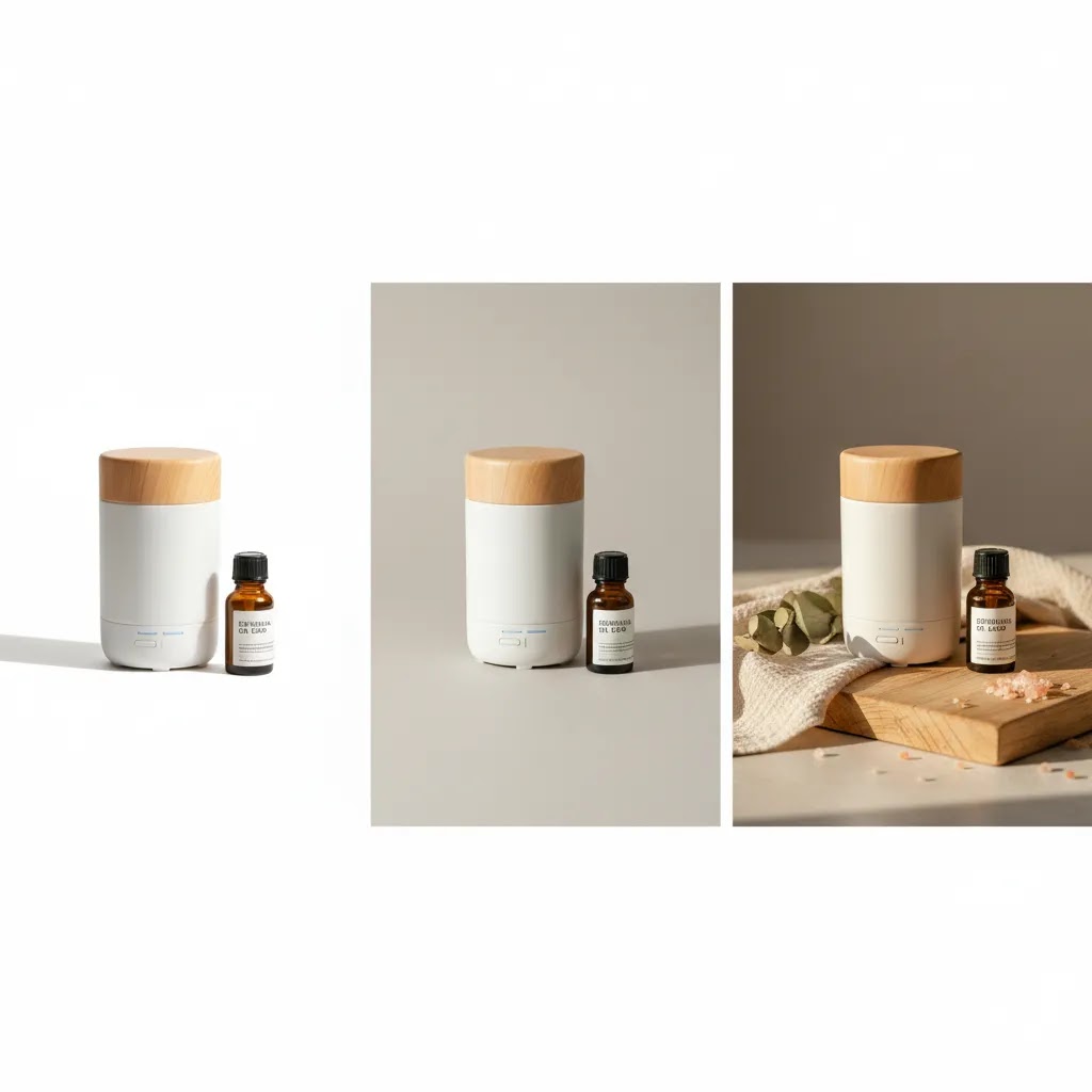
1. White background
A white background is the safest default for catalog images, product page galleries, comparison shopping feeds, and marketplace listings. It keeps attention on the product and creates consistency across SKUs. It is often the best option for electronics, beauty items, packaged goods, and any product where shape and detail matter more than atmosphere.
It also tends to work well for White Background Photography workflows because it simplifies editing and can make your store look more organized.
2. Neutral solid background
Soft gray, beige, stone, or muted brand colors can add personality without becoming distracting. This works well for premium DTC brands that want a more distinctive look than pure white but still need consistency across product pages. Neutral backgrounds are often a strong middle ground for Shopify stores that care about brand aesthetics.
3. Lifestyle background
A lifestyle background places the product in context. Think skin care on a bathroom shelf, coffee gear on a kitchen counter, or apparel outdoors. These photos can improve perceived relevance because shoppers see how the item fits into real life. They are especially useful on landing pages, social ads, and secondary product images.
If you need this kind of content at scale, a hybrid workflow that combines studio shots with digital edits or a product photography studio process can save time while keeping quality consistent.
4. AI-generated or edited background
AI background tools are useful when you need multiple scene variations without reshooting. They can help create seasonal themes, location-style settings, or cleaner branded visuals from existing product images. The catch is that they require judgment. If shadows, reflections, or product edges look unnatural, trust can drop quickly. AI is most useful as a workflow tool, not as a substitute for product accuracy.
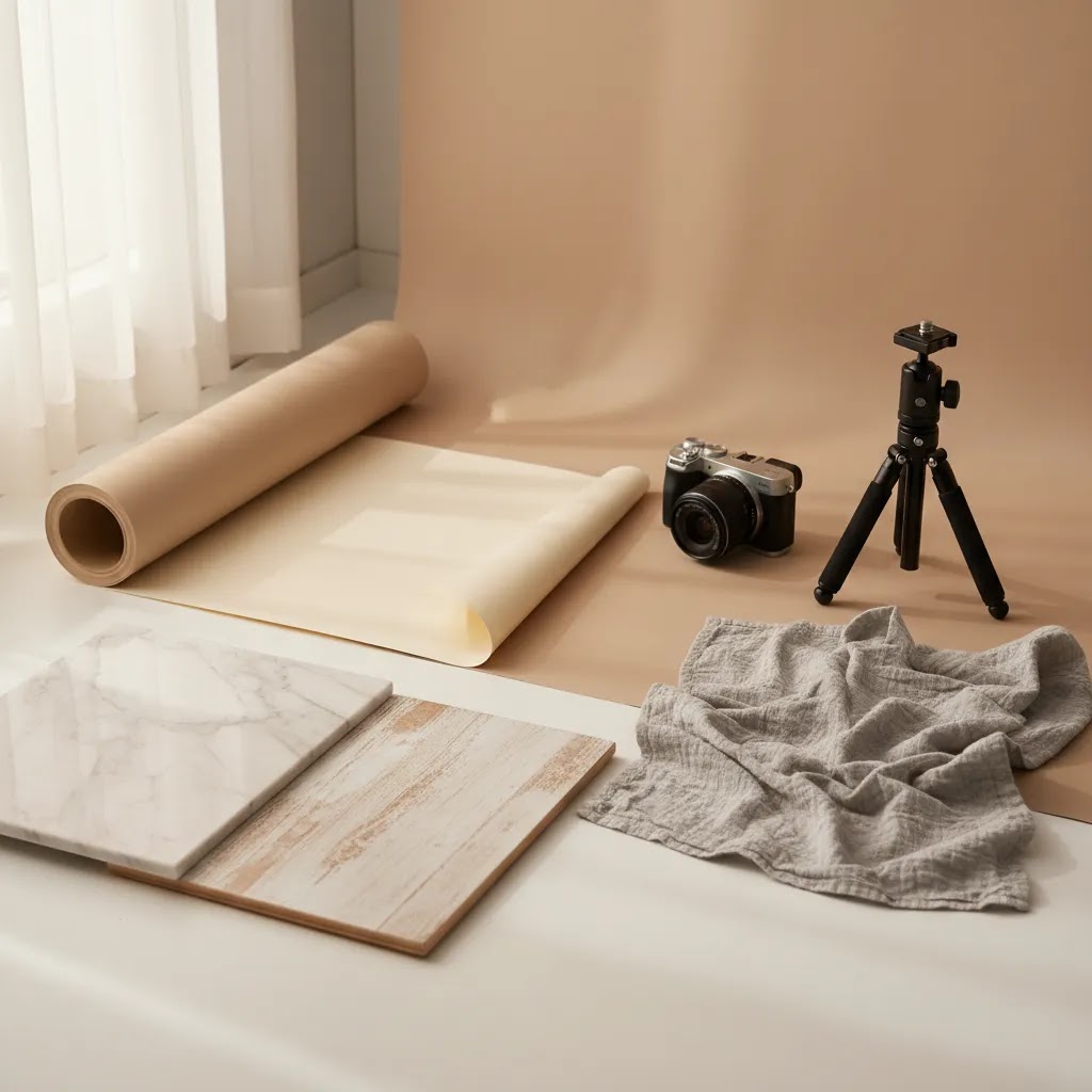
Choosing the right backdrop material (paper, vinyl, fabric, boards)
Once you decide on a background “type” (white, neutral, lifestyle), you still have a real-world decision to make: what physical material you are going to shoot on. This choice affects glare, wrinkles, cleanup time, and how much editing you end up doing after the shoot.
Paper backdrops (seamless paper rolls or sheets)
Paper is a go-to for clean catalog shots because it is typically matte and predictable under light. That matte finish helps reduce reflections, which matters if you sell glossy packaging, glass, or polished metal. The tradeoff is durability. Paper marks easily, can crease, and does not love water, so you may need to cut off the dirty section and re-tape a fresh area.
For small products, paper is also one of the easiest ways to create a “sweep” (a background that curves from horizontal to vertical) so you do not get a hard horizon line behind the product.
Vinyl backdrops (including wipeable sweeps)
Vinyl is popular for teams that shoot often because it is reusable and wipeable. If you sell cosmetics, food-adjacent products, or anything that can spill or smear, vinyl can save you time. The downside is that some vinyl surfaces can be slightly reflective. Under hard light, that reflection can show up as hot spots and make white backgrounds harder to keep even.
From a workflow standpoint, vinyl can reduce reshoots, but it may increase lighting work. If you are seeing glare, soften your light source, move lights farther away, or adjust angles so reflections bounce away from the camera.
Fabric backdrops (cotton, muslin, canvas)
Fabric can look great for lifestyle shots, especially if you want texture. The reality is that fabric wrinkles easily, and those wrinkles can become your editing problem. Fabric also tends to pick up dust and lint, which is a bigger issue than most people expect when you are shooting for zoomed-in ecommerce galleries.
If you use fabric, pull it tight with clamps, steam it when needed, and avoid shiny fabrics unless you know how to light them. For pure white hero images, fabric is usually slower than paper or boards because you spend more time fixing imperfections.
Backdrop boards and “floor-to-wall” setups
Rigid boards are one of the most practical options for small-to-medium products because they stay flat, travel well, and can be swapped quickly. You can use one board as the “floor” and another as the “wall” behind the product to create a clean corner, or use a single larger board and curve it slightly for a sweep-like effect.
Boards are also strong for flat lays. If your brand relies on top-down photography (beauty sets, bundles, accessories), a consistent board surface can keep your catalog uniform without needing a full stand or backdrop system.
How the material choice affects editing time
Think of it this way: the cleaner and more even your physical backdrop is, the less you need to “rescue” in post. Matte surfaces typically make edge detection easier for white-background cutouts and can reduce weird reflections that confuse AI background swaps. Wrinkles, texture, and shine often look fine to the naked eye, but they increase cleanup time when you are producing a full catalog, not one hero image.
Tools and workflows for background creation
If you want to improve your background for photos without rebuilding your whole content process, start with tools that match the job.
For simple cleanup, Free White Background Generator is useful when you need product photos white background outputs for catalog or marketplace use. For more stylized scenes, AI Background Generator can help create contextual visuals for campaigns or secondary gallery images. If you need more control over object placement or scene edits, Background Swap Editor and Magic Photo Editor give you a more flexible editing workflow.
For store owners producing a larger volume of creative assets, Creator Studio may be worth considering as a centralized workspace. If your existing source shots are soft or low resolution, Increase Image Resolution can help before background edits. If text overlays or packaging clutter need to be removed from supporting visuals, Remove Text From Images can be part of the prep step.
For apparel, accessories, or hand-held products, Place in Hands can be useful for ad creatives or mock lifestyle scenes. If you are in the evaluation stage, AcquireConvert’s mockup generator guide is a practical next read because mockups and background swaps often solve similar content gaps for growing brands.
The best workflow for most stores is layered: shoot once as cleanly as possible, create a compliant plain-background hero image, then generate or edit supporting backgrounds for merchandising, email, and paid social. That keeps your main product photos dependable while giving your marketing team more room to test creative angles.
How to set up a simple product photo background (tabletop setup)
For most Shopify store owners, the fastest way to get consistent backgrounds is a simple tabletop setup you can repeat every time you shoot. You do not need a full studio. You need a controlled, repeatable environment that produces clean source photos, because every editing workflow gets easier when the starting image is solid.
A minimal gear setup that works for small products
A practical starter kit looks like this: a table, a sweep (paper, vinyl, or a curved board), clamps or tape, and a basic lighting setup. The key is the sweep. When your background curves from the table up behind the product, you avoid a hard horizon line and reduce the “messy countertop” look that makes products feel less premium.
Lighting can be simple. A lot of small teams start with one or two continuous lights and diffuse them, or use indirect window light, but the goal is always the same: soft, even light that does not create harsh shadows or shiny glare.
Step-by-step workflow for a cleaner background
Start by setting your sweep so it is smooth and held in place with clamps or tape. Place your product far enough from the background so shadows do not fall sharply onto it. In practice, this usually means pulling the product forward rather than pushing it right against the “wall” part of the sweep.
Next, set a consistent camera position. Keep the camera height and angle the same across your SKU set, especially for hero images. Consistency here matters more than people think, because Shopify collection pages punish inconsistency. When every product is shot from a slightly different height, your catalog starts to look chaotic, even if each image is individually good.
Then, control your exposure and white balance. If your “white” background is drifting between warm and cool across a shoot, lock your white balance if your camera allows it, and avoid mixing light sources. A consistent white background makes it easier to output a true white background later, whether you do it manually or with a background remover for photos tool.
Common setup mistakes that create “messy” backgrounds
Wrinkles and seams are the first problem. Paper that is bent, fabric that is creased, or vinyl that is rippling will show up as unwanted texture. The quick fix is physical, not digital: pull the material tight, clamp it, and replace damaged sections.
Mixed white balance is the second. A window plus a warm ceiling bulb can create weird color shifts that are hard to correct consistently across a whole catalog. The fix is to shoot with one light type and keep the setup in the same place during a batch.
Glare is the third, especially with glossy products and shiny vinyl. If you see bright hotspots, make your light source larger (diffusion), move lights farther away, or adjust angles so reflections bounce away from the lens. If you can get glare under control in-camera, your AI background generator for product photos results will usually look more believable too, because the lighting cues remain consistent.
Pros and Cons
Strengths
Considerations
Who this guidance is for
This is for ecommerce store owners who are trying to make smarter decisions about product imagery, not just prettier ones. If you run a Shopify store, sell on Amazon, or manage a growing catalog across multiple channels, the background decision affects more than aesthetics. It influences consistency, click-through, channel compliance, and production time.
It is especially relevant if you are deciding between studio photography, edited white backgrounds, lifestyle scenes, or AI-assisted image workflows. If your team is small and you need content that works across your website, paid ads, and marketplaces, a practical background system usually beats one-off creative decisions.

AcquireConvert recommendation
At AcquireConvert, the goal is not to push every merchant toward the same visual style. It is to help you choose the option that fits your store model, sales channels, and production reality. Giles Thomas’s background as a Shopify Partner and Google Expert is useful here because product imagery affects both conversion and discoverability. The image that works best on a branded product page is not always the one that works best in a shopping feed or marketplace result.
For most merchants, the sensible approach is a mixed background strategy. Use a clean primary image for clarity and compliance, then add contextual or AI-enhanced alternatives where they support merchandising. If you are reviewing your broader image stack, explore AcquireConvert’s category page on E Commerce Product Photography for related guides on shooting, editing, and visual optimization.
How to choose the right setup for your store
Here is a practical framework you can use.
1. Start with the sales channel
If the image is for Amazon or another marketplace, begin with compliance. In many cases, a plain white background for photos is the lowest-risk option for the hero image. For your own Shopify store, you can be more flexible, but the first image still needs to communicate the product clearly.
2. Match the background to the product type
Simple, functional, or technical products usually benefit from plain backgrounds. Emotion-driven or design-led products often need at least some lifestyle imagery. Beauty, apparel, home decor, and gifting categories usually perform better with a mix of clean and contextual visuals.
3. Consider your catalog size
If you manage hundreds of SKUs, consistency matters more than artistic variety. A repeatable background system will usually save time and create a more trustworthy storefront. If you launch a smaller curated line, you may have more room to use custom scenes selectively.
4. Evaluate production resources honestly
If you do not have in-house photography support, AI and editing tools can be useful. But use them where they are strongest: removing distractions, creating alternate scenes, and extending a good base image. They are less dependable when the original photo is poor or when absolute realism is critical.
5. Test by page intent, not personal preference
A founder may prefer lifestyle-heavy imagery, while shoppers may need clearer cutout images to compare features. Use analytics and page purpose to guide decisions. Product pages need trust and detail. Collection pages need scannability. Ads need attention. Email needs fast visual recognition.
If you are unsure, default to clarity first and creativity second. That tends to be the safer choice for product photos for website use and usually gives you more flexibility across channels later.
Frequently Asked Questions
Is a white background always best for product photos?
No. A white background is often best for hero images, catalogs, and marketplace listings because it keeps the product clear and consistent. But it is not always the strongest option for branding or storytelling. Many stores do better with white for the first image and contextual backgrounds for secondary images, ads, and landing pages.
What background works best for Shopify product pages?
For Shopify stores, the best setup is usually a clean primary image paired with supporting photos that show context, scale, or use. That gives you a strong first impression while still helping shoppers imagine ownership. The right mix depends on your niche, theme layout, and how visually driven your brand is.
Can I use AI for product photos without hurting trust?
Yes, but only if the output still looks believable and the product remains accurate. AI for product photos works best for background variation, campaign creative, and scene expansion. It is less reliable when it changes product proportions, textures, or shadows in ways that could mislead shoppers.
What is the best background for Amazon product photos?
For primary Amazon images, white is usually the safest choice because it aligns with common marketplace expectations and keeps the listing clear. Supporting images can be more descriptive and contextual. If Amazon is a major channel for you, build your image workflow around compliance first, then add creative variants for your own store.
Should every product in my catalog use the same background?
Not necessarily, but your store should feel consistent. Large catalogs usually benefit from a standardized hero background so collection pages look organized. Secondary images can vary more by product type or campaign. The goal is controlled variety, not a random mix that makes the catalog feel uneven.
Are AI background generators good enough for ecommerce?
They can be, especially for small teams that need more content options without repeated reshoots. AI background generator tools are most useful when they extend a strong original product photo. You still need to review edges, shadows, color accuracy, and realism before publishing anything customer-facing.
Do lifestyle backgrounds improve conversion rates?
They may help in many cases, especially for products where use context matters. But they are not automatically better than clean studio shots. Conversion impact depends on your product category, customer intent, and where the image appears in the buying journey. The strongest approach is usually a mix rather than a single format.
What if I do not have a professional studio?
You can still create effective product backgrounds with a simple setup, careful lighting, and editing tools. Many smaller brands begin with a repeatable home or office shooting workflow, then use background cleanup or AI scene tools to improve presentation. A polished result matters more than having a large production budget.
How many background styles should one product have?
For most stores, two to three styles are enough: one plain hero image, one close-up or angle variation, and one contextual or lifestyle version. More than that can be useful for ads and social content, but your product page does not need endless visual formats if the core buying questions are already answered.
How to set up a background for product photos?
Use a tabletop setup with a sweep background (paper, vinyl, or board) that curves from the table up behind the product, so there is no hard horizon line. Keep the product a little distance from the background to reduce harsh shadows, and keep your camera height and angle consistent across SKUs so your Shopify collection pages look uniform. Use one consistent light source type and stable white balance to avoid color shifts that make your background look uneven.
What color background is best for selling?
The best background color is the one that makes the product easiest to read quickly, with clean contrast and consistent lighting. White is usually the safest choice for marketplaces and large catalogs, because it stays clear and predictable across SKUs. Many DTC brands also use off-white or light neutral backgrounds to feel more premium on product pages, as long as the color stays consistent and does not introduce a blue or yellow cast across the catalog.
How to get a white background for product photos?
You can do it in-camera by shooting on a white sweep with even lighting and enough distance between the product and background to avoid dark shadows. The goal is a clean, bright background that still keeps accurate product edges. If your source photo is good but not perfectly white, a background remover for photos or white background generator tool can help, but you still need to check edges, shadows, and product color accuracy before publishing.
Key Takeaways
Conclusion
The right background for product photos is rarely about following one visual rule. It is about choosing the image style that helps customers evaluate the product quickly and confidently in each context. For many ecommerce brands, that means using clean, compliant hero images alongside more expressive supporting visuals. White backgrounds still matter, especially for marketplaces and large catalogs, but they are only one part of a better merchandising system. If you want more practical guidance, AcquireConvert is a strong place to continue your research. You can explore related guides on E Commerce Product Photography, compare content workflows, and see how experienced store owners approach visual optimization with a conversion mindset.
This article is editorial content created for educational purposes and is not a paid endorsement unless explicitly stated otherwise. Tool availability, features, and pricing may change over time, so verify current details directly with each provider before making a decision. Any performance outcomes discussed are illustrative only and not guaranteed.

Hi, I'm Giles Thomas.
Founder of AcquireConvert, the place where ecommerce entrepreneurs & marketers go to learn growth. I'm also the founder of Shopify agency Whole Design Studios.