Food Product Photography for Ecommerce (2026)
Food product photography sits at the center of how shoppers judge freshness, quality, and value before they ever read your ingredients list. If you sell snacks, sauces, coffee, supplements, frozen meals, or gift boxes online, your photos often do the first job of conversion. The challenge is that food needs more than a technically clean image. It needs styling, believable color, appetizing texture, and composition that fits your product page, ad creative, and marketplaces. This guide walks you through how to style, light, and compose food photography for ecommerce, with practical advice you can apply whether you shoot in-house or brief a professional. If you are still comparing gear, workflows, and visual production options, it also helps to review broader ecommerce tools and image workflows together.
Contents
- Why food product photography matters
- How to style, light, and compose food shots
- Food photography angles and shot types (that work for ecommerce)
- Useful tools and workflows for store owners
- Backdrops and surfaces: building a repeatable look (without over-styling)
- Pros and Cons
- Who this approach is for
- How to choose the right setup
- Phone-first workflow: how to get consistent results with a smartphone
- Frequently Asked Questions
Why food product photography matters
Food is one of the hardest ecommerce categories to photograph well because shoppers expect both accuracy and desire. They want to trust the packaging, portion, and color, but they also want the product to look appealing enough to buy. That means your visual system has to do two jobs at once.
First, you need clean catalog-ready images for product pages, collection pages, retail pitches, and marketplaces. Second, you need styled images that suggest taste, use occasion, and brand personality. A jar of hot sauce on white may work for a SKU page, while a styled serving shot may work better in paid social or email.
This is where many store owners get stuck. They either overspend on highly styled imagery that does not scale across a catalog, or they use flat, inconsistent photos that reduce trust. A stronger approach is to combine consistent base product shots with selected lifestyle and ingredient-led scenes. If you also sell on marketplaces, studying amazon product photography requirements helps you avoid format issues and keep assets usable across channels.
How to style, light, and compose food shots
Start with the commercial goal of each image. Before you place a prop or turn on a light, decide where the image will be used. A hero image for Shopify product pages needs clarity and consistency. A campaign image can be moodier and more expressive. A thumbnail for collection pages needs fast readability at small size.
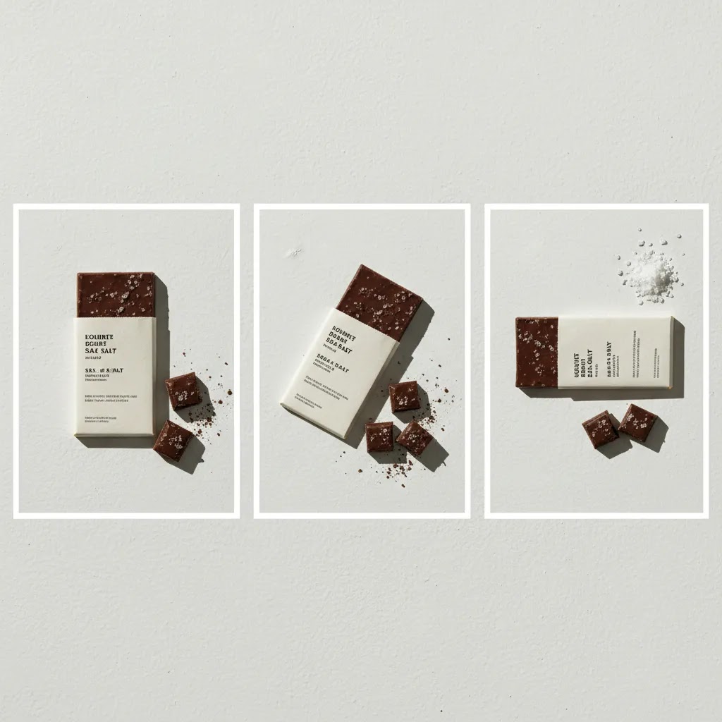
Styling: make the product feel edible and credible
Styling for ecommerce should support the product, not distract from it. If you sell packaged food, keep the label readable and front facing. If the item inside matters, show it in a secondary frame with a plated or poured version. Ingredient props work best when they explain flavor or usage. They work less well when they clutter the frame.
Use surfaces and props that match the product's price point and audience. Premium tea may suit stone, linen, and restrained color. Kids' snacks may benefit from brighter surfaces and simpler, cheerful styling. For white on white product photography, the challenge is separation. Use subtle shadows, texture variation, or a slight background tone shift so the pack does not disappear.
Lighting: prioritize color accuracy and texture
Soft side light is usually the safest starting point for food product photography. It reveals shape and texture without making packaging look glossy or uneven. Backlight can work well for drinks, jars, and products where translucency matters, but it can also create label glare if the angle is wrong.
For most in-house setups, one soft key light plus a reflector is enough. Window light can work if you can control the time of day and repeat it consistently. If you need repeatable results across many SKUs, artificial light is often more practical. Consistency matters more than complexity.
Watch white balance closely. Food buyers notice when chocolate turns gray, greens look dull, or sauces become too orange. That kind of mismatch can create returns, poor reviews, or a trust gap on the product page.
Composition: design for the crop, not just the full frame
Compose with your storefront templates in mind. On Shopify product cards, square and vertical crops often matter more than the original landscape shot. Leave enough negative space for ad text overlays if assets will be reused in paid campaigns. A centered pack shot works for catalog use, while a slight angle or supporting ingredient layout may suit social.
Think in image sets, not one-off images. A strong product page usually includes:
- one clean hero image
- one or two alternate angles
- one detail shot for texture or ingredients
- one context image showing scale or serving suggestion
- one brand or lifestyle image if relevant
If you are refining a broader visual system across channels, it is worth comparing this with your overall ecommerce photography standards so product, collection, and campaign images feel connected.
Food photography angles and shot types (that work for ecommerce)
Here is the thing, you can have good light and decent styling, and still end up with images that do not sell because the angle is wrong for the job. For most Shopify stores, your best performing image sets are usually built around a few repeatable angles that make the product easy to understand at thumbnail size.
The three core angles most ecommerce sets rely on
Top-down (flat lay): This is the cleanest way to show collections of items, ingredients, or a full meal kit layout. It often works well for social, email headers, and lifestyle shots where you want to show variety. For product pages, top-down is more of a supporting angle unless the product is naturally flat or you need to show the full set of what is included.
45-degree: This is the most versatile “looks like a real human viewpoint” angle. It tends to work well for plated food, bowls, drink setups, and packaged goods when you want a little depth without distorting the label. In many cases, this angle is the most reusable across Shopify product pages, ads, and organic social because it feels natural and still reads clearly.
Straight-on (front-facing): This is your workhorse for packaged food. If you sell bags, boxes, jars, bottles, and supplements, straight-on is typically the safest hero angle because branding stays readable and consistent. It is also easier to standardize across a catalog, which matters when shoppers compare flavors or variants on collection pages.
A simple “shot sequence” you can repeat across SKUs
If you want your catalog to look cohesive, build a default sequence and stick to it. Think of it as your baseline set for every SKU, then layer in campaign or lifestyle shots when you need them.
- Hero pack shot: straight-on, label centered, consistent crop
- Secondary angle: slight turn (or 45-degree) to show depth and shape
- Back-of-pack or info panel: clear readability for shoppers who check ingredients and nutrition
- Detail close-up: texture, ingredients, or a key feature like grind size, mix consistency, or topping
- Serving suggestion or in-use: plated, poured, or prepared, sized realistically
Now, when it comes to keeping that sequence consistent, lock in your “geometry” first. Use the same tripod height, keep a consistent distance from the product, and avoid switching focal length from shoot to shoot. If you shoot on a phone, that typically means using the same camera module and physically moving the tripod rather than pinching to zoom. If you shoot on a camera, it means choosing one lens and sticking with it for your core catalog.
Common angle mistakes with packaged food, and how to avoid them
Packaged food is less forgiving than plated food because shoppers are looking for proof. They want to read the label, understand size, and feel like what they see is what they will get.
- Label distortion: Shooting too close with a wide lens can curve typography and logos, especially on bags and tall jars. Step back and crop, or use a longer focal length to keep branding natural.
- Unreadable branding: A dramatic tilt can look stylish, but it can also reduce clarity on Shopify collection cards and mobile PDPs. If the hero image is angled, keep the label readable and consider using a straight-on version as the default product card image.
- Misleading portion perspective: A close, low angle can make a serving look bigger than it is. That may create a trust gap when the product arrives. Use a consistent bowl, glass, or plate for scale, and keep serving shots realistic. If you use garnishes, keep them supportive rather than transformative.
- Gloss and glare at the wrong angle: Glossy pouches and plastic tubs can catch the light and wipe out key claims. Small changes in product rotation and light placement usually solve this, so test angle and lighting together rather than treating them as separate steps.
Useful tools and workflows for store owners
If you shoot food products yourself, editing speed matters almost as much as the shoot. Most brands do not fail because they cannot take one good image. They fail because they cannot produce 20 to 200 consistent images every month.
AcquireConvert's product data highlights a few useful image workflows for ecommerce teams:
- AI Background Generator can help create alternate settings for promotional visuals when you need variety beyond a plain backdrop.
- Free White Background Generator is relevant for clean catalog images and marketplace-ready listings.
- Increase Image Resolution may help when older assets are too small for modern storefronts or campaign placements.
- Background Swap Editor can be useful for testing seasonal or campaign variations without reshooting every SKU.
- Creator Studio offers a broader editing workflow for teams producing frequent product visuals.
These tools can save time for background cleanup, alternate scenes, and asset reuse. They are less reliable if your original photo has poor lighting, inaccurate color, or weak styling. AI can support production efficiency, but it does not replace the need for a believable source image.
For merchants testing packaging concepts before a full shoot, a mockup generator can help you validate layout ideas, variant labeling, or ad concepts before investing in final photography. If you are deciding whether to keep photography in-house or outsource it, reviewing what a product photography studio typically handles can clarify the trade-offs.
As a practical rule, use AI-assisted editing for speed and iteration, but keep your core SKU imagery grounded in real product photography wherever accuracy affects trust or compliance.
Backdrops and surfaces: building a repeatable look (without over-styling)
What many store owners overlook is that your backdrop is part of your brand system. If your background changes from SKU to SKU, your catalog can feel inconsistent even if the lighting is decent. The goal is not to build a new set for every product. It is to create a small set of surfaces you can reuse so your Shopify product pages and collection grids look intentional.
Backdrop options that work well for food ecommerce
Paper sweeps: Great for clean catalog work because they remove horizons and visual clutter. They are also one of the simplest ways to control color. If you want repeatable white on white product photography, a white sweep paired with controlled shadows is often the most scalable option.
Foam boards and painted boards: Useful when you want a matte surface with a little texture. Boards are easy to store and swap. They can also be angled as a vertical background and a horizontal surface, which helps you keep the same “world” across shots.
Tile, stone, and concrete-style surfaces: These tend to signal premium and food-forward positioning, especially for coffee, tea, sauces, and specialty ingredients. They can also help with contrast when packaging is light colored.
Wood surfaces: Wood can read warm and approachable, but it can also quickly look rustic. If your brand is modern or minimalist, lighter, cleaner wood tones usually work better than heavily grained, dark planks.
Linen and fabric: Fabric adds softness and lifestyle context. It is great for supporting frames, but it can create wrinkles and inconsistent shadows if you rely on it for every SKU. If you use linen, keep a dedicated piece for your brand so the weave and color stay consistent across reshoots.
Match backdrop texture and color to your brand price point
Consider this, shoppers read visual cues fast. A bright, clean background with simple props tends to feel modern and product-led. Darker, moodier surfaces can feel premium, but they can also reduce clarity at thumbnail size. For many Shopify stores, the safest approach is a clean catalog look for your core product images, then a separate lifestyle look for storytelling.
If you sell multiple flavors or variants, backdrop consistency matters even more. A simple system helps customers compare products without visual noise. It also helps your ads and email creative feel connected to the storefront.
Separation and contrast, especially for white on white
White on white product photography can look high-end, but only if the product does not blend into the background. Separation usually comes from a few controllable variables.
- Use a slightly off-white backdrop rather than pure bright white, so the pack edge reads clearly.
- Create a soft shadow under the product with side light, then keep it consistent across the catalog.
- Add subtle texture in the surface (matte paper, lightly textured board) so the product outline does not disappear.
- Watch highlight clipping on white packaging, because once detail is blown out it is hard to recover cleanly.
From a practical standpoint, treat your background like a standardized input. If you change it every season, your catalog can feel fragmented. If you want seasonal variety, keep it mostly in supporting lifestyle images and campaign assets, not in the core set that lives on the product page.
A simple “backdrop system” for ecommerce
If you want a repeatable look without overthinking it, build a small kit and name it like you would name product variants. That makes it easier to brief a freelancer, reshoot months later, or hand off production to a team member.
- 1 to 2 core catalog backdrops for your standard product images
- 1 to 2 lifestyle backdrops for ingredient-led or in-use scenes
- One “wildcard” surface reserved for seasonal or campaign moments
The way this works in practice is simple, your catalog stays consistent, while your marketing still gets variety. You also reduce the chance that new product launches look like they came from a different brand because someone picked a different surface on shoot day.
Pros and Cons
Strengths
- Strong food photography can improve perceived quality and make unfamiliar products feel safer to buy online.
- A structured image set supports multiple channels, including Shopify product pages, ads, email, wholesale decks, and marketplaces.
- Soft, consistent lighting helps maintain color accuracy across packaging, ingredients, and serving shots.
- Thoughtful styling can communicate flavor, usage occasion, and brand positioning without relying only on copy.
- AI-assisted background and editing tools may reduce production time for supporting visuals and repeated asset formats.
Considerations
- Food is perishable and visually unstable, so shoots often take longer than standard hard-goods photography.
- Overstyling can make the product look less believable, especially if the packaging and served result feel disconnected.
- In-house teams may struggle to maintain consistent lighting and color across a growing catalog.
- AI-generated food photography can create unrealistic textures or serving scenes if used without careful review.
Who this approach is for
This approach suits ecommerce brands that sell food or beverage products and need images that work across both conversion-focused product pages and brand marketing. It is especially relevant for Shopify merchants managing a growing SKU range, seasonal launches, bundles, or subscription products.
If you are a founder shooting products yourself, the style-light-compose framework helps you prioritize what matters most before spending on props or editing tools. If you already work with freelancers or agencies, it gives you a clearer briefing structure so the output is more consistent and more usable across your storefront.
How to choose the right setup for your store
There is no single best food photography workflow for every ecommerce business. The right choice depends on catalog size, order volume, team skills, and how often you launch new products. Here are the criteria that matter most.
1. Start with your sales channels
If your main revenue comes from your own storefront, you can balance clean product shots with richer brand storytelling. If you also rely on marketplace traffic, clean white-background compliance often takes priority. Many merchants need both. In that case, brief your shoots in layers: required catalog images first, styled campaign images second.
2. Match image complexity to AOV and buying behavior
Low-cost impulse items often need fast clarity. Shoppers should understand product type, flavor, and pack size immediately. Higher-consideration products, gift products, and premium food brands usually benefit from more mood, texture, and ingredient storytelling. If your AOV is higher, extra image depth may help support the decision.
3. Be realistic about in-house capacity
Many founders can create very usable imagery with one light, a reflector, a tripod, and a disciplined process. The challenge is consistency over time. If you are regularly adding SKUs, updating packaging, or running promotions, a repeatable system matters more than a perfect one-off shoot. Consider whether your team can style, shoot, edit, name files, and upload assets reliably each month.
4. Use AI where it helps, not where it weakens trust
Food product photography ai workflows can be useful for testing backgrounds, resizing assets, or producing lightweight campaign variations. They are less suitable for replacing the core truth of the product. If the final image makes texture, portion, garnish, or packaging look unrealistic, you may create a mismatch between expectation and delivery.
5. Build a shot list before you book anything
Your shot list should specify image purpose, orientation, backdrop, props, label angle, and crop requirements. This is especially helpful if you are comparing in-house production with freelance or studio support. It also keeps your asset library aligned with product page templates, collection cards, email modules, and paid ad placements.
At AcquireConvert, we generally recommend that store owners think about photography the same way they think about conversion optimization: remove friction, maintain consistency, and support the buying decision. That practical approach reflects Giles Thomas's experience as a Shopify Partner and Google Expert, especially when imagery affects product page performance, Shopping visibility, and ad click quality. For broader production strategy, you can also browse the E Commerce Product Photography and Catalog Photography sections on AcquireConvert.
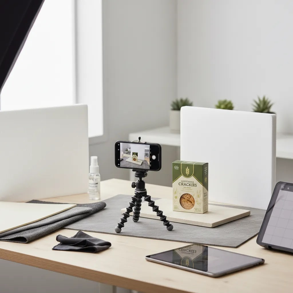
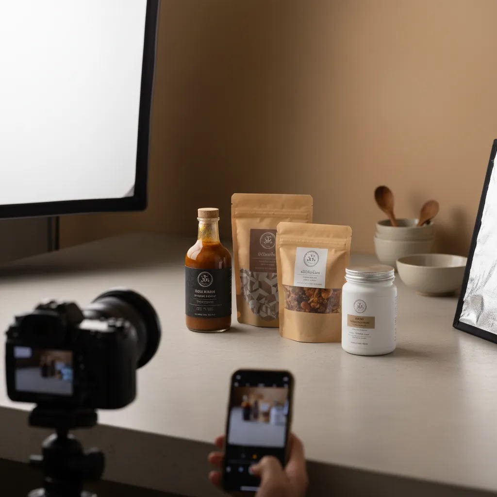
Phone-first workflow: how to get consistent results with a smartphone
Smartphones can produce strong ecommerce imagery, but only if you treat the process like a system. The phone itself is rarely the bottleneck. Inconsistent light, shifting backgrounds, and mixed editing decisions are what usually make a catalog look amateur.
Phone shooting settings that matter for ecommerce consistency
For most Shopify store owners, the goal is repeatable output, not “creative” camera tricks. A few habits make a big difference.
- Turn on grid lines and use them to keep labels level and centered.
- Tap and hold to lock focus and exposure, so brightness does not shift between frames.
- Avoid digital zoom. Move the tripod or your shooting table instead, because digital zoom can reduce detail and amplify noise.
- Pick one lens and stick to it for your catalog. Switching between phone lenses changes perspective and can make products feel inconsistent in size.
- Keep the phone parallel to the product for straight-on shots, especially for labels and typography.
If you photograph a lot of packaged goods, consider using the “front-facing hero” as your anchor image, then add one supporting angled image as your variation. That simple pattern tends to scale well across many SKUs.
A minimal repeatable setup for founders
Think of it this way, your phone is the camera, but your setup is the studio. You can keep it simple and still be consistent.
- Tripod with a phone mount, so height and angle do not drift between products.
- One controllable light source, or consistent window light that you can repeat. If you use window light, shoot at the same time of day and diffuse it with a sheer curtain.
- One catalog backdrop that stays set up, so you are not rebuilding every shoot.
- Reflector or white foam board to lift shadows, especially for dark packaging.
For scale consistency across SKUs, mark your product position on the table and mark your tripod position on the floor. If you can keep distance and height fixed, your collection pages will look far more cohesive.
A simple editing checklist for catalog-level consistency
Most “phone photos” look like phone photos because editing varies too much from image to image. Keep your edits restrained and repeatable.
- Correct white balance first, so packaging and food tones look accurate.
- Normalize exposure across the set, so one flavor does not look brighter than another.
- Check saturation on key food colors (greens, reds, chocolate tones), and avoid pushing them beyond what the product actually looks like.
- Crop to your Shopify image strategy (square or vertical), and keep product size consistent in frame.
- Export consistently, with the same file format and resolution approach each time.
If you use AI editing tools for background cleanup or variations, keep a human review step before publishing. Small artifacts around labels, edges, or transparent packaging can show up on product pages and reduce trust.
Where phones break down for food packaging, and when to upgrade
The reality is that phones can struggle with a few common packaged-food problems.
- Glare control: Glossy bags and plastic tubs often reflect a phone light source or bright window, which can wipe out claims and nutrition panels.
- Color shifts: Mixed light (window plus room lights) can create odd color casts that are hard to correct perfectly.
- Fine texture detail: Coffee grounds, spice blends, and baked texture can look soft if light is not controlled or if the phone over-smooths detail.
If you are constantly fighting reflections, if your catalog is growing fast, or if you need wholesale-ready consistency, upgrading to controlled lighting or booking a professional shoot is often worth testing. It does not have to be all or nothing. Many brands shoot core white-background and label-accurate images in a controlled setup, then use phones for lightweight lifestyle content that is clearly social-first.
Frequently Asked Questions
What is the best lighting setup for food product photography?
For most ecommerce brands, a soft side light paired with a reflector is the safest starting setup. It tends to preserve texture, maintain packaging readability, and keep shadows controlled. Natural light can work for small batches, but artificial light is often better when you need repeatability across many SKUs and reshoots.
Should food products be photographed on white or in a styled setting?
You usually need both. White-background images are ideal for product pages, collection cards, retail line sheets, and marketplace listings. Styled images help communicate taste, ingredients, and brand feel. A practical ecommerce workflow starts with clean product shots, then adds a smaller number of styled scenes for ads, social, and email.
Can AI-generated food photography replace a real photoshoot?
In most cases, no. AI can help with backgrounds, concept testing, and promotional variations, but shoppers still need accurate product representation. If AI changes texture, serving size, garnish, or packaging appearance too much, trust may drop. It works best as a production aid rather than a replacement for your core SKU photography.
How many images should a food product page have?
A solid starting point is four to six images per product. Include a hero image, alternate angle, detail shot, packaging or ingredient close-up, and one contextual or serving image. If the product has important preparation steps, portion guidance, or bundle contents, add those visually rather than relying only on text.
What props work best in food product photography?
The best props explain flavor, usage, or audience without competing with the product. Common options include ingredients, utensils, simple linens, bowls, boards, and glassware. Keep them restrained. If a shopper notices the prop before the package or product, the styling is probably doing too much.
How do I avoid glare on food packaging?
Move the light source off-axis, diffuse it more heavily, and slightly adjust the product angle rather than keeping it perfectly flat to camera. Glossy bags, jars, and plastic containers often need small position changes to control reflections. A polarizing setup may help in some cases, but simple light placement usually solves most issues.
Is smartphone photography good enough for ecommerce food brands?
It can be, especially for early-stage brands with a disciplined setup. Good light, a tripod, a consistent backdrop, and careful editing matter more than the camera body alone. The risk is inconsistency over time. If your catalog is growing or you need wholesale-ready assets, a more controlled system may be worth it.
What are the best angles for food photography?
The most reliable angles are top-down, 45-degree, and straight-on. Top-down works well for flat lays, ingredient spreads, and meal kit layouts. A 45-degree angle often looks natural for plated food and lifestyle scenes. Straight-on is typically best for packaged food hero images because it keeps labels and branding readable, which matters on Shopify product pages and collection thumbnails.
What is the best background for food photography?
The best background is one you can repeat consistently and that supports your brand positioning. Paper sweeps and simple boards work well for clean catalog images. Tile, stone, wood, and linen can work for lifestyle scenes if they match your product's price point and do not overpower the packaging. If you shoot white on white, aim for subtle separation using controlled shadows or slight texture so the product edges stay visible.
How do you take professional food pictures with a phone?
Use a tripod, consistent lighting, and one repeatable backdrop, then lock focus and exposure so your phone does not change brightness between shots. Avoid digital zoom and keep your camera angle consistent across products. In editing, normalize white balance and exposure across the set so colors and packaging look consistent from SKU to SKU.
How do you compose food photos for Instagram vs. a product page?
Instagram composition can be more expressive, with wider scenes, props, and negative space for a story or a hook. Product page composition is usually about clarity and comparison, the label should be readable, the product size should be consistent, and crops should match your Shopify layout. Many brands use the same source photo but crop differently, tighter and cleaner for PDPs, wider and more lifestyle-driven for social.
How should I brief a photographer for food ecommerce shoots?
Provide a shot list, usage notes, orientation requirements, styling direction, brand references, and examples of crops needed for your storefront and ads. Clarify whether the deliverables include white-background pack shots, lifestyle images, detail shots, and retouching. A good brief saves time and usually reduces costly reshoots.
Does food photography affect Shopify conversion performance?
It can, because imagery shapes first impressions, perceived quality, and product understanding. Better photography may improve engagement and confidence, especially for products where texture, flavor cues, and packaging matter. Results vary by niche, price point, and page design, so treat imagery as one important conversion input rather than a guaranteed fix.
Key Takeaways
- Food product photography should balance appetite appeal with accurate representation.
- Use clean white-background images for core ecommerce needs and styled scenes for brand storytelling.
- Soft, controlled lighting usually gives the best mix of color accuracy, texture, and packaging readability.
- Compose for storefront crops, ad placements, and image sets, not just one full-frame shot.
- Use AI editing tools to speed up production, but keep your core product imagery grounded in real photography.
Conclusion
Good food product photography is less about expensive gear and more about making smart choices around styling, lighting, and composition. If your images help shoppers understand what they are buying, trust what they see, and picture the product in use, you are already moving in the right direction. For Shopify merchants, that usually means building a repeatable visual system that supports both conversion and brand consistency. AcquireConvert focuses on practical ecommerce guidance for exactly that kind of work. If you want to compare image production options, AI-assisted workflows, and store-ready visual strategies in more depth, explore AcquireConvert's photography resources and related guides shaped by Giles Thomas's experience as a Shopify Partner and Google Expert.
This article is editorial content created for educational purposes and is not a paid endorsement unless explicitly stated otherwise. Tool availability and features may change over time, so verify current details directly with the provider before making a decision. Any performance or conversion impact discussed here is not guaranteed and will vary by product, niche, store setup, and execution.

Hi, I'm Giles Thomas.
Founder of AcquireConvert, the place where ecommerce entrepreneurs & marketers go to learn growth. I'm also the founder of Shopify agency Whole Design Studios.