Jewelry Pictures That Convert Trust (2026 Guide)
If you sell jewelry online, your pictures do more than show the product. They carry the job of proving detail, finish, scale, and quality before a shopper can touch anything. That is especially true for Shopify merchants competing against larger brands with polished imagery. Strong jewelry pictures can help buyers understand craftsmanship, while weak ones can make even well-made pieces look flat or mass-produced. This guide covers what actually makes jewelry photography work for ecommerce, from lighting and angles to white background shots, styled images, and selective AI cleanup. If you are comparing your current setup with other ecommerce tools and workflows, this article will help you decide what is worth improving first.
Contents
What Great Jewelry Pictures Need to Do
Jewelry product photography has a narrower margin for error than many other categories. Reflections, tiny scratches, stone color shifts, and metal tone can all look different once a product is photographed, compressed, and displayed on a mobile screen. That means your goal is not just to create attractive pictures of product. Your goal is to reduce doubt.
For most ecommerce stores, effective jewelry pictures need to answer five shopper questions quickly:
A practical gallery usually combines clean white background images, macro detail shots, scale references, and a small number of styled or on-model images. If you sell on marketplaces as well as your own site, there is often overlap with amazon product photography requirements, especially around consistency and background control. For a broader framework, AcquireConvert’s ecommerce photography resources are useful for building an image system that supports conversion, not just aesthetics.
Jewelry Quality Criteria Shoppers Look For (The “5 C’s” and How to Photograph Them)
Here’s the thing: most shoppers do not evaluate jewelry like a jeweler, but they still look for quality signals. You will often see quality described using “C” frameworks, especially around gemstone jewelry. Not every “C” is fully photographable, but you can usually capture enough proof to reduce doubt on a Shopify product page.
For ecommerce, think of the “5 C’s” as a buyer-friendly checklist you can support with specific photo types:
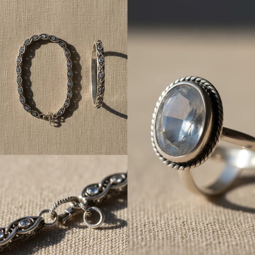
Now, when it comes to what you can actually show in pictures, a few details matter more than people expect. Craftsmanship is often the biggest conversion lever because it is visible. A sharp macro of prongs, pave work, bezels, chain links, and clasp mechanisms can do more than a paragraph of product copy. Condition is similar. If you sell pre-owned or vintage pieces, you need honest close-ups of wear areas. If you sell new jewelry, you still want to avoid lighting that hides micro-scratches or creates an artificial plastic shine.
Stone clarity and color are trickier. You can support them with controlled lighting and consistent white balance, but you should not promise that a photo perfectly represents every optical effect. If you sell gemstones, it usually helps to include at least one image taken in softer diffused light and one that shows how the stone plays with light, while still keeping the edit restrained.
Credibility is where many store owners leave money on the table. If you have hallmarks, purity stamps, maker’s marks, or a certificate card, you can photograph those clearly. Packaging shots can also help, especially if they match what ships. Just keep them secondary to the product itself so the page does not feel like it is hiding behind branding.
If you want a simple checklist you can hand to whoever shoots your catalog, use this mapping:
In practice, this is how you make “quality” feel real on a screen, without relying on heavy claims. You show the evidence shoppers wish they could check in person.
The Elements That Show True Craftsmanship
Sharp detail is the first trust signal. Jewelry buyers want to inspect prongs, clasps, engravings, stone settings, chain links, and texture. If your images are soft, over-smoothed, or too small, you lose one of the strongest ways to justify premium pricing. A tripod, controlled lighting, and close-up shots matter more than elaborate styling.
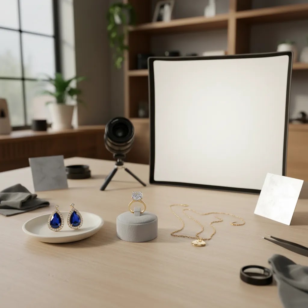
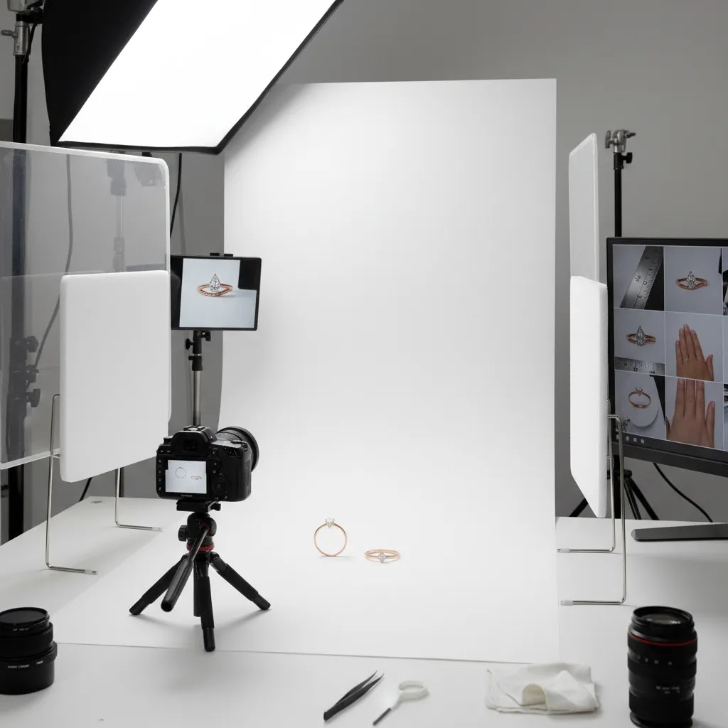
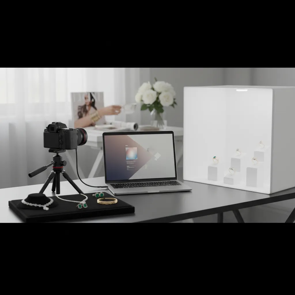
Lighting should reveal finish, not create glare. Diffused light tends to work best because polished metal can produce harsh hotspots very quickly. Most store owners get stronger results with a light tent or a small controlled setup than with direct bare lighting. This is one reason many merchants eventually move from a casual table setup to a dedicated product photography studio workflow once catalog volume increases.
Background choice affects both compliance and perception. White background images are often essential for product pages, collection grids, marketplace listings, and paid shopping feeds. They make comparisons easier and help customers focus on the piece itself. For this use case, the AcquireConvert category on White Background Photography is relevant if you are refining your catalog standard.
Multiple angles reduce return risk. Front, side, clasp, back, and close-up stone shots help set accurate expectations. Rings need profile views to show setting height. Earrings usually need front and hanging views. Necklaces benefit from clasp detail and length reference. Customers rarely complain that they saw too many useful images, but they often hesitate when they only see one polished hero shot.
Scale reference matters. One of the most common jewelry buying frustrations is size mismatch. Include a model image, hand shot, neck shot, or a measurement graphic. If you use composites or lifestyle placements, keep them realistic. A restrained mockup generator can help for merchandising concepts, but it should not replace accurate core catalog photography.
Selective AI editing can help, but only within limits. For example, tools such as Free White Background Generator, AI Background Generator, and Increase Image Resolution may help merchants clean up catalog images, create alternate scenes, or improve presentation when original files are weak. ProductAI also offers editing options like Background Swap Editor and Place in Hands. Those can be useful for testing creative concepts or supporting lifestyle merchandising. Still, AI jewelry product photography works best as an assistive layer, not as a substitute for truthful capture of color, scale, and craftsmanship.
For broader category guidance, the AcquireConvert E Commerce Product Photography section is worth exploring if you are building a repeatable workflow across product lines.
Jewelry Style Photos: How to Shoot Lifestyle and On-Model Images That Still Feel Trustworthy
Styled images can lift a jewelry product page because they answer a different question: “Can I picture myself wearing this?” The risk is that style photos can also reduce trust if they hide the product or distort color. The way this works in practice is simple. Your white background and macro shots prove accuracy, then your style photos help the shopper imagine fit and vibe.
A practical styled shot framework for jewelry usually includes three images:
What many store owners overlook is how quickly a style image can feel untrustworthy. Common failure points are usually predictable:
From a practical standpoint, you do not need a huge studio to get reliable style shots. Window light can work well if it is indirect and consistent. Place the model near a window with a sheer curtain, then use a white foam board opposite the window to bounce light back and soften shadows. If you need repeatability across days, a small diffused light kit or light tent setup can be easier to control, especially for reflective metal.
Background choices matter more than most people think. Neutral backgrounds and simple styling often convert better for independent Shopify stores because the product stays readable in thumbnail view. If you want to add mood, keep it subtle and consistent. One strong rule is to keep your product gallery rhythm predictable: lead with your clean catalog images, then place 1 to 3 style images later in the carousel so shoppers can first confirm what the piece actually is.
Consistency tips that help on Shopify product galleries are not complicated, but they are worth documenting: use the same crop ratio, keep your hero image style consistent across SKUs in a collection, and keep white balance stable so gold does not swing from yellow to green between products. These are small details, but they tend to compound into a more trustworthy storefront.
Pros and Cons
Strengths
Considerations
Who This Approach Is For
This approach fits Shopify jewelry brands, handmade sellers, DTC accessory stores, and multi-channel merchants who need product pictures that look credible on product pages, social ads, and marketplaces. It is especially useful if you are selling higher-consideration items where material quality, setting detail, and finish influence conversion. If your store is still using inconsistent phone shots, heavily filtered lifestyle images, or supplier photos that do not match your brand, tightening your jewelry photography process is usually a worthwhile next step. It is also a good fit for merchants exploring AI product pictures but who want to use them carefully, without misrepresenting the product.
What’s Trending in Jewelry Right Now (and How That Should Influence Your Pictures)
Trends matter in jewelry because they change how customers shop. When a style is popular, shoppers compare pieces based on how they stack, layer, and sit on the body. That means your shot list may need to shift slightly, even if your core catalog standard stays the same.
Some of the trend-driven categories that often affect photography needs include stacking rings, layered necklaces, chunky chains, and mixed metals. You do not need to rebuild your whole gallery for trends. Consider this: keep your core white background set stable, then add 1 to 2 trend-supporting images that help shoppers visualize the look that brought them to your product in the first place.
Here are specific images that trends often require, and why they help conversion:
The reality is that chasing trends can also hurt you if it breaks catalog consistency. If one product has ten styled images and the next has only one white background shot, your collection pages look uneven and your brand can feel less reliable. A better approach for most Shopify store owners is to standardize your essentials, then layer in trend-specific images only where they genuinely answer a buyer question.
AcquireConvert Recommendation
At AcquireConvert, the focus is practical ecommerce execution rather than photography theory for its own sake. That matters if you are trying to improve product page trust, support paid traffic, or raise the quality of your Shopify storefront without building a full studio team. Giles Thomas’s experience as a Shopify Partner and Google Expert shapes that approach, especially where images affect shopping feeds, landing page performance, and buyer confidence.
If you are evaluating whether to improve your own process, outsource parts of it, or use AI to speed up production, start with the site’s photography resources and compare them against your current catalog standards. That will help you identify whether your biggest issue is lighting, consistency, white background execution, or lack of detail shots. The goal is not more images for the sake of it. It is better product representation that helps the right customers feel comfortable buying.
How to Choose the Right Jewelry Photo Workflow
If you are deciding how to improve jewelry pictures, focus on the workflow rather than any single tool. Most stores do better when they fix capture quality first, then editing, then presentation.
1. Start with your sales context
If you sell mostly through your own Shopify store, you have more freedom to combine white background images with close-ups, styled shots, and educational graphics. If you also sell through marketplaces, consistency and compliance become more important. That may push you toward a stricter image standard.
2. Match the setup to catalog size
A small handcrafted collection may justify slower, more careful photography per piece. A fast-growing catalog needs repeatability. In that case, fixed camera positions, lighting presets, shot lists, and background standards matter more than creative variety. This is where a documented process can save time and help delegation.
3. Decide where AI fits
AI can be useful for background cleanup, resolution improvement, and merchandising experiments. ProductAI’s Magic Photo Editor and Creator Studio may help stores produce alternate versions more efficiently. Still, use AI carefully for jewelry. If your brand sells fine or custom pieces, preserving accurate color, setting detail, and material appearance should come before speed.
4. Build around shopper questions
Every SKU should answer the basics: what it looks like, how big it is, how it closes or sits, and what details make it special. That usually means a hero image, at least one close-up, one angle change, and one scale reference. Premium pieces may need extra detail shots or short-form video support.
5. Review performance after publishing
Do not judge photo quality only by whether the images look nice internally. Watch behavior on product pages. If visitors bounce quickly, zoom less than expected, or abandon after viewing imagery, your visuals may not be answering the right questions. In many cases, stronger pictures help the rest of your merchandising work do its job.
Frequently Asked Questions
What kind of background works best for jewelry pictures?
White backgrounds are usually the safest choice for core ecommerce catalog images because they keep attention on the product and work well across collections, feeds, and marketplaces. Styled backgrounds can still help for campaigns or social content, but they should support, not replace, accurate product shots.
How many pictures should a jewelry product page include?
Most stores benefit from at least four to six useful images per SKU. A practical set includes a hero shot, one or two close-ups, another angle, a scale reference, and a lifestyle or on-model image where relevant. More can help if each image answers a different buying question.
Can I use AI jewelry product photography for my store?
You can use AI as a supporting tool for cleanup, background changes, or visual variations. It may be helpful for testing concepts or improving lower-quality originals. Still, you should review every output carefully so metal tone, gemstone color, texture, and scale stay truthful to the actual product.
Do jewelry pictures need macro photography?
In many cases, yes. Macro or close-up photography helps shoppers inspect craftsmanship and justifies price more effectively than wide shots alone. You do not need every image to be extreme close-up, but at least one detail-focused image is usually worthwhile for rings, stones, engravings, and textured finishes.
What is the biggest mistake ecommerce stores make with jewelry images?
The most common issue is making images look polished but not informative. Strong jewelry photography should not hide behind mood or heavy editing. If customers cannot judge scale, finish, or important details, the gallery may look premium while still failing to support buying confidence.
Should I hire a jewelry product photography service?
That depends on your catalog size, margins, and internal skills. If you sell premium pieces, need consistent output, or struggle with reflections and detail capture, outside help may be worth considering. Smaller stores can often start in-house, then outsource once volume or quality requirements increase.
Are lifestyle shots necessary for jewelry ecommerce?
Lifestyle shots are not always mandatory, but they are often useful. They help customers understand scale, fit, and styling in a way flat catalog images cannot. The key is balance. You still need accurate standalone product pictures as the foundation of the product page.
How do I make jewelry pictures look professional without overspending?
Focus on fundamentals first: controlled lighting, stable camera positioning, a clean background, consistent editing, and a repeatable shot list. Many stores improve results significantly before buying advanced gear. Better process tends to matter more than expensive equipment, especially early on.
Do white background images hurt luxury positioning?
No, not if they are done well. White background images can actually strengthen trust because they present the product clearly and honestly. Luxury positioning usually comes from the overall presentation, including sharp detail, thoughtful composition, branding, and supporting lifestyle imagery, rather than background color alone.
What jewelry is trending right now?
Trends change often, but common patterns include stacking rings, layered necklaces, chunky chains, mixed metals, and finishes that look more tactile like hammered or brushed textures. For your pictures, the practical takeaway is to show how a piece stacks or layers, and to add the specific detail shots trend shoppers compare, like ring profile height or clasp and extender images for necklaces.
What is the 2 1 1 rule for jewelry?
The “2 1 1” rule is often used as a simple styling idea: two of one type of piece, one of another, and one statement element, so the look feels balanced instead of random. If you want to apply it to your product pictures, it can work well for showing layered necklaces or ear stacks, as long as your main item is still clearly identifiable and your product page also includes clean standalone shots for accuracy.
How do you make jewelry style photos?
Start with a repeatable structure: one hero lifestyle image, one on-model scale image, and one context image that shows how it’s worn. Keep lighting soft and consistent so metal tone stays accurate, keep props minimal, and avoid filters that change gemstone color. Style photos should support the catalog images, not replace them.
What are the 5 C’s of jewelry?
The “5 C’s” are a buyer-friendly way to think about quality signals: craftsmanship, condition, clarity, color, and credibility. In product photography, the most useful approach is to capture macro proof of craftsmanship, honest surface finish for condition, controlled-light stone images for clarity and color, and credibility cues like hallmarks or packaging where relevant.
Key Takeaways
Conclusion
Good jewelry pictures are not only about making a product look beautiful. They are about helping a customer trust what they are buying. For ecommerce stores, that means combining clarity, consistency, and realism with enough detail to show craftsmanship properly. If you improve only one thing, start by making your product pages more informative through better angles, close-ups, and scale references. From there, refine lighting, editing, and selective AI support. If you want more practical guidance, explore AcquireConvert’s photography resources for store owners and learn from Giles Thomas’s practitioner-led perspective as a Shopify Partner and Google Expert. That kind of grounded approach is often what turns better imagery into better buying confidence.
This article is editorial content created for educational purposes and is not a paid endorsement unless explicitly stated otherwise. Pricing and product availability for third-party tools are subject to change, so verify current details directly with the provider. Any performance outcomes discussed are not guaranteed and will vary by product, niche, traffic quality, and execution.

Hi, I'm Giles Thomas.
Founder of AcquireConvert, the place where ecommerce entrepreneurs & marketers go to learn growth. I'm also the founder of Shopify agency Whole Design Studios.