Product Imagery Best Practices for 2026
Good product imagery does more than make your store look polished. It helps shoppers understand what they are buying, reduces uncertainty, and can support better conversion rates when paired with strong product pages. If you sell on Shopify, Amazon, or your own storefront, the visual standard is higher than it used to be. Shoppers expect clean backgrounds, consistent framing, lifestyle context, and zoom-ready detail shots. The challenge is choosing an approach that fits your catalog, team size, and margin structure. Some stores need an in-house workflow. Others need AI-assisted editing or outside help. If you are comparing your setup, start by reviewing related ecommerce tools and then use the practices below to build visuals that are useful, consistent, and realistic to maintain.
Contents
Why Product Imagery Matters
Product imagery sits at the center of ecommerce decision-making. Your visitor cannot touch the material, test the fit, or inspect the finish in person, so your images do a large part of the selling work. That is especially true for mobile shoppers, where one unclear image can create enough doubt to lose the click.
For most store owners, the goal is not simply “better-looking photos.” It is imagery that answers buying questions fast. Can the customer judge scale? Can they see texture? Can they tell what is included? Can they picture the product in real use?
Strong visuals usually include a mix of white-background catalog shots, close-up detail images, and contextual lifestyle frames. If you sell on marketplaces, image requirements may be stricter, which is why separate workflows for amazon product photography often make sense. If you are still shaping your broader visual process, AcquireConvert’s ecommerce photography resources can help you map out a system that fits your product type and sales channels.
The biggest mistake many merchants make is treating imagery as a one-time branding task. In practice, it is an operating system. New launches, seasonal updates, ad creatives, merchandising tests, and listing refreshes all depend on having assets that are consistent and usable.
Product Imagery Types That Actually Move the Buying Decision
Most Shopify stores struggle with product imagery because they do not have a clear “image taxonomy.” They have some nice photos, but they are missing a repeatable set that answers the same buyer questions on every product page.
From a practical standpoint, these are the core image types worth building into your shot list.
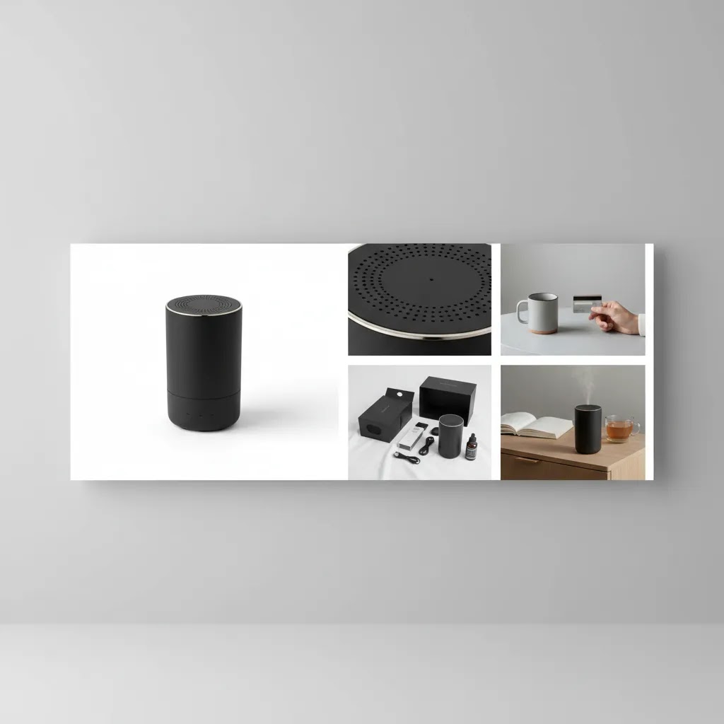
Hero image (packshot)
This is the first image shoppers see on collection pages, in search results, and on your product page. Keep it simple and instantly readable. For many categories, that means a clean background, clear silhouette, and consistent crop across the collection.
Alternate angles
Think of this as “no surprises” coverage. Show the front, back, side, and any key angles that change how the product is understood. For products with components, include an angle that clearly shows what is included.
Detail or macro shots
These are your trust builders. Stitching, fabric texture, grain, seams, zippers, connectors, buttons, finish quality, ingredient texture, labels, and anything else a shopper would inspect in person belongs here.
Scale reference
What many store owners overlook is how often returns are really “scale confusion.” Use on-body shots, in-hand shots, or a simple scale prop. The goal is quick comprehension, not a fancy scene.
Lifestyle and in-use images
Lifestyle images help shoppers picture the product in their own life. This is where you show context and use case. For some brands, lifestyle sells the feeling. For others, it sells the function. Either way, it should still be honest about size, color, and how the product actually looks in real conditions.
Infographic or feature callouts
These work best as secondary gallery images, not the hero. Use simple callouts to highlight dimensions, included accessories, materials, or key features. Keep the text minimal and make sure it stays readable on mobile.
Optional motion: short video, 360, or 3D
Motion can help when a product is hard to understand from still images alone, for example reflective items, products with moving parts, or anything where fit and drape matters. The reality is that 360 and 3D tend to add cost and ongoing maintenance. You have more files to manage, more ways for something to break on mobile, and more updates when packaging or product details change. For many Shopify stores, standard stills plus one short in-use clip often covers most of the same clarity benefits without turning your catalog into a production project.
Consider this: if you are going to invest in advanced formats, test them on a small group of top sellers first. If you cannot maintain them consistently across a collection, they often end up looking like a one-off experiment rather than a dependable system.
Example image sets you can model
If you want a simple way to plan your own shot list, start with a category-based “minimum viable image set.” Here are a few practical examples.
Apparel (tops, dresses, outerwear): hero on-model or mannequin, back view, close-up fabric texture, detail of key feature (zipper, hem, pocket), fit or drape angle, scale reference (full-body), lifestyle frame in context.
Beauty (skincare, cosmetics): hero packshot, alternate angle showing label clearly, macro of texture or applicator, “what’s included” shot for sets, in-hand scale, lifestyle vanity shot, infographic with key claims or usage steps (kept compliant with your ad platform and category rules).
Home goods (decor, kitchen, storage): hero packshot, angled view, close-up material and finish, scale reference in a real room or on a counter, lifestyle room scene, dimensions or capacity graphic, “in use” frame that shows function.
Electronics and accessories: hero packshot, ports and connectors detail, included accessories laid out, in-hand scale, device in-use shot, close-up of buttons or controls, dimension graphic if sizing is a common support issue.
Best Practices That Actually Help Store Owners
The most effective product imagery practices are the ones your team can repeat every week, not just during a polished campaign shoot. Here are the standards worth building into your workflow.
1. Keep image sets consistent across the catalog
Use the same framing logic, image order, aspect ratio, and lighting style across similar products. That consistency makes your collection pages look more trustworthy and helps shoppers compare options quickly.
2. Lead with the clearest “buying” image
Your first image should show the product clearly, without visual clutter. For many categories, that means a plain background hero shot. Save moodier or more stylized images for later in the gallery.
3. Include detail shots that remove doubt
Zoomed-in views of materials, stitching, closures, ports, labels, or finish quality can reduce friction. If you frequently answer the same pre-purchase questions in support tickets, you probably need more specific product imagery.
4. Show scale and real-world context
One of the easiest ways to improve visual clarity is to show the product in use. A hand-held shot, on-body shot, shelf placement, or room scene can make proportions instantly clearer. This is where lifestyle and catalog images should work together, not compete.
5. Optimize for every channel, not just your storefront
The images that work on your Shopify PDP may need edits for Google Shopping, marketplaces, or paid social. File size, background standards, crop ratios, and text overlays often vary by platform.
6. Edit for clarity, not for deception
Retouching should improve consistency and focus, but it should not misrepresent color, size, texture, or included accessories. That is important for trust, returns prevention, and brand credibility.
7. Build a shot list before shooting
A repeatable shot list saves time and cuts reshoots. For many stores, a practical minimum includes: hero image, 2-3 angles, 2 detail shots, one scale image, and one lifestyle image. More complex products may need demonstration frames or annotated supporting graphics.
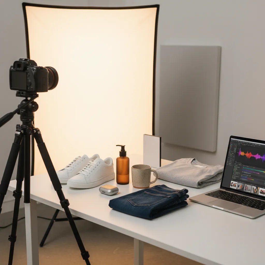
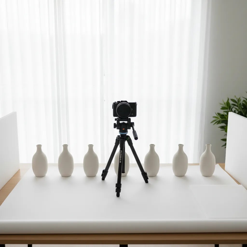
Practical Photography Basics: Lighting, Consistency, and the 20/60/20 Rule
Here’s the thing: most product imagery problems are not camera problems. They are lighting and consistency problems. You can shoot with a modern phone and still get store-ready results if you control a few basics.
A simple lighting baseline that works for most products
Your goal is clarity, not artistry. Start with one main light source and make it soft. Soft light reduces harsh shadows and makes surfaces look more accurate.
Use diffusion whenever you can, for example a softbox, a light tent, or even a white curtain between the light and the product. Keep the light direction consistent across the catalog so your collection pages do not look like a patchwork of different shoots.
For reflective products, what you are really photographing is reflections. The fix is usually bigger, softer light and controlling what the product “sees” around it. A light tent or larger diffused source often does more than hours of editing.
Color consistency is another common failure point. Avoid mixing light sources, for example daylight from a window plus warm room lights. Pick one type of light and stick to it. This makes it much easier to keep product color believable from image to image.
The 20/60/20 rule for product photography (when time is tight)
If you are shooting at home or with a small team, a helpful way to prioritize is the 20/60/20 rule:
Think of it this way: editing can polish an image, but it rarely fixes an unclear one. If you spend most of your effort on setup and styling, you end up with images that need less work and look more consistent across the catalog.
Common failure modes and quick fixes
Harsh shadows: move the light farther away, add diffusion, or bounce light back with a white foam board opposite the light.
Mixed white balance: turn off other lights and commit to one source, then keep that setup unchanged for the full shoot so images match.
Reflective packaging and shiny products: use a light tent, increase diffusion, and simplify what is around the product. In many cases, a clean “white environment” is easier than trying to remove complex reflections later.
Texture loss from over-smoothing: be careful with aggressive noise reduction or skin-smoothing style tools. On product pages, texture is part of trust. If your fabric, wood grain, or matte finish looks plastic, shoppers notice.
AI Tools and Editing Workflow Options
AI image tools can help store owners move faster, especially when the bottleneck is editing rather than shooting. They are most useful for cleanup, background work, and generating variations from already-decent source images. They are less useful when the original image is poorly lit, badly framed, or inaccurate in color.
If you need to clean up images before upload, category-specific resources like Background Removal & Editing are a good place to compare options. From the current product data available, several tools are relevant for ecommerce image workflows:
These tools can support a lean in-house process, especially for brands trying to create more product imagery without full studio overhead. But use them with discipline. AI edits should support product understanding, not create unrealistic expectations. If you need assets for landing pages, social previews, or merchandising tests rather than only final listing images, a dedicated mockup generator may also be worth evaluating.
For stores with larger catalogs, the best setup is often hybrid: shoot consistently, then use AI tools for white background versions, cleanup, resizing, and scenario testing. If your in-house process is breaking down because the setup itself is poor, it may be smarter to first fix your physical product photography studio workflow before adding more software.
File Specs and Shopify Implementation Details (Size, Format, Speed, and Zoom)
What many store owners overlook is that product imagery is not just a creative task. It is also a UX task. If images load slowly, crop awkwardly on mobile, or look soft when shoppers pinch and zoom, you can lose the value of a good shoot.
Use formats and compression that support speed without destroying detail
For most product photos, JPEG is still a practical default because it balances quality and file size well. Use PNG when you truly need transparency or when JPEG artifacts damage the image. WebP can be a strong option for performance in many modern setups, but the right choice can vary depending on your theme, apps, and how your images are being served.
The way this works in practice is simple: export images at a sensible size for your theme, compress them so they load fast, then check the result on a real phone. You are looking for a clean first impression plus enough detail for zoom, not huge files that slow down every PDP view.
Consistency in aspect ratio prevents collection page “jumping”
On Shopify, inconsistent image aspect ratios are one of the fastest ways to make a store feel unpolished. If one product is tall, the next is wide, and the next is tightly cropped, your collection grids can look messy and your page layout can jump as images load.
Choose a standard aspect ratio for a collection, then crop your hero images to match it. Keep that same logic for key gallery images so shoppers get a consistent browsing experience.
Variant imagery and file organization matter more as your catalog grows
If you sell variants, especially color variants, keep your image sets organized so the right images show for the right selection. A common problem is mixing colorways in the same gallery with no clear order, which creates confusion and can lead to returns.
Even if you are a small team, simple naming rules and folder structure can prevent expensive reshoots later. The more SKUs you have, the more you need your imagery workflow to behave like operations, not a one-off creative task.
Alt text: treat it as accessibility first, SEO second
Alt text helps screen readers and improves accessibility. Keep it descriptive and specific, for example product name plus a useful qualifier like color or view angle. Avoid keyword stuffing. The goal is clarity for humans, and that typically aligns with what search engines reward anyway.
A quick QA checklist before you publish
Before you push new images live, run a fast checklist:
Pros and Cons
Strengths
Considerations
Who These Practices Are For
These product imagery practices are especially useful for Shopify merchants, marketplace sellers, and growing direct-to-consumer brands that need visuals to do more selling work. They fit stores that are beyond the very first setup stage and now need consistency across collections, ads, email campaigns, and product launches.
They are also relevant if you are currently deciding between shooting at home, hiring local help, or using AI to extend a small content team. If your catalog changes often, these practices matter even more because inefficient image production compounds quickly as your SKUs grow.

How to Choose the Right Imagery Workflow
There is no single best workflow for every ecommerce business. The right choice depends on your catalog complexity, brand positioning, and how often you need new assets.
1. Start with your product type
Small reflective items, apparel, cosmetics, furniture, and food all create different photography demands. A clean white-background setup may be enough for simple accessories. Apparel usually needs model, flat-lay, or mannequin variation. Larger products may need more space and environmental context.
2. Decide what must be shot versus what can be edited
Good source images are still the foundation. Use AI to speed up repetitive post-production, create alternate backgrounds, or test merchandising concepts. Do not rely on software to fix fundamental product clarity issues. If your product needs tactile credibility, such as stitching, finish, or ingredient texture, capture that in-camera first.
3. Match the workflow to your team capacity
A solo founder can maintain a simple repeatable setup with a light box, smartphone or camera, and standardized editing steps. A brand with weekly launches may need a production calendar, folder naming rules, shot templates, and approval checkpoints. If your team is already stretched, a partially outsourced workflow may be more realistic than building everything internally.
4. Consider where the images will be used
Your PDP gallery, collection thumbnails, Meta ads, Google Shopping images, and email banners all have different requirements. Before choosing a service or tool, list your output formats. This avoids ending up with beautiful assets that are awkward for day-to-day merchandising.
5. Measure the right outcomes
Do not judge product imagery only by whether it “looks premium.” Look at practical signals: click-through from collection pages, add-to-cart rate on PDPs, product return reasons, time to publish new products, and how often your team needs reshoots. In many cases, the better system is the one that is slightly less artistic but much more scalable.
If you are still comparing approaches, browse the broader E Commerce Product Photography category to see which workflows, tools, and service models best match your stage of growth.
AcquireConvert Recommendation
For most ecommerce brands, the best move is to build a visual content system before investing heavily in more assets. That means standardizing your shot list, deciding which images belong on every product page, and choosing where AI editing can save time without compromising trust. Giles Thomas’s perspective as a Shopify Partner and Google Expert is useful here because product imagery does not just affect onsite conversion. It also influences feed quality, ad creative usability, and how consistent your brand appears across channels.
AcquireConvert is a strong specialist resource if you want practical guidance instead of vague design advice. You can explore related photography categories, compare workflows, and see how other store owners approach image production for both marketplaces and direct-to-consumer stores. If your next decision is whether to improve your setup, outsource selectively, or use AI tools to fill the gaps, AcquireConvert gives you a grounded place to evaluate the trade-offs.
Frequently Asked Questions
What is product imagery in ecommerce?
Product imagery includes the full visual set used to sell an item online. That usually means hero images, alternate angles, close-ups, scale shots, lifestyle photos, and sometimes graphics or short motion assets. The goal is to help shoppers understand the product clearly enough to buy without handling it in person.
How many product images should a product page have?
For many ecommerce stores, 5 to 8 images is a practical range. That often includes one main image, several angle shots, one or two detail images, and at least one contextual or scale image. The ideal number depends on category complexity, but every image should answer a real buyer question.
Can I create professional product imagery at home?
Yes, many stores can produce strong imagery at home if they control lighting, use a stable setup, and follow a repeatable shot list. Small products are usually the easiest to manage this way. The key is consistency, color accuracy, and thoughtful editing, not expensive gear alone.
Are AI tools good for ecommerce product photography?
AI tools can be useful for editing, background changes, cleanup, and creating variations from solid base images. They are less reliable as a complete replacement for careful photography, especially when material accuracy matters. Used well, they can speed up production and help smaller teams publish assets faster.
Should I use white backgrounds or lifestyle images?
Most stores benefit from both. White backgrounds are strong for clarity, catalog consistency, and marketplace compliance. Lifestyle images help communicate scale, use case, and brand feeling. A balanced gallery often works better than choosing one style exclusively.
When should I hire an ecommerce product photography service?
If your catalog is growing quickly, your current images are inconsistent, or your team cannot keep up with production, outside help may make sense. This is especially true for apparel, beauty, reflective items, or products that need advanced styling and lighting control.
How does product imagery affect conversions?
Product imagery can influence trust, product understanding, and buyer confidence. Clearer visuals may support stronger click-through and add-to-cart behavior because they reduce uncertainty. That said, results vary by niche, price point, page layout, traffic quality, and the rest of your product page experience.
What should I avoid in product imagery?
Avoid inconsistent lighting, misleading edits, cluttered first images, and galleries filled with repetitive angles that add no new information. You should also avoid assets that load slowly or crop awkwardly on mobile. Good imagery should clarify, not distract.
Do different channels need different image versions?
Yes. Shopify product pages, Amazon listings, paid social placements, and Google Shopping feeds often benefit from different crops, backgrounds, or formatting rules. Planning for channel-specific outputs from the start usually saves time and reduces last-minute asset rework.
What does product image mean?
A product image is a visual representation of the item you sell, used on your product page, collection pages, ads, and listings. In ecommerce, product images are not just decoration. They help shoppers confirm what the product is, what it looks like from different angles, and whether it fits their needs.
What are the 4 types of images?
In an ecommerce product gallery, a practical set of four image types is: a hero image, alternate angle images, detail close-ups, and a lifestyle or scale image. Many stores add a fifth type, which is an infographic or dimensions graphic, when sizing and features are common buying questions.
What is the 20 60 20 rule in photography?
The 20 60 20 rule is a prioritization framework: spend about 20% of your effort on capture basics (focus and stability), 60% on setup and lighting (where most quality comes from), and 20% on editing. For product imagery, it helps small teams avoid over-relying on post-production to fix issues that are easier to solve with better lighting and consistency.
What are 5 examples of products?
Examples of products that often need different imagery approaches include: a T-shirt (fit and fabric), a face serum (label clarity and texture), a coffee maker (features and scale), a candle (finish and lifestyle context), and wireless earbuds (included accessories and ports). The best image set depends on what shoppers need to see to buy confidently.
Key Takeaways
Conclusion
Better product imagery usually comes from tighter process, not bigger promises. If your visuals are inconsistent, start with the basics: standard shot lists, stronger hero images, useful detail shots, and editing rules your team can actually follow. Then decide where AI tools, in-house production, or outside support fit into the workflow. For Shopify merchants and other ecommerce operators, that practical approach tends to be far more useful than chasing overly polished visuals that are hard to maintain. If you want more guidance, explore AcquireConvert’s photography resources and category pages for hands-on advice shaped by Giles Thomas’s experience as a Shopify Partner and Google Expert.
This article is editorial content created for educational purposes. It is not a paid endorsement unless explicitly stated otherwise. Pricing, features, and product availability for any referenced tools are subject to change, so verify current details directly with the provider. Any performance impact from product imagery changes will vary by store, traffic source, product type, and implementation quality, and specific results are not guaranteed.

Hi, I'm Giles Thomas.
Founder of AcquireConvert, the place where ecommerce entrepreneurs & marketers go to learn growth. I'm also the founder of Shopify agency Whole Design Studios.