Product Photography Staging (2026 Guide)
Product photography staging is the part of the shoot that shapes how shoppers interpret your product before they read a single line of copy. For ecommerce brands, staging is not about making images look fancy. It is about building the right buying context for each product type, from skincare and apparel to electronics and home goods. The best setup depends on what you sell, where the image will appear, and how much visual explanation the customer needs. If you are still comparing workflows, props, and image production options, it also helps to understand the wider mix of ecommerce tools that support product imaging, editing, and listing performance. This guide breaks down practical staging decisions store owners can make for every major product category, with clear trade-offs, budget considerations, and next steps.
Contents
What product photography staging actually means
Product photography staging is the deliberate setup around your product before the camera clicks. That includes the background, surface, props, lighting style, spacing, composition, and any human or environmental context. It is closely related to styling, but staging is broader because it covers the full visual scene.
For ecommerce, good staging does three jobs. First, it clarifies what the product is. Second, it helps the shopper imagine ownership. Third, it supports the selling channel, whether that is your Shopify product page, a collection page, paid ads, marketplaces, or social content.
A plain white image is still essential for many catalogs and marketplaces, but not every image should be clinical. If you sell on marketplaces, staging choices may differ from your direct-to-consumer storefront. That is why merchants often separate catalog images from supporting lifestyle images and platform-specific assets, especially for amazon product photography.
If you want a broader framework for planning image types across your store, AcquireConvert’s guide to ecommerce photography is a useful companion resource.
How to stage different product types
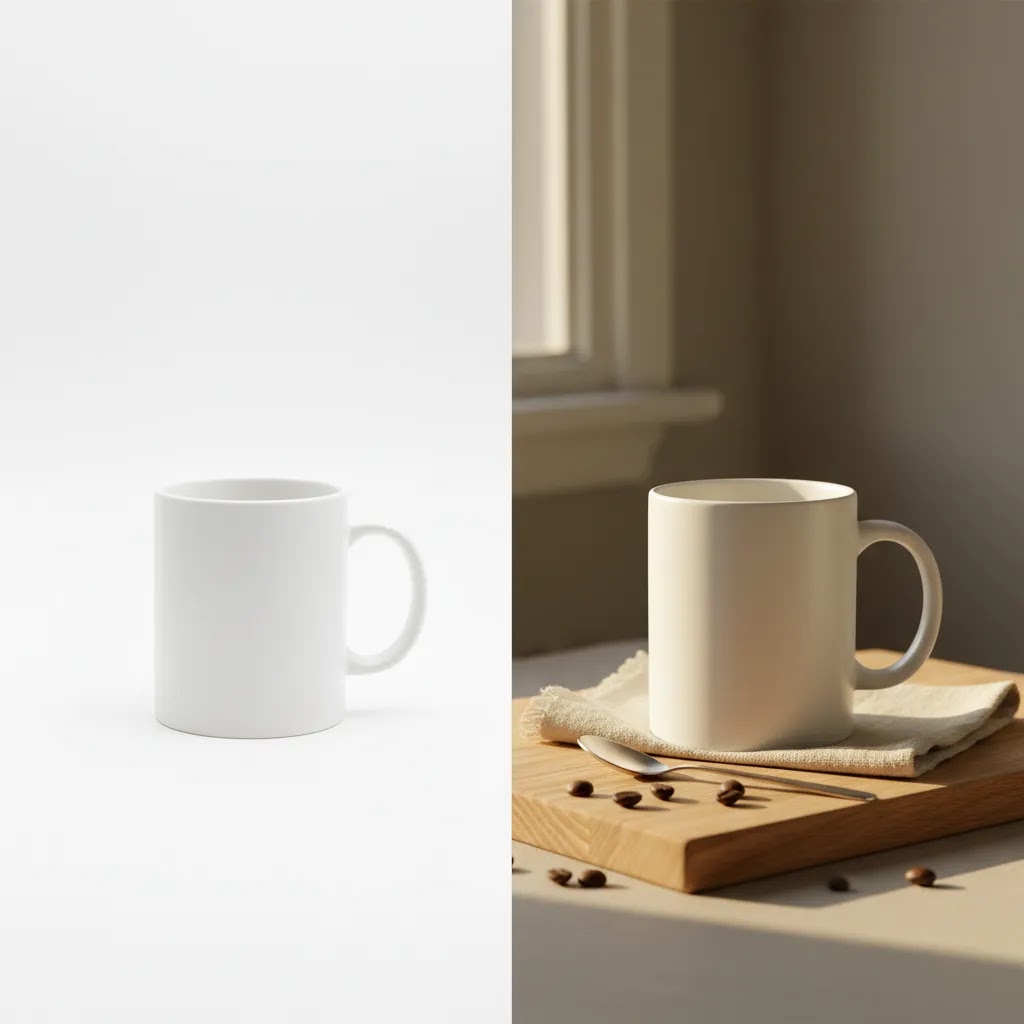
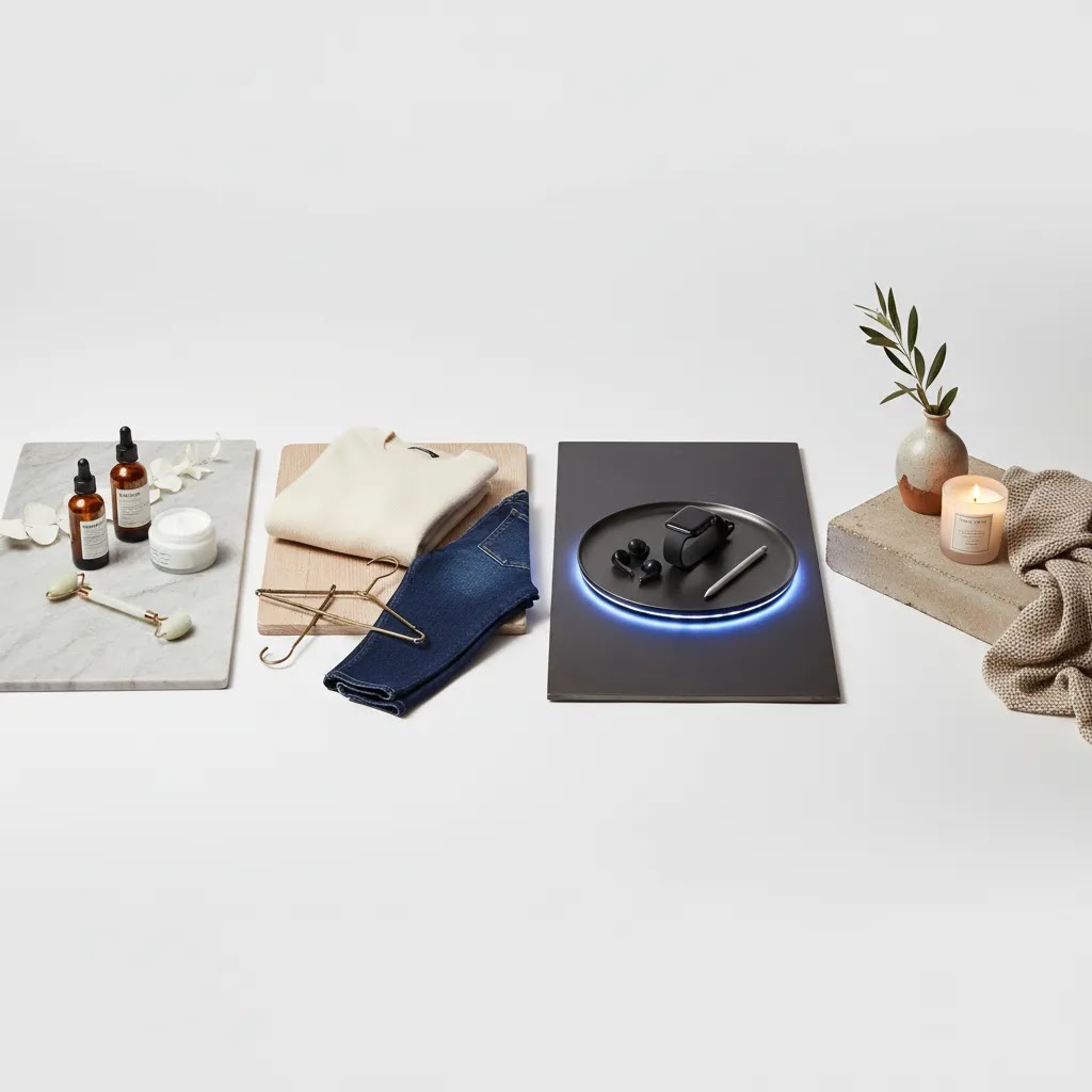
Beauty, skincare, and cosmetics usually benefit from clean, intentional staging. Use surfaces that suggest premium quality, such as stone, glass, or soft matte finishes. Props should support ingredients or use cases, not crowd the frame. A serum bottle next to sliced citrus may work if vitamin C is central to the product story. Random flowers usually do not.
Apparel and accessories need staging that solves fit and scale questions. Flat lays can work for basics, but premium fashion often needs mannequins or live model content. Product clothing photography should show drape, fabric texture, and real-world pairing. The more style-driven the purchase, the more context the shopper needs.
Tech product photography tends to work best with minimal staging. Clean lines, controlled reflections, and selective props matter more than decorative scenes. Shoppers want to understand ports, size, finish, and use environment. A laptop on a desk can work. A laptop surrounded by unrelated office clutter usually weakens the image.
Food, beverage, and consumables need appetite appeal and usage cues. Staging often includes ingredients, serving context, or packaging beside the prepared product. Keep freshness and color accuracy front and center. If the product is shelf-stable, the scene should still feel believable rather than overly styled.
Home goods and decor often sell better in-room because scale is hard to judge in isolation. A candle on a bedside table or a throw pillow on a sofa helps the customer picture ownership. For larger catalogs, many merchants combine real set photography with digitally created environments or a mockup generator for secondary assets.
Jewelry and small luxury items need very controlled staging. Small changes in light direction, surface finish, and prop size can change whether the product feels premium or amateur. Keep the scene restrained so detail stays dominant.
Corporate product photography for B2B goods, branded kits, or packaging usually calls for more structured staging. The image should feel polished and commercially credible, often with fewer playful props and stronger emphasis on function, quality, and brand consistency.
Product photography angles and composition rules that sell (not just look nice)
Staging sets the scene, but angles and composition decide whether the shopper understands the product quickly. For most Shopify product pages, your first few images have a job: answer the buyer’s biggest questions without forcing them to zoom, guess, or read paragraphs.
Angles that typically answer buyer questions fastest
There is no single best angle for every product, but a few angles tend to do the most work across ecommerce categories.
Now, when it comes to choosing what to prioritize, tie the angle to what drives the decision in that category. Apparel often needs drape and fit cues, so a flat lay alone can feel incomplete. Tech often needs ports, scale, and finish, so detail and side views matter more than decorative lifestyle scenes. Beauty often wins on brand trust and ingredient signals, so label clarity and texture shots carry more weight.
Composition rules that help ecommerce images convert
Composition is not about being artsy. It is about directing attention and making your image work on a small mobile screen.
Think of it this way: staging is what you add, composition is how you control it. If you are unsure, simplify the scene and give the product more space.
Common angle mistakes that hurt ecommerce performance (and how to fix them)
These are the issues that show up a lot in scrappy in-house shoots and can quietly drag down product page clarity.
From a practical standpoint, you can fix most of these with a simple tabletop setup: a consistent camera position, a repeatable product placement spot, and a checklist of must-have angles per product type.
Key elements that make staging work
Strong staging is usually built on a few repeatable decisions rather than creative luck. Here is what matters most.
If you shoot regularly, it can be worth developing a repeatable scene library and documented shot list. That is especially useful if you work with a freelancer, rotate products often, or plan to use a dedicated product photography studio setup in-house.
Many growth-stage brands also separate staging into three asset groups: catalog-safe images, conversion-focused product page images, and campaign creatives. That structure keeps your visual production efficient and helps prevent one image style from trying to do every job.
Product photography shot list (so you don’t miss anything)
If you want staging to translate into better product pages, you need consistency. A shot list is the simplest way to keep your shoot focused, make your edits predictable, and ensure each SKU has the same set of “answers” for the shopper.
Here is a practical shot list framework you can reuse across most ecommerce catalogs.
A practical ecommerce shot list template
What many store owners overlook is that the shot list is not only for the photographer. It is also for merchandising. When your Shopify product page has a predictable image structure, customers learn how to evaluate your products faster, and comparing variants becomes easier.
How to adapt the shot list by product type
Most catalogs need a core set of images plus category-specific shots. A few examples:
For stores with lots of variants, consistency across SKUs matters as much as the quality of any single photo. Keep the same camera height, crop, and lighting pattern across variants so shoppers can compare colorways or sizes without your images adding friction.
How to adapt the shot list by channel (Shopify, ads, marketplaces)
The same product often needs different assets depending on where it appears.
The reality is that if you plan these differences upfront, you can often capture everything in one shoot. If you do not, you end up reshooting because you are missing the one angle that answers the main objection.
A quick pre-shoot workflow to plan the shot list
You do not need a complex production doc, but you do need a plan. Before shoot day:
This kind of planning sounds basic, but it is how you avoid a product page where half the images feel like they belong to a different brand or a different product line.
Pros and Cons
Strengths
Considerations
Who should invest more in staging
Not every store needs a high-concept visual setup. If you sell replenishable basics, simple and consistent imagery may be enough. But stronger staging usually matters more for visually led categories, premium positioning, new product launches, giftable items, and products that need context to be understood.
Shopify merchants with rising acquisition costs often find that imagery becomes one of the few levers they can improve without changing the product itself. Better staged images may support higher click-through rates from ads, stronger product page engagement, and a clearer premium signal, though outcomes will vary by niche, traffic quality, and overall offer.
If your current product photography photos feel flat, generic, or inconsistent, staging is one of the first places to review.
How to choose the right staging approach
You do not need the most artistic concept. You need the setup that helps your store sell more clearly. These criteria usually matter most.
1. Start with the job of the image
Ask whether the image is meant to identify, persuade, or inspire. Identification images should be clean and compliant. Persuasion images should explain benefits and usage. Inspiration images can be more editorial. Many store owners mix these goals and end up with assets that do none of them particularly well.
2. Match staging to product complexity
Simple products need simple staging. Complicated products need more explanation. A plain ceramic mug may need only surface variation and a usage shot. A modular tech accessory may need staged setups that show components, ports, and real-world placement.
3. Consider production cost against catalog size
Product photography costs increase fast when every SKU gets a custom scene. If you have a large catalog, create a tiered system. Reserve advanced staging for hero products, best sellers, launch collections, and ad creatives. Use standardized setups for the rest. This gives you better control over cost per asset.
4. Build for consistency, not sameness
Consistency means a customer can tell all images belong to the same brand. Sameness means every product gets the exact same treatment even when it does not fit. Keep your lighting, color treatment, and prop logic consistent, but let each category have its own practical staging rules.
5. Plan for post-production and reuse
Before the shoot, decide whether you will need transparent cutouts, white backgrounds, square crops, vertical social assets, or banner-friendly negative space. Staging should make post-production easier, not harder. That is one reason experienced operators storyboard the full asset set before shooting instead of thinking one image at a time.
For stores experimenting with AI-assisted visuals, use them carefully. They can help with concepting, alternate backgrounds, and campaign variations, but they should not replace accurate product representation on core commerce pages. Giles Thomas’s work at AcquireConvert consistently takes that practical view: use visual tools where they support merchandising clarity, not where they risk confusing the buyer.
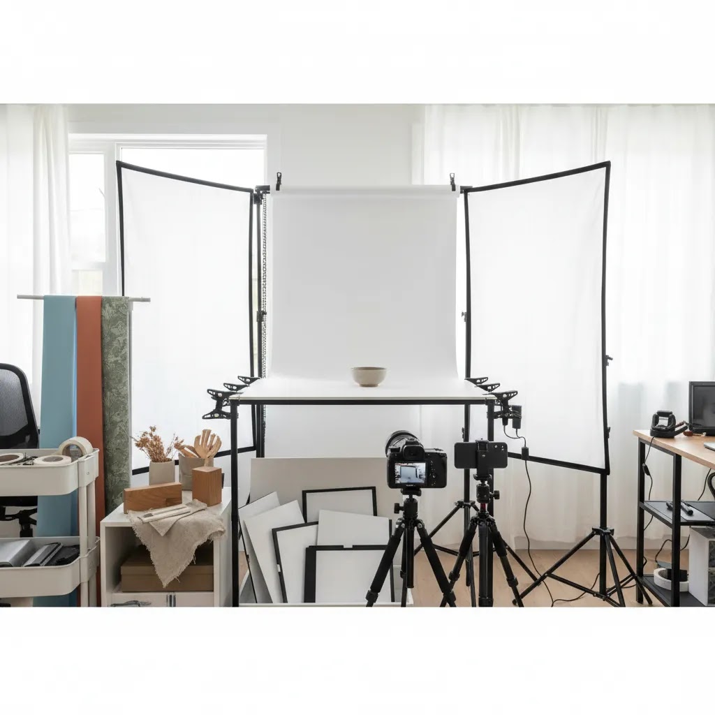
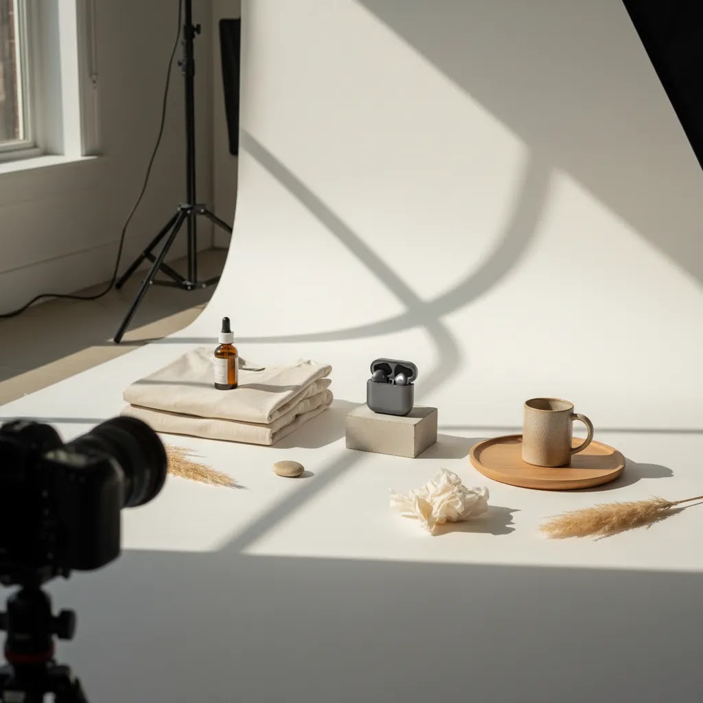
At-home product photography setup: a simple staging “kit” and repeatable mini-studio
For most Shopify store owners, “staging” really means building a small, repeatable setup you can use every time you add new SKUs. That consistency is what keeps your storefront looking credible as you grow. You do not need a full studio to get there, but you do need a few basics that remove guesswork.
A minimal staging kit that covers most product shoots
If you are building a simple at-home setup, this gear tends to give the best return because it controls light and background, which are the two things that make DIY product photos look DIY.
If you are starting with window light, focus on control rather than buying more gear. Use a diffuser to soften the light, use foam board to fill shadows, and shoot at the same time of day so color and shadow direction stay consistent.
How to set up a repeatable staging corner at home
The way this works in practice is simple: you are building a mini-studio that you can reset in minutes and replicate next week.
Consider this: if your images are consistent, your Shopify collection pages look cleaner, your product pages feel more trustworthy, and your ad creatives are faster to produce because you are not reinventing the scene every time.
When it is worth upgrading from DIY to in-house production or a studio
Upgrading is less about “pro vibes” and more about volume and consistency needs.
If you do upgrade, keep the same mindset: document your setup, keep your shot list tight, and build a system you can repeat across your catalog.
Frequently Asked Questions
What is product photography staging?
Product photography staging is the setup around the item being photographed, including background, props, lighting, surface, spacing, and scene context. Its purpose is to make the product clearer and more appealing for the intended channel. For ecommerce, staging should help the shopper understand the product faster rather than simply making the image look more creative.
How is staging different from styling?
Styling usually refers to the visual arrangement of objects, colors, and props. Staging is broader and includes the full shot environment, camera framing, lighting decisions, and the intended selling context. In practice, many teams use the terms interchangeably, but staging is the better term when you are planning a commercially useful ecommerce image set.
Do all ecommerce products need lifestyle staging?
No. Many products still need clean catalog images first, especially for marketplaces and collection pages. Lifestyle staging is most useful when context helps explain use, fit, scale, ingredients, or quality. A good workflow usually includes both clean product images and a smaller set of staged support images for conversion and advertising.
What are typical product photography costs for staged shoots?
Costs vary widely based on product size, shoot complexity, prop sourcing, set building, retouching, and whether models are involved. A simple tabletop setup costs far less than a multi-scene fashion or home lifestyle shoot. For most merchants, the better question is which products deserve the highest production investment based on margin, volume, and campaign importance.
What works best for product clothing photography?
Clothing usually needs a mix of flat lays, ghost mannequin shots, close detail images, and model photography. The right mix depends on your price point and brand style. If fit and movement are central to the purchase decision, live model or editorial-style staging often adds more value than static folded shots alone.
How should I stage tech product photography?
Keep it clean and functional. Tech buyers usually care about scale, finish, usability, and compatibility. Use minimal props, controlled reflections, and practical environments such as desks or workspaces where relevant. Avoid over-decorating the scene because it can distract from ports, materials, and design details that matter in the buying decision.
Can AI tools help with product staging?
They can help with concept generation, background variations, mockups, and campaign creative testing. They are less suitable for replacing accurate core product imagery where color, dimensions, and product truth matter. For ecommerce, AI-assisted images work best as supplementary assets rather than substitutes for the primary product page image set.
Should I use a freelance photographer or build an in-house setup?
That depends on your product volume and quality needs. Freelancers can be a strong fit for occasional launches or specialized categories like jewelry, cosmetics, or product model photography. In-house setups often make more sense when you have frequent SKU updates, repeatable lighting needs, and enough volume to justify equipment and workflow documentation.
What mistakes hurt product staging most?
The most common issues are cluttered props, mismatched surfaces, poor light control, and scenes that overpower the product. Another common mistake is using one visual style for every category without considering what the customer needs to see. Strong staging is less about creativity and more about useful, repeatable merchandising choices.
What background is best for staging product photos?
For most ecommerce catalogs, a clean white background is the safest default because it reads well in thumbnails, looks consistent across a collection page, and can be more marketplace-friendly. For staged images on a Shopify product page, textured backgrounds like wood, stone, paper, or fabric can work well if they match your brand and do not compete with the product. The key is control: avoid backgrounds with busy patterns, strong color casts, or wrinkles that make the image feel less credible.
How do you stage product photos at home (without a studio)?
Start by choosing one consistent spot, ideally near a window, and control the light with diffusion and simple reflectors like foam board. Use a background sweep instead of a sheet, keep your product placement and camera position consistent, and build a small shot list you repeat for every SKU. If your images look different week to week, it is usually because the light direction, camera distance, or background changes between shoots.
What is a product photography shot list, and what should it include?
A product photography shot list is a checklist of images you plan to capture for each product so you do not miss key angles and details. It typically includes a clean hero image, alternate angles, close-ups, scale cues, an in-use or lifestyle shot, and packaging or “what’s included” images where relevant. For Shopify stores, a shot list also helps keep your product grids consistent across variants and new launches.
What are the best product photography angles for ecommerce listings?
The best angles are the ones that answer buying questions quickly. A front 3/4 angle is a common hero because it shows depth, while straight-on front shots help when labels or branding are important. Side profiles help with thickness and shape, top-down angles work well for flat lays and kits, and macro close-ups prove quality and details. Your category decides what matters most, so choose angles based on what shoppers need to see to feel confident.
Key Takeaways
Conclusion
Product photography staging works best when it is tied to merchandising, not decoration. A skincare bottle, hoodie, phone stand, or home fragrance product each needs a different visual context to sell well online. The right setup helps customers understand value faster and gives your brand a more credible, consistent presence across storefront, ads, and marketplaces. If you are refining your image workflow, AcquireConvert is a strong place to continue your research. Giles Thomas brings a practical operator’s perspective as a Shopify Partner and Google Expert, with guidance built for real ecommerce teams. You can explore the broader E Commerce Product Photography category or review the fundamentals in Product Photography Fundamentals to plan your next shoot more confidently.
This article is editorial content intended for educational purposes and is not a paid endorsement unless explicitly stated otherwise. Pricing, services, and tool availability are subject to change. Any performance outcomes discussed are not guaranteed and will vary based on your product, market, creative execution, and ecommerce setup.

Hi, I'm Giles Thomas.
Founder of AcquireConvert, the place where ecommerce entrepreneurs & marketers go to learn growth. I'm also the founder of Shopify agency Whole Design Studios.