Watch Product Photography Tips for Stores (2026)
Watch product photography is one of the harder ecommerce image categories to get right. You are dealing with polished metal, reflective crystals, tiny markings, dark straps, and buyer expectations that are often much higher than for everyday accessories. If your store sells watches, poor images can make even a well-made product look flat, scratched, or low value. Strong images do the opposite. They help shoppers assess finish, scale, strap material, dial detail, and overall quality before they commit. This guide walks through how to plan, shoot, and edit watch images for ecommerce, with practical steps you can use in-house or hand to a freelancer. If you are mapping out your broader visual workflow, it also helps to review other ecommerce tools that support a smoother content production process.
Contents
Why Watch Photography Matters for Ecommerce
A watch is a precision product, and your photos need to communicate that. Shoppers want to inspect the dial, bezel, crown, bracelet links, clasp, stitching, texture, and thickness. They also want reassurance that the finish looks as premium in real life as it does in your listing.
That creates a specific ecommerce challenge. Watches are small, reflective, and detail-heavy. A basic overhead setup that works for mugs or skincare products usually is not enough here. You need more control over reflections, more attention to angles, and more careful retouching.
For most stores, the best watch product photography set includes a clean white-background hero image, several close-ups, side-profile shots, and at least one lifestyle or context image. That mix supports conversion across your product page, collection pages, social ads, and marketplaces. If you also sell on marketplaces, the image standards overlap with many amazon product photography requirements, especially around clean backgrounds and accurate visual representation.
Whether you shoot luxury watches, fashion watches, or smart wearables, the same principle applies: accuracy first, style second. Creative watch photography can strengthen brand perception, but only after your essential product photos clearly answer shopper questions.
How to Shoot Watch Images That Sell
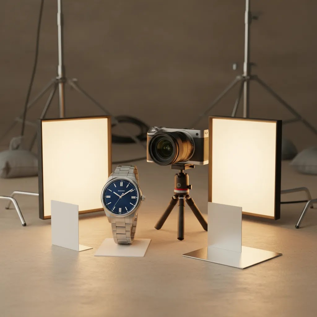
The most important part of photography of watch products is controlling reflection. A watch face can mirror your room, your camera, and even your own hands if the setup is not managed carefully. That is why soft, diffused light matters more here than raw brightness.
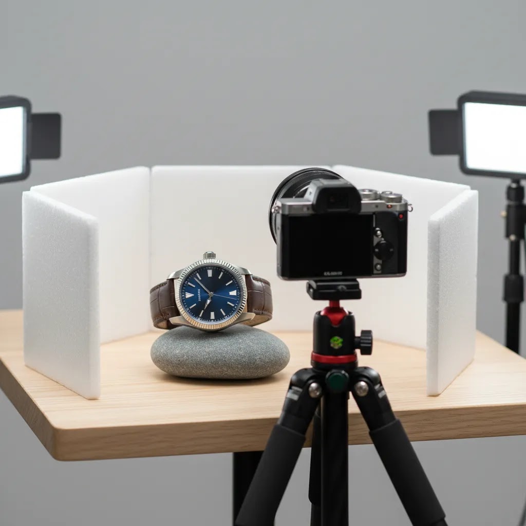
Start with a stable surface, a tripod, and a clean product. Use gloves or a microfiber cloth before every frame. Dust and fingerprints that look minor to the eye can become painfully obvious in close-up images.
For lighting, a light tent or diffusion panels usually help. They soften the metal reflections and reduce harsh hotspots on the crystal. Position lights from the sides or slightly above rather than blasting the watch head-on. Small angle changes can completely change how the dial reads.
For a standard ecommerce set, shoot these frames:
If you want more creative watch product photography, add shadow-led compositions, premium props, or textured backgrounds. Just keep those images secondary to your core catalog photos. Shoppers still need the standard product views first. For a wider framework on visual merchandising, see AcquireConvert’s guide to ecommerce photography.
Smart watch product photography has one extra challenge: the screen. You need to decide whether to show the watch powered on, composited later, or kept neutral to avoid glare. For Apple Watch product photography or similar wearables, a realistic screen presentation can help buyers understand functionality, but it should not misrepresent what comes preloaded or how bright the display appears in daily use.
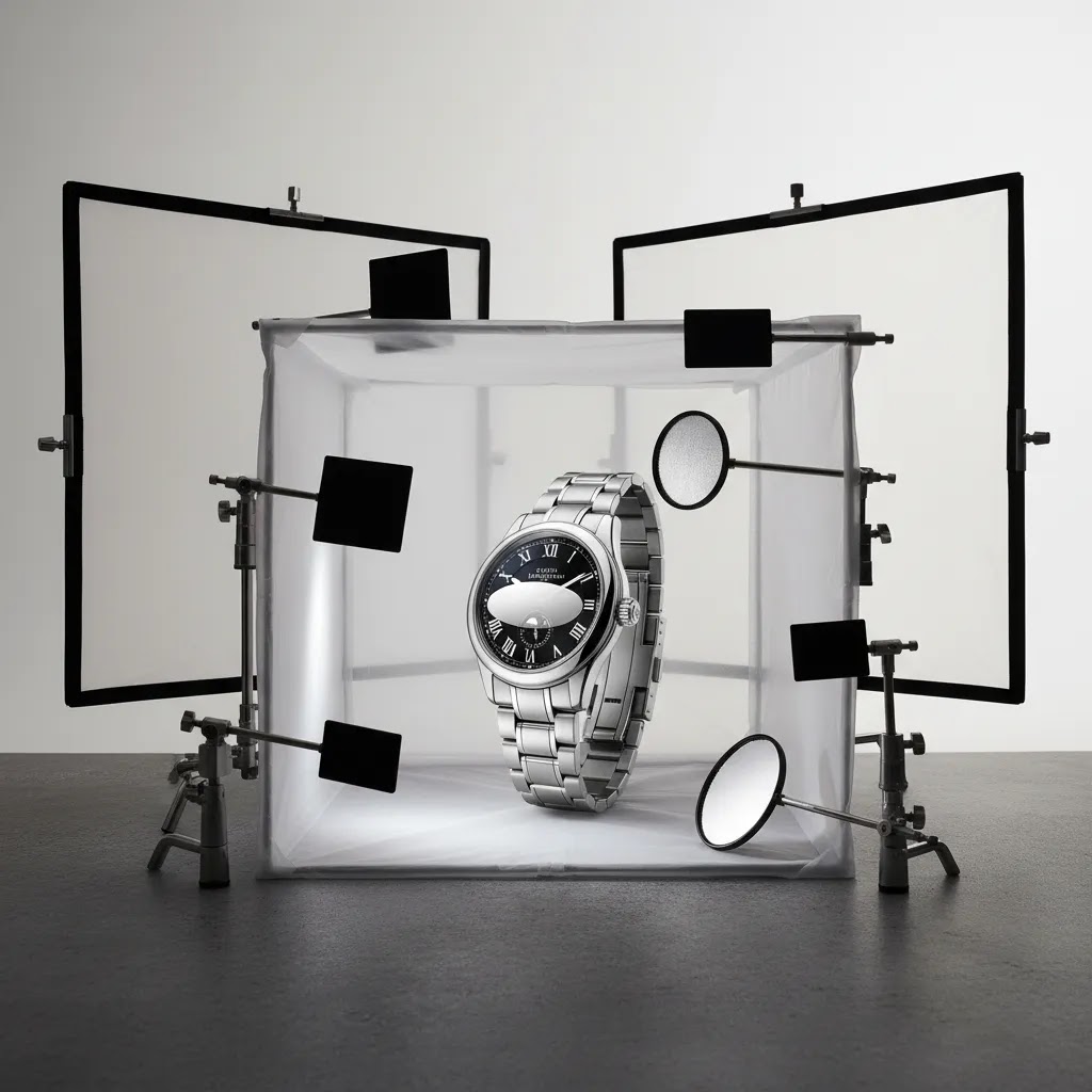
Watch Photography Lighting Setups That Actually Control Reflections
Here’s the thing with watches: you are not just lighting the product, you are lighting what the product is reflecting. The polished case and the crystal behave like little mirrors, which is why “just use soft light” is usually not enough once you want consistent results across a full catalog.
The two setups below are built around the same idea: use diffusion to create big, clean reflections, then use black and white flags to shape those reflections so the edges of the case and the dial details read clearly.
A repeatable 2-light “wrap” setup for white-background catalog shots
This is the setup most Shopify store owners should start with because it is controllable, consistent, and designed for clean hero shots and standard angles.
From a practical standpoint, most of the “premium” look comes from micro-positioning. Move your lights, flags, and watch a half inch at a time, then review the dial readability and case edge separation. Those small moves usually matter more than buying another light.
A simple moody setup for dark backgrounds and premium lifestyle-style frames
Moody watch photography is basically controlled subtraction. You want the dial and key edges to pop, while the rest falls into a clean, intentional shadow.
Consider this when you go darker: the goal is still accurate representation. Moody does not mean underexposed. It means controlled highlights and intentional shadows.
How to “paint” the dial and hands so the indices read cleanly
When the dial looks dull or the indices disappear, it is usually not a camera problem. It is a reflection problem. You are seeing the reflection of your tent, your ceiling, or a big white surface with no shape.
Quick troubleshooting for common watch lighting problems
Styling and Props for Creative Watch Photography (Without Expensive Gear)
Creative watch photography usually fails for one simple reason: the props become the subject. If you are selling watches, the dial and case need to win the viewer’s attention first. Props are there to create context and brand feel, not to compete with the product.
What many store owners overlook is that you can get strong lifestyle-style assets with basic household items, as long as you keep the scene controlled and consistent.
Practical prop categories you can source fast
Think of props as “textures and signals.” You are signaling luxury, ruggedness, minimalism, or performance without having to over-style every frame.
How to keep props secondary so the watch stays primary
The reality is that the watch already has a lot of visual complexity. Props should simplify, not add noise.
A simple styling workflow that scales across SKUs
For most Shopify store owners, consistency beats constant reinvention. If every SKU has a totally different lifestyle setup, your collection pages can look chaotic.
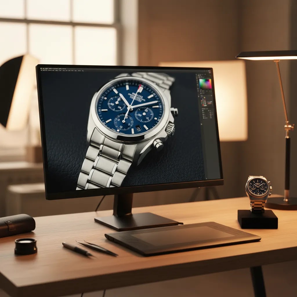
How to Edit Watch Product Photos
Editing is where good watch photography becomes commercially usable. The goal is not to make the watch look unreal. The goal is to remove distractions and present the product accurately.
Your editing workflow will usually include:
For white-background listings, a tool like Free White Background Generator may help speed up cleanup for simple catalog use cases. If you need to isolate the product for more stylized placement, you can also review AcquireConvert’s category resources on Product Photography Fundamentals and E Commerce Product Photography.
For lifestyle variants or campaign assets, AI Background Generator and Background Swap Editor may be useful for testing alternate scenes. That said, luxury watch product photography usually benefits from a restrained editing hand. Overprocessed reflections, exaggerated contrast, or artificial shadows can make expensive products feel less trustworthy.
If you need larger zoomable assets, Increase Image Resolution may help prepare images for high-density displays. Some merchants also use a mockup generator for campaign layouts, but mockups should support, not replace, real product photography. For premium launches, a controlled product photography studio setup is often the better option if reflections are proving difficult to manage in-house.
Luxury Watch Close-Ups: Macro, Focus Stacking, and Retouching Boundaries
Now, when it comes to luxury watch product photography, close-ups are where buyer trust is won or lost. The bezel brushing, polishing transitions, applied indices, dial texture, and engraving need to look crisp, but still real. If your close-ups feel overly sharpened or “improved,” shoppers often pick up on it, even if they cannot explain why.
When macro alone is not enough (and why focus stacking helps)
Macro gets you close, but it does not magically give you infinite depth of field. With dial shots, you might get the logo sharp but lose the chapter ring. With crown shots, you might nail the engraving but the knurling falls out of focus. This is where focus stacking can help.
Focus stacking is taking multiple photos at different focus points, then combining them so more of the watch appears sharp in one final image. It is not always necessary, but it can be useful for hero close-ups where the detail is the product.
The way this works in practice is simple, but picky:
Focus stacking software and workflows vary, and results can look unnatural if you overdo it. The goal is not “everything razor sharp.” The goal is to keep the key selling details sharp without making the image feel synthetic.
Retouching boundaries for luxury expectations
Luxury buyers expect clean, controlled images, but they also expect honesty. You can remove distractions without rewriting the product.
Think of it this way: you are retouching to match how the product looks when it is clean and properly lit, not to create a “better than real” version.
Output recommendations for ecommerce detail without the fake look
For ecommerce, sharpness is mostly about restraint and consistency. You want your close-ups to look crisp on modern phones and retina displays, but not crunchy.
Pros and Cons
Strengths
Considerations
Who This Approach Is For
This workflow is a strong fit for ecommerce store owners selling wrist watches, fashion watches, luxury pieces, or smart watches who want images that look clean and conversion-focused without overstating the product. It is especially useful if you run Shopify and need one image set that can work across PDPs, collection pages, email promotions, and paid social.
It is also practical for small teams deciding whether to shoot in-house, work with freelancers, or outsource to a studio. If your catalog is growing and you need repeatable standards, this approach gives you a process rather than a one-off creative shoot.
AcquireConvert Recommendation
If you are improving watch product photography as part of a wider store optimization effort, AcquireConvert is a useful specialist resource to keep in your workflow. Giles Thomas brings a practitioner lens as a Shopify Partner and Google Expert, which matters when your product visuals need to support not only branding but also conversion, merchandising, and channel-specific image requirements.
For store owners, the practical next step is to pair better visuals with stronger product page execution. Use this watch photography workflow to tighten your hero images, detail shots, and lifestyle assets, then compare how those visuals sit within your broader merchandising setup. AcquireConvert’s related resources on ecommerce photography and studio planning can help you decide whether to keep production in-house, test AI-assisted editing, or invest in a more controlled process.
How to Choose Your Watch Photography Setup
There is no single best setup for every store. The right choice depends on your catalog size, price point, launch frequency, and how much visual consistency you need.
1. Match production quality to your average order value
If you sell entry-level fashion watches, you may not need a highly stylized luxury setup for every SKU. A clean white-background image set plus a few strong detail shots may be enough. If you sell premium or collectible watches, buyers often expect closer inspection and more refined finishing in the imagery.
2. Decide what must be real and what can be assisted
Core product images should be real photographs. That is especially important for metal finish, strap texture, and fit details. AI-assisted tools can help with cleanup, background work, and asset resizing, but they should not invent material qualities or alter the product’s appearance.
3. Build a repeatable shot list
The fastest way to create inconsistency is improvising every shoot. Define one standard list for front, side, detail, clasp, back, and on-wrist shots. Then add creative watch photography only where it serves a real merchandising purpose, such as a collection launch or paid campaign.
4. Consider your editing capacity
Shooting is only half the job. Watches often require more retouching than other products because tiny flaws stand out. If you have a large catalog, evaluate whether your team can maintain quality at scale. Tools can help, but someone still needs to review each final image for realism.
5. Test image performance in context
The best watch product photography is the imagery that helps buyers make a confident decision. That may mean a brighter white-background hero image for collection pages and a tighter macro crop on the product page. Review click-through and on-page engagement alongside your merchandising goals, but avoid assuming that one visual style will suit every product line.
Frequently Asked Questions
What is the best background for watch product photography?
For primary ecommerce images, a white background is usually the safest choice because it keeps attention on the product and works well across product pages and marketplaces. For secondary images, darker or textured backgrounds can help premium watches feel more distinctive, as long as the watch remains clearly visible and true to life.
How do you avoid reflections when photographing watches?
Use diffused lighting, a light tent or scrim, and small angle adjustments. Reflections are often caused by direct light or visible surroundings bouncing off the crystal and metal. A tripod helps because it lets you make controlled position changes without constantly rehandling the watch and adding fingerprints.
How do you photograph a watch face clearly without glare?
Start by increasing diffusion and changing what the crystal is reflecting. A light tent or scrim helps, then use black and white cards (flags) near the watch to create controlled reflection lines that define the case and help the dial read clearly. If you can see your camera in the crystal, adjust the watch angle a few degrees and raise the camera slightly, then reframe from the tripod. Small position changes usually remove glare more reliably than editing.
What camera settings are best for watch product photography (aperture, shutter speed, ISO)?
Many watch shoots work best with low ISO (to keep the dial clean), a shutter speed that is as slow as needed when using a tripod, and an aperture that balances sharpness with depth of field. For example, you might start around ISO 100, a mid-range aperture, and then adjust shutter speed to expose correctly. The exact settings depend on your lens, your distance to the watch, and your lighting. For macro close-ups, you may need a smaller aperture or a focus stacking workflow to keep more of the dial and bezel sharp.
How do you take sharp watch photos with a phone?
Use a stable setup and treat your phone like a camera on a tripod. Lock focus and exposure (if your phone camera app allows it), use the rear camera, and add plenty of diffused light so the phone does not raise ISO and smear detail. Avoid digital zoom. Instead, move the phone closer only if it can still focus, or crop slightly later. Clean the watch and the phone lens before every set, because tiny smudges can soften dial text fast.
Do I need a macro lens for photography watch detail shots?
A macro lens usually helps if you want sharp dial, bezel, and strap close-ups. It is not mandatory for every store, but it does make it easier to capture the detail buyers expect from watch photography. If you do not have one, use the sharpest lens available and prioritize stable lighting and careful focus.
Can AI tools help with watch photo editing?
They can help with background cleanup, resolution improvements, and simple scene testing. That may save time for ecommerce teams producing catalog assets. Still, watch images need human review because small visual errors can make metal edges, reflections, or dial markings look unnatural and reduce buyer trust.
What props work best for watch photography at home?
Matte, neutral props tend to work best because they reduce messy reflections and keep the watch as the focal point. Paper and card are great for clean minimalist scenes, fabric adds softness and lifestyle context, and wood or stone can signal rugged or heritage positioning. Keep props simple, avoid obvious branding, and use spacing so the props support the watch rather than competing with the dial.
What images should I include on a watch product page?
A strong set usually includes a front hero image, a three-quarter angle, side profile, strap or bracelet detail, dial close-up, caseback if relevant, and one lifestyle image. For smart watches, include a realistic view of the screen if it supports the buying decision and does not misrepresent the product.
Is luxury watch product photography different from fashion watch photography?
Yes, usually in both precision and expectation. Luxury buyers tend to inspect finishing, texture, and subtle material detail more closely, so lighting and retouching need to be more controlled. Fashion watch photography can often lean more heavily into styling, but the product still needs accurate core images for ecommerce use.
Should I shoot watches in-house or hire a studio?
In-house can work if you have a repeatable setup, enough time for editing, and someone comfortable managing reflections. A studio often makes more sense for premium launches, large catalogs, or luxury products where consistency is critical. The right choice depends on your volume, quality needs, and internal resources.
Can mockups replace real watch product photography?
No. Mockups can support campaign creative, landing pages, or concept testing, but they should not replace real catalog photography. Buyers need to see the actual product finish, dimensions, and materials. For most stores, mockups are best used as supporting assets rather than the foundation of the product page.
Key Takeaways
Conclusion
Good watch photography is not about flashy effects. It is about showing craftsmanship, finish, and product detail in a way that helps shoppers buy with confidence. If you sell watches online, your image set should answer practical questions first, then support your brand style second. That means cleaner lighting, more disciplined angles, and more careful retouching than many merchants initially expect.
If you want to keep improving your visual merchandising, explore AcquireConvert’s related guides on ecommerce photography, studio planning, and image workflows. Giles Thomas’s Shopify and ecommerce expertise gives store owners a more practical lens on what actually helps product pages perform, especially when visuals need to support both brand presentation and conversion.
This article is editorial content created for educational purposes and is not a paid endorsement unless explicitly stated otherwise. Pricing and product availability for any third-party tools mentioned are subject to change, so verify current details directly with the provider. Any performance outcomes from photography improvements, editing tools, or workflow changes will vary by store, product, traffic quality, and implementation.

Hi, I'm Giles Thomas.
Founder of AcquireConvert, the place where ecommerce entrepreneurs & marketers go to learn growth. I'm also the founder of Shopify agency Whole Design Studios.