Scene Background for Product Shoots (2026 Guide)
Choosing the right scene background can change how shoppers read your product in seconds. A clean white backdrop may support catalog clarity, while a styled lifestyle scene can add context, mood, and perceived value. For Shopify store owners, the challenge is knowing when to use each approach and how to create backgrounds that help conversion rather than distract from the product. If you are building a stronger visual strategy, it helps to start with the wider role of lifestyle photography in ecommerce. This guide covers how scene backgrounds work, where AI tools fit, what to avoid, and how to decide between white, edited, and fully styled backgrounds for your product shots.
Contents
What a scene background actually does
A scene background is more than visual filler. In ecommerce, it tells the shopper where the product belongs, how it may be used, and what kind of brand experience you are selling. That matters most for products that benefit from context, such as skincare, home goods, apparel accessories, food, gifting products, and seasonal collections.
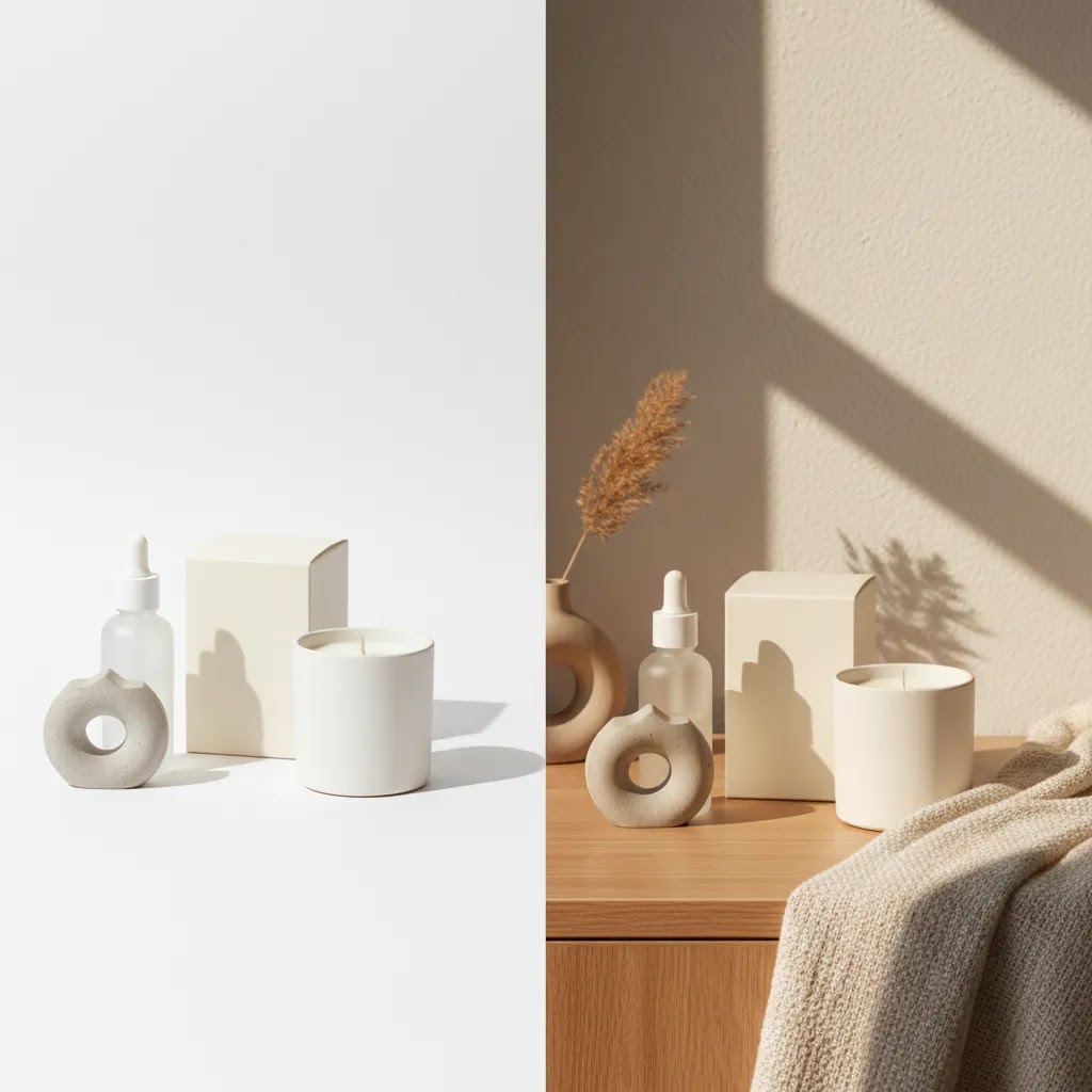
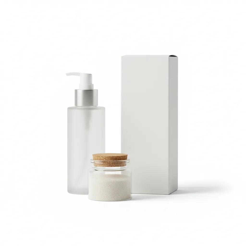
White background product photography still matters. It is often the clearest option for marketplaces, collection pages, product feeds, and image consistency across large catalogs. But a pure white image does less to communicate mood or use case. That is why many brands mix product photography on white background with scene-based visuals on product pages, ads, email campaigns, and landing pages.
If you are refining your visual identity, scene backgrounds also overlap with branding photography. The background color, props, surfaces, shadows, and lighting all shape how premium, playful, minimalist, or practical your store feels.
For many merchants, the real decision is not white background versus lifestyle. It is how to use both in the right places so your store stays clear, persuasive, and scalable.
Key ways to create a background scene
Store owners usually have four practical options for building a background scene.
First, shoot a real set. This gives you the most control over lighting realism, prop styling, and brand consistency. It is often the strongest option for hero images and premium campaigns, especially if your products need tactile detail. If you are working in-house, a simple product photography studio setup can be enough for controlled scenes.
Second, start with a white background and edit later. This works well if you want one master product image that can be reused across PDPs, ads, seasonal campaigns, and social formats. For example, Free White Background Generator can help create a clean base image, while AI Background Generator can then place that product into a more contextual setting.
Third, swap or extend backgrounds with editing tools. If you already have usable product photos, tools like Background Swap Editor and Magic Photo Editor may help you test different looks without reshooting everything. This is useful for campaigns where you want variations by season, audience, or channel.
Fourth, build AI-assisted lifestyle scenes. For merchants exploring scale, an ai scene generator approach can be a practical way to produce more visual concepts faster. That said, AI backgrounds are usually best treated as a creative workflow tool, not a full replacement for art direction, brand standards, or quality control.
If your current images need cleanup before any background work, tools like Increase Image Resolution and Remove Text From Images may help prepare source files. For more immersive context, Place in Hands can be useful when your product benefits from human scale or usage cues.
The main point is simple: choose the workflow that matches your product, brand style, catalog volume, and tolerance for editing time.
Scene background styles shoppers search for (and how to use them without hurting clarity)
Here is the thing: a lot of shoppers do not only mean “background scene for product photos” when they search for scene backgrounds. They are also using “scene background” as a style category, usually tied to a specific era or aesthetic. That can be useful for ecommerce, but only if you translate the look into a repeatable, product-first system.
Scene background aesthetic
This is the broad bucket, and it usually means “stylized, mood-led, a bit editorial.” From a practical standpoint, it works best when you define a narrow palette and a short list of textures so your product stays the hero. Think two to three core colors, one main surface (stone, wood, acrylic, fabric), and props that support the product story instead of competing with it.
For Shopify stores, this often makes sense for limited drops, seasonal capsules, and giftable categories where mood influences perceived value. It can be less effective for high-consideration products where shoppers need clinical clarity, such as complex supplements, safety gear, or products where trust comes from a clean, consistent presentation.
Scene background 2000s and Y2K
“2000s” and “Y2K” scene styles tend to lean into glossy plastics, chrome, translucent color, stickers, playful typography, and bold color pops. The ecommerce-safe version is not “make everything loud,” it is to pick one signature element and keep everything else controlled. For example, a reflective acrylic riser on a simple gradient background, or one chrome prop paired with a neutral surface.
These looks can be a strong match for youth-driven categories, streetwear, accessories, beauty drops, and festival-season campaigns. The tradeoff is that high-gloss props and gradients can reduce product edge clarity, especially in thumbnails, so you need to keep contrast and lighting consistent.
Scene background emo
“Emo” style searches typically point to darker palettes, grainier textures, distressed surfaces, and a more dramatic, moody light. You can use that without making your product feel untrustworthy by keeping the product exposure accurate and using the mood in the supporting layers: the surface texture, the background color, and one or two props that signal the vibe.
For most Shopify store owners, emo-style scenes are best used as campaign creative, not as the only product representation. If your entire catalog is dark and stylized, it can make comparison shopping harder and reduce accessibility on mobile.
A practical guardrail checklist for style-led scenes
Style is only helpful if it does not create inconsistency across SKUs or confusion in the funnel. Use these guardrails to keep scenes conversion-safe:
Think of it this way: you can absolutely borrow from trend aesthetics, but your store still needs a system. Shoppers tolerate experimentation in ads and campaign visuals. They expect clarity and consistency once they are comparing variants on a product page.
Pros and Cons
Strengths
Considerations
Who this approach is for
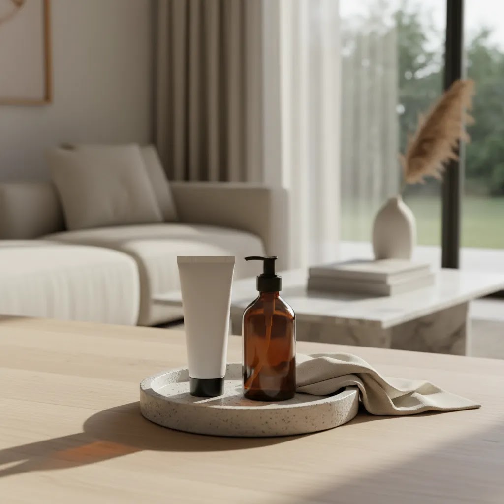
Scene backgrounds make the most sense for ecommerce brands that need to sell more than the object itself. If your product benefits from mood, gifting context, everyday use, or aspirational positioning, lifestyle scenes can do useful work. This is often true for Shopify merchants selling beauty, wellness, home decor, apparel accessories, food and drink, handmade goods, and seasonal products.
It is also a good fit for brands that already have basic white background shots and want to improve product page persuasion. If that sounds like your store, it is worth reviewing broader lifestyle product photography strategy before building scenes one image at a time.
AcquireConvert recommendation
For most store owners, the best approach is a mixed image system. Use white background product photography for consistency, search feeds, collection pages, and clean merchandising. Then use scene backgrounds where context matters most, such as hero images, product page galleries, ad creative, and seasonal landing pages.
That balanced approach reflects how experienced ecommerce operators usually work. They do not rely on one image style for every job. They match the format to the conversion goal.
AcquireConvert is a useful specialist resource here because the guidance is shaped by Giles Thomas's experience as a Shopify Partner and Google Expert. If you are comparing practical ways to create contextual visuals without overcomplicating your workflow, browse the Lifestyle Product Photography hub at Lifestyle Product Photography and then explore adjacent topics like AI-generated scenes and branded visuals. It is a good next step if you want a sharper image strategy for your Shopify store rather than generic photography advice.
Channel-specific requirements: Shopify, feeds, ads, and marketplace rules
What many store owners overlook is that scene backgrounds do not behave the same way across your Shopify store, your product feeds, and your ads. The same image can look great on a product page and perform poorly in a grid, or it can pass on-site but cause issues in a channel with strict image expectations.
Where scene backgrounds usually work best
Scene images tend to earn their keep in places where you are selling a story, not just a SKU. On Shopify, that is typically your product page gallery (especially secondary images), your landing page hero sections, and campaign creatives that tie to a season or collection. They also tend to work well in paid social and email, where you have a split second to communicate vibe and use case.
Where clean or white usually performs better
Clean images are often the safer choice for collection grids, search results, and any layout where shoppers are comparing multiple products fast. In those contexts, visual consistency often matters more than creativity. This is also why many merchants keep product photography on white background for search feeds and catalog-heavy placements, even if their on-site branding is more lifestyle-led.
Feed and ad policy constraints (and the “two-asset system”)
Background expectations can vary by channel and can change over time, so you should always verify the current guidelines for the platforms you rely on most. From a workflow standpoint, the simplest way to stay flexible is to maintain a two-asset system per SKU: one clean master image (often white) for feeds, grids, and consistency, plus one or more scene variants for persuasion and campaigns.
The way this works in practice is you reduce risk. If a scene image gets disapproved, crops poorly, or just does not read in a small placement, you have a clean fallback that protects your merchandising and acquisition pipeline.
QA for mobile before you publish
Most shoppers are on mobile, and mobile is where busy scenes fall apart first. Do a quick QA pass before pushing a new background style across a collection:
How to choose the right scene background
Here are the criteria that matter most if you are evaluating a background scene workflow for ecommerce.
1. Start with the product's buying context
Ask what the shopper needs to understand before buying. A candle may need mood. A cosmetic product may need texture and cleanliness. A kitchen item may need use context. A technical accessory may need scale and compatibility cues. The best background color for product photography depends on what reduces friction and reinforces trust for that product type.
2. Decide where the image will appear
Marketplace feeds, collection pages, and comparison-heavy layouts usually reward cleaner images. Product detail pages, social ads, and email campaigns often benefit more from context-rich visuals. If the image will be viewed small on mobile, keep props minimal and contrast strong.
3. Check whether AI helps or hurts
AI background for product photography can save time, especially for concept generation and campaign iteration. But it is not automatically better. Look closely at shadows, reflections, hand placement, surface contact, label accuracy, and edge cleanup. If any of those feel off, the image may reduce trust. AI should support production efficiency, not weaken product credibility.
4. Build for repeatability
A one-off beautiful image is not enough if you manage dozens or hundreds of SKUs. Choose a scene system your team can repeat. That may mean using a fixed lighting setup, a narrow prop library, a consistent color palette, or a standard AI prompt structure. Repeatability matters more than novelty for most growing stores.
5. Keep white background assets in your workflow
Even if lifestyle scenes become your main merchandising style, retain a clean white background for product photography version of each core SKU where possible. It gives you flexibility for catalogs, marketplaces, comparison pages, and future edits. In practice, merchants who separate their master asset from their creative variations usually have fewer production bottlenecks.
If you are testing new styles, run a small controlled experiment. Update hero images for a limited product set, watch engagement and conversion behavior, and compare the output quality against your current baseline. That will tell you much more than assuming a styled scene always performs better.
Scene background assets for editing: PNG workflows, overlays, and templates
If you have seen searches like “scene background png” or “scene background for editing,” they usually are not talking about photographing a set from scratch. They are usually talking about edit-ready assets you can combine with an existing product photo, typically to create faster variations for ads, email, and on-site campaigns.
What these assets typically are
In practice, “scene background PNG” often refers to one of three things: pre-made backdrop images, overlay elements (like sparkles, stickers, clouds, shadows, texture layers) that are saved as PNGs so they can sit on top of an image, or transparent product cutouts that can be dropped onto different backgrounds. “Scene background for editing” usually means the same thing, but with the intent that you will customize it in a design tool.
A practical workflow that stays scalable
For most Shopify store owners, the workflow that keeps quality under control is to start with one clean master image per SKU. That is typically a white or neutral shot that is sharp, color-accurate, and properly exposed. From there, you can create scene variants for different channels:
Consider this: if your master image has a soft shadow falling to the right, your background scene should support that same lighting direction. That one detail is often the difference between “this looks like a real photo” and “this looks edited,” especially for products with reflective packaging.
Common pitfalls that reduce credibility
Template and overlay workflows can be fast, but they can also create a “stock creative” look if you are not careful. Watch for:
From a practical standpoint, a good rule is to treat templates as a starting point, not a finished system. Build a small library of brand-consistent scenes you can reuse, but vary them enough that your catalog still feels intentional.
Frequently Asked Questions
What is a scene background in product photography?
A scene background places your product in a contextual environment rather than isolating it on a plain backdrop. For ecommerce, that could mean a bathroom counter, kitchen surface, gift setup, or styled seasonal setting. The goal is to show use case, mood, and brand fit while keeping the product as the focal point.
Is white background product photography still necessary?
Yes, in many cases it is. White background product photography remains useful for marketplaces, collection pages, product feeds, and consistent catalog presentation. Even if you use lifestyle scenes heavily, clean white-background images usually give you a flexible core asset that can support multiple sales channels and future edits.
Can AI generate good background scenes for product photos?
It can, especially for concept testing, campaign variations, and lower-cost content workflows. But quality varies. You still need to review realism, brand fit, shadows, and edge detail carefully. For hero assets or premium product launches, many merchants use AI as a support tool and keep a manual approval step before publishing.
What is the best background color for product photography?
There is no single best option for every store. White is often the safest and most versatile. Neutral tones work well for premium or minimalist brands. More expressive colors can support seasonal campaigns or stronger brand identity. The right choice depends on product contrast, brand style, and where the image will appear.
Should I remove background product photography for every image?
No. Removing the background is useful when you need a clean master image, transparent cutout, or marketplace-ready asset. But not every image should be isolated. Contextual scenes often help shoppers imagine ownership or use. The stronger strategy is usually to maintain both isolated and lifestyle versions of important SKUs.
Are AI background generators good for Shopify stores?
They can be, especially for smaller teams that need more visual output without constant reshoots. Shopify merchants often use them for promotional banners, PDP secondary images, and campaign creative. The key is keeping visual consistency and checking that the generated background does not make the product look inaccurate or overly edited.
What camera settings work best for product photography on white background?
There is no universal setting, because it depends on your lens, lighting, product surface, and room conditions. A low ISO, tripod, controlled aperture, and consistent lighting are usually part of the setup. The main goal is even exposure, accurate color, and sharp detail rather than chasing one standard preset.
How many scene backgrounds should one product have?
For most ecommerce stores, one to three strong scene variations per hero SKU is enough. More than that can create production overhead without adding much conversion value. Start with a core white background image, one contextual lifestyle image, and one campaign or use-case variation if the product justifies it.
Do scene backgrounds improve conversion rates?
They may help in some stores, especially where context and visual branding influence purchase decisions. But results are not guaranteed, and the impact depends on product type, traffic source, page design, and image quality. The best way to evaluate them is through controlled testing rather than assumptions.
What is a scene background aesthetic?
A scene background aesthetic is a stylized look and mood for a photo background, usually defined by a specific palette, texture, and prop choices. In ecommerce, it means building a scene that signals brand vibe and use case while still keeping the product clear and accurate. The practical goal is not to be “artsy,” it is to make the product feel more desirable without reducing trust.
What is a scene background PNG?
A scene background PNG usually refers to an edit-ready graphic element or background asset saved in PNG format. It may be a transparent overlay element (like a sticker or texture), or it may be part of a composition you can layer behind or over a product cutout. Store owners often use these assets to create faster variations for ads, email, and campaign visuals.
What does “scene background for editing” mean?
“Scene background for editing” usually means a pre-made background or template designed to be customized in a photo editor. Instead of photographing a full set, you start with a clean product image and combine it with a backdrop, overlays, and shadows to create a lifestyle-style result. Quality depends on matching lighting direction, scale, and sharpness so the final image does not look pasted together.
What is a Y2K or 2000s scene background style?
A Y2K or 2000s scene background style is a throwback aesthetic that typically uses glossy surfaces, chrome or metallic accents, translucent color, playful props, and bold color combinations. For ecommerce, the conversion-safe version is usually a controlled take on the trend: one or two signature elements with consistent lighting and enough contrast that the product is still the focal point.
Key Takeaways
Conclusion
A strong scene background can make your product feel more useful, desirable, and on-brand, but only if it serves the shopper's decision. For most ecommerce stores, the smartest setup is not choosing between white and lifestyle imagery. It is building a flexible system that uses both. Start with clean master product shots, then layer in scene-based visuals where context can strengthen trust and product understanding. If you want a more informed approach, AcquireConvert is a solid place to continue your research. Giles Thomas brings the perspective of a Shopify Partner and Google Expert, which helps keep the advice practical for merchants, not just photographers. Explore related guides on lifestyle imagery, branding, and AI-assisted scene creation to sharpen your store's visual merchandising strategy.
This article is editorial content and not a paid endorsement unless stated otherwise. Tool availability and features may change over time, so verify current details directly with the provider before use. Any performance outcomes discussed are illustrative only and are not guaranteed.

Hi, I'm Giles Thomas.
Founder of AcquireConvert, the place where ecommerce entrepreneurs & marketers go to learn growth. I'm also the founder of Shopify agency Whole Design Studios.