Food Photography White Background (2026 Guide)
If you sell food online, your images have to do two jobs at once. They need to look appetizing, and they need to keep the product page clean enough for shoppers to understand what they are buying fast. That is why food photography white background setups are so useful for ecommerce. A white scene reduces distractions, supports consistent catalog presentation, and often fits better with Shopify collection pages, marketplaces, and paid ads. The challenge is that white can also expose every lighting mistake, shadow, crumb, and color cast. If you want a broader foundation first, start with our guide to white backdrop for photos. In this article, you will learn how to light food on white, compose it so it still feels premium, and avoid the flat, overexposed look that can hurt conversions.
Contents
Why White Background Food Photography Works
For ecommerce, clarity usually beats drama. A white background helps customers focus on the food itself, the packaging, portion size, texture, and color. That matters whether you sell baked goods, meal kits, snacks, supplements, or handmade pantry products.
White also supports consistency across product grids. When every SKU sits on a similar background, your store looks more organized and more trustworthy. This can be especially important for Shopify merchants trying to improve category page scanning and keep branded visuals coherent across mobile and desktop.
There is also a practical ad advantage. White background images are often easier to crop for marketplaces, email campaigns, and product feeds. If your workflow includes post-processing, our guide to photoshop white background product photography can help you clean up edges and keep tones natural.
That said, food is not the same as a hard product. It can melt, wilt, sweat, and lose texture under lights. A successful white background food photography setup keeps the scene bright without washing out the details that make the item look fresh and worth buying.
How to Light Food on a White Background
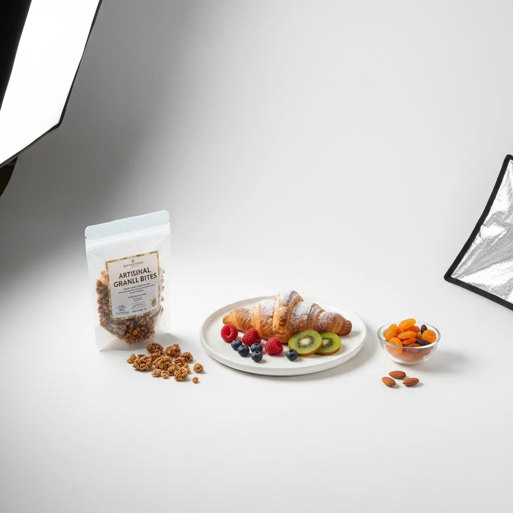
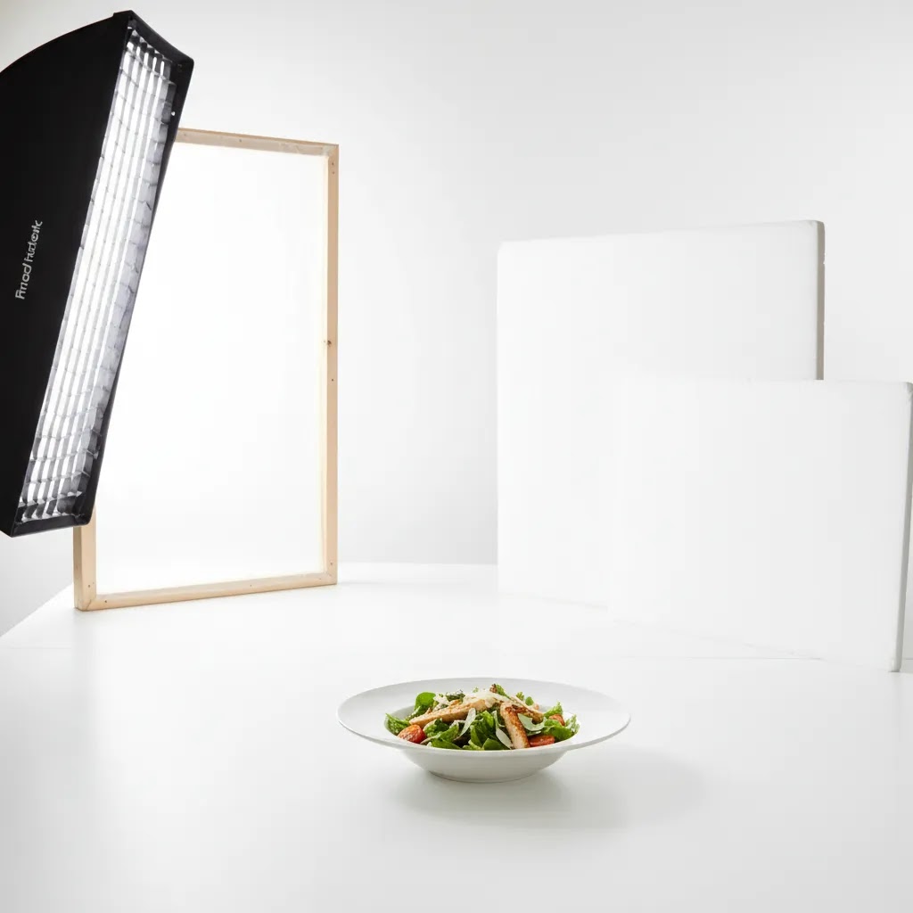
The best starting point is soft side light. Place your light source at roughly 45 degrees to the food rather than directly overhead or straight from the front. This creates definition on the edges, preserves texture, and stops the image from looking clinical.
If you are using window light, put the table close to the window and place a white reflector on the opposite side to lift shadows. If you are using artificial light, a softbox or diffused continuous light will usually give you more control and repeatability for product lines with multiple flavors or sizes.
Your goal is not pure white everywhere from the first shot. It is better to expose correctly for the food and lift the background slightly in editing than to blow out highlights on frosting, powdered sugar, rice, or pale sauces. This is where many merchants get into trouble. They meter for the background, not the product.
A few practical lighting rules usually help:
The backdrop itself matters too. Different surfaces reflect light in different ways. Matte paper usually gives you more predictable results than glossy boards. If you are still deciding on materials, see our breakdown of white background paper for practical setup considerations.
Editing Workflow: White Background Photo Edit and Background Changes
Even with a solid setup, food on white usually needs some cleanup. The goal is a bright, consistent background that still looks natural, with enough shadow and texture that the product feels real. From a practical standpoint, your post-processing should be fast enough to repeat across a catalog, not a one-off hero image workflow that only works once.
A simple post-processing checklist for food on white
If you want a clean, professional food photography white background look, start with a consistent baseline edit and only then move into detailed retouching:
When a background change workflow makes sense
Sometimes you cannot reshoot. Maybe seasonal products are gone, or you are working with an older library of images that were shot on mixed backgrounds. In those cases, changing the background to white can be a reasonable fix, but it comes with a few common failure points.
The way this works in practice is simple: you mask the product, clean the edges, and replace the background with a controlled white. Where most store owners get into trouble is the details:
If you do use a background swap, keep a light hand. It is usually better to keep a natural shadow and accept that the background is slightly off-white than to force a sterile result that looks edited.
Output settings that work for ecommerce and Shopify grids
Once you have clean files, consistency in export matters as much as the edit itself. For most Shopify store owners, the key is predictable cropping and clean edges, because your images will appear as thumbnails, collection cards, and sometimes in external feeds.
Composition Choices That Keep Food Interesting
A white background can simplify an image, but it should not make it lifeless. Composition is what keeps a clean ecommerce image from feeling generic.
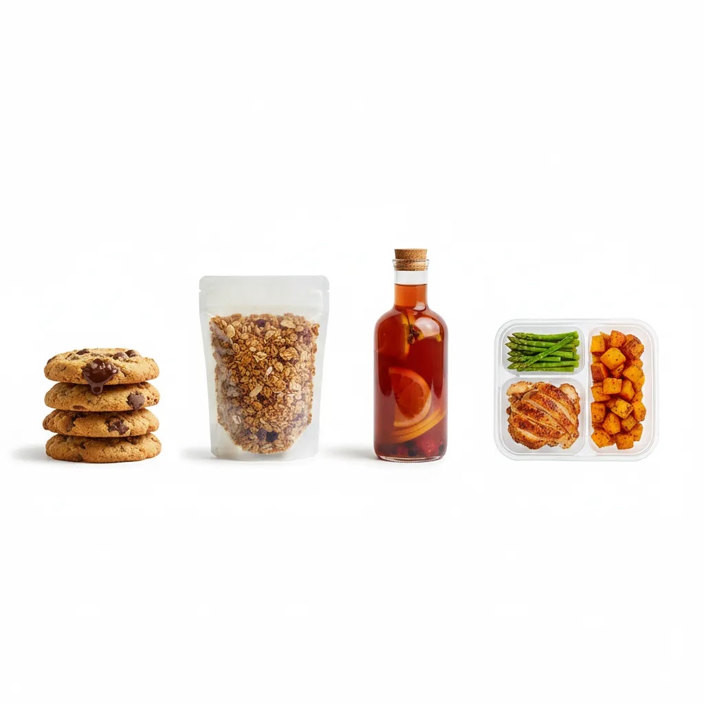
Start by deciding what the shopper needs to understand immediately. Is it the serving suggestion, the package, the ingredients, or the texture? If the product is boxed food or a jarred item, lead with the packaging and use the plated food as supporting context. If you sell prepared dishes directly, lead with the food and use props sparingly.
Negative space is one of the main strengths of white. It gives the eye room to rest and makes the product stand out. It also gives you flexibility for cropping into social ads, banners, and email modules. But too much empty space can make the item look small or low value. In many cases, a tighter crop with one intentional prop works better than a wide shot with lots of unused white.
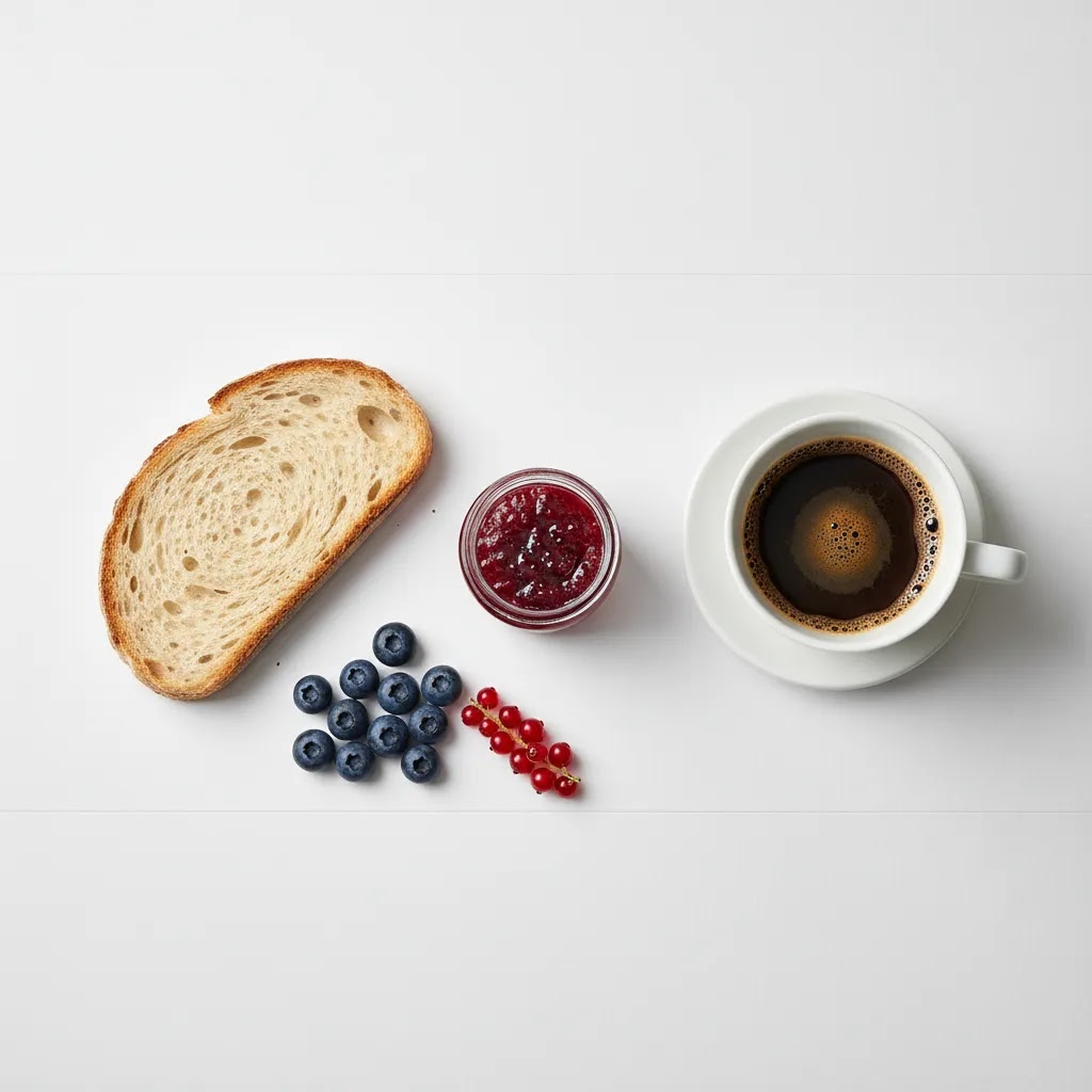
Top-down composition is common in food photography, especially for bowls, pizzas, grazing layouts, and recipe kits. It can work very well for top view food photography white background images if the ingredients create natural shape and color contrast. For products with height, such as cakes, bottled drinks, or stacked sandwiches, a 45-degree angle often sells texture better.
Use these composition principles for stronger product images:
If you are building a repeatable visual system for a growing catalog, it helps to think beyond one image and plan a full product photography studio workflow that supports consistent lighting, angles, and editing standards.
White Background Ideas That Look Clean, Not Sterile
White background food photography does not have to mean one look. What many store owners overlook is that the surface does a lot of the work. You can stay within a clean, minimal style while choosing whites that feel warmer, more handcrafted, or more premium, depending on the product.
Practical white background options, and when they work best
Here are a few surfaces that tend to work well for ecommerce, along with the tradeoffs you will actually notice on set:
How to choose a surface based on the product problems you actually have
Consider this: the “right” white surface is often the one that reduces your cleanup time.
If you sell multiple flavors or variations, keep your whites consistent across the line. Use the same surface, same lighting position, and the same camera settings wherever possible. Otherwise, your product grid can start to look like a mix of different brands, even if your packaging is consistent.
How to get a “white background hd” look in camera, without heavy editing
The reality is that a crisp, clean white look comes more from lighting and separation than from pushing sliders in post.
If you can get the background close to white in camera, your editing becomes a quick consistency pass instead of a rescue mission.
Pros and Cons
Strengths
Considerations
Using Food Background Images and PNGs Without Hurting Trust
If you search for food background images or a food background png, you will find a lot of options. Some of them can be useful, but they are not a substitute for real product photography on your PDP. For most Shopify store owners, the safest approach is simple: use real photos for product listings, and use background assets for marketing layouts where the goal is attention and message clarity.
When background images and PNGs make sense
Background assets can work well when you need fast variations for creatives, especially when you are not asking the shopper to judge the product itself in that exact image:
For product detail pages, be careful. Shoppers use PDP images to confirm texture, portion size, and packaging details. If the main product images start to look composited or overly stylized, trust can drop, especially for food where customers are sensitive to realism.
Common conversion problems to avoid
Here is the thing: background assets fail less because of the asset itself and more because of mismatch.
Quality and usage details many people miss
If you do use background images or PNGs, a few checks will save you time and headaches:
Use assets as design elements, not as a replacement for showing the real product. That balance usually keeps your store looking professional without creating a trust problem on the pages where shoppers make the final decision.
Who This Approach Is For
Food photography on white works best for ecommerce brands that need clear, scalable visuals. If you run a Shopify store with multiple SKUs, subscription options, bundles, or seasonal variants, this approach can make your catalog easier to manage and more consistent to shoppers.
It is especially useful for packaged foods, snacks, supplements, sauces, and giftable food products where the product page needs a blend of appetite appeal and product clarity. It can also suit prepared foods if you balance clean composition with enough texture and shadow to keep the dish looking real.
If your brand leans heavily into storytelling, you may want white-background shots for your main catalog images and more atmospheric lifestyle images for PDP galleries and social content.
AcquireConvert Recommendation
For most ecommerce store owners, the smartest approach is not choosing between clean white images and styled brand photography. It is building a system that uses each where it performs best. White-background images usually make sense for collection pages, product feeds, and comparison-friendly product detail pages. Styled images help with emotional selling lower on the page and in ads.
That is the practical lens AcquireConvert brings to visual merchandising. Giles Thomas, a Shopify Partner and Google Expert, focuses on what actually helps merchants present products clearly and sell more effectively across search, shopping feeds, and store pages. If you are refining your visual standards, browse our White Background Photography resources and the broader Product Photography Fundamentals category for setup, editing, and workflow guidance you can apply without turning every shoot into a full agency production.
How to Choose the Right Setup for Your Store
There is no single perfect white background setup for every food brand. The right choice depends on your catalog, your team, and how the images will be used.
1. Match the setup to the product type
Glossy drinks, reflective jars, and plastic packaging need tighter control over reflections. Matte baked goods and dry snacks are usually more forgiving. Pale foods need more separation, often through side light, subtle shadow, or a slightly off-white surface rather than stark bright white.
2. Decide whether speed or styling matters more
If you are shooting dozens of SKUs, repeatability matters more than creative variety. Use a simple surface, one main light, one reflector, and a fixed camera position. If you are shooting hero images for a premium launch, you can spend more time on garnish placement, texture, and prop styling.
3. Build for ecommerce crops first
Before the shoot, check your Shopify theme image ratios, collection card crops, and thumbnail sizes. A beautiful composition that loses the label or cuts off the garnish on mobile is not doing its job. Plan your framing with those crops in mind.
4. Keep editing realistic
Retouching should improve clarity, not erase the food's natural character. Over-brightening whites can make bread look dry, fruit look chalky, and sauces look artificial. If you need more background cleanup, keep the product tones anchored in reality rather than pushing for sterile perfection.
5. Use a mixed image strategy
For many food brands, the strongest structure is:
This gives shoppers both precision and context. It may also support better decision-making for customers who want to understand ingredients, quantity, and presentation before they buy.
Frequently Asked Questions
Is a pure white background best for all food products?
Not always. Pure white can work well for packaged foods and catalog consistency, but some pale dishes lose definition against it. In those cases, a slightly off-white surface or more controlled side shadow may give you a better result while still keeping the clean ecommerce look shoppers expect.
What lighting is best for food photography on white background?
Soft side light is usually the safest choice. It shows texture and shape without making the image feel harsh. Whether you use window light or a softbox, aim to light the food first and let the background fall just bright enough to clean up later instead of overexposing the whole scene.
Can I use natural light for white background food photography?
Yes, especially if you have a large window and consistent daylight. Use diffusion if the sun is direct, and place a white reflector opposite the window to soften shadows. Natural light can produce attractive results, but it is less repeatable than controlled studio lighting if you shoot often.
What background material works best?
Matte materials are usually easier to manage than glossy ones because they produce fewer reflections and hot spots. Paper, matte boards, and vinyl can all work depending on your workflow. If you are comparing options, our guide on white background paper is a helpful place to start.
Should I shoot food from above or at an angle?
Use the angle that reveals the product best. Top-down works well for flat dishes, bowls, spreads, and ingredient layouts. A 45-degree angle is often better for showing height, layers, and texture in products like burgers, cakes, bottled drinks, and plated meals.
How do I stop white backgrounds from looking gray?
Gray backgrounds usually mean the backdrop is underlit relative to the subject or the white balance is off. Move the food slightly forward, add bounce to the background area, and correct exposure in editing. You do not need the background to be blown out in camera, but it should be bright and neutral.
How much editing is reasonable for ecommerce food photos?
Reasonable editing includes color correction, crumb cleanup, stain removal, minor exposure balancing, and background cleanup. It should not materially misrepresent the food. If you are using retouching tools, keep the product looking believable and consistent with what the customer will actually receive.
Do white background food images help ecommerce conversions?
They can help clarity, consistency, and product comparison, which may support better shopper confidence. But results depend on product type, store design, audience, and how well the rest of the product page communicates value. Image style should support the buying decision, not be treated as a guaranteed fix.
Can I create these shots without a full studio?
Yes. Many small brands start with a table near a window, a white backdrop, a reflector, and one reliable camera angle. The key is consistency. A simple setup used well usually beats a complicated one that changes every shoot and creates mismatched images across your catalog.
How does this fit with product page strategy?
Think of white-background shots as the clarity layer of your product page. They help customers identify the item quickly. Then use additional gallery images for texture, scale, ingredients, packaging details, and lifestyle context. That combination is often more effective than relying on one image style alone.
How do I edit a food photo to a white background?
Start by correcting white balance so your whites look neutral, then adjust exposure for the food and recover highlights on pale areas so you do not lose detail. After that, lift the background gently, clean crumbs and stains, and keep a soft natural shadow so the product does not look cut out. Consistency across your catalog matters more than forcing every image to pure white.
Can I change the background of a food photo to white without reshooting it?
In many cases, yes, but results depend on the photo. If the product has clean edges, you can mask it and replace the background with white, then rebuild a believable shadow. The common issues are halos, gray edges, and shadows that do not match the new background, especially with flaky pastry, herbs, steam, or powdered ingredients, so plan on testing the result on your product page before you commit to doing it across a whole line.
Where can I find white food background images (and what resolution do I need for ecommerce)?
White background assets can be useful for ads, banners, and email layouts, but for ecommerce you want files that stay clean when cropped and compressed. Choose assets with enough resolution for your largest placement and check usage rights for commercial work. For product pages, prioritize real photography because it is typically more trustworthy for shoppers evaluating food texture and portion size.
How do I photograph white or pale foods on a white background without losing detail?
Use soft side light and expose for the brightest part of the food, not the background. Create separation by adding distance between the food and the backdrop, and keep a little shadow under the subject so the edges stay visible. You can also use a slightly off-white surface rather than a stark pure white, which often helps pale foods keep definition while still looking clean.
Key Takeaways
Conclusion
White background food photography is not about making every image look sterile. It is about giving shoppers a clean, trustworthy view of what you sell while keeping your catalog consistent across product pages, ads, and feeds. If you control light carefully, preserve texture, and compose with intent, white can make food look both premium and clear. For store owners, that balance matters. It supports browsing, comparison, and brand presentation without unnecessary visual noise. If you want to build a stronger workflow from backdrop choice through editing, explore AcquireConvert’s guides on white backdrop for photos and photoshop white background product photography. They are designed to help ecommerce merchants make smarter visual decisions with practical, repeatable standards.
This content is editorial and intended for educational purposes. It is not a paid endorsement unless explicitly stated otherwise. Any results from photography changes will vary by store, product type, audience, and implementation quality. Always test image presentation within your own ecommerce workflow and storefront context.

Hi, I'm Giles Thomas.
Founder of AcquireConvert, the place where ecommerce entrepreneurs & marketers go to learn growth. I'm also the founder of Shopify agency Whole Design Studios.