Beverage Product Photography (2026 Guide)
Beverage product photography has a bigger job than most ecommerce imagery. You are not just showing a bottle, can, pouch, or carton. You are selling refreshment, texture, temperature, brand identity, and trust in a split second. For Shopify store owners, that usually means balancing clean catalog shots with lifestyle images that feel real enough to stop the scroll. If you are planning a new shoot or trying to improve underperforming product pages, start by understanding how lighting, props, and AI editing each affect conversion-focused visuals. This guide breaks down what matters most, where merchants often overspend, and which AI tools can help streamline post-production. If you want a wider visual strategy context, AcquireConvert’s guide to lifestyle photography is a useful starting point.
Contents
What beverage product photography needs to do
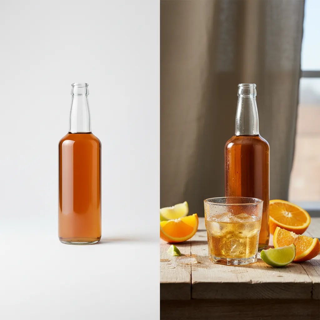
Beverage photography sits between catalog precision and appetite appeal. A plain white background image is often required for marketplaces, product feeds, and collection pages. But on your own store, especially on Shopify, you also need images that show mood, flavor cues, serving moments, and pack details clearly.
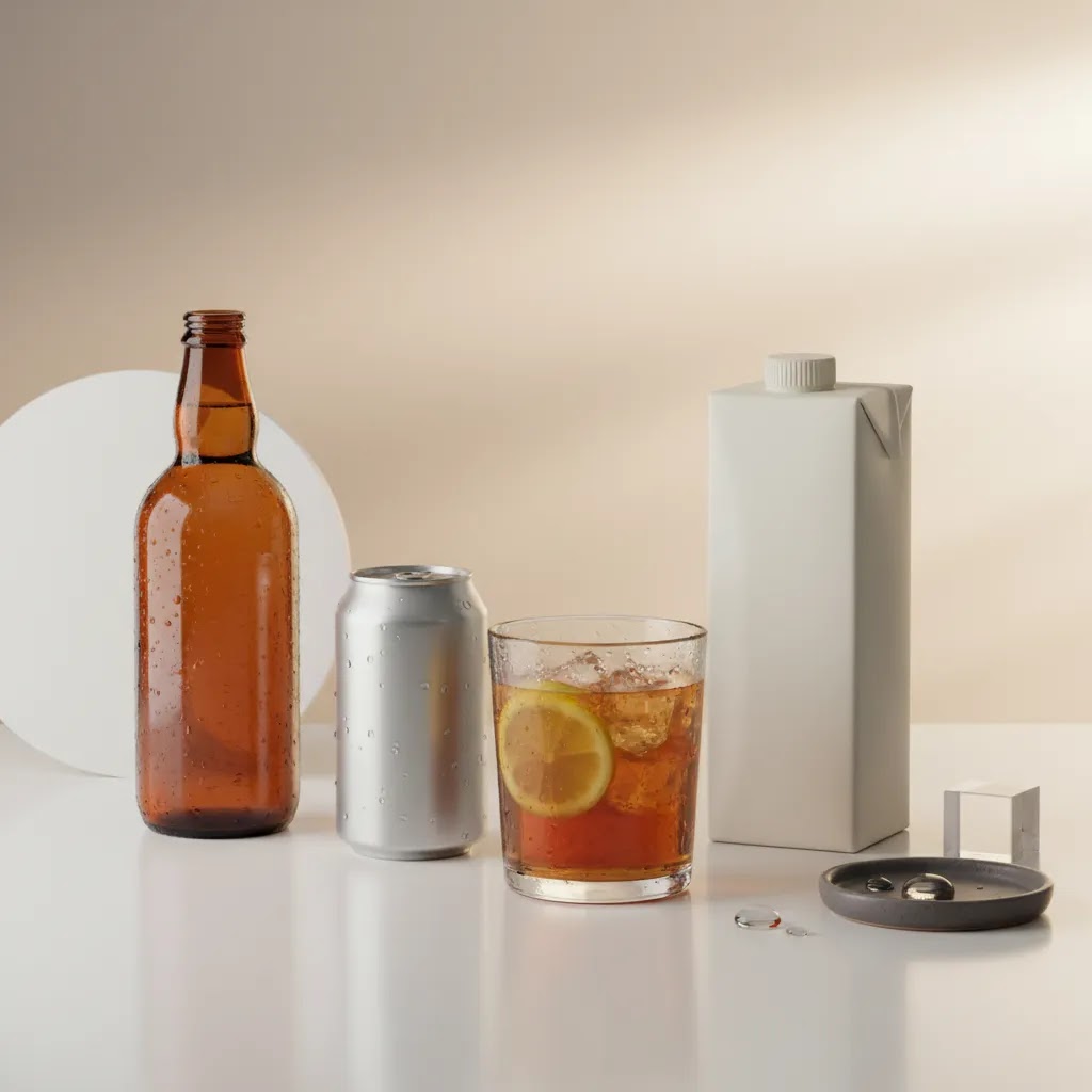
That is why the strongest setups usually include at least three image types: clean hero shots, close-ups for label and texture detail, and contextual lifestyle scenes. A sparkling water brand may need condensation and backlighting to signal cold refreshment. A coffee concentrate may need richer tones, glassware, and ingredient styling. A functional drink may need clearer emphasis on benefits and packaging trust signals.
The commercial question is not “how do I make this look artistic?” It is “what kind of image helps a shopper understand the product faster and feel confident enough to buy?” That makes beverage photography part of product marketing photography, not just brand decoration.
If your brand story is central to the purchase decision, it also helps to align your shoot with broader branding photography choices so your PDPs, ads, email campaigns, and social assets feel connected.
Lighting, props, and AI tools that matter most
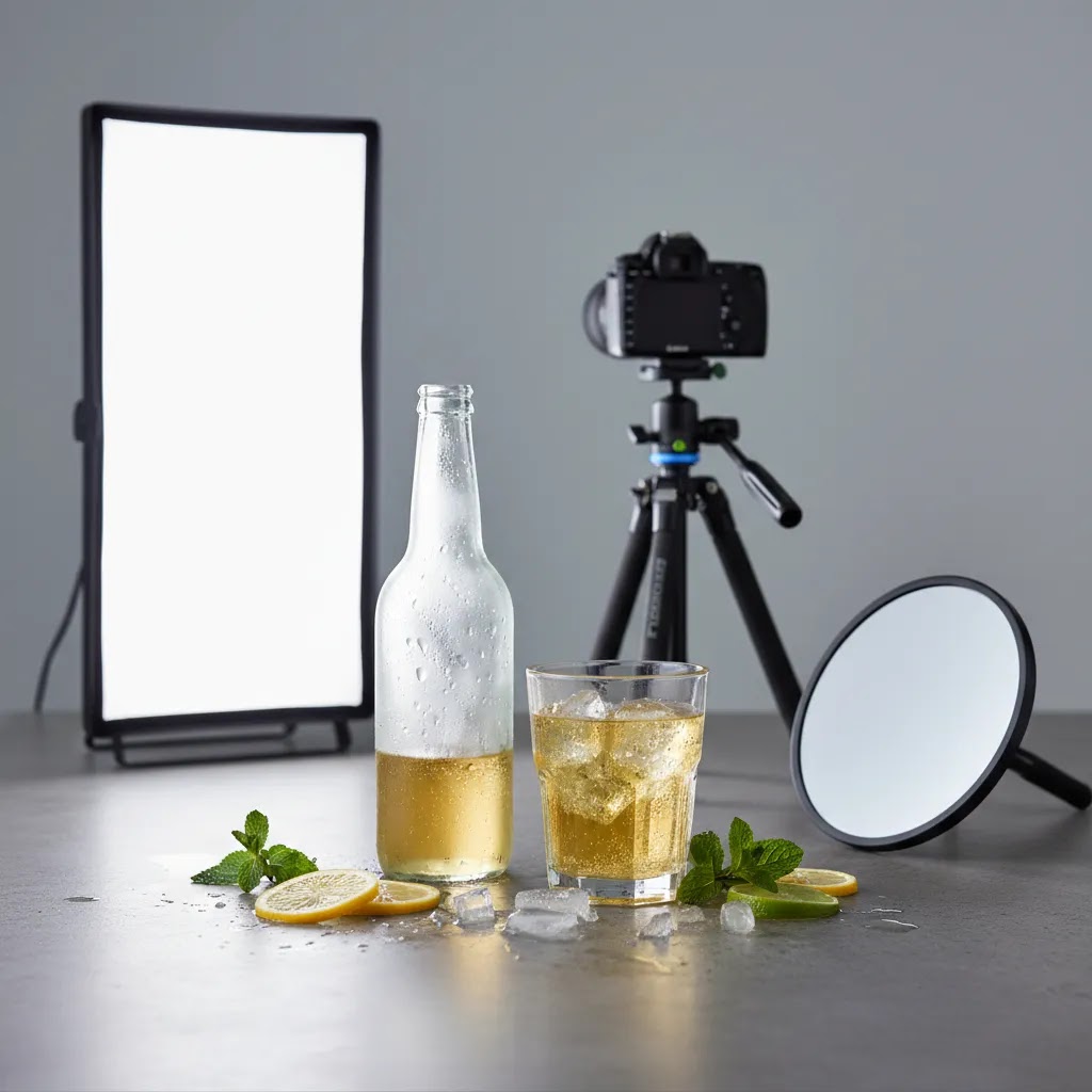
Lighting is the first decision because beverages are highly reflective. Glass bottles, cans, glossy labels, and liquid surfaces can all create distracting hotspots. Soft side lighting is often the safest starting point for ecommerce because it reveals shape without flattening the pack. Backlighting can work well for translucent drinks, especially juices, teas, and spirits, but it needs careful control or your label may lose readability.
For cold-drink visuals, many merchants try real condensation and melting ice on set. That can look excellent, but it also slows the shoot and creates inconsistency across SKUs. If you need repeatable results across a range, shooting cleaner base images and adding background or atmosphere later can be more efficient.
Props should support the purchase story, not overwhelm it. Citrus slices, herbs, bar tools, glassware, fruit, fabric, and surfaces can all help, but only when they reinforce flavor, use case, or positioning. Premium tonic water and kids’ juice boxes should not be styled the same way. This is where choosing the right scene background becomes practical, not decorative.
AI tools can be useful after the shoot, especially for background cleanup, alternate scene creation, and asset resizing. Based on the current product data available, the most relevant options include:
For many stores, AI beverage photography works best as a workflow layer, not a full replacement for thoughtful product photography. Shoot the pack well first, then use AI to scale variations, adapt assets to campaigns, and speed up production for secondary images.
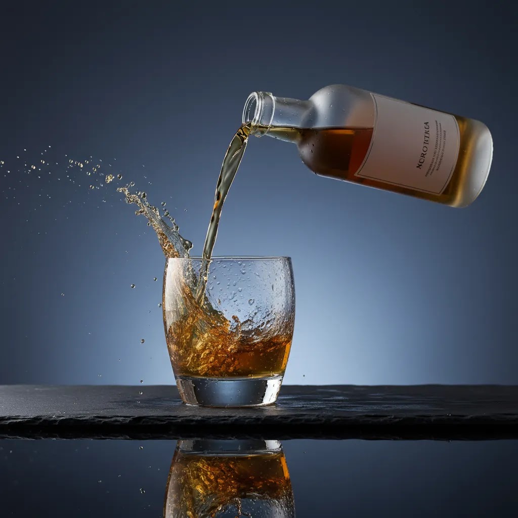
High-speed splash, pour, and “liquid dynamics” shots (when they matter and how to plan them)
Here’s the thing with splash and pour shots: they can look incredible, but they are not automatically “better” for ecommerce. For most Shopify stores, your baseline job is still clarity. Shoppers need to recognize the exact SKU, read the label, and understand what they are buying. A dramatic pour shot that hides the pack or makes the product look like a generic drink may hurt comprehension, even if it looks cinematic.
So when are liquid action frames worth doing? They are usually most valuable for top-of-funnel and mid-funnel creative, like paid social ads, hero banners, and campaign landing pages where you are selling refreshment, energy, or flavor in a split second. They can also be useful for brand storytelling moments, especially if “texture” is the product, think carbonation, crema, foam, or a thick functional shot. On the other hand, trying to create a unique splash setup for every SKU can become a time sink fast. For SKU-level PDP coverage, you typically get more conversion value from clean angles, a consistent lifestyle template, and close-ups that make the pack easy to trust.
From a practical standpoint, action shots only get repeatable when you plan them like a production. That starts with a shot list that spells out what you need the frame to do. Is it a pour into a glass, a splash on ice, a bottle being opened, or a “liquid arc” behind the pack? Decide whether the product needs to be in the frame the entire time, and where the label must sit so it stays readable in the final crop.
Timing and repeatability are the real constraints. A clean splash might take dozens of attempts, even with experience. You need to control fill levels, pour height, angle, and the surface you are pouring into. You also need to keep the set consistent so your images match across your range. If your goal is a consistent Shopify PDP system, it is often smarter to capture one or two hero action frames for the brand, then use simpler variations for the rest of the catalog.
Lighting is also different than standard beverage product photography. To freeze motion, you either need very fast shutter speeds with a lot of light, or you rely on flash duration to “stop” the motion. That means a more controlled setup, more testing, and typically more gear than a basic diffusion-and-softbox catalog workflow. If you are shooting with flash, keep in mind that reflections and label glare become even harder to manage on glossy packs, especially on curved bottles and metallic cans.
Safety and cleanup matter more than people expect. Liquids around power, stands, and camera gear add risk, and sticky ingredients can turn a set into a mess quickly. Build time into your shoot for resets, and plan for towels, spare labels, backup packs, and a process to keep your hero packaging clean. If the label gets wrinkled or spotted, you can lose the “trust signal” you were trying to create in the first place.
The conversion-friendly rule is simple: even in action, the shopper should still know what is being sold. Keep the product identity clear, keep the label readable when it matters, and avoid any composition that could be mistaken for a different flavor or format. A splash should support the purchase story, not compete with it.
Beverage styling fundamentals: condensation, ice, foam, and glass prep (repeatable, on-brand results)
Most beverage shoots fall apart for simple reasons. The condensation looks patchy. The ice melts too fast. Foam collapses between takes. Glassware picks up fingerprints and dust. None of that is “artistic,” it is just inconsistency, and inconsistency is what makes a Shopify collection page look messy.
What many store owners overlook is that styling is not only about making one image look good. It is about making an entire SKU set look like it belongs together. That means you need a repeatable workflow, especially if you are photographing multiple flavors, sizes, or pack formats in one session.
Start with glass prep, because it affects everything else. Use identical glassware across variants unless you have a clear merchandising reason not to. Clean it between takes, and treat smudges like a lighting problem, because they will catch highlights and pull attention away from the label. Choose a fill level and stick to it. A changing fill line across flavors reads as sloppy, even if customers cannot explain why.
Condensation is the biggest “cold drink” signal, but it is also the hardest to keep consistent. Real condensation depends on temperature, humidity, and time, so it often varies shot to shot. If you are shooting one hero lifestyle image, real condensation can be worth the effort. If you are shooting a full range, you may get more consistency by capturing a clean base image, then adding subtle atmosphere in post. That could be a slightly cooler grade, controlled highlights, or a bit of background mood, without trying to fake the physical edge of droplets on glass.
Ice is similar. Real ice gives you believable refraction and reflections, but it melts, fogs, and changes shape quickly under lights. If you want consistency across a range, set rules: same cube size, same number of cubes, same placement, and the same “time window” from pour to shutter so each SKU looks like it was shot in the same moment.
Foam and head are their own challenge. A beer-style head, a sparkling pour, or a coffee crema can look premium, but it is very time sensitive. Plan your sequence so you are ready to shoot right after the pour, and capture the most important frames first. If you are shooting multiple angles, do not assume the foam will hold while you tweak props for ten minutes.
If you want a simple system for multi-SKU shoots, think of it as a checklist you follow every time:
Now, when it comes to AI editing, it can help, but you need to be careful with realism. Background cleanup and light atmosphere adjustments can be a good fit, especially when you are trying to keep a set consistent across SKUs. Where AI can break quickly is anything that changes the physical truth of the product, like inventing new reflections, altering liquid edges, or creating droplets that do not match the lighting direction. If you use AI to add a colder feel, review the output at full size. Look at the rim of the glass, the meniscus line, and the label edges. If those details look off, shoppers may not know why, but trust can drop.
Pros and Cons
Strengths
Considerations
Who this approach is for
This approach fits beverage brands that sell online and need photography to do real commercial work. That includes DTC Shopify stores, subscription brands, premium mixers, coffee and tea products, functional drinks, alcohol-adjacent brands where compliant imagery matters, and growing wholesale brands building cleaner sell sheets and retailer assets.
It is especially relevant if you already have basic product photos but they do not feel distinctive enough to support stronger click-through or on-page engagement. It also suits teams that want to produce one core shoot and extend it into multiple visual variants using AI tools rather than commissioning every scene from scratch.
Beverage photo use-cases beyond the PDP: packaging, ads, and hospitality-style brand assets
Even if your main sales channel is Shopify, beverage photography rarely lives only on the product page. The same product may need to show up on packaging, retailer sell sheets, point-of-sale materials, email headers, paid social creative, and even menu-style placements for hospitality partners. If you plan only for the PDP crop, you can end up reshooting later because you do not have the right angles or formats.
Consider this as you plan a shoot: think in terms of an asset library, not a single “final image.” Your PDP hero might be a square crop with the label centered. Your ad creative might need a vertical frame with negative space for copy. Your homepage banner might need a wide crop with room for a headline. If you capture those options during the shoot, you usually save time later, and your brand stays visually consistent.
A practical way to do this is to capture a few extra frames per setup while the set is already built:
Brand consistency is what ties it together. Set simple rules and keep them consistent across channels: your background style, surface color palette, prop types, and how you handle highlights and reflections. If one SKU is shot warm on wood and another is shot cool on marble with a totally different lighting direction, your store can feel fragmented, even if each photo looks good on its own.
Hospitality-style beverage photography is a useful mindset when the “moment of consumption” is part of the sell. It is less about the pack floating perfectly on white, and more about making the drink feel present, cold, fresh, and served the way your customer wants it. For ecommerce, the trick is balancing that mood with clarity. Keep the pack identifiable, keep the brand readable where it matters, and capture enough clean frames that you can still support conversion-focused layouts on Shopify.
AcquireConvert recommendation
If you are evaluating your next beverage shoot, think like an ecommerce operator first. Start with the images your store actually needs to sell: a clean hero shot, pack detail, scale reference, and one or two context-rich lifestyle frames. Only then add more experimental creative. That order matters because your photography needs to support merchandising, ad creative, and conversion, not just aesthetics.
AcquireConvert’s content is built for merchants making those trade-offs in the real world. Giles Thomas brings a practical perspective as a Shopify Partner and Google Expert, which is useful when your product photography needs to work across product pages, organic search assets, and paid acquisition creative. For related guidance, you can explore the broader Lifestyle Product Photography category, or if you are deciding between in-house production and a more controlled setup, review this guide to a product photography studio. If AI scene creation is part of your process, this article on an ai scene generator is a smart next read.
How to choose the right setup for your store
1. Start with sales channel requirements
Your Shopify PDP may benefit from richer lifestyle storytelling, but Google Shopping feeds, retail marketplaces, and wholesale decks often need cleaner presentation. Decide upfront which images are required versus optional. That prevents overspending on scenes you may barely use.
2. Match the lighting style to the product material
Clear glass, matte cans, metallic finishes, and shrink sleeves all react differently to light. If you have translucent liquids, test backlight and side light. If labels are reflective, prioritize readability over atmosphere. Many merchants get better results from a simpler light setup with careful diffusion than from dramatic lighting that hides the pack.
3. Use props with a merchandising purpose
Ask what each prop tells the shopper. Is it showing serving suggestion, flavor, seasonality, premium positioning, or usage occasion? If not, it may be visual clutter. A good prop set should help shoppers understand the product faster. This is particularly important for subscription beverage brands, giftable products, and premium SKUs where first impression affects perceived value.
4. Decide what AI should handle
AI is most helpful when it removes repetitive work. White-background generation, background replacement, resolution improvements, and fast concept testing are practical uses. It is less reliable when you need physically accurate liquid behavior, packaging compliance review, or highly regulated claims context. Treat AI as a production assistant, not an autopilot.
5. Budget for consistency, not just one hero image
Store owners often focus on one amazing product photography shot and overlook the full image system needed for ecommerce. A stronger investment is usually a repeatable template across your range. That means consistent crop ratios, lighting logic, label visibility, and editing standards. It may not feel as glamorous as a one-off campaign image, but it usually creates a better shopping experience.
If you are comparing visual styles beyond beverages, the broader E Commerce Product Photography category is useful for understanding what translates best across different product types and store formats.
Frequently Asked Questions
What is the best lighting setup for beverage product photography?
Soft side lighting is a strong starting point because it shapes the bottle or can while keeping reflections manageable. Backlighting can work well for translucent beverages, but you need to protect label readability. For most ecommerce stores, a repeatable setup with diffusion is more useful than dramatic lighting that only works for one hero shot.
Do I need both white background and lifestyle images for my store?
Usually, yes. White background images help with collection pages, feeds, and clean product presentation. Lifestyle shots add context, flavor cues, and brand personality. In many cases, using both gives shoppers a clearer buying picture and gives your marketing team more flexibility across email, paid social, and product page modules.
How important are props in beverage photography?
Props matter when they support the product story. Glassware, ingredients, garnishes, and textured surfaces can make a beverage feel more desirable, but they should never confuse the shopper about what is actually for sale. The best prop choices usually reinforce flavor, occasion, or positioning without stealing attention from the packaging.
Can AI create beverage product images from scratch?
AI can generate scenes and edit backgrounds, but most ecommerce brands still benefit from photographing the actual product first. That helps preserve label accuracy, packaging detail, and trust. AI beverage photography is often most effective for variations, mockups, or secondary assets rather than as the only source of core PDP imagery.
Which AI tools are useful for beverage brands?
Useful options from the current tool data include AI Background Generator, Free White Background Generator, Increase Image Resolution, Background Swap Editor, and Magic Photo Editor. These are most relevant for scene creation, cleaner catalog images, and post-production support. Check each provider directly for current capabilities and pricing details, since offers can change.
Should I shoot beverages in-house or hire a studio?
That depends on volume, quality expectations, and team capacity. In-house can work for lean brands with a controlled product range and repeatable setup. A studio often makes more sense when you need reflective product handling, multiple campaign assets, or tighter consistency across many SKUs. The tipping point is usually time and complexity, not just cost.
How many images should each beverage product page have?
Most stores benefit from at least four to six useful images per SKU: a hero shot, alternate angle, close-up, size or pack detail, ingredient or flavor cue, and one lifestyle context image. Some brands need more, especially if the label carries important functional or compliance information that shoppers need to inspect.
Can better photography improve conversion rates?
It may, especially if your current images are unclear, inconsistent, or not showing the product in a persuasive context. Photography affects trust, comprehension, and perceived quality. But results depend on the full product page experience, including price, reviews, offer structure, page speed, and how well the imagery matches customer expectations.
What should I prioritize if product photography costs are tight?
Prioritize your highest-traffic or highest-margin SKUs first. Get clean hero shots and a small number of high-utility supporting images before investing in more complex creative. If needed, use AI tools for secondary scene variations after the core photography is complete. That usually gives a better return than trying to produce every possible concept upfront.
How do you photograph drinks with condensation or a cold “frosty” look without it melting or looking inconsistent?
Consistency comes from choosing one approach and sticking to it across the range. Real condensation can look great, but it changes quickly, so you need a tight shooting routine with consistent bottle temperature, a consistent time window between set styling and the shutter, and a reset process so each SKU is shot in the same conditions. If you are shooting many SKUs, a cleaner base image with subtle post-production atmosphere can be more repeatable. AI can help with background cleanup and mild mood adjustments, but you should review results closely because fake droplets or unrealistic glass edges can look wrong fast.
How do you photograph reflective glass bottles without harsh glare or unreadable labels?
Use large, diffused light sources and control what the bottle is reflecting. In practice that means more diffusion, careful positioning, and a clean set so you are not reflecting clutter into the glass. Move the light and camera until you get shape without a bright hotspot across the label. If you need backlighting for a translucent drink, keep it controlled and add flags or negative fill so the label stays readable. The goal for ecommerce is not maximum drama, it is a premium-looking bottle with a label shoppers can trust.
What camera settings are best for splash or pouring drink photography (shutter speed, flash, and timing)?
If you are using continuous light, you typically need a fast shutter speed to freeze motion, and that can require a lot of light or a higher ISO. If you are using flash, the flash duration often does the “freezing,” which can let you shoot at a more standard shutter speed while still capturing crisp droplets. Either way, timing is the hard part, so plan for repetition and test runs. Keep your composition conversion-friendly by making sure the pack is still identifiable and the label is not lost in motion blur or glare.
What is beverage “hospitality photography,” and how is it different from standard product photography?
Hospitality-style beverage photography focuses on the served experience, the glass, the pour, the garnish, the mood, and the moment someone wants to be in. Standard product photography is usually more pack-forward and consistent for catalogs and PDP systems. For Shopify stores, hospitality-style images can be great for ads, hero banners, and brand storytelling, but they still work best when supported by clear pack shots and detail images that make the exact SKU easy to understand.
Key Takeaways
Conclusion
Beverage product photography works best when it is planned as part of your ecommerce sales process, not treated as a separate creative exercise. The right lighting helps shoppers read the pack and trust the product. The right props add context without clutter. The right AI tools can speed up production and expand your asset library, but they work best when built on strong source photography. If you are refining your visual strategy, AcquireConvert is a useful specialist resource for practical ecommerce guidance. You can explore more on lifestyle product photography, review adjacent content like branding and scene setup, and use Giles Thomas’s practitioner-led insights to make better decisions for your Shopify store.
This article is editorial content created for informational purposes and is not a paid endorsement unless explicitly stated otherwise. Pricing, features, and availability for third-party tools are subject to change, so verify current details directly with the provider before making a purchase decision. Any performance outcomes discussed are not guaranteed and may vary based on your store, product category, traffic quality, creative execution, and overall conversion setup.

Hi, I'm Giles Thomas.
Founder of AcquireConvert, the place where ecommerce entrepreneurs & marketers go to learn growth. I'm also the founder of Shopify agency Whole Design Studios.