Food Photography Props for Ecommerce (2026)
Good food photos rarely come from the dish alone. The props around it shape the story, guide the eye, and help shoppers understand your brand. If you sell packaged foods, meal kits, drinks, kitchen products, or handmade goods online, the right food photography props can make your images feel cleaner, more premium, or more appetizing without overwhelming the product. That matters on product pages, ads, email campaigns, and social posts.
This guide is for store owners who want practical styling decisions, not vague creative advice. You will learn which props actually help, which ones distract, and how to adapt your setup for flat lays, hero shots, and lifestyle content. If you are building a broader visual system, start with AcquireConvert’s guide to lifestyle photography to see how styled imagery fits into ecommerce conversion work.
Contents
What food photography props actually do
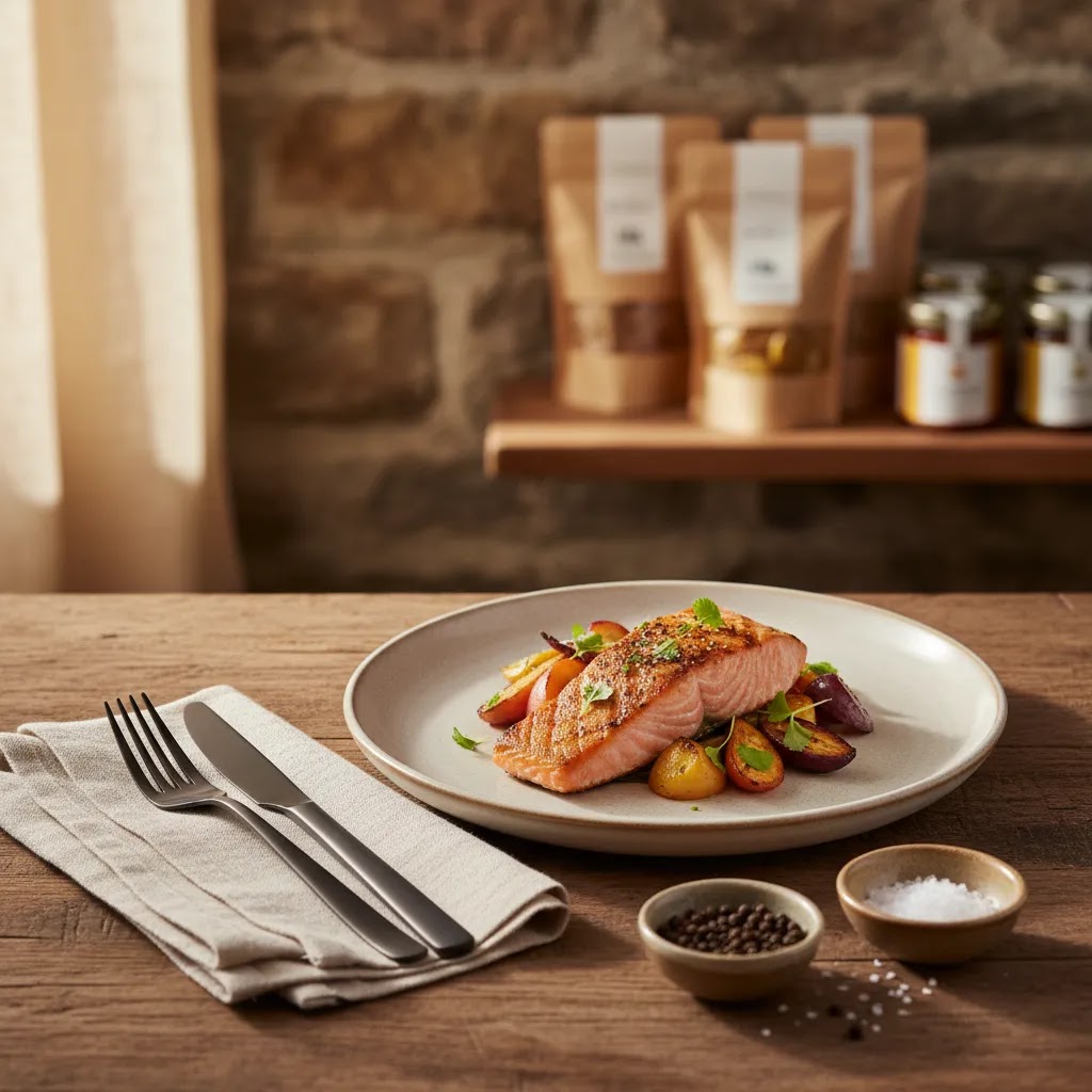
Food photography props are the supporting objects that help frame a dish or packaged food product. Think plates, bowls, cutlery, linens, glasses, trays, ingredients, surfaces, and small décor pieces. Their job is not to steal attention. Their job is to create context, balance, color contrast, and appetite appeal.
For ecommerce, that role gets even more specific. Props should support the selling goal of the image. On a product page, they may help communicate serving suggestions or product use. In paid social, they may make a still image feel less flat and more native to the feed. In email or landing page banners, they can reinforce seasonality and brand mood.
The best prop choices usually do three things well:
If your visuals are also part of a larger identity refresh, it helps to review how styling overlaps with branding photography. The strongest ecommerce image systems do not treat props as random add-ons. They treat them as part of a repeatable visual language.
The best props to style dishes like a pro
You do not need a massive prop closet to get professional-looking images. You need a small set of versatile items that photograph well and fit your offer. For most food brands, these are the props worth buying or sourcing first.
1. Neutral plates and bowls
Start with matte white, cream, gray, or muted ceramic dishes. These colors work across most cuisines and let the food stay dominant. Bright patterns can work for certain brands, but they are harder to reuse across a product catalog.
2. Simple cutlery with low shine
Highly reflective metal can create editing headaches and distracting highlights. Brushed finishes or darker-toned cutlery usually photograph more cleanly. Keep several sizes so your setup feels proportionate in close-ups and overhead shots.
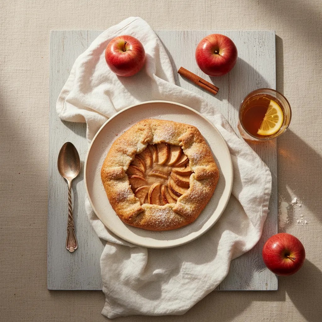
3. Textured linens and napkins
Linens add softness and depth, especially for flat lay food photography props. Wrinkles can be useful when controlled, but messy folds tend to look accidental. Stick to a small palette that supports your packaging colors.
4. Glassware that fits the serving story
If you sell drinks, sauces, syrups, or anything used in recipes, the right glass can clarify scale and use case. A heavy tumbler communicates something different from a delicate stemmed glass. Choose shapes that support the product rather than compete with it.
5. Ingredient accents
Fresh herbs, spices, crumbs, citrus slices, or raw ingredients can add realism and movement. The key is restraint. A few supporting ingredients placed with intention usually look better than a crowded table full of visual noise.
6. Trays, boards, and risers
These help create levels and separate objects without making the shot feel cluttered. Wood boards work well for rustic brands. Painted risers or acrylic blocks suit more modern or premium looks.
7. Backdrops and surfaces
Your surface is one of the most important props in the entire setup. Food photography backdrops influence contrast, warmth, and mood more than most store owners expect. Review your scene background choices with the same care you give plates and styling tools. One good background can carry dozens of campaigns.
For merchants experimenting with AI-supported visuals, this is also where workflow decisions start to matter. If you want concept variety before a full shoot, an ai scene generator can help you test styling directions, color palettes, and set ideas before you commit to physical production.
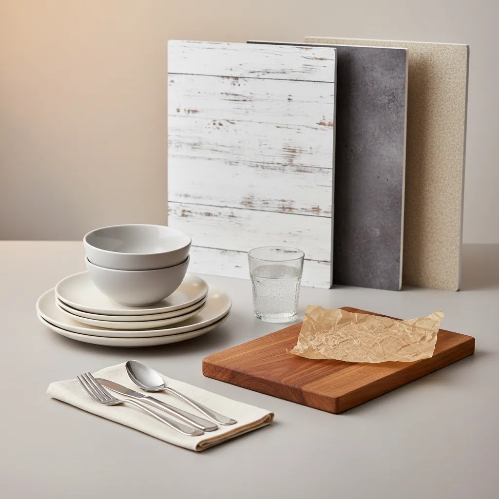
Essential prop checklist for a starter kit (most you already own)
Here’s the thing, most “prop closets” start as a kitchen drawer plus a couple of smart additions. If you are trying to build consistency across product pages and ads, the goal is not to collect cute objects. The goal is to build a small kit you can reuse across multiple SKUs, seasons, and shot types.
From a practical standpoint, start by doing a quick inventory at home. Pull items that are camera-friendly, meaning they are neutral, matte or low-shine, and not heavily branded. Then fill the gaps with a few pieces that help you create variety without changing your whole look every time.
Starter kit essentials to look for
Most store owners can find a surprising amount of this in their own kitchen:
How to choose pieces that stay useful
What many store owners overlook is that versatility is mostly about shape, texture, and neutrality.
If you have branded packaging with bold colors, lean more neutral with props. If your packaging is minimal, you can typically add a little more warmth and texture around it. Either way, you want your props to support your brand palette, not compete with it.
Storage and organization for a small prop kit
Once you have the basics, keep them usable. A prop kit that is chipped, stained, or scattered across your house is hard to rely on when you need to shoot quickly.
For most Shopify store owners, this kind of organization matters because you are not doing one perfect shoot. You are doing repeated shoots over months, sometimes in a rush, sometimes between other business tasks.
Pros and Cons
Strengths
Considerations
Common prop mistakes that ruin food photos (and how to fix them)
The reality is that most food photos do not fail because the food looks bad. They fail because the styling makes the product unclear, messy, or off-brand. If you are selling online, these mistakes can show up fast in thumbnails and collection grids, even if the full-size image looks “pretty.”
Props are more colorful than the food
This is the classic problem, the props upstage the dish. It often happens when you use bright napkins, patterned plates, or colorful glassware around food that is more subtle in tone.
How to spot it quickly:
How to fix it:
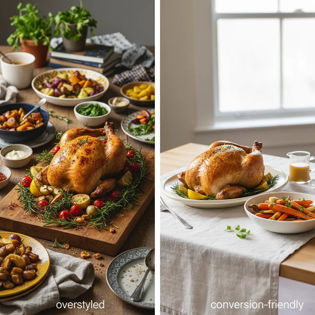
Overcrowding and mixed styles in one frame
Too many items is not just a composition issue. In ecommerce, it can lower perceived quality because the scene feels unplanned. You also see this when props come from different style worlds, like rustic wood plus modern glossy ceramics plus loud patterns. The photo can end up looking like a garage sale table, not a brand.
How to fix it:
Consider this, many Shopify product pages show images in a grid or carousel. A crowded scene can look worse when cropped, and it can make it harder for shoppers to understand what they are actually buying.
Reflection and glare from shiny cutlery and glassware
Shiny props can create bright hotspots that pull attention away from the product. They can also reflect your light source, your camera, or even your clothing, which can be a pain to retouch at scale.
How to fix it:
The way this works in practice is simple, if your props are difficult to light, they are difficult to scale. For ecommerce, “looks good under normal lighting” matters more than “looks cool in one perfect shot.”
Who this approach is for
This approach works best for ecommerce brands that need images to do more than document a product. If you sell coffee, snacks, spice blends, sauces, sweets, supplements, meal kits, or kitchen-adjacent products, thoughtful prop styling can make your catalog feel more intentional and more premium.
It is especially useful for Shopify merchants who manage content in-house and need one visual system that can stretch across product pages, collection pages, paid ads, and organic social. If you are still working out basic lighting, camera angles, and consistency, pairing this guide with a broader product photography studio setup article will help you avoid styling problems that are really production problems.
AcquireConvert recommendation
For most store owners, the smart move is to build a compact prop system instead of buying props one shoot at a time. Start with 2 to 3 plates, 2 linens, 1 to 2 glasses, one wood or stone-style surface, and a handful of ingredient accents that match your niche. Then test those across hero shots, flat lays, and promotional creatives. That approach keeps your imagery consistent while still giving you enough flexibility for campaigns.
At AcquireConvert, the editorial lens is practical ecommerce performance, not just aesthetics. Giles Thomas’s experience as a Shopify Partner and Google Expert is useful here because image decisions affect more than brand feel. They can influence click-through from ads, on-page engagement, and how trustworthy your catalog looks to shoppers. If you want more visual strategy guidance, browse the Lifestyle Product Photography section or review the basics in Product Photography Fundamentals before investing in a larger shoot.
How to source props: thrift, antique, handmade, and brand-safe options
If you are building a prop kit for ecommerce, sourcing matters because you are not buying one-off pieces for a single photo. You are buying repeatable tools for your content pipeline.
For most Shopify store owners, the best approach is to source props from a few reliable “lanes,” then filter everything through brand consistency and camera performance.
Where to find good props (and what to look for)
Here are common places store owners source food photography props, plus quick checks that help you avoid mistakes:
What many store owners overlook is how often branding sneaks into props. Logos on mugs, patterned plates with recognizable marks, or trendy shapes can date your catalog. In ecommerce, the cleanest prop is often the one nobody notices.
When to buy vs rent or borrow
Buying props makes sense when the pieces support your everyday catalog and can be reused for months. Renting or borrowing can make more sense for campaign-specific needs, like a holiday setup, a limited seasonal flavor, or a one-time brand shoot where you need a different vibe.
If you rent or borrow, be thoughtful about hygiene and food-contact surfaces. Boards, linens, and glassware may need extra cleaning, and some vintage items are better used as background elements rather than direct food-contact pieces. If your product is packaged and sealed, you have more flexibility. If you are plating real food, keep your workflow clean and consistent.
How to stay consistent as your catalog scales
Consistency gets harder when you add SKUs, change seasons, and shoot in batches across months. This is where a simple “prop style guide” helps, even if it is just a one-page note for your team.
Think of it this way, you are defining guardrails:
That strategy helps you source new props without slowly drifting away from the look shoppers recognize in your store and ads. It also makes it easier to keep your Shopify product pages consistent when you add new photos later.
How to choose props without hurting conversions
Picking food photography props is not just a creative exercise. It is a merchandising decision. Here is how to make better choices if your main goal is selling online.
1. Match props to your price point
If your product is positioned as premium, flimsy-looking props will undermine that message. Handmade ceramics, heavier linens, and restrained styling often support higher perceived value. If your product is casual and family-oriented, over-styled props may feel disconnected from the real customer experience.
2. Prioritize product visibility
Ask one simple question for every object in the frame: does this help sell the product? If not, remove it. This is especially important for thumbnail images, collection pages, and mobile-first layouts where small visual distractions have a bigger impact.
3. Build around repeatability
The best props are not just attractive. They are reusable. A store owner with 20 SKUs should avoid building totally different scenes for every product unless the margin supports that effort. Consistent props can create a more trustworthy catalog and simplify reshoots later.
4. Think in shot types
Different images need different prop density. Hero images often need fewer props because the shopper must identify the product instantly. Editorial banners and social assets can carry more environmental detail. Flat lays benefit from symmetry and spacing. Angled shots often need depth and layering. Plan your prop kit around those use cases rather than styling every image the same way.
5. Decide where AI helps and where it does not
AI generated food photography can be useful for concept exploration, seasonal mockups, or testing background ideas before a real shoot. It may also help smaller brands develop rough compositions when time is tight. But AI for food photography still needs human judgment. Texture realism, ingredient accuracy, plating logic, and brand consistency can all become weak points if you rely on automation alone.
If you are comparing ai vs traditional food photography, treat AI as a planning and iteration tool first. For many ecommerce brands, that is the most reliable way to use it. Traditional photography still gives you stronger control over product truthfulness, exact packaging details, and compliance-sensitive visuals. That is especially important if what shoppers receive must closely match what they saw online.
6. Test images in real ecommerce contexts
A styled image can look great full screen and still perform poorly as a product card, ad creative, or mobile crop. Before committing to a prop direction, place your images into the actual environments where customers will see them. Check homepage banners, collection grids, PDP galleries, and social placements. What looks polished in isolation may feel cluttered in a live store theme.
The practical rule: choose props that improve clarity first and mood second. If a styling decision weakens clarity, it is probably the wrong one for ecommerce.
Frequently Asked Questions
What is food photography in an ecommerce context?
Food photography for ecommerce is imagery created to help sell food-related products online. That can include packaged foods, drinks, meal kits, ingredients, or kitchen products shown with food. Unlike editorial-only photography, ecommerce images need to balance appetite appeal with accuracy, clear branding, and compatibility with product pages, ads, and mobile layouts.
Which food photography props should I buy first?
Start with versatile basics: neutral plates, one or two bowls, low-reflection cutlery, textured linens, and a reliable backdrop or tabletop surface. Those items work across many products and shot types. Buy props that can be reused across your catalog instead of niche items that only fit one campaign.
What are the essential props for food photography?
A practical starter set is usually neutral plates or bowls, one simple board or tray, a couple of textured linens, low-shine cutlery, and a matte surface or backdrop. Add a few small bowls or ramekins for spices and toppings. In many cases, you already own most of this. The key is choosing pieces that are neutral, low-glare, and reusable across multiple products.
What color props are best for food photography?
Neutral colors tend to be the most reusable for ecommerce, like white, cream, gray, muted earth tones, and darker slate-style tones. They keep the food as the priority and help your catalog look consistent across SKUs. If you use color, treat it as a controlled accent, often through a linen, a garnish, or one supporting item, rather than multiple bright props competing in the same frame.
How do you choose props that don’t distract from the food?
Use props with simple shapes, minimal patterns, and low shine. Then run quick checks: view the image as a small thumbnail and use the squint test. If your eye goes to the napkin, glassware, or cutlery before the product, the props are too loud. Pull elements out until the product is clearly the highest priority.
Where can I buy (or find) food photography props?
Thrift stores are often great for neutral plates, bowls, and linens. Vintage and antique stores can add character pieces, and kitchen supply stores can be good for standardized items you can replace later. If you want a premium handmade look, local ceramics can work well. In all cases, prioritize matte finishes, minimal branding, and pieces that fit your brand style guide so your images stay consistent as you scale.
How many props should I use in one image?
Usually fewer than you think. For product-focused ecommerce shots, one hero dish plus two to four supporting elements is often enough. The exact number depends on crop, platform, and composition. If the viewer notices the props before the product, the styling is probably too busy.
What are the best food photography backdrops?
Good backdrops are matte, non-distracting, and appropriate for your brand. Neutral stone, painted wood, soft gray, off-white, and darker slate-style surfaces are common because they create contrast without overpowering the dish. The best choice depends on the food color, packaging palette, and the mood you want to create.
Can AI replace traditional food photography?
Not fully for most ecommerce brands. AI can help with concept generation, scene testing, and early-stage creative exploration. It may be useful for social content or visual ideation. But traditional photography is usually stronger for exact packaging accuracy, realistic plating details, and maintaining trust between product images and what customers receive.
Is a food photography app enough for store owners?
A food photography app can help with quick edits, color cleanup, and content production on a phone. For some small brands, that may be enough for social content or early-stage listing images. But if you need consistent paid ad creatives, premium product pages, or large campaign assets, you will usually outgrow app-only workflows.
What props work best for flat lay food photography props setups?
Flat lays benefit from items with clear shapes and controlled textures. Plates, napkins, cutlery, ingredient sprinkles, recipe cards, and small bowls all work well because they create structure from above. Choose props that help spacing and balance rather than objects that add height, which reads less effectively in overhead compositions.
Is food photography profitable for ecommerce brands?
It can be valuable when the images improve product understanding, brand perception, and campaign usability. The return depends on your margins, order value, traffic quality, and how widely you reuse the images. Strong visuals may support better merchandising, but they are only one part of conversion performance.
How should I approach thai food photography or other cuisine-specific styling?
Use props that respect the cuisine and serving context rather than defaulting to generic restaurant styling. Research typical tableware, ingredient presentation, and color cues. Authenticity matters. If the props feel culturally mismatched or overly stereotyped, the image may lose credibility even if it is technically polished.
Key Takeaways
Conclusion
The right food photography props can make your dishes look more polished, more on-brand, and more ready to sell online. The wrong ones can clutter the frame and weaken product clarity. That is why the best approach is usually simple, repeatable, and built around your actual ecommerce use cases, not just what looks artistic in isolation.
If you are refining your brand visuals, AcquireConvert is a strong place to continue your research. Explore more practical guidance in our lifestyle and product photography resources, and use Giles Thomas’s practitioner-led insights to make smarter decisions about AI imagery, product presentation, and conversion-focused content for your store.
This article is editorial content published by AcquireConvert for educational purposes. It is not a paid endorsement unless explicitly stated otherwise. Any outcomes from photography, styling, or AI-assisted workflows will vary by brand, product type, execution quality, and traffic source. Tool capabilities and product offerings are subject to change, and readers should verify current details directly with the provider.

Hi, I'm Giles Thomas.
Founder of AcquireConvert, the place where ecommerce entrepreneurs & marketers go to learn growth. I'm also the founder of Shopify agency Whole Design Studios.