Product Styling for Better Photos (2026 Guide)

Product styling is the difference between a photo that simply shows an item and one that helps a shopper picture owning it. For ecommerce brands, that matters because your images often have to do the work of an in-store experience. Good styling can add context, clarify scale, reinforce brand positioning, and make your catalog feel more consistent across product pages, ads, and social content. If you are building stronger visual merchandising for your store, this sits alongside broader lifestyle photography decisions such as setting, composition, and how much story each frame should carry. The goal is not to decorate for the sake of it. The goal is to arrange products in a way that supports buying intent, keeps the item as the hero, and fits how your customers actually shop online.
Contents
What product styling really means for ecommerce
Product styling is the deliberate arrangement of the hero product, supporting props, surfaces, colors, textures, and spacing within a shot. In ecommerce, that arrangement should help a shopper understand the product faster. It should not distract from the item or make the image feel confusing.
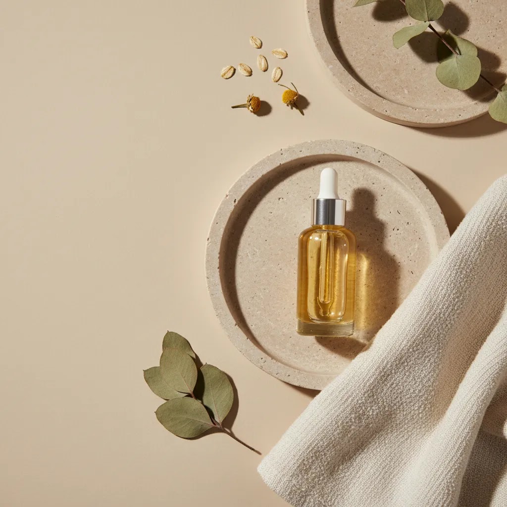
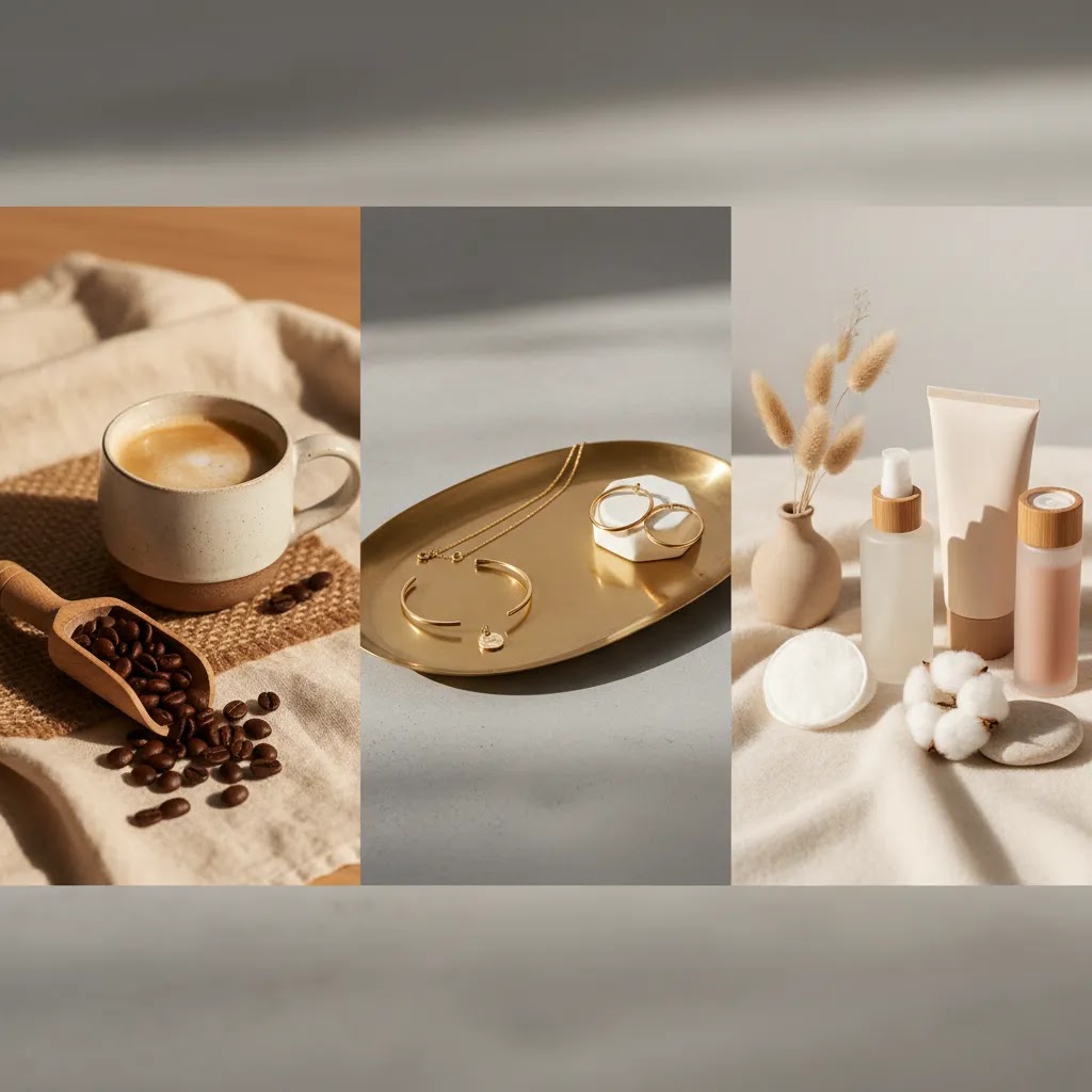
For example, a skincare brand may style a serum with a clean tray, soft towel texture, and ingredients that suggest routine and quality. A coffee brand may style beans, cups, and linen to communicate warmth and use occasion. A jewelry store may keep props minimal and rely on shadow, elevation, and spacing so the metal finish stands out.
The best styling choices usually depend on three things: the sales channel, the product type, and the customer’s purchase motivation. Amazon main images often need stricter simplicity, while DTC product pages and paid social can support more contextual scenes. If your visual direction is tied closely to your brand identity, your styling should also align with your broader branding photography approach so shoppers get a consistent impression across touchpoints.
For Shopify merchants in particular, styled images can support higher perceived value, stronger merchandising, and clearer differentiation, especially in crowded niches like beauty, home goods, food, and accessories.
Key product styling elements to get right
1. Start with the product hierarchy
Your product should stay visually dominant. Before you add props, decide what the eye should notice first, second, and third. If a prop is larger, brighter, or more detailed than the actual item, the styling is working against you.
2. Match props to buyer intent
Props should clarify use, ingredients, scale, or mood. They should answer a shopper’s likely questions. A candle may benefit from styling that suggests room setting and ambiance. A cleanser may benefit from styling that suggests routine, freshness, and texture. Random decorative objects usually weaken the photo.
3. Build around the right scene background
Surfaces, backdrops, and depth cues affect how premium or practical a product looks. A matte stone surface may suit luxury skincare. Painted wood may fit handmade goods. If you are refining backdrop choices, it helps to think deliberately about your scene background so the setting supports the product category instead of competing with it.
4. Use color with restraint
Pick a tight palette. Usually one dominant color family, one secondary accent, and a neutral is enough. Too many competing tones can make product grids look inconsistent across your store. This matters on collection pages where shoppers scan quickly and visual clutter can lower clarity.
5. Style for crops and channel requirements
A scene that looks great in a wide banner may fall apart in a square crop for Instagram or a mobile PDP gallery. Plan your arrangement so key details survive vertical, square, and landscape formats. This is especially important if the same asset will be reused in email, social, paid ads, and onsite merchandising.
6. Decide where AI editing actually helps
Not every store has a full studio setup. If you need to test concepts quickly, AI tools can help with variations, cleanup, and scene experimentation. AcquireConvert readers evaluating visual workflows may find tools like AI Background Generator, Free White Background Generator, and Background Swap Editor useful for concept development or supporting assets. These tools may save time for some workflows, but they still need careful review for realism, consistency, and channel compliance.
If you want a broader foundation before building styled sets, the category pages on Product Photography Fundamentals and Lifestyle Product Photography are practical starting points.
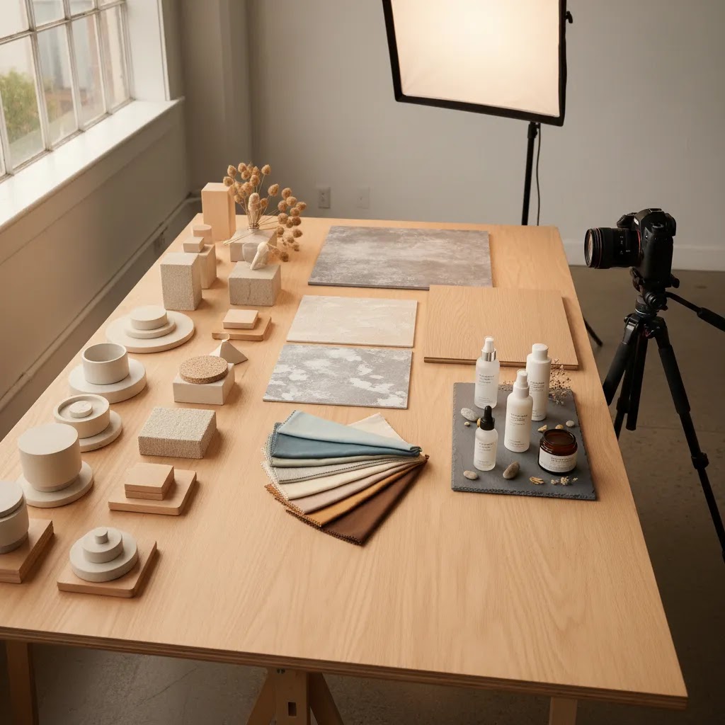
A practical product styling workflow: concept to shot list
Here’s the thing: most styling problems happen before you even pick up the camera. Store owners often style “by vibe” on the day, then wonder why the set looks different across products, or why the images do not crop cleanly for Shopify and paid social.
A simple workflow fixes that. You start with a concept, then translate it into a repeatable shot list you can run across a whole collection.
Step 1: Define the concept or story first
Before you choose props, decide what the photo needs to communicate in one glance. Think of it as the one-sentence story behind the frame: “morning skincare routine,” “freshly baked and ready to serve,” or “premium giftable candle for a cozy home.”
From a practical standpoint, this keeps your prop decisions honest. If a prop does not support that story or the buyer intent behind it, it does not earn a place in the scene.
Step 2: Turn the concept into a repeatable shot list
You want a shot list that works for ecommerce, not just a single hero image. For most Shopify product pages, a useful baseline includes:
This also makes your content more reusable. The same set can feed your Shopify PDP gallery, collection page merchandising, and paid ads, as long as you plan for crops upfront.
Step 3: Prep to avoid reshoot pain later
What many store owners overlook is continuity. If a product sells well, you may need to reshoot it, add a new variant, or expand the collection. If you cannot recreate the scene, your catalog starts looking messy fast.
Small prep steps help a lot:
If you are doing this in-house, even a phone photo of the set with notes about placement can be enough to make future shoots match.
Step 4: A simple on-set sequence that saves time
The way this works in practice is simple: test first, then shoot the full set.
Take one test frame, then check three things before you commit:
Once those are right, shoot the full sequence from your shot list. You get more consistent results and fewer “we have to redo this” surprises.
Pros and Cons
Strengths
Considerations
Product styling techniques: props, placement, and human elements
If you already understand the basics, the next level is not “more props.” It is how you use them. The same prop library can look premium or messy depending on placement, spacing, and whether the scene feels natural.
Prop storytelling without clutter
Consider this: props work best when they behave like supporting evidence. They should reinforce a message your customer already wants to believe, such as “this is fresh,” “this is calming,” or “this is made for daily use.”
A simple way to keep scenes clean is to choose props that do one job each. One prop can suggest use, another can suggest texture, another can hint at ingredient or scent. When a prop does not have a role, it becomes visual noise.
If you struggle with clutter, start by removing props until the image still makes sense. Then add back only the one element that improves clarity or mood the most.
Natural placement that still feels intentional
Styled photos often fail when everything looks “placed” at the same angle with the same spacing. Real life has variation. Items overlap slightly. Some objects sit closer to camera. Some are partially cropped.
From a practical standpoint, your goal is controlled imperfection. Try placing props on slightly different angles and distances, then check that the product still reads as the hero. Negative space matters here, especially for Shopify galleries where thumbnails are small and busy images can look confusing.
Using human elements to add relatability
Hands, usage moments, and in-context interactions can make lifestyle images feel more believable, especially for beauty, skincare, food, and small accessories. They also help shoppers understand scale quickly.
The key is restraint and realism. Show the interaction that explains the product, such as holding a jar, dispensing a serum, lighting a candle, or wearing an accessory. Avoid poses that look unnatural, or anything that blocks the product label when the label is a key trust signal.
If you do include hands, keep an eye on consistency. Nail color, skin tone, and grooming can change the perceived brand feel, especially across a collection. Many stores standardize this by using the same model hand or the same set of guidelines for every shoot.
Simulating real-life situations by category
For most Shopify store owners, “lifestyle” does not mean a full production shoot. You can build simple use scenes that customers recognize immediately.
The reality is that these scenes work when the product remains the anchor. If the environment starts to feel like the main subject, the image may look nice but do less for conversion.
Who should focus on product styling first
Product styling deserves priority if you sell visually influenced products where context shapes buying decisions. That includes skincare, cosmetics, candles, packaged food, apparel accessories, jewelry, home décor, and gift items. It is especially useful for Shopify brands that already have traffic but feel their product pages look flat or too similar to competitors.
If you are still building basic catalog coverage, start with clear core images first. Then layer in styled assets where they can support merchandising and storytelling. Merchants working from a small space can still do this well with a simple setup or a compact product photography studio workflow rather than a large commercial set.
AcquireConvert recommendation
If you are evaluating how much styling your store actually needs, treat it as a merchandising decision, not just a creative one. Start by looking at your highest-margin or most giftable products first. Those are often the SKUs where improved imagery has the clearest commercial upside. Then review whether your current photos answer three shopper questions: What is it? How is it used? Why does it feel worth the price?
AcquireConvert takes a practical approach here. The site is led by Giles Thomas, a Shopify Partner and Google Expert, so the advice is grounded in how ecommerce operators build stores that need to convert, not just look good. If you want to extend styled imagery without a full reshoot, you can also explore AcquireConvert’s coverage of an ai scene generator for testing concepts and supporting creative production. This is a useful next step if you are comparing manual styling, studio shoots, and AI-assisted workflows.
How to choose the right styling approach
1. Choose based on product category
Different categories need different levels of context. Beauty products often benefit from ingredient cues, reflective surfaces, and routine-based arrangements. Food products usually need appetite appeal and serving context. Home goods often need spatial context so shoppers can picture the item in use. Start by asking what the customer cannot easily infer from a plain cutout image.
2. Choose based on channel
For Amazon, styled images usually belong in secondary gallery slots or A+ content rather than the main image. For Shopify PDPs, homepage campaigns, and Meta ads, you have more room to create a scene that reinforces value. This is why many brands use a mix: clean catalog images for clarity and styled images for persuasion.
3. Choose based on your brand position
If your brand competes on premium perception, styling should feel intentional and polished. If you compete on utility or price transparency, a simpler, more functional setup may perform better. The right answer is not always the most elaborate one. It is the one that fits your customer’s expectations.
4. Choose based on production capacity
If you launch new products often, complex styling may be hard to maintain. Build a repeatable system instead: a small prop library, two or three approved surfaces, defined lighting setups, and a shot list template. Consistency usually matters more than novelty for growing catalogs.
5. Choose based on whether you need speed, realism, or control
Physical styling gives you the most control over material realism, shadows, and product accuracy. AI-assisted tools may help with faster experimentation. For instance, Magic Photo Editor and Creator Studio may be helpful if you want to test layout concepts or create additional variations for marketing channels. Still, review every output carefully. Packaging edges, reflections, labels, and hand placement can all affect trust if they look unnatural.
A practical decision framework for store owners looks like this:
If you follow that approach, product styling becomes easier to manage and more commercially useful.
Color psychology and background strategy (by product category)
Color and background are not just aesthetic choices. They change what shoppers assume about the product before they read a word of copy. On Shopify collection pages, your images often appear as a grid first, so consistency and first impressions can matter as much as the individual PDP gallery.
Warm vs cool palettes, and what they tend to signal
Think of it this way: warm palettes often read as cozy, comforting, and “human.” They can work well for candles, food, drinkware, and home goods where warmth matches the use occasion.
Cool palettes often read as clean, fresh, and clinical. They can be a fit for skincare, wellness, and products where shoppers want to feel “purity” or performance.
Neutrals can signal minimalism and premium positioning, but they can also make products blend together if everything is beige. If your collection page starts to look like a single color block, consider adding one controlled accent color that repeats across the set.
A background choice framework that supports conversion
Backgrounds usually fall into a few practical buckets. The right one depends on category, price point, and how much context the customer needs to understand the product.
For category-specific direction, here are practical defaults that tend to work well:
Post-production consistency: the overlooked part of styling
What many store owners overlook is that styling is only half the battle. Editing decisions can make a catalog feel cohesive, or make it feel like five different shoots stitched together.
Light retouching is usually about consistency: matching exposure, white balance, and contrast across your core product set. The goal is that a shopper can scroll your collection page and everything feels like it belongs together.
Be careful with over-editing. If you push color too far, shoppers may receive a product that looks different from the photos, which can create trust issues and returns. This is also where AI-assisted editing needs extra review. It can be helpful for cleanup and testing variations, but you still need to verify label accuracy, edges, and true-to-life color before publishing images across your Shopify store and ads.
Frequently Asked Questions
What is product styling in ecommerce photography?
Product styling is how you arrange the product and any supporting elements in a photo to improve clarity, context, and brand presentation. That can include props, surfaces, colors, spacing, and lighting direction. In ecommerce, the purpose is usually to help shoppers understand the product faster and make the page feel more persuasive without distracting from the item itself.
How many props should I use in a styled product photo?
Usually fewer than you first think. Start with one to three supporting elements that reinforce use, ingredients, or mood. If a prop does not help explain the product or strengthen the brand feel, remove it. For most store owners, restraint leads to cleaner galleries, stronger mobile viewing, and easier consistency across the rest of the catalog.
Are styled photos better than white background product images?
They serve different jobs. White background images are usually best for clarity, compliance, and quick product scanning. Styled photos are better for storytelling, brand positioning, and use-case context. Many ecommerce stores need both. A clean primary image builds trust, while a styled secondary image can help communicate why the product matters in real life.
Does product styling help Shopify product pages convert?
It may help when styling clarifies value, supports perceived quality, or gives shoppers context they cannot get from a plain image alone. The effect depends on product type, customer expectations, and the rest of your page experience. Styled imagery works best when paired with strong copy, clear pricing, trustworthy reviews, and a clean product page layout.
What products benefit most from lifestyle product styling?
Products that rely on visual appeal, gifting potential, or routine context tend to benefit most. That includes beauty, skincare, candles, food, drinkware, accessories, and home décor. These categories often sell better when shoppers can picture the item in use, understand its texture or mood, and see how it fits within a broader lifestyle.
Can I use AI tools for product styling concepts?
Yes, in many cases AI tools can help you test backgrounds, scene arrangements, and visual directions before a full shoot. They can also support content variations for ads or social. Still, they are best used with review and restraint. Always check realism, label accuracy, shadows, and product proportions before using AI-generated visuals on commercial pages.
How do I keep styling consistent across a large catalog?
Build a repeatable system. Create a small approved prop library, define two or three background surfaces, document your lighting setup, and use a standard shot list by collection. Consistency becomes much easier when you reduce creative decisions on shoot day. This also helps if different team members or freelancers contribute assets over time.
Should Amazon product photos use the same styling as my Shopify store?
Not always. Amazon often has stricter image expectations, especially for main images, so your Shopify gallery may support more creative context than your marketplace listings. You can still keep the same brand feel, but the exact composition and level of styling may need to change by channel. Start with platform rules, then adapt your creative approach around them.
What is the biggest mistake in product styling?
The most common mistake is letting the set design overpower the product. If shoppers notice the props first, the image is probably doing too much. Another frequent issue is styling that looks attractive but does not match the actual customer or product use case. Good styling should feel intentional, relevant, and commercially useful.
What does a product stylist do?
A product stylist plans and builds the visual set around the product. That typically includes defining the concept for the shoot, selecting surfaces and props, arranging the product for camera, and making sure the scene supports the brand and sales channel. In ecommerce, a good product stylist also thinks about repeatability, so the look can be maintained across new SKUs and future reshoots.
How do you become a product stylist?
Most product stylists build skills through practice and portfolio work. Start by learning basic composition, lighting direction, and prop selection, then create a few repeatable “sets” you can shoot across multiple products to show consistency. If you work with ecommerce brands, it also helps to understand practical constraints like Shopify product page crops, how collection page grids look, and how images get reused in ads and email.
What is a styling product?
A styling product is a supporting item used to help stage the main product, such as a tray, fabric, ingredient cue, or background surface. The point is to add context or mood without competing with the hero item. In a strong ecommerce photo, styling products should feel relevant to buyer intent and kept simple enough that the main product stays visually dominant.
What is product styling?
Product styling is the process of arranging a product and any supporting elements, like props, surfaces, and backgrounds, so the photo communicates value clearly and consistently. For ecommerce, the goal is to help shoppers understand the item quickly, picture it in use, and feel confident in what they are buying.
Key Takeaways
Conclusion
Strong product styling is really about better visual merchandising. It helps your photos explain the product, support your brand, and create a more considered shopping experience across product pages, ads, and social channels. The right setup is usually simpler than many store owners expect. Start with product clarity, add only the props that earn their place, and build a styling system you can repeat as your catalog grows. If you want practical next steps, AcquireConvert is a useful specialist resource for ecommerce imagery, AI-assisted creative workflows, and Shopify-focused growth advice. Explore the related guides linked above to compare approaches and find a styling process that fits your store, your team, and your content goals.
This article is editorial content created for educational purposes and is not a paid endorsement unless explicitly stated otherwise. Pricing, features, and tool availability are subject to change, so verify current details directly with the provider before making a decision. Any performance or conversion impact discussed here is illustrative only and not guaranteed.

Hi, I'm Giles Thomas.
Founder of AcquireConvert, the place where ecommerce entrepreneurs & marketers go to learn growth. I'm also the founder of Shopify agency Whole Design Studios.