Flat Lay Clothes Photography Ideas (2026 Guide)
You have solid products, your Shopify store is live, and traffic is starting to come in, but your apparel photos still feel flat in the wrong way. That is a common problem for fashion brands, especially when hiring full model shoots for every new drop is not realistic. Flat lay photography can help you show fit, styling, fabric, and brand personality without the cost and complexity of a full editorial setup.
The challenge is that not all flat lays sell equally well. Some look polished and scroll-stopping, while others make even a strong product feel lifeless. The difference usually comes down to planning, composition, lighting, and how well each image matches the intent of the page it lives on. If you need inspiration that works for ecommerce, this guide will walk you through practical flat lay clothes photography ideas you can use for product pages, collection banners, email campaigns, and social content. If you want broader context on product photography, this article fits into that bigger picture and focuses specifically on apparel.
Contents
Why flat lays work for fashion stores
Flat lays are popular because they give you control. You can shape the garment, show key details, and create a consistent catalog look without worrying about model direction, studio schedules, or changing body positions across a product line.
For many Shopify apparel stores, that consistency matters just as much as creativity. Collection pages tend to look stronger when products share a similar angle, crop, and visual rhythm. A well-shot flat lay also helps customers quickly understand what they are buying, which can reduce friction before the add-to-cart moment.
Think of it this way: model shots often sell aspiration, while flat lays often sell clarity. The strongest stores usually use both. If you want more inspiration beyond clothing-specific examples, AcquireConvert has a related guide on flat lay photography ideas that can help you expand your shot list across different product types.
What flat lays show especially well
Flat lay clothes photography ideas work best when you need to highlight shape, color, pattern, and styling combinations. They are especially useful for tees, dresses, denim, knitwear, activewear, kidswear, and accessories that pair naturally with an outfit story.
They also perform well in email and social formats because the composition is easy to crop for square, vertical, and banner layouts. In practice, this means one planned shoot can supply assets for product pages, Instagram, paid social creative, and seasonal landing pages.
How to build a flat lay that sells
Before you try more advanced photography ideas, get the structure right. A strong flat lay starts with a garment that looks intentional on the surface beneath it. If the item is wrinkled, twisted, or unevenly spaced, the image will usually feel amateur, even with good lighting.
Start with garment prep
Steam the clothing, remove lint, and shape the item before the camera comes out. Sleeves, collars, hems, and waistlines should look neat but still natural. For fashion ecommerce, over-stiff styling can make products look less wearable.
Choose the hero angle early
Most clothes flat lay photography uses a straight overhead angle because it creates the cleanest catalog presentation. That said, slight angle shifts can work for editorial banners or social content. The key is consistency within a product range, so customers are not comparing one neatly framed item against another that looks oddly distant or oversized.
Build around the commercial goal
What many store owners overlook is that the image brief should change based on placement. A main product image should prioritize clarity and accurate representation. A homepage banner or lookbook tile can be more styled and expressive. If you are refining this process across your brand, it helps to think beyond single images and toward your full product photography studio workflow, whether that is in-house or outsourced.
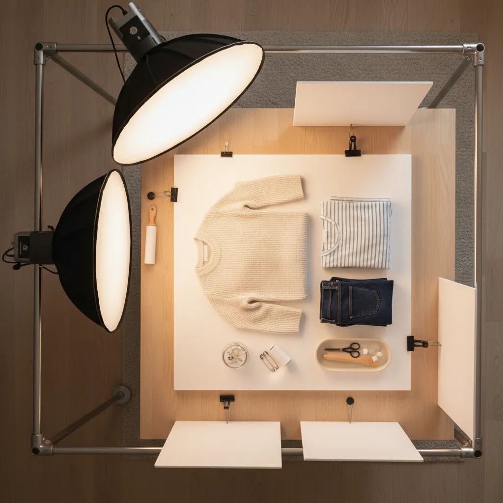
Flat lay clothing photography setup: gear, space, and an overhead workflow
A lot of flat lay photography problems are not creative problems, they are setup problems. If your camera is not truly overhead, if your distance changes from product to product, or if you are fighting the same wrinkles and shadows every shoot, it is hard to build a catalog that looks consistent.
The practical overhead setup (and how to avoid distortion)
The goal is simple: shoot straight down, with the camera sensor parallel to the floor. When the camera tilts even slightly, you start getting uneven proportions. Necklines look wider than they should, hems curve, and the garment can feel skewed in a Shopify collection grid.
In practice, most store owners get the most repeatable results using a tripod with a horizontal arm, or a C-stand style overhead setup, so the camera is positioned above the garment rather than in front of it. However you mount the camera, check that the lens is centered over the garment and that your frame edges look symmetrical. That one step can save a lot of editing time later.
A repeatable “stage” setup for small rooms
You do not need a big studio. You need a repeatable stage. Mark a rectangular “shoot area” on the floor with tape, then place your background board or paper inside that zone. The tape markers make it easier to keep your camera height and framing consistent.
Consider this: consistency comes from removing decisions. If your camera is always the same height, your background always sits in the same spot, and your lights stay at the same distance, you can reset between products fast. That is what makes flat lays practical for weekly drops and growing catalogs.
A basic gear checklist that makes shoots smoother
You do not need to buy everything at once, but a few low-cost tools usually make a bigger difference than upgrading your camera body. Clamps are useful for holding backdrops flat and keeping fabric from shifting. A steamer helps you remove wrinkles quickly, and a lint roller saves you from fixing dust and hair on every shot. Foam boards can be used as bounce to soften shadows, and sandbags can keep stands stable if you are working overhead.
Now, when it comes to phone vs camera: a modern phone can be enough for social-first flat lays if your lighting is controlled and your compositions are consistent. A dedicated camera tends to give you more flexibility for color accuracy, sharper detail crops, and more consistent results across a big product line. The best choice is the one that fits your current workflow and still produces images you would feel confident using as a main product photo.
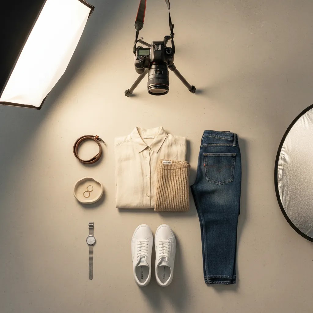
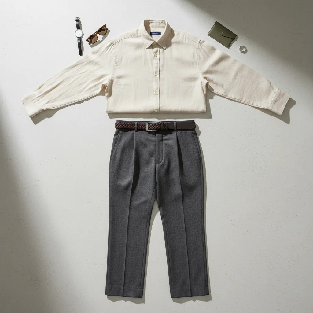
Creative flat lay clothes photography ideas
You do not need every photo to look the same. The reality is that different flat lay concepts serve different jobs in your store and marketing funnel. Some help customers inspect the product, while others create desire or show how pieces fit into a lifestyle.
1. The clean catalog flat lay
This is your baseline ecommerce shot. Place one garment on a plain background, center it carefully, and keep shadows soft. Use this for main product images, collection thumbnails, and marketplaces that prefer minimal styling.
2. The full outfit story
Style the hero garment with complementary pieces such as shoes, a bag, jewelry, or a jacket. This works especially well for boutiques and fashion brands with strong cross-sell opportunities. You are not just showing a dress or shirt, you are showing customers how to wear it.
3. The detail-led flat lay
Photograph the full garment, then capture close crop flat lays of fabric texture, buttons, stitching, labels, waistbands, or cuffs. This can be helpful for premium apparel, where material quality often drives the purchase decision.
4. The seasonal prop setup
Add props that support the season without overpowering the product. Sunglasses, beach towels, knit scarves, notebooks, or gift packaging can work well. Keep the props secondary. The garment still needs to be the focal point.
5. The color-variant lineup
If you sell one style in multiple colors, photograph the variants in a tidy arrangement. This is a practical way to communicate range and encourage comparison. It can also support collection pages and promotional graphics for new arrivals.
6. The folded-and-unfolded comparison
For knitwear, denim, or basics, show one folded item and one fully laid-out item together. This gives customers a quick sense of compactness and shape. It can work nicely in editorial sections of your store or social campaigns.
7. The social-first crop
Some social media flat lay clothes photography ideas are built for vertical reels covers, square posts, and story graphics. Leave extra negative space for text overlays, promotion labels, or pricing. If Instagram is a major traffic source for your store, plan these shots during the same session rather than cropping catalog images later and hoping they still work visually.
If tees are a big part of your assortment, AcquireConvert also has a more specific resource on flat lay t shirt photography ideas that can help you tailor compositions to that product type.
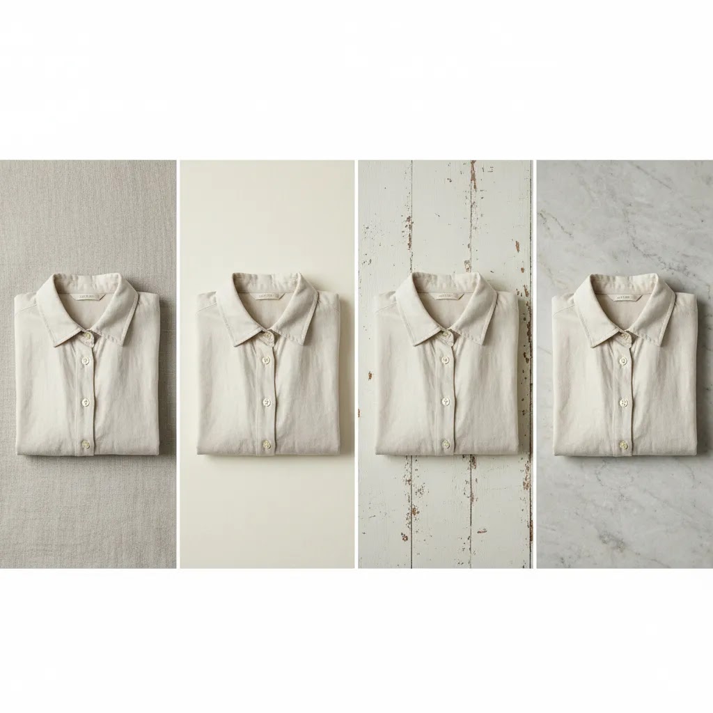
Flat lay backgrounds for clothes: what to use, what to avoid
Background choice is one of the fastest ways to change the perceived positioning of your brand. The right surface can make the same garment feel premium and intentional. The wrong surface can make colors look off, textures look noisy on mobile, and your collection pages feel inconsistent.
Clean seamless backgrounds vs textured surfaces
If your priority is a clean product grid and fewer surprises with color, seamless paper or smooth boards are usually the safest option. They keep the focus on the garment, and they tend to work well for core catalog images where clarity matters most.
Textured surfaces like linen, concrete, and wood can work well when your brand has a more boutique or lifestyle look. Linen can feel soft and natural for resortwear or kidswear. Concrete can feel modern for streetwear or minimalist basics. Wood can feel warm for heritage or outdoorsy positioning. The tradeoff is that texture can compete with subtle garment details, especially once the image is reduced to a small Shopify thumbnail.
Common background pitfalls that show up in ecommerce
Unwanted color casts are one of the big ones. A “white” foam board can photograph blue under cool LEDs, and a warm-toned wood surface can push neutrals and whites toward yellow. Reflective surfaces are another common mistake. They create bright spots that are hard to retouch and can make product edges look messy.
Fabric backdrops also look great until they wrinkle. If you use fabric, pull it tight and clamp it so the weave and creases do not become the main texture in the frame. Also check your background pattern at phone size. Grain, speckling, and heavy texture that looks tasteful on desktop can look distracting once your customer is scrolling on mobile.
A fast way to test backgrounds before committing
Pick one hero SKU that represents your typical color palette, then shoot it on two or three different backgrounds using the same lighting and framing. Drop those images into a mock collection grid view so you can judge what it will look like when customers browse quickly. What feels “cool” as a standalone photo does not always feel cohesive when you see 12 products in a row.
Backgrounds, lighting, and styling choices
Many flat lay clothing photography ideas succeed or fail based on the setup more than the styling concept. A smart composition on a poor background with mixed lighting will still look inconsistent. From a practical standpoint, the foundation matters.
Background ideas that support the product
White backgrounds are ideal for clean product listings and a professional catalog feel. Neutral tones such as beige, pale gray, stone, and warm cream can add softness without distracting from the garment. Textured surfaces like wood, linen, or paper may work for boutique brands, but only if they fit your brand style and do not distort color accuracy.
For most Shopify stores, one or two background styles are enough. Too many surfaces can make collection pages feel patchy. If you want examples across adjacent apparel niches, the Fashion & Apparel Photography category is a useful place to explore related visual approaches.
Lighting that keeps color accurate
Soft natural light near a window can work very well, especially for smaller brands shooting in-house. The main risk is inconsistency across times of day and weather conditions. If you shoot frequently, simple continuous lights or softboxes can give you more repeatable results.
Color accuracy matters a lot in apparel ecommerce. If the blue shirt looks teal in one image and navy in another, customers may lose confidence. Use the same lighting setup, white balance, and editing workflow across the range whenever possible.
Styling that looks intentional, not crowded
Flat lay photography background ideas often get too prop-heavy. Here is the thing: props should support the story, not compete with the product. If you are selling minimalist workwear, a clean notebook and watch might be enough. If you are selling resortwear, sandals and sunglasses may make sense. If the customer notices the prop before the garment, pull elements out.
How to keep flat lays consistent across a whole catalog
Consistency is what turns a set of flat lay clothing photography ideas into a catalog system. It is also what makes your Shopify store feel more premium, because customers stop noticing the photography and start focusing on the product.
Create a simple template per category
Different categories need different templates. A tee template is not the same as a dress template, and denim often needs its own approach. The way this works in practice is to define a standard crop, scale, and garment alignment for each category, then repeat it.
For example, you might decide that tees are always centered with the collar at a consistent distance from the top edge, sleeves angled in a consistent way, and the hem straight across. For dresses, you might standardize the shoulder placement and make sure the skirt hem is always fully visible. The exact template is less important than documenting it and sticking to it, especially across a big SKU count.
Use editing checkpoints to match color and exposure across SKUs
Mixed lighting is one of the main reasons catalogs look inconsistent. If you shoot some items with window light and others under LEDs, your whites and neutrals will often drift. Pick one lighting setup and lock it in. Set a consistent white balance, and avoid blending light sources unless you really know what you are doing.
It also helps to take a quick reference shot at the start of each session, then use it as a visual anchor when you edit the rest of the products from that shoot. That way, if your exposure creeps brighter over time or your warmth shifts, you have something consistent to match back to.
Plan files and output for ecommerce, not just for a single image
Think ahead to where images will live. Collection grids usually look best when aspect ratios are consistent, and when garments occupy a similar percentage of the frame. Leave safe margins around the product so nothing feels cramped in thumbnail view.
If you create marketing assets from the same shoot, capture a few variations with extra negative space so you have room for text overlays later. That small planning detail can save you from awkward crops when you need a banner, an email header, or a social ad variation.
Where flat lay images fit in a Shopify store
Flat lay product photography ideas become far more useful when you assign them to specific store placements. That is where the return on the shoot improves. You stop creating “nice images” and start creating assets with a job to do.
Main product galleries
Use flat lays for a clear front view, detail crops, and styled secondary images. This mix can help customers understand both the item and how it fits into a wardrobe. For many stores, flat lays work best alongside model photography rather than replacing it completely.
Collection pages and merchandising tiles
Collection grids benefit from consistency. Similar framing and background treatment can make a page feel more premium and easier to browse. This is one reason many brands keep a standard flat lay format for category thumbnails.
Email campaigns and launch graphics
Outfit flat lays are useful for announcing new arrivals, bundles, and seasonal edits. They are also efficient because one image can highlight several SKUs at once. AcquireConvert regularly covers practical ecommerce visuals and merchandising from a store-owner perspective, and its Product Photography Fundamentals hub is a helpful starting point if you are building a repeatable image process.
Social content and ads
Instagram flat lay clothes photography ideas often need more visual storytelling than catalog images. You may want negative space for copy, stronger prop choices, or a more editorial crop. If you run paid social, remember that creative performance depends on audience targeting, offer strength, and market conditions as much as the image itself.
For broader planning, you can also revisit AcquireConvert's product photography coverage to make sure your apparel images support both acquisition and conversion, not just aesthetics.
Common mistakes to avoid
Even good products can look underwhelming if the flat lay process is rushed. Most issues are fixable once you know what to check for.
The difference between stores that look polished and stores that look improvised usually comes down to systems. Create a shot list, document your background and lighting choices, and reuse proven layouts. That makes future launches much faster and helps your brand look more consistent over time.
The strategies and tools discussed in this article are based on current ecommerce best practices and publicly available information. Results will vary depending on your store, niche, and implementation. Always verify tool pricing, features, and platform compatibility directly with the relevant provider before making purchasing decisions.
Frequently Asked Questions
What is the best background for flat lay clothes photography?
For most ecommerce uses, a white or light neutral background is the safest choice because it keeps attention on the garment and tends to work well across product pages, collection grids, and marketplaces. If your brand has a strong visual identity, you can test textured or colored surfaces for editorial and social content. Just make sure they do not distort the clothing color or make the image feel busy. A good rule is to use cleaner backgrounds for sales-focused images and more styled backgrounds for campaigns or social posts.
Do flat lay photos work well for Shopify product pages?
Yes, especially as part of a broader image set. Flat lays are excellent for showing shape, print placement, and key product details in a clean, consistent way. They often work best when paired with model shots, close-up fabric images, and size-related information in the product description. For many apparel brands, flat lays improve browsing clarity on collection pages and mobile screens. If you rely heavily on visual merchandising, they can be a practical addition to your regular product photography workflow.
How do I make flat lay clothing photos look less boring?
Start by thinking about styling, not just placement. You can layer complementary pieces, add a few relevant props, vary the crop, or shoot detail-focused versions alongside the main overhead image. The best clothes photography ideas usually connect the product to a use case, season, or customer identity. For example, a workwear brand might style a blazer with a notebook and loafers, while an activewear brand could use a water bottle and sneakers. Keep the story clear, but do not overcrowd the frame.
Should I use props in flat lay clothes photography?
Props can help if they reinforce the brand story or show how the item fits into a lifestyle. They are most useful for social content, seasonal promotions, email graphics, and lookbook-style assets. For core catalog images, fewer props usually lead to clearer communication. The key is relevance. A prop should make the clothing feel more contextual, not more confusing. If you are unsure, shoot both versions. That gives you a cleaner ecommerce image and a more styled creative option for campaigns.
What is flat lay photography used for?
Flat lay photography is used to show products from a top-down perspective in a way that is clean, consistent, and easy to browse. For apparel stores, it is commonly used for main product images, detail shots, collection tiles, email graphics, and outfit-style merchandising. It can also support social content because the same image can be cropped into square, vertical, and banner formats without losing the core composition.
How do you do a flat lay for clothes to sell online?
Start with garment prep, steam it, remove lint, and shape it so it looks natural but intentional. Shoot from a true overhead angle with the camera sensor parallel to the floor, and use consistent lighting so colors stay accurate. Then keep the framing consistent across products so your Shopify collection pages look cohesive. In many cases, a simple system with a standard background, fixed camera height, and a repeatable styling template will sell better than constantly changing concepts.
What props should I use for flat lay clothing photography?
Use props that reinforce how the item is worn, or the season it is meant for, without competing with the garment. Shoes, bags, jewelry, sunglasses, and simple lifestyle items can work well when they match your brand. For core catalog images, keep props minimal or skip them entirely. If you are unsure, shoot two versions: one clean for ecommerce listings and one styled for email and social.
How do you make a flat lay look professional?
Professional-looking flat lays usually come from consistency and control. Keep the overhead angle true, remove wrinkles and lint, and avoid mixed lighting that shifts color. Use a background that stays clean and does not add unwanted texture or color cast. Then standardize your crop and alignment so a customer can scan your Shopify collection grid without feeling like every product was shot differently.
What camera angle is best for flat lay clothes photography?
A straight overhead angle is usually the most effective because it keeps proportions consistent and makes the image easier to compare across multiple products. This matters on collection pages where shoppers scan quickly. Slight angle changes can work for more editorial uses, but they can also make the product look distorted if you are not careful. If your goal is selling clarity, stay overhead and focus on garment shaping, even spacing, and accurate color. Consistency tends to matter more than creative variation in core product listings.
How many flat lay images should I take per clothing product?
For many stores, three to five useful images are better than one perfect hero shot. A practical set might include a clean front flat lay, one detail crop, one styled outfit version, and one back or folded view if relevant. The right number depends on product complexity and your store layout. A plain T-shirt may need fewer images than a jacket with special hardware or lining. If you want category-specific inspiration, reviewing related flat lay photography ideas can help you build a repeatable shot list.
Can I create good flat lay photos without a professional studio?
Yes, many smaller brands start with a simple in-house setup and get solid results. You need a clean background, controlled lighting, enough space to shoot overhead, and a process for styling garments carefully. Window light can work, but a basic lighting setup often gives you more consistency over time. If your catalog is growing quickly, the conversation usually shifts from whether you can shoot in-house to whether your current setup is efficient enough. That is where thinking about your broader product photography studio setup becomes important.
Are flat lay photos good for Instagram and social ads?
They can work very well, especially if your brand has a strong styling point of view. Flat lays are flexible for square posts, stories, carousels, and promotional graphics. They also let you feature several items in one frame, which can support cross-selling and outfit-led campaigns. That said, strong social performance depends on more than the image alone. Your offer, audience targeting, copy, and landing page all matter. For some stores, flat lays perform best as supporting creative rather than the only visual format in ads.
What colors and textures work best in flat lay photography backgrounds?
Neutral colors usually offer the most flexibility because they complement rather than compete with the garment. White, cream, pale gray, and muted beige are common choices for fashion stores. Textures such as linen, matte paper, concrete, or light wood can work if they fit your brand and do not create visual clutter. Test background choices on mobile as well as desktop. Fine textures can look elegant on a large screen but noisy on a phone. The best option is the one that keeps the clothing readable and true to color.
What is the difference between flat lay and mannequin or model photography?
Flat lay photography focuses on clarity, styling control, and consistency. Mannequin photography can show more structure, especially for tailored pieces. Model photography adds fit, scale, and emotional context. Most fashion stores benefit from a mix rather than choosing only one. Flat lays are often the most efficient for rapid product launches and merchandising assets. Models usually help more with aspiration and fit cues. If you are building your visual system from scratch, browsing the Fashion & Apparel Photography section can help you compare approaches across apparel categories.
Key Takeaways
Conclusion
Good flat lays do more than make your products look tidy. They help customers understand what they are buying, support your brand identity, and give you flexible visual assets for your Shopify store, emails, and social channels. That is why the best flat lay clothes photography ideas are not just creative, they are commercial. They make the product easier to browse, compare, and trust.
Your next step is simple: choose one clothing category, build a small shot list with a clean catalog flat lay, a styled outfit version, and two detail images, then test that format across your store. Once you see what feels strongest for your brand, document the setup and repeat it. If you want to keep improving your process, explore AcquireConvert's related guides in the Product Photography Fundamentals hub for more practical advice grounded in real ecommerce use cases.
Results from ecommerce strategies vary depending on store type, niche, audience, budget, and execution. Nothing in this article constitutes a guarantee of specific outcomes. Third-party tool features and pricing are subject to change: verify current details directly with each provider.

Hi, I'm Giles Thomas.
Founder of AcquireConvert, the place where ecommerce entrepreneurs & marketers go to learn growth. I'm also the founder of Shopify agency Whole Design Studios.