Flat Lay Photography Ideas for Product Shots (2026 Guide)

You have a good product, a decent Shopify theme, and traffic finally landing on your pages, but the product photos still look flat in the wrong way. Not clean, not premium, just lifeless. That is where many store owners get stuck. They know imagery matters, but they are not sure how to make simple overhead shots feel polished enough to sell. Flat lay photography can solve that problem, especially for apparel, books, beauty items, accessories, stationery, and gift products.
The best part is that strong flat lay shots do not always require a full commercial set. With the right styling, background choice, and composition, you can create images that look more intentional, more clickable, and more suited to ecommerce. This guide covers practical flat lay photography ideas you can use for product pages, social content, and collection imagery. If you want broader product photography guidance first, that AcquireConvert resource is a useful starting point for understanding how images affect store performance.
Contents
Why flat lays work for ecommerce
Flat lays are popular because they reduce visual confusion. Your customer sees the full product, the styling context, and the key details in one frame. For many stores, that makes them especially useful for thumbnails, collection pages, social posts, and secondary product images.
From a practical standpoint, flat lays also help you create consistency. If your catalog includes shirts, scarves, notebooks, candles, or cosmetics, shooting from directly above gives you a repeatable format. That matters because consistent image structure can make your store feel more trustworthy and easier to browse.
The reality is that flat lays are not just decorative. They can support both acquisition and conversion. A well-styled overhead image may improve click appeal on social platforms, while a cleaner product presentation on-site may help shoppers evaluate items faster. For most Shopify stores, that combination is worth paying attention to.
If you are building a stronger visual system across your store, the broader Product Photography Fundamentals category is worth exploring for related shot planning and presentation advice.
Flat lay photography setup ideas that actually help
Start with a stable overhead shooting position
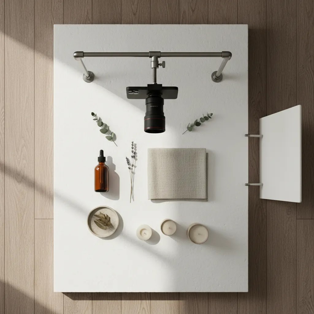
Your first priority is control. If your camera or phone keeps shifting, your framing changes from shot to shot and your catalog starts to look inconsistent. Use a tripod with an overhead arm if possible, or mount your phone above the scene. If that is not available, shoot from a step stool and mark the product area on the surface below so each composition stays aligned.
Consistency beats complexity. A simple repeatable setup usually produces stronger ecommerce images than a creative setup you cannot recreate next week.
Use soft, directional light
Natural window light works well for many at-home shoots, especially when diffused with a sheer curtain. Place the setup beside the light source rather than in harsh direct sunlight. This helps you keep shadows soft and product colors more accurate.
If you shoot regularly, a basic controlled setup may make sense. A dedicated product photography studio setup can give you more reliable lighting, faster production, and fewer editing issues, particularly once your SKU count starts growing.
Plan your surface before you place the product
Many store owners style first and think about the background later. That usually leads to clutter. Choose your surface, define the crop, and decide whether the image is meant for product detail, social storytelling, or category merchandising. Then place props only after the core frame works without them.
Flat lay composition rules that keep shots looking designed
Good flat lays rarely happen by accident. Styling matters, but composition is what makes the shot feel intentional instead of random. If your overhead photos keep looking like you simply placed items on a table, these frameworks can help you build shots that read quickly and sell clearly.
The 20/60/20 balance for ecommerce flat lays
Think of your frame as three layers of importance.
The 60 percent is the hero product, the thing you are actually selling. It should be the biggest visual element and the easiest to identify, even when the image is seen as a small thumbnail.
The 20 percent is supporting elements, props, packaging, ingredients, or accessories that clarify what it is, how it is used, or what is included. This part is where you add story, but it should not compete with the product.
The remaining 20 percent is negative space, breathing room that makes the shot feel premium and keeps the product edges clean. For Shopify product pages, negative space also gives you more flexibility for theme cropping and responsive layouts.
From a practical standpoint, if you are not sure what to remove from a flat lay, remove from the “supporting 20 percent” first. Most clutter comes from too many “helpful” extras.
Reliable composition patterns, and where each one fits
There are a few patterns that work repeatedly across ecommerce and social, because they create structure your customer can process fast.
A centered grid works well for catalog consistency. Place the product dead center, align props symmetrically, and keep the crop consistent across a collection. This is a strong choice for Shopify collection grids, bundles, and any category where comparison shopping is common.
A diagonal flow is better for lifestyle and social content. It guides the eye from corner to corner and feels more dynamic. This can work well for Instagram, email banners, and paid social creative, especially when the goal is scroll stopping rather than strict product evaluation.
Corner framing is useful for sets and bundles. You place supporting items in two corners or along the edges, leaving the center area clean for the hero product. It is also a good pattern when you want space for text overlays in campaign creative, without turning your Shopify product page images into ad graphics.
How to protect clarity on mobile crops
Most flat lay photos look fine on a laptop, then fall apart on a phone. The issue is usually spacing and edge control.
Leave extra margin around your hero product so it is not touching the edges of the frame. Tight crops can feel cramped, and they can also get cut off when Shopify themes render different image ratios.
Before you finish the scene, consider the crops you will need: square for collection thumbnails, 4:5 for many social placements, and wider crops like 16:9 for banners. If you shoot only one tight composition, you often lose either key product details or the “designed” feel once you resize.
Think of it this way, if the product and its main detail points stay clear in a square crop, you are usually safe across the rest of your placements.
Flat lay photography background ideas
Your background should support the product, not compete with it. That sounds obvious, but it is one of the most common reasons flat lay shots underperform. A busy background can make a product feel lower quality, less clear, or simply harder to process on a small screen.
Clean white for catalog clarity
White backgrounds remain useful because they keep attention on the product and fit most ecommerce layouts. They are especially effective for marketplaces, collection grids, and stores with minimalist branding. If your goal is clean merchandising, white is often the safest choice.
Textured neutrals for warmth
Think linen, matte stone, painted wood, muted card, or concrete-style boards. These surfaces add depth without overwhelming the shot. They work particularly well for handmade goods, apparel accessories, books, and home products.
Brand-color backgrounds for campaigns
Consider this, if your packaging uses dusty pink, sage, navy, or sand, repeating those tones in flat lay backgrounds can make your email campaigns and collection banners feel more cohesive. Use these selectively. They are often better for campaign creatives and Instagram than for every core product image.
At-home background options that still look intentional
For flat lay photography ideas at home, foam boards, large poster sheets, vinyl backdrops, and clean tabletops are often enough. You do not need expensive materials to get started, but you do need surfaces that are clean, non-reflective, and large enough for consistent cropping.
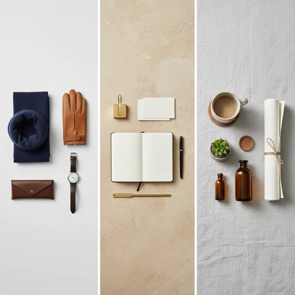
Flat lay product photography ideas by product type
Flat lay photography ideas for clothes
Clothing is one of the strongest use cases for flat lays, especially for casualwear, basics, kidswear, and boutique collections. Shape matters more than many people expect. Steam garments, smooth creases, and build subtle structure into sleeves, hems, and collars so the item does not look collapsed.
If apparel is your focus, these dedicated flat lay clothes photography ideas can help you plan folds, outfit styling, and composition choices more deliberately.
Flat lay t shirt and pants photography ideas
T shirts usually work best with a symmetrical layout. Align the shoulders, even out the sleeves, and keep the hem straight unless you are intentionally going for a more editorial look. Pants benefit from either a clean straight-leg presentation or a gentle bend at the knees to create shape without distraction.
For stores selling basics or printed tees, these flat lay t shirt photography ideas are useful if you want more specific examples around fold style, collar presentation, and image framing.
Flat lay dress and scarf photography ideas
Dresses can look awkward in overhead shots if they are simply dropped on a surface. Define the silhouette first. A-line pieces, wrap dresses, and textured fabrics often benefit from gentle shaping at the waist or skirt. Scarves work well with movement, but keep the flow controlled so the shot still reads clearly on mobile.
Flat lay photography ideas for books
Books are ideal for storytelling. You can shoot them closed for a clean product-led image, open for texture and interior mood, or stacked with complementary props like reading glasses, coffee cups, or notebooks. The key is to avoid making the supporting items more interesting than the book itself.
Flat lay food and fabric photography ideas
Food flat lays need freshness and structure. Ingredients should feel intentional, not scattered. Fabric flat lays should emphasize texture and drape. In both cases, side elements should frame the hero item and reinforce scale, color, or use case.
The product still needs to be the hero, even when lifestyle cues are part of the composition.
Using flat lays for Shopify and Instagram
Not every flat lay belongs in the same part of your marketing. What works on Instagram may not work as your main Shopify product image. This is where many store owners blur creative content and conversion content together.
For Shopify product pages
Your main image usually needs maximum clarity. That means clean edges, readable product shape, accurate color, and minimal distractions. Flat lays often work best as a primary image for items like notebooks, beauty products, gift boxes, scarves, or folded apparel. For more structured products, they may be better as a secondary angle.
For collection pages
Collection grids benefit from consistency more than artistic variety. If you use flat lays across a category, maintain the same camera height, crop ratio, and background tone. That helps shoppers compare products faster.
For Instagram flat lay photography ideas
Instagram gives you more freedom to add mood, props, and layered storytelling. You can build scenes around seasons, gifting occasions, or routines. Just remember that engagement and sales intent are not always the same thing. The flat lay that performs best on social may still need a simpler ecommerce version for the product page.
AcquireConvert often looks at visual decisions through both traffic and conversion lenses, which is the right way to think about product imagery. A photo does not just need to look good. It needs to support clicks, understanding, and buying confidence.
Flat lay shot planning for seasonal campaigns and product launches
If you only shoot flat lays when you are “due” for new product images, you end up reinventing styling every time. Campaign planning is where flat lays can save you a lot of effort, because a small number of repeatable concepts can cover months of social posts, email creatives, and collection banners.
Build a simple idea bank you can reuse
Campaign flat lays usually work best when the concept is clear in one second. Here are formats that tend to translate well for ecommerce use.
Seasonal themes, gifting flat lays for holidays, fresh and bright for summer, practical and organized for back-to-school. The goal is not to add seasonal clutter, it is to add one or two signals that make the timing obvious.
Launch teasers, partial reveals of packaging, close crops of texture, or a “color story” spread showing the new collection palette. These can be useful for ads and social, while your product pages stay clean and consistent.
Bundles and “what’s in the box,” lay out everything included, arranged with clear spacing. This can reduce purchase friction for sets, kits, and gift boxes because shoppers can see what they are getting.
Routine or use-case layouts, morning skincare, desk setup, travel essentials. This format often works well when your product needs context to feel valuable.
Create a repeatable prop kit by product category
What many store owners overlook is that props become a brand asset. If you build a small prop kit for each category, you stop scrambling for styling and you get more consistent creative output.
For beauty, that might mean a couple of neutral tiles, a small tray, cotton, a simple towel, and one accent item that fits your brand. For stationery, it might be paper clips, a pen, a notebook, and a texture board. For apparel accessories, it could be a consistent hanger, a fabric surface, and one packaging element.
The way this works in practice is simple: keep the kit stored together, and only add one seasonal piece when you need it. That makes it easier to stay on-brand without turning every shoot into a full styling project.
Keep campaign creativity separate from core catalog consistency
Your core Shopify product page images should stay consistent so customers can compare products and trust what they are seeing. That usually means stable lighting, repeatable crops, and minimal distractions.
Campaign flat lays can be more expressive, but they should still feel like your brand. Use them in banners, email headers, ads, and social posts, and keep your PDP image set focused on clarity. In many cases, the best approach is to shoot both in one session: get the clean hero flat lay first, then shift into the more stylized campaign version after you have the conversion-critical images locked.
Mistakes that weaken flat lay product shots
What many store owners overlook is that most weak flat lays fail for a few very fixable reasons.
Here is the thing, your customer is usually scanning quickly. If the product shape is unclear or the image feels messy, that friction can reduce confidence. You may not notice the problem because you already know what the item is. A first-time shopper does not.
For stores growing their visual library, AcquireConvert is one helpful resource for connecting photography choices to store performance, especially if you are trying to balance brand storytelling with clean merchandising.
Common flat lay mistakes and how to fix them fast
If a flat lay looks “off,” you usually do not need a full reshoot strategy. You need a fast diagnosis. Here are common symptoms and the quickest fixes that tend to work for ecommerce shoots.
Messy shadows that make the product feel low quality
Symptom: hard shadow edges, multiple shadows, or dark patches that hide details.
Fix: move the setup farther from direct sun, diffuse the window, and keep one dominant light direction. If you are using artificial light, avoid mixing different bulbs. One controlled light source is usually easier to manage than several small ones.
Warped perspective and crooked lines
Symptom: boxes look trapezoid-shaped, labels tilt, grids do not align, flat items look skewed.
Fix: make sure your camera is truly parallel to the surface. A small tilt becomes obvious in flat lays. Use your phone’s grid, center the lens above the hero product, and raise the camera height slightly if edges look distorted.
Dull or inconsistent colors across the set
Symptom: whites look yellow or blue, skin tones in packaging look wrong, your collection images do not match each other.
Fix: lock consistent white balance for the session and do not rely on auto settings jumping between shots. If your phone or camera keeps changing exposure and color, that inconsistency will show up in Shopify collection grids.
Clutter that makes the product hard to identify
Symptom: the props are the first thing you notice, or you need a second to find what is being sold.
Fix: remove props until the hero product reads clearly at thumbnail size. Then add back only what helps the buyer understand use, scale, or what is included.
Inconsistent scale across a category
Symptom: the same type of item looks larger or smaller from product to product, making the catalog feel messy.
Fix: use a marked placement area, fixed camera height, and consistent crop. If you need variation, keep it for campaign images, not for the core product grid.
Reflective packaging and distracting glare
Symptom: glossy boxes or bottles pick up bright window streaks, hotspots, or reflections of your room.
Fix: soften the light with diffusion and adjust angle slightly by rotating the product, not by tilting the camera. Small rotations often remove glare while keeping the overhead feel intact.
A fast pre-shoot checklist that prevents most problems
Before you start shooting a batch, run a quick check. Clean lint and dust, straighten labels, align props to the grid, check for reflections on glossy surfaces, and keep your lighting consistent so white balance stays stable. These are small details, but they are usually what separates a “home shot” from a product image that feels store-ready.
The two-minute review before you end the shoot
Before you pack everything away, do one quick review on the device you shot with.
Zoom check: zoom in and look for dust, hair, label misalignment, and packaging dents.
Edge check: scan the borders for clipped props, awkward tangents, and cramped spacing.
Color check: compare two or three images from the set and confirm the whites and brand colors match.
Crop check: test a square crop and make sure the product still reads clearly. If it does not, reshoot with more breathing room. This step alone can save you from rebuilding a whole product page image set later.
A practical flat lay workflow you can repeat
If you want flat lay photography ideas that are useful beyond a single shoot, build a repeatable process.
A repeatable system usually saves more time than any single styling trick. It also helps you scale content production as your catalog expands.
If you eventually move beyond occasional shoots, browsing the wider Catalog Photography section can help you think more systematically about category-wide visual standards and studio workflows.
The strategies and tools discussed in this article are based on current ecommerce best practices and publicly available information. Results will vary depending on your store, niche, and implementation. Always verify tool pricing, features, and platform compatibility directly with the relevant provider before making purchasing decisions.
Frequently Asked Questions
What products work best for flat lay photography?
Flat lay photography works especially well for products that read clearly from above. Think folded apparel, T shirts, scarves, beauty products, books, stationery, jewelry sets, food items, and gift boxes. Items with important side profiles or complex structure may need additional angles. For most ecommerce stores, flat lays are strongest when they simplify product understanding instead of replacing every other photo type. If you are still deciding where flat lays fit in your image strategy, start with products that have a clear outline and benefit from styled presentation.
Can I create strong flat lay photography ideas at home?
Yes, many store owners can produce good flat lays at home with a phone, window light, foam board, and a stable overhead position. The limiting factor is usually not equipment, it is consistency. Uneven lighting, wrinkled products, and rushed styling tend to hurt results more than using simple gear. Start small and control what you can. Choose one background, one time of day, and one framing method. If your products sell well with clean overhead shots, you can refine your setup over time rather than overspending early.
What is the best background for flat lay product photography?
The best background depends on your product, brand style, and where the image will be used. White is often best for clean ecommerce presentation. Textured neutrals can make products feel warmer and more premium. Branded colors may suit campaigns or social content. The key is making sure the background increases clarity instead of creating distraction. For most Shopify stores, the most effective approach is to use one or two reliable background styles across a category rather than changing surfaces for every item.
How do I style clothes so they look better in flat lay shots?
Start by steaming the garment and shaping it intentionally. Sleeves, collars, waistlines, hems, and folds should communicate the product silhouette. Avoid dropping the item onto the surface and hoping it looks natural. That usually makes apparel look lifeless. For stores selling multiple clothing types, it helps to create category-specific styling rules. Tops may need symmetrical framing, while dresses may need more shape in the skirt. If you want more examples for apparel-specific layouts, review these flat lay clothes photography ideas for more targeted inspiration.
Are flat lays good enough as the main image on a Shopify product page?
Sometimes, yes. Flat lays can work very well as the primary image for products like books, beauty items, stationery, gift sets, and some apparel. But they are not always the best lead image for every product. If shape, fit, texture, or side detail matters, you may need a front-facing or modeled image first. In practice, many Shopify stores get the best result by combining one clean hero image with flat lays as supporting visuals. The goal is clarity first, style second, especially for conversion-focused product pages.
How many props should I use in a flat lay shot?
Usually fewer than you think. Props should support the story of the product, not compete with it. One to three well-chosen elements are often enough. A notebook beside a book, a ribbon beside a gift box, or a skincare spatula beside a cream can add context. Once props start pulling attention away from the product, the image becomes less useful for ecommerce. Ask whether each element clarifies use, scale, or mood. If not, remove it. Cleaner scenes usually perform better for product understanding.
What lighting is best for flat lay photography?
Soft, even lighting tends to work best. Window light from the side is often enough for at-home shoots, especially if you diffuse it with a curtain or white fabric. Direct midday sun can create harsh contrast and color problems. Artificial lighting can work well too, but only if it is consistent and balanced. The important thing is to avoid mixed light sources, such as daylight plus warm indoor bulbs, because that often creates editing headaches. Reliable lighting matters more than expensive lighting for most smaller stores.
How do I make flat lay photos feel less boring?
Use texture, spacing, and controlled styling rather than clutter. A shot becomes interesting when the product is arranged with intention. You can introduce contrast through fabric, paper, subtle shadows, or color relationships, but the image should still feel clean. Think of variation as structure, not noise. Small changes in angle, crop, and supporting objects can help without making the frame messy. If your catalog feels repetitive, create a few approved shot styles by product type instead of improvising every time.
Should I use AI tools to edit flat lay product photos?
AI tools can help with background cleanup, resizing, or resolution improvements, especially when you need faster post-production. But results vary depending on the product edge detail, lighting quality, and how clean the original image is. If you are exploring image editing support, tools such as AI Background Generator or Increase Image Resolution may be useful starting points. Features and outputs can change, so always verify current capabilities and review edited images carefully before publishing.
When should I move from a home setup to a studio setup?
If you are shooting regularly, managing a growing SKU count, or struggling with inconsistent lighting and turnaround time, a more controlled setup may be worth considering. That does not always mean renting a full commercial studio. It may simply mean dedicating a fixed area, upgrading supports, and standardizing lighting. Once product volume grows, production efficiency becomes just as important as image quality. If you want to think more seriously about scaling your workflow, this guide to a product photography studio can help you weigh the tradeoffs.
What is the 20 60 20 rule in photography?
The 20 60 20 rule is a simple composition framework that helps you keep a flat lay shot balanced and readable. Roughly 60 percent of the visual attention should be on the hero product, 20 percent on supporting elements like props or packaging, and 20 percent on negative space so the image feels clean. For ecommerce, the main benefit is clarity. It reduces the chance that props steal attention or the frame becomes too cramped for mobile viewing and Shopify crop ratios.
What makes a good flat lay photo?
A good flat lay photo is easy to understand quickly. The product shape is clear, the lighting is soft and consistent, the styling supports the product rather than competing with it, and there is enough spacing that the image still works as a small thumbnail. For Shopify stores, it also helps when the photo is shot and edited consistently across a category so collection grids feel cohesive.
What are common flatlay mistakes?
Common flatlay mistakes include cluttered props, mixed lighting that shifts color, messy wrinkles or dust, cramped crops that cut off edges, and inconsistent scale across a collection. Another frequent issue is perspective tilt, which makes products and packaging look skewed. In most cases, these problems are fixable by simplifying the scene, locking your camera position, controlling one light source, and running a quick pre-shoot plus end-of-shoot review.
What are some flat lay photography ideas?
If you need general inspiration beyond a specific product type, start with repeatable formats. Try a clean hero product with one supporting prop, a “what’s included” layout for sets and bundles, a routine-based layout that shows context of use, or a seasonal variation with one or two themed elements. The key is keeping the product as the focal point and leaving enough negative space that the shot stays clear on mobile and works across different crops.
Key Takeaways
Conclusion
Strong flat lay photography is less about artistic flair and more about control, clarity, and consistency. If your product shots feel disjointed or underwhelming, you do not need to rebuild everything at once. Start with one product category, one background, one lighting setup, and one repeatable overhead composition. That alone can improve how professional your catalog feels.
Now, when it comes to next steps, pick three products from your store and reshoot them using a clean hero flat lay plus one styled variation. Compare how those images look on mobile, in collection grids, and in social posts. If you want more image planning ideas after that, explore AcquireConvert’s broader product photography guide or browse the Product Photography Fundamentals hub for related resources. Small visual upgrades can make your store easier to shop, and that is often where better conversion starts.
Disclaimer: Results from ecommerce strategies vary depending on store type, niche, audience, budget, and execution. Nothing in this article constitutes a guarantee of specific outcomes. Third-party tool features and pricing are subject to change, verify current details directly with each provider.

Hi, I'm Giles Thomas.
Founder of AcquireConvert, the place where ecommerce entrepreneurs & marketers go to learn growth. I'm also the founder of Shopify agency Whole Design Studios.