Dramatic Lighting Photography for Products (2026)
Dramatic lighting photography can make a product feel premium, cinematic, and more emotionally engaging, especially if you sell fashion, beauty, home decor, drinks, or giftable products. For ecommerce, though, mood should never come at the cost of clarity. Your shopper still needs to understand color, texture, shape, and finish quickly enough to feel confident adding the item to cart. That balance is what matters.
This guide explains how to create moody product shots that still work commercially. You will learn what dramatic light actually means, how to shape it, where it fits in a product image set, and what mistakes tend to hurt conversion. If you want a softer starting point before pushing into higher contrast setups, our guide to loop lighting photography is a useful reference.
Contents
What dramatic lighting means in product photography
Dramatic lighting photography uses contrast intentionally. Instead of lighting the whole scene evenly, you highlight one side, one edge, or one key product feature while allowing other parts of the frame to fall into deeper shadow. That tension between light and dark is what creates mood.
For ecommerce brands, this style is usually best treated as a supporting image style, not the only style in your gallery. Your clean catalog image still does the heavy lifting for clarity. The dramatic shot adds brand character, helps the product feel more editorial, and may improve engagement on landing pages, email campaigns, and paid social creative.
The technique overlaps with several other lighting styles. A directional key light, controlled fill, negative fill, and selective reflections often matter more than expensive gear. If you are still building your kit, start with the basics in our guide to photography lighting equipment. From there, you can adapt those tools for sharper contrast and more controlled shadow falloff.
The key point is simple: moody does not mean underexposed. A strong dramatic image still has a clear focal point, readable details, and a deliberate lighting pattern that supports the product story.
What is dramatic lighting in photography (products vs portraits)
Dramatic lighting in photography usually means high contrast with intentional shadow placement. You are not trying to “light everything.” You are choosing what gets emphasized, what falls away, and where the viewer’s eye is meant to land.
In portraits, dramatic lighting is often about emotion and facial structure. You can let one side of the face go darker and still have a successful image because the subject remains recognizable and the story is carried by expression.
For products, the rules tighten. You can absolutely use deep shadows, but the product still needs to be understood at ecommerce speed. From a practical standpoint, you are balancing mood with specific commercial requirements, so the shopper does not have to guess.
Here is the core lever you control: hard light vs soft light.
Hard light comes from a relatively small light source compared to the subject, or a light that is far enough away that it appears small. It creates crisp shadow edges and bright specular highlights, especially on glossy packaging. Hard light is one of the fastest ways to make an image feel dramatic, but it can also punish imperfections, create blown highlights on reflective surfaces, and make label text harder to read if it lands in shadow.
Soft light comes from a large light source relative to the subject, typically created by bringing a diffusion panel or softbox closer. It gives smoother shadow transitions and can look more “premium catalog.” You can still create drama with soft light by controlling direction and using negative fill, but the vibe will be less gritty and more refined.
Consider this as your “before you shoot” decision for ecommerce: decide what must stay readable even in a dramatic setup. In many product categories, that includes the brand logo, label text, key color-critical areas (like shade names in beauty), and the defining silhouette. If those elements disappear, you might get a cool image, but it may not earn its place on a Shopify product page where clarity drives confidence.
How to set up dramatic lighting for moody product shots
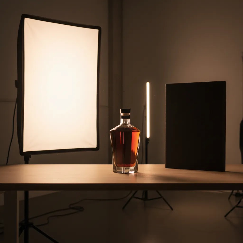
If you want repeatable results, treat dramatic lighting as a controlled system rather than trial and error. Start with one light first. Add modifiers, reflectors, or flags only after the core direction looks right.
1. Begin with a single directional key light
Place your main light 45 to 90 degrees from the product, slightly above the subject. This creates visible shape and texture. Side lighting is often the fastest path to a moodier image because it reveals depth while keeping part of the product in shadow.
2. Control spill aggressively
Use black foam board, flags, or grids to stop light from bouncing around the set. This is one of the most overlooked steps in lighting product photography. Too much uncontrolled fill flattens the image and removes the mood you are trying to build.
3. Add fill only if the product becomes unreadable
If shadows get too dense, use a small white card or reflector on the opposite side. Keep it subtle. The goal is not to erase contrast. The goal is to preserve important product details like stitching, embossed logos, glass edges, or label text.
4. Match the surface to the product finish
Glossy products need more reflection control than matte products. Jewelry, cosmetics, bottles, and metal packaging often benefit from strip lighting, diffusion, and careful angle adjustments. Flat products may need less complexity but more attention to shadow shape.
5. Build the shot around one visual priority
Pick the one thing the shopper should notice first. It could be texture, silhouette, packaging detail, or liquid transparency. Dramatic lighting works best when the light emphasizes that one attribute instead of trying to show everything equally.
If you need a wider grounding in light placement, diffusion, and modifier choices, see our broader guide to product photography lighting. It helps if you are moving from basic storefront images into more brand-led visuals.
Dramatic lighting patterns you can replicate (Rembrandt, short lighting, split light)
One reason dramatic lighting feels hard to repeat is that many people shoot “moody” without aiming for a recognizable pattern. If you give yourself a target lighting pattern, you can troubleshoot faster when a product looks flat, unintentionally dark, or strangely reflective.
These patterns come from portrait photography, but they translate well to products if you think in terms of planes, edges, and label readability.
Rembrandt lighting (the “triangle of light” idea)
In portraits, Rembrandt lighting is known for a small triangle of light on the shadow side of the face. For products, the equivalent goal is a controlled highlight area on the front plane, plus a secondary “readable zone” that keeps the silhouette and key branding from disappearing.
The way this works in practice: place your key light 45 degrees to the side and slightly above, then rotate the product until you see a deliberate highlight on one front edge and a softer lit area that still shows form on the darker side. For bottles and jars, you are often aiming for a clean vertical highlight that wraps slightly, with enough exposure on the label to stay legible. For boxes, you want one face lit and the adjacent face falling into shadow, but not so deep that the box shape collapses.
Common failure modes: the label goes dead because it is turned too far into shadow, or glossy packaging catches a hot highlight that blows out the most important printed details.
Split lighting (clean half-light, half-shadow)
Split lighting is the simplest dramatic look: one side gets lit, the other side goes dark. On products, it can look premium and bold, especially when you want strong shape and clear material cues.
To set it up, move the key light farther to the side until the shadow line falls close to the product’s center. This tends to work well on cylindrical shapes like bottles, cans, and candles because the curve can hold a bright highlight and still preserve a recognizable outline. For jewelry, split lighting can create a high-end, mysterious look, but it also increases the chance of harsh reflections and overly deep shadows in gemstone settings.
Common failure modes: the shadow side swallows the silhouette against a dark background, or a reflective surface picks up unwanted set reflections because the light is too hard and too uncontrolled.
Short lighting (shadow-forward, shape-enhancing)
Short lighting means the side of the product facing the camera is darker, while the far side is lit. In portraits this slims the face. In product photography, it can add depth and make shapes feel more sculpted, especially on bottles, premium tubes, and textured packaging where you want to emphasize contour instead of flat label presentation.
To get it, start with your key light around 45 degrees off to the side, then rotate the product and camera relationship so the camera sees more of the shadowed front plane. You keep the highlight on the far edge as a controlled strip that describes shape. This is often a strong choice when you want a dramatic hero image for a collection launch, but it is usually not the best choice when label text is the main selling point.
Common failure modes: the front plane gets too dark and the product looks underexposed, or the highlight becomes a distracting bright stripe that pulls attention away from the brand mark.
Where dramatic lighting helps ecommerce and where it does not
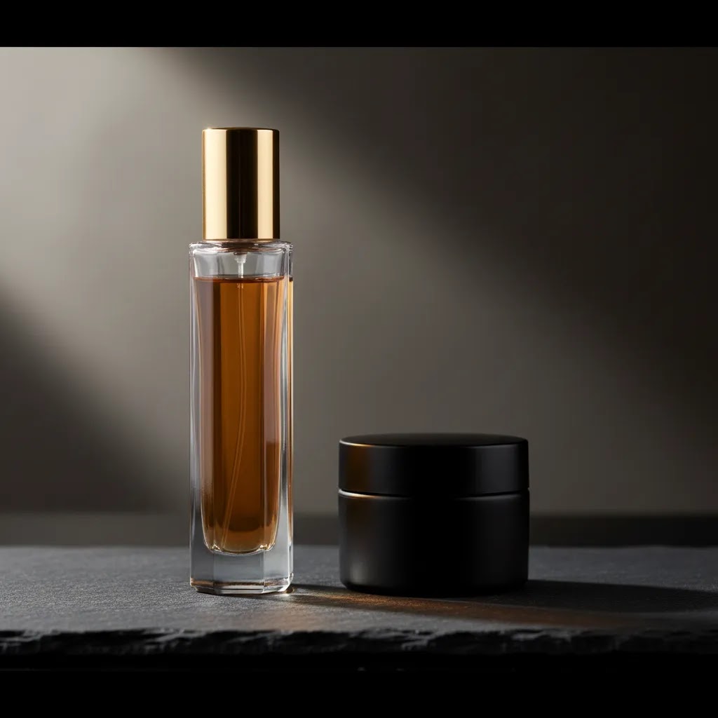
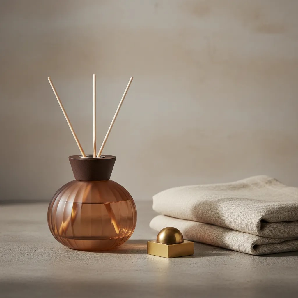
Dramatic lighting is strongest when the product has visual character to reveal. Think perfume bottles, skincare jars, candles, premium food packaging, sneakers, watches, or dark glass beverage products. In those cases, deep shadows and controlled highlights can communicate material quality better than flat, even lighting.
It also works well for seasonal campaigns, hero banners, collection launches, and storytelling assets. If you run Shopify product launches or promotional landing pages, these images can help differentiate a product line and support a higher-end brand feel.
Where store owners get into trouble is using moody shots as the only product image. That is risky if your customer needs to judge exact color, fit, dimensions, or bundle contents. Apparel basics, technical accessories, or multi-variant products usually need cleaner primary images first.
A practical approach is to use a mixed gallery. Start with a white or neutral background image for clarity. Add a close-up detail shot. Then include one dramatic image for emotion and brand positioning. If you are comparing mood-led imagery with more commercial setups, our resource on the best lighting for photography can help you choose by use case rather than style preference alone.
For many merchants, the best dramatic shots are created in a controlled product photography studio environment where reflections, shadow edges, and background spill are easier to manage consistently.
Pros and Cons
Strengths
Considerations
Practical rules and ratios for controlling contrast (lighting ratio, negative fill, and a simple 3-light framework)
The reality is that “dramatic” is not random. It is controlled contrast. If your shots keep coming out flat or too dark, you will usually fix it faster by thinking in ratios and roles instead of endlessly moving the light a few inches at a time.
Lighting ratios: the simplest way to diagnose “too flat” vs “too dark”
Lighting ratio is just the relationship between your key light (main light) and your fill (the light that lifts shadows). You do not need a light meter to benefit from this. You just need to make your changes intentional.
For a moodier product look, you typically want the fill to be meaningfully weaker than the key. If your fill is too strong, the image looks like standard catalog lighting. If your fill is too weak, labels, edges, and product shape may disappear.
You can adjust that relationship three reliable ways:
From a practical standpoint, set your exposure for the highlight side first so you do not blow out the brightest areas on glossy packaging. Then add just enough fill to make the “must-read” details visible.
Negative fill: deeper shadows without underexposing the whole frame
Negative fill is one of the most repeatable tools for dramatic product photography. It means placing black material close to the product on the shadow side to absorb bounce light. This is different than simply using less light. You can keep your overall exposure where it needs to be, but still deepen the shadows and increase shape.
In a small home studio setup, white walls and ceilings act like giant reflectors. That can make your images look accidentally “bright and flat,” even when your key light is placed to the side. Putting black foam board near the shadow side often restores the contrast you thought you were creating.
Placement matters. Bring the black card in close to the product, just outside the frame, on the side you want to go moodier. If the result looks too harsh, pull it back slightly or angle it so it blocks less bounce. This is also useful on reflective products because it can clean up unwanted reflections by giving the product a darker, simpler thing to “see.”
A simple 3-light rule for products: key, fill, and separation
A basic “3-light” framework is: key light, fill light, and a separation light (often a rim light or background light). You do not always need three actual lights, but it helps to assign the roles.
For most Shopify store owners shooting products for a brand campaign, a one-light setup plus fill cards is the quickest path. Add a separation light when the silhouette is getting lost, especially on dark products against dark backgrounds. If you skip the separation role entirely, your dramatic shot may feel muddy, even if the exposure is technically correct.
Think of it this way: drama comes from contrast, but product clarity comes from separation.
How to choose the right lighting approach for your store
You do not need to use dramatic lighting on every product. The better question is where it earns its place in your content mix.
1. Look at your product category
If you sell beauty, fragrance, jewelry, spirits, candles, or premium packaged goods, dramatic lighting often makes sense. These categories benefit from mood and surface detail. If you sell basics where informational clarity matters most, use dramatic lighting more sparingly.
2. Decide whether the image is for conversion or attention
Some images are meant to answer shopper questions. Others are meant to stop the scroll. Dramatic lighting tends to perform best in the second category. That is why it often belongs in banners, ads, and social creative rather than image slot one on a product detail page.
3. Consider how much setup consistency you need
If you shoot dozens of SKUs every week, a high-contrast lighting style may slow your workflow unless you standardize it. Document your light position, product distance, camera angle, and reflector placement. Repeatability matters more than chasing a perfect one-off image.
4. Think about post-production time
Moody product shots often need more cleanup. Dust, fingerprints, uneven reflections, and shadow transitions become more visible when contrast is high. Make sure the creative payoff justifies the extra editing time.
5. Match the lighting to the customer journey
Use clean lighting to explain the product. Use dramatic lighting to sell the feeling around it. The strongest ecommerce galleries usually do both. If your brand leans aspirational, consider pairing moody product images with more contextual, story-driven visuals from the Lifestyle Product Photography category. If you want a broader view of practical setup options, the Product Photo Lighting category is a good next step.
AcquireConvert recommendation
For most ecommerce brands, dramatic lighting photography is best used as a strategic supporting style, not a full replacement for clear catalog imagery. That is especially true on Shopify stores where product page images need to balance visual appeal with conversion clarity. A moody hero shot can raise perceived quality, but your core gallery still needs to answer practical shopper questions fast.
That balanced approach is central to how AcquireConvert covers ecommerce creative strategy. Giles Thomas, a Shopify Partner and Google Expert, focuses on what helps store owners build better buying experiences, not just prettier images. If you are refining your image stack, start by comparing your current product gallery against your traffic source, page intent, and brand positioning. Then introduce dramatic shots where they support discovery, storytelling, or launch campaigns without replacing high-clarity images shoppers rely on.
For next steps, review related AcquireConvert lighting guides and see how other store owners structure product visuals around both aesthetics and conversion goals.
Frequently Asked Questions
Is dramatic lighting photography good for ecommerce product pages?
It can be, but usually as a secondary or supporting image. Dramatic lighting helps create emotion and highlight texture, which is useful for premium branding. Your primary product image should still prioritize clarity, color accuracy, and detail visibility so shoppers can evaluate the item confidently.
What products work best with moody lighting?
Products with texture, shine, contour, or premium packaging tend to work best. Common examples include perfume, skincare, candles, drinks, jewelry, watches, and luxury accessories. Items that rely on exact color matching or simple specification clarity may need cleaner, more evenly lit images first.
Do I need expensive equipment to create dramatic lighting?
No. Many strong dramatic product shots start with one light, a modifier, and a few black and white boards for controlling fill and reflection. Better control usually matters more than a larger equipment budget. What you do need is consistency, especially if you are shooting multiple SKUs.
What is dramatic lighting in photography?
Dramatic lighting usually means high contrast and intentional shadows. Instead of lighting the product evenly, you use directional light to emphasize a specific edge, surface, or detail while letting other areas fall darker on purpose. For ecommerce, the dramatic look still needs a clear focal point and readable details, so the image stays commercially useful.
What are the 4 types of artistic lighting?
A practical way to think about artistic lighting types is by the role light plays in the image: key lighting (main direction and mood), fill lighting (shadow control), back or rim lighting (separation and outline), and background lighting (gradients, mood, and depth). You can create dramatic product photos by using any one of these strongly, then controlling the others so the product stays readable.
What is the 20 60 20 rule in photography?
The 20/60/20 rule is a simple way some photographers plan tonal balance in an image: roughly 20% highlights, 60% midtones, and 20% shadows. It is not a strict requirement, but it is a useful checkpoint if your dramatic photos are turning into pure darkness or harsh blown highlights. For product photography, you typically want the midtones to hold the product information, while highlights and shadows support shape and mood.
What is the 3 lighting rule?
The “3-light” approach usually means building the image with a key light (the main look), a fill light (to keep important areas visible), and a back, rim, or background light (to separate the product from the background). For dramatic product shots, you can often use one light plus cards to do the fill role, then add a small rim or background light only if the silhouette is getting lost.
How is dramatic lighting different from bad lighting?
Bad lighting hides information by accident. Dramatic lighting hides selected areas on purpose while keeping the focal point clear and intentional. The product should still be readable, and the shadow pattern should look deliberate rather than random, muddy, or underexposed.
Can I use natural light for dramatic product photography?
Yes, if you can control it. Window light from the side can create strong mood, especially when you block excess bounce with black cards. The challenge is consistency. If you need repeatable results for ecommerce catalogs or campaigns, artificial lighting is often easier to manage.
What is the best background for moody product shots?
Darker neutral backgrounds are common because they support contrast without competing with the product. Textured stone, matte acrylic, dark paper, and subtle gradients can work well. The right choice depends on the product finish and the level of editorial styling your brand can support.
Should I use dramatic lighting for Shopify collection pages?
Usually with caution. Collection pages need quick scanning, so consistency and clarity matter. Dramatic shots may work for banners, campaign tiles, or featured products, but standard grid thumbnails usually perform better when they are clean and easy to compare across products.
How do I stop dramatic lighting from looking too dark?
Watch your shadow detail carefully. Add a small reflector, move the light slightly forward, or increase diffusion if the product loses readability. You can keep strong contrast while still preserving key details like packaging text, edges, and finish. The image should feel moody, not muddy.
Is dramatic lighting useful for social ads and email campaigns?
Often, yes. These channels benefit from visual differentiation and a stronger emotional first impression. A moody product shot may help catch attention in busy feeds or inboxes. Just make sure the landing page still provides cleaner supporting images that answer product questions clearly.
Key Takeaways
Conclusion
Dramatic lighting photography can add depth, premium feel, and stronger visual storytelling to your product images, but it works best when it serves a clear ecommerce purpose. If a shopper cannot quickly understand what you sell, the image is doing too much branding and not enough selling. The sweet spot is a gallery that mixes clarity with mood.
If you are improving your store visuals, AcquireConvert is a strong place to continue your research. Giles Thomas brings a Shopify Partner and Google Expert perspective to topics that affect both presentation and performance. Explore more lighting guides, compare setup options, and use what fits your product type, traffic source, and store goals.
This article is editorial content created for educational purposes and is not a paid endorsement unless explicitly stated otherwise. Visual performance and conversion impact can vary by product category, brand, traffic source, and store setup. Pricing for any third-party tools or services mentioned elsewhere on AcquireConvert is subject to change and should be verified directly with the provider.

Hi, I'm Giles Thomas.
Founder of AcquireConvert, the place where ecommerce entrepreneurs & marketers go to learn growth. I'm also the founder of Shopify agency Whole Design Studios.