Product Photography Lighting (2026 Guide)
If your product photos feel flat, inconsistent, or harder to convert with than they should be, lighting is usually the first thing to fix. Good product photography lighting helps you show texture, color accuracy, size, and product detail in a way that builds trust with shoppers. That matters whether you sell skincare, clothing, jewelry, home goods, or larger items that need more space and control. This guide breaks down the best lighting approaches by product type, along with practical setup advice you can actually use. If you want a broader foundation before building your setup, start with our guide to loop lighting photography, then come back here to match the right light to the right product.
Contents
Why product photography lighting matters
Lighting does more than make a photo brighter. It shapes the product, controls shadows, reveals surface detail, and affects how premium your store looks. For ecommerce, that has a direct influence on how confidently a shopper evaluates what you sell.
If you are running a Shopify store, your images often have to do several jobs at once. They need to work on collection pages, product pages, ads, email campaigns, and sometimes marketplaces. A lighting setup that looks fine on one hero image can still fail if it creates inconsistent shadows across a full catalog.
That is why the best product photography lighting is not one universal kit. It is a setup that matches the size, reflectivity, texture, and intended use of the product. Small reflective products need control. Apparel needs even coverage and realistic color. Furniture needs depth and room to light. If you are still piecing your setup together, our guide to photography lighting equipment can help you understand which tools matter and which ones you can skip early on.
Best lighting setups by product type
Different product categories need different lighting techniques. Here is the practical version store owners can use.
Small products like jewelry, watches, cosmetics, and accessories
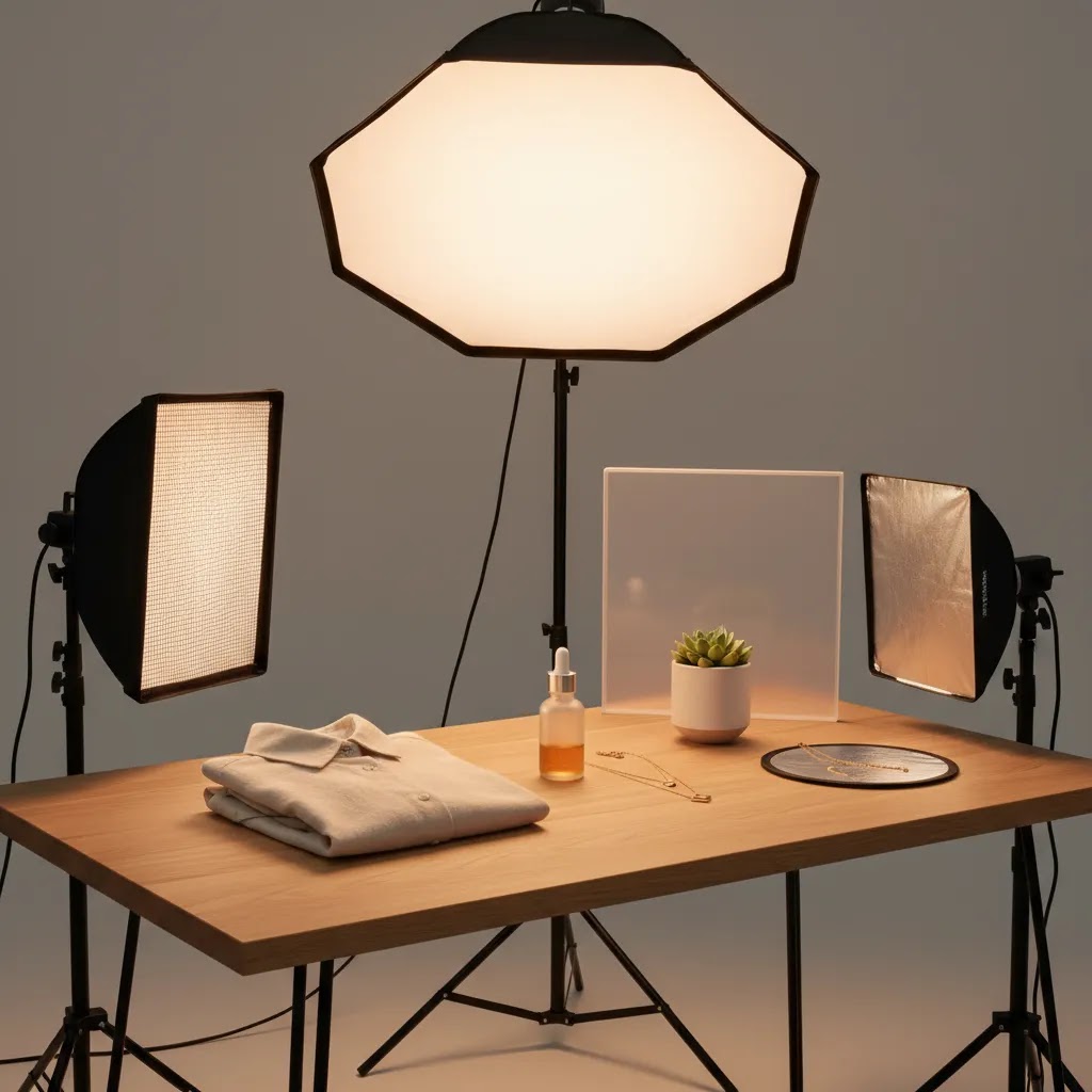
For small products, soft and controlled light usually works best. A tabletop setup with two soft light sources at 45-degree angles is a strong starting point. Add a diffuser or light tent if reflections are hard to manage.
This setup helps you keep highlights clean while preserving detail. Jewelry and glossy packaging often need extra bounce cards to soften specular reflections. You may also need to flag off parts of the light to stop bright hotspots.
Apparel, shoes, and soft goods
Clothing needs broad, even light so fabric color and texture stay accurate. One large key light and one fill light can work well, especially if you are shooting flat lays or simple mannequin images. For folded apparel, overhead lighting with side fill often produces a clean ecommerce look.
If you want a more editorial style for campaigns, you can introduce shadow intentionally. That is where techniques from dramatic lighting photography become useful, but for core product page images, consistency usually matters more than mood.
Glass, bottles, and reflective packaging
These are some of the hardest products to light well. The goal is usually not to point light directly at the item but to light the surfaces around it. Large diffused panels on both sides can create controlled edge highlights, while a backlight can help separate the product from the background.
For skincare, fragrance, and beverage brands, this kind of control can make the difference between an image that looks homemade and one that feels retail-ready.
Food and textured handcrafted goods
Food, ceramics, candles, and handmade products often benefit from softer directional light that preserves shape and texture. Window light can work very well for this if you can keep it consistent. If not, continuous LED panels with diffusion are easier to repeat across shoot days.
Side lighting tends to emphasize texture. Front lighting is flatter and safer, but often less interesting.
Large products like furniture, luggage, and fitness equipment
Large product photography lighting is more about coverage and spacing than raw brightness. You need bigger modifiers, more distance between the light and subject, and often more background control. Shooting these items in a dedicated product photography studio can be the practical choice if your in-house space is limited.
For most large products, one large soft key light plus a fill or reflector is enough to start. Add background lights only if you need a brighter white sweep or more separation.
Product photography lighting setup examples you can copy
What many store owners overlook is that “good lighting” is usually just a few repeatable placements that you can document and reuse. Below are starter setups you can run in a spare room, garage, or small studio corner. Treat these like templates, then adjust based on what your product surface is doing.
Setup 1: One light + reflector (fastest reliable starter setup)
This is the simplest setup that still gives you shape and clean shadows. It works well for matte products, most packaging, and many home goods.
Diagram:
Camera -> [ Product ]
Key light: front-left at 45 degrees, slightly above product height
Reflector: front-right, close to product to lift shadows
From a practical standpoint, start with the key light about 2 to 4 feet from the product for small tabletop items, and farther back for larger items. Raise the light so it points slightly down toward the product. If your shadows look harsh, make the light source bigger (bigger softbox or more diffusion) or move it closer. If the product looks flat, move the key light more to the side so shadows create shape, then use the reflector to control how deep those shadows get.
Setup 2: Two-light 45/45 (classic ecommerce catalog look)
If you need consistent catalog images across a growing number of SKUs, two matching diffused lights at 45-degree angles is a strong baseline. It is common for small products, shoes, and apparel on mannequin.
Diagram:
Light (45 degrees) -> [ Product ] <- Light (45 degrees)
Camera: centered in front
Start with both lights slightly above product height, angled down. Keep them the same distance from the product so shadows stay even. If the image looks too “flat,” lower the power of one light to reintroduce gentle shadow and depth. If your background is not evenly white, move the product farther away from the background so less shadow falls onto it, then adjust exposure.
Setup 3: Backlit diffusion for bottles and glossy packaging (clean edge highlights)
Glass and glossy packaging often look best when you light what the product reflects, not the product itself. A practical way to do that is to use a bright diffused surface behind the product, then add controlled side fill.
Diagram:
Camera -> [ Product ] -> Diffused backlight (through diffusion panel or white sheet)
Side fill: large diffusion on one or both sides, or reflectors
Place a diffused light behind the bottle aimed toward the camera, but blocked so it does not flare your lens. The “block” can be as simple as shifting the backlight higher and using a piece of black card near the camera line to stop direct glare. If the edges of the bottle disappear, bring in a diffused side light or a white reflector to create clean edge definition. If labels look washed out, lower the backlight intensity or move it farther away so the label holds contrast.
Setup 4: Overhead flat lay with side fill (apparel and small lifestyle setups)
For flat lays, you want even coverage without making everything look like it was shot under a ceiling light. Overhead diffusion plus side fill is the typical answer.
Diagram:
Overhead diffused light -> [ Flat lay surface ]
Reflector or fill light: from one side to control shadow depth
Keep the overhead light large relative to the flat lay. A small light source overhead creates hard shadows around sleeves, collars, and props. If shadows feel muddy, add a white foam board on the darker side, close to the product. If the image feels too “clinical,” move the side fill farther away so you keep a little more natural depth.
Troubleshooting by symptom (common ecommerce lighting issues)
The reality is most problems show up the same way across categories. Start with the symptom you see, then make one change at a time.
If you see hotspots on glossy items: make the light bigger (more diffusion or a larger modifier), move the light so it reflects away from the camera, and use black cards (flags) to remove bright reflections. In practice, reflection control usually beats adding more lights.
If shadows look muddy and heavy: bring a reflector closer, increase fill, or move the product farther from the background so the shadow falls out of frame. Muddy shadows can also come from mixed room light, which is a white balance problem as much as a lighting one.
If the background is uneven or gray: increase distance between product and background, aim lights more at the product than the backdrop, and adjust exposure so the product is correct first. A background that is “perfect white” can be tempting, but if you overexpose the background you can blow out product edges.
If colors shift between products or across shoot days: lock your color temperature, avoid mixed lighting, and use the same white balance approach each time. That is where the next section matters.
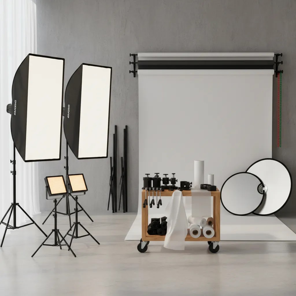
Lighting equipment that actually helps
You do not need the biggest product photography lighting kit to get sellable images. You need control, repeatability, and a setup suited to your catalog.
Start with these essentials
When a light box helps
A product photography lighting box can be useful for small items such as cosmetics, tech accessories, and packaged goods. It simplifies shadow control and can speed up catalog work. The trade-off is that images may start to look too uniform if every SKU is shot the same way.
When DIY is enough
DIY product photography lighting can work if you are early stage and shooting a narrow range of products. A north-facing window, white foam boards, and a clean background may be enough to launch. The issue is scale. As your SKU count grows, inconsistent natural light often creates more editing time and less reliable color.
When to invest more
If your store depends on visual trust, such as beauty, jewelry, or premium home goods, better control usually pays off in time saved and image consistency. If you are actively comparing options, our guide to the best lighting for photography is a useful next step.
Color temperature and white balance for accurate product colors
Color accuracy is not a “nice to have” for ecommerce. If the product arrives looking different than it did on your Shopify product page, you may see more returns, more support tickets, and less trust on the next purchase. Apparel, cosmetics, and home decor are where this tends to hurt the most.
Now, when it comes to product photography lighting, color problems usually come from one of two things: mixed light sources, or inconsistent white balance settings between shoots.
What color temperature (Kelvin) means in plain terms
Kelvin (K) is just a way to describe how warm or cool a light looks. Lower numbers look warmer (more yellow). Higher numbers look cooler (more blue).
For product photography, many store owners aim for daylight-balanced lighting. Daylight-balanced LEDs are typically around 5000K to 5600K. The important part is not chasing a perfect number. It is keeping it consistent across your whole catalog.
Here is the thing: mixed lighting is where things fall apart. If you have daylight from a window (cooler) plus household bulbs (often warmer) plus an LED panel that is set to something else, you can end up with weird color shifts. One side of the product goes warm, the other goes cool, and your edits become a time sink.
How to set white balance in practice (and keep it consistent)
You have a few realistic options, depending on what you shoot with.
If you shoot with a camera that supports white balance presets, start by selecting the preset that matches your light (often “Daylight” for daylight-balanced LEDs). Then keep your lighting and settings the same for every SKU in that product family. That alone can reduce catalog-to-catalog color drift.
If you want more consistency, use a custom white balance. The way this works in practice is you place a neutral target in the same light as your product (many people use a gray card), fill the frame with it, then set custom white balance in-camera. Once that is set, shoot the whole batch without changing your lights or mixing in room light.
If you are shooting on a phone, you often have less direct control over white balance. Your best move is to control the environment harder: block window light when using LEDs, turn off overhead room lights, and keep the same lighting placement for every session. If your phone app allows locking white balance and exposure, lock them so the phone does not “correct” color mid-shoot.
Keeping color consistent across multiple shoot days
For most Shopify store owners, the challenge is not one shoot. It is that the next shoot happens two weeks later, in a slightly different room setup, with one light moved a few inches, and suddenly your new products do not match the old ones.
To keep consistency, document your setup. Mark the floor for tripod position and light stands, record your Kelvin setting if your lights let you choose it, and keep a reference shot at the start of each session (a gray card shot or a known “color standard” product). If your lighting kit has adjustable color temperature, avoid changing it between sessions unless you are willing to reset white balance and re-check your edits.
Pros and Cons
Strengths
Considerations
How to choose the right lighting setup
If you are deciding what to buy or how to build your setup, use these four criteria.
1. Match the setup to product size
Small product photography lighting should prioritize precision. Large product photography lighting should prioritize coverage and working distance. If you shoot both, a modular setup with movable lights and diffusion panels is more useful than a fixed light box.
2. Consider surface finish
Matte products are forgiving. Glossy, metallic, or transparent items are not. If your catalog includes reflective packaging or glass, spend more on diffusion and flags before spending more on extra lights. Control matters more than output.
3. Think about workflow, not just image quality
A setup that produces beautiful photos but takes 20 minutes to reset between SKUs may not be practical. Many ecommerce operators need lighting that can be repeated quickly by a small in-house team. That usually means stable stands, marked positions, and a documented product photography lighting diagram for each product family.
4. Separate catalog photos from campaign photos
Your white background product page images need consistency. Your homepage hero, paid social ads, or seasonal launch photos may benefit from more stylized lighting. Keep those workflows separate. This is where browsing the broader Product Photo Lighting hub can help you build systems instead of improvising every shoot.
5. Build for your next stage of growth
If you are adding new SKUs every month, choose a setup that can scale. If your current challenge is simply getting clean product photos live, start with a reliable two-light arrangement and a plain background. The best product photography lighting set up is the one you will use consistently, not the one that looks most advanced on paper.
Choosing a product photography lighting kit: what to buy first (and what to avoid)
If you search for a product photography lighting kit, you will see bundles that look “complete” but still leave you fighting reflections, harsh shadows, or inconsistent backgrounds. For most Shopify store owners, the smartest approach is to buy control first, then add lights when you have a clear reason.
A practical buy order (based on where your store is at)
If you are early stage and shooting a smaller catalog, start with one solid continuous light, one large diffusion option (softbox or diffusion panel), and reflectors or foam boards. That combination covers a lot more products than people expect, especially if you can control ambient room light.
If you are growing and adding SKUs regularly, the next step is usually a second matching light plus better stands and a more repeatable background setup. Matching lights matter because two different lights can produce slightly different color, which creates more editing work and more risk of catalog inconsistency.
If you are at a stage where you shoot weekly or you have multiple people on the team capturing product, invest in stability and repeatability: sturdy stands that do not sag, consistent modifier sizes, and a documented layout that anyone can replicate. This is the unglamorous part of lighting that saves time.
Light box vs softbox (what to pick for your products)
A light box is great when your products are small and you want speed. It wraps light around the product, which reduces harsh shadows, and it can be a solid option for simple catalog images. The limitation is control. If you want more shape, more contrast, or better edge definition, you can hit the ceiling of what a light box can do pretty quickly.
A softbox setup is slower to dial in at first, but it scales better across product types. You can change distance, angle, and modifier size. You can add flags for reflective items. You can light larger products without “outgrowing” the kit.
Think of it this way: if you sell mostly small packaged goods and want fast consistency, a light box may be enough. If you sell a mix, or anything reflective, softboxes and diffusion panels give you more room to solve problems.
LED panels vs COB-style lights (and why it matters)
Many kits use LED panels because they are thin and convenient. They can work well for small setups, especially if you diffuse them. The trade-off is that some panels struggle to push enough light through heavy diffusion, which can force higher ISO or slower shutter speeds. A tripod helps, but it can still slow down your workflow.
COB-style LED lights are more like a single strong source that you shape with modifiers. In many cases, they give you more output and more flexibility with larger softboxes. If you shoot bigger items, or you want a consistent setup that works with strong diffusion, COB-style lights can be easier to build around. The key is still control and diffusion, not raw brightness.
Common kit pitfalls to avoid
Some kits look good on paper but create problems in practice.
Tiny softboxes are one of the biggest issues. A small softbox close to a reflective product can create a small, harsh reflection that looks cheap. Larger modifiers tend to create smoother transitions and cleaner highlights.
Inconsistent color output is another one. If your lights do not render color accurately, your edits get harder and your product colors can drift. Look for lights built for photo and video work, and if your kit lists a color rendering spec, higher is generally better. If a kit does not list meaningful specs, that is usually a sign you are buying mystery performance.
Weak stands and clamps are a quiet problem until they ruin a shoot. If your light slowly droops, every product in the batch changes. If your stand tips, you can lose time or damage gear. Stability is part of image quality because it affects repeatability.
Not enough diffusion is the final common failure. A lot of kits include lights but not enough ways to soften them. Diffusion is often what makes a modest kit look professional, especially for skincare packaging, glossy labels, and anything with shiny coatings.
AcquireConvert recommendation
For most ecommerce store owners, the smartest path is to treat lighting as an operational decision, not just a creative one. Giles Thomas approaches this from a practical merchant perspective as a Shopify Partner and Google Expert. That means focusing on how images support conversion, merchandising, and acquisition, not just how they look in isolation.
If you are building your process, first review the fundamentals at Product Photography Fundamentals. Then compare lighting styles and setups inside AcquireConvert’s lighting content so you can decide what belongs in your regular catalog workflow and what should be reserved for campaign content. This is especially helpful if your store is balancing product page consistency with a stronger visual brand identity.
Frequently Asked Questions
What is the best product photography lighting for ecommerce?
For most ecommerce stores, soft diffused lighting is the safest starting point because it creates even exposure, cleaner shadows, and more accurate color. A two-light setup with diffusion works well for many categories. The best choice still depends on what you sell, especially if your products are reflective, transparent, or unusually large.
Is natural light good enough for product photography?
It can be, especially for handmade goods, food, or early-stage stores shooting small batches. The challenge is consistency. Natural light changes throughout the day and across seasons, which can make your catalog feel uneven. If you need repeatable results across many SKUs, continuous artificial light is usually easier to manage.
Do I need a product photography lighting kit?
You do not always need a full kit right away. Many stores can start with two continuous lights, diffusion, reflectors, and a tripod. A kit becomes more useful when you want standardized results or faster setup times. Choose based on your catalog size and shooting frequency, not just what looks comprehensive.
What lighting works best for small products?
Small products usually benefit from soft, close, controlled light. Diffusion is important because tiny items often show harsh reflections and dense shadows very quickly. A light box may help for simple catalog work, but for premium-looking images, a flexible tabletop setup with reflectors often gives you more control.
How do I light large products like furniture?
Use larger modifiers, place lights farther back, and give yourself enough distance between the product and background. Large items need even coverage and shape, not just brightness. If your room is tight, shadows and background spill become harder to manage, which is why some brands move larger shoots to a dedicated studio space.
What is a product photography lighting diagram?
A lighting diagram is a simple visual map showing where your lights, camera, subject, and reflectors are positioned. It helps you repeat successful setups across different shoot days. For ecommerce teams, even a basic diagram can save time and keep product imagery more consistent across the full catalog.
Should I use continuous lights or flash?
Continuous lights are usually easier for in-house ecommerce teams because you can see the effect in real time. Flash can provide strong output and control, but it adds complexity. If you are shooting your own products regularly without a dedicated photographer, continuous LED lighting is often the more practical starting point.
How many lights do I need for product photography?
Many stores can start with one key light and one fill source, which could be a second light or a reflector. More lights are not automatically better. In fact, too many uncontrolled sources can flatten the image or create messy reflections. Start simple, test by product type, and add complexity only when needed.
What type of light is best for product photography (LED, softbox, ring light, or light box)?
For most ecommerce product photos, continuous LED lights with diffusion (like a softbox or a diffusion panel) are a practical starting point because you can see what the light is doing in real time. A light box can work well for small products when you want speed and consistent results, but it can limit control and make images look overly uniform. Ring lights are typically less flexible for product photography because they can create obvious circular reflections on glossy items, although some sellers use them for very small products or quick content. The best choice depends on product size, surface finish, and how consistent you need your catalog to look.
What color temperature (Kelvin) is best for product photography lighting?
Many product photographers use daylight-balanced lighting, commonly around 5000K to 5600K, because it produces neutral-looking images that are easier to keep consistent across a catalog. The more important rule is consistency. Pick a color temperature, set your lights to it, and avoid mixing in window light or room bulbs that shift color. Then set your camera or phone white balance to match so product colors stay reliable across shoot days.
Where should lights be placed for product photography?
A reliable starting placement is one key light at about a 45-degree angle to the product, slightly above product height, plus a reflector on the opposite side to lift shadows. If you use two lights, place them at roughly 45 degrees on both sides for even coverage. For reflective products like bottles and glossy packaging, you often get better results by lighting a diffused surface beside or behind the product, rather than pointing bare light directly at it.
How do you avoid reflections and glare in product photography?
Start by making your light source larger and more diffused, since small hard lights create harsh glare. Then change the angle: move lights so reflections bounce away from the camera rather than back into the lens. For glossy and metallic products, black cards (flags) placed just outside the frame can remove distracting reflections and add cleaner edges. It usually takes a few small adjustments, but once you find a setup that works for your product surface, document it so you can repeat it.
Can AI tools replace good lighting?
AI editing tools can help refine backgrounds, improve consistency, or adapt images for different channels, but they do not fully replace well-lit source photography. The better your original image is, the more useful AI-assisted editing becomes. It is usually smarter to treat AI as a workflow enhancer rather than a substitute for solid lighting.
Key Takeaways
Conclusion
Product photography lighting is not about buying the most gear. It is about creating a repeatable setup that shows your products clearly and consistently across your store. The right choice depends on what you sell, how often you shoot, and whether your goal is clean catalog imagery, more stylized campaign visuals, or both. If you want a practical next step, explore AcquireConvert’s lighting guides to compare setups, equipment, and styles in more detail. Giles Thomas’s perspective as a Shopify Partner and Google Expert keeps the focus where store owners need it: on visuals that support trust, merchandising, and better decision-making across your ecommerce funnel.
This article is editorial content intended for educational purposes and is not a paid endorsement unless explicitly stated otherwise. Product needs, image quality, and commercial outcomes vary by store, catalog, and implementation. Any tool availability or features referenced are subject to change. Always verify current details directly with the provider before making a purchase decision.

Hi, I'm Giles Thomas.
Founder of AcquireConvert, the place where ecommerce entrepreneurs & marketers go to learn growth. I'm also the founder of Shopify agency Whole Design Studios.