Flat Lay Background: Best Surfaces & Textures (2026)
Choosing the right flat lay background can make a bigger difference to your product photos than many store owners expect. The surface under your products affects brightness, texture, color accuracy, and how premium your store feels at first glance. If you sell apparel, jewelry, skincare, stationery, or home goods, the wrong background can distract from the product. The right one helps shoppers focus and may improve perceived quality. This is especially important if you rely on your own product photography for Shopify collections, product pages, social posts, and ads. In this guide, I’ll break down the best surfaces and textures for flat lays, where each works best, and how to choose a setup that fits your brand, product type, and available shooting space.
Contents
What Makes a Good Flat Lay Background
A good background for flat lay photography does three jobs well. First, it keeps attention on the product. Second, it supports your brand style without overpowering the frame. Third, it works consistently across multiple shoots so your storefront looks cohesive.
For ecommerce, consistency matters more than novelty. A dramatic stone texture may look great in one Instagram post, but if it shifts the mood too far from your product pages, your catalog can start to feel disjointed. Most stores do better with 2 to 3 dependable background options rather than a large mix of trendy surfaces.
If you are still refining your shooting process, it helps to pair your background choice with proven flat lay photography principles. That means thinking about shadows, spacing, crop ratios, and whether the image is intended for a product grid, a PDP hero image, an email banner, or paid social creative.
The practical test is simple. Ask whether the surface helps your products look cleaner, sharper, and easier to shop. If it does, keep it. If it adds visual noise or makes color correction harder, it is probably not the right fit for ecommerce use.
What to Use for a Flat Lay Background (Quick, Practical Options)
Here’s the thing, you do not need a purpose-built photography kit to get a clean flat lay background. Many Shopify store owners start with whatever is available at home, then upgrade once they know what look they want to standardize.
These are practical “use what you have” options that can work well, along with the main watchouts.
Poster board or large craft paper is often the fastest route to a clean look. It can work well for lightweight items like skincare, jewelry cards, and small accessories. The downside is durability. It creases and scuffs easily, which can show up as “dirty” areas in a collection grid.
Foam board is one of the most common starter surfaces for a reason. It is rigid, usually matte, and easy to move near a window. It is also more repeatable than paper because it holds flat. The main drawback is edge wear. After a while, corners can dent and start to look DIY if they appear in frame.
Baking parchment can be useful for very small products when you need a quick diffusion layer on top of a surface, especially if your tabletop is too glossy. It can also help reduce texture. The limitation is that it wrinkles and can create uneven highlights, so it is better for quick tests than long-term catalog work.
A bedsheet or plain fabric can work if you want a soft lifestyle feel for clothing or baby products. From a practical standpoint, fabric tends to look best when it is pulled tight and the weave is subtle. The moment it wrinkles or bunches, it can read as amateur, especially on mobile thumbnails where shoppers see the texture before they see the product.
A tabletop, desk, or kitchen counter is a common “I need to shoot today” option. It can look good if the surface is matte and consistent, like a simple wood table. The problem is that many countertops are glossy, speckled, or strongly colored. That can introduce reflections and color casts that slow down editing.
Now, when it comes to choosing between these quick options, use a simple filter.
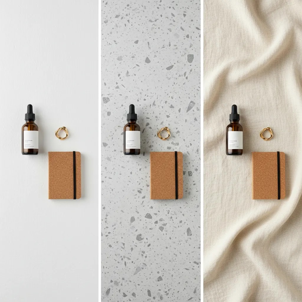
First, matte vs glossy. Matte surfaces are usually easier to light and edit. Glossy surfaces often create hotspots and reflections that distract from the product, especially with packaging, metal, or anything shrink-wrapped.
Second, texture strength. Subtle texture can add depth. Strong texture can compete with small products and make the image feel busy in Shopify collection grids. If you can clearly describe the texture from a small thumbnail, it is probably too strong for core catalog use.
Third, color cast risk. Warm wood, colored fabric, and painted surfaces can reflect onto white products and light clothing. You can fix some of this in editing, but it is rarely perfect. If color accuracy matters, start neutral and add brand color through props or styling instead of the background.
If you want a simple “starter kit” that holds up for ecommerce, I would keep it basic and repeatable. One neutral hard board for catalog consistency, plus one textured board or mat for lifestyle content. That gives you two dependable looks without turning every shoot into a new experiment.
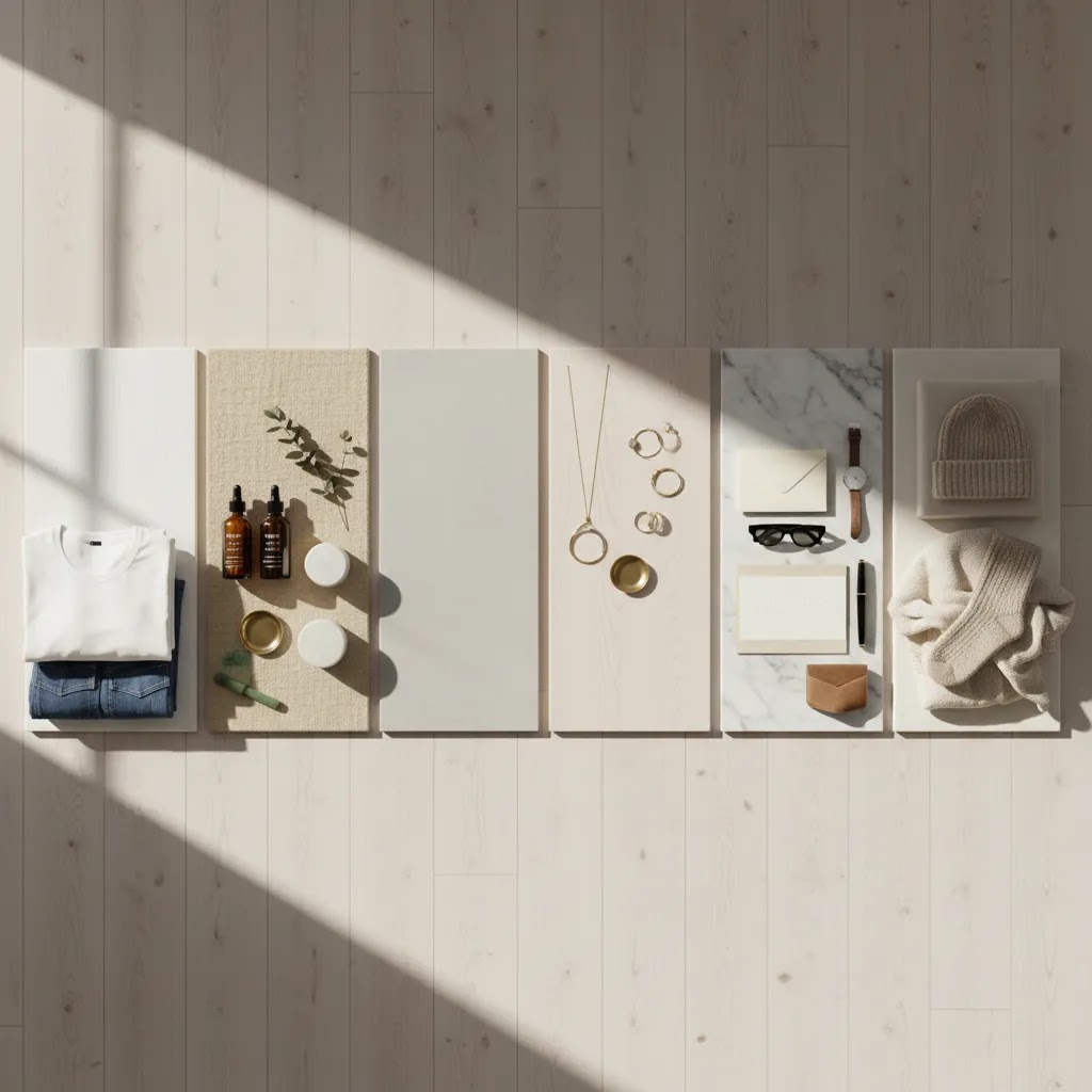
Best Surfaces and Textures for Flat Lay Photography
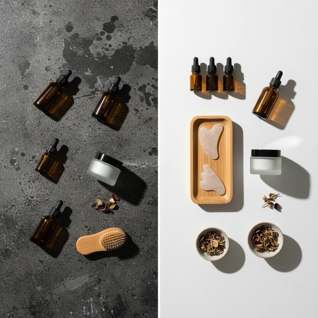
There is no single best photography flat lay background for every store. The right choice depends on what you sell and how polished or editorial you want your images to feel. These are the most reliable options for ecommerce teams and DIY store owners.
1. White foam board or matte white boards
A matte white surface is the safest option if you want clean, bright, marketplace-friendly images. It works especially well for skincare, jewelry, small accessories, and simple apparel shots. A flat lay photography white background also makes it easier to maintain a consistent catalog look.
Its main limitation is that it can feel plain if your brand depends on warmth or texture. White also shows dust, wrinkles, and edge shadows quickly, so your lighting needs to be controlled.
2. Faux marble boards
Marble-look boards are popular for beauty, jewelry, candles, and gift products. They add a polished feel without needing a real stone surface. For stores that want a slightly elevated lifestyle look, this can be a good middle ground between plain white and heavily styled editorial photography.
The trade-off is that strong veining can compete with small products. If you use faux marble, choose subtle patterns and keep props limited.
3. Light wood surfaces
Light oak, ash, or whitewashed wood works well for handmade goods, home products, baby items, and lifestyle-oriented apparel brands. It introduces warmth and texture while staying relatively neutral.
This is often a strong flat lay background for clothes photography when your brand is casual, natural, or seasonal. It is less suitable if you need highly color-accurate catalog images, because warm wood tones can reflect onto lighter garments.
4. Painted MDF or plywood boards
If you want a repeatable studio setup without spending much, painted boards are a practical choice. You can create matte cream, soft gray, pale beige, or muted brand-color surfaces that fit your product line. This is one reason flat lay photography background boards remain popular with small ecommerce teams.
The main advantage is control. You decide the tone and finish. The downside is durability. Boards can scratch, chip, or develop uneven shine if the paint finish is not truly matte.
5. Vinyl mats and printed background mats
Flat lay photography background mats are useful when you need multiple looks in a small space. They are lightweight, easy to store, and available in textures like concrete, plaster, terrazzo, stone, or wood. For stores shooting often, they can save time and reduce setup friction.
Quality varies a lot. Lower-end mats may curl at the edges, reflect light, or look artificial in close-up shots. If your products are premium, test carefully before using these as a core catalog surface.
6. Seamless paper rolls or sheets
Flat lay photography background paper is ideal if you need clean color fields for lookbooks, campaigns, or seasonal launches. Paper gives you a smooth finish and easy color variation, from white and cream to soft pastel or bold brand colors.
It is less durable than boards or mats. Paper tears, wrinkles, and stains easily, so it works best for lightweight products and planned shoots rather than daily handling.
7. Fabric and fur textures
Textile surfaces, including linen, canvas, muslin, and even photography fur flat lay background setups, can work for fashion, baby products, or soft lifestyle imagery. These textures create a more editorial mood and can soften hard product lines.
For ecommerce, use caution. Fabric wrinkles quickly and fur can overwhelm the frame. These surfaces are better for campaign content and social storytelling than standard product page photography.
Common Flat Lay Mistakes (And How to Fix Them Fast)
What many store owners overlook is that flat lays usually fail for small, fixable reasons. The product might be great and the background might be fine, but a few details make the image feel messy once it hits a Shopify collection grid.
Messy edges are one of the most common issues. This shows up as the edge of the board, a seam between surfaces, or a background that is not large enough for the crop you need. The quick fix is to shoot wider than you think you need, then crop for different placements. If you are already mid-shoot, raise the camera slightly so you get a cleaner, more forgiving crop area around the product.
Unwanted reflections are another big one, especially with glossy packaging, jars, watches, and anything metallic. If you see hotspots on the product, the fix is usually not “edit harder.” It is controlling the light. Try moving the product so it is not reflecting the brightest part of the window or light source. If you have a spare piece of card or board, you can “flag” the light by placing it near the reflective side to block a harsh reflection and create a cleaner gradient. This is one of the simplest ways to make a flat lay look more premium without changing your whole setup.
Wrinkled fabric backgrounds are a fast way to make photos look DIY. If you use fabric, pull it tight and keep the folds intentional. For clothing shots, wrinkles in the background plus wrinkles in the garment can combine into one noisy thumbnail. If the fabric texture is the point, make it consistent and keep the product edges sharp.
Inconsistent white balance is the quiet killer of a cohesive catalog. One product looks warm, the next looks cool, and your collection page feels inconsistent even if each photo is “good.” The fix is to keep your lighting consistent during the shoot. Avoid mixing window light with warm indoor bulbs. If you are shooting near a window, try to shoot your set in one session so light direction and color do not drift over hours.
Props overpowering the product is common in flat lays because it is tempting to style. Think of it this way, your shopper is not browsing a magazine spread. They are scanning thumbnails. If the prop has more contrast than the product, or if it overlaps key product details, the product can get lost. The fix is to simplify props, especially for anything that will become a Shopify thumbnail. Keep props smaller than the product, lower contrast than the product, and pushed toward the edges of the frame.
Uneven spacing is another issue that looks minor in the moment, but it reads as “off” in the final image. If you are arranging multiple items, step back and check spacing symmetry. A simple trick is to rotate the product relative to the background grain or marble veining. If the background has lines, align your product so it does not fight those lines. This is especially useful for faux marble and wood, where the pattern can accidentally pull the viewer’s eye away from the product.
The ecommerce reality check is this, most of these problems are more obvious on a collection grid than in a single image. Before you wrap a shoot, export one or two images and preview them at small size on your phone. If the product is not instantly readable, strip back styling, clean up reflections, and give yourself more negative space for cropping.
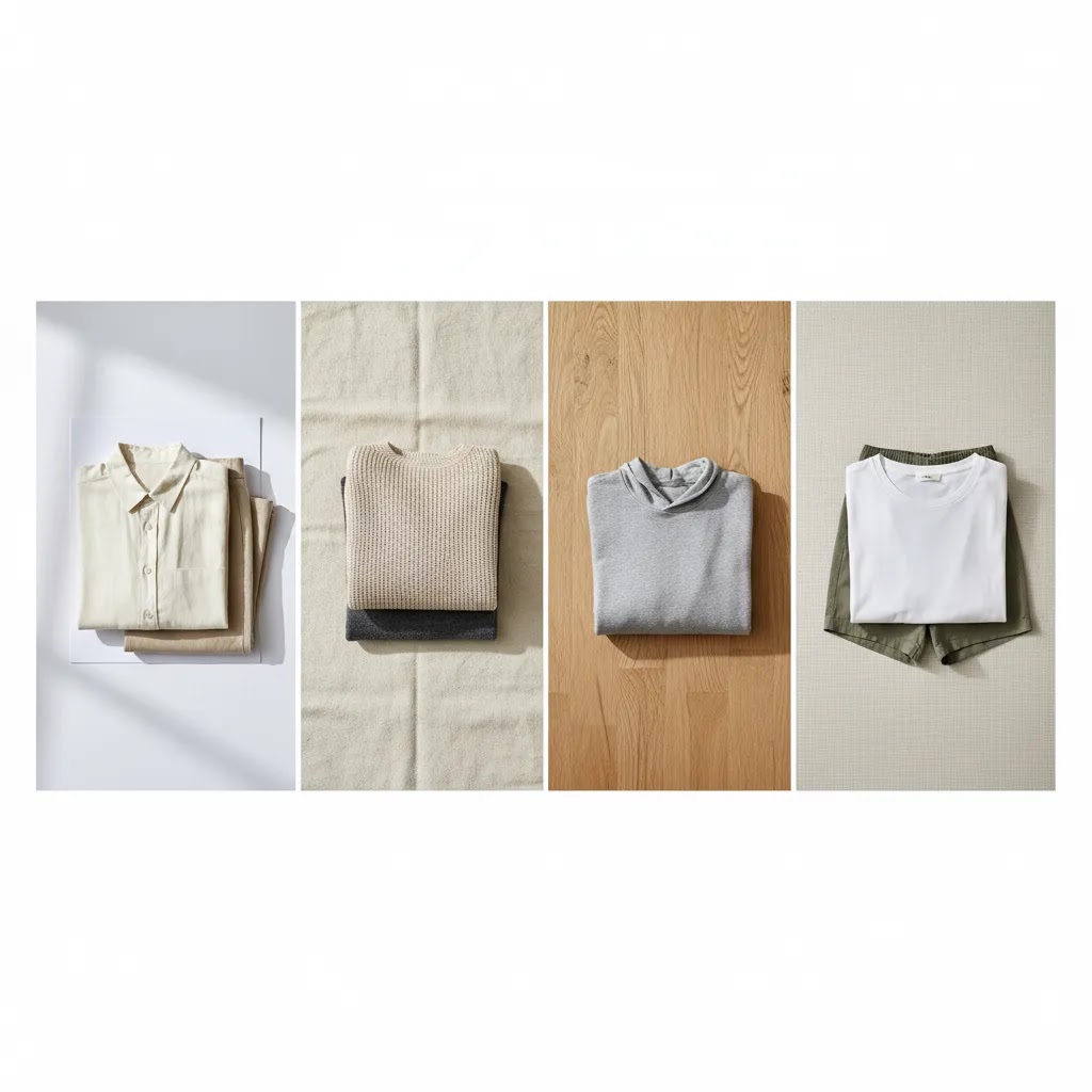
Best Flat Lay Background for Clothes
If you sell apparel, the best flat lay background for clothes usually comes down to three priorities: accurate garment color, visual separation from the fabric, and consistency across collections.
For most clothing brands, a matte white or light neutral background is the safest starting point. It keeps the focus on fit, fold, fabric, and color. This matters on Shopify category pages, where shoppers may compare multiple items quickly and scan thumbnails before clicking.
If your garments are light colored, pure white can reduce edge definition. In that case, try soft gray, warm ivory, pale beige, or very light stone textures. These tones keep the frame clean but help define the outline of white, cream, or pastel clothing.
A light wood or soft canvas setup can also work for casualwear, kidswear, handmade fashion, or earthy lifestyle brands. If you use it, keep the grain subtle and avoid strong yellow tones that may shift product color. Pairing the right background with thoughtful diy photography lighting helps prevent shadow buildup in sleeves, collars, and hems.
For fashion ecommerce, my practical rule is this:
That balance gives you both clarity and personality, which is exactly what most growth-stage stores need.
The 20/60/20 Rule for Flat Lays (How to Style Without Distracting)
If you want a simple styling framework that keeps your product as the hero, the 20/60/20 rule is a useful one. The idea is that around 60% of the visual weight is your product, around 20% is supporting elements (props, packaging, ingredients, or context), and around 20% is negative space.
For ecommerce, this matters because your flat lay is rarely viewed full-screen. It is usually seen as a small Shopify thumbnail, a cropped ad placement, or a quick glance in an email. If you fill the frame with props, you are making the product harder to recognize at the exact moment a shopper is deciding whether to click.
Here is how it tends to work best across common ecommerce outputs.
For a PDP hero style flat lay, go product-first. In many cases, that means reducing the “prop” portion to close to zero and giving yourself more negative space for cropping. You want clean edges, predictable lighting, and a product shape that reads instantly. This is where matte neutral boards usually win.
For a lifestyle flat lay on your product page, in an email banner, or as a secondary image, you can bring props back in. Keep them quiet and on-brand, and make sure they do not overlap the product. This is where subtle stone, plaster, or light wood can add context without taking over.
For social posts, you can push styling further, but still keep the product readable. If the goal is storytelling, you can increase prop presence, but be honest about where the image will end up. A highly styled Instagram post often does not translate well to a Meta ad thumbnail or a Shopify collection image.
Consider this for clothes and small accessories. Clothing flat lays benefit from more negative space than you think because you will often need to crop into square thumbnails and still show key details like collars, waistlines, or sleeve shapes. A practical approach is to leave clean space around the garment so you can crop multiple ways without cutting off important features.
For small accessories like jewelry, sunglasses, or wallets, the same rule applies, but the “product” portion needs help. You may need to shoot closer, use fewer props, and choose a background texture that does not compete. If you are using a textured surface, keep the prop portion restrained so the combination does not become visually busy.
How to Choose the Right Background for Your Store
If you are deciding between flat lay photography background kits, boards, mats, or paper, use these five criteria.
1. Product type and size
Small products like rings, lip balms, and stationery benefit from cleaner surfaces with minimal pattern. Larger products like sweaters, gift sets, or home accessories can handle a little more texture because the item still dominates the frame.
2. Brand aesthetic
Your surface should support the brand mood already present in your store design. Minimal brands usually do better with white, plaster, or pale stone. Handmade and natural brands often suit wood, linen, or soft matte neutrals. Luxury brands may prefer restrained marble or darker editorial setups, but only if product details remain clear.
3. Lighting conditions
Some backgrounds are forgiving under window light. Others are not. Glossy vinyl, heavily sealed painted boards, and bright faux stone can create reflections that slow down shooting and editing. If your setup is home-based, matte surfaces are usually more dependable.
4. Repeatability
If you plan to shoot new arrivals every week, use a background that stores easily, cleans quickly, and looks the same every time. This is where boards and quality mats often beat paper. If your brand is scaling and you are considering a more permanent product photography studio workflow, repeatability becomes even more important.
5. Channel fit
Think beyond one photo. Will the same surface work on product pages, collection grids, email headers, Pinterest pins, and Meta ads? The strongest choices usually perform across several channels. If you need campaign flexibility, create one dependable catalog look and one lifestyle look rather than trying to force one background to do everything.
And if your current setup is being limited more by your camera or lens than your backdrop, it may be worth reviewing your options for the best camera for product photography before spending more on styling surfaces.
AcquireConvert Recommendation
For most ecommerce store owners, the best approach is not to chase the most stylish flat lay photography background. It is to build a small, repeatable system. Start with one matte white or soft neutral board for clean catalog work. Then add one textured option, such as subtle wood or stone, for lifestyle content. That setup covers most Shopify product pages, collection images, social posts, and launch emails without making your visual brand inconsistent.
AcquireConvert focuses on practical decisions like this for store owners who want results they can actually implement. Giles Thomas brings a useful perspective here as a Shopify Partner and Google Expert, especially if your photography choices need to support conversion, merchandising clarity, and paid traffic performance. If you want to go deeper, browse the Product Photography Fundamentals section and the related guide on White Background Photography to tighten up your shooting process.
Pros and Cons
Strengths
Considerations
Frequently Asked Questions
What is the best flat lay background for ecommerce photography?
For most ecommerce stores, a matte white or light neutral board is the safest choice. It keeps attention on the product, works across product pages and collection grids, and is easier to edit consistently. If your brand needs more warmth or texture, add one secondary lifestyle surface instead of replacing your main catalog background entirely.
What is the best flat lay background for clothes?
The best flat lay background for clothes is usually matte white, ivory, or soft gray. These colors help garments stand out without making the frame busy. If you sell casual or handmade apparel, light wood or subtle fabric textures can work well for lifestyle shots, but clean neutrals are still the better option for core catalog images.
Are flat lay photography background boards better than paper?
Boards are usually better for repeat shoots because they are more durable and easier to reuse. Paper is useful when you want a smooth, seamless look or need color variety for short-term campaigns. If you shoot regularly for your store, boards tend to be the more practical long-term choice.
Do background mats work for product photography?
Yes, quality background mats can work well, especially if storage space is limited. They are lightweight and give you multiple texture options without needing several hard boards. The main watchout is surface realism. Some lower-cost mats look artificial or reflect too much light, which can reduce the quality of close-up product shots.
Should I use texture in flat lay product photos?
Texture can help if it supports your brand and does not compete with the product. Subtle wood, plaster, stone, or linen often works well. Heavy texture, bold veining, or high-contrast surfaces can distract shoppers, especially on mobile. For ecommerce, subtle usually performs better than dramatic.
Is white always the best background for flat lay photography?
Not always, but it is often the most versatile. White works particularly well for clean product presentation and marketplace compatibility. That said, very light garments or white packaging may lose definition on a pure white surface. In those cases, a soft gray or warm neutral background can create better edge separation.
Can I use fabric as a photography flat lay background?
Yes, but use it selectively. Linen, canvas, or muslin can create a softer lifestyle look for apparel, baby products, or handmade goods. The challenge is that fabric wrinkles easily and can make editing more time consuming. For product pages, hard matte surfaces are usually more consistent and easier to manage.
How many flat lay backgrounds should an online store have?
Most stores only need two or three. One should be your main catalog background, usually white or light neutral. Another can support lifestyle or seasonal content. A third is optional if you sell across very different categories. Keeping the number small helps your brand stay visually consistent and easier to scale.
Do I need a better camera before changing my background?
Not necessarily. A better background and cleaner lighting can improve image quality even if you are still shooting with a phone. If your photos already look sharp but inconsistent, fix the surface first. If detail, crop flexibility, or low-light quality is the issue, your camera setup may need attention too.
What to use for a flat lay background?
You can use foam board, poster board, seamless paper, a matte tabletop, or a printed background mat. If you need a quick setup, a neutral matte board is usually the most reliable for ecommerce because it stays flat and is easier to light. Avoid glossy surfaces if your products or packaging reflect easily, since that can create hotspots that are hard to edit cleanly.
What does “flat lay” mean in photography?
A flat lay is a photo taken from directly above, with the products arranged on a flat surface. For ecommerce, flat lays are commonly used for clothing, accessories, and curated product bundles because they show shape, styling, and grouping clearly. The key is keeping the product readable at small thumbnail sizes, not just making a decorative layout.
What are common flatlay mistakes?
Common mistakes include messy board edges in frame, unwanted reflections, wrinkled fabric, inconsistent white balance between shots, props that overpower the product, and uneven spacing. Most of these can be fixed quickly by shooting wider for safer crops, using matte surfaces, flagging light to reduce glare, simplifying props for Shopify thumbnails, and checking consistency on your phone before finishing the shoot.
What is the 20 60 20 rule in photography?
In flat lay styling, the 20/60/20 rule is a simple way to keep images clean: about 60% of the visual weight is the product, about 20% is supporting props or context, and about 20% is negative space. For ecommerce, that negative space helps with cropping for collection grids, ads, and social placements without cutting off key product details.
Key Takeaways
Conclusion
The best flat lay background is the one that helps your products look clearer, more consistent, and easier to shop. For most ecommerce brands, that means starting simple with white or soft neutral surfaces, then adding restrained texture where it genuinely supports the brand. If you sell clothes, accessories, or small lifestyle products, this approach gives you flexibility without turning every shoot into a styling exercise. AcquireConvert is built for practical decisions like these. If you want to sharpen your setup further, explore our guides on flat lay photography and diy photography lighting to create product images that fit your store, your workflow, and your growth stage.
This content is editorial and intended for educational purposes only. It is not a paid endorsement unless explicitly stated otherwise. Product photography results vary based on your products, lighting, camera setup, editing process, and storefront context. No specific performance or conversion outcomes are guaranteed.

Hi, I'm Giles Thomas.
Founder of AcquireConvert, the place where ecommerce entrepreneurs & marketers go to learn growth. I'm also the founder of Shopify agency Whole Design Studios.