Flat Lay Photography for Ecommerce (2026 Guide)
Flat lay photography can be one of the most practical ways to create clean, scroll-stopping product images without a large studio setup. If you sell apparel, beauty products, stationery, jewelry, gift boxes, or wedding-related items, overhead shots can help you show color, texture, bundles, and styling details in a format that feels organized and easy to shop. For many store owners, it is also more achievable than complex lifestyle shoots. If you are still building your visual workflow, it helps to start with a broader understanding of product photography so your flat lays fit the rest of your catalog strategy. This guide explains what flat lay photography is, where it works best for ecommerce, how to set it up, and how AI tools may help speed up editing without replacing good shot planning.
Contents
What Flat Lay Photography Is and Why It Works
A flat lay photo is an image shot directly from above, with the subject arranged on a flat surface. If you have ever seen neatly styled overhead images of clothing, skincare products, wedding invitation sets, or gift bundles, you have seen flat lay photography in action. The format is popular because it gives you control. You choose the background, spacing, props, and composition, then capture the scene from a fixed top-down angle.
For ecommerce, that control matters. Overhead images can make your product pages look more consistent, especially if you sell collections or items that are often purchased together. A well-planned flat lay can also communicate size, color coordination, and product pairing faster than a text description alone.
Flat lays are not the right choice for every SKU. Products that need depth, fit, scale from multiple angles, or close material inspection may need additional shots. Clothing flat lay photography, for example, works well for folded tees, coordinated outfits, and capsule collections, but it usually performs best alongside model or mannequin images. The same is true for beauty, food, and stationery. Think of flat lays as one image type in a broader visual system, not the only one.
If your goal is consistency at home, your results will often improve with a repeatable surface, a stable overhead shooting position, and controlled diy photography lighting.
Flat Lay Composition Basics (What Makes an Overhead Shot Look Professional)
Here’s the thing about flat lays. The camera angle is simple, but the composition is what separates a store-ready image from something that looks like a random desk photo. In ecommerce, your job is to make the customer immediately understand what the hero product is, what else is included (if anything), and where their eyes should go first.
Start with a clear hero product and build a “grid” around itEven if you do not use a literal grid layout, think like you are building one. Pick the main product, place it first, then build the rest around it using consistent spacing and intentional negative space. Negative space is not wasted space. It is what makes a flat lay feel premium and easy to scan, especially on Shopify collection pages where images are small.
A practical way to keep spacing consistent is to choose a simple “unit” and repeat it. For example, keep every item about two finger-widths apart, and keep the hero product at least double that distance from the edge of frame. Then mark your edges and hero placement with tape guides so you can repeat it across the catalog.
Use repeatable composition patterns across your catalogIf you want a cohesive store, you need a few templates you can use again and again. These are three patterns most Shopify stores can apply quickly:
Common flat lay mistakes (and fast fixes)Most flat lay issues are not “camera” problems. They are arrangement and consistency problems. A few that come up over and over:
From a practical standpoint, consistency matters more than being “creative” for every shot. If you have 200 SKUs, you want three to five strong composition templates you can repeat, not 200 one-off arrangements that all feel different.
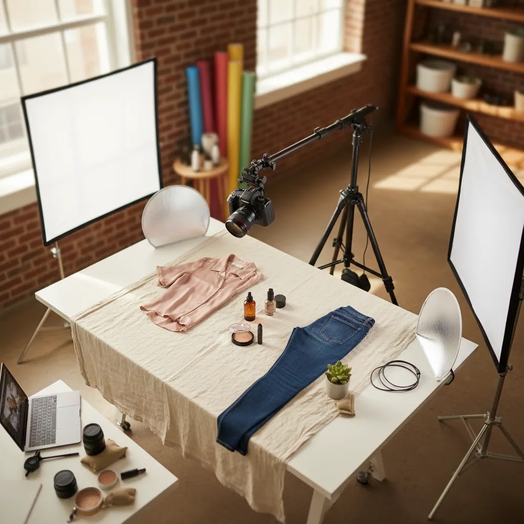
How to Build a Flat Lay Photography Setup
A strong flat lay photography setup does not need to be expensive, but it does need to be repeatable. The main challenge is not taking one good shot. It is taking 50 or 500 shots that feel like they belong in the same store.
Start with a stable shooting surface. This could be foam board, a styled backdrop, painted MDF, vinyl, fabric, or a branded color surface depending on your niche. White and light neutral backgrounds tend to work best for marketplace-style clarity, while textured surfaces may suit boutique brands that rely on mood and storytelling. Your background choice should support the product, not compete with it.
Then solve the camera position. You need the lens square to the product plane. If the camera tilts, your flat lay will look sloppy and lines will distort. Many merchants build or adapt a diy product photography table so they can mark consistent framing zones and keep the setup in place between shoots.
Your checklist should include:
For camera gear, your phone may be enough for many stores, especially if lighting and composition are strong. If you need more control over sharpness, color, or lens choice, it is worth comparing options in this guide to the best camera for product photography.
Lighting and Shadow Control for Flat Lays (Natural Light vs Artificial)
Lighting is where most flat lays either look clean and premium, or they start to look like a listing photo from a cluttered kitchen table. You do not need a full studio, but you do need to control the direction of light and the quality of shadows.
Natural light vs artificial lightNatural window light can work well for flat lays because it is soft and flattering. The tradeoff is consistency. Weather and time of day can change your results quickly, which becomes a problem if you are shooting product restocks over multiple days.
Artificial light is usually more repeatable. A continuous light with diffusion can give you a consistent “every shoot looks the same” baseline. The reality is that either option can work for Shopify stores, as long as you standardize your setup and stop mixing light sources.
Where to place the light: side light vs top lightLight position changes how your product reads:
Consider this: pick one light position for each product category and stick to it. Your store will look more consistent, and your editing time usually drops because exposure and shadow patterns do not change every session.
Shadow control: diffusion, bounce, and flaggingOnce you have a key light, your job is to manage shadows and reflections:
For most Shopify product pages, you typically want soft shadows that show the product is real, but not so strong that the layout looks messy. If you are shooting on white, keep an eye on “gray wash” in shadows, it makes the background look off-white in a way that is harder to fix later.
Quick camera and phone settings for sharper, more consistent flat laysMost flat lay quality problems come from tiny shifts in exposure and focus from shot to shot. A few practical rules help:
If you want a deeper walkthrough of DIY setups and light shaping without a full studio build, the diy photography lighting guide is a good next step.
Best Ecommerce Use Cases for Flat Lay Photography
Flat lay photography tends to work best when your product benefits from visual organization. It helps customers understand what is included, how items pair together, and how a collection feels as a set.
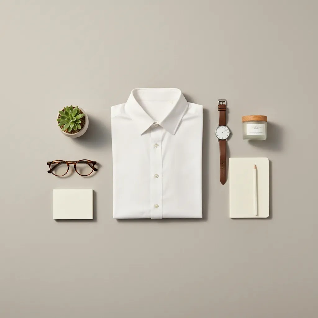
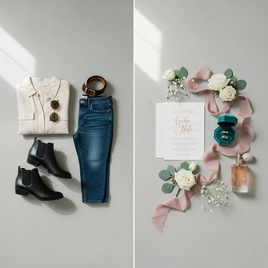
Apparel and fashion: Flat lay photography clothing setups are useful for folded garments, outfit planning, and accessories sold as coordinated looks. Fashion flat lay photography can also support collection launches on landing pages, email campaigns, and social posts. It is especially effective for showing color stories across a season.
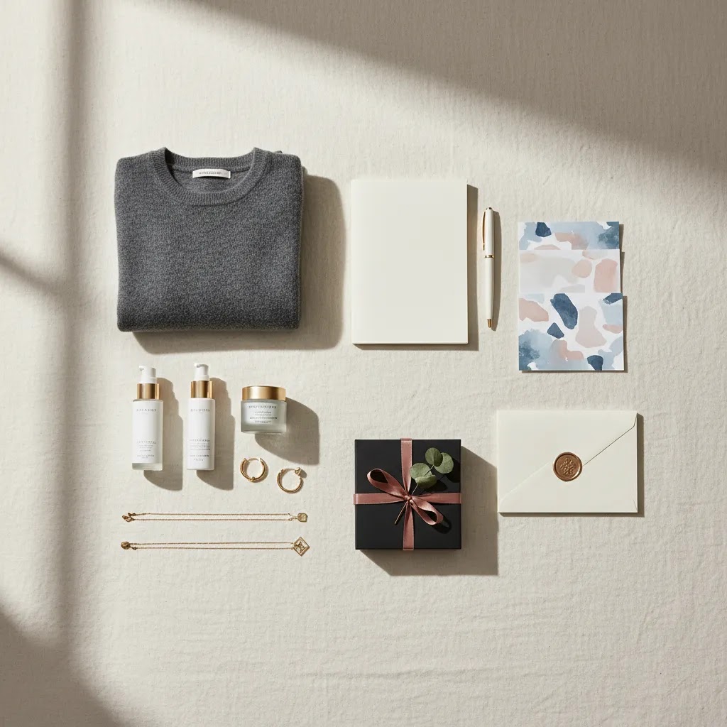
Wedding and gifting: Flat lay photography wedding imagery is common for invitation suites, favors, keepsakes, jewelry, and curated gift boxes. The overhead format gives you room to combine multiple pieces in one frame while keeping the presentation neat.
Beauty and skincare: Serums, palettes, brushes, and bundles often look strong in flat lays because labels, packaging, and textures can be arranged clearly. This can help on collection pages where shoppers compare variants quickly.
Home, stationery, and craft: Products that come in sets, or products with visual detail but limited dimensional depth, are often a natural fit.
That said, not every product should rely on this style. Structured bags, furniture, footwear, or products where side profiles matter usually need additional image types. If you are scaling your visual operation beyond home shoots, a dedicated product photography studio approach may make more sense for some categories.
Flat Lay Backgrounds and Surfaces (Mats, Boards, and Brand Consistency)
Your background is not just “a backdrop.” It is part of your catalog system. If your backgrounds change too often, your Shopify collection pages can start to feel chaotic, even if every individual image looks good.
Choosing backgrounds by product categoryFor most stores, white or light neutral backgrounds are the safest baseline for product pages because they prioritize clarity and reduce the risk of shifting perceived product color. This is especially true for categories where color accuracy drives returns or customer trust, like apparel, cosmetics, and home textiles.
Textured backgrounds can help when your product needs context to feel premium. Paper goods, handmade items, and gifting often benefit from subtle texture because it adds warmth without adding clutter. The key is keeping texture low-contrast so it does not compete with labels, edges, or fine product details.
Strong color backgrounds can work for campaigns, but they can also harm conversion on core product pages if they distort the product’s true color or create a mismatch between your listing image and what customers see elsewhere (like in reviews or UGC). If you do use color, test it in a limited context first, like seasonal banners or email creative, and keep core catalog images consistent.
Practical surface options that are easy to maintainFrom a practical standpoint, you want surfaces that stay flat, clean easily, and do not crease. A few common options store owners use:
Keeping surfaces clean matters more than people expect. Dust and tiny fibers show up fast in overhead shots, especially on dark products or white backgrounds. A lint roller, microfiber cloth, and a quick “wipe and inspect” habit before each set will save you a lot of editing time.
Create a simple background system for Shopify consistencyWhat many store owners overlook is that you do not need unlimited background options. You need a small set that you use on purpose:
Think of it this way: your backgrounds are part of your merchandising. When they are consistent, your store feels more trustworthy. When they vary randomly, your catalog can feel like it was stitched together from different brands.
Where AI Tools Can Help Flat Lay Photography
AI should support your workflow, not cover up weak photography. The most useful AI tools for flat lays are usually editing tools that speed up cleanup, background work, or content repurposing after the shot is already solid.
Based on current tool data, a few options may be relevant for ecommerce image workflows:
These tools may help if you are adapting flat lays for ads, collection banners, or seasonal campaigns. Still, they will not replace the need for good spacing, accurate color, clean styling, and product truthfulness. If your actual item shape, texture, or proportion changes too much in editing, customer expectations may drift from what arrives in the package.
For brand-led inspiration beyond pure catalog shots, it is also useful to review examples from Lifestyle Product Photography and compare which images should sell the product and which should sell the mood.
Pros and Cons
Strengths
Considerations
Who Flat Lay Photography Is For
Flat lay photography is a good fit for ecommerce brands that want a clean, repeatable content style without building a full studio workflow from day one. It is especially practical for Shopify merchants selling apparel accessories, cosmetics, stationery, jewelry, wedding goods, gift boxes, and curated product bundles.
If you are a solo operator or small team, flat lays can help you produce homepage, collection page, email, and social assets from one shooting session. They are also useful for brands that want a polished editorial look but still need operational efficiency.
If your products depend heavily on scale, technical detail, or 3D shape, use flat lays as support imagery rather than your primary image format. In those cases, your best setup may combine overhead shots with clean standard catalog images from the broader Product Photography Fundamentals workflow.
How to Choose the Right Flat Lay Approach for Your Store
There is no single best flat lay style for every ecommerce business. The right approach depends on what you sell, where the image appears, and what questions the customer needs answered before buying.
1. Start with the job of the imageAsk whether the image is meant to clarify the product, show a bundle, support a campaign, or create a branded mood. Product-page flat lays should usually prioritize clarity. Social or email flat lays can be more stylized.
2. Match the background to the channelWhite or neutral backgrounds often help product pages feel clean and consistent. Textured, colored, or seasonal backgrounds may work better for ads, landing pages, or editorial merchandising. A flat lay photography background should support the shopping decision, not distract from it.
3. Decide how much styling your customer actually needsSome niches benefit from richer storytelling. Wedding, gifting, and beauty are obvious examples. Other niches may convert better with restraint. If shoppers mainly need to confirm product attributes, keep props minimal.
4. Build a repeatable system before you scaleExperienced merchants usually get better results from templates than improvisation. Create a few repeatable compositions by category, set your light position, mark your shooting area, and standardize edit settings. This matters far more than chasing a perfect one-off image.
5. Use AI selectivelyAI can save time on cleanup and variants, but it should not create confusion. If your customers are buying based on color, texture, packaging, or included accessories, keep the final image faithful to the actual product. That is especially important for marketplaces, paid ads, and high-return categories.
At AcquireConvert, the practical approach is simple: use flat lays where they make the shopping journey clearer, not just prettier. Giles Thomas’s work across ecommerce growth and visual AI tools reflects that same principle. If you want more context on store-ready image workflows, check our related guides on product photography basics, lighting, and equipment choices to build a setup you can actually maintain.
Frequently Asked Questions
What is flat lay photography?
Flat lay photography is a top-down image style where products are arranged on a flat surface and photographed from directly above. In ecommerce, it is commonly used for apparel, beauty, stationery, gift sets, and wedding products because it helps show multiple elements clearly in a single frame.
What is the flat lay photography definition for ecommerce?
For ecommerce, flat lay photography means using overhead shots to present products in an organized, visually clean way that helps customers understand the item or set. It is most effective when the arrangement supports buying decisions, such as showing included pieces, color coordination, or bundle composition.
Is flat lay photography good for clothing brands?
Yes, flat lay photography clothing setups can work very well for folded garments, outfit combinations, accessories, and launch collections. Still, many clothing brands benefit from pairing flat lays with model, mannequin, or detail shots so shoppers can also understand fit, drape, and scale.
How do I make a flat lay photography setup at home?
Start with a clean surface, soft even light, and a way to hold your camera directly overhead. Then create a repeatable setup using placement guides, a simple background, and a shot list. The key is consistency. A modest home setup can still produce strong ecommerce images if the process is controlled.
What equipment do I need for flat lay photography?
You can shoot flat lays with a smartphone, a clean surface, and good light, but the setup becomes much easier when you can keep everything consistent. Most store owners benefit from an overhead support (tripod with a boom arm or overhead rig), a repeatable background surface, and simple light control tools like diffusion and white bounce cards. If you are using artificial light, aim for one consistent light source and avoid mixing it with room lighting so color stays predictable.
What are common flat lay mistakes?
The most common issues are cluttered styling, unclear hero product placement, inconsistent spacing, crooked alignment, and harsh or mismatched shadows. Fast fixes usually involve removing props, standardizing spacing with simple guides, using a grid overlay to straighten the shot, and softening light with diffusion while filling shadows with a white bounce card. If you solve those basics, your flat lays typically look more professional without changing your camera.
What background works best for flat lay photography?
White, off-white, and light neutral backgrounds are the safest choice for most product-page uses because they keep attention on the item. Textured or colored surfaces can work well for branded campaigns, but only if they do not distort color accuracy or distract from what the customer is actually buying.
Can I use flat lay photography for wedding products?
Yes. Flat lay photography wedding images are especially common for invitation suites, keepsakes, favors, jewelry, and curated gift sets. The overhead angle makes it easier to combine multiple pieces in one image while keeping the composition clean and premium-looking.
Do I need a professional camera for flat lay photography?
No, not always. Many store owners can create effective flat lays with a modern smartphone if lighting, framing, and editing are handled well. A dedicated camera may help if you need more control over sharpness, lens choice, and color, but equipment alone will not solve weak composition.
Can AI create flat lay photography?
AI may help with editing, background changes, cleanup, or creative variants, but it should be used carefully for ecommerce. If the final image no longer reflects the actual product, customer trust may drop. In most cases, AI works best as a support tool after a strong original photo is captured.
Are flat lay photography examples enough for a product page?
No, usually not by themselves. Flat lay photography examples are useful for merchandising and context, but many products still need front, side, close-up, or in-use images. The best product pages combine image types so shoppers can evaluate both appearance and practical details before buying.
Key Takeaways
Conclusion
Flat lay photography earns its place in ecommerce because it is practical, scalable, and visually organized when done well. It can help you present bundles, collections, outfits, and styled product stories in a way that feels both polished and shoppable. The real value is not just that overhead shots look good. It is that they can fit into a repeatable workflow you can maintain as your catalog grows. If you want to improve your store visuals further, explore AcquireConvert’s related guides on lighting, shooting setups, and camera selection. Giles Thomas’s perspective as a Shopify Partner and Google Expert keeps the advice grounded in how real ecommerce brands build content systems that support conversion, not just aesthetics.
This article is editorial content created for educational purposes and is not a paid endorsement unless explicitly stated otherwise. Tool availability and features are subject to change, and readers should verify current details directly with the provider. Any photography or ecommerce results mentioned are not guaranteed and will vary based on product type, execution, store setup, and customer context.

Hi, I'm Giles Thomas.
Founder of AcquireConvert, the place where ecommerce entrepreneurs & marketers go to learn growth. I'm also the founder of Shopify agency Whole Design Studios.