Flat Lay Food Photography Tips (2026 Guide)
Flat lay food photography works well because it shows shape, color, portions, and ingredients in one frame. For ecommerce brands selling packaged foods, kitchen products, tableware, recipe kits, or lifestyle goods, it can be one of the most practical ways to create attractive content without a complex setup. A good overhead image can help on product pages, social posts, email campaigns, and paid creative. If you are still building your visual system, start with the broader basics of product photography first, then apply those principles to food styling, composition, and lighting. The goal is not to make every shot look elaborate. It is to make your food look clear, fresh, and appealing enough that shoppers want to keep scrolling, click through, and learn more.
Contents
What flat lay food photography is good for
Flat lay food photography means photographing food from directly above. This angle is especially useful when you want to show multiple items together, create a strong sense of order, or tell a quick visual story with ingredients, utensils, packaging, and serving pieces.
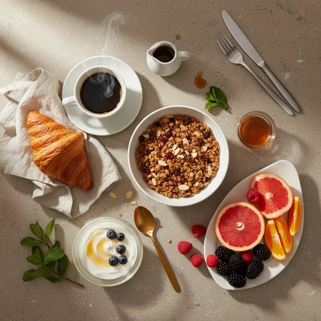
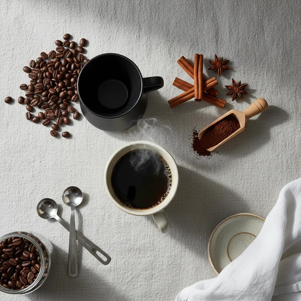
For ecommerce, that matters because shoppers often decide in seconds whether an image feels trustworthy and appetizing. Overhead compositions can help you show product context without making the scene feel crowded. A breakfast box brand can show granola, fruit, and packaging together. A coffee brand can show beans, a mug, brewing tools, and the final drink in one clean arrangement. A cookware brand can use the same angle to highlight both the meal and the pan.
This style also scales well. Once you develop a repeatable setup with a consistent background, lighting direction, and prop system, you can create a library of images that works across storefront banners, collection thumbnails, and social content. If you want to understand the broader shot style beyond food, our guide to flat lay photography gives you a useful foundation.
What makes a food flat lay look delicious
A strong food flat lay usually comes down to five things: lighting, composition, color balance, texture, and restraint. Store owners often focus on props first, but the image usually succeeds or fails based on light and arrangement.
Lighting should reveal texture without creating harsh glare. Side light from a window is often the most forgiving setup because it gives bread crust, herbs, steam, sauces, and fruit surfaces more shape. If your images feel dull or muddy, review your diy photography lighting before buying more gear.
Composition needs structure. Start with one hero item, then support it with secondary ingredients or tableware. In ecommerce photography flat lay scenes, every object should earn its place. If a spoon, napkin, or ingredient does not clarify the story, remove it.
Color should feel intentional. Foods with similar tones can blend into the background, especially beige pastries, pasta, bread, or cereal. Use contrasting linens, darker boards, or garnishes to separate elements.
Texture is what makes flat lay food photography look edible rather than staged. Crumbs, drizzles, chopped herbs, steam, and slight imperfections can help. You do not want visual mess, but you do want signs that the food is real.
Restraint matters more than most people expect. New photographers often fill every corner. The better approach is to leave breathing room so the eye knows where to land. That also gives you flexibility for cropping into ad placements, Shopify hero sections, and Instagram posts.
If you are selling products rather than publishing recipes, keep the commercial objective clear. Your scene should support the product, not overpower it. That is especially important if you plan to reuse the shot in a product photography studio workflow where consistency matters across a larger catalog.
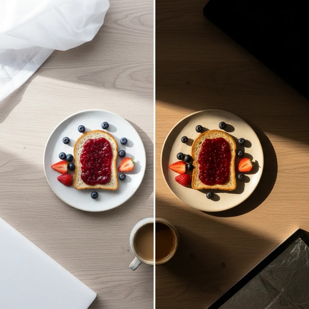
Flat lay food photography lighting patterns: bright and airy vs moody
Here is the thing, most flat lay food photography lighting advice focuses on “soft light” and stops there. In practice, you usually need to choose a lighting look that matches your brand and the products you sell, then make that look repeatable.
Bright and airy typically uses high overall exposure, softer shadows, and cleaner whites. It often suits wellness brands, breakfast foods, baked goods with lighter tones, meal kits, and modern DTC packaging where you want the scene to feel fresh and minimal. The risk is that whites can shift blue or gray, and pale foods can blend into pale backgrounds if you do not create separation with shadows, garnishes, or a slightly warmer surface.
Dark and moody usually uses deeper shadows, more contrast, and richer colors. It often suits chocolate, coffee, red wine, spices, rustic breads, and products where you want “craft” or “evening” energy. The risk is muddy color and underexposure, especially if your background and hero item live in the same mid-brown zone. You still need enough light to show texture, otherwise it just looks dim.
From a practical standpoint, the fastest way to control the look is to control three variables: light direction, diffusion, and negative fill.
1. Light direction (where the shadows fall)For overhead food, side light is usually the easiest starting point. Place your window or light source to the left or right of the table, not directly above the scene. Side light gives you shape and texture, especially on matte foods like bread, rice, granola, and herbs. Backlight can look great too, but it tends to create more glare on glossy sauces, plates, and plastic packaging, so you need more control.
2. Diffusion (how soft the light is)Diffusion is what turns a harsh window beam into soft, commercial-friendly light. A thin curtain, a diffusion panel, or even a clean white shower curtain can soften shadows and reduce shiny hotspots. If your plate has bright blown-out spots, or your sauce looks like a mirror, diffusion is usually the fix before you start moving props around.
3. Negative fill (how you keep depth in a “bright” setup)What many store owners overlook is that “bright” does not mean “flat.” If your scene looks washed out, add negative fill on the opposite side of the light source. That can be as simple as a piece of black foam board placed just outside the frame. It deepens shadows, adds contrast, and helps food look more dimensional without making the whole image darker.
Now, when it comes to reflections on plates, sauces, and packaging, small changes matter. Rotate the plate, slightly change the angle of your light source, or raise your diffusion a few inches. Glossy packaging can reflect your ceiling, your shirt, or your phone, so keep the area above the set as clean and neutral as possible.
Editing matters here too, but it is more about consistency than dramatic changes. For bright and airy, keep whites consistent across your catalog and avoid pushing exposure so far that plates lose detail. For moody, protect your shadows so they stay intentional, not gray and noisy. If your colors start to look muddy, it often means your white balance is off or your contrast is too low. A simple, repeatable editing approach will usually outperform a different “style” on every SKU.
Pros and Cons
Strengths
Considerations
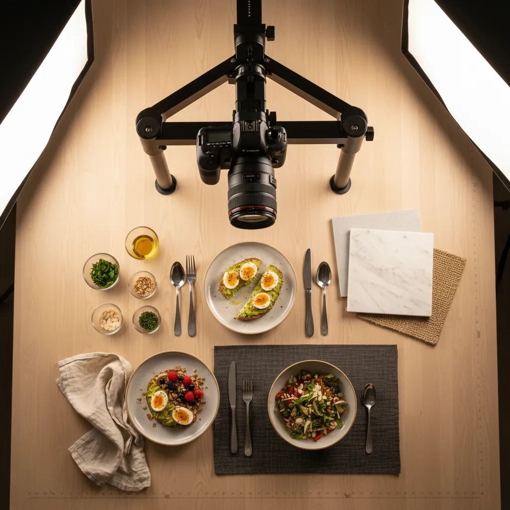
Equipment and camera setup for repeatable overhead shots
If you are shooting flat lays for a Shopify store, repeatability is usually the real goal. You are not just trying to get one great shot, you are trying to build a system you can use across 10, 50, or 200 SKUs without your images drifting in angle, scale, or sharpness.
Start with stable supportA tripod that can point straight down, or an overhead arm, is one of the most useful upgrades for flat lay food photography. It helps you keep framing consistent, reduces blur at slower shutter speeds, and makes it much easier to shoot the same layout again for seasonal variations. If you do not have that, you can still shoot overhead with a phone, but you will spend more time correcting skewed angles and inconsistent crops.
Use a remote or self-timerEven small vibrations can soften an overhead shot, especially in lower light. A simple remote shutter, a wired release, or a self-timer helps. If you are shooting on a phone, use the timer and avoid tapping the screen at the moment of capture. If you are shooting with a camera, make sure your tripod is stable and not extended more than it needs to be.
Keep the camera perfectly parallel to the tableFlat lays look “off” when the sensor is not parallel to the surface. Plates become ovals, packaging looks skewed, and your scene starts to feel like it is sliding out of the frame. Many cameras and phones can display gridlines, use them. Check that the edges of your table or backdrop run parallel with your frame lines before you style the whole scene.
Lens and distortion considerationsOverhead shots punish wide-angle distortion. Very wide focal lengths can make bowls and round plates warp near the edges of the frame, and packaged products can look stretched. In many cases, a slightly longer focal length gives a more natural look and makes your product feel more true-to-life. If you need to include a lot in the scene, raise the camera height rather than going wider, when you can.
Phone-specific tips that improve consistencyTurn on gridlines, tap to set focus and exposure, then lock exposure if your phone supports it. Keep the phone parallel to the table, not angled from your body position. If your phone keeps changing brightness as you move props, it can make a set of images look inconsistent in a collection grid. Stabilizing the phone with a clamp or overhead mount helps, even if you still use natural window light.
When upgrading gear may help is usually about control, not “quality.” If you shoot often, need consistent manual exposure, or want cleaner control of depth of field for packaging plus food styling in the same frame, a dedicated camera can be worth it. If you are still deciding, the practical breakdown in our guide to the best camera for product photography is a good next step.
Who flat lay food photography is for
This approach is a strong fit for ecommerce operators who need visually consistent content without a full production team. It works especially well for packaged food brands, coffee and tea sellers, bakery businesses, meal kits, cookware stores, tabletop brands, and gift box merchants. It can also help creators selling digital recipe content or food-related subscriptions.
If you run a Shopify store, flat lays are useful when you need images that can flex across product pages, collection pages, blog content, and paid social. They are less ideal when your product depends on height, pouring action, or side detail. In those cases, combine flat lays with angled shots and detail crops. If gear is part of your next decision, review your options for the best camera for product photography based on how often you shoot and how much control you want.
AcquireConvert recommendation
At AcquireConvert, we look at photography through a practical ecommerce lens. That means not just asking whether an image looks nice, but whether it supports merchandising, brand clarity, and conversion intent across your storefront. Giles Thomas brings that same operator mindset as a Shopify Partner and Google Expert, which is especially useful if your images need to work across Shopify themes, product grids, Shopping creative, and campaign landing pages.
If flat lay food photography is part of a bigger visual refresh, explore the wider Product Photography Fundamentals category and compare visual styles that fit your store. If your brand overlaps with textiles, apparel, or lifestyle merchandising, the examples in Food & Apparel Photography can also help you think more clearly about styling, surface choice, and scene consistency.
How to plan better flat lay food shots
If you want flat lay food photography that actually helps your business, plan the image around the sales context first. A shot for a homepage hero has a different job than a shot for a product page or an Instagram carousel.
1. Start with the use caseAsk where the photo will appear. Product pages usually need cleaner scenes with less distraction. Social content can handle more props and storytelling. Marketplace listings often need simpler backgrounds and stronger product visibility.
2. Build around one hero elementChoose the item that matters most. That could be the finished dish, packaged product, pan, mug, or ingredient. Place that first, then add supporting elements. This keeps the frame commercial instead of decorative.
3. Control your background and propsBackdrops should support the food color and brand feel. Dark slate can work for moody dessert shots. White or warm neutral surfaces often suit breakfast and wellness brands. Props should fit the product price point. Handmade ceramics may suit artisanal goods. Cleaner plates and linens may suit modern DTC branding.
4. Light for appetite, not just brightnessBrighter is not always better. Soft directional light usually makes food look fresher because it defines edges and texture. Watch for oily highlights, blown-out plates, and heavy shadows around bowls or cups.
5. Keep consistency if you sell multiple SKUsFor ecommerce stores, consistency may matter more than one exceptional image. If customers browse several products in sequence, your image set should feel related. Keep camera height, backdrop family, crop style, and prop density aligned across SKUs. That creates a more professional storefront and can make collection pages easier to scan.
A useful working process is to shoot one safe version first, then create one styled variation. That way you have a reliable commercial image plus an editorial option for social or email. This is often a better investment than trying to create one elaborate scene that has to serve every channel.
Flat lay composition rules that make styling faster (and less cluttered)
Consider this, styling feels slow when you are improvising every frame. A few simple composition frameworks can speed up your process and reduce clutter because you are making fewer “maybe this looks good” decisions.
Rule of thirds for quick hero placementIf you are unsure where to put the main dish or packaged product, place it on a thirds intersection rather than dead center. Center can work for symmetry, but thirds often feels more editorial and leaves space for supporting elements. This also makes it easier to crop later for Shopify banners or ad formats without cutting through the hero item.
Triangles for natural structureTriangles are one of the fastest ways to make a flat lay feel intentional. Place your hero item first, then place two supporting items to form a triangle. That could be a mug and a bag of coffee with a small spoon of beans, or a snack bar with a torn wrapper and a small bowl of ingredients. The triangle gives the eye a path and stops the layout from feeling random.
Leading lines that guide the eyeCutlery handles, parchment edges, linen folds, and even ingredient trails can act as leading lines. Use them to point toward the hero item, not away from it. If a fork handle points out of frame, your viewer’s attention may follow it right out of the image.
Odd numbers and repeating shapesThree cookies often looks better than two. Five berries scattered with some spacing often looks more natural than four in a perfect grid. Repeating shapes also helps, for example round bowls with round plates, or a repeated ingredient shape that echoes your packaging geometry. The key is to keep repetition supportive, not competitive.
Build a clear hierarchyThe way this works in practice is simple: your hero item should be the largest, sharpest, and most contrasty object in the frame. Supporting elements should be slightly smaller, slightly farther from the hero, or lower contrast. If your props are brighter than your food, or your napkin is the highest contrast area, you have flipped the hierarchy and the image will feel “busy” even with only a few items.
Watch for exit points and tangentsExit points are where the eye leaves the frame. A knife pointing out of the image, a bright highlight at the corner, or a strong diagonal line exiting the top edge can pull attention away from the product. Tangents are when objects just barely touch each other or barely touch the frame edge, like a plate kissing the border or a spoon almost touching a bowl. Those near-misses create tension and can make the scene feel accidental. The fix is usually simple, add space, overlap intentionally, or pull the object farther away so the spacing looks deliberate.
A quick clutter checkIf the frame feels crowded, remove one item and re-shoot. Then remove one more and re-shoot. Many store owners find the third version is the one that finally looks premium. You can always add complexity later, but it is hard to rescue a flat lay that has too many competing objects.
Frequently Asked Questions
What is a food flat lay photography setup?
A food flat lay photography setup is an overhead shooting arrangement where the camera points straight down at the food scene. In practice, that usually includes a table or board, directional light from a window or artificial source, a stable camera support, and a small set of props. For ecommerce, the best setups are repeatable, so you can produce consistent images across multiple products.
Why does flat lay food photography work so well for ecommerce?
It works because it can show the product, serving context, ingredients, and brand mood in one image. That makes it useful for product pages, collection banners, and social promotions. Shoppers can understand the scene quickly. It may not replace every angle you need, but it often performs well as a supporting image that adds context and appetite appeal.
What lighting is best for flat lay food photography?
Soft side light is usually the safest option because it reveals texture without flattening the food. Window light works well for many small brands, especially if you diffuse it with a thin curtain or white fabric. If natural light is inconsistent, a simple artificial setup can help you shoot more reliably. The key is direction, control, and consistency rather than raw brightness.
How many props should I use in a food flat lay?
Use fewer than you think you need. Start with the hero food item, then add only props that clarify the story. A spoon, napkin, ingredient, or drink can help if it supports the product. If the scene starts competing with the food, pull elements out. In ecommerce images, clarity usually beats decoration.
What backgrounds work best for flat lay food photography?
Neutral, textured, and non-reflective backgrounds are usually the easiest to work with. White, cream, gray, wood, stone, and matte painted boards are common choices. The right backdrop depends on the food and your brand style. Darker foods may need lighter surfaces for separation, while pale foods may benefit from warmer or darker contrast.
Is a phone good enough for flat lay food photography?
For many ecommerce brands, yes. A modern phone can produce strong flat lays if you have good light, a stable shooting position, and careful styling. The bigger limitation is usually consistency and control, not image quality alone. If you shoot often, need tighter manual settings, or want cleaner catalog coverage, a dedicated camera may still be worth considering.
How do I make flat lay food photography look less staged?
Introduce controlled imperfection. That might mean a few crumbs, a sliced piece, a drizzle, scattered herbs, or a slightly folded napkin. Those small details can make the food feel handled and real. The trick is moderation. You want natural texture, not accidental mess that distracts from the product or reduces clarity.
Should I use flat lay images on Shopify product pages?
Yes, in many cases they work well as secondary or lifestyle-supporting images. They help customers picture the product in use and can communicate flavor, serving ideas, or bundle contents. For Shopify stores, pair them with straightforward hero images that clearly show packaging, scale, and product details. Flat lays are usually strongest when they support, not replace, core product shots.
What mistakes make food flat lays look unprofessional?
Common problems include cluttered styling, flat lighting, poor color contrast, reflective surfaces, and weak focal hierarchy. Another issue is inconsistency across a catalog. One polished image will not carry the whole store if the rest feel mismatched. Planning your surfaces, crops, and light direction in advance can help you avoid most of these issues.
What are flat lays in photography?
Flat lays are photos shot from directly above, where the items are arranged on a flat surface so the image reads as a graphic composition. In ecommerce, flat lays are often used to show products alongside supporting items, ingredients, or props so shoppers understand context quickly.
What is the 20 60 20 rule in photography?
The 20 60 20 rule is a simple way to think about visual balance in a scene. One common interpretation is: about 60% of the frame is the main subject area and supporting elements, while the remaining 40% is split into two smaller areas that provide breathing room or secondary detail. It is not a strict rule, but it is a useful reminder that leaving intentional negative space often makes flat lays feel cleaner and more premium.
What is the best camera for flatlays?
The best camera for flat lays is the one that helps you shoot consistently from overhead with reliable focus, exposure control, and minimal distortion. For many store owners, a modern phone is enough when paired with good light and a stable overhead setup. If you need more control and shoot frequently for a catalog, an interchangeable lens camera with a lens that avoids wide-angle warping can be a better long-term fit.
How much does a food photographer cost?
Food photographer costs vary a lot based on experience, location, usage rights, and whether you need styling, props, and retouching included. Some shoots are priced per image, others per half-day or full-day, and licensing can change the final number. If you are hiring for ecommerce, ask for a quote that matches your actual needs, such as a repeatable setup across multiple SKUs, consistent crops, and images sized for Shopify product pages and ads.
Key Takeaways
Conclusion
Flat lay food photography is one of the most practical image styles for ecommerce brands because it can combine product clarity, storytelling, and channel flexibility in a single frame. The strongest results usually come from disciplined choices: directional light, simple props, clear hierarchy, and consistency across your catalog. If you are building your store visuals in-house, focus on repeatable setups before chasing elaborate styling. That approach tends to save time and create a more cohesive storefront. For more practical guidance, explore AcquireConvert’s photography resources and broader ecommerce education. Giles Thomas’s perspective as a Shopify Partner and Google Expert helps connect visual decisions to how customers actually browse, compare, and buy online.
This article is editorial content created for educational purposes and is not a paid endorsement unless explicitly stated otherwise. Any tools, platforms, or resources mentioned should be evaluated independently for fit. Results from photography changes, ecommerce optimization, or creative updates are not guaranteed and may vary by store, niche, traffic source, and implementation quality.

Hi, I'm Giles Thomas.
Founder of AcquireConvert, the place where ecommerce entrepreneurs & marketers go to learn growth. I'm also the founder of Shopify agency Whole Design Studios.